ODA’s Chelsea Mercantile lobby in Manhattan makes a grand entrance

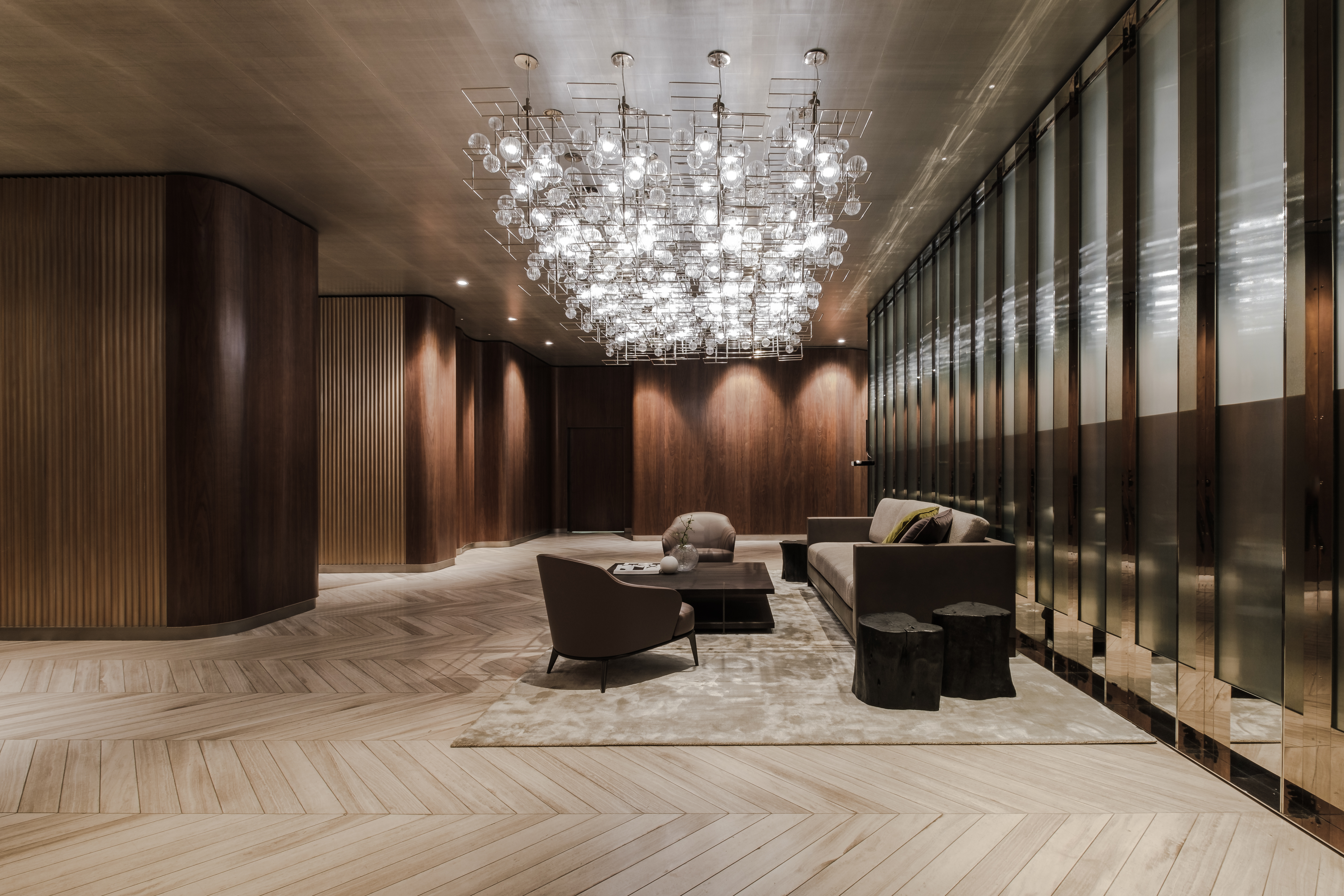
Those with a predeliction for lobby design will salivate over ODA’s chocolate-coloured design for the Chelsea Mercantile building on 7th Avenue in Manhattan. Entering the lobby – which wraps up metal surfaces with vintage lamps and softly patterned walls – you will find yourself in an elegant reverie of chocolate and chestnut tones.
The 19-storey Chelsea Mercantile is an amalgamation of three pre-war buildings dating back to 1908 on a former garment industry and textile manufacturing site. ODA – a practice refining the art of developing, designing and thinking – was tasked with the challenge to unite the buildings with a new lobby.
The 8,000 sq ft space had a peculiar shape, due to its patchwork architectural history, and it was ODA’s job to stitch it back together in the most functional way, whilst reflecting the history of the building and creating something delectable.
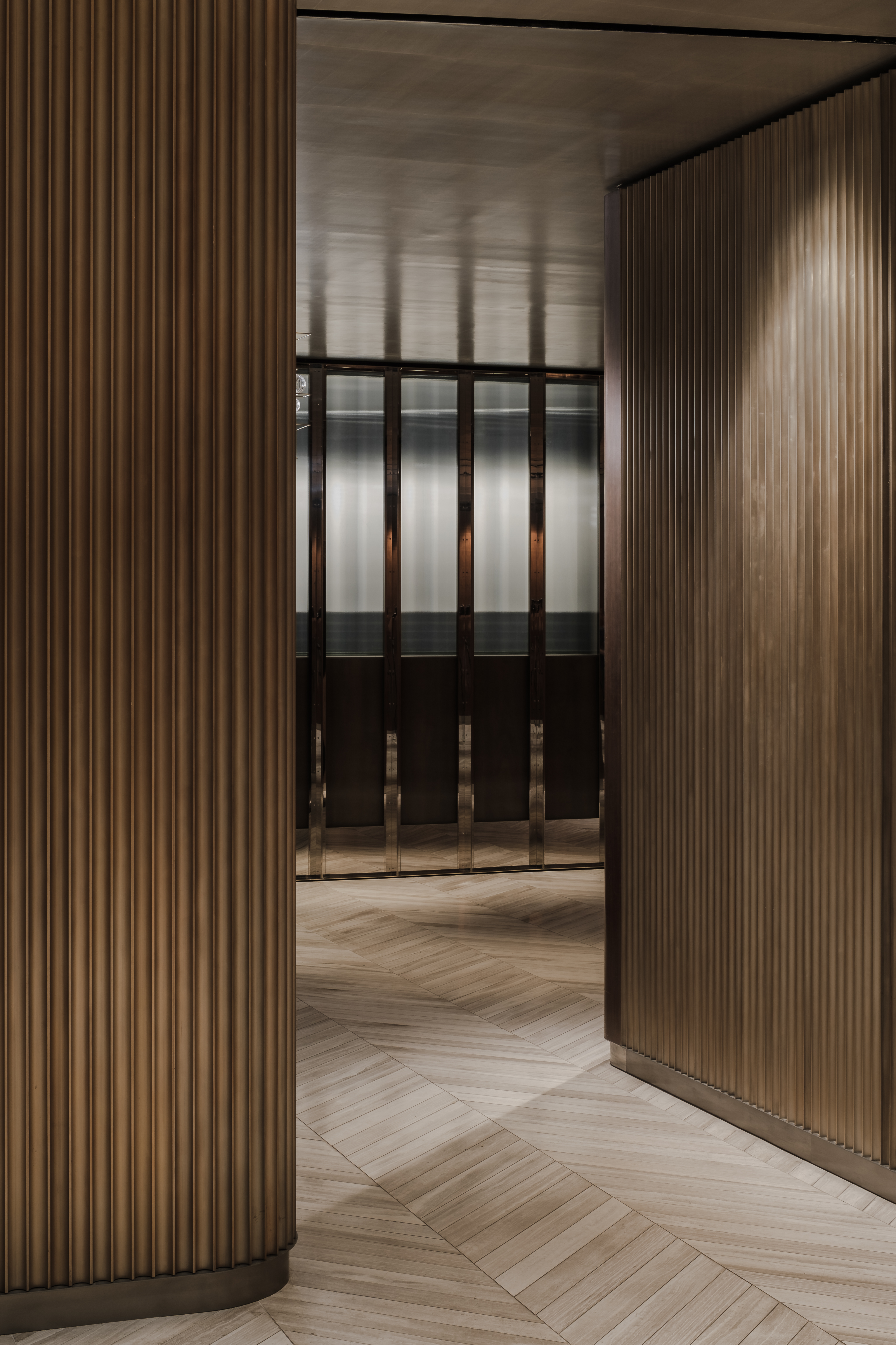
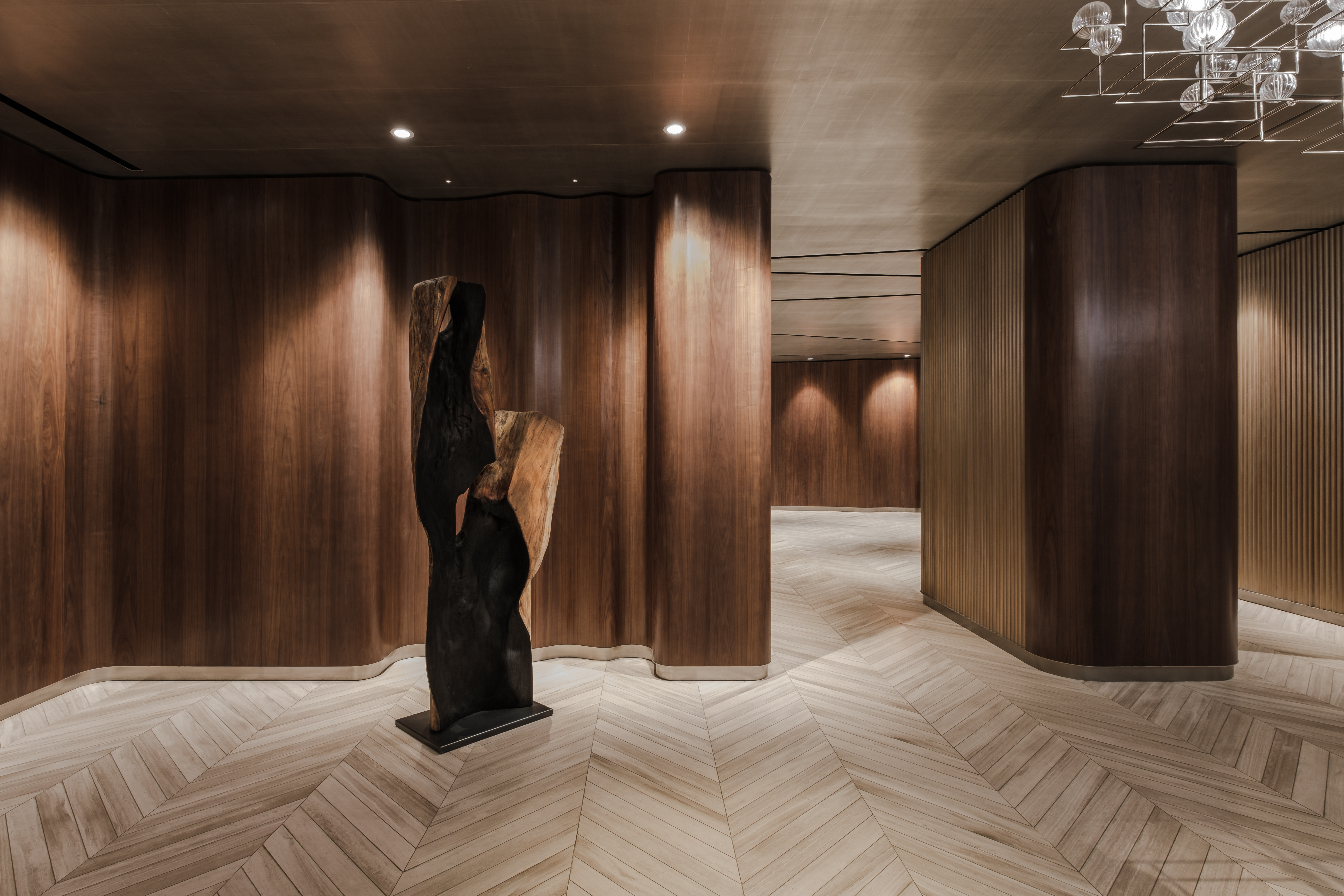
‘The garment industry – the industrial history of the building, and the fact that the building used to create fabric – inspired us to think of spools of fabric and tailoring methods as a structure for the new lobby design. The walls are shaped organically, with the wall shapes resembling the fabric spools of the time. And these shapes invite and direct the observer into and through a sense of revealing and discovery,’ says Ryoko Okada, director of interiors at ODA, who headed up the project.
RELATED STORY
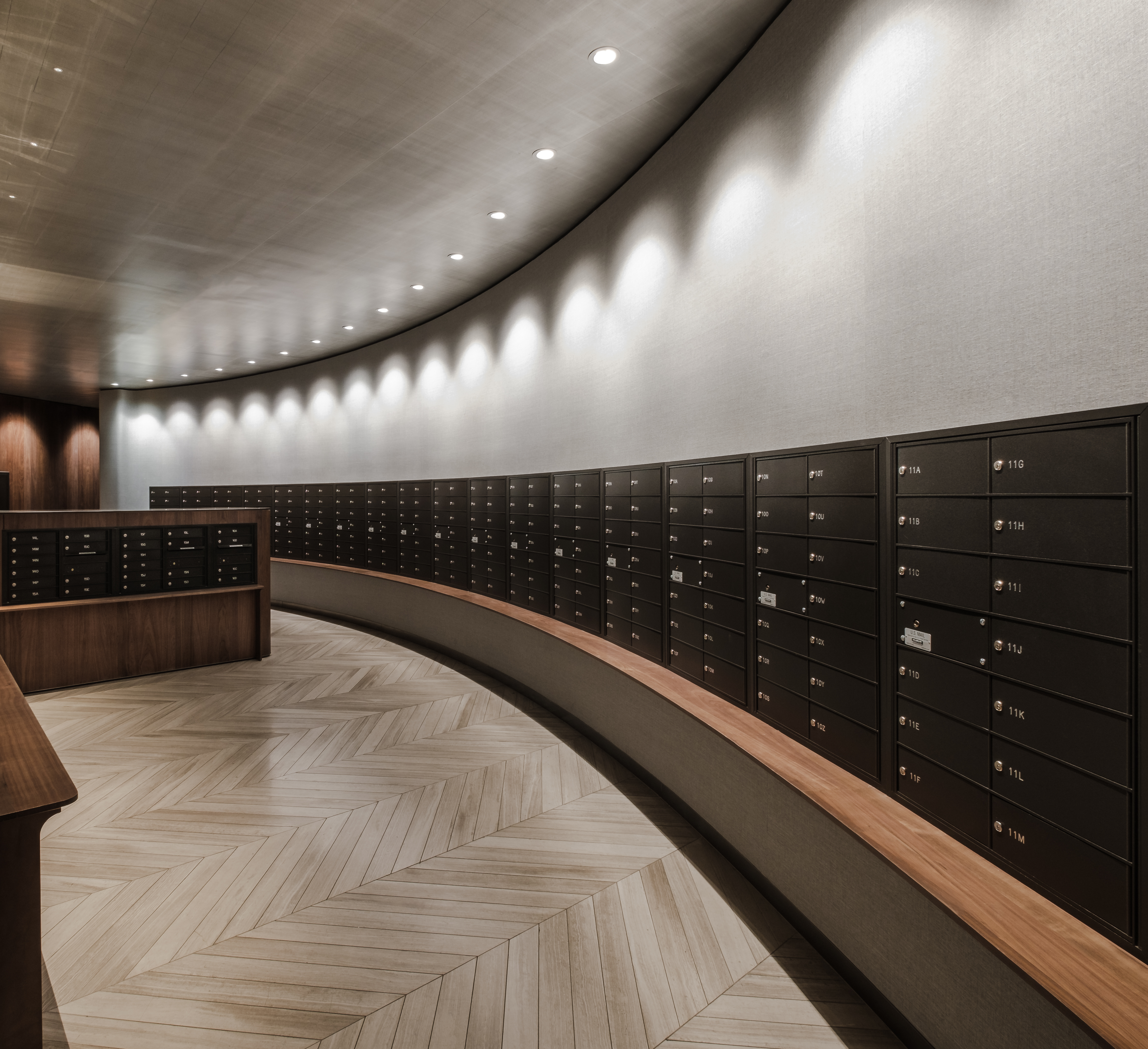
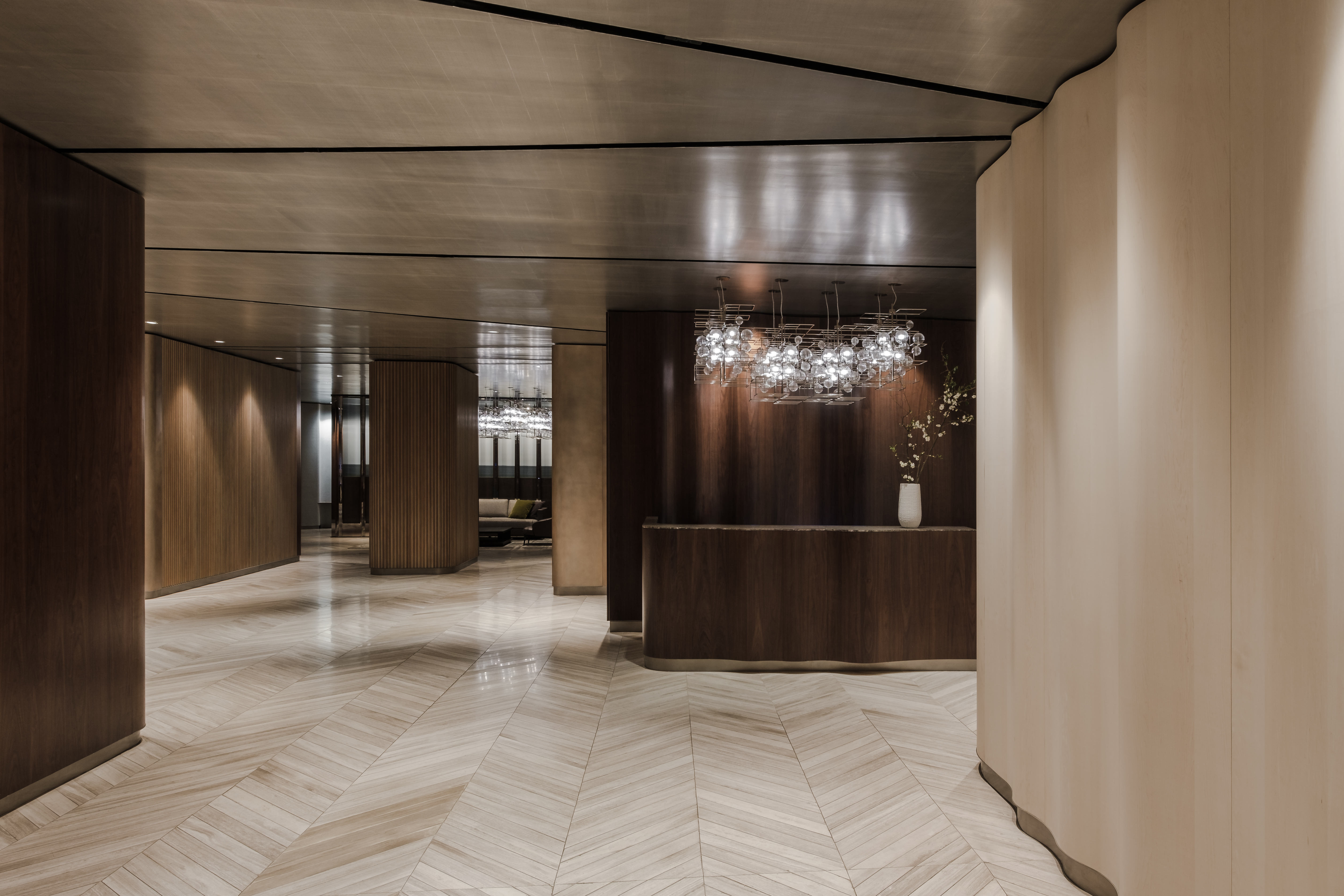
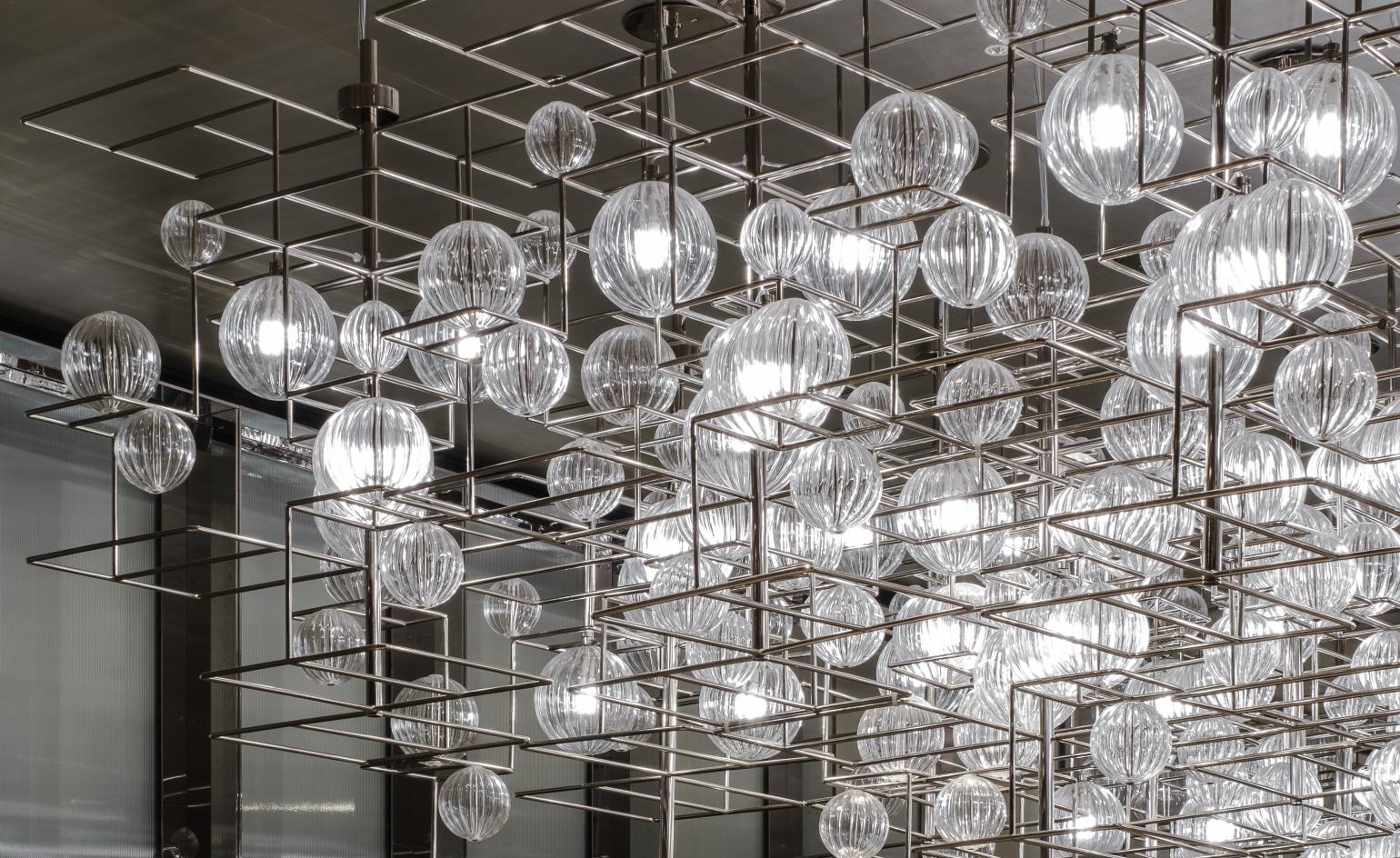
Instead of an 'in-between' space, ODA wanted to create a space that would ‘hold its own importance,’ says Okada. Echoing the grand presence of the façade, the interior of the lobby is heady and atmospheric. A vintage glass lamp crowns a seating area, while a mail room with curved wall of black metal mailbox brings some 50s glamour to picking up your bills.
Robust base materials bring flow to the circulation. Honed nublado light marble with chevron patterning by Stone Source sweeps across the floor, and a metallic ceiling adds slithers of reflections to the dense interior.
The walls help to divide and direct with a subtle variation in materials. Flat and rippled maple and walnut panels are alternated with curved metal panels with a rose finish by Amuneal, and ribbed glass in the mailroom.

INFORMATION
Wallpaper* Newsletter
Receive our daily digest of inspiration, escapism and design stories from around the world direct to your inbox.
Harriet Thorpe is a writer, journalist and editor covering architecture, design and culture, with particular interest in sustainability, 20th-century architecture and community. After studying History of Art at the School of Oriental and African Studies (SOAS) and Journalism at City University in London, she developed her interest in architecture working at Wallpaper* magazine and today contributes to Wallpaper*, The World of Interiors and Icon magazine, amongst other titles. She is author of The Sustainable City (2022, Hoxton Mini Press), a book about sustainable architecture in London, and the Modern Cambridge Map (2023, Blue Crow Media), a map of 20th-century architecture in Cambridge, the city where she grew up.
-
 The Lighthouse draws on Bauhaus principles to create a new-era workspace campus
The Lighthouse, a Los Angeles office space by Warkentin Associates, brings together Bauhaus, brutalism and contemporary workspace design trends
By Ellie Stathaki
-
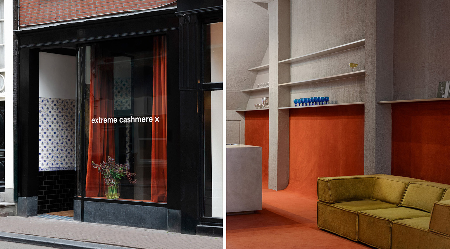 Extreme Cashmere reimagines retail with its new Amsterdam store: ‘You want to take your shoes off and stay’
Wallpaper* takes a tour of Extreme Cashmere’s new Amsterdam store, a space which reflects the label’s famed hospitality and unconventional approach to knitwear
By Jack Moss
-
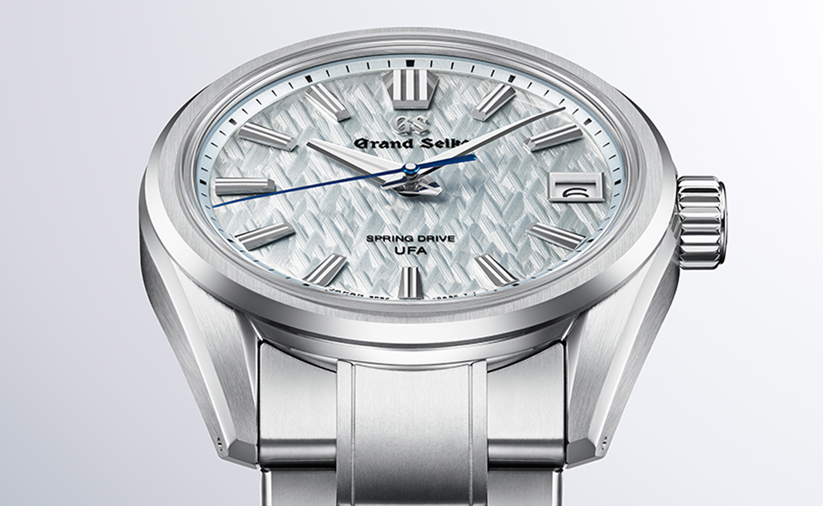 Titanium watches are strong, light and enduring: here are some of the best
Brands including Bremont, Christopher Ward and Grand Seiko are exploring the possibilities of titanium watches
By Chris Hall
-
 The Lighthouse draws on Bauhaus principles to create a new-era workspace campus
The Lighthouse, a Los Angeles office space by Warkentin Associates, brings together Bauhaus, brutalism and contemporary workspace design trends
By Ellie Stathaki
-
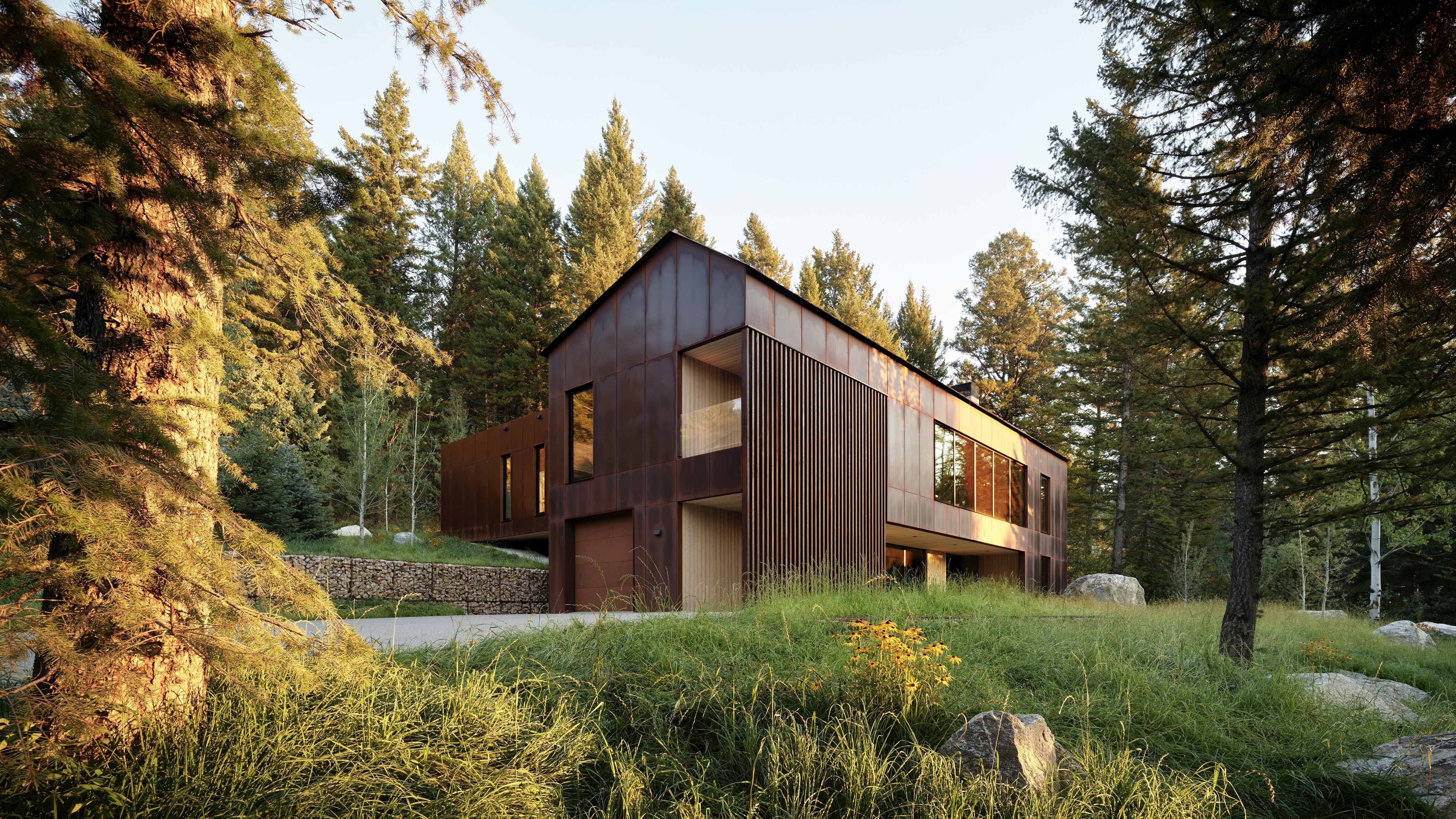 This minimalist Wyoming retreat is the perfect place to unplug
This woodland home that espouses the virtues of simplicity, containing barely any furniture and having used only three materials in its construction
By Anna Solomon
-
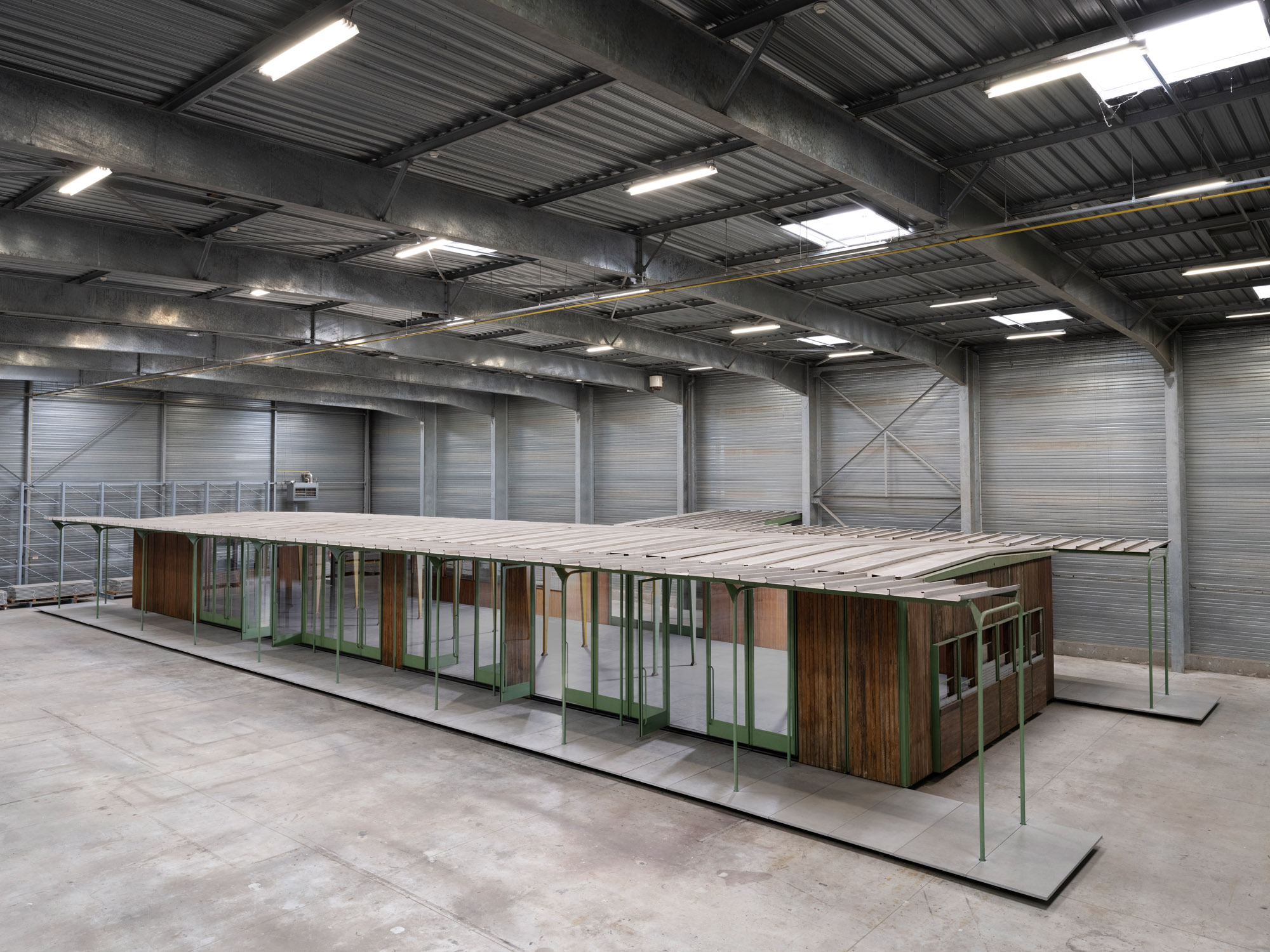 Croismare school, Jean Prouvé’s largest demountable structure, could be yours
Jean Prouvé’s 1948 Croismare school, the largest demountable structure ever built by the self-taught architect, is up for sale
By Amy Serafin
-
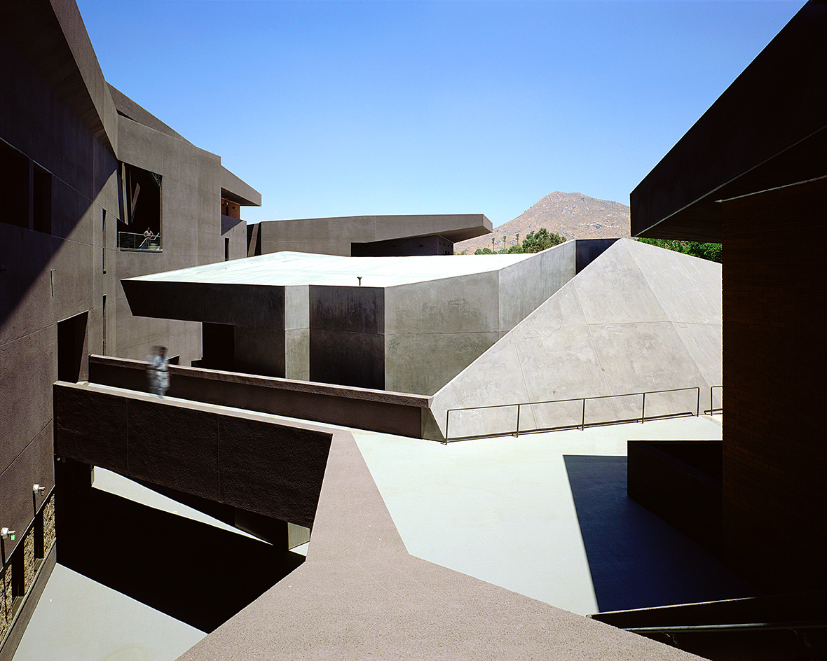 We explore Franklin Israel’s lesser-known, progressive, deconstructivist architecture
Franklin Israel, a progressive Californian architect whose life was cut short in 1996 at the age of 50, is celebrated in a new book that examines his work and legacy
By Michael Webb
-
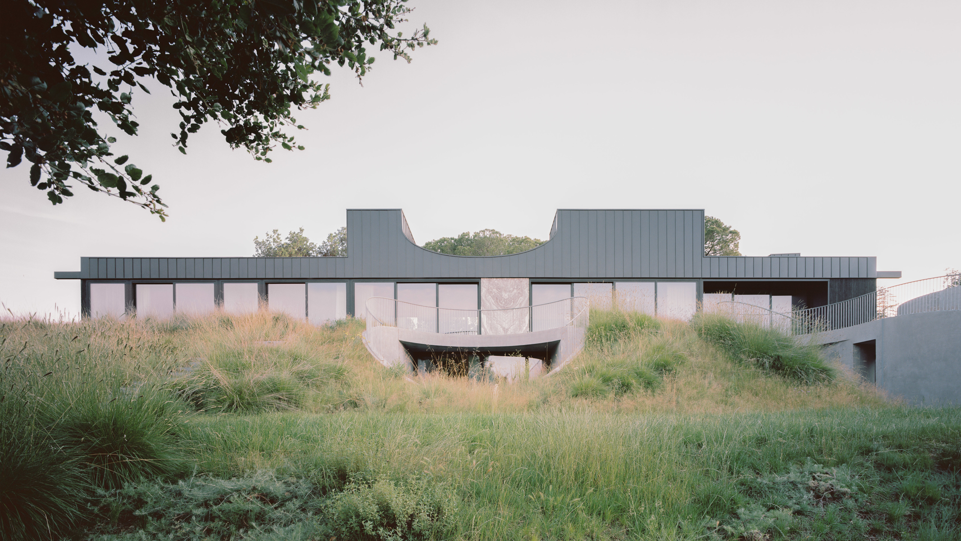 A new hilltop California home is rooted in the landscape and celebrates views of nature
WOJR's California home House of Horns is a meticulously planned modern villa that seeps into its surrounding landscape through a series of sculptural courtyards
By Jonathan Bell
-
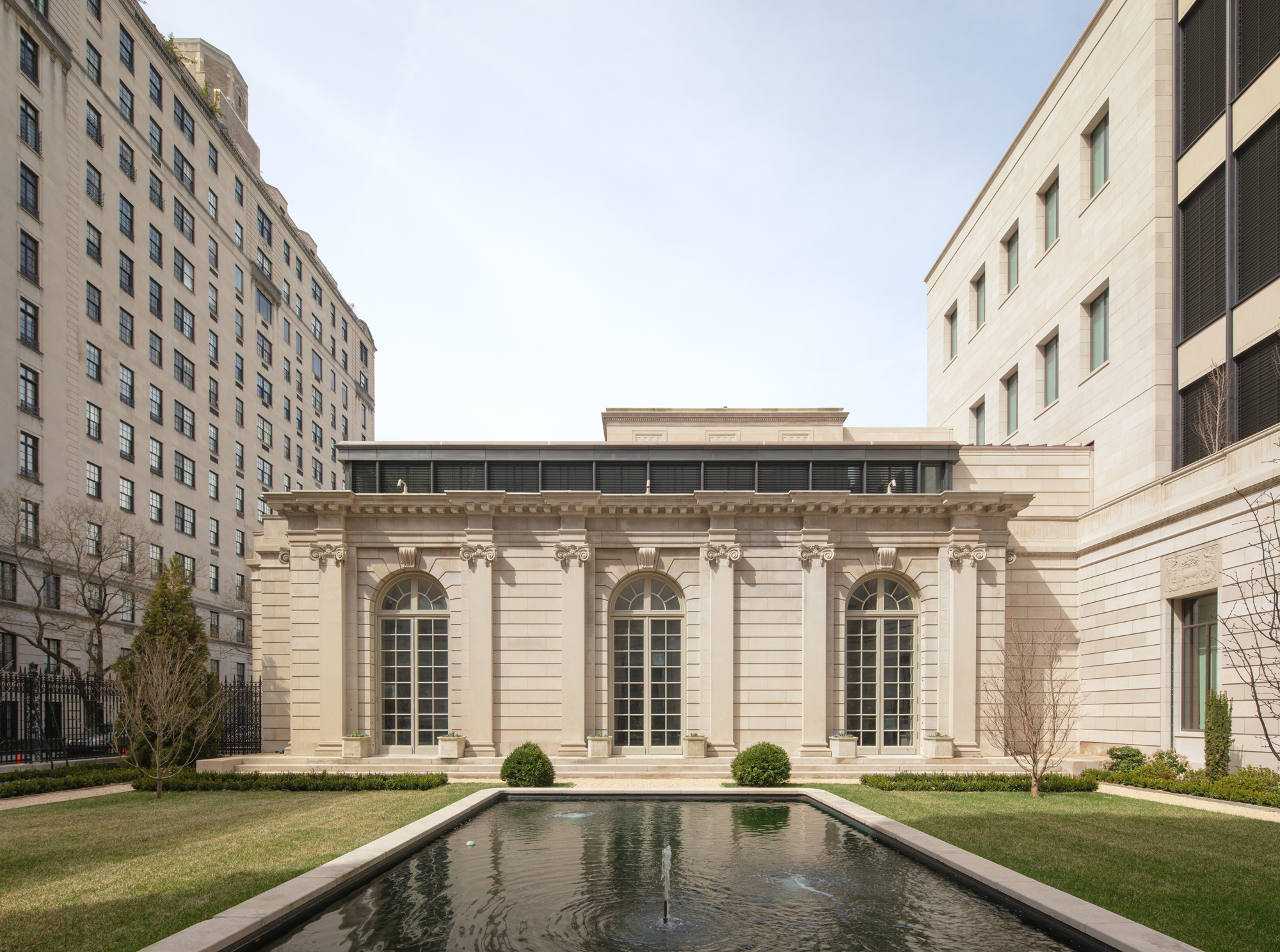 The Frick Collection's expansion by Selldorf Architects is both surgical and delicate
The New York cultural institution gets a $220 million glow-up
By Stephanie Murg
-
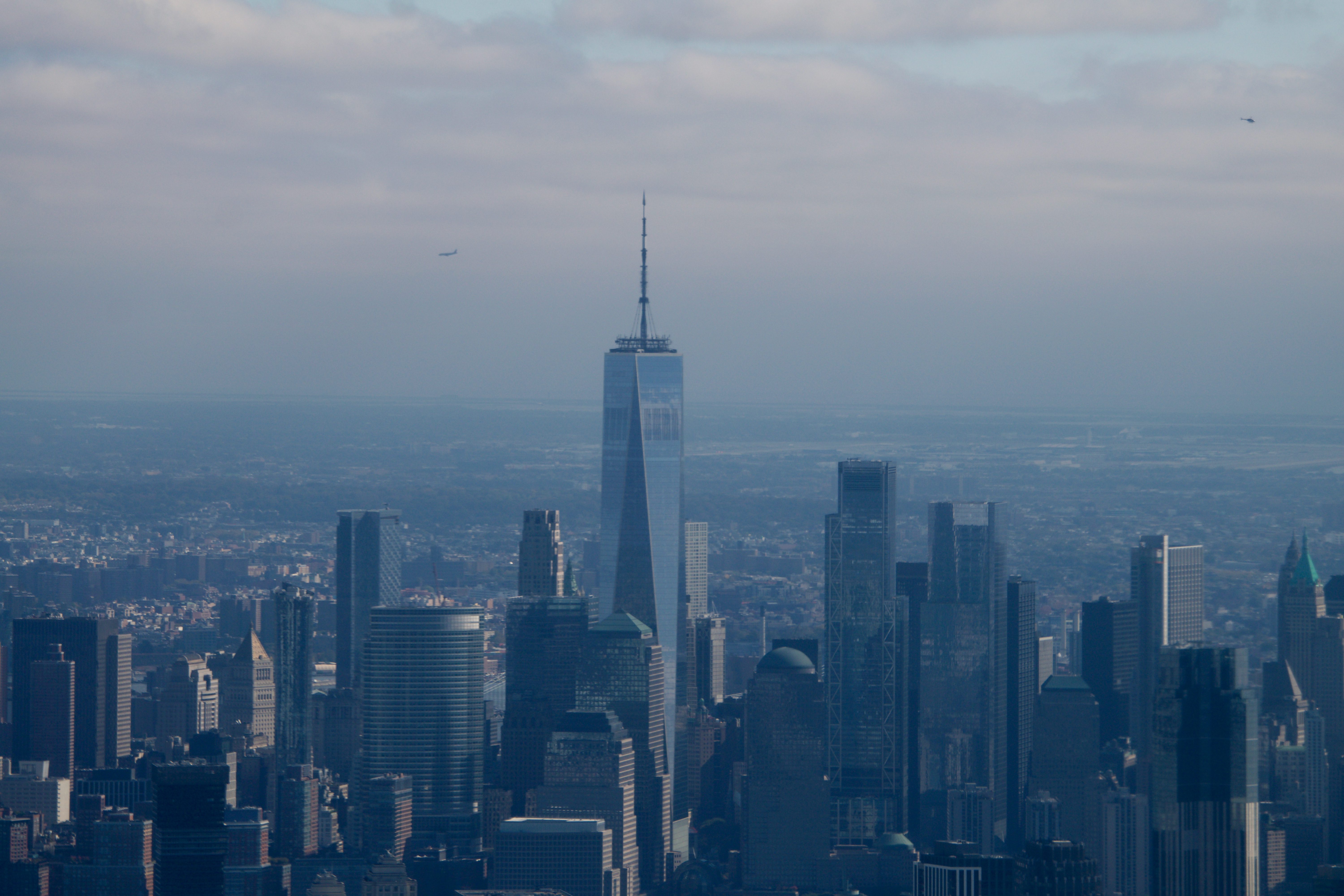 Remembering architect David M Childs (1941-2025) and his New York skyline legacy
David M Childs, a former chairman of architectural powerhouse SOM, has passed away. We celebrate his professional achievements
By Jonathan Bell
-
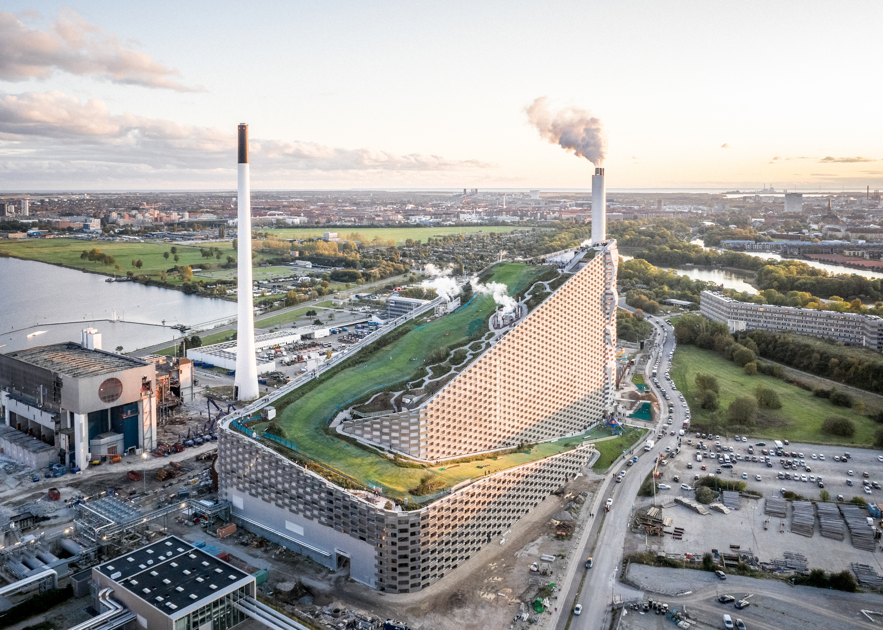 What is hedonistic sustainability? BIG's take on fun-injected sustainable architecture arrives in New York
A new project in New York proves that the 'seemingly contradictory' ideas of sustainable development and the pursuit of pleasure can, and indeed should, co-exist
By Emily Wright