Groundbreaking: Italy’s Tetra Pak Hub is all about innovation
Receive our daily digest of inspiration, escapism and design stories from around the world direct to your inbox.
You are now subscribed
Your newsletter sign-up was successful
Want to add more newsletters?
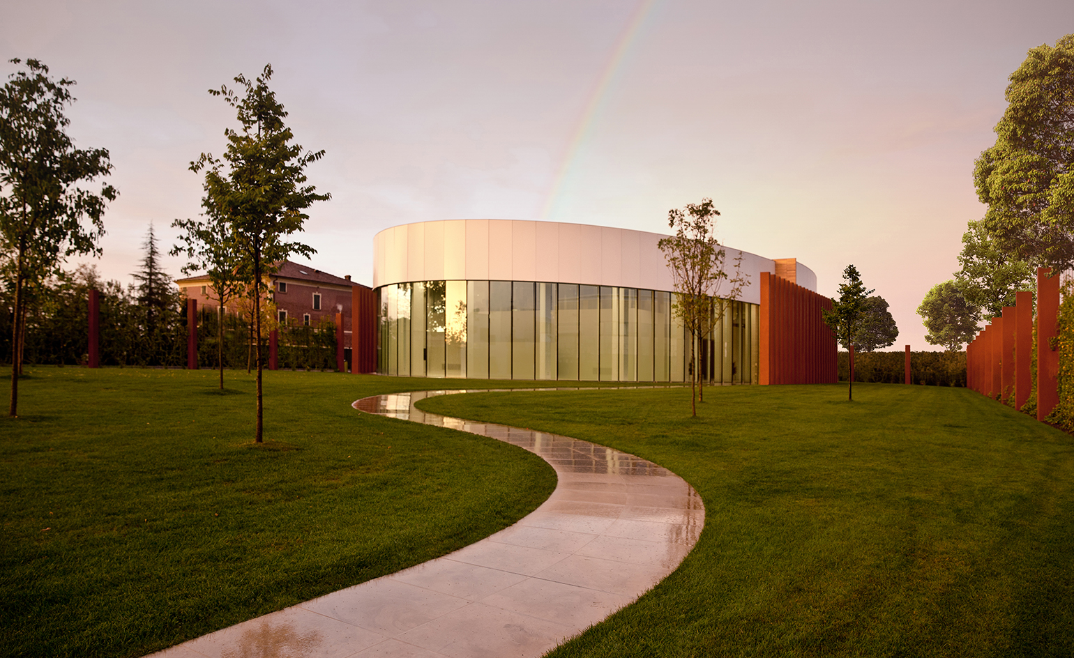
Architecture studio 1+1=1 Claudio Silvestrin Giuliana Salmaso has just signed off a striking addition for the home of Tetra Pak in Italy, the country's new innovation centre for the Swedish food packaging multinational.
1+1=1 Claudio Silvestrin Giuliana Salmaso and Trombini Studio won the competition to design this 1300 sq m facility back in 2009, a space which would be dedicated to research, innovation and training. This was to be built adjacent to the company's existing headquarters in Emilia Romagna. Close to Modena, the structure would be in good company, within a region where innovation is a local tradition; this is also where the Ferrari and Lamborghini car factories were founded. However, a major earthquake hit northern Italy in 2012, causing widespread damage and delaying the construction plans. The building was, at the time, in design development. The natural event caused a change in the area's earthquake regulations, so the design needed to be updated respectively.
For example, a 'gelosia' wall in the original design – a partition wall constructed with a perforated pattern that allows light and air to cross through – needed to be replaced. Enter the terracota-coloured pillars made of reinforced concrete and finished with cocciopesto.
'The intention of the project was to represent tradition, innovation and style with a stunning yet functional contemporary architecture that expresses the international image of the company and its commitment to quality and innovation', explain the architects.
Now, replacing a derelict farm on site, a winding footpath leads visitors through a green garden to the centre's dramatic, irregularly shaped 11m high wooden door. The pillars flank it on on the right hand side, while the building's curved glass facade unfolds to the left.
The interior is an 8m high sinuous space that encourages an open plan, flexible desk arrangement. The airy and calm environment overlooks a park. 'The elliptical shape facilitates the circulation of information and teamwork, and fosters a way of working that encourages communication and innovation', say the architects. 'Meanwhile the inner core contains square and rectangular rooms, which are suitable for working in a more conventional way'.
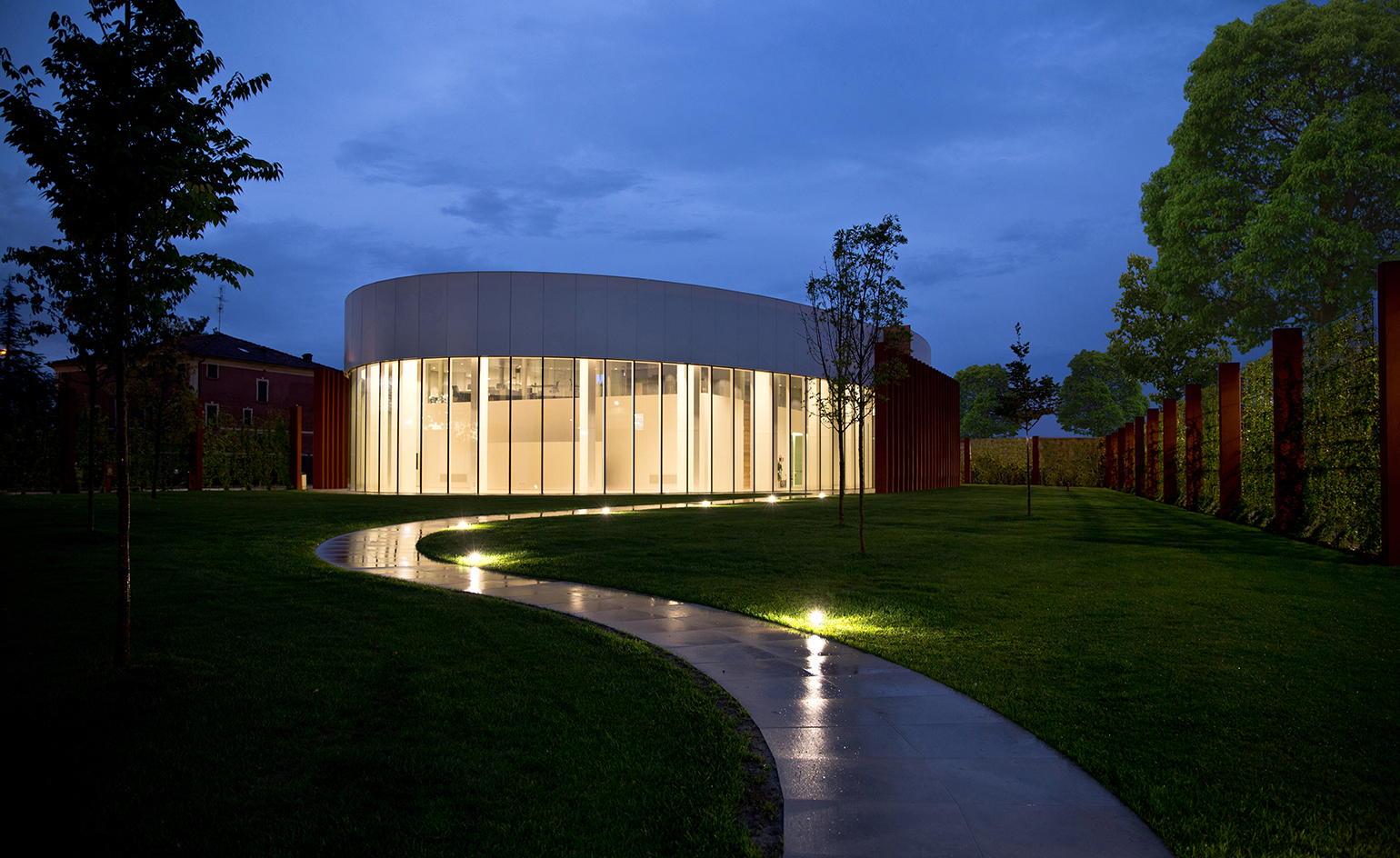
The building's curved form was chosen to encourage information exchange and teamwork, explain the architects
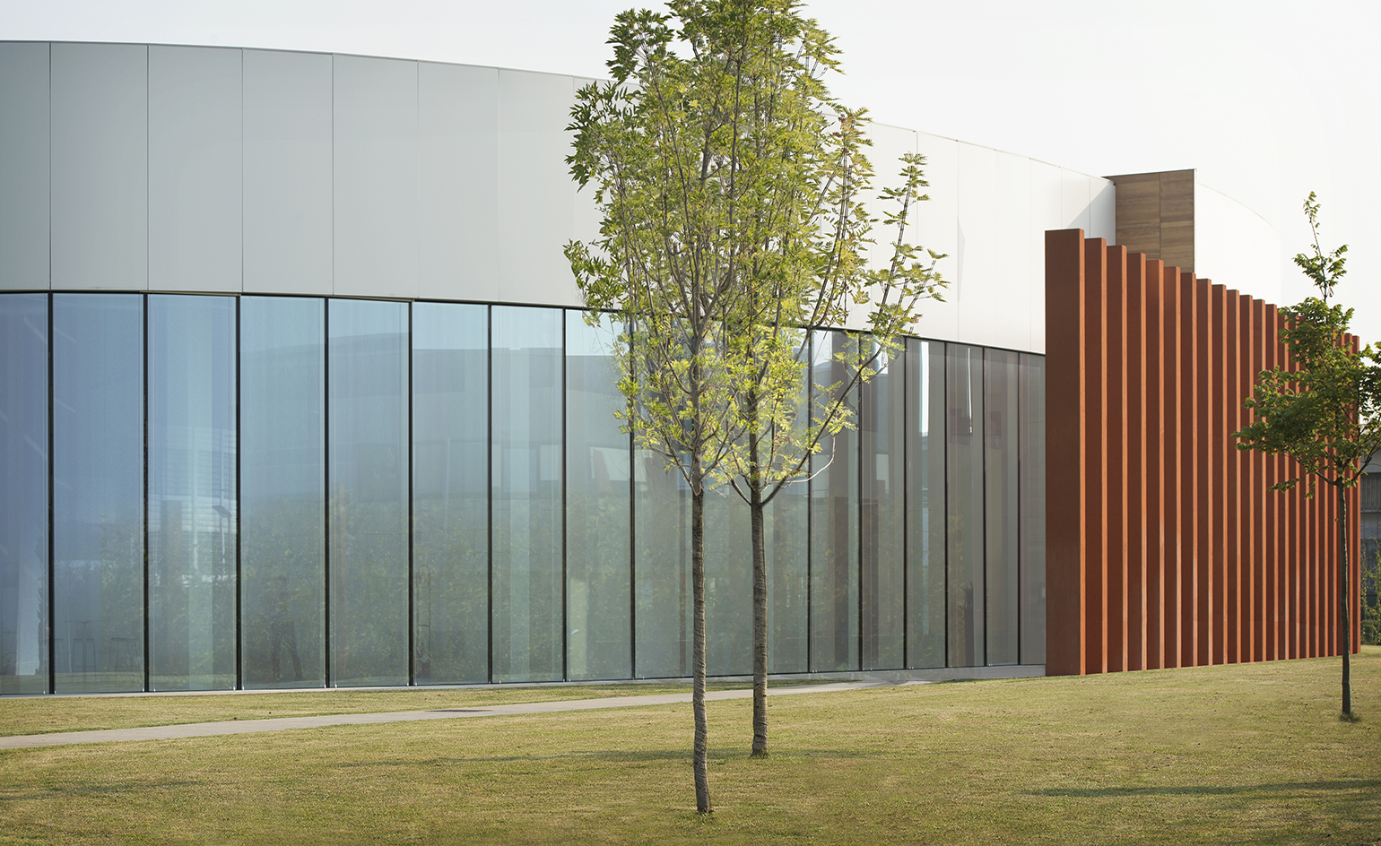
The building was designed according to the area's strict earthquake regulations
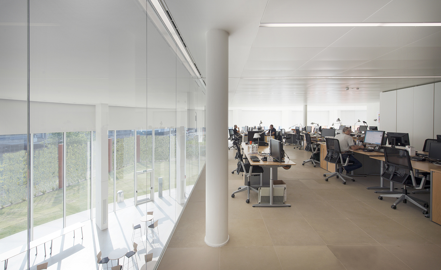
Inside, the layout is mostly open plan, offering flexible workspace
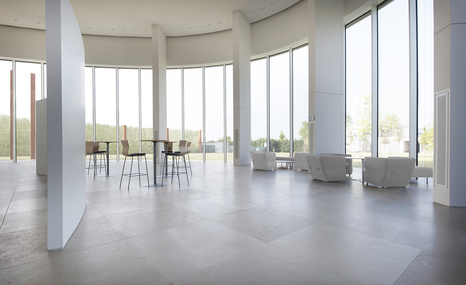
Looking out to a green park through large floor to ceiling openings, the interior is bright and calm
INFORMATION
For more information visit the 1+1=1 website
Photography: Giulia Ricagni and Giovanni de Sandre
Receive our daily digest of inspiration, escapism and design stories from around the world direct to your inbox.