Clive Lonstein’s Manhattan home is a warm minimalist space brimming with texture
Designer Clive Lonstein elevates his carefully curated Manhattan home with rich textures and fabrics
Receive our daily digest of inspiration, escapism and design stories from around the world direct to your inbox.
You are now subscribed
Your newsletter sign-up was successful
Want to add more newsletters?
Approaching this Manhattan pre-war building, once home to famed luxury retailer Barneys, one cannot help but feel a sense of nostalgia for the bygone era in which it was built. Early 20th-century Manhattan structures are typically both charming and flawed, containing occasional whimsical treats from a creative mason, but often saddled with odd layouts and narrow corridors. This is why, when entering Clive Lonstein’s 17th-floor residence, you are struck by an unexpected feeling of spaciousness. The architectural designer’s home is drenched in natural light from its southwest-facing windows, combined with unusually high ceilings for a building of its vintage and, most notably, a distinctly minimalist aesthetic.

A palm wood dining table by VCA is paired with chairs by ALB, which are covered in a Toyine Sellers woven fabric, while a Robert Mapplethorpe photograph of a calla lily leans against the wall on the kitchen counter
‘What’s interesting about this apartment is that it’s part of the building’s setback. All the floor plans change for this unit and the two floors above.’ That setback also affords the apartment an oversized terrace. ‘When these upper levels were being built, they really were doing something more glamorous; they raised the ceiling height and there is also a fireplace,’ says the designer, who moved in after a year-long gut renovation of his own creation. Lonstein strove for a more contemporary interior to contrast with the architecture: ‘The beams have a pre-war sensibility, but I did clean up the detailing. The bathrooms are quite contemporary. The kitchen is sleek, but then you have the contrast of the foliage outside on the terrace.’

Inside Clive Lonstein's Manhattan home
It is easy to consider minimalist or modernist design as a cold look for a home. After all, its famous representatives, including the likes of Mies van der Rohe and Le Corbusier, prioritised a less-is-more design philosophy that not only rejects embellishment but often uses materials that feel inherently industrial, such as concrete, glass and steel. While the overarching aesthetic of Lonstein’s design adheres to the same principles, the interior is anything but sterile, with pops of colour to liven up the rooms, introduced through paintings and fabrics and enhanced by varied textures.

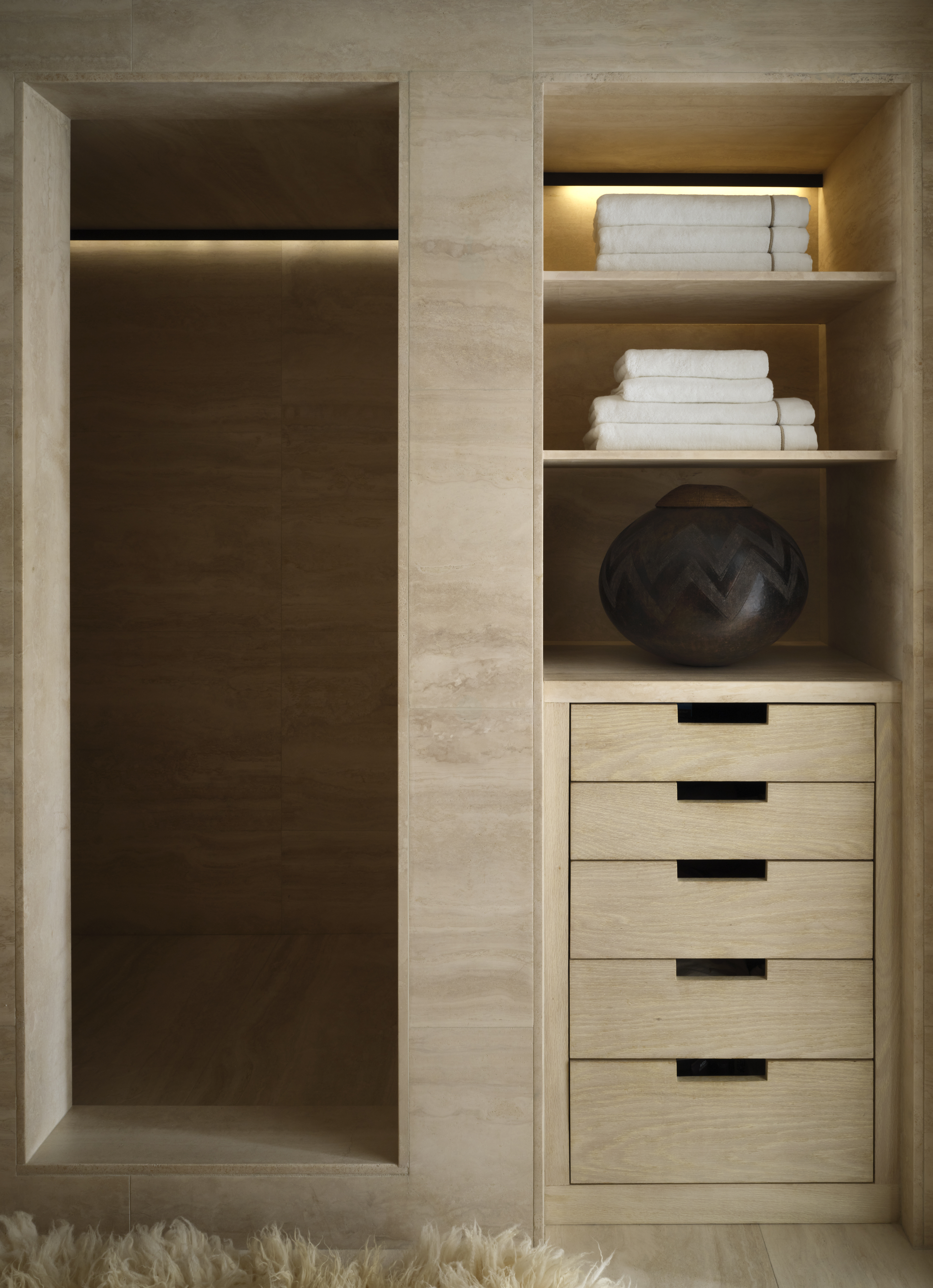
The primary bathroom is lined with ivory travertine from BAS Stone
‘My sensibility is minimalistic,’ explains Lonstein. ‘When I use that term, I don’t think that it’s interpreted correctly; people assume it means stark white boxes. I like it minimalistic but with incredibly rich material. So I’m going to switch that word to ‘reductive’ instead. I had to be reductive and edit down to my favourites and things that make sense in a New York City apartment. ’Those elements have indeed been reduced, with care taken to form a collection of furniture, products and surfaces of exquisite richness that clearly bring Lonstein joy.

For the designer, texture is the difference between a minimalist décor that is stark and one that is warm and inviting.
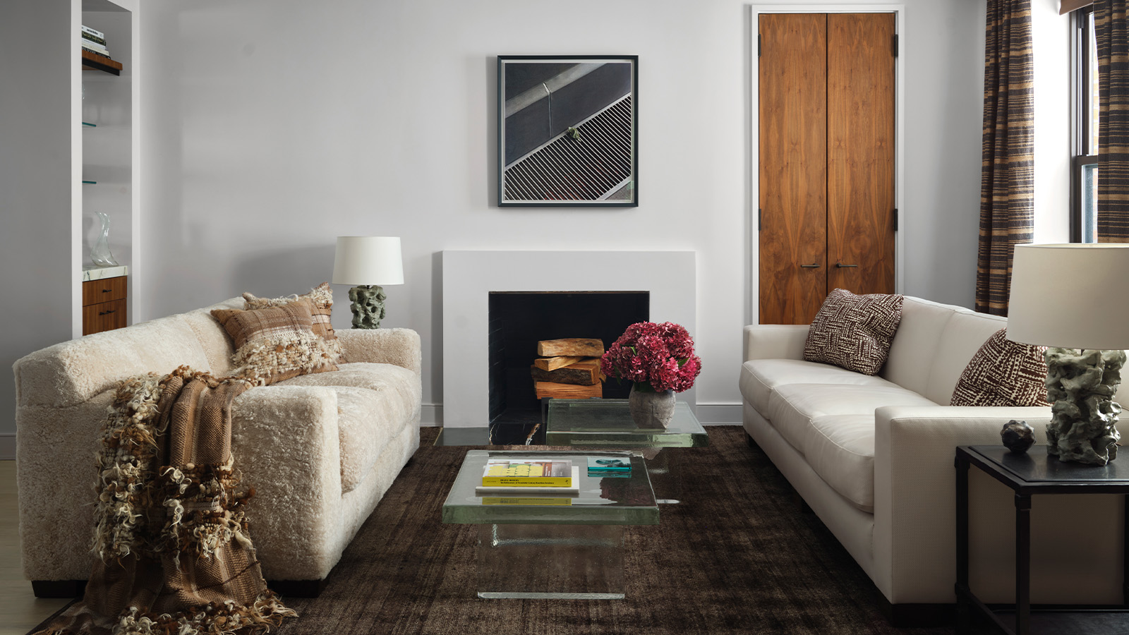
‘See this shearling sofa?’ he says excitedly, pointing to one of two sofas, a highly textured piece by Long Island’s Anthony Lawrence-Belfair. Right across from it is a leather sofa and ‘instead of it just being plain leather, it’s perforated’. Pointing to a recycled silk rug from Beauvais Carpets, he marvels that ‘it has a million different tones of brown and it has this texture to it’. Then there is the Perrine Rousseau drapery. ‘Having something that has a charcoal linen and hessian-coloured silk woven through as a stripe brings warmth to it. If you look at the drapes, they’re so textural,’ says Lonstein.
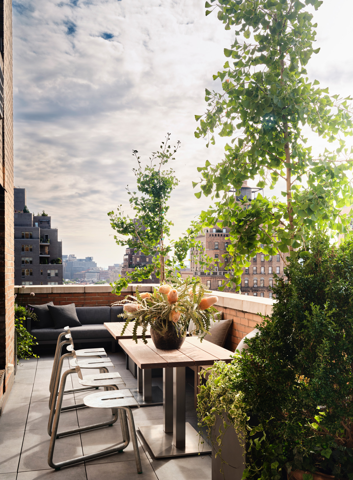
The large terrace with a sofa and tables by Restoration Hardware and outdoor metal chairs by Atelier Thomas Serruys
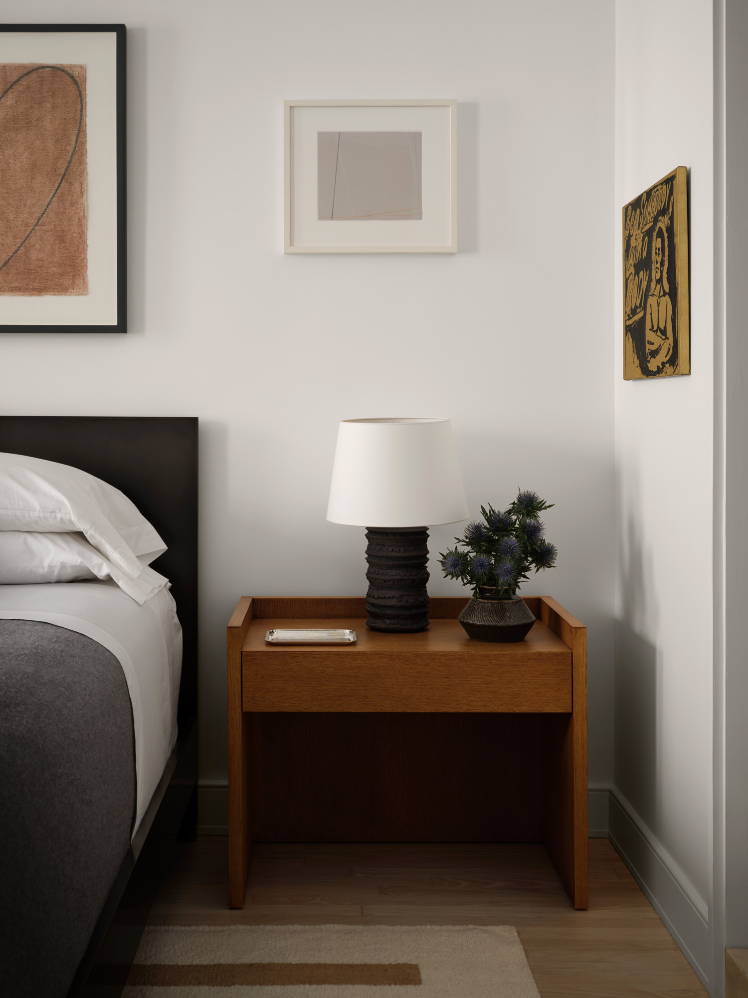
Throughout the apartment, artwork, curated by consultant Barbara Berger, addsa further layer of interest. Lonstein says he ‘wanted to create a space where each item stands on its own and one thing doesn’t drown out something else’. A painting by Cheyney Thompson, for instance, appeals to him for ‘the abstraction and the whole grid that’s on it and the cobalt blue’.
Receive our daily digest of inspiration, escapism and design stories from around the world direct to your inbox.
The kitchen, which features stainless steel cabinets by Darren Vigilant, is unapologetically contemporary. ‘I do a ton of entertaining, so I wanted a heavy-duty range,’ Lonstein says. ‘The countertop is integrated so that it’s one piece from the backsplash to the sink. I wanted it to feel almost like a ship’s industrial kitchen. The floor is just one slab; there are no seams. So once again, it adds to that minimalistic feel.’ Two leather bar stools by Ochre peer over a marble counter from BAS Stone, while a Robert Mapplethorpe photograph sits on top, leaning against the wall.

From here, a glass door leads out onto a large terrace where contemporary furniture is juxtaposed against the building’s traditional architecture. ‘The exterior lives in a sort of terracotta world. I loved how the blue-grey [I added] worked so well with the orange. And then you contrast it with the softness of the plantings.’
Lonstein’s Manhattan home may be true to his pared-down aesthetic but it’s born out of very intentional and elaborate thinking. ‘I love that minimalism is taking all of my experience and influences and focusing them to create something warm.’

This article appears in the October 2024 issue of Wallpaper*, available in print on newsstands, on the Wallpaper* app on Apple iOS, and to subscribers of Apple News +. Subscribe to Wallpaper* today.
Alfredo Mineo is a Paris-based writer covering design, beauty, and visual culture. He contributes to Wallpaper*, Vogue, and Allure. For Wallpaper*, he has profiled architects, artists, and designers with a focus on materiality and spatial language. Originally from New York, his work explores how people live with objects and how personal environments reflect larger aesthetic codes.