Architecture colours defining yesterday, today and tomorrow
‘Colour Memories’, a new exhibition by London’s Museum of Architecture, takes a look at the colours inspiring architects through time and personal experience
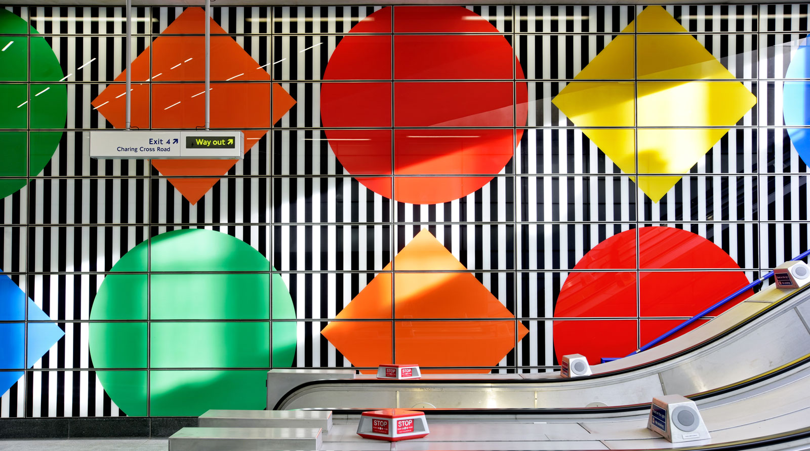
Architecture and colour have a long and established relationship. Bright geometric pops of colour at Tottenham Court Road Underground station, courtesy of artist Daniel Buren and part of Hawkins/Brown’s redevelopment; the muted colours of Morris + Company’s models for its Sylvan Heritage project in Kent; and the vivid stripes of Charles Holland Architects' Polly pavilion in North Yorkshire – colours lend each of these distinctive designs its own idiosyncratic character. The emotive role of colour and its power to be both joyful and inclusive has long held architects and designers engaged, and is now the subject of a new digital exhibition organised by the Museum of Architecture, London.
‘Colour Memories’ looks into the sentimental role colour holds for architects, who juggle the personal connotations it can conjure for them with a knowledge of how it will impact design. The exhibition examines the impact of memory and how it works alongside colour’s power to alter perceptions of space, set the ambience, or draw on an intrinsic web of cultural associations.


Pictured above, Architect Jonathan Hagos is inspired by the salmon-orange hue of his parents’ Opal Kadett. Below, Polly pavilion at Fountains Abbey & Studley Royal in North Yorkshire, by Charles Holland Architects
For Jonathan Hagos of architecture practice Freehaus, salmon orange was the colour of his parents’ Opal Kadett, parked outside the first home he remembers living in. For Catherine Pease of vPPR Architects, soft green recalls the calming hues of plants, and she and her colleagues are drawn to projects that link landscape and architecture. For Harbinder Singh Birdi of Hawkins\Brown Architects, traffic red holds a significance. Paul Monaghan of AHMM finds the distinctive green of a Victorian tile sentimental.
‘Colour is something that helps us recall memories and feelings,' says founder and director of The Museum of Architecture Melissa Woolfrod. ‘The steel blue of the ocean on a windy Autumn's day that gives us chills just thinking of it; bright neon-coloured lights in cities that evoke excitement and energy; and primary-coloured crayons strewn across a table harking back to the nostalgia and innocence of being a child. Narratives like these are driving the Museum of Architecture's Colour Memories exhibition, bringing the personal stories of architects, and the designs they inspire, to life.'
The exhibition, sponsored by Axalta, looks further than nostalgia’s role in colour memory, contemplating how colour informs both the design process and our mood and wellbeing. It nods to recent movements in architecture and design, considering the role of the Multiform movement – characterised by its use of bold colours and themes – and the vibrant New London Fabulous movement, which celebrates colourful design cues from diverse cultures. Twenty architectural practices come together for the digital exhibition, providing a personal exploration of colour’s role in their designs.
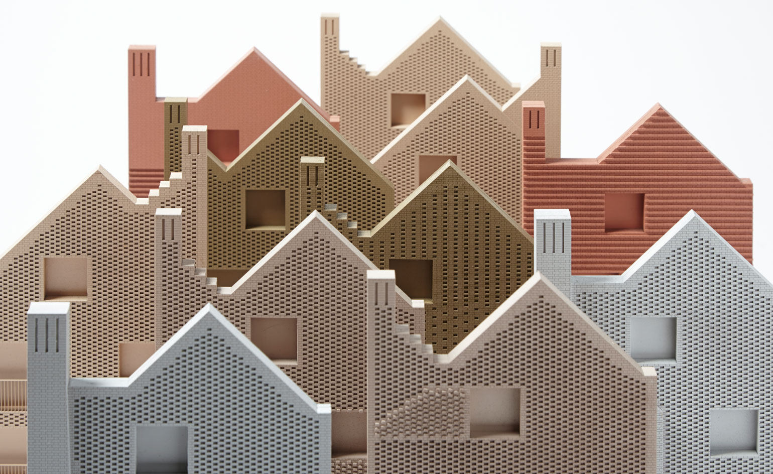

Pictured above, Morris + Company Sylvan Heritage models for its project in Kent. Below, Mathematics department building at Queen Mary University of London by WilkinsonEyre architects.
INFORMATION
‘Colour Memories’, until October 2021, is a digital exhibition sponsored by Axalta
museumofarchitecture.org
Wallpaper* Newsletter
Receive our daily digest of inspiration, escapism and design stories from around the world direct to your inbox.
Hannah Silver is the Art, Culture, Watches & Jewellery Editor of Wallpaper*. Since joining in 2019, she has overseen offbeat design trends and in-depth profiles, and written extensively across the worlds of culture and luxury. She enjoys meeting artists and designers, viewing exhibitions and conducting interviews on her frequent travels.
-
 Marylebone restaurant Nina turns up the volume on Italian dining
At Nina, don’t expect a view of the Amalfi Coast. Do expect pasta, leopard print and industrial chic
By Sofia de la Cruz
-
 Tour the wonderful homes of ‘Casa Mexicana’, an ode to residential architecture in Mexico
‘Casa Mexicana’ is a new book celebrating the country’s residential architecture, highlighting its influence across the world
By Ellie Stathaki
-
 Jonathan Anderson is heading to Dior Men
After months of speculation, it has been confirmed this morning that Jonathan Anderson, who left Loewe earlier this year, is the successor to Kim Jones at Dior Men
By Jack Moss
-
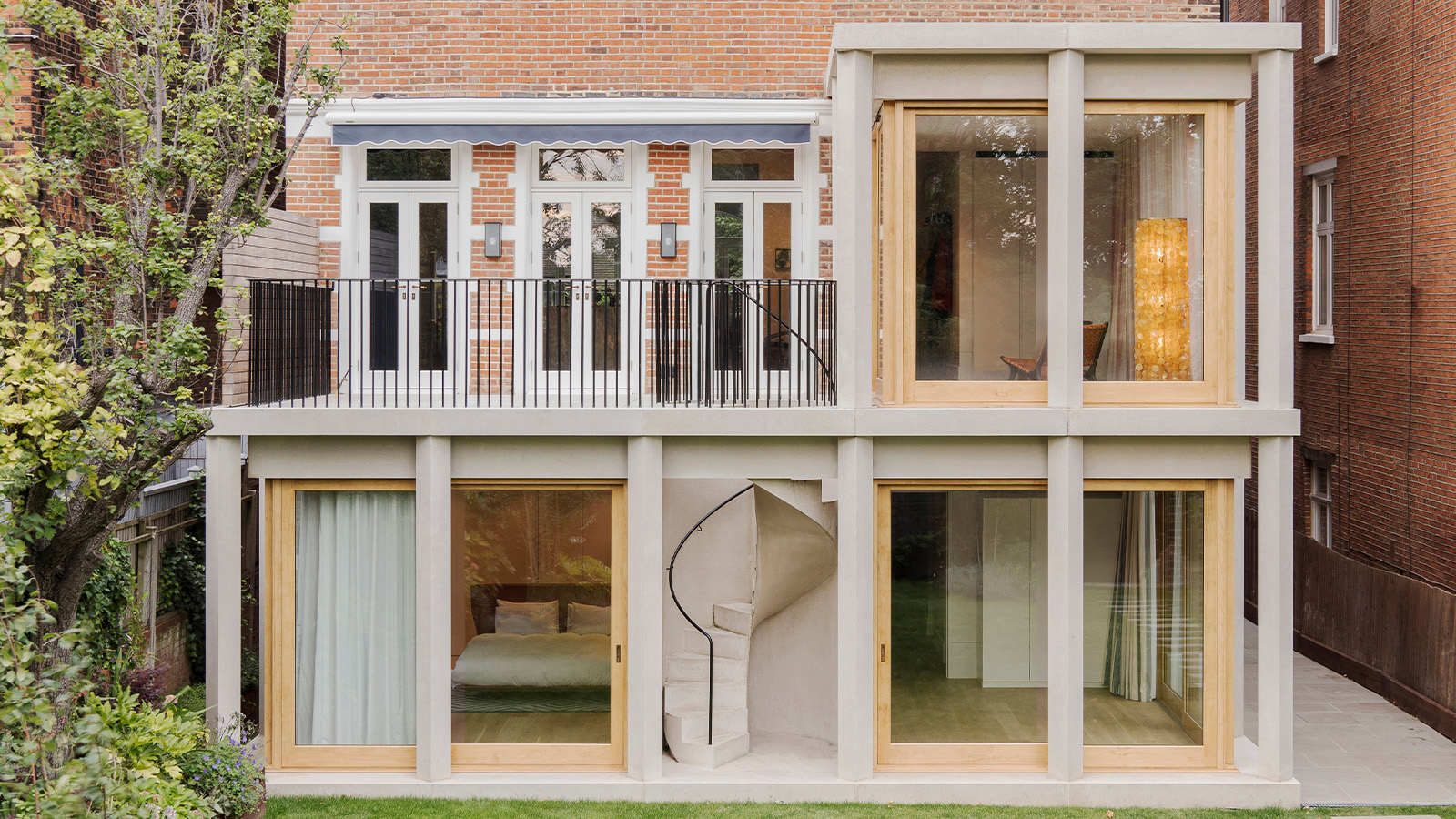 This 19th-century Hampstead house has a raw concrete staircase at its heart
This Hampstead house, designed by Pinzauer and titled Maresfield Gardens, is a London home blending new design and traditional details
By Tianna Williams
-
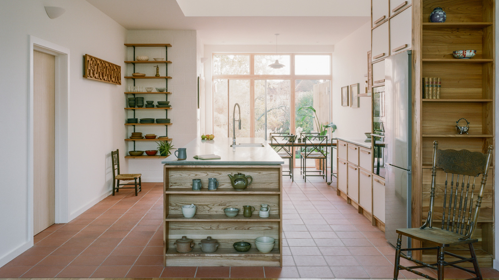 An octogenarian’s north London home is bold with utilitarian authenticity
Woodbury residence is a north London home by Of Architecture, inspired by 20th-century design and rooted in functionality
By Tianna Williams
-
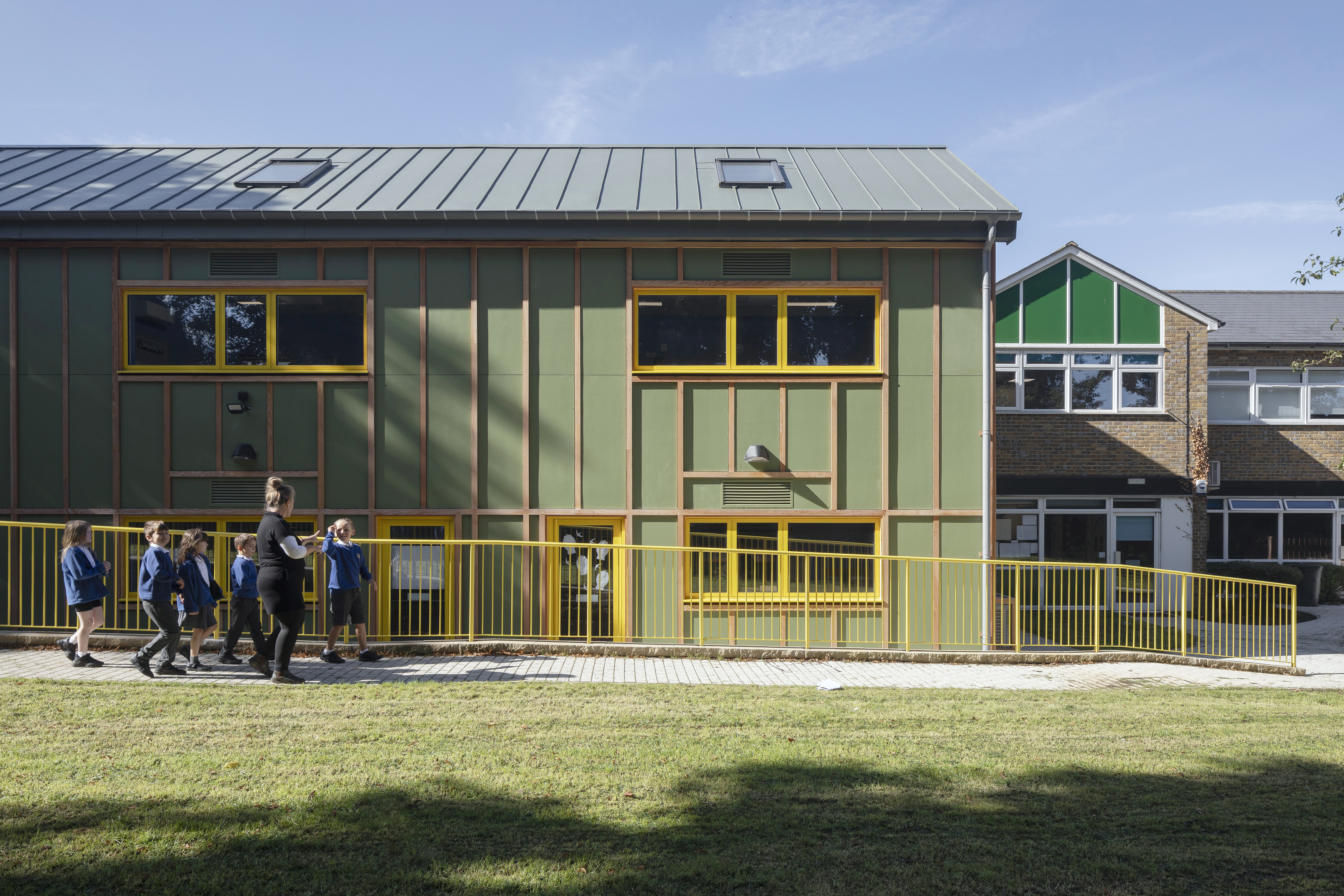 What is DeafSpace and how can it enhance architecture for everyone?
DeafSpace learnings can help create profoundly sense-centric architecture; why shouldn't groundbreaking designs also be inclusive?
By Teshome Douglas-Campbell
-
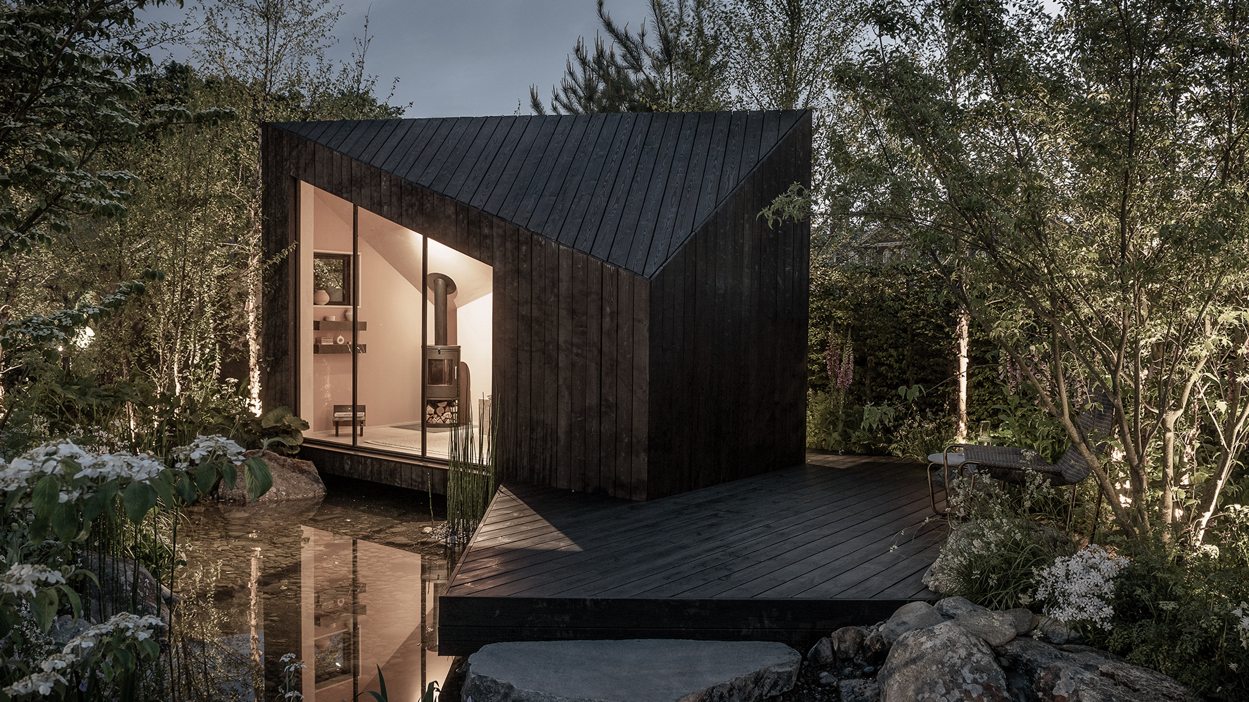 The dream of the flat-pack home continues with this elegant modular cabin design from Koto
The Niwa modular cabin series by UK-based Koto architects offers a range of elegant retreats, designed for easy installation and a variety of uses
By Jonathan Bell
-
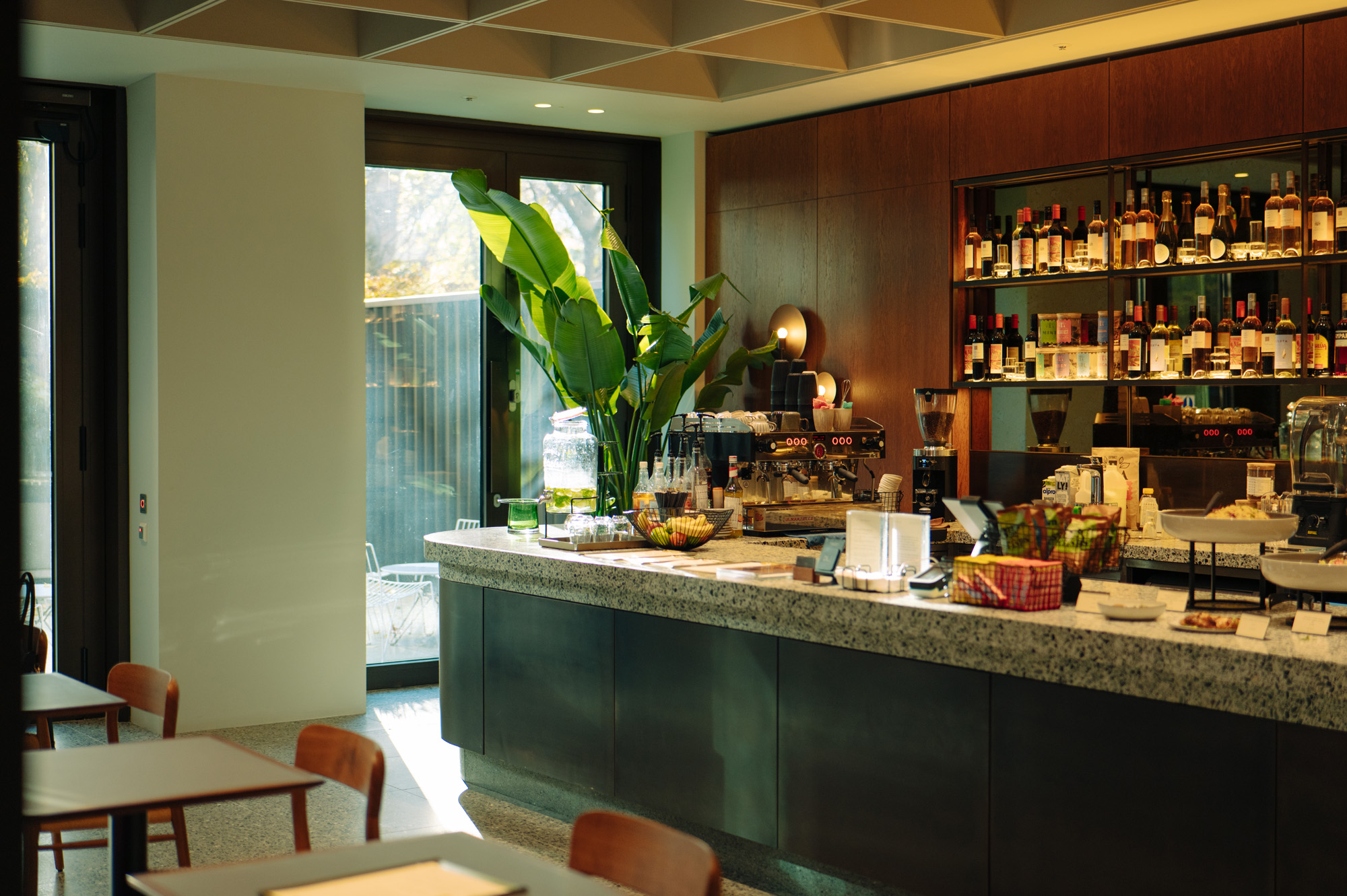 Are Derwent London's new lounges the future of workspace?
Property developer Derwent London’s new lounges – created for tenants of its offices – work harder to promote community and connection for their users
By Emily Wright
-
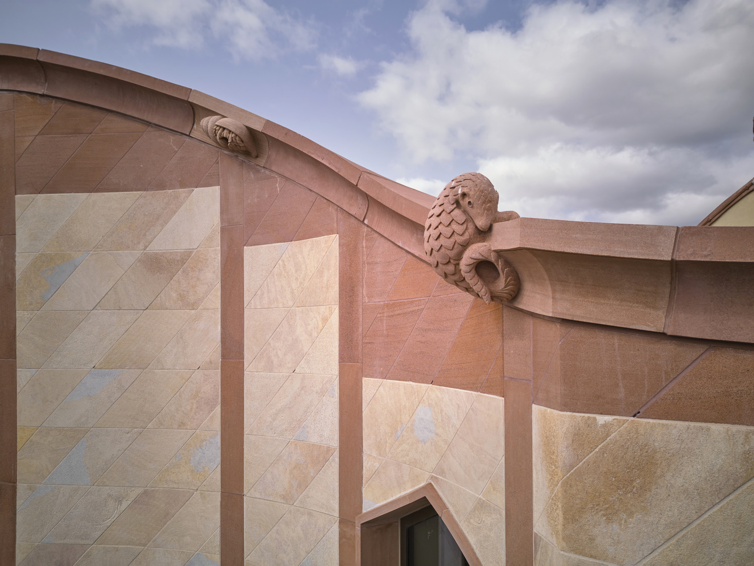 Showing off its gargoyles and curves, The Gradel Quadrangles opens in Oxford
The Gradel Quadrangles, designed by David Kohn Architects, brings a touch of playfulness to Oxford through a modern interpretation of historical architecture
By Shawn Adams
-
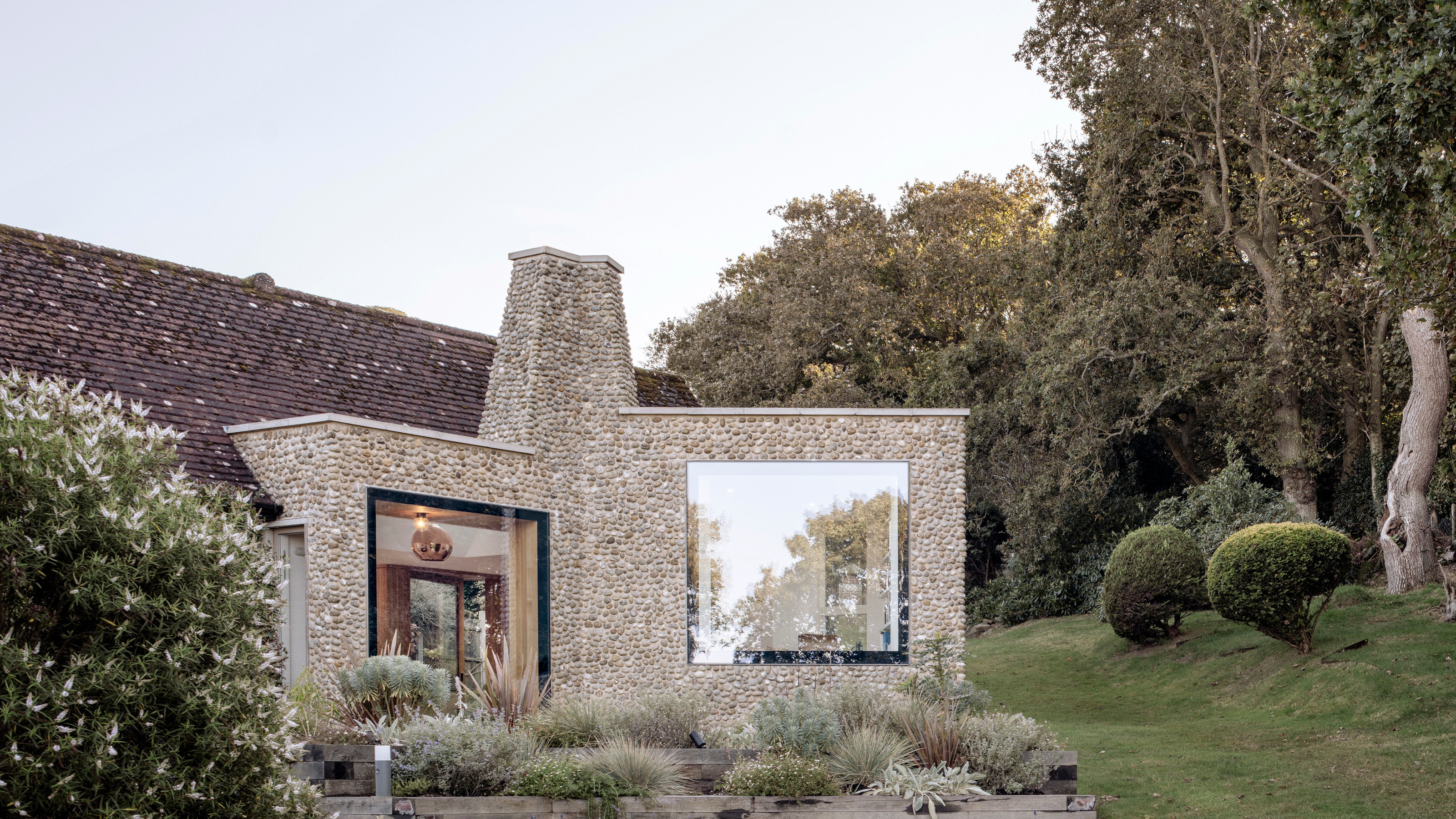 A Norfolk bungalow has been transformed through a deft sculptural remodelling
North Sea East Wood is the radical overhaul of a Norfolk bungalow, designed to open up the property to sea and garden views
By Jonathan Bell
-
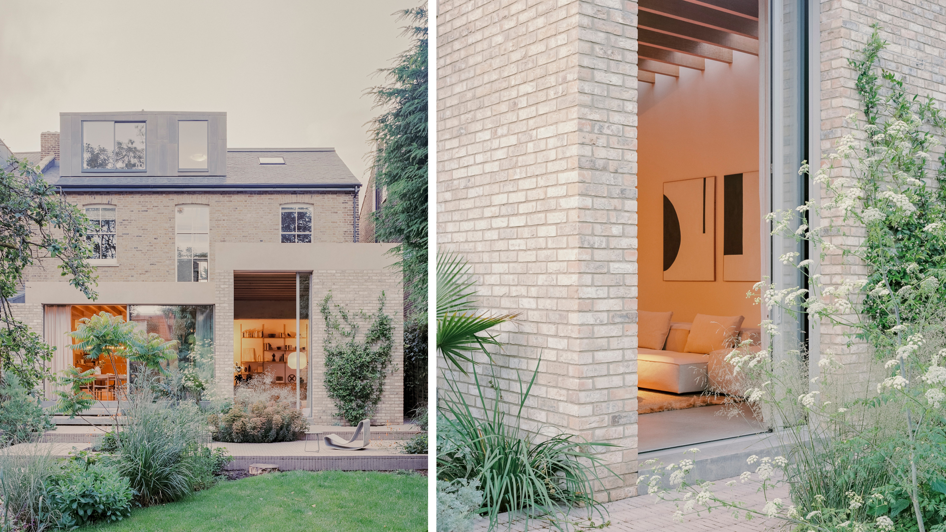 A new concrete extension opens up this Stoke Newington house to its garden
Architects Bindloss Dawes' concrete extension has brought a considered material palette to this elegant Victorian family house
By Jonathan Bell