Dark age: a cluster of blackened concrete pavilions forms a discreet retreat outside Mexico City
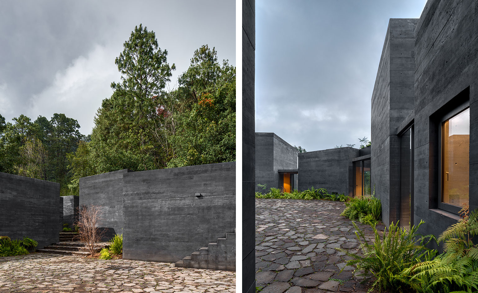
‘From our first conversation with the client, we thought this would be a conventional weekend house,’ says architect Fernanda Canales of Casa Bruma, a remarkable retreat located just a couple of hours outside Mexico City. ‘However, when we visited the remote and rural site, it was hard to even work out the shape of the plot,’ she continues. ‘There were no markings and just so much vegetation.’
Canales, who collaborated on the project with architect Claudia Rodríguez, a former fellow student who now works with Taller de Operaciones Ambientales in Mexico City, realised they needed another strategy. ‘For a start, we couldn’t remove any existing trees, and it was hard to find a single space on the site longer than five metres,’ she recalls. ‘So we decided to develop the house as a series of small boxes or pavilions.’ The second conundrum was the climate. ‘It’s quite cold – almost freezing – in this part of the country in the early morning and late at night,’ she explains, ‘so every volume needed to make the most of morning and evening sunlight.’
The scene was set for an architectural puzzle. Tasked with creating the series of carefully orientated blocks, Canales and Rodríguez eventually settled on a very old-school approach. ‘We couldn’t do it on the computer. We tried with a simulation program, but it was useless because every tree had a different shape at different times of the year,’ Canales explains. ‘So we did it physically and set out the pavilions at full scale on the ground using bits of wood. Every time we went to the site we adapted the plan. Some views we only discovered when we were there – the angles were critical, as were the connections between each volume and the patios.’ The result is a residence comprising nine pavilions, all arranged around a central stone courtyard.
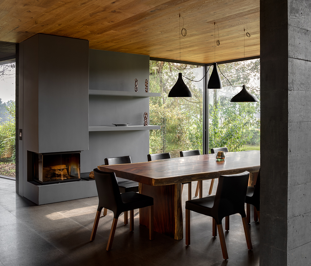
The main dining room, with ‘Swell’ pendants lights by Pablo, and an oak-clad ceiling designed to contrast with the concrete walls and grey basaltina stone floors. Photography: Rafael Camo
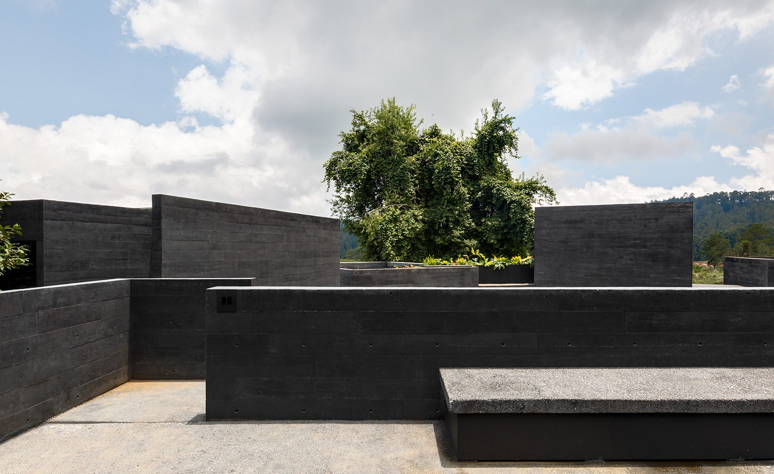
‘We have ended up with an exploded house,’ Canales concludes, ‘with views out to the landscape from within.’ Each structure was treated in exactly the same way; concrete specially mixed with a black pigment forms the external walls and minimal inward-looking fenestration. The overall effect is of stumbling across an abandoned village or a long-lost ruin in among the vegetation.
‘We wanted a natural feel,’ says Canales, ‘so that no one would know if the house had been there for one year or ten years.’ The effect was enhanced by the use of lowtech and readily available local materials; the remoteness of the site meant that everything had to be laboriously carried in and made with local builders. ‘You’ll never have to paint this house,’ the architect says of the zero-maintenance façades, while naturalistic planting is designed to emphasise the blurry distinction between site and landscape.
By creating a separate building for each function, the architects circumvented the need to change levels; the topography does all the work, with a few discreet external stone steps taking account of the slopes. The four structures at the west of the site are the lowest, with green roofs that allow them to blend in to the horizon. They include the garage, at the north-west corner, a utility room, a children’s sleeping block and the kitchen. The latter is linked by a glass walkway to the grand dining room, a two-storey pavilion with the family room above. A more formal sitting room is placed at the south-east point of the site, beneath a planted roof terrace up at canopy level.
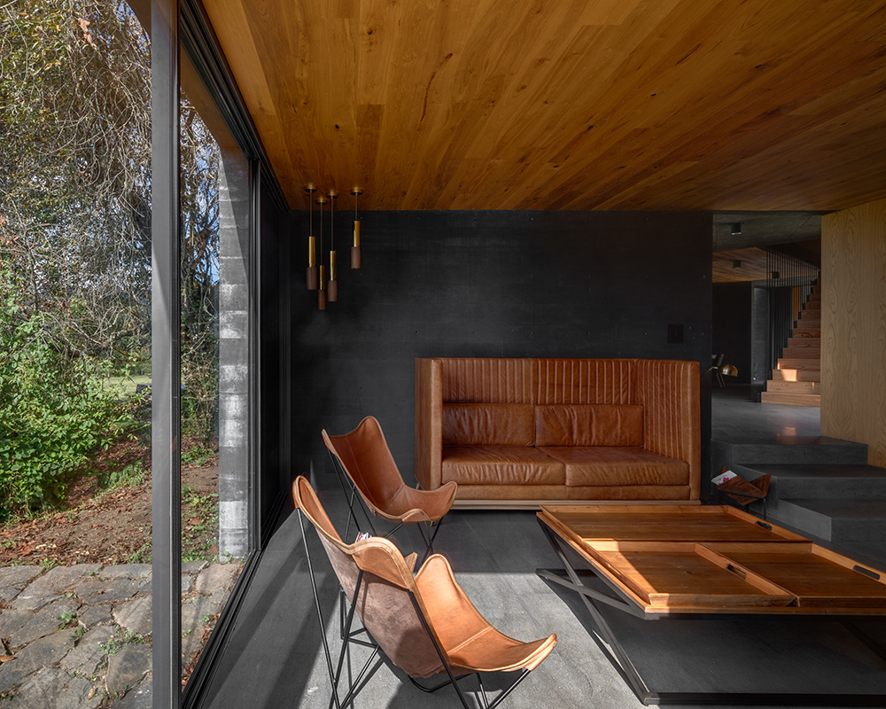
The living room, with a leather sofa and butterfly chairs, and, in the corner, an ‘Amelia’ pendant lamp by David Pompa. Photography: Rafael Camo
The master bedroom suite is above the children’s bedroom, sitting alongside a further sleeping pavilion with another terrace above. Finally, the circle of structures is complete with a double guest room with a sleeping loft.
Privacy is key. The kitchen is the only pavilion with a window facing onto the internal patio, while the independent nature of each structure allows groups of guests to stay in the house without bumping into each other (except at breakfast).
The internal terrace is designed to catch the sun for outdoor dining (when it’s warm enough). ‘The life of the house is concentrated here,’ Canales says, ‘but when you’re inside you have a very different outlook. The courtyard is the only place you get a sense of all of the volumes together.’ Internal finishes include more dark stained concrete, together with stone, wood and traditional-style tiles in the kitchen. ‘The wood is a warm contrast to the exterior stone and concrete – it softens the space,’ Canales acknowledges. ‘Everything is designed to be simple and low maintenance.’
The Mexico City-based architect combines her practice with teaching, writing and curating, as well as collaborating with other local architects such as Rodríguez, and Saidee Springall and Jose Castillo of A|911. Canales’ written work includes biographies of the country’s most famous 20th-century architects, and she has also contributed to the Venice Biennale. Casa Bruma takes the typology of the private house to another level, artfully scattering its core components and creating a self-contained domestic world that begs further exploration.
As originally featured in the May 2018 issue of Wallpaper (W*230)
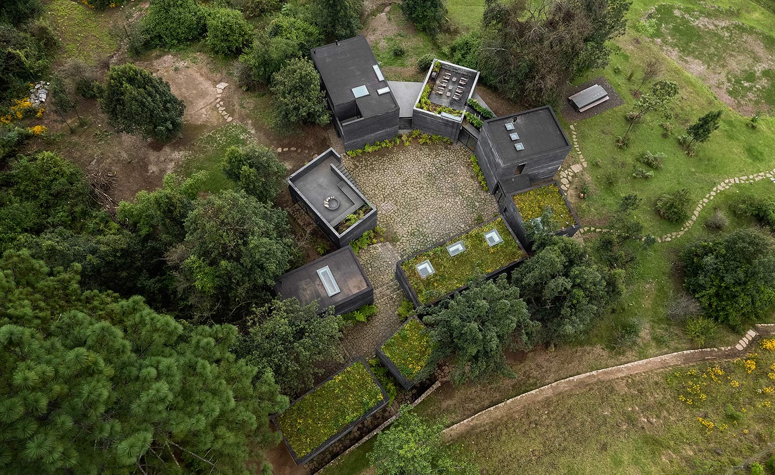
The property comprises nine pavilions, some with green roofs, arranged to fit around the site’s topography and existing trees
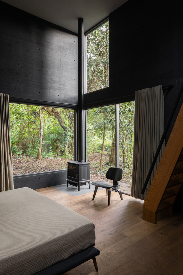
The double guest room, with stairs leading up to a mezzanine level and two further beds
INFORMATION
For more information, visit the Fernanda Canales website
Wallpaper* Newsletter
Receive our daily digest of inspiration, escapism and design stories from around the world direct to your inbox.
Jonathan Bell has written for Wallpaper* magazine since 1999, covering everything from architecture and transport design to books, tech and graphic design. He is now the magazine’s Transport and Technology Editor. Jonathan has written and edited 15 books, including Concept Car Design, 21st Century House, and The New Modern House. He is also the host of Wallpaper’s first podcast.
-
 Titanium watches are strong, light and enduring: here are some of the best
Brands including Bremont, Christopher Ward and Grand Seiko are exploring the possibilities of titanium watches
By Chris Hall
-
 Warp Records announces its first event in over a decade at the Barbican
‘A Warp Happening,' landing 14 June, is guaranteed to be an epic day out
By Tianna Williams
-
 Cure your ‘beauty burnout’ with Kindred Black’s artisanal glassware
Does a cure for ‘beauty burnout’ lie in bespoke design? The founders of Kindred Black think so. Here, they talk Wallpaper* through the brand’s latest made-to-order venture
By India Birgitta Jarvis
-
 Tour the wonderful homes of ‘Casa Mexicana’, an ode to residential architecture in Mexico
‘Casa Mexicana’ is a new book celebrating the country’s residential architecture, highlighting its influence across the world
By Ellie Stathaki
-
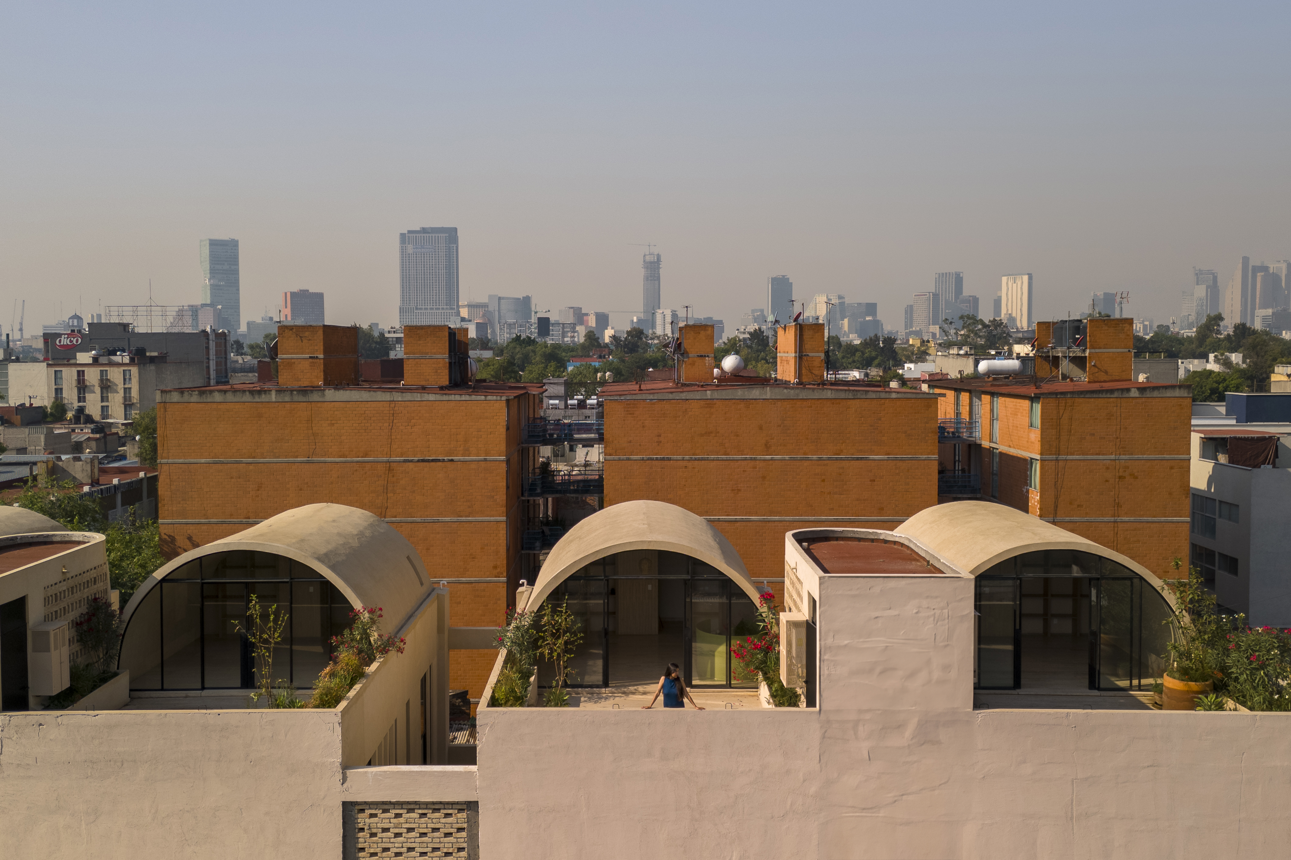 A barrel vault rooftop adds drama to these homes in Mexico City
Explore Mariano Azuela 194, a housing project by Bloqe Arquitetura, which celebrates Mexico City's Santa Maria la Ribera neighbourhood
By Ellie Stathaki
-
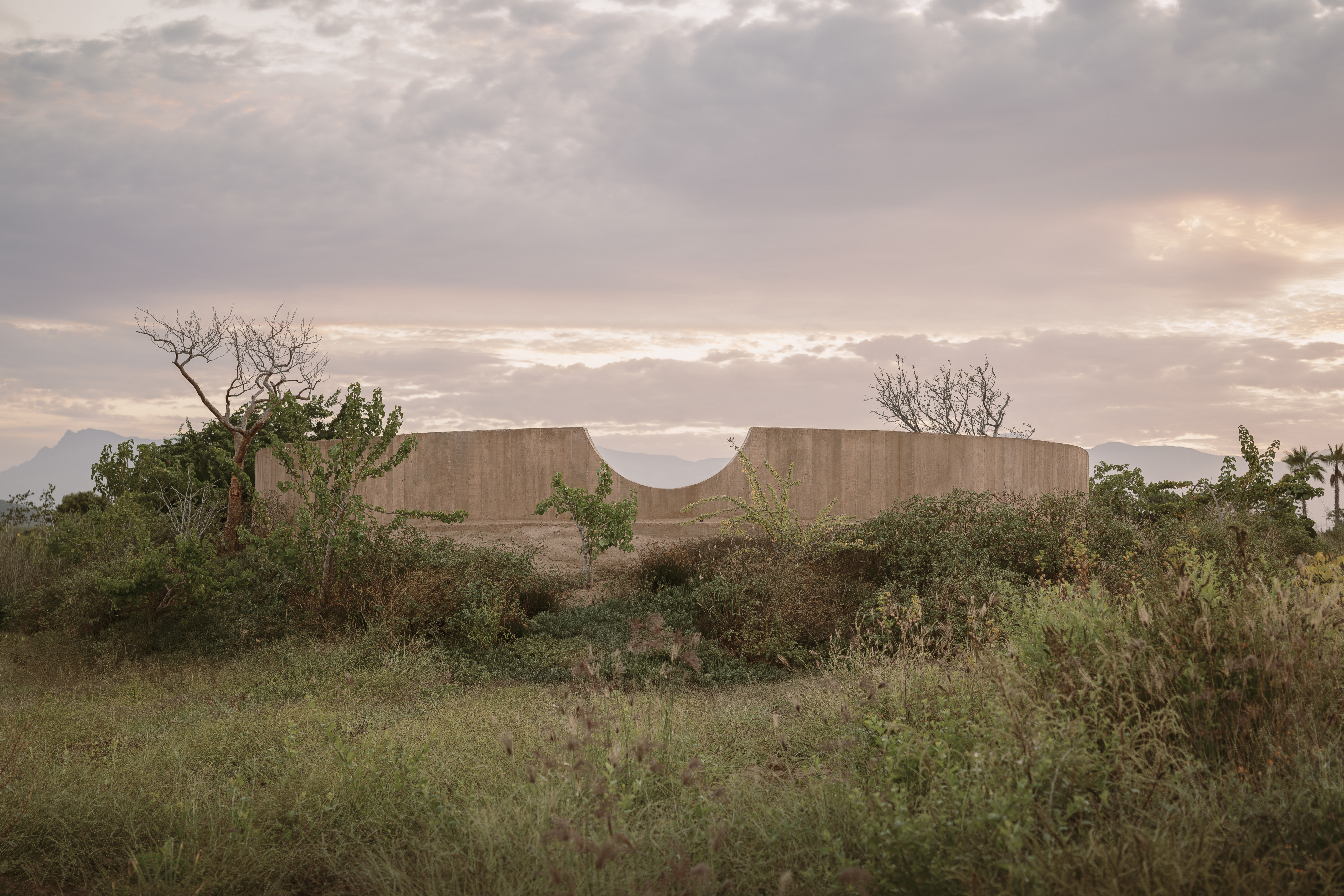 Explore a minimalist, non-religious ceremony space in the Baja California Desert
Spiritual Enclosure, a minimalist, non-religious ceremony space designed by Ruben Valdez in Mexico's Baja California Desert, offers flexibility and calm
By Ellie Stathaki
-
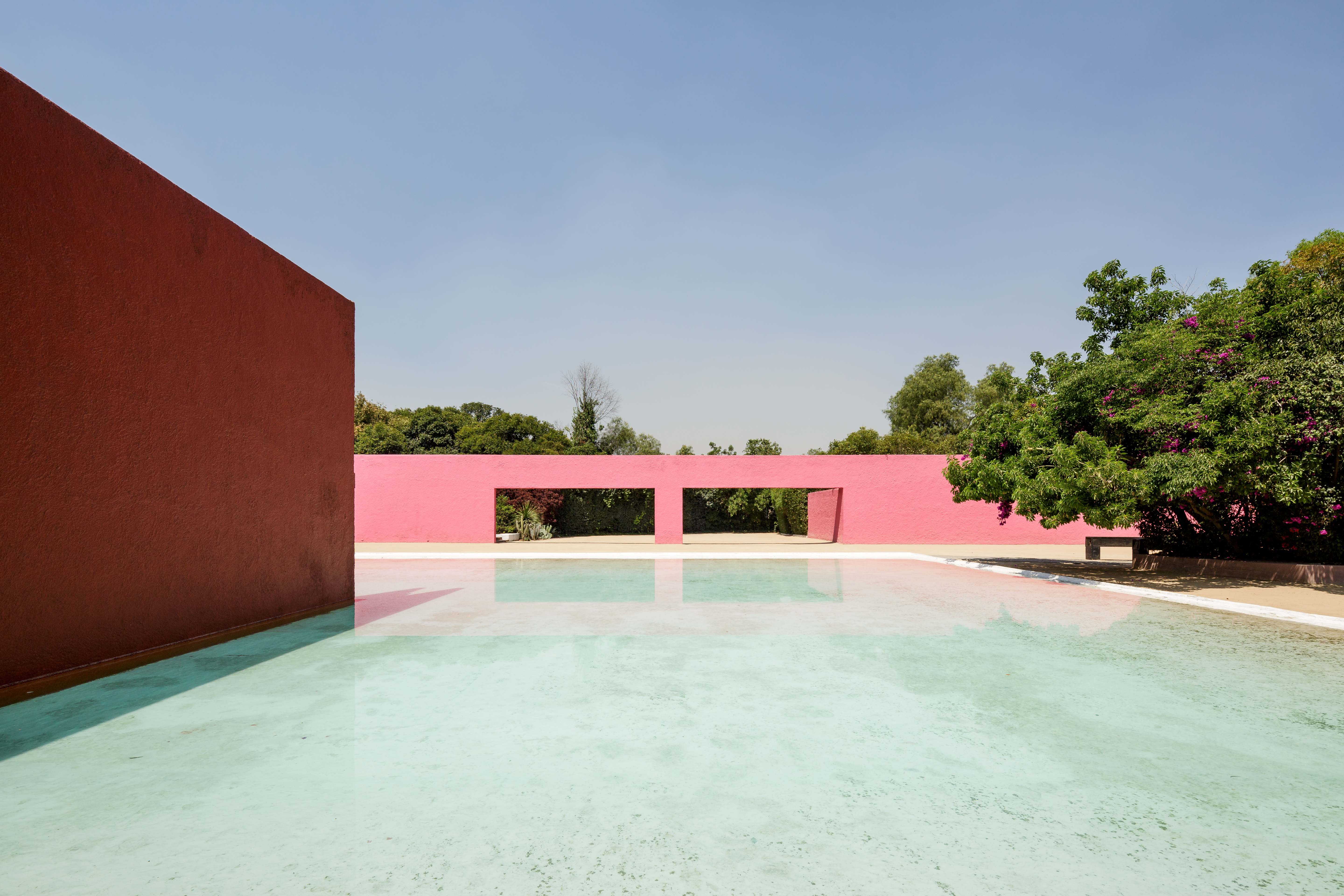 La Cuadra: Luis Barragán’s Mexico modernist icon enters a new chapter
La Cuadra San Cristóbal by Luis Barragán is reborn through a Fundación Fernando Romero initiative in Mexico City; we meet with the foundation's founder, architect and design curator Fernando Romero to discuss the plans
By Mimi Zeiger
-
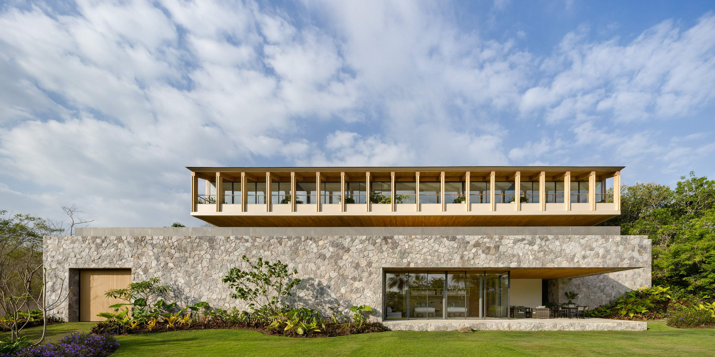 Enjoy whale watching from this east coast villa in Mexico, a contemporary oceanside gem
East coast villa Casa Tupika in Riviera Nayarit, Mexico, is designed by architecture studios BLANCASMORAN and Rzero to be in harmony with its coastal and tropical context
By Tianna Williams
-
 Mexico's long-lived football club Atlas FC unveils its new grounds
Sordo Madaleno designs a new home for Atlas FC; welcome to Academia Atlas, including six professional football fields, clubhouses, applied sport science facilities and administrative offices
By Tianna Williams
-
 Discover Casa Roja, a red spatial exploration of a house in Mexico
Casa Roja, a red house in Mexico by architect Angel Garcia, is a spatial exploration of indoor and outdoor relationships with a deeply site-specific approach
By Ellie Stathaki
-
 HW Studio’s Casa Emma transforms a humble terrace house into a realm of light and space
The living spaces in HW Studio’s Casa Emma, a new one-bedroom house in Morelia, Mexico, appear to have been carved from a solid structure
By Jonathan Bell