KAAN Architecten’s Belgian crematorium encourages introspection
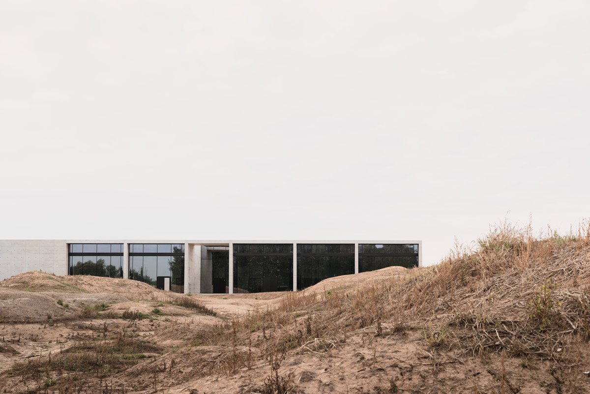
KAAN Architecten holds the human aspect of its projects in high regard. ‘We prefer to work with clients that come to us with the greater good in mind’, says Kees Kaan, founder of the Dutch firm, who adds that their professional direction – focusing on public work, more than private houses – was not something he necessarily set out to do.
With the completion of Crematorium Siesegem, a project led by Vincent Panhuysen, KAAN Architecten can count another thoughtful structure as part of their portfolio. Crematoria have complex logistics that often determine their design. This newly completed crematorium, on a 5476sq m plot on the outskirts of Aalst in Belgium, feels holistic and soothing thanks to its controlled flow of activity. The trees, shrubs and small hills surrounding the building, conceived by Brussels landscape designer Eric Dhont, move visitors to slow down before entering. A service road for hearses to the east is hidden from view entirely.
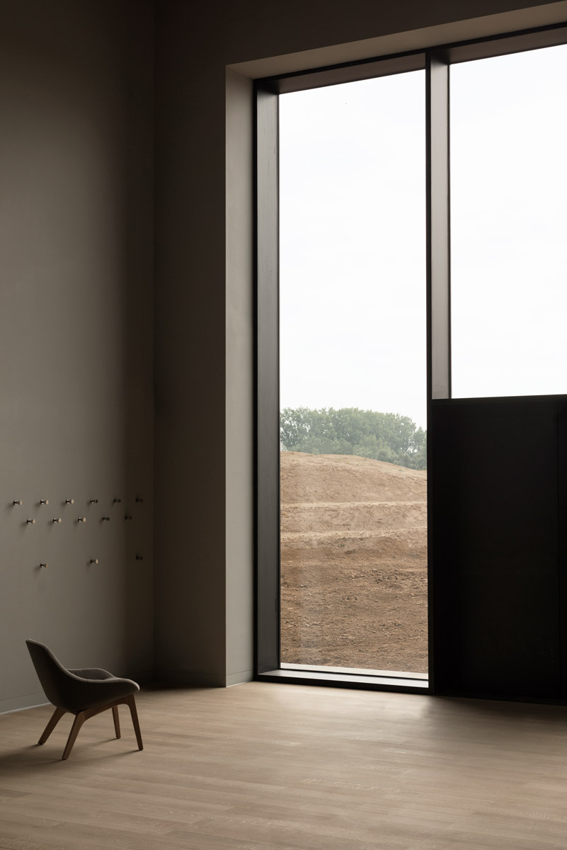
The materials used include naked concrete, wood and render in natural tones.
‘We wanted to give the families that come here the feeling that it’s an exclusive experience’, says Panhuysen about the separation between the visitors and the logistics of the ceremonies. From the reception hall, to the ceremony spaces and the restaurant and bar – in Belgium, Catholic tradition prescribes enjoying coffee and a small meal with relatives and friends after a funeral – the 6.4 metre high ceiling imbues visitors with a feeling of vastness, while the ceiling height windows let in generous amounts of daylight. An especially commissioned large-scale charcoal painting by Belgian artist Rinus Van de Velde radiates serenity and comfort despite its dark symbolism.
The elimination of various passageways encourages introspection, says Panhuysen. The spatial clarity of the crematorium’s layout contributes to the tranquility of the experience here, as does the architectural simplicity of the ceremonial assembly halls clad in Ceppo di Gré marble and furnished with benches upholstered in a softly textured yellow-beige leather. Acoustic plaster with a flocked quality adds to the domestic feel of these spaces.
In accordance with changing practices concerning cremation, KAAN Architecten decided to show the technical side of the process, says Panhuysen. As opposed to being closed off for visitors, as is usually the case, visitors can enter the cremation chamber, where the apparatus is conceived almost as abstract pieces of furniture in a soft, matt yellow. What’s in effect an industrial process becomes humane by virtue of KAAN Architecten’s characteristic legible designs that balance between monumentality and intimacy – in times of bereavement, it’s the kind of comfort only architecture can offer.
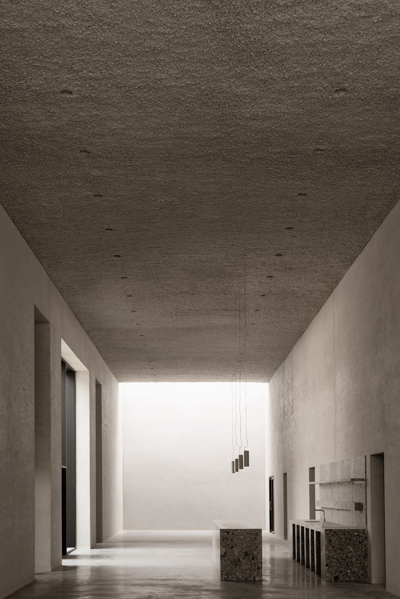
The architects aimed to create a comforting sequence of serene spaces.
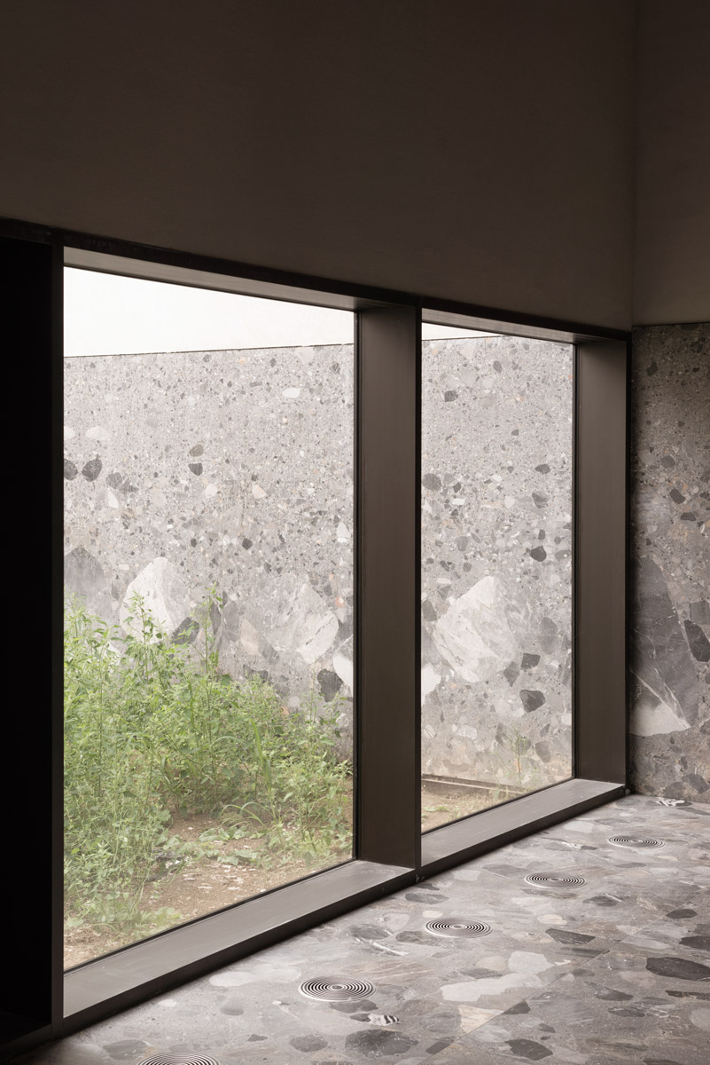
Upon the landscaping’s completion, the project will be surrounded by green hills.
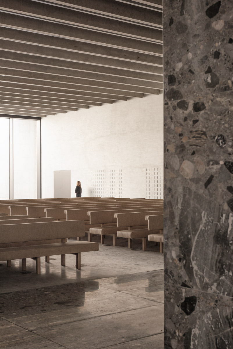
The scheme encompasses two ceremonial assembly halls.
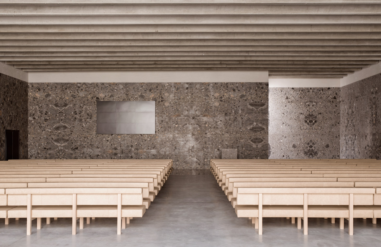
Large windows allow the assembly halls to be bathed in natural light.
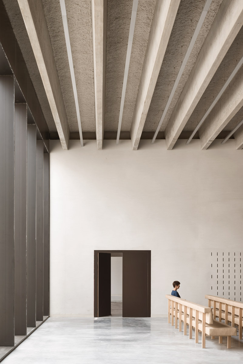
Minimalist architecture underlines the overall sense of calm.
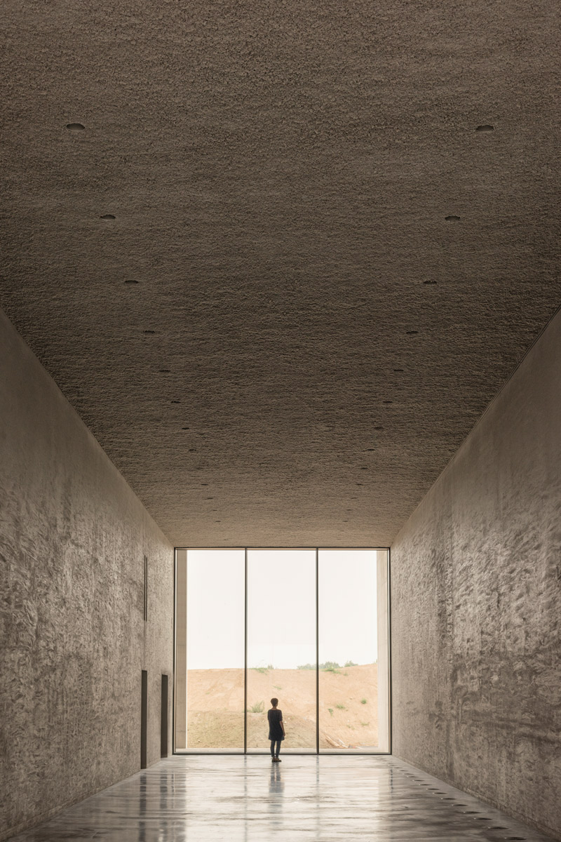
The architects wanted to harmonize the building with the surrounding natural environment.
INFORMATION
For more information, visit the KAAN Architecten website
Wallpaper* Newsletter
Receive our daily digest of inspiration, escapism and design stories from around the world direct to your inbox.
Siska Lyssens has contributed to Wallpaper* since 2014, covering design in all its forms – from interiors to architecture and fashion. Now living in the U.S. after spending almost a decade in London, the Belgian journalist puts her creative branding cap on for various clients when not contributing to Wallpaper* or T Magazine.
-
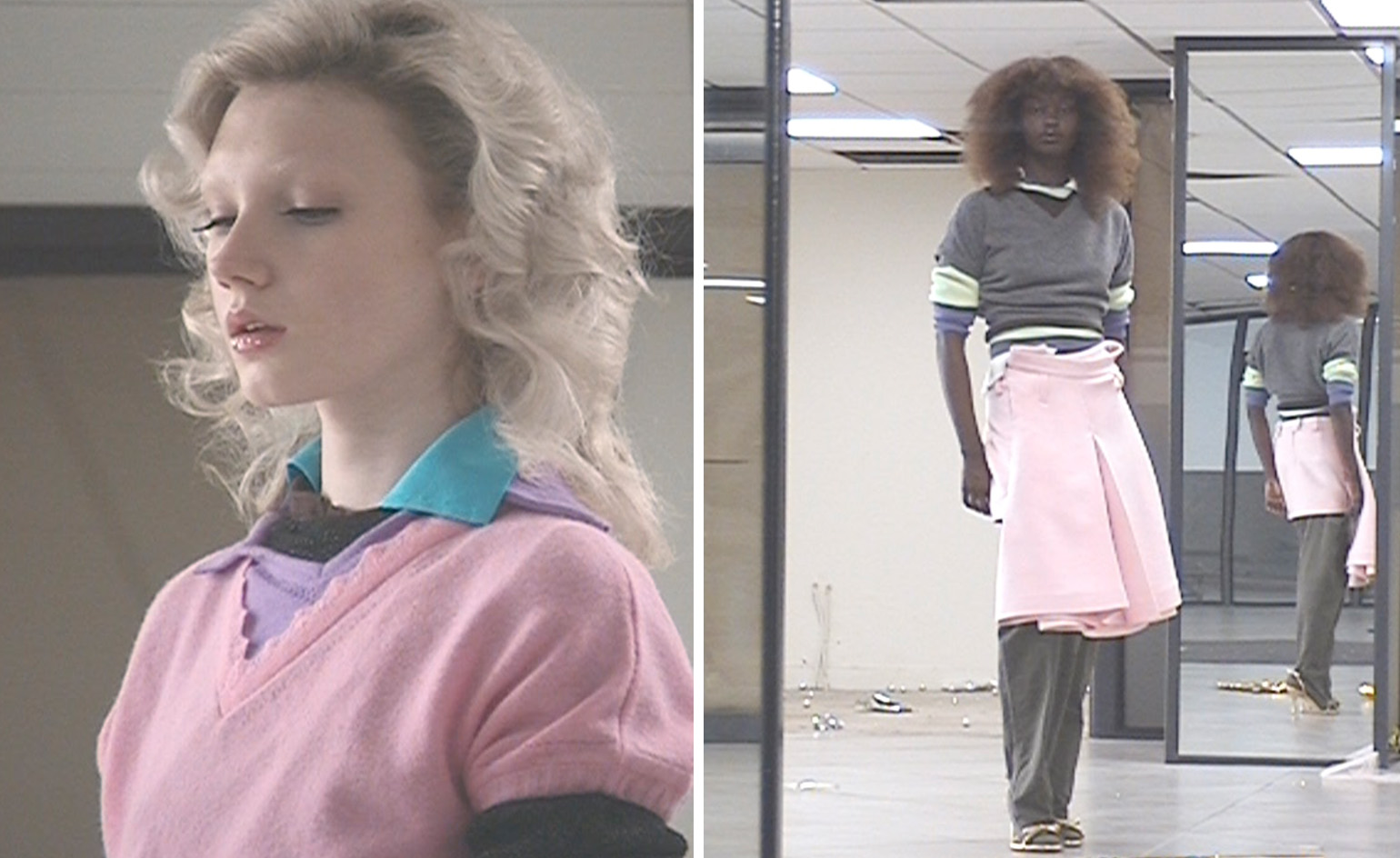 All-In is the Paris-based label making full-force fashion for main character dressing
Part of our monthly Uprising series, Wallpaper* meets Benjamin Barron and Bror August Vestbø of All-In, the LVMH Prize-nominated label which bases its collections on a riotous cast of characters – real and imagined
By Orla Brennan
-
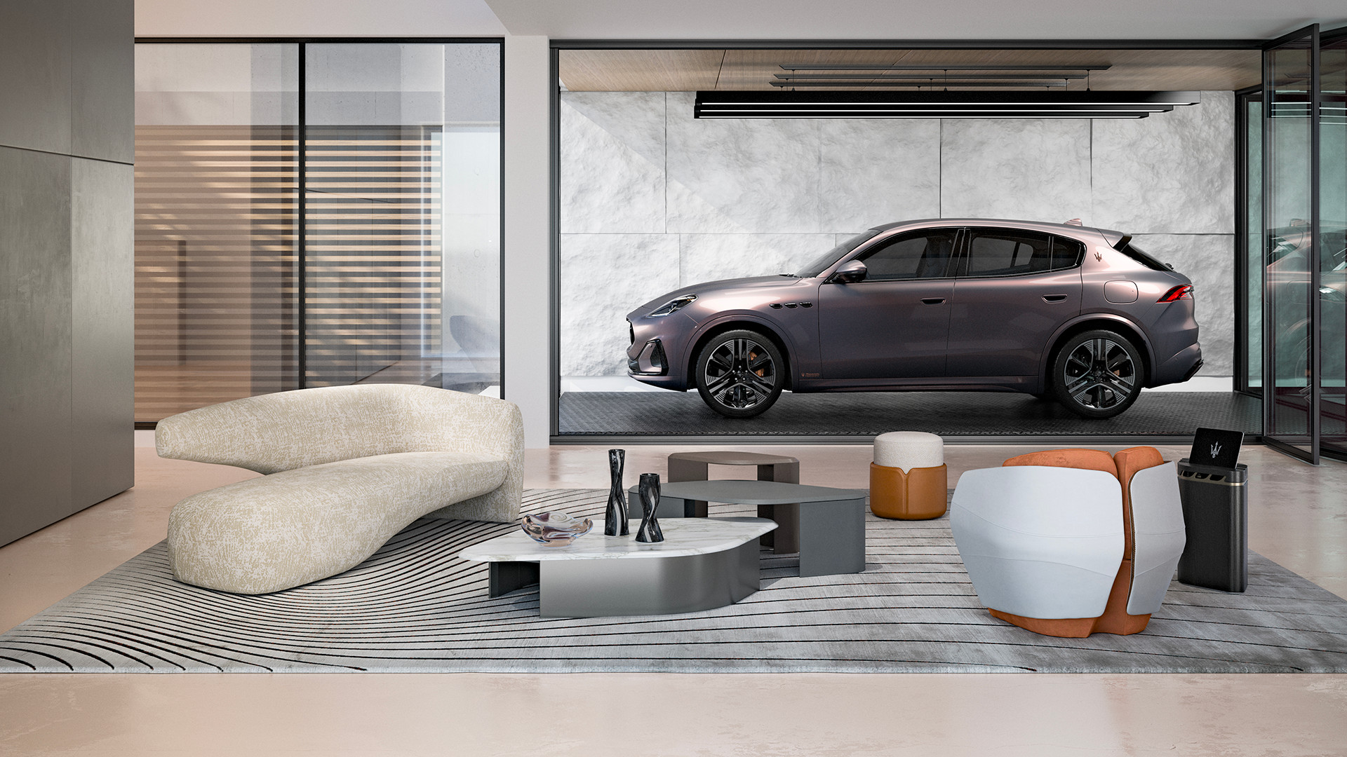 Maserati joins forces with Giorgetti for a turbo-charged relationship
Announcing their marriage during Milan Design Week, the brands unveiled a collection, a car and a long term commitment
By Hugo Macdonald
-
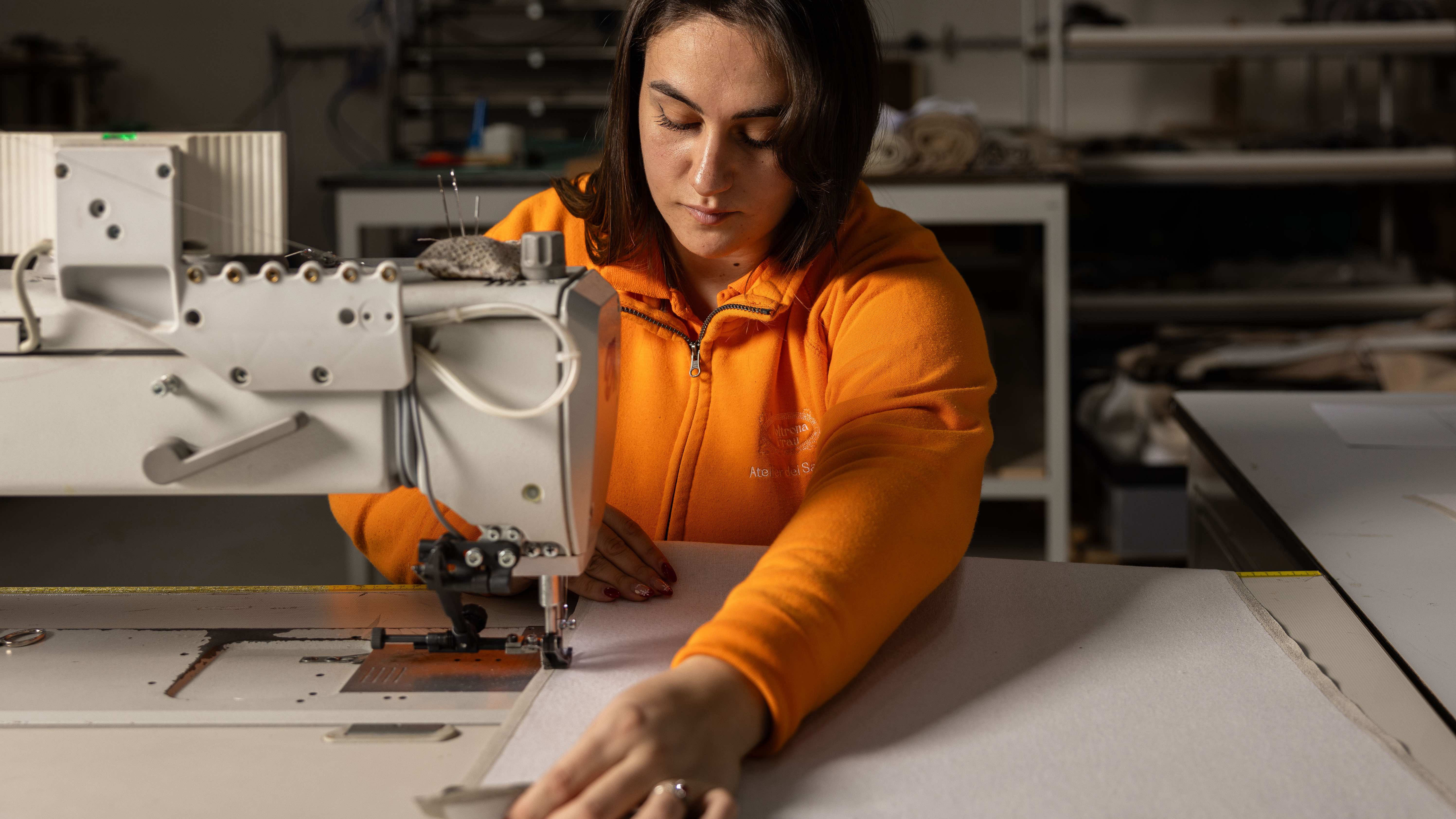 Through an innovative new training program, Poltrona Frau aims to safeguard Italian craft
The heritage furniture manufacturer is training a new generation of leather artisans
By Cristina Kiran Piotti