Daniel Libeskind takes us on a tour of his newly completed residential complex in Milan’s CityLife development
Receive our daily digest of inspiration, escapism and design stories from around the world direct to your inbox.
You are now subscribed
Your newsletter sign-up was successful
Want to add more newsletters?
A new neighbourhood coming up in the northwest of Milan is unlike anything the Italian metropolis has seen before. Based on a master plan by Studio Daniel Libeskind, Zaha Hadid Architects and Arata Isozaki & Associates, CityLife, as the scheme is called, is set on the 25-hectare walled-off piece of city that used to house Milan’s former trade fair (since relocated to the Fuksas-designed extravaganza to the west of the city).
Set along 10 hectares of green parkland and water features designed by landscape architecture practice Gustafson Porter, the site will eventually include three tall glass office towers designed by Libeskind, Isozaki and Hadid, a shopping district, a lower residential tower by Libeskind, and two relatively low-rise residential complexes by Libeskind and Hadid in the southern part of the district.
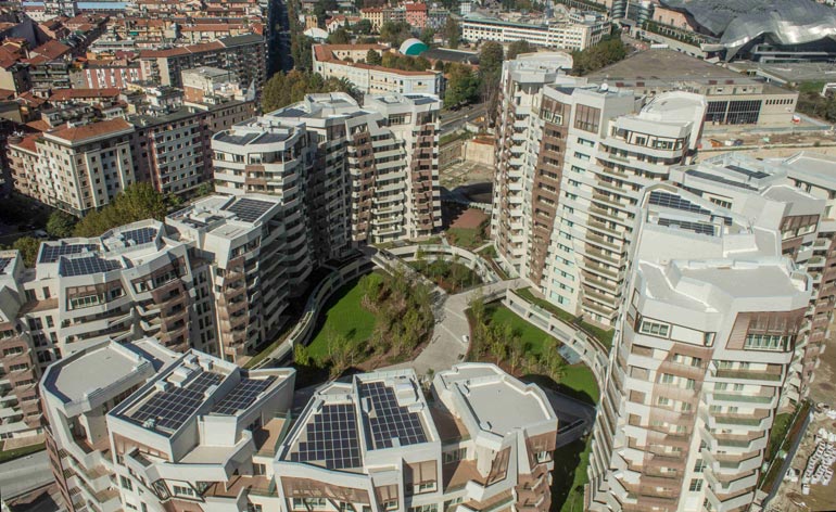
I am here to see the just completed first phase of the Libeskind Residences, a residential complex of five buildings measuring between seven and 14 storeys high and containing 308 housing units, including 22 double-height penthouses or ‘villas’. ’We wanted the lower buildings to be placed closer to the historic fabric of the city,’ explains Daniel Libeskind as we stand in the CityLife showroom located at the edge of the busy construction site.
The buildings that make up the housing cluster – or ‘archipelago’ as Libeskind likes to say - were oriented to maximise daylight and the connection to the surrounding streets and to give views from existing perspectives. They were also arranged so as to create an internal car-free ‘social space’ that, he says, was inspired by the context. ’There is an analogy here to the classic Italian courtyard,’ says the architect, referring to the interior courtyards that were so prevalent in Milanese housing until WWII, adding, ’Parents can watch their kids playing in the piazza, like in old times.’ Importantly, all owners will have access to the private underground parking structure.
The residential complex’s greatest strength is the buildings’ façades, which are ‘clad’ in a textured and marbled tile developed by innovative Italian ceramics company Casalgrande Padana. It looks like travertine but is, in fact, reinforced porcelain and designed to be self-cleaning. ’All buildings look good when they are first built,’ smiles Libeskind.
The asymmetrical and faceted glass-and-tile balconies wrap around the buildings creating an expressiveness that is further enhanced by undulating sun-shading louvres made of a bamboo polymer composite, also designed for greater durability and sustainability than a conventional wood such as teak. ’The exteriors are as articulated as possible so that each apartment is unique both in footprint and façade,’ points out Libeskind.
The master plan for the larger site involved keeping and comprehensively refurbishing a few of the historic structures that belonged to the trade fair, including an early-1920s stadium, a 1930s velodrome and two Art Nouveau gate buildings. ’Opening the site up and connecting it to the urban fabric was the main concept,’ explains Libeskind. ’At the centre you have the hub of office buildings, the high-density working area.’ Several underground car parks and a new metro stop in the site’s centre will ensure that this is a pedestrian- and bicycle-only space. ’The idea is that you can live and work in one place.’
Receive our daily digest of inspiration, escapism and design stories from around the world direct to your inbox.
Whether the Milanese take to this 21st century vertical way of living and working remains to be seen. What is certain is that in a city with plenty of hardscaping, CityLife will provide a welcome moment of green respite and the possibility of calling a major new city park, home.
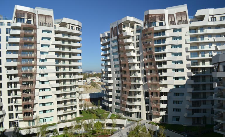
The buildings that make up the housing cluster were oriented to maximise daylight and the connection to the surrounding streets and to give views from existing perspectives.
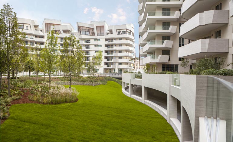
They were also arranged so as to create an internal car-free ‘social space’. 'There is an analogy here to the classic Italian courtyard,' explains Libeskind.

The apartments are all unique in terms of size, exposure and layout, with a choice between two-room or larger family apartments, and penthouses with terraces.
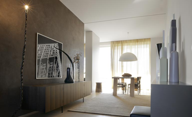
The master plan for the larger site involved keeping and comprehensively refurbishing a few historic structures to transform them into modern apartments.
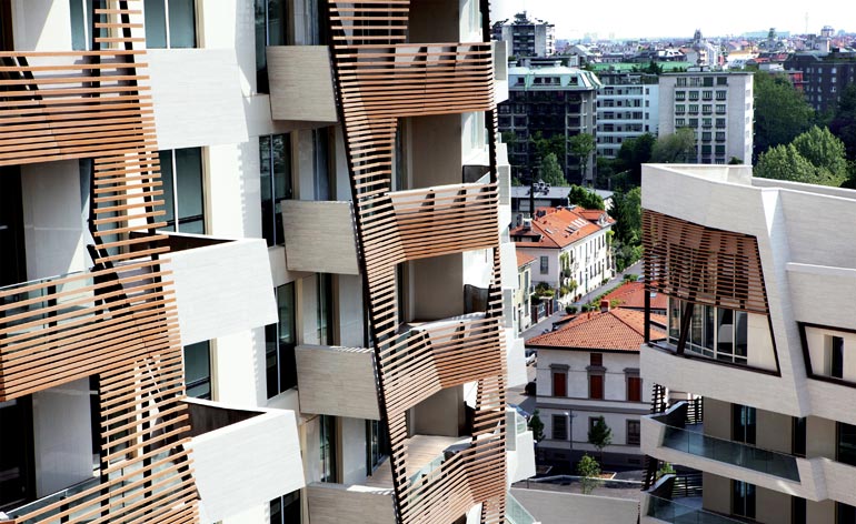
The asymmetrical and faceted glass-and-tile balconies wrap around the buildings creating an expressiveness that is further enhanced by undulating sun-shading louvres made of a bamboo polymer composite.
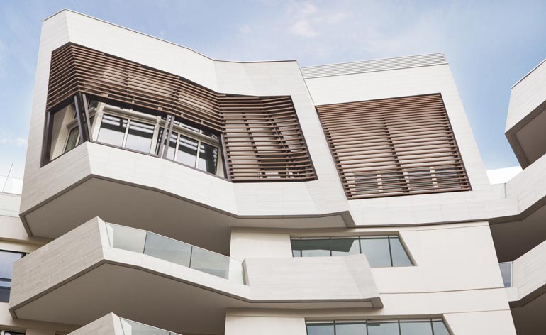
The residential complex’s greatest strength is the buildings’ façades, which are ‘clad’ in a textured and marbled tile developed by innovative Italian ceramics company Casalgrande Padana.
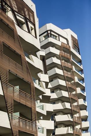
It looks like travertine but is in fact reinforced porcelain and designed to be self-cleaning.
ADDRESS
CityLife
Viale Duilio, 5
(Largo Domodossola) Milan
Italy
Giovanna Dunmall is a freelance journalist based in London and West Wales who writes about architecture, culture, travel and design for international publications including The National, Wallpaper*, Azure, Detail, Damn, Conde Nast Traveller, AD India, Interior Design, Design Anthology and others. She also does editing, translation and copy writing work for architecture practices, design brands and cultural organisations.