Ruby City by Adjaye Associates wins Wallpaper* Design Award for Best New Public Building
This year's Wallpaper* Design Awards 2020 shortlist for the Best New Public Building spotlights structures that haven’t just won our hearts with their exceptional architecture but provide examples of how innovative design can support local communities and heritage – like our winner, Ruby City, US, by Adjaye Associates
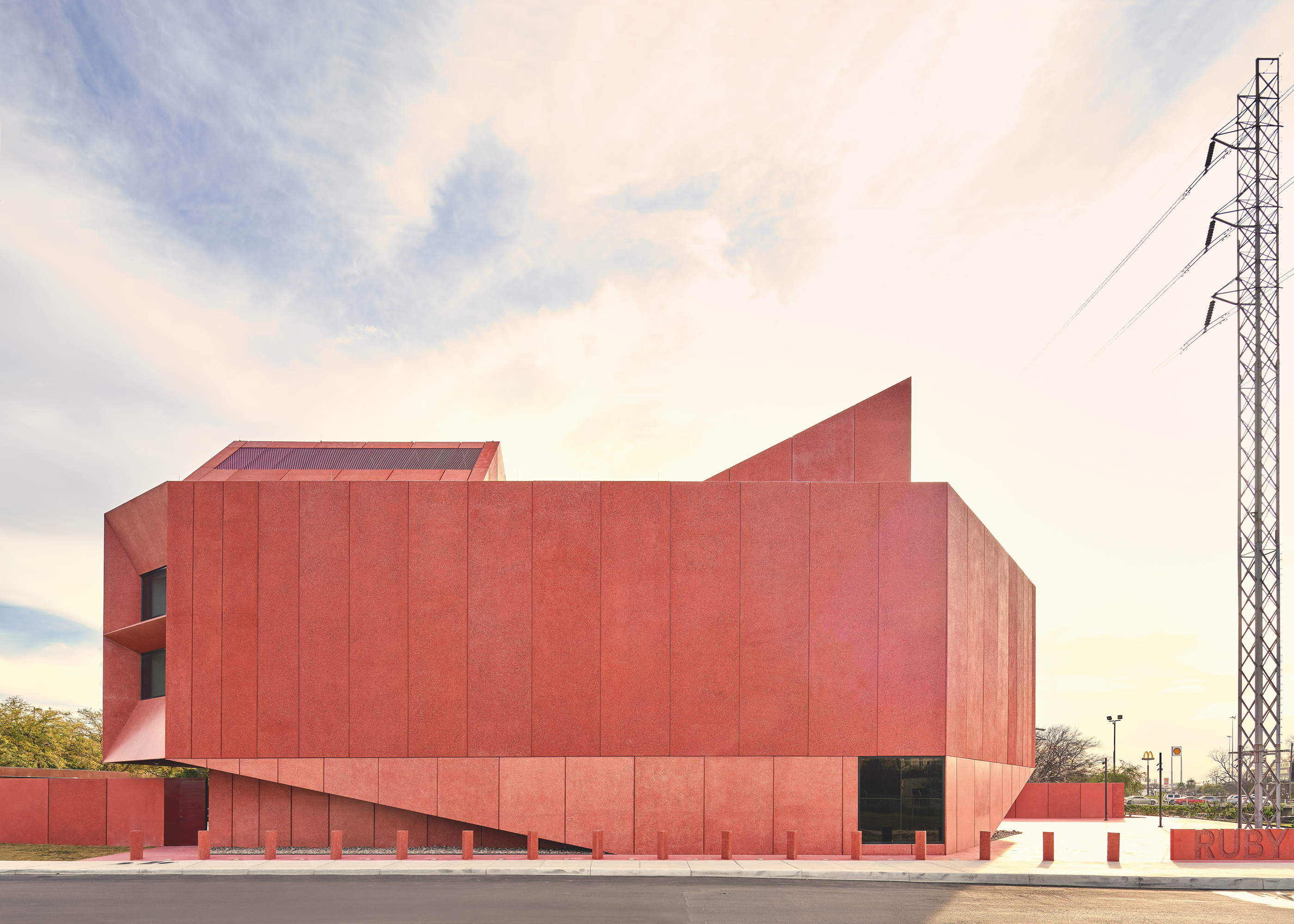
WINNER
Ruby City, US, by Adjaye Associates
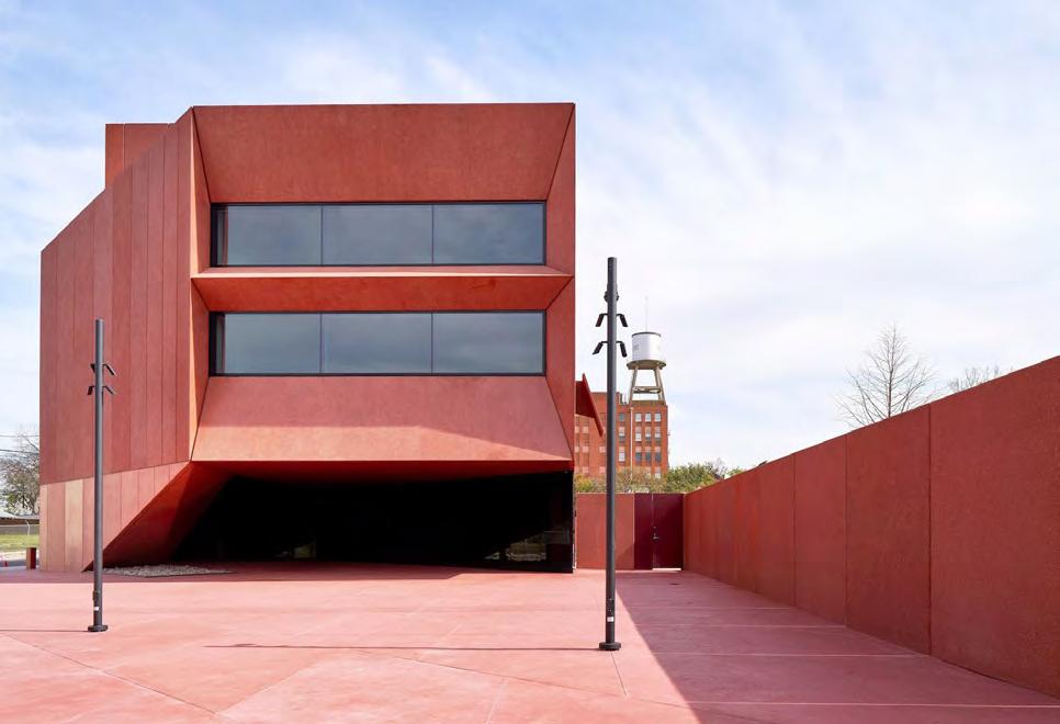
On the edge of San Pedro Creek in San Antonio, southern Texas, Ruby City rises. The 14,500 sq ft art centre, clad in colourful precast concrete, is the city’s latest cultural venue, designed by Adjaye Associates in partnership with local firm Alamo Architects. The project was conceived 12 years ago by the late art collector and philanthropist Linda Pace, who sketched her idea for the project after waking from a dream. David Adjaye’s goal was to translate this idea into a building that would do justice to her legacy. The result? A jewel-like structure that provides inspirational space for the community and interacts with its surroundings. Ruby City’s skin uses a glass and mica aggregate made south of the border in Mexico City. At ground level, the concrete has been polished to create a smooth, tactile finish; 3m above, a coarser aggregate using shards of varying shades has been used. Inside, there are three white walled galleries filled with light, courtesy of two pitched rooflights.
KEY FEATURES: Jewel-like shape, pink colour, concrete structure
ARCHITECTS’ PREVIOUS WORK: Smithsonian National Museum of African American History & Culture, Washington DC; Moscow School of Management, Skolkovo, Russia; Dirty House, London
adjaye.com
SHORTLIST
MK Gallery, UK, by 6a Architects
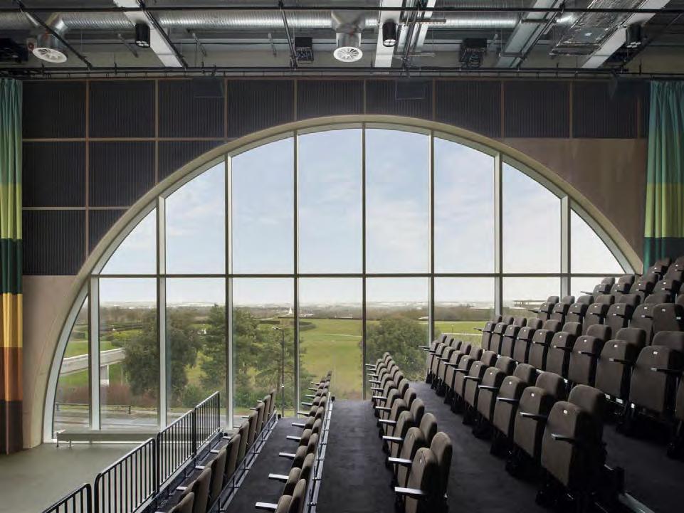
A new corrugated stainless steel box has been added by 6a Architects to the MK Gallery in Milton Keynes. It’s a redesign that elevates the 20-year-old gallery into a public cultural venue with a focus on education, out-of-hours activity and accessibility. Full of quirks and colour, the design celebrates the utopian history of the town, designed in the 1960s by modernist architect Derek Walker. Elements of the original gallery built in the 1990s survive, such as the main entrance, which 6a Architects aimed to make more open and pedestrian friendly. The new façade has been painted in sandstone and terracotta, a revival of the 1999 design, and plastered with a neon heart and the original typographic logotype for Milton Keynes, as well as the bold blue graphic logo for MK Gallery, redesigned last year. The architects also repurposed a former loading bay to create space for a colourful, popular café.
KEY FEATURES: Openness, bold colours and shapes, transparency
ARCHITECTS’ PREVIOUS WORK: South London Gallery; Paul Smith Albemarle Street; Raven Row gallery, all in London
6a.co.uk
NUS School of Design & Environment 4, Singapore, by Serie Architects
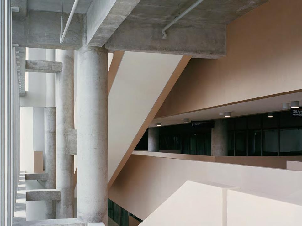
Peeking gracefully above lush foliage near the southern coastline of Singapore, the new NUS School of Design & Environment 4 (SDE4) is a porous concrete structure that appears lightweight – and has a ‘light’ environmental impact to boot. Designed by Serie Architects and Multiply with Surbana Jurong, the 8,500 sq m building is the first net zero energy building of its kind in Singapore, meaning that it generates as much, if not more, energy that it consumes within its footprint. The undulating perforated aluminium façade panels that moderate the harsh sun are designed to be demountable, allowing students and researchers to test various façade systems on the building itself, while more than 50 per cent of the building’s total area is naturally ventilated. When additional cooling is needed, engineers Transsolar helped install a hybrid system that combines tempered air – which is less energy intensive than conventional AC cooling – with ceiling fans.
Wallpaper* Newsletter
Receive our daily digest of inspiration, escapism and design stories from around the world direct to your inbox.
KEY FEATURES: Sustainability, concrete structure, tropical architecture influences
ARCHITECTS’ PREVIOUS WORK: Jameel Arts Centre, Dubai; The Tote banqueting hall, Mumbai; Blue Frog Lounge, Mumbai
serie.co.uk
Pearling Path visitor centre, Bahrain, by Valerio Olgiati
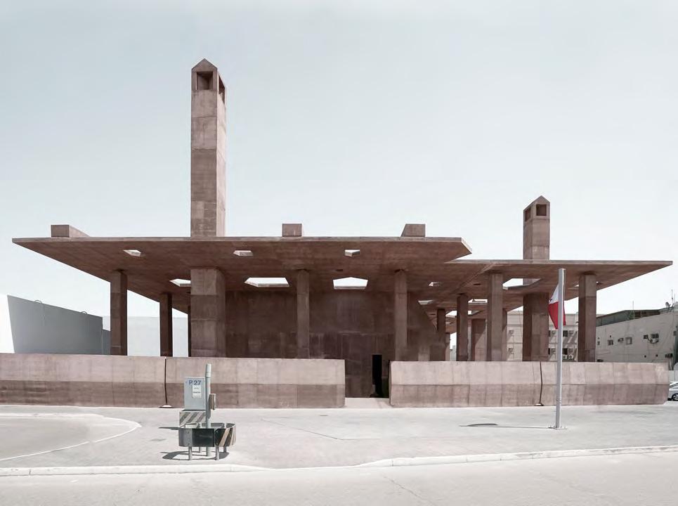
A design conceived around the ruins that form part of the Pearling Path, one of Bahrain’s two Unesco-protected sites, this generously scaled project functions as the entrance to the cultural heritage site and the foyer to the medina (traditionally, the old, walled part of town in the Arab and North African world). This ‘urban room’, as its Swiss architect Valerio Olgiati calls it, is open and public, with concrete elements placed at various, strategic points, subtly delineating the property boundaries. A horizontal plate sits some 10m above, shading the path from the region’s strong sun. Part of the complex is a rather enigmatic, jewel-shaped, concrete structure with no windows, which hosts the museum dedicated to the surrounding historical site. Here, brutalist, minimalist, sculptural concrete offsets beautifully the precious antique architecture, while cleverly knitting together the large-scale ruins.
KEY FEATURES: Concrete structure, open-air architecture, bridging old and new
ARCHITECTS’ PREVIOUS WORK: Celine store, Miami; Villa Além, Portugal; Atelier Bardill, Switzerland
olgiati.net
The Twist gallery, Norway, by BIG
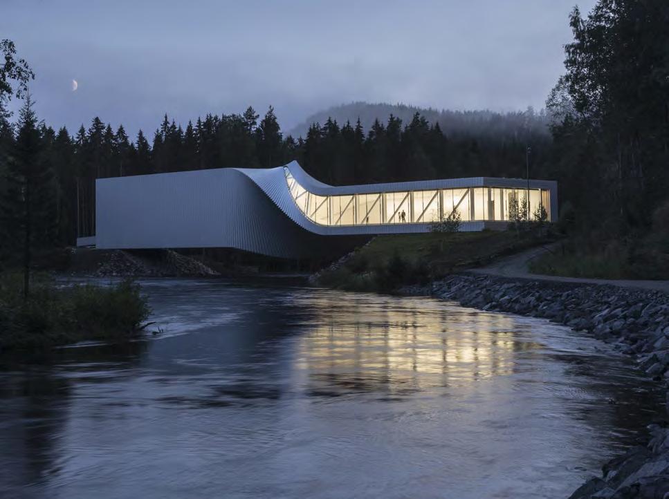
Bjarke Ingels Group’s The Twist has joined the exhibits at businessman and avid art collector Christen Sveaas’ Kistefos Sculpture Park, set in the remains of his family’s wood-pulp mill. The building is designed to house art and contains a single, airy gallery, as well as some rather fun toilet facilities, overlooking the river and the belly of the structure in all its twisted glory. Slender and curvaceous, the white geometric shape stretches over the water, carrying a sense of movement that translates fully inside too. There, walls become floors and vice versa, while large glass openings offer spectacular views out to the surrounding countryside. The interiors are clad in white painted planks of solid wood, referencing the external, industrial-style, aluminium strips, while hinting at traditional Norwegian architecture. The building, which sits in the park among works by the likes of Anish Kapoor and Martin Creed, completes a journey through the larger site in a single, curated trajectory.
KEY FEATURES: Lightness, twisted form, bridge-like structure
ARCHITECTS’ PREVIOUS WORK: Lego House in Billund, Denmark; Serpentine Pavilion 2016, London; Danish National Maritime Museum, Helsingør, Denmark
big.dk
Ellie Stathaki is the Architecture & Environment Director at Wallpaper*. She trained as an architect at the Aristotle University of Thessaloniki in Greece and studied architectural history at the Bartlett in London. Now an established journalist, she has been a member of the Wallpaper* team since 2006, visiting buildings across the globe and interviewing leading architects such as Tadao Ando and Rem Koolhaas. Ellie has also taken part in judging panels, moderated events, curated shows and contributed in books, such as The Contemporary House (Thames & Hudson, 2018), Glenn Sestig Architecture Diary (2020) and House London (2022).
-
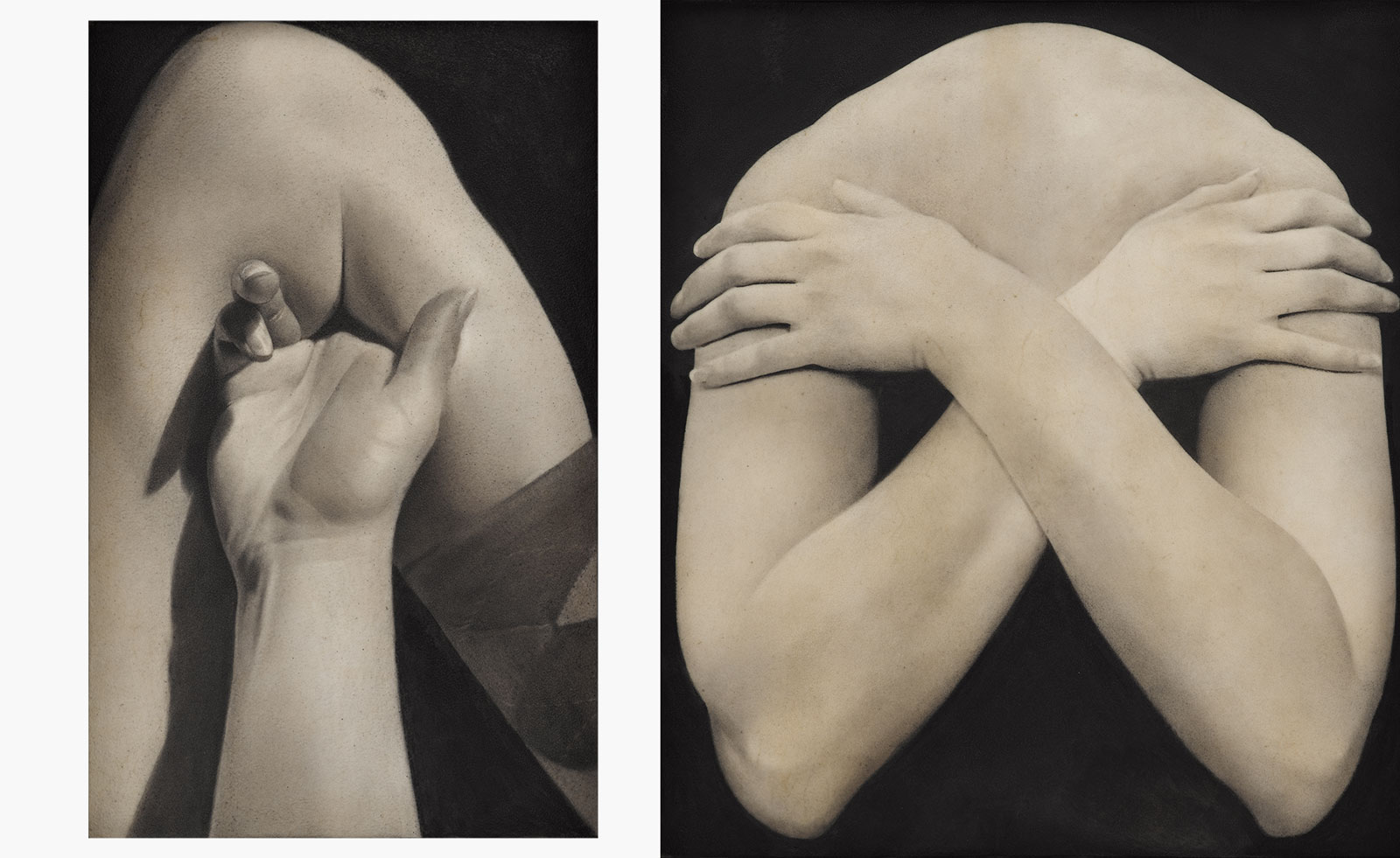 Put these emerging artists on your radar
This crop of six new talents is poised to shake up the art world. Get to know them now
By Tianna Williams
-
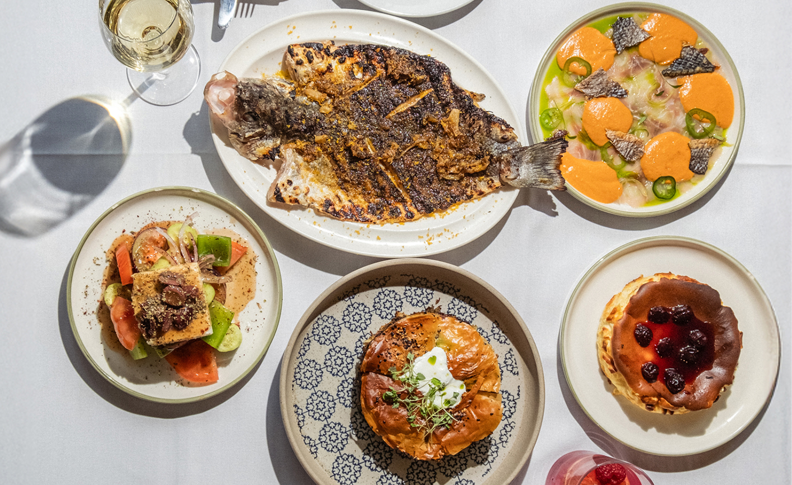 Dining at Pyrá feels like a Mediterranean kiss on both cheeks
Designed by House of Dré, this Lonsdale Road addition dishes up an enticing fusion of Greek and Spanish cooking
By Sofia de la Cruz
-
 Creased, crumpled: S/S 2025 menswear is about clothes that have ‘lived a life’
The S/S 2025 menswear collections see designers embrace the creased and the crumpled, conjuring a mood of laidback languor that ran through the season – captured here by photographer Steve Harnacke and stylist Nicola Neri for Wallpaper*
By Jack Moss