Doctor’s orders: DS+R creates a light-filled Medical Center for Columbia University
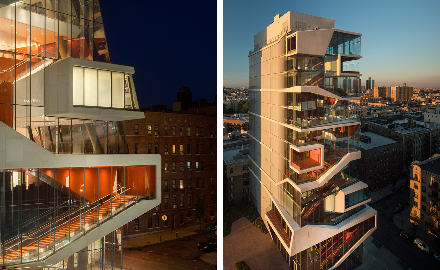
Diller Scofidio + Renfro seems to be the architects du jour for Columbia University. Not only is it masterminding the lauded Business School; but first, its 14-storey, glass cascading Medical Center tower is unveiled just in time for the start of the fall semester.
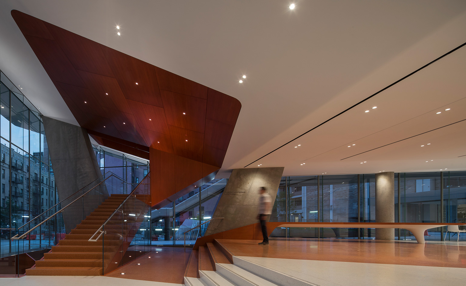
The tower is both an education and graduate centre. After heavily weighed considerations taken on the part of the architects, says Elizabeth Diller, which worked in collaboration with the firm Gensler, the pristinely modern building is anchored to become the hub of medical student life at the university. According to Diller, the students were asked, 'Where they want to spend time?' Thus, the architects in turn created a 'building you don’t want to escape from'. The Center is flooded with light, exploiting 'views to the south, north and east, and a celebration of the site' and factoring state-of-the-art everything, including study sky lounges, like those of an arena or taller tower. Add in smart-glass ensconced common areas, and chances are the students won't ever want to leave.
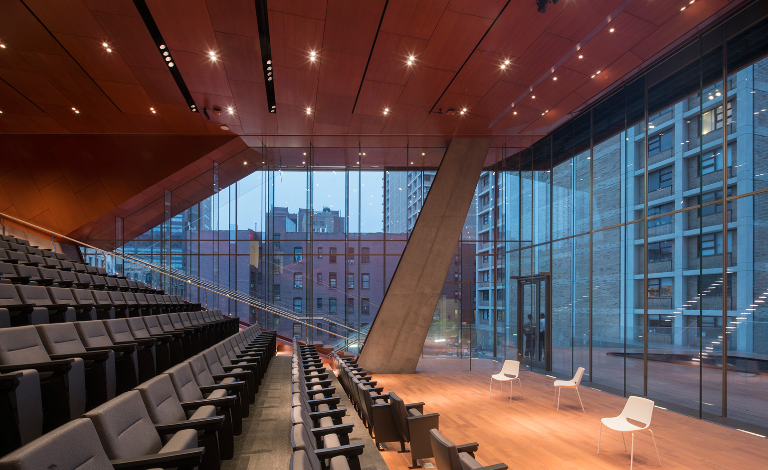
While most medical students are trapped in residency rotation rounds or the fluorescent-dimmed aisles of the library, this new educational outpost is actually 'distinctly different', says Diller, who also points out that the typical medical educational facility tends to be boxy, low in height and clunky. 'This is a challenge of that,' she says. 'For the students, there is a correlation between space and learning.' And while the classrooms and learning spaces within the building offer the latest and best technological setups available, including flexible teaching spaces and a clinical simulation center, the 'heart of the building', in Diller’s eyes, is really the 10th floor student common area. When researching for the project, Diller came across an anatomy map of a snake, whose heart is in the middle of the body, which thus became the guiding principle behind the building’s logic – expressed through a snaking 'study cascade', which vertically links the interior spaces through the building's 14 floors.
Both an education and graduate centre, the pristinely modern building is set to become the hub of medical student life at the university
While most medical students are trapped in residency rotation rounds or the fluorescent-dimmed aisles of the library, this new educational outpost is actually ’distinctly different,’ says Elizabeth Diller

The classrooms and learning spaces within the building offer the latest and best technological setups available, including flexible teaching spaces and a clinical simulation centre
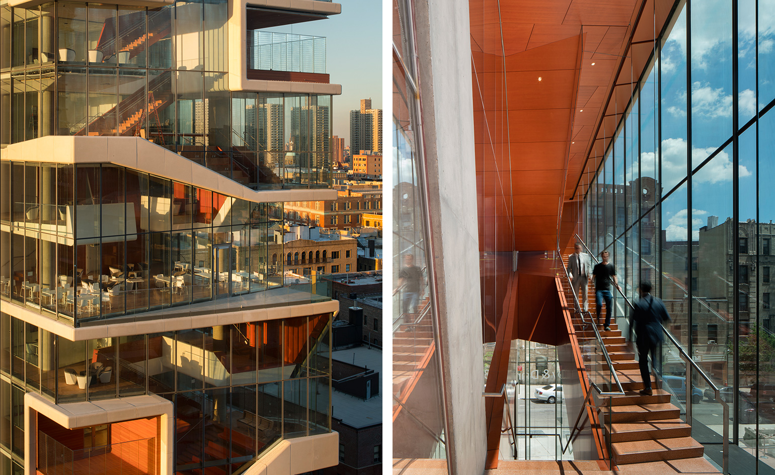
When researching for the project, Diller came across an anatomy map of a snake, whose heart is in the middle of the body, which thus became the guiding principle behind the building’s logic – expressed through a snaking ’study cascade’, which vertically links the interior spaces through the buildings 14 floors
INFORMATION
For more information, visit the Diller Scofidio + Renfro website
Wallpaper* Newsletter
Receive our daily digest of inspiration, escapism and design stories from around the world direct to your inbox.
Julie Baumgardner is an arts and culture writer, editor and journalist who's spent nearly 15 years covering all aspects of art, design, culture and travel. Julie's work has appeared in publications including Bloomberg, Cultured, Financial Times, New York magazine, The New York Times, Wall Street Journal, as well as Wallpaper*. She has also been interviewed for The Atlanta Journal-Constitution, Miami Herald, Observer, Vox, USA Today, as well as worked on publications with Rizzoli press and spoken at art fairs and conferences in the US, Middle East and Asia. Find her @juliewithab or juliebaumgardnerwriter.com
-
 Put these emerging artists on your radar
This crop of six new talents is poised to shake up the art world. Get to know them now
By Tianna Williams
-
 Dining at Pyrá feels like a Mediterranean kiss on both cheeks
Designed by House of Dré, this Lonsdale Road addition dishes up an enticing fusion of Greek and Spanish cooking
By Sofia de la Cruz
-
 Creased, crumpled: S/S 2025 menswear is about clothes that have ‘lived a life’
The S/S 2025 menswear collections see designers embrace the creased and the crumpled, conjuring a mood of laidback languor that ran through the season – captured here by photographer Steve Harnacke and stylist Nicola Neri for Wallpaper*
By Jack Moss
-
 Croismare school, Jean Prouvé’s largest demountable structure, could be yours
Jean Prouvé’s 1948 Croismare school, the largest demountable structure ever built by the self-taught architect, is up for sale
By Amy Serafin
-
 We explore Franklin Israel’s lesser-known, progressive, deconstructivist architecture
Franklin Israel, a progressive Californian architect whose life was cut short in 1996 at the age of 50, is celebrated in a new book that examines his work and legacy
By Michael Webb
-
 A new hilltop California home is rooted in the landscape and celebrates views of nature
WOJR's California home House of Horns is a meticulously planned modern villa that seeps into its surrounding landscape through a series of sculptural courtyards
By Jonathan Bell
-
 The Frick Collection's expansion by Selldorf Architects is both surgical and delicate
The New York cultural institution gets a $220 million glow-up
By Stephanie Murg
-
 Remembering architect David M Childs (1941-2025) and his New York skyline legacy
David M Childs, a former chairman of architectural powerhouse SOM, has passed away. We celebrate his professional achievements
By Jonathan Bell
-
 What is hedonistic sustainability? BIG's take on fun-injected sustainable architecture arrives in New York
A new project in New York proves that the 'seemingly contradictory' ideas of sustainable development and the pursuit of pleasure can, and indeed should, co-exist
By Emily Wright
-
 The upcoming Zaha Hadid Architects projects set to transform the horizon
A peek at Zaha Hadid Architects’ future projects, which will comprise some of the most innovative and intriguing structures in the world
By Anna Solomon
-
 Frank Lloyd Wright’s last house has finally been built – and you can stay there
Frank Lloyd Wright’s final residential commission, RiverRock, has come to life. But, constructed 66 years after his death, can it be considered a true ‘Wright’?
By Anna Solomon