Diller Scofidio + Renfro’s Liz Diller in conversation with Stefan Sagmeister
In conversation with fellow New Yorker, graphic designer Stefan Sagmeister, Liz Diller reflects on the High Line effect, beauty in the grotesque and DS+R's design for The Broad art museum in LA, which opened on 20 September, before giving us an exclusive photographic tour
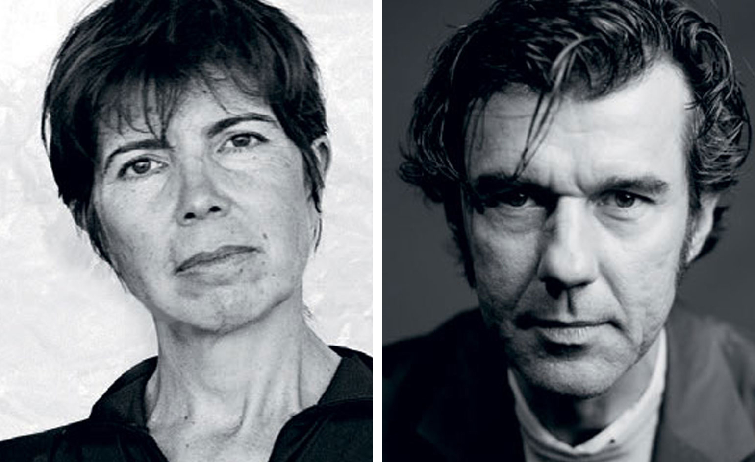
Liz Diller is one of the founding partners of New York architectural studio Diller Scofidio + Renfro (DS+R), and has helped reshape America’s urban landscape. Here, she speaks with graphic designer Stefan Sagmeister about the High Line effect, beauty in the grotesque and DS+R’s design for The Broad art museum in LA
As one of the founding partners of New York architectural studio Diller Scofidio + Renfro (DS+R), Liz Diller has helped reshape America's urban landscape. In conversation with fellow New Yorker, graphic designer Stefan Sagmeister, she reflects on the High Line effect, beauty in the grotesque and DS+R's design for The Broad art museum in LA, which opened on 20 September, before giving us an exclusive photographic tour.
Stefan Sagmeister: I find the most amazing thing about Diller Scofidio + Renfro's work is how it's embraced by the public. Not just the architecture projects such as the High Line and Lincoln Center [in New York], but the avant-garde independent work as well, such as the Blur Building [a Swiss Expo 2002 pavilion at Lake Neuchâtel], which I visited with my mother. She was blown away. Is the engagement with the public intentional?
Liz Diller: The Blur Building was the first time we became aware of the importance of audience. Before that, the studio had an academic and subcultural following. Blur was an environmental-scale, man-made, immersive fog bank on a Swiss lake. Water was pumped from the lake, filtered, controlled by smart weather technologies and shot through 35,000 high-pressure water nozzles into a cloud the size of a football field. Blur had no walls, no space, and no function; it was an architecture of atmosphere, a whiteout with white noise that you could explore and get lost in. It was a hit – everyone, from your mother and mine to visitors of all backgrounds came to see it. People attributed many meanings to it – some thought it referred to art-historical notions of nature and the sublime, some thought it was a surrealist fun house, some thought it was about ascension into heaven, and others read it as a symbol of the indeterminacy of Swiss identity. This loose fit between meaning and a work motivated us to take pleasure in projects on a large scale for an expanded audience in which meaning is layered like an onion. Publicness became a large part of the ethos of our practice.
The High Line came next. It was an urban-scale intervention using a stretch of elevated industrial infrastructure that had become obsolete in the 1980s, turned into a ruin, and saved from demolition by two citizen activists with a vision to turn it into a public park. We joined the effort and then had to invent nature 10m in the air, 8m wide, and 1.5 miles long. Early projections expected 300,000 visitors annually. Last year there were six million.
It's probably the most influential piece of architecture built in Manhattan in decades. It's gone global, no?
It became one of the top tourist attractions in New York and then went viral – there are over 60 new parks currently in planning stages worldwide that reference the High Line. We unwittingly touched a global nerve. Why tear down bridges, viaducts, highways, train trestles, if you can turn them into public promenades?
As urban space is getting more and more privatised and every square inch has commercial value, we have to be vigilant about protecting as much non-programmed public space as possible. But our reading of the High Line's success has to do with discovering a new virtue – that of doing nothing. This is new for urban dwellers, especially New Yorkers. We are always productive. When we're not in our offices working, we're in the gym burning calories or on our devices reading and sending messages. On the High Line you can't do much. You can't ride a bike, walk a dog, or throw a ball. There is nothing to do but walk and sit and watch people. In the Sunken Overlook, a little theatrical space over 10th Avenue, you can stare at car tail lights disappearing into the distance. Limiting the visual field and framing the banal makes it sublime – like staring into a fireplace, an urban Zen.
And of course in that way, it's very clearly connected to Blur, in its nothingness.
Precisely.
I like that. There's essentially nothing to do. One of my favourite quotes about the difference between art and design is from Donald Judd: 'Design has to work, art does not.' Art can just be. Much like the High Line or Blur. I think that has a lot to do with why contemporary art museums are so popular right now. From MoMA to Tate Modern, people go not just for the art, but also because of nothingness, the possibility of space that doesn't have to do anything.
It's an interesting theory – the museum is a cultural form of sanctioned down time, a hole in the day in which expectations are loose, like in a public square, a place to be with others, one that provides a cultural atmosphere as opposed to an explicit place of leisure. I've been thinking a lot about our [studio's] roots doing installations on borrowed or stolen sites. We militantly resisted the museum and stayed outside its walls. Years later, we became more comfortable going through those walls with our curatorial and installation projects. And now we're building the walls of museums.
How would you define the role of architecture in the art museum?
Rather than the conventional arguments, in which either architecture is protagonist and art is subservient or architecture is in a supporting role for art, we prefer to think of architecture as a collaborator with the museum in promoting the public's appreciation of both art and space.
This is my experience of the Institute of Contemporary Art, which you designed in Boston. The programme and the architecture are collaborative.
The building curates its relationship to the site somewhat cinematically. You enter the lobby, where the view to the harbour is pinched, then you take a glass elevator that scans the view vertically, you enter the theatre that appropriates the view as a backdrop, you walk across the north gallery and scan the view horizontally, and you descend into the mediatheque that edits all but the texture of water. It's hypnotic and timeless. The only place where the view is turned off is in the galleries. Having spent much of the early part of our career on the art side of the wall, we believe in letting artists and curators have the freedom to rescript gallery space without the distraction of the architecture.
Which DS+R has also done at The Broad [in Los Angeles]. I've heard you mention the 'veil' and the 'vault' when describing the idea of the museum. Can you explain?
As the home of a contemporary art collection, the building is half exhibition space and half art storage. Typically, storage in a museum is off-site or in some back-of-house space that nobody sees. This large, dark part of the programme was a design challenge as it faces a particularly prominent building – Frank Gehry's Disney Hall. Also, Grand Avenue [The Broad's location] is a key street in the initiative to urbanise downtown LA and we thought having a warehouse on this major artery was bad. We decided to turn this liability into an asset. The art will be stored in the 'vault', a heavy opaque and sculptural volume that floats in the middle of the building. The 'veil' is the five-sided outer layer, comprising facades and roof, that nests over the vault and brings in diffuse natural light. The veil and vault are always in dialogue: you see the vault through the veil from the street; you enter through the veil into the lobby with the vault hovering over you; you shoot up an escalator through the vault and arrive on its top surface at the main gallery under the filtered light of the veil; you return to the ground floor via a stair that snakes through the vault and offers glimpses into the live storage space. One of the unique aspects of the veil system is that it spans 200 feet over the 35,000 square foot main gallery.
No columns?
None. One acre of column-free art space.
I think the veil is beautiful. Does beauty have a role to play in your own work?
'Beauty' was stricken from architectural vocabulary over a century ago. However, architects never quite stopped the active pursuit of it. I don't deny using the adjective often but also in the context of the grotesque, the disfigured, and the oddly disproportional – I love things that are off, a bit too fat or too thin or too long or too short.
The veil is beautiful for me because it's distorted, incomplete, ragged at the top where the cellular system is sheared. Its geometry converges the parallel lines of the city edges and the 43-degree angle of true north to capture natural light. The consequent inside and outside corners and the meeting of the ceiling and walls are the product of intensely studied aesthetic decisions. The veil is also both structural, spanning a city block, and a filtering system for light. Beauty for me means capturing complexity in a simple way. I know you're bringing up beauty to be provocative.
Since Marcel Duchamp, we're not supposed to speak about beauty. But it's a serious concern and should be reconsidered. Beauty is part of what it means to be human. We crave it. Not necessarily natural beauty either, but artificial beauty, beauty we've created. We often ignore the impact that it has on function. A tool can actually function better because it's beautiful. I think beauty is what people get about your work. But perhaps more than that, I think people get the sense that a lot of time – dare I say love and care – has gone into making spaces that are meaningful, that become co-opted by the people who visit or work in those spaces. I see this on the High Line. People behave differently. Somehow DS+R has altered people's behaviour towards public space; they treat it as their own. I don't know if it's still true, but I read an article in The New York Times that discussed the unprecedented low crime rate reported by the police precincts around the High Line, even though there are millions of visitors a year. No major crime. That's sensational. How can that be?
It's true. When we designed the High Line in collaboration with James Corner Field Operations and Piet Oudolf, we carefully considered the quantity of access points connecting to New York streets. Would the park feel safe with one access point every ten blocks or would the sensation of no escape feel creepy? Is one every three blocks too many? How would you secure and patrol the 1.5-mile stretch? I think we solved those problems but what was a surprise was the positive attitude on the High Line. People are considerate. They don't litter the way they do in the street. There's definitely affection and respect for the place.
We didn't set out to alter behaviours there like we did at Lincoln Center, where we sought to create a social consciousness and civic pride in a neglected and desolate site designed in the 1950s and built in the 1960s as a citadel – a fortress for the rarefied domain of the arts for a well-to-do suburban public arriving by car. We wanted to break down the walls and bring the city in, to make the campus a destination for the general public, not only for patrons that could afford a $300 ticket to the opera.
You make it sound easy but I know that's not true. I have visited so many architectural catastrophes around the world. I assume that everyone had well-meaning intentions, that the city officials, the planners, the designers set out to create vibrant spaces, not empty spaces that are devastatingly unsuccessful. Just because you put a bench or a stair somewhere does not mean the public will just show up and sit on it. So what does DS+R do differently? Why does it work for you?
[Laughs] We start by assuming that we're not the first to the table. There's a history to a site, to an institution, to a place, to a neighbourhood, all of which precedes us. So understanding context thoroughly before we act is important. Typically, our work is not alien to a place but it critically interprets what's already there and alters it. We think of ourselves as the users. Would we want to sit on that bench?
I think it's more than that. To impact the world in the greatest possible way, we must not be myopic. Designers must have the wherewithal, the broad curiosity, and the tenacity to commit to their cause. Designers must be politicians, leaders, and consensus builders. I know this is how your firm must operate. Was this always the case?
In the ten years it took to conceive and build Lincoln Center our thinking matured. To change anything would require convincing 12 constituent organisations, donors who would pay for it, city officials who would have to change policy, the preservationist community that would have to accept why we couldn't embalm a historically sensitive site, local residents who needed to be part of the future of the place... I could go on and on. We resented the fact that we were in perpetual meetings with no time to design – like Thomas Edison's adage about one per cent inspiration and 99 per cent perspiration. Then I realised the 99 per cent hard work selling the project was just as creative as the one per cent to conceive it. To make a significant, large-scale impact on a city involves educating people, seeing the world through their eyes, winning their trust over time. In this period, we became more and more interested in the intersection of architecture, politics, policy, and economics. That led to pushing back against the limited agency of the architect as a receiver of existing programmes and logics. What if the architect could be more entrepreneurial – work outside the typical client-architect relationship?
We've only touched upon the architectural work, but in fact, that represents just a portion of DS+R's effort over the years.
We do independent projects like art installations, curatorial projects, theatre works, and dance productions. We're working on two operas right now. We just finished a book and we're starting a new one. We collaborate with an array of experts in different disciplines: from robotics engineers to composers and choreographers, to climatologists and material scientists. We follow a vision and do all the research necessary to get there. We did not know how to make a cloud before we started Blur. Much of our work shares one thing in common: we jump of a cliff without a parachute and we hope that we make a soft landing.
As originally featured in the October 2015 edition of Wallpaper* (W*199)
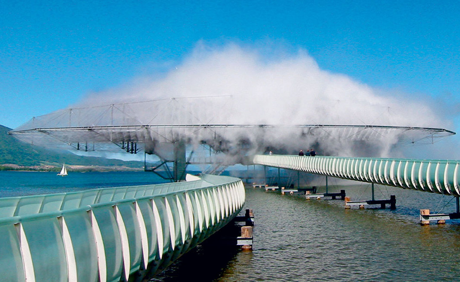
The Blur Building, Swiss Expo, Yverdon-les-Bains, Switzerland, 2002.
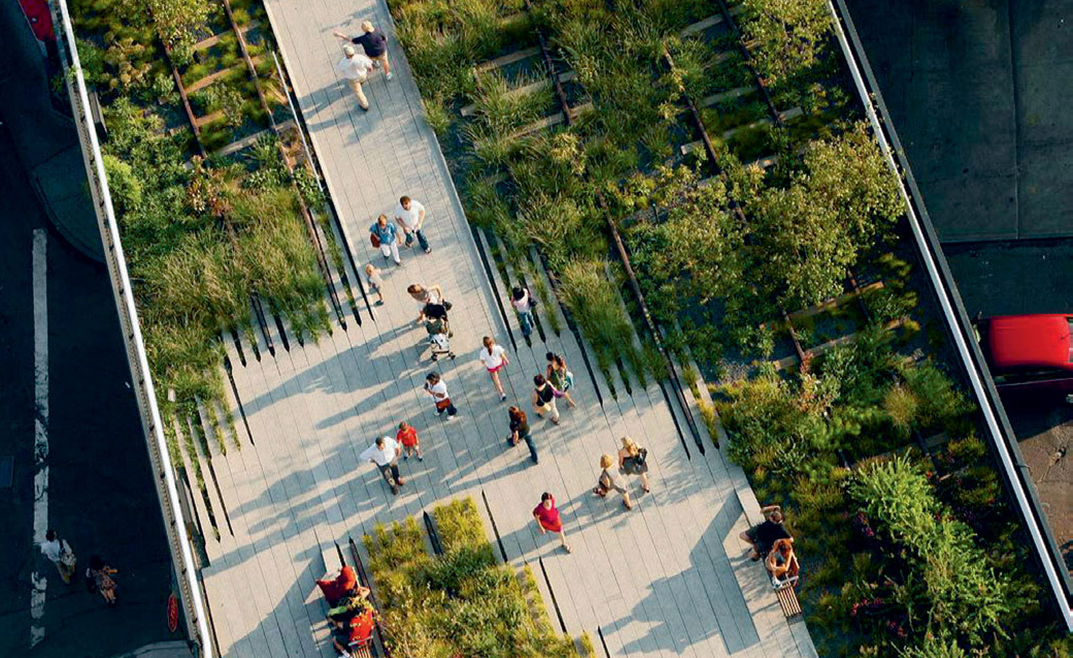
The High Line, New York, 2014.
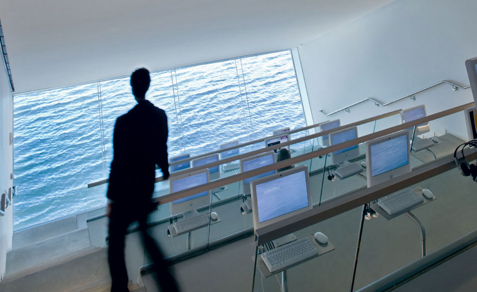
Mediatheque at the Institute of Contemporary Art, Boston, MA, 2006.
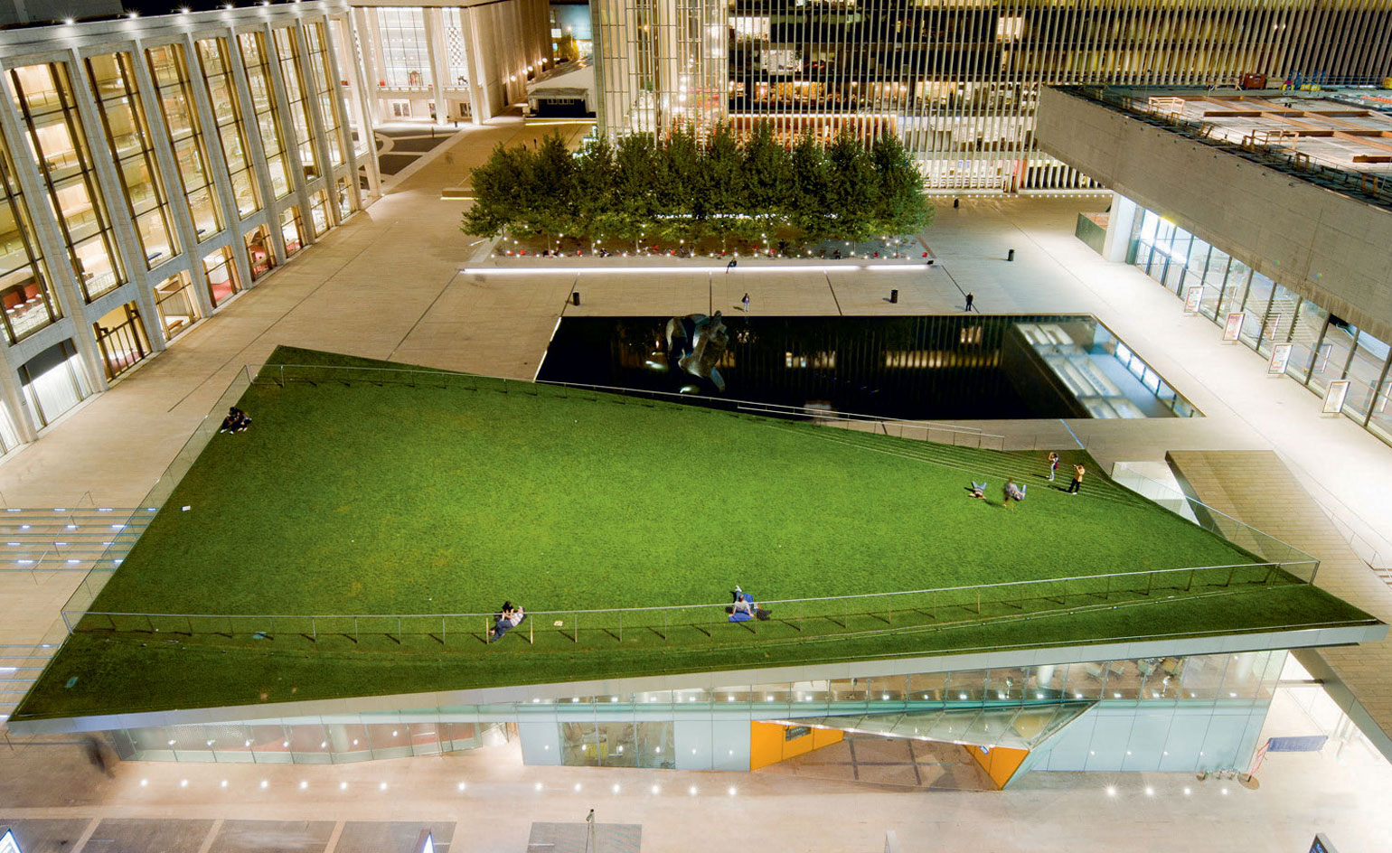
Hpar Pavilion at the North Plaza, Lincoln Centre for the Performing Arts, New York, 2012.
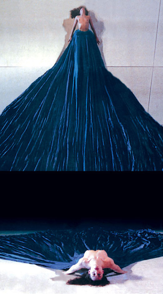
Moving Target, Charleroi Danses, Belgium, 1996. courtesy Diller Scofidio + Renfro
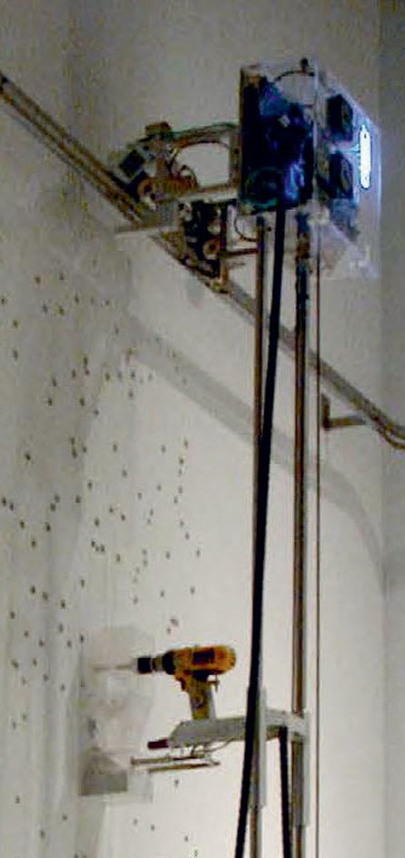
Mural, installation at ’Scanning: the Aberrant Architects of Diller + Scofidio’, Whitney Museum of American Art, New York, 2003.
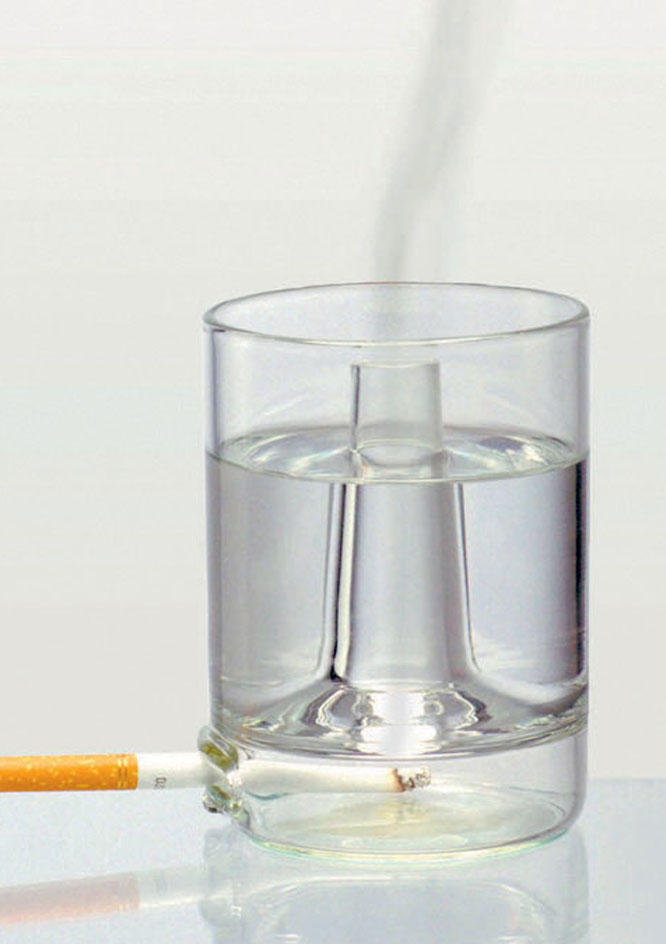
’Vice/Virtue’ drinking glass, Glassmanifest, Leerdam, Netherlands, 1997.
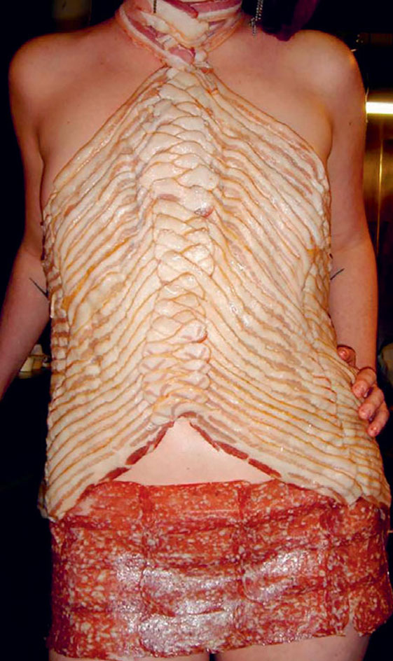
’Meat Dress’, gown for Miss Meatpacking Distract Competition, New York, 2006.
INFORMATION
View a gallery from Phaidon’s new book, The High Line, with a design log narrated by DS+R and James Corner Field Operations, at Wallpaper.com
ADDRESS
Wallpaper* Newsletter
Receive our daily digest of inspiration, escapism and design stories from around the world direct to your inbox.
The Broad
221 S. Grand Ave.
Downtown Los Angeles
CA 90012
-
 Japan in Milan! See the highlights of Japanese design at Milan Design Week 2025
At Milan Design Week 2025 Japanese craftsmanship was a front runner with an array of projects in the spotlight. Here are some of our highlights
By Danielle Demetriou
-
 Tour the best contemporary tea houses around the world
Celebrate the world’s most unique tea houses, from Melbourne to Stockholm, with a new book by Wallpaper’s Léa Teuscher
By Léa Teuscher
-
 ‘Humour is foundational’: artist Ella Kruglyanskaya on painting as a ‘highly questionable’ pursuit
Ella Kruglyanskaya’s exhibition, ‘Shadows’ at Thomas Dane Gallery, is the first in a series of three this year, with openings in Basel and New York to follow
By Hannah Silver
-
 Remembering architect Ricardo Scofidio (1935 – 2025)
Ricardo Scofidio, seminal architect and co-founder of Diller Scofidio + Renfro, has died, aged 89; we honour his passing and celebrate his life
By Ellie Stathaki
-
 Discover Diller Scofidio + Renfro’s Blue Dream house in the Hamptons
A new monograph captures Blue Dream house and the lengthy design and construction process of a quintessential example of contemporary Hamptons architecture
By Jonathan Bell
-
 DS+R Prior Performing Arts Center is designed as a public commons
Prior Performing Arts Center by Diller Scofidio + Renfro completes at the College of the Holy Cross in Worcester, Massachusetts
By Stephen Zacks
-
 Diller Scofidio + Renfro: what’s next?
Diller Scofidio + Renfro announces the official openings and design launches of new buildings in Australia, Italy, China and the USA
By Pei-Ru Keh
-
 MoMA’s expansion by DS+R and Gensler prioritises connection
By Pei-Ru Keh
-
 Diller Scofidio + Renfro’s riverside park on London’s Greenwich Peninsula opens
By Ellie Stathaki
-
 The Shed at Hudson Yards unveiled in New York
By Pei-Ru Keh
-
 Our first look inside Fifteen Hudson Yards by Diller Scofidio + Renfro and Rockwell Group
By Ellie Stathaki