The Elizabeth Line Bond Street station joins the dots in London’s West End
The Elizabeth Line Bond Street station completes the new network's central London section; we go underground and up onto rooftops to explore its wide-ranging impact
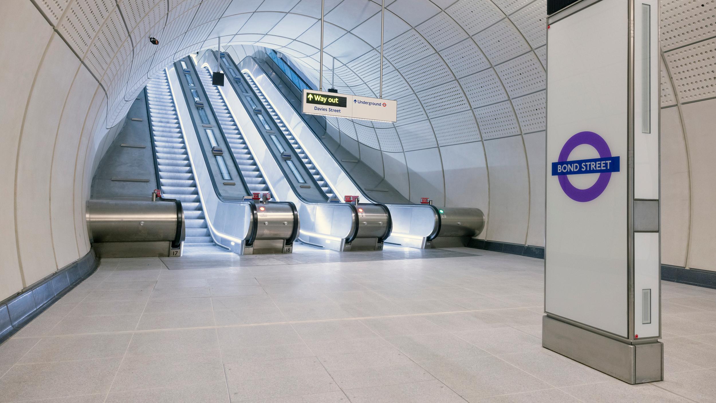
A new opening marks the final piece in central London’s new Elizabeth Line – Bond Street station. The delayed launch, five months after the rest of the first stage of the line in May 2022 (itself substantially delayed – we explored the Elizabeth Line under construction) finally gives the West End a major new transport interchange, promising to create easier access for hundreds of thousands of workers and visitors.
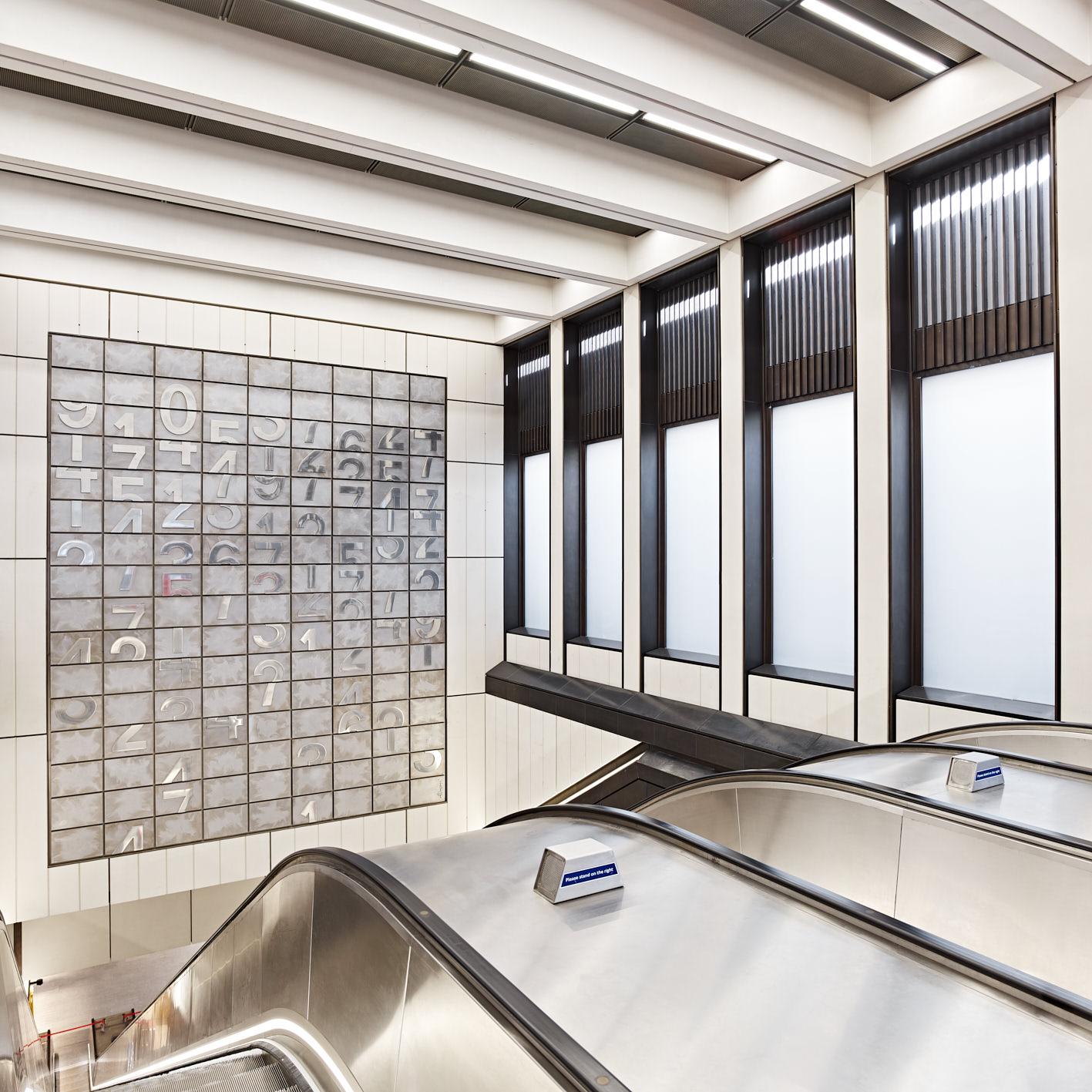
One of three new artworks by Darren Almond at Bond Street Station
The impact of Elizabeth Line – Bond Street station
What’s most compelling about the Elizabeth Line Bond Street is the way in which the new station has catalysed a number of major architectural projects in the vicinity. The station itself, buried deep beneath the south of Oxford Street, was designed by John McAslan + Partners, following the initial design masterplan set up by Grimshaw Architects for the whole Elizabeth Line system.
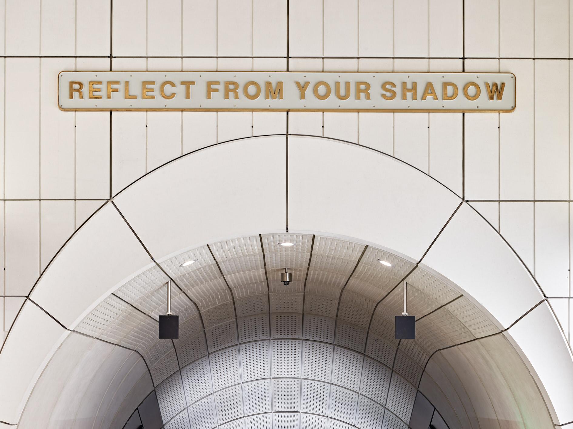
One of three new artworks by Darren Almond at Bond Street Station
All of the stakeholders in this multi-billion-pound enterprise have played a very long game, whether they’re developers, architects, engineers, councils, or transport organisations. The first plans for what became known as Crossrail (and was subsequently named the Elizabeth Line in 2016) were mooted back in 1974, although plans for major cross-capital train tunnels date back to the 1940s.
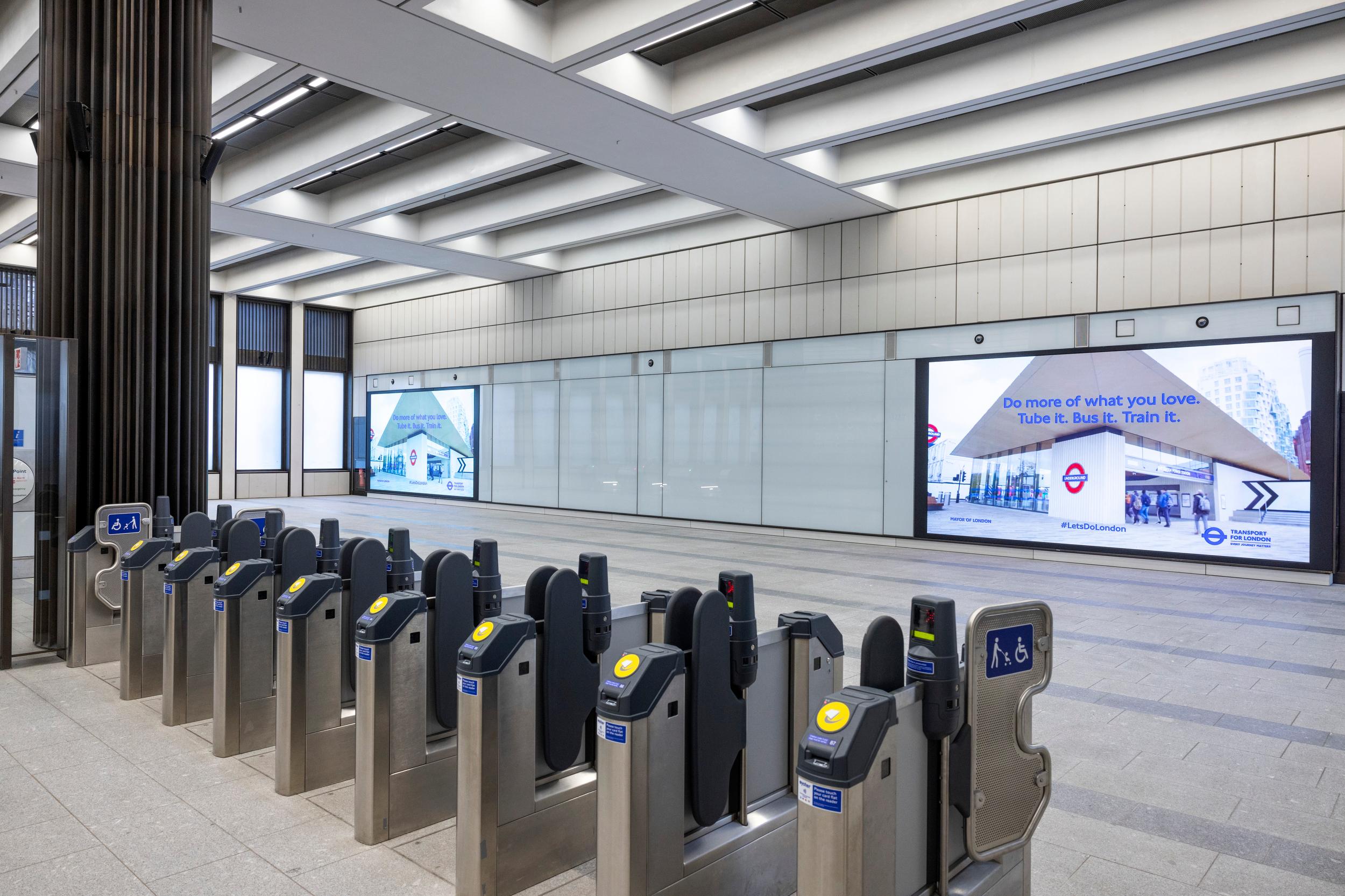
The new Bond Street Station by John McAslan + Partners
The route as built was approved in around 2005, with construction starting in 2009 for an expected opening date of 2017. As we now know, this didn’t go entirely to plan, but the long gestation has meant that architects like McAslan, Grimshaws and Lifschutz Davidson Sandilands have spent the best part of two decades working on the scheme.
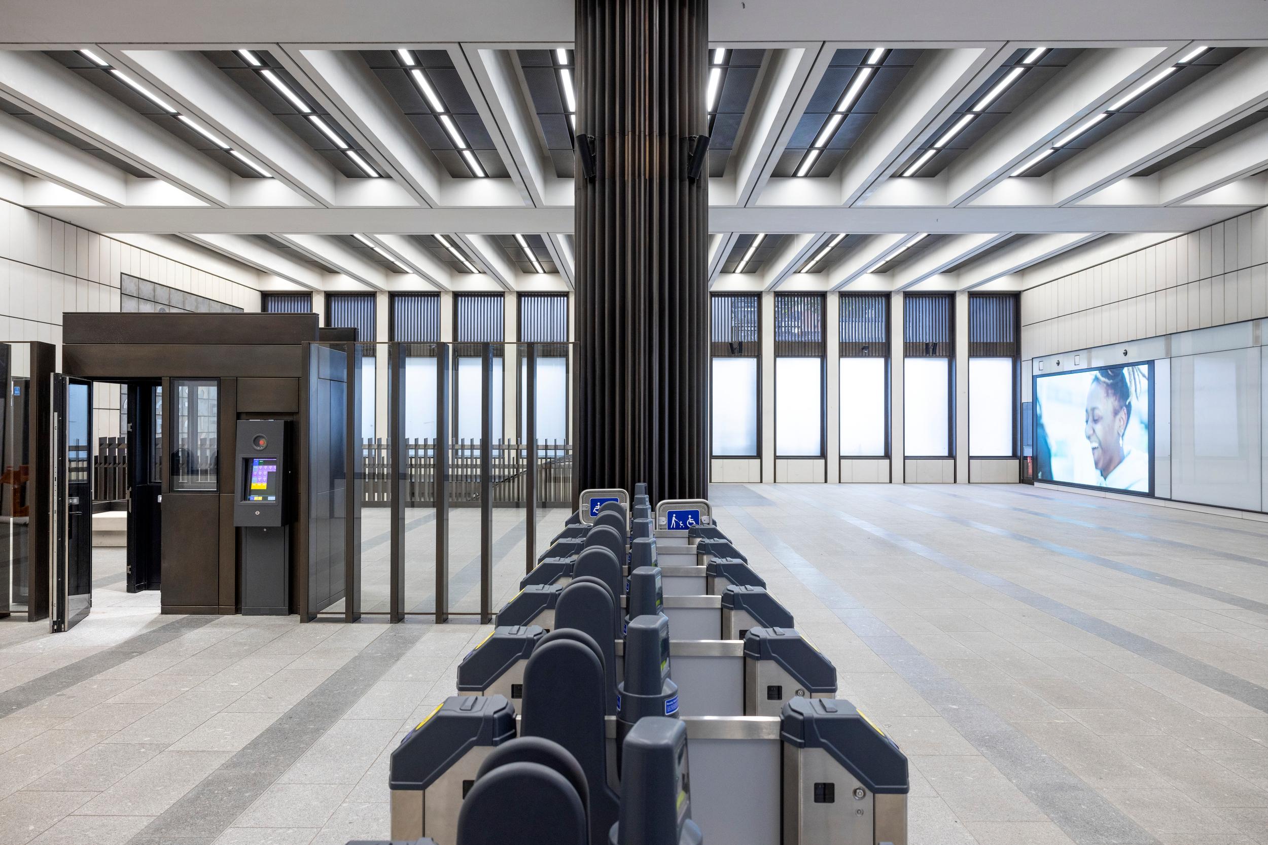
The new Bond Street Station by John McAslan + Partners
Whereas the Jubilee Line, the capital’s second most recent piece of major infrastructure, was characterised by a series of architecturally distinct stations, the Elizabeth Line approach was more uniform. What makes the new line notably different from the rest of the network is the sense of scale; trains are around twice as long as a standard tube train, and travel at around twice the speed.
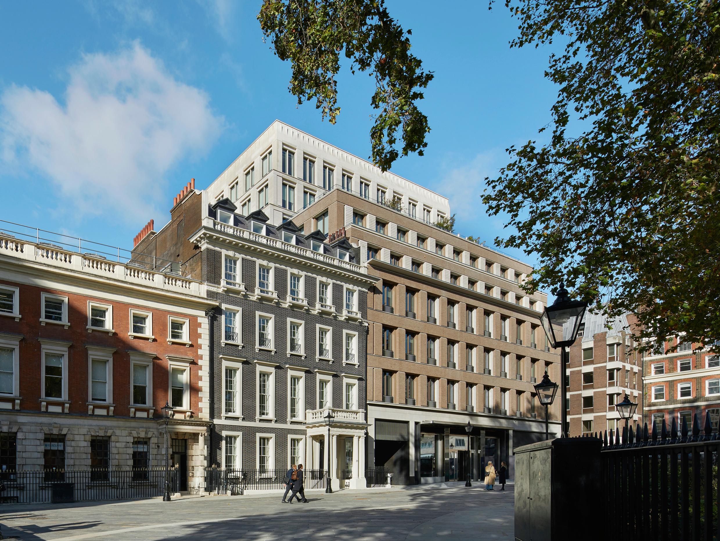
The new Bond Street Station, Hanover Square entrance
Bond Street is a fine example of the subterranean grandeur, with a sense of volume in the tall, curved tunnels and halls that brings to mind the vastness of the Moscow Metro. It’s far more restrained than the palatial Communist system however, with sober concrete greys, discreet electronic signage and signature elements like the perforated concrete panels defining the spaces.
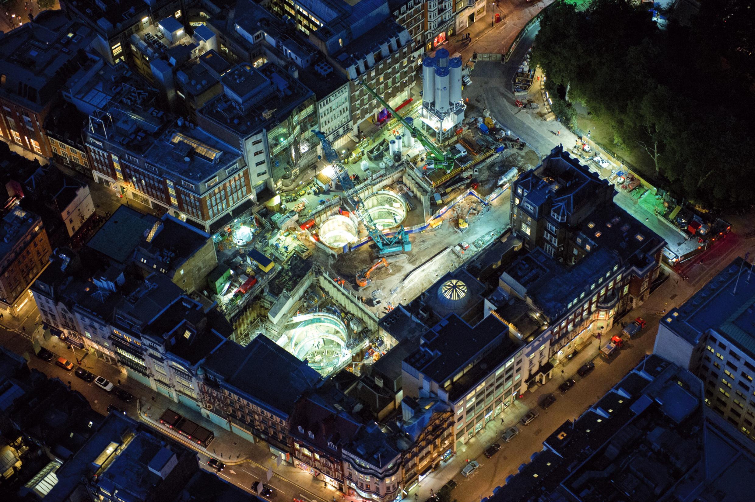
An aerial view of Bond Street Station under construction
Down below, passengers rise up on 60m-long escalators, the second longest on the entire network, past bronze panels and that distinctive curved ceiling. Lighting shifts from warm, subtle hues to a bolder, blue-tinged light, drawing one towards the surface. Artworks have also been integrated, as elsewhere on the system, with a new sign-based piece by Darren Almond (one of three by the British artist) adorning the concrete buttresses above the escalators to the Davies Street entrance.
Wallpaper* Newsletter
Receive our daily digest of inspiration, escapism and design stories from around the world direct to your inbox.
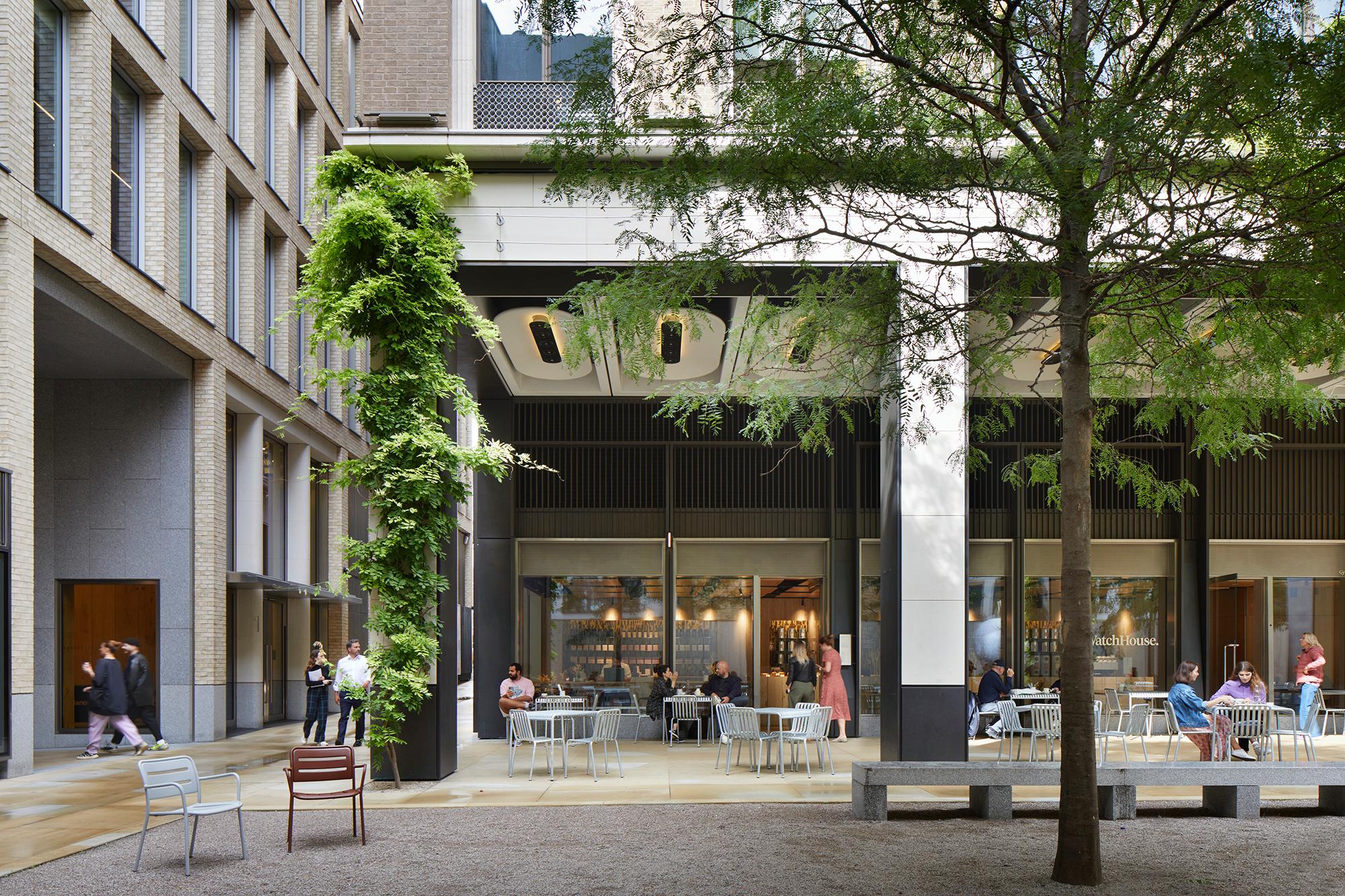
Medici Courtyard, a new space alongside the Hanover Square entrance to Bond Street Station
Bond Street is also home to the longest platform on the Underground, at 255m, some 28m below the ground. Effectively running east to west, it gives the station two new entrance points, at Davies Street in the west, where there is a below-ground intersection with the Jubilee and Central line, to a grand entrance in Hanover Square to the east.
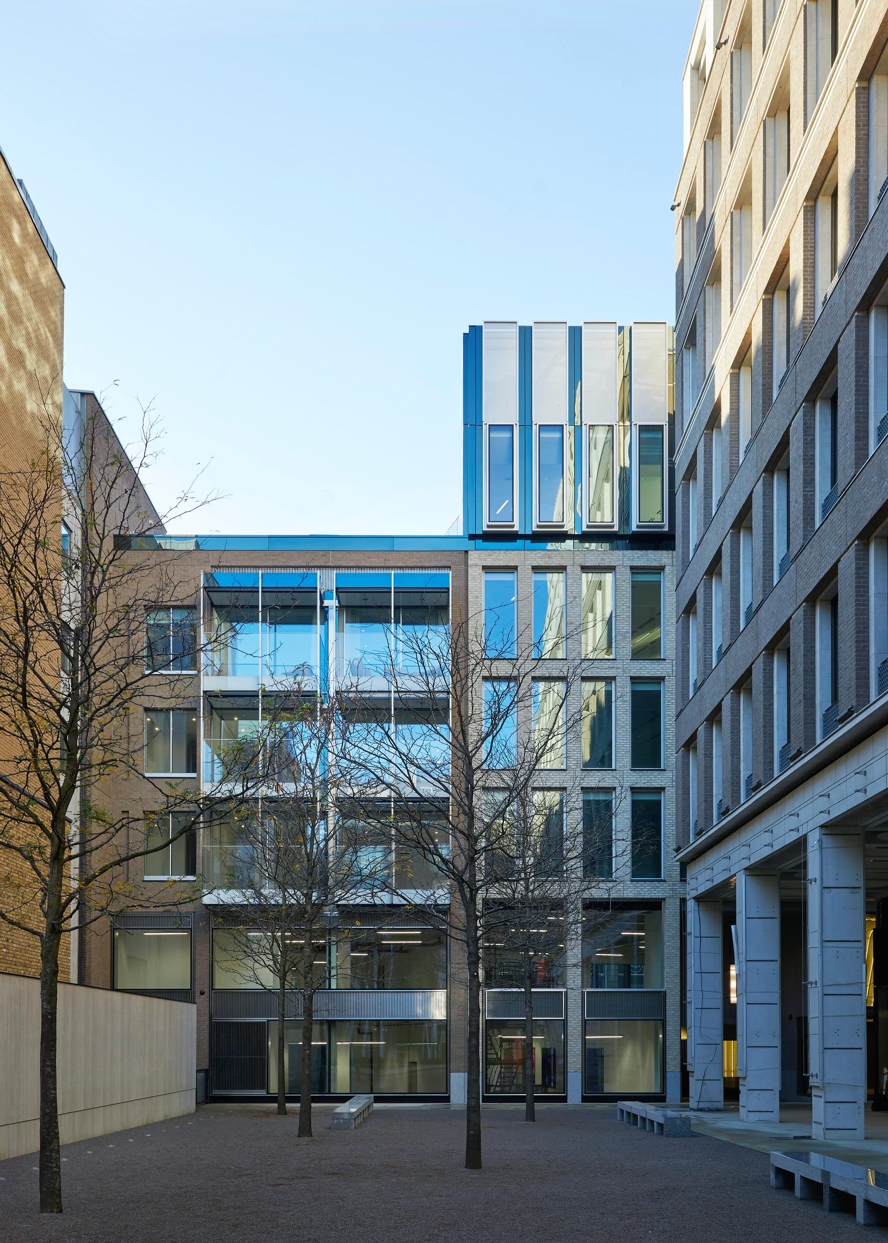
Medici Courtyard, looking west to the new apartment building
Both sites required extensive demolition, not just to create the extremely deep level stations (effectively ten-storey underground buildings), but also to allow access for thousands of truckloads of cement throughout the long construction period. At Hanover Square, the new entrance sits beneath one of the many ‘OSD’ – over-station development – that have cropped up along the new line.
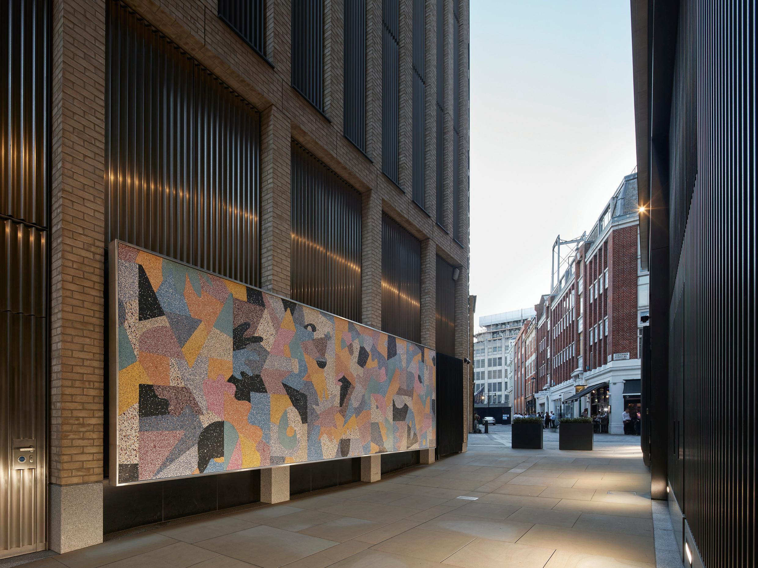
Everyone I’ve Ever Known, an installation by Rhys Coren off Medici Courtyard
This building was designed by Lifschutz Davidson Sandilands and represents one slice of a massive piece of urban renewal made possible by the new line. Not only does the station entrance open out onto a freshly revitalised (and partly pedestrianised) Hanover Square, the job involved the intensive restoration and reconfiguration of a listed building, two separate office buildings, six apartments and one of the first shopping arcades to be built in central London in decades.

New office lobby by Lifschutz Davidson Sandilands
Paul Sandilands guides us through the new cityscape created by the new entrance to Hanover Square, almost all of which has been handled by his firm. For example, the galleried windows of the new Medici Arcade bracket a route from New Bond Street, past the newly created Medici Courtyard, along an arcade to Hanover Square.
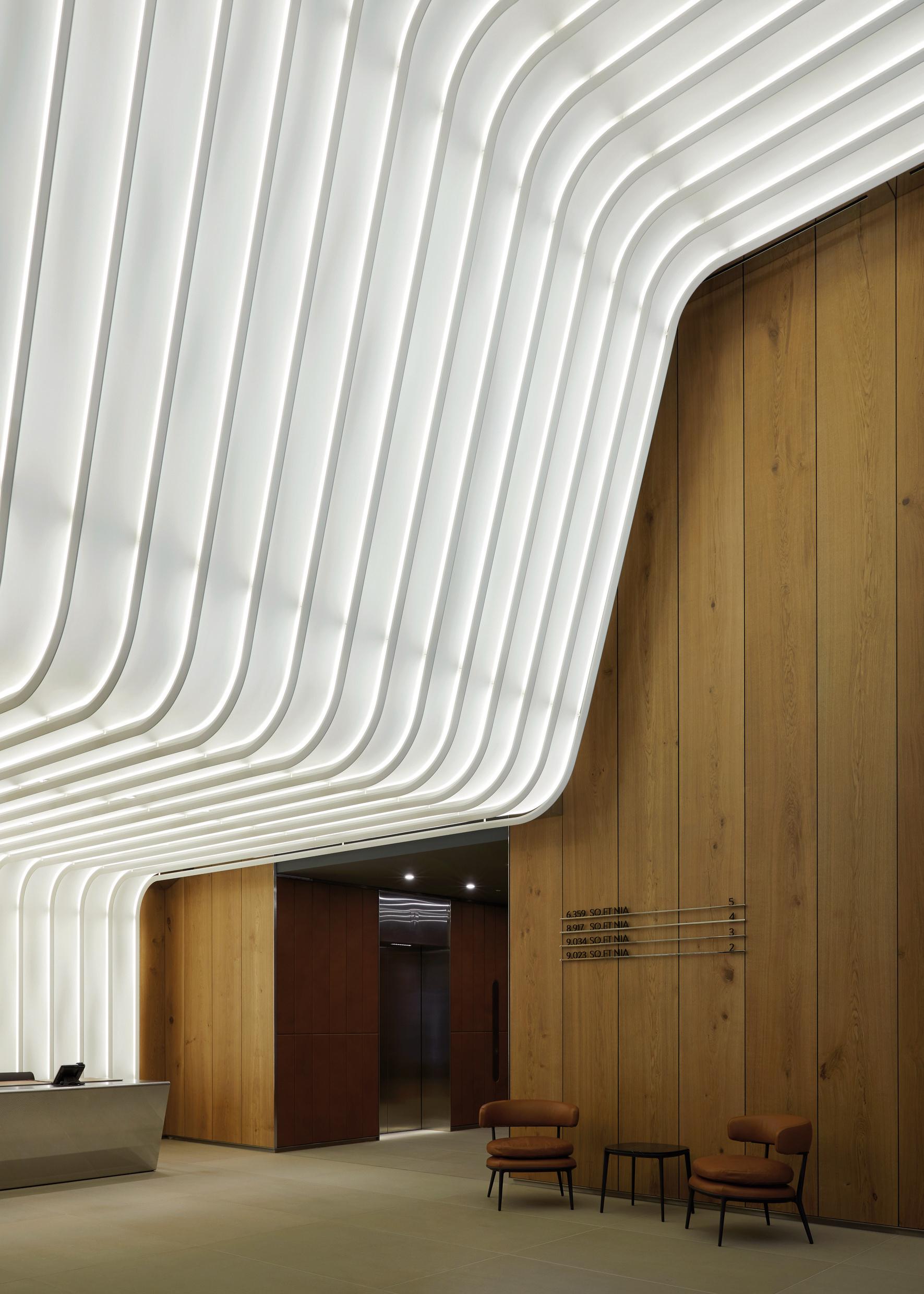
New office lobby by Lifschutz Davidson Sandilands
This small square loosely follows the pattern of the 18th century garden that once existed behind 20 Hanover Square, one of only two buildings dating back to when the Square was set out by the 1st Earl of Scarbrough in 1714. 20 Hanover Square was the London HQ of estate agents Knight Frank for over a century, and part of the refurbishment works saw the removal of an auction room extension to the rear of the house, as well as substantial restoration works.
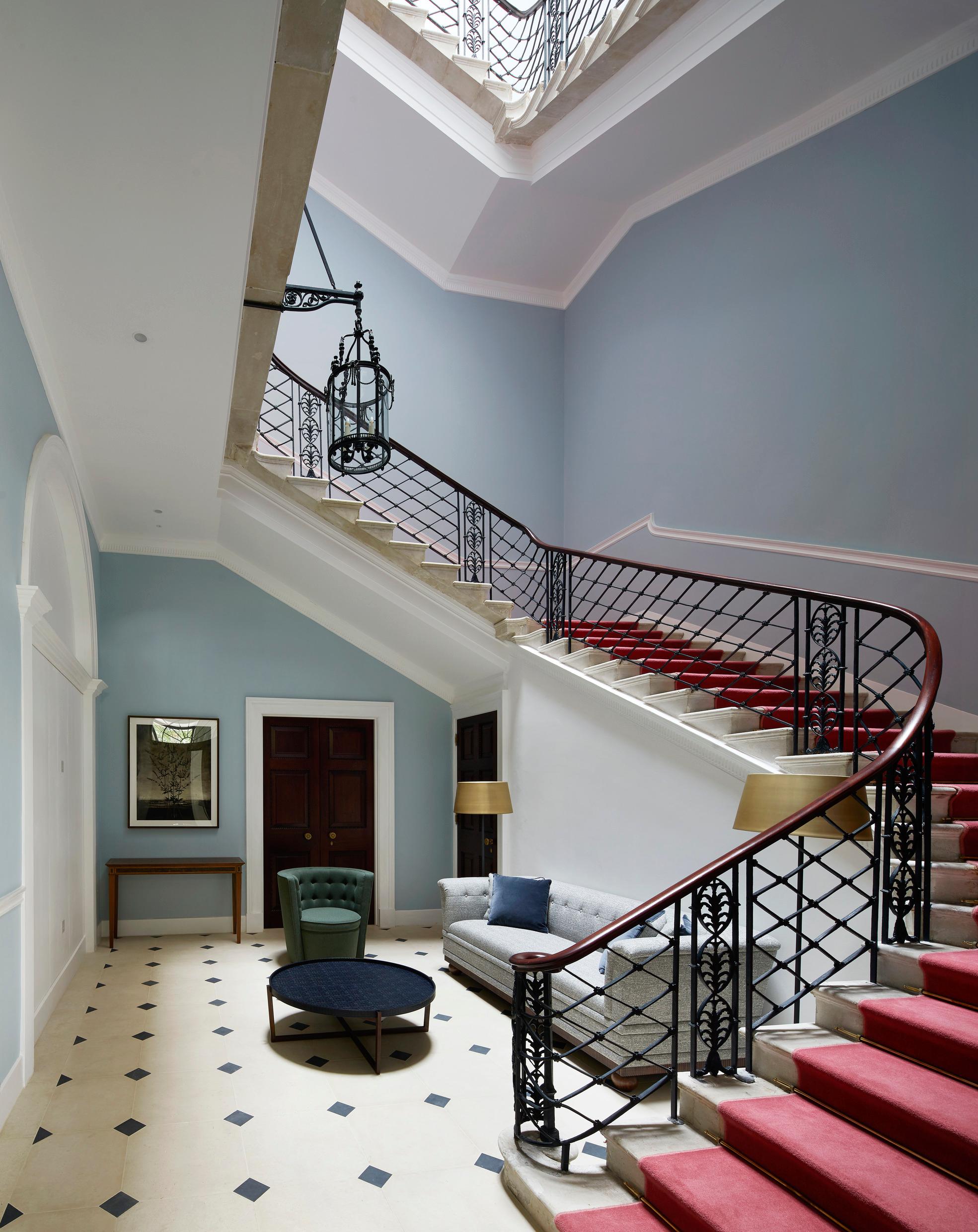
The stairwell of 20 Hanover Square, restored by Lifschutz Davidson Sandilands
As Sandilands points out, the attention to detail extended to the use of traditional craft methods and techniques, the kind of high-budget project that wouldn’t have been possible in isolation.
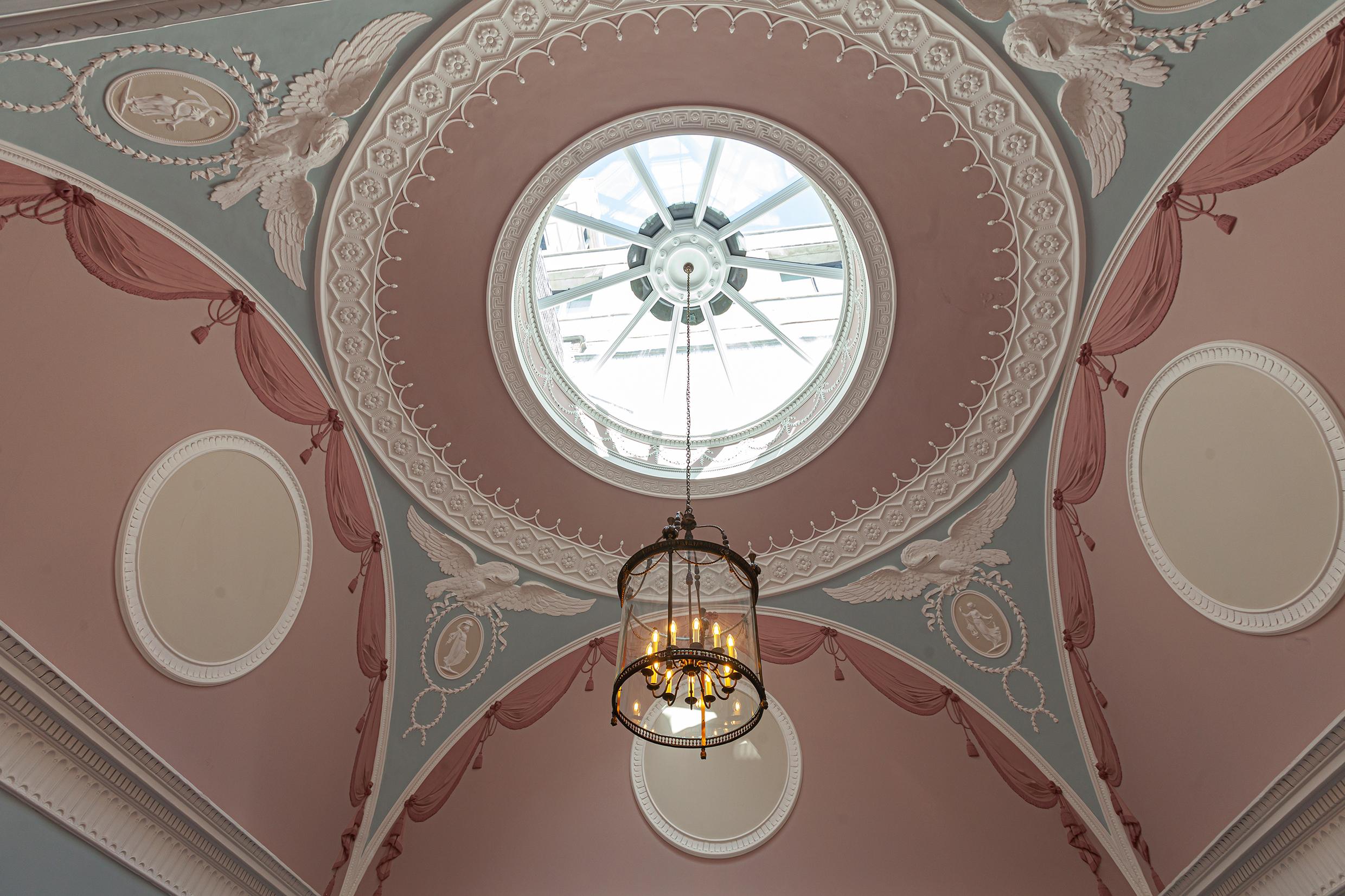
The restoration of 20 Hanover Square
The house is now home to the JCA London Fashion Academy, set up by Professor Jimmy Choo OBE to offer a BA and MA in fashion design and business innovation to a select group of talented students. Overseen by Director and CEO Stephen Smith, the academy makes excellent use of the grand rooms and tall ceilings of the 1722 structure, seamlessly upgraded by LDS.

The interior of 20 Hanover Square, home of JCA London Fashion Academy
John McAslan + Partners were responsible for the elegant station entrances, red brick in Davies Street and Portland Stone in Hanover Square, together with daylight-infused ticket halls and expansive views out onto the cityscape. There’s bronze detailing – a nod to the modern movement work of Charles Holden, architect of London Transport’s HQ in St James and many classic stations, as well as the nearby Senate House. Bond Street is both intersection and destination, with the new station, along with its neighbouring Elizabeth Line stop at Tottenham Court Road, aiming to alleviate some of the pressure on Oxford Circus.
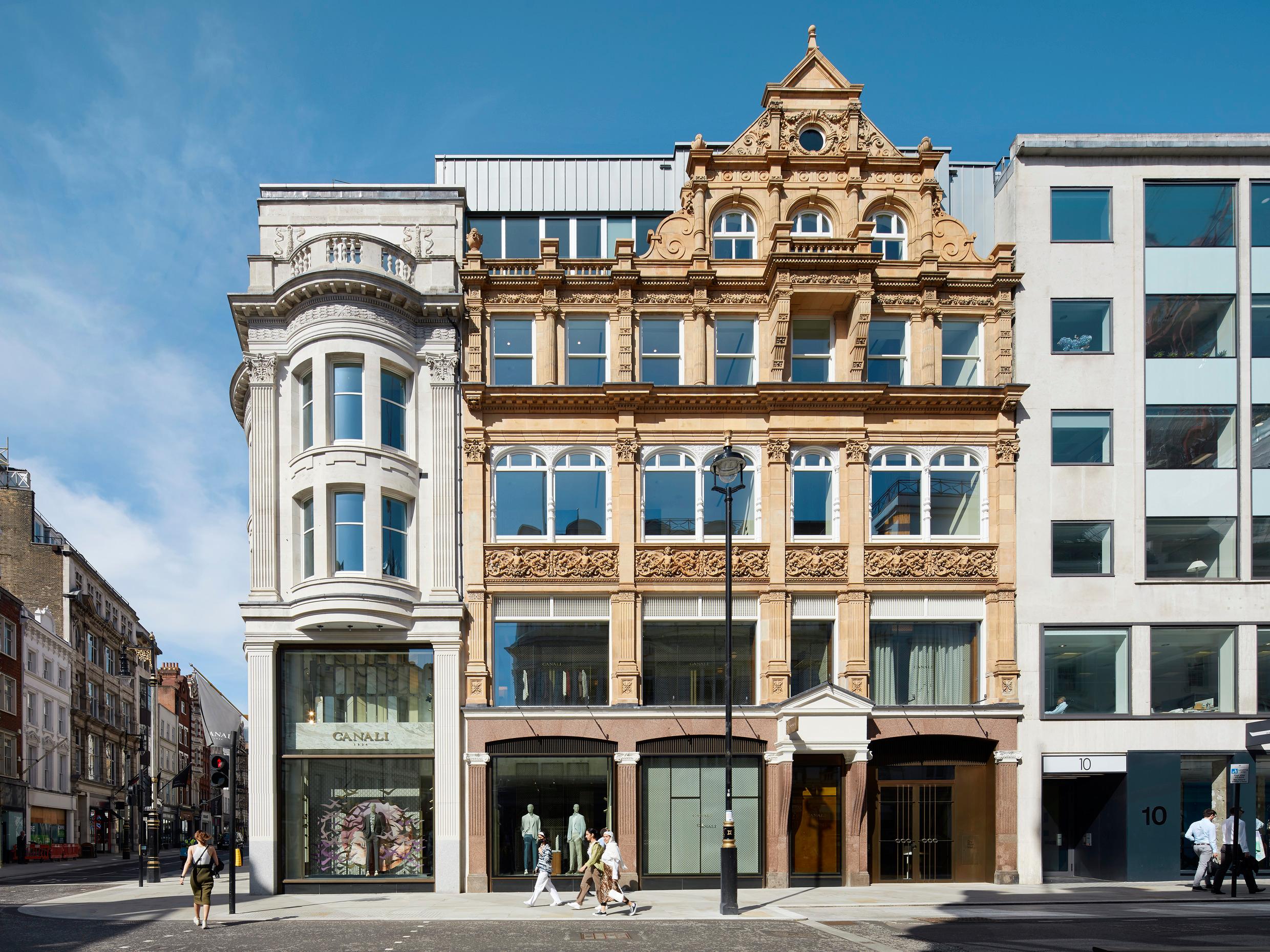
14 Brook Street
LDS has also built the new offices above the station entrance, a modest exercise in contextual design that takes cues from both Georgian proportions, as well as the work of Holden. The building, which essentially sits atop the structural framework that tops out the station below, is accessed via a sleek contemporary lobby opening out onto the square, with refined detailing offering up a sense of timeless glamour, perhaps burnished by the presence of Vogue House in the opposite corner of the Square.
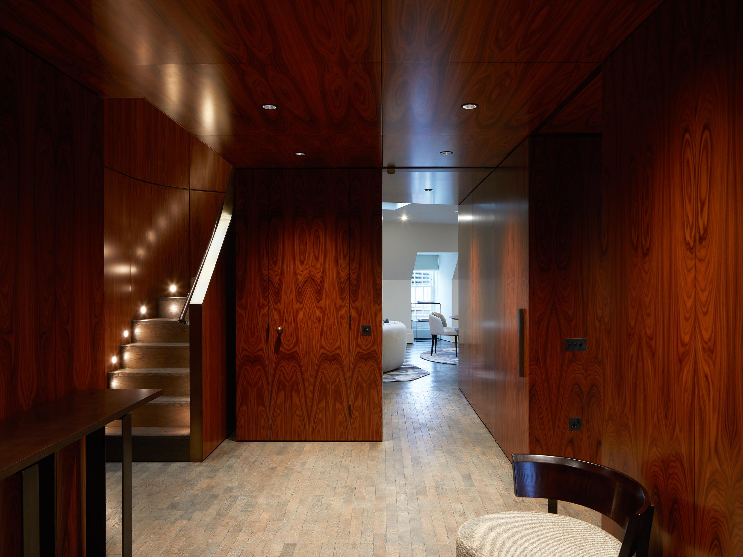
One of the new apartments at 14 Brook Street
Sandilands praises GPE's (Great Portland Estates) work as a developer-landlord for its consistency of vision and dedication to getting the details just right. ‘They look after their buildings because they own them,’ he notes. The idea of commercial buildings lasting for just a few decades no longer flies in our longevity-obsessed world, and Sandilands stresses that this work – in all its differing scope, scale, and usage – should last a century or so.
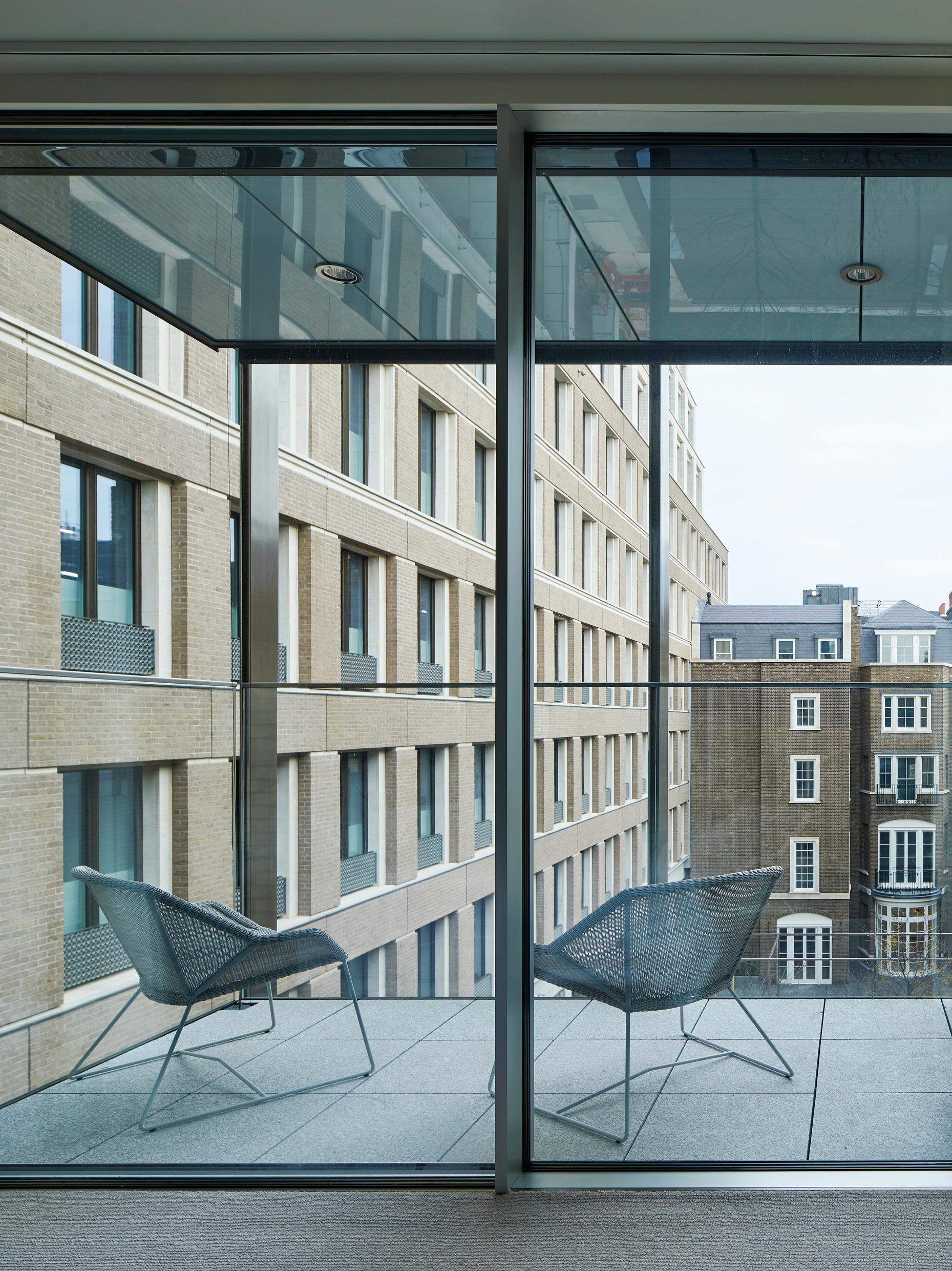
One of the new terraces at 14 Brook Street
The works also extended to a discrete development of six high specification apartments overlooking Brook Street and New Bond Street, behind a retained and restored façade, as well as a scattering of roof terraces – now very much in favour with planners – for office workers and residents alike. Other major developments nearby include a forthcoming residential building and hotel designed by Rogers Stirk Harbor at 22 Hanover Square.
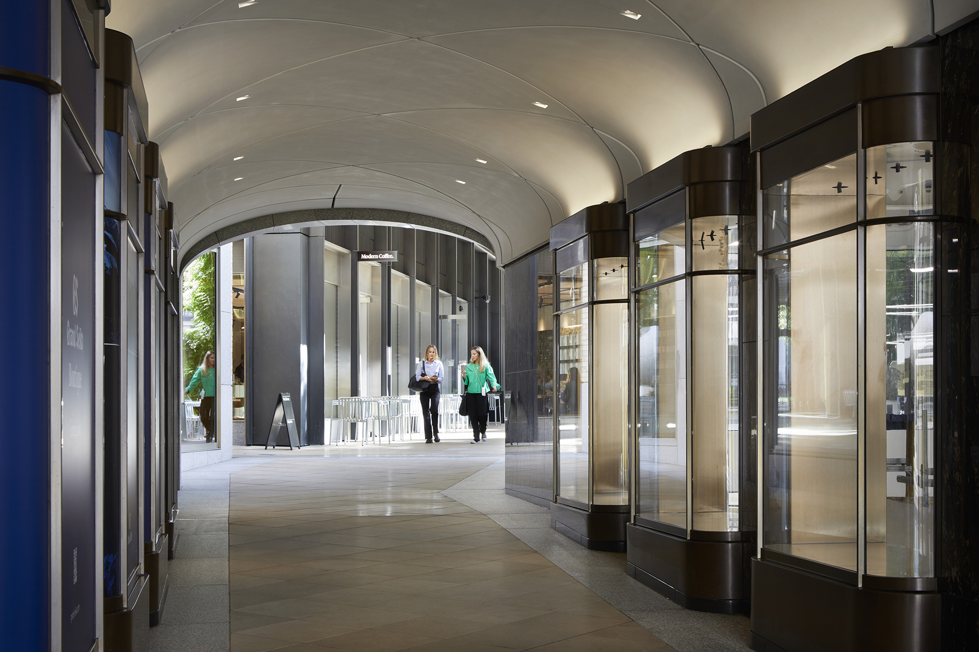
The new Medici Arcade
In short, the whole area is a complex mesh of public and private partnerships, of buildings old and new, retained façades, hidden vents, discrete access ways, and unexpected views. ‘It’s been a bit like getting an orchestra to play at the same time,’ Sandilands says, reflecting on a project that has been part of his office for well over a decade. ‘It’s a once in a lifetime project for me,’ he concludes. As for Mayfair’s eclectic architectural mix, it’s been handed many more lifetimes of use.
Jonathan Bell has written for Wallpaper* magazine since 1999, covering everything from architecture and transport design to books, tech and graphic design. He is now the magazine’s Transport and Technology Editor. Jonathan has written and edited 15 books, including Concept Car Design, 21st Century House, and The New Modern House. He is also the host of Wallpaper’s first podcast.
-
 Eight designers to know from Rossana Orlandi Gallery’s Milan Design Week 2025 exhibition
Wallpaper’s highlights from the mega-exhibition at Rossana Orlandi Gallery include some of the most compelling names in design today
By Anna Solomon
-
 Nikos Koulis brings a cool wearability to high jewellery
Nikos Koulis experiments with unusual diamond cuts and modern materials in a new collection, ‘Wish’
By Hannah Silver
-
 A Xingfa cement factory’s reimagining breathes new life into an abandoned industrial site
We tour the Xingfa cement factory in China, where a redesign by landscape specialist SWA Group completely transforms an old industrial site into a lush park
By Daven Wu
-
 An octogenarian’s north London home is bold with utilitarian authenticity
Woodbury residence is a north London home by Of Architecture, inspired by 20th-century design and rooted in functionality
By Tianna Williams
-
 What is DeafSpace and how can it enhance architecture for everyone?
DeafSpace learnings can help create profoundly sense-centric architecture; why shouldn't groundbreaking designs also be inclusive?
By Teshome Douglas-Campbell
-
 The dream of the flat-pack home continues with this elegant modular cabin design from Koto
The Niwa modular cabin series by UK-based Koto architects offers a range of elegant retreats, designed for easy installation and a variety of uses
By Jonathan Bell
-
 Are Derwent London's new lounges the future of workspace?
Property developer Derwent London’s new lounges – created for tenants of its offices – work harder to promote community and connection for their users
By Emily Wright
-
 Showing off its gargoyles and curves, The Gradel Quadrangles opens in Oxford
The Gradel Quadrangles, designed by David Kohn Architects, brings a touch of playfulness to Oxford through a modern interpretation of historical architecture
By Shawn Adams
-
 A Norfolk bungalow has been transformed through a deft sculptural remodelling
North Sea East Wood is the radical overhaul of a Norfolk bungalow, designed to open up the property to sea and garden views
By Jonathan Bell
-
 A new concrete extension opens up this Stoke Newington house to its garden
Architects Bindloss Dawes' concrete extension has brought a considered material palette to this elegant Victorian family house
By Jonathan Bell
-
 A former garage is transformed into a compact but multifunctional space
A multifunctional, compact house by Francesco Pierazzi is created through a unique spatial arrangement in the heart of the Surrey countryside
By Jonathan Bell