Colourful homes to inspire your vibrant interior renovation
A splash of colour here or there might be a fun way to brighten up a residential interior, but when architects go truly big with colour, the results can be impressive and transformative; and here, we explore some of the finest examples of colourful homes around the world
Colour blocking
Maryland House
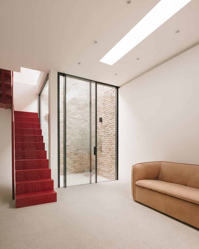
Tucked away on an unassuming street, within a quiet residential pocket off the beaten track in east London, Remi Connolly-Taylor’s first new build cuts a distinctly contemporary figure. Marking the end of a residential terrace, the bold structure feels at once modern and respectful to the low Victorian housing it sits next to. Maryland House, named after its namesake neighbourhood in Stratford, is a highly tailored live/work space, designed precisely for the needs of its dynamic creator and her young business. The site used to be a small, empty lot filled with rubbish and debris from surrounding construction. Now, it holds a two-level home with a studio on top, and is clad in London stock brick that mirrors the surrounding materials and colour tones of the neighbourhood’s mix of Victorian and post-war housing. With only 100 sq m of internal space, size played a key role in design decisions. ‘Maryland House was designed around what we could and couldn’t do,’ says Connolly-Taylor. Working with local manufacturers and craftsmen, the project developed into a jewel box of a home, ticking all the boxes for efficiency, functionality, spaciousness and a clean, fairly minimalist aesthetic.
The House Recast
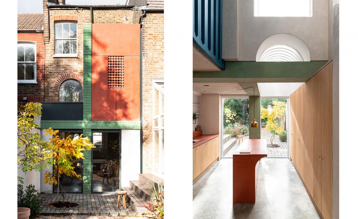
Studio Ben Allen’s House Recast has been crowned the overall winner at the ‘Don’t Move, Improve’ competition in London. The playfully colourful architecture of the home stood out to the judging panel from 22 shortlisted designs that celebrated home improvement and everyday, yet exceptional domestic design. The main prize is awarded following a string of announcements regarding sub-category wins, including gongs for working-from-home designs and unique character. Studio Ben Allen’s work topped the charts with a home that ‘pushes the boundaries of how homes can look and feel’, say the judges.
Mo-tel House by Office S&M
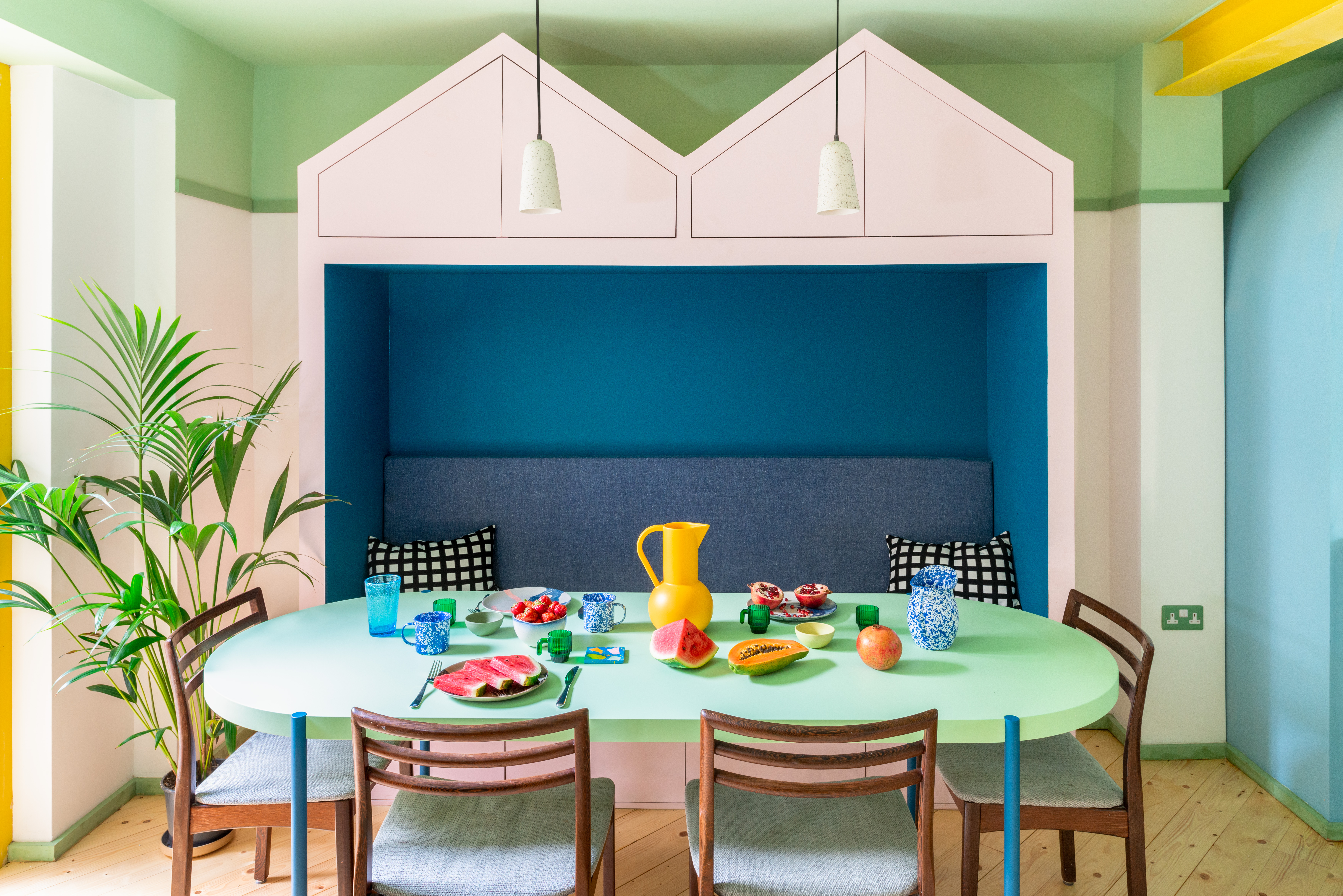
What started as a remodelling project of the lower ground floor of a Victorian townhouse in Islington, ended in an explotion of fun colour and shape in London's Mo-tel House by Office S&M. The owners were after a playful interior to brighten up their daily life and the young architecture studio obliged, creating a composition of bold colours. Block coloured surfaces and tinted mirrors make up a striking interior and gently distort perceptions of scale, giving the appearance of a space that is larger than it actually is. Built in furniture is especially designed to fit the concept and colour scheme. There are bespoke kitchen cabinets in shades of blue; a pink and dark blue bench as part of the dining area; a pink staircase ballustrade; and a light green ceiling running throughout.
Amott Road by Alexander Owen Architecture
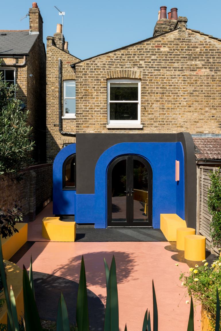
If the 2021 shortlist for ‘Don’t Move, Improve’ is anything to go by, then home improvements during a year of on-and-off lockdowns have resulted in a series of fun and playful projects. The coveted London-wide competition’s nominees have just been announced and it’s clear that colour is king and unexpected designs that bring a sense of lightness to the everyday have been the order of the day in the UK capital. A great example is this South London extension by emering local architecture studio Alexander Owen.
Wallpaper* Newsletter
Receive our daily digest of inspiration, escapism and design stories from around the world direct to your inbox.
Going bold
Villa Nilon
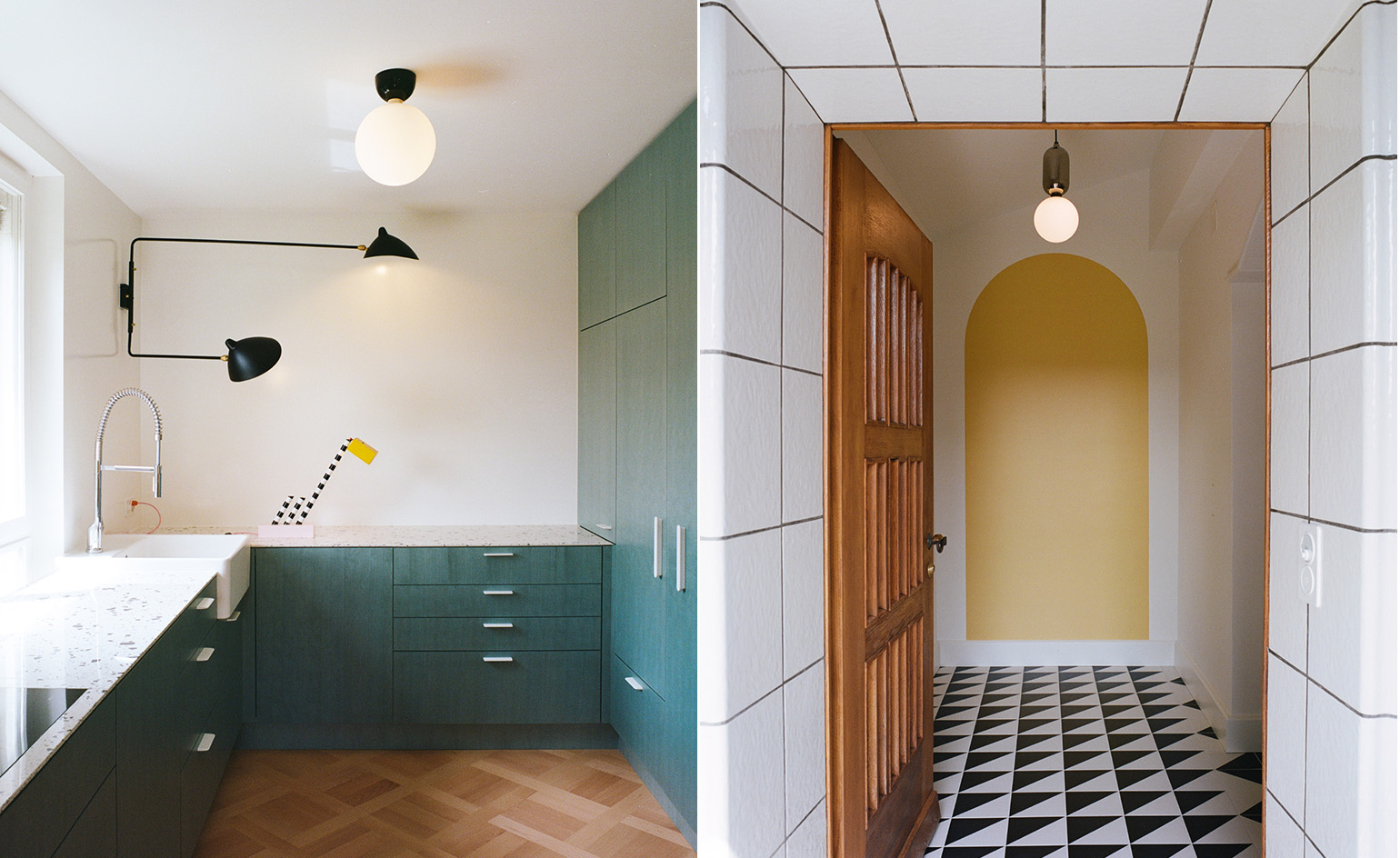
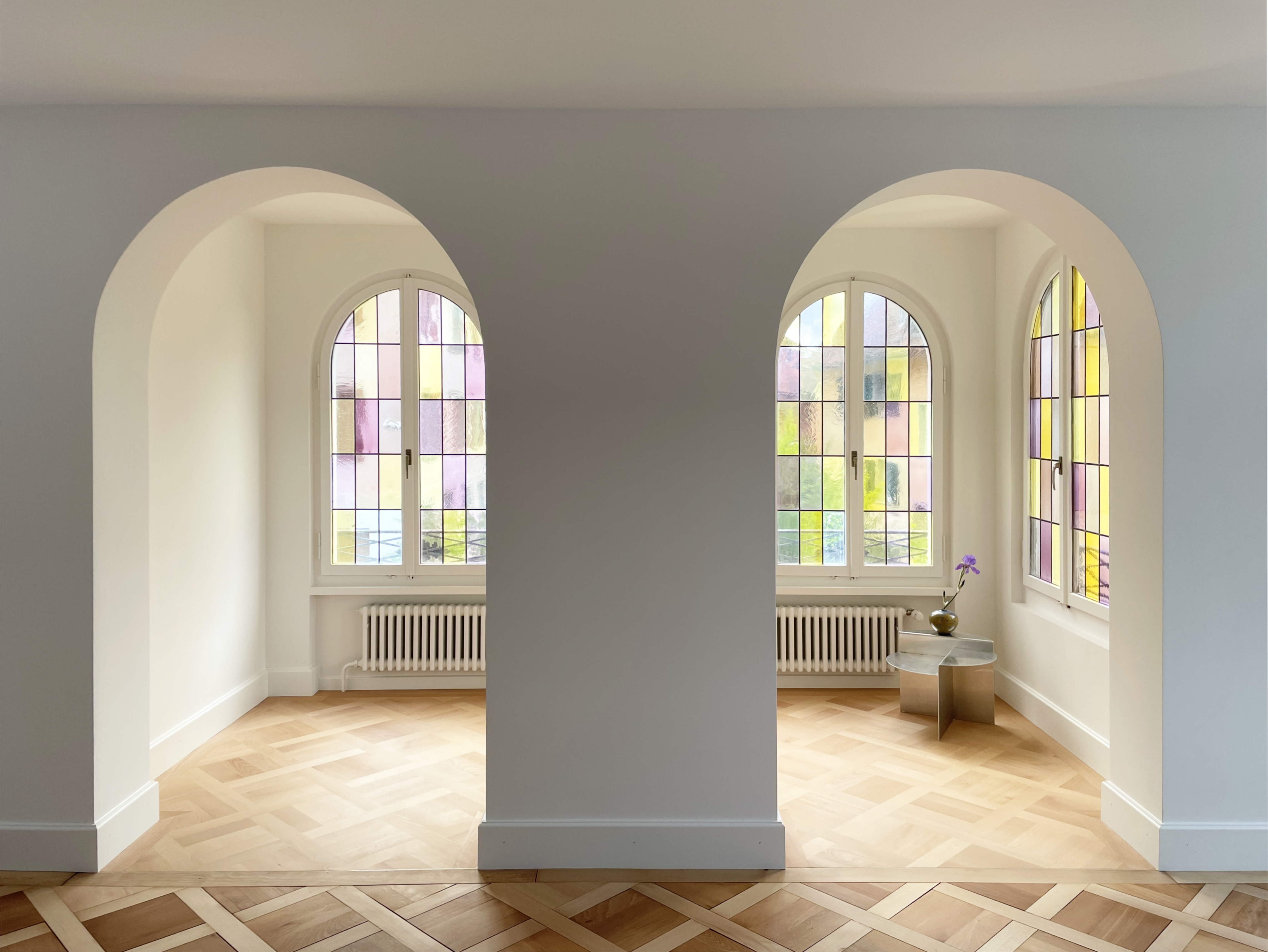
A historic 1923 villa in Zurich has been transformed with a splash of colour, courtesy of Swiss architecture studio ILAI. Playful and bold yellow and pink hues now adorn the bathrooms and hallways, along with monochrome patterned tiles, which cleverly offset and underline the colour choices. A bespoke green joinery kitchen brings joy to everyday cooking, while the house's original stained glass windows play a key role in the composition too. Adding colour is not the only thing the architects did in this contemporary redesign. Tearing down walls to open up the space, and inserting strategic openings helped create a sense of spatial generosity throughout, while flooding the interior with natural light. ‘Thanks to the clear graphic language of the architectural shapes and surface treatments, the villa has been given a playful character,' say the practice principals Iela Herrling and Adi Heusser.
The Blue Building by LOT
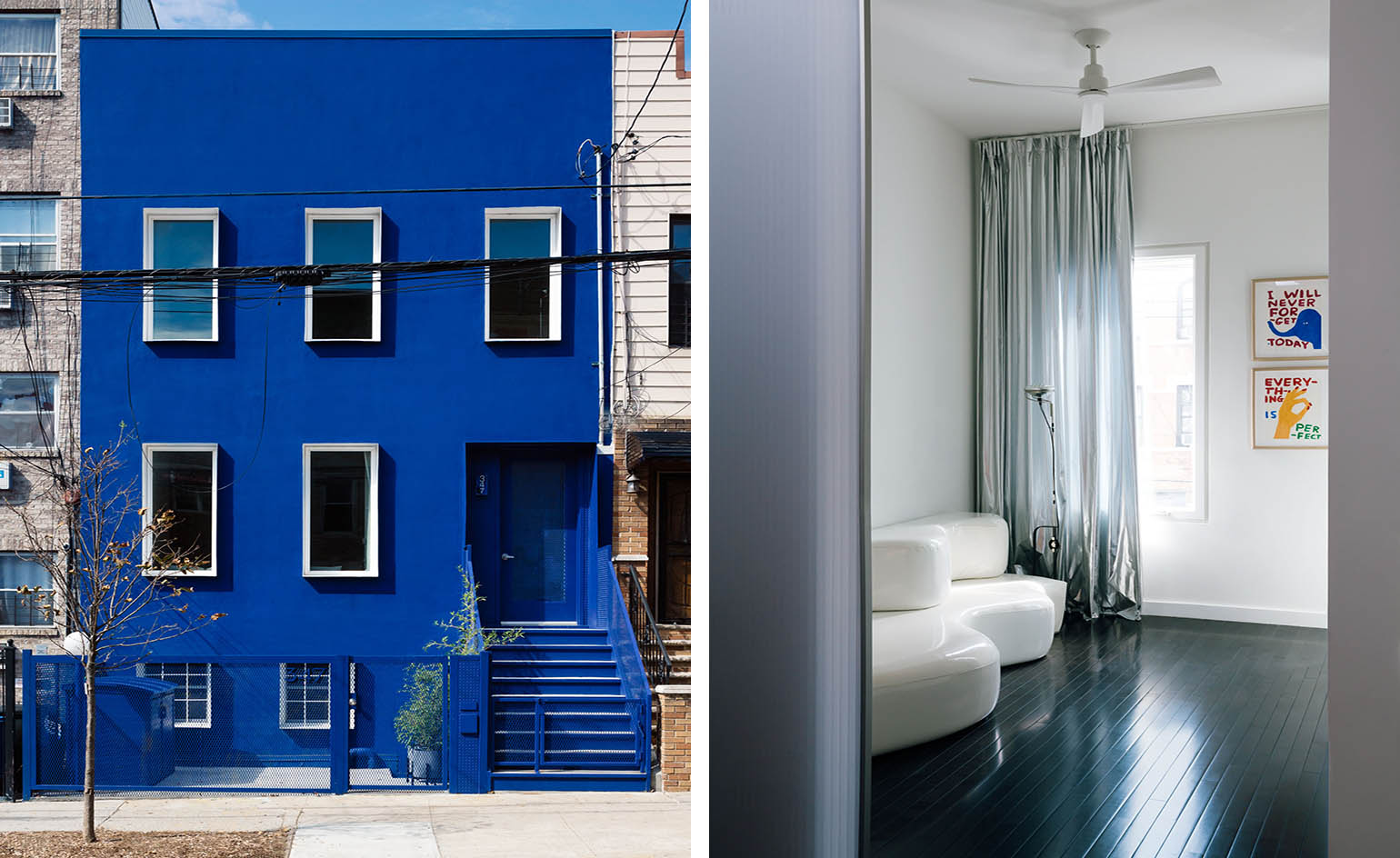
A commission for a private house for a pair of artists, The Blue House certainly stands out among its neighbours in Bushwick, Brooklyn. The brainchild of New York and Athens based architecture studio LOT, the home showcases how a fairly ‘typical' townhouse renovation can offer fertile ground for fun and experimentation. The architects painted the whole exterior a bold blue tone, drawing inspiration from their Formations design project, a series of ultramarine blue seating-scaled elements. Inside, colour remains a theme, albeit in gentler shades. Translucent, polycarbonate panels, black painted wooden floors, walls in white, light pink and green, compose a sophisticated interior that balances the building's strong outward statement.
Lover's House by Isla Architects
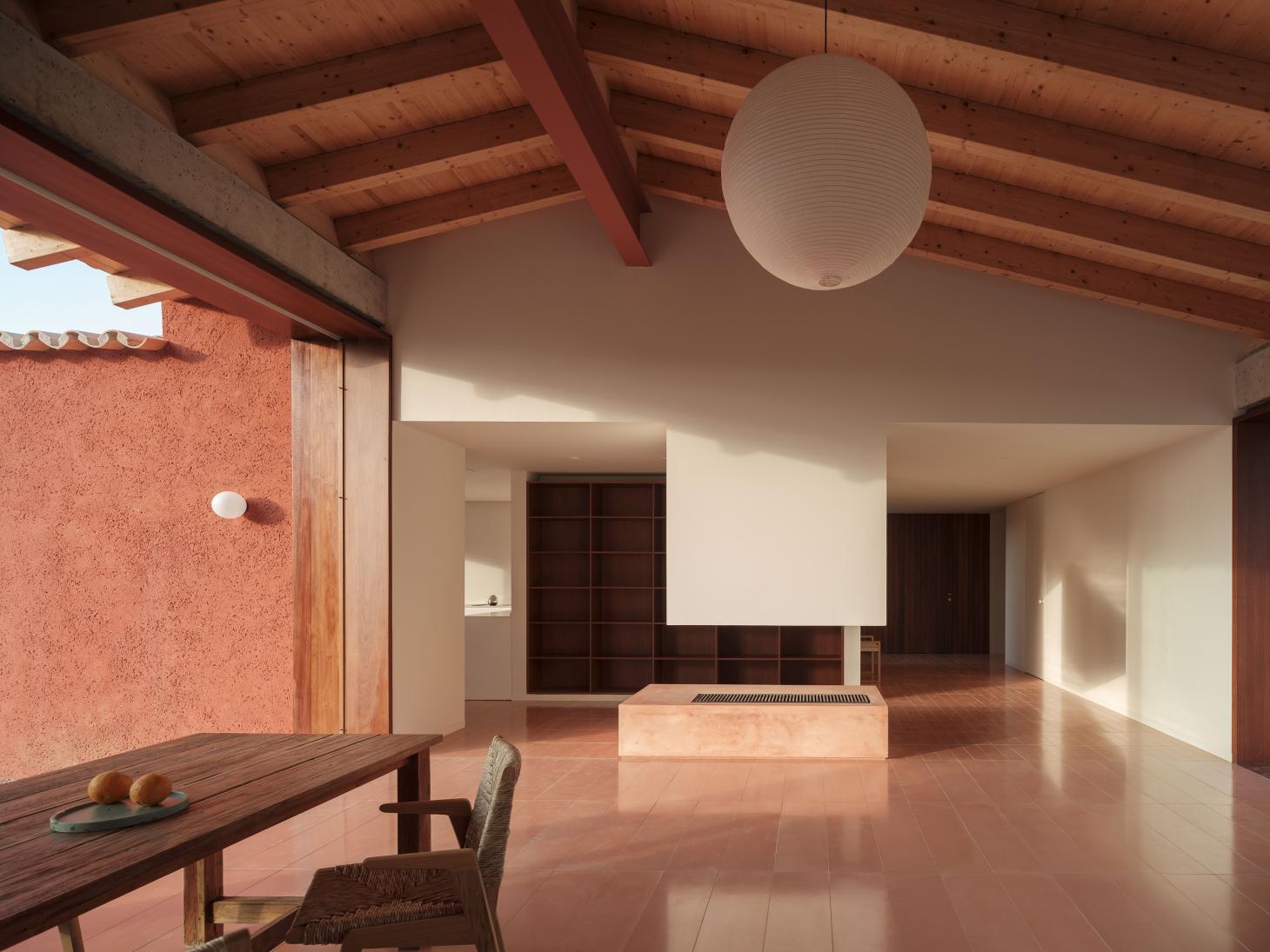
Briefed to create a home for a speculative resident that would immediately stand out in the local property market, Mallorca-based Isla Architects responded by drawing on the Balearic island’s warm climate, natural beauty and relaxed lifestyle, as well as Spain’s architectural heritage for inspiration. The result, named Lover’s House, sits in Santa Maria, in the heart of the island, and is a textured and colourful Mallorcan retreat. The structure’s warm terracota-pink colour (concrete tinted with a shade of red) is a defining element in the design. Reminiscent of the work of Mexican modernist Luis Barragán, known for his use of light and bold colour, often in compositions that feel tactile and close to earth, the house reads as at once textured and connected to the natural landscape around it, but also graphic and contemporary.
Mountain View House by CAN
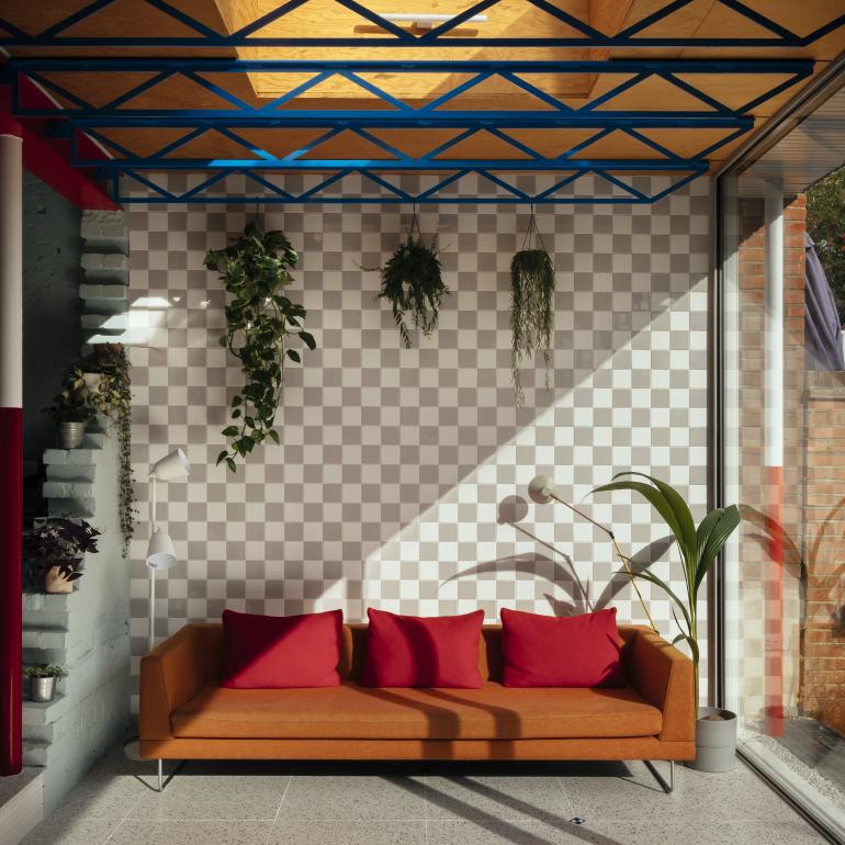
An Edwardian semi-detatched house in South London got a radical makeover, courtesy of architecture studio CAN. The project, playfully bringing together bold colours, unusual details and a staged mountain scenery top, belongs to practice founder Mat Barnes and his family of four; which made the daring decisions somewhat easier, even though, Barnes explains, ‘in a way my wife served the client role, tempering ideas that were too impractical or downright absurd.’ The architect drew on references such as the Hi-Tech style of Hopkins House and Dior’s 2015 Dior Musée Rodin show in Paris. He also further developed fascinations around thin frames and the scaffolding aesthetic he had previously explored in the practice’s Lomax Studio project. The rear extension’s mountain profile was employed to create a juxtaposition between the thin ground level frame and the heavier-seeming top. ‘This was designed to exaggerate the fragility of the structure by emphasising the weight of the roof,’ he says. ‘The mountain profile also worked compositionally with the existing house.’
The Andi
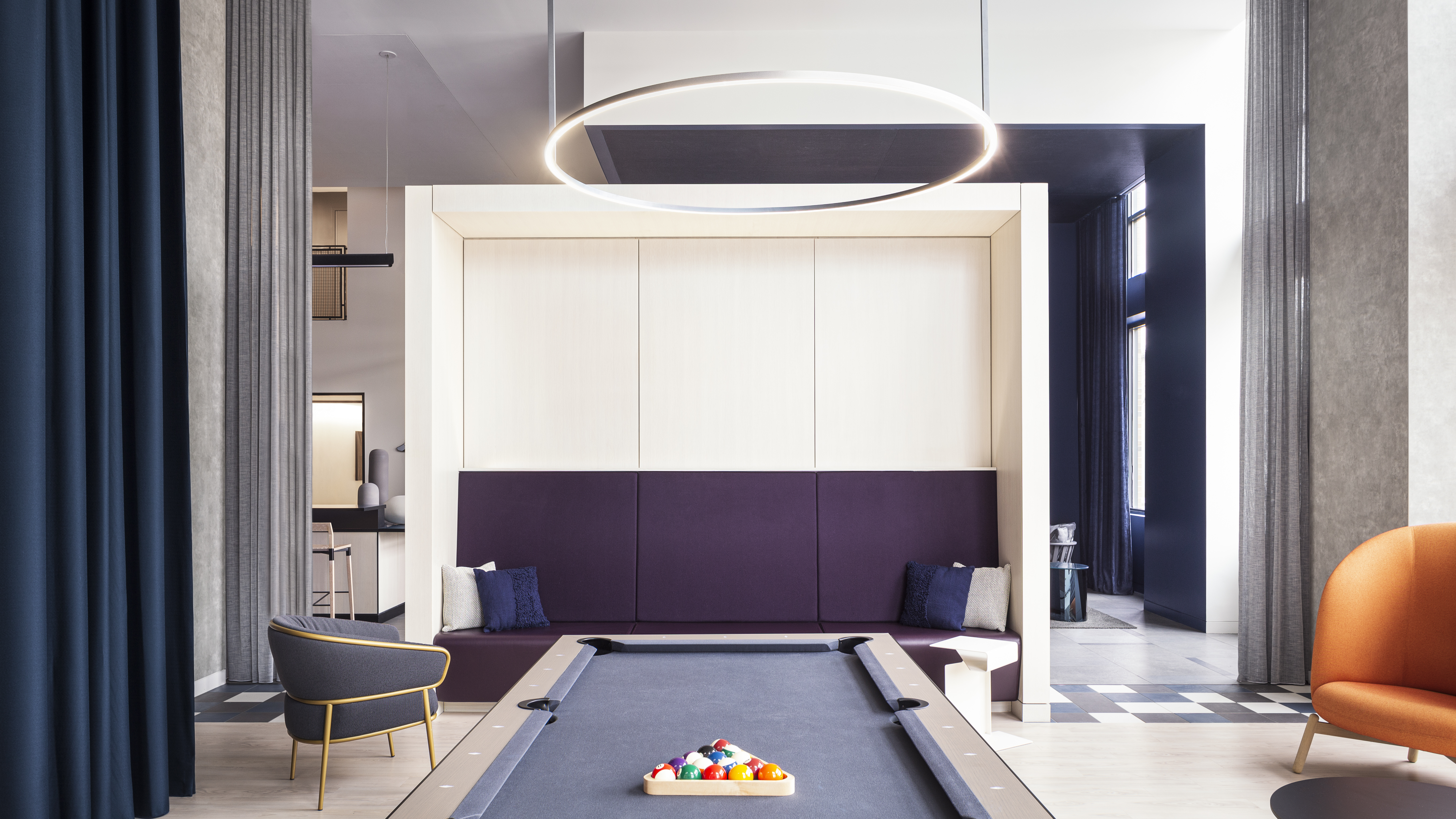
Bold coloured fabrics add character and vibrancy to this minimalist concrete apartment interior in Boston’s South Bay. Set within The Andi, a multi-family residential scheme. the space was completely reimagined by Patrick Planeta of the Planeta Design Group. Apart from providing a dramatic backdrop, the soaring blue drapes for example, add an architectural touch by creating a private space where residents can use as intimate “pods” for gaming, dining, or chatting. Strong colour is showcased elsewhere too. 'Saffron-colored lighting, and furnishings in hues of blue, purple and orange add pops of color throughout, while curated artworks in complimentary colors adorn the walls, adding to the space’s concept and color scheme,' the design team explains.
Project Hereward
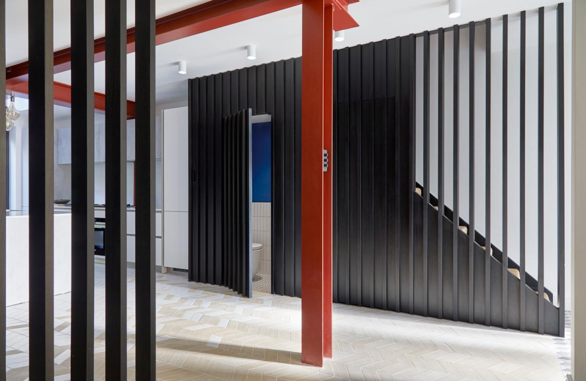
This small project packs quite a punch. Designed by London architecture practice Studio VA, a fairly compact and straightforward home renovation resulted in a rather impactful design with the right blend of colour, sleek lines and an industrial material palette. The scheme is called Project Hereward, and its design solution showcases how balancing old and new on the small scale can be just as rewarding as the larger projects. The commission came to the young studio, headed by architect Akis Pattihis, from a couple who were after their ‘forever home’. ‘They put a lot of trust in me and the design, to offer them something which is really very different to what they had initially considered they wanted,’ the architect recalls. ‘They had faith in the design and now I am sure they are very thrilled with the final outcome.’ Read More
Pastels
AR Residence by Dedraft
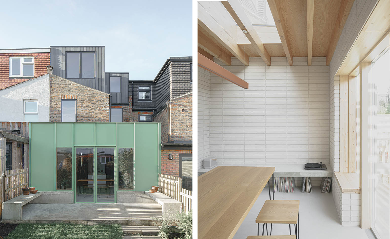
East London architects Dedraft have completed an avocado green extension in a Walthamstow home. The volume is part of the redesign of a typical terraced house for an illustrator and a librarian. The clients were keen to use bold colour and have plenty of natural light inside, and the architects responded with a matte, dusty green aluminium panelled addition. This houses an interior that uses grey concrete floor tiles, natural pine, Corian worktops and pale grey, stack-bonded, sand-blaster blockwork on the walls. More muted interior tones make for a versatile environment. However, brighter colours do pop up inside too, for example in the family bathroom's green porcelain tiles and black hardware.
Upper Wimpole by Jonathan Tuckey Design
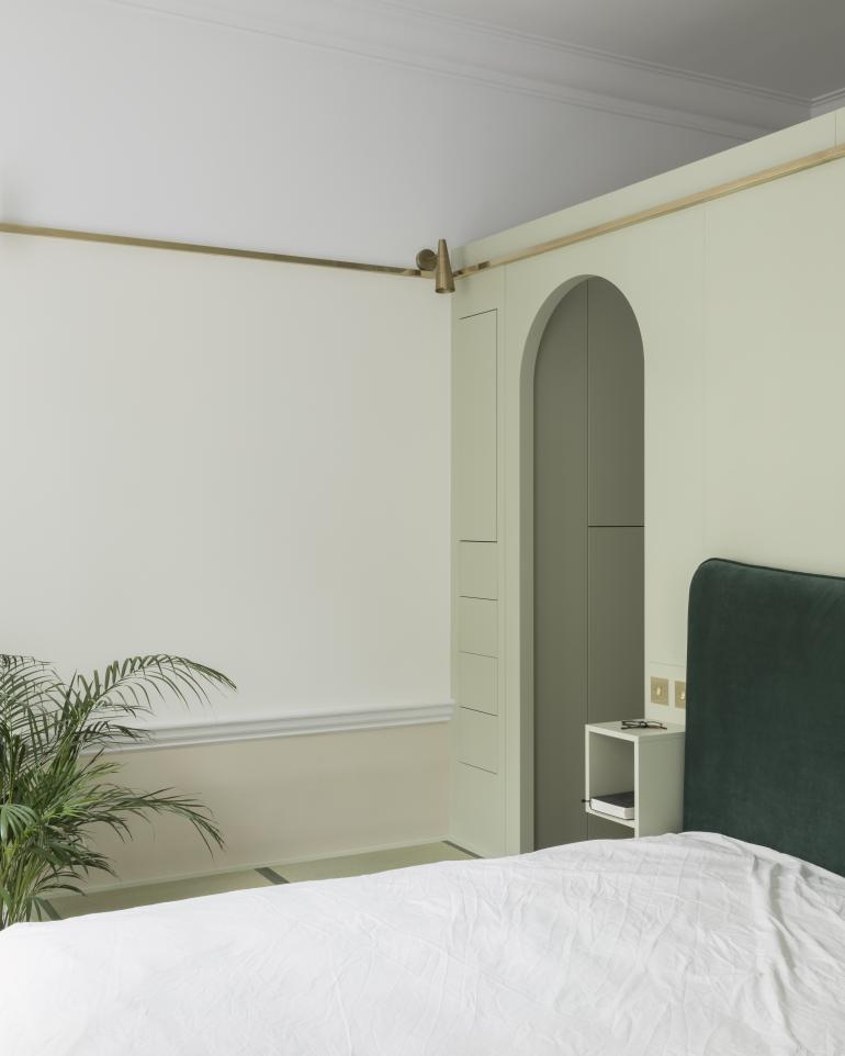
Renovation and conversion expert Jonathan Tuckey's latest home interior design, a house improvement in central London’s Wimpole Street, brings together the Italian Renaissance, John Soane’s Bank of England, Louis Kahn, Regency styles and British castles. Tuckey’s concept consisted of a series of refined, craft-rich joinery elements, which would appear in different rooms and unite the interior with a coherent single approach – at the same time differentiating each room through the colour and type of joinery, giving each space its own identity. The design proposal had roots in the owner’s brief and functional requirements for storage and the need to subdivide certain spaces.
Monon Guesthouse
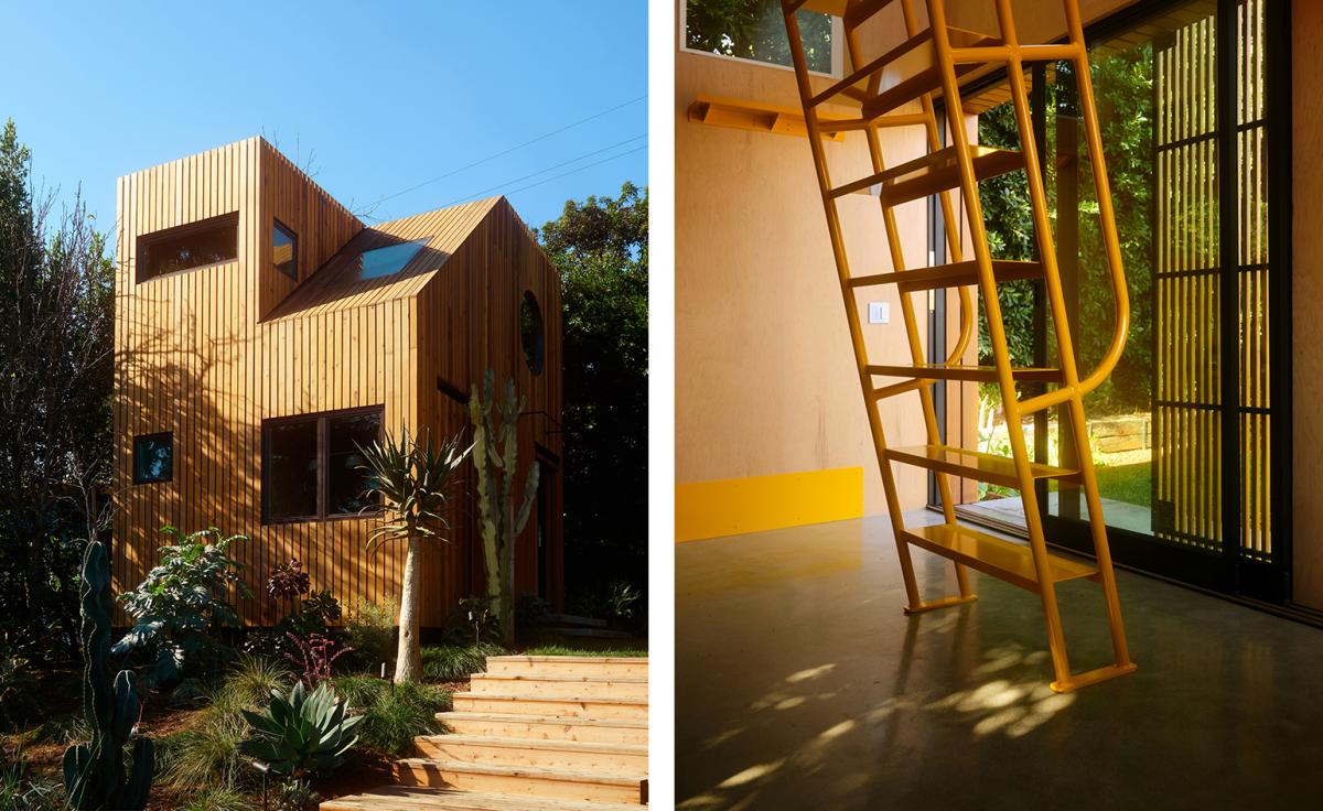
A curious wooden structure has emerged in a back garden in the Los Angeles neighbourhood of Los Feliz. Nestled behind a hillside property, this is Monon Guesthouse, the latest work by Californian architectural designer Jerome Byron; and its unusual appearance and architectural folly-like, pavillion nature was not a coincidence. ‘As a commission, the guest house was meant to spark creativity and imagination for both the husband and wife, an entrepreneur and writer, and their two young children,’ explains Byron. The guesthouse, spanning two levels and some 245 sq ft, now sits among rich foliage in a finely landscaped architectural garden. The levels, pathways and planting were designed by LA office Terremoto, who came into the site first, reimaginging it with a wild and graphic garden of cacti and grasses. The small cabin-like addition was going to be added among this natural environment.
Albion Street
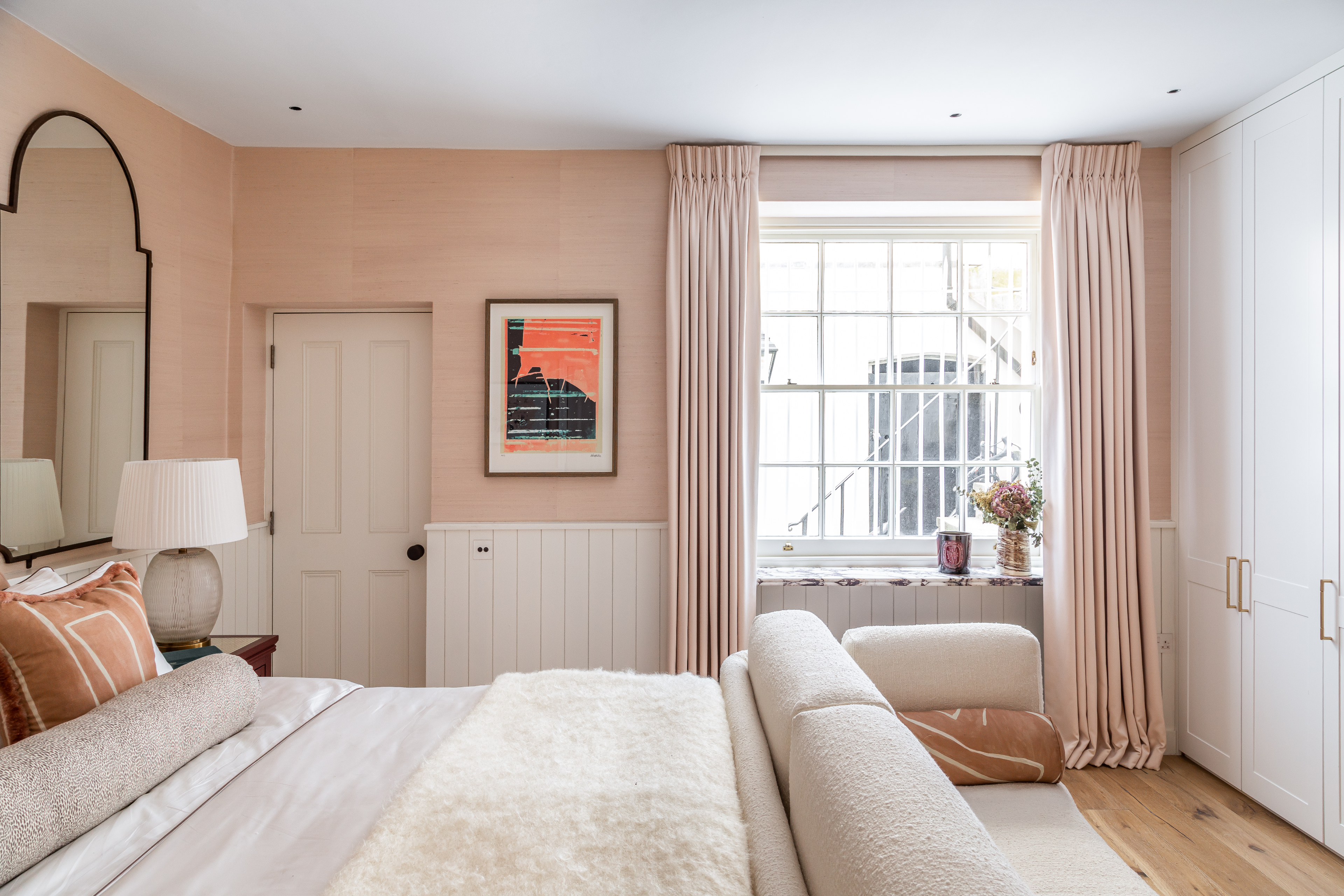
Created for two owners who combine Swedish and English heritage, this home is a masterful mix of heritage elements and contemporary notes, wrapped up in a chic, pastel colour palette. Located in London, the project has been composed by design studio Barlow & Barlow. Creative Director Lucy Barlow often works with colour and pattern - some times bold, others subtle - to craft modern spaces that stand out and this scheme is no exception. The home here hosts a generous four bedrooms, living spaces as well as a family cinema room and conservatory.
Ellie Stathaki is the Architecture & Environment Director at Wallpaper*. She trained as an architect at the Aristotle University of Thessaloniki in Greece and studied architectural history at the Bartlett in London. Now an established journalist, she has been a member of the Wallpaper* team since 2006, visiting buildings across the globe and interviewing leading architects such as Tadao Ando and Rem Koolhaas. Ellie has also taken part in judging panels, moderated events, curated shows and contributed in books, such as The Contemporary House (Thames & Hudson, 2018), Glenn Sestig Architecture Diary (2020) and House London (2022).
-
 Put these emerging artists on your radar
This crop of six new talents is poised to shake up the art world. Get to know them now
By Tianna Williams
-
 Dining at Pyrá feels like a Mediterranean kiss on both cheeks
Designed by House of Dré, this Lonsdale Road addition dishes up an enticing fusion of Greek and Spanish cooking
By Sofia de la Cruz
-
 Creased, crumpled: S/S 2025 menswear is about clothes that have ‘lived a life’
The S/S 2025 menswear collections see designers embrace the creased and the crumpled, conjuring a mood of laidback languor that ran through the season – captured here by photographer Steve Harnacke and stylist Nicola Neri for Wallpaper*
By Jack Moss
-
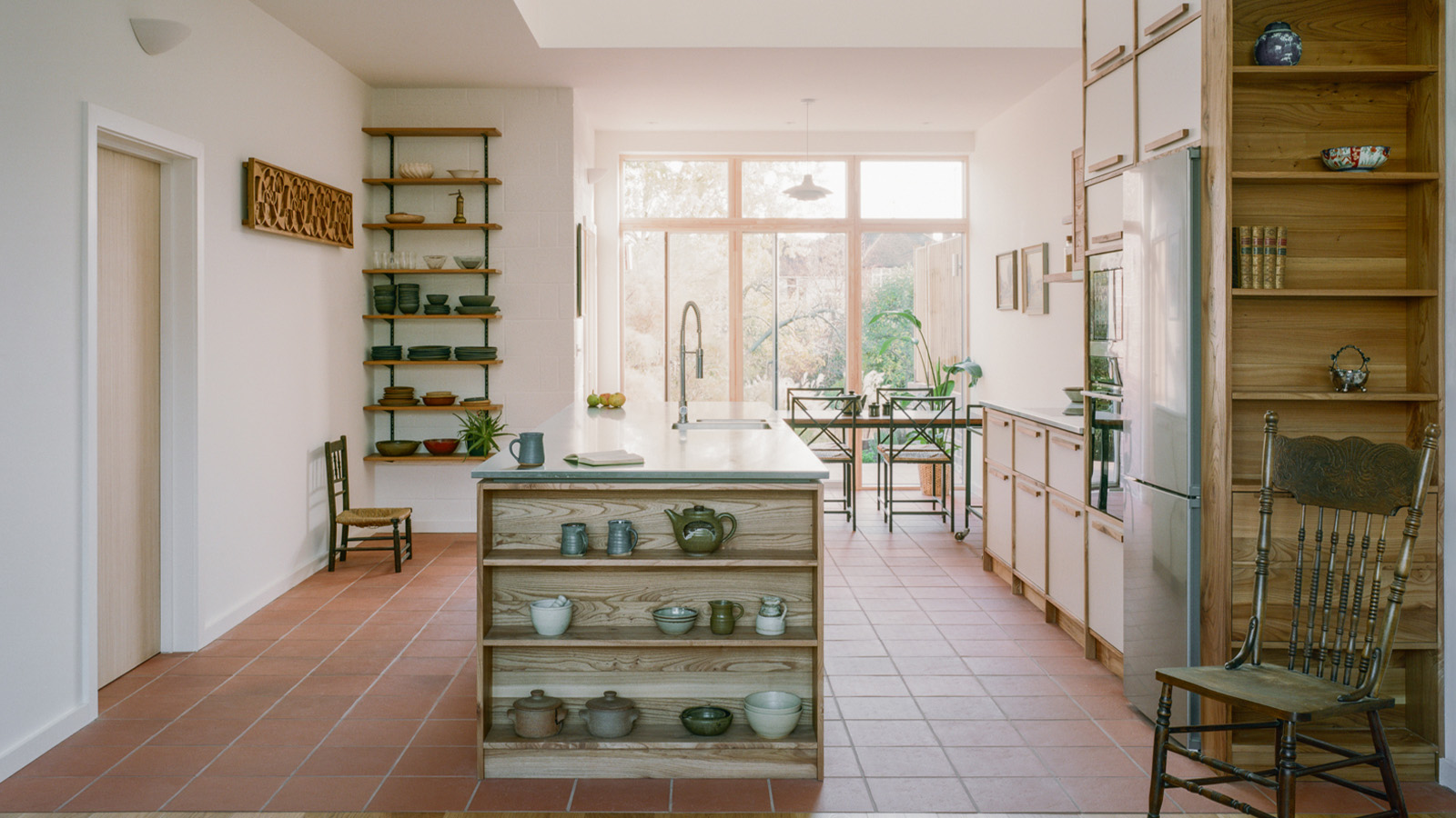 An octogenarian’s north London home is bold with utilitarian authenticity
Woodbury residence is a north London home by Of Architecture, inspired by 20th-century design and rooted in functionality
By Tianna Williams
-
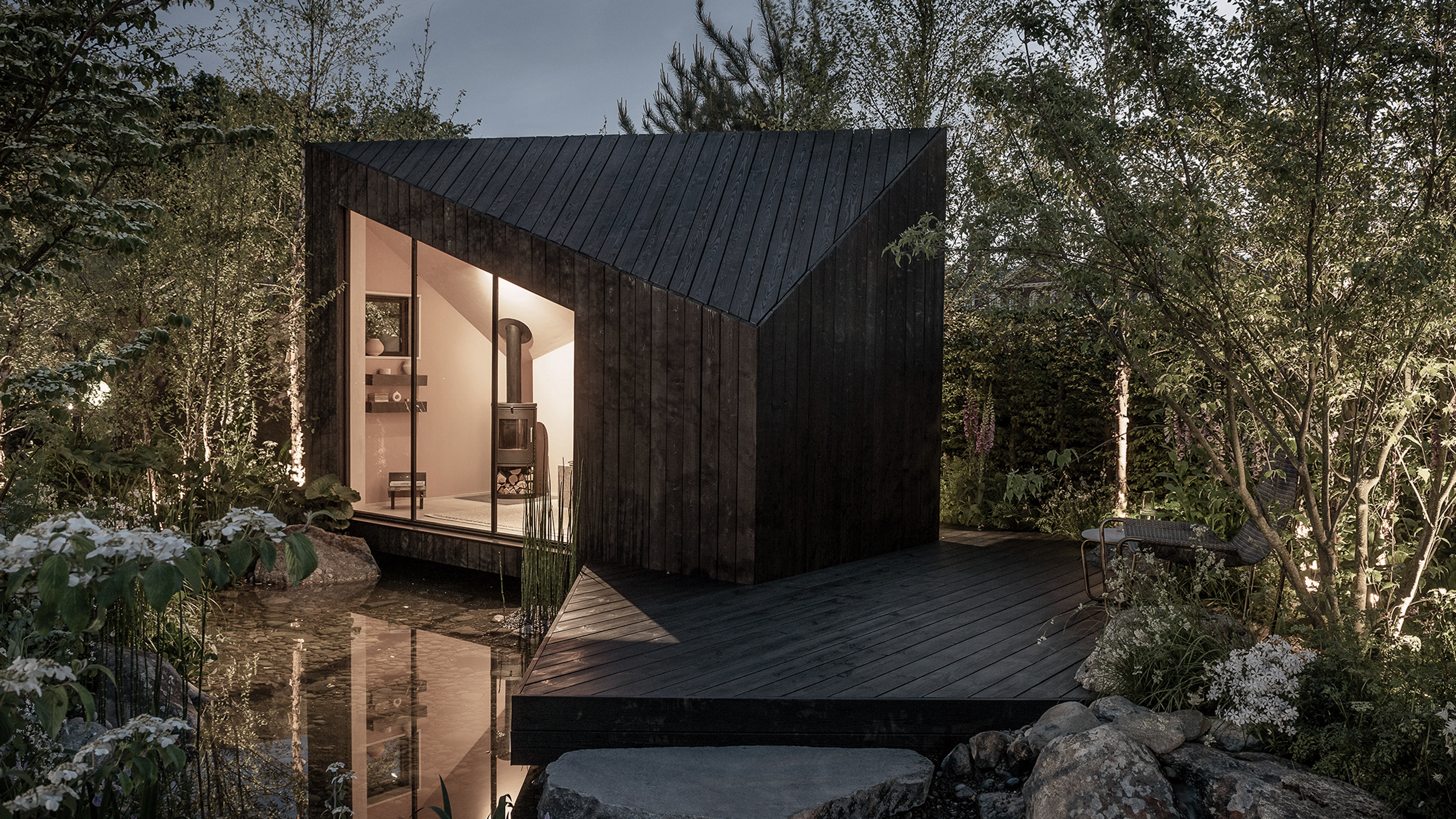 The dream of the flat-pack home continues with this elegant modular cabin design from Koto
The Niwa modular cabin series by UK-based Koto architects offers a range of elegant retreats, designed for easy installation and a variety of uses
By Jonathan Bell
-
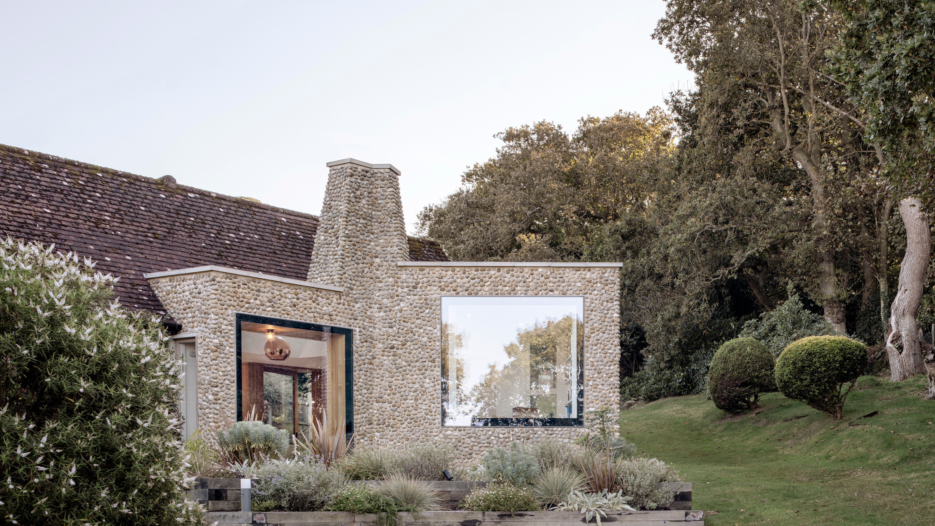 A Norfolk bungalow has been transformed through a deft sculptural remodelling
North Sea East Wood is the radical overhaul of a Norfolk bungalow, designed to open up the property to sea and garden views
By Jonathan Bell
-
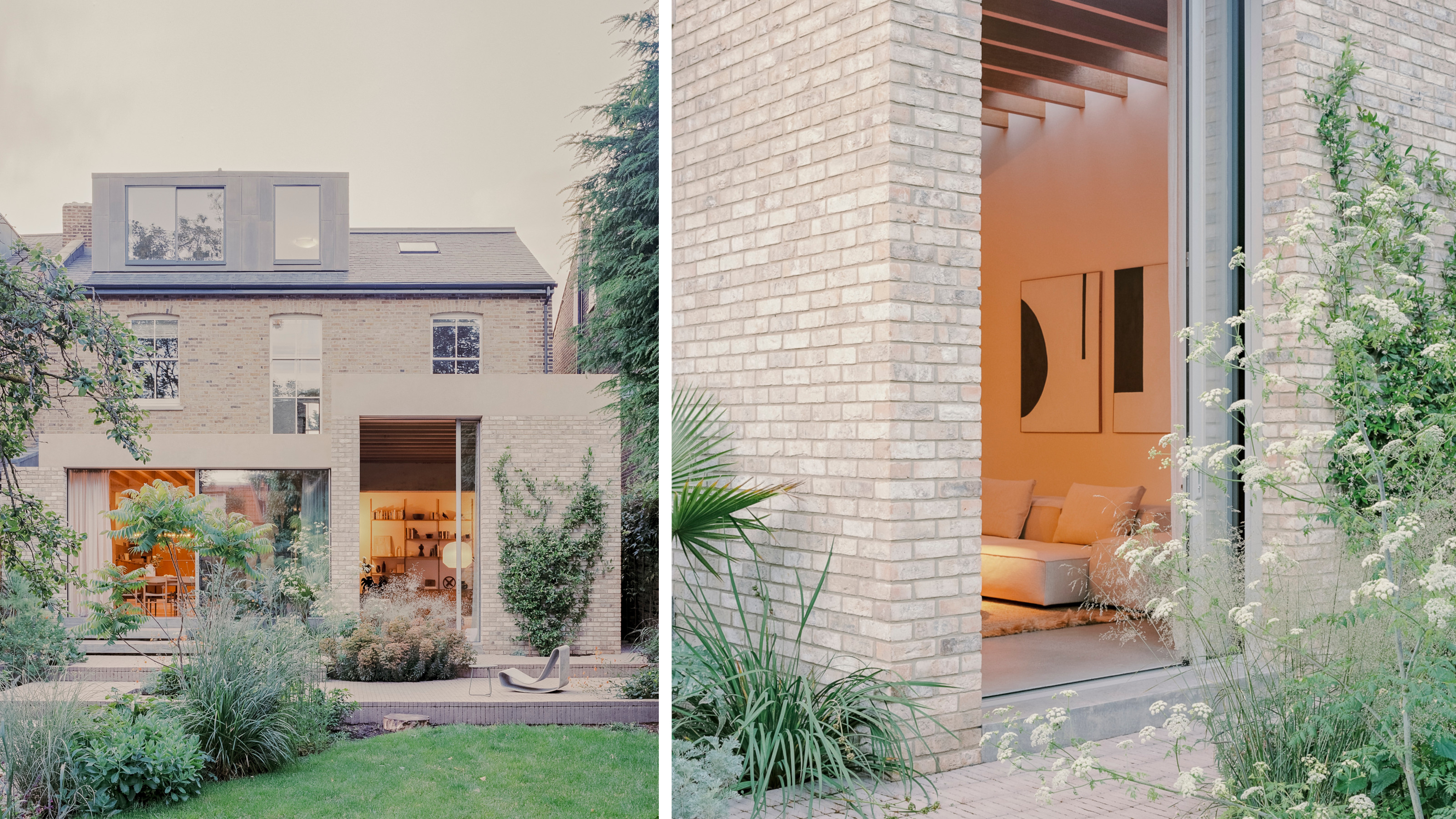 A new concrete extension opens up this Stoke Newington house to its garden
Architects Bindloss Dawes' concrete extension has brought a considered material palette to this elegant Victorian family house
By Jonathan Bell
-
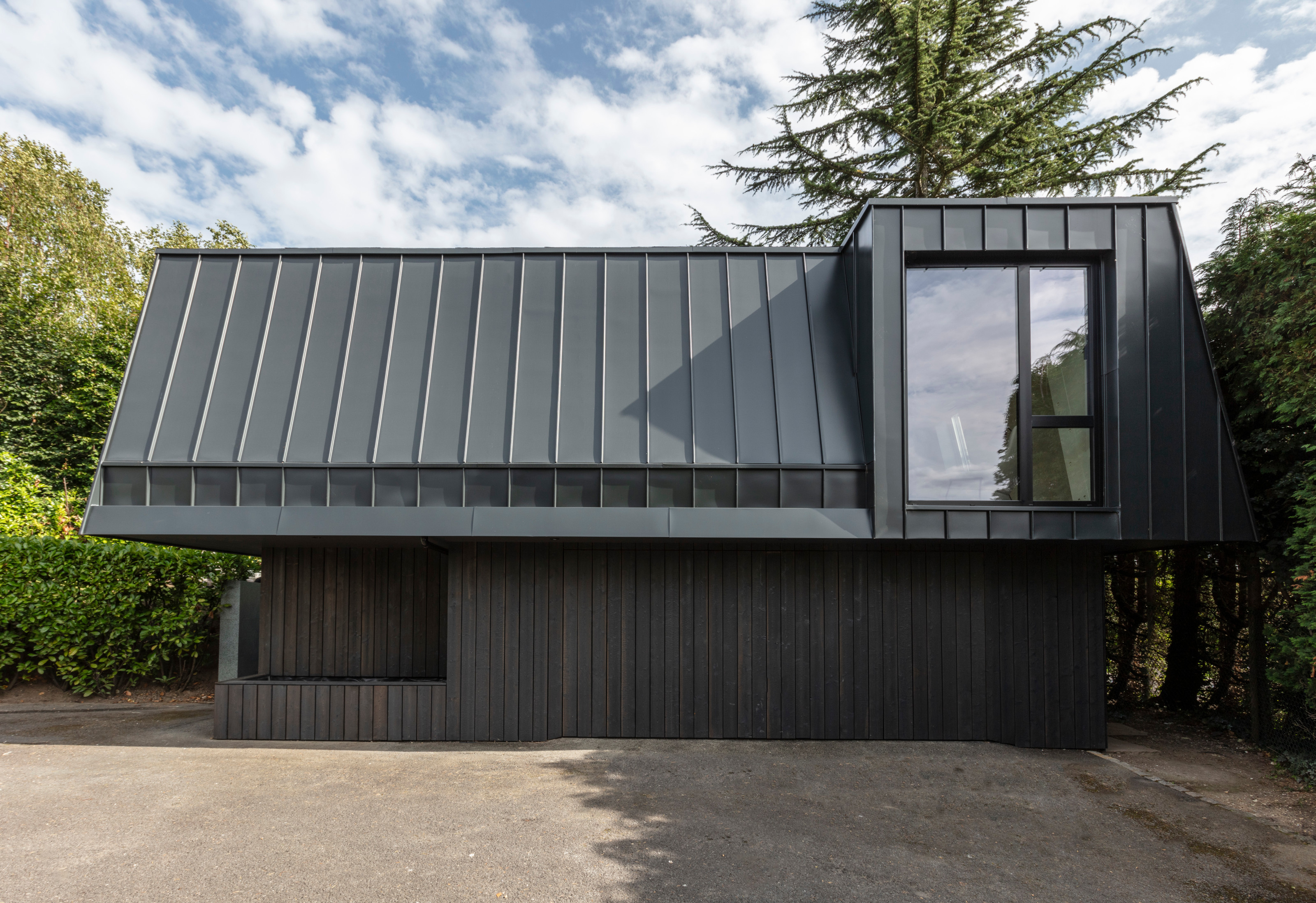 A former garage is transformed into a compact but multifunctional space
A multifunctional, compact house by Francesco Pierazzi is created through a unique spatial arrangement in the heart of the Surrey countryside
By Jonathan Bell
-
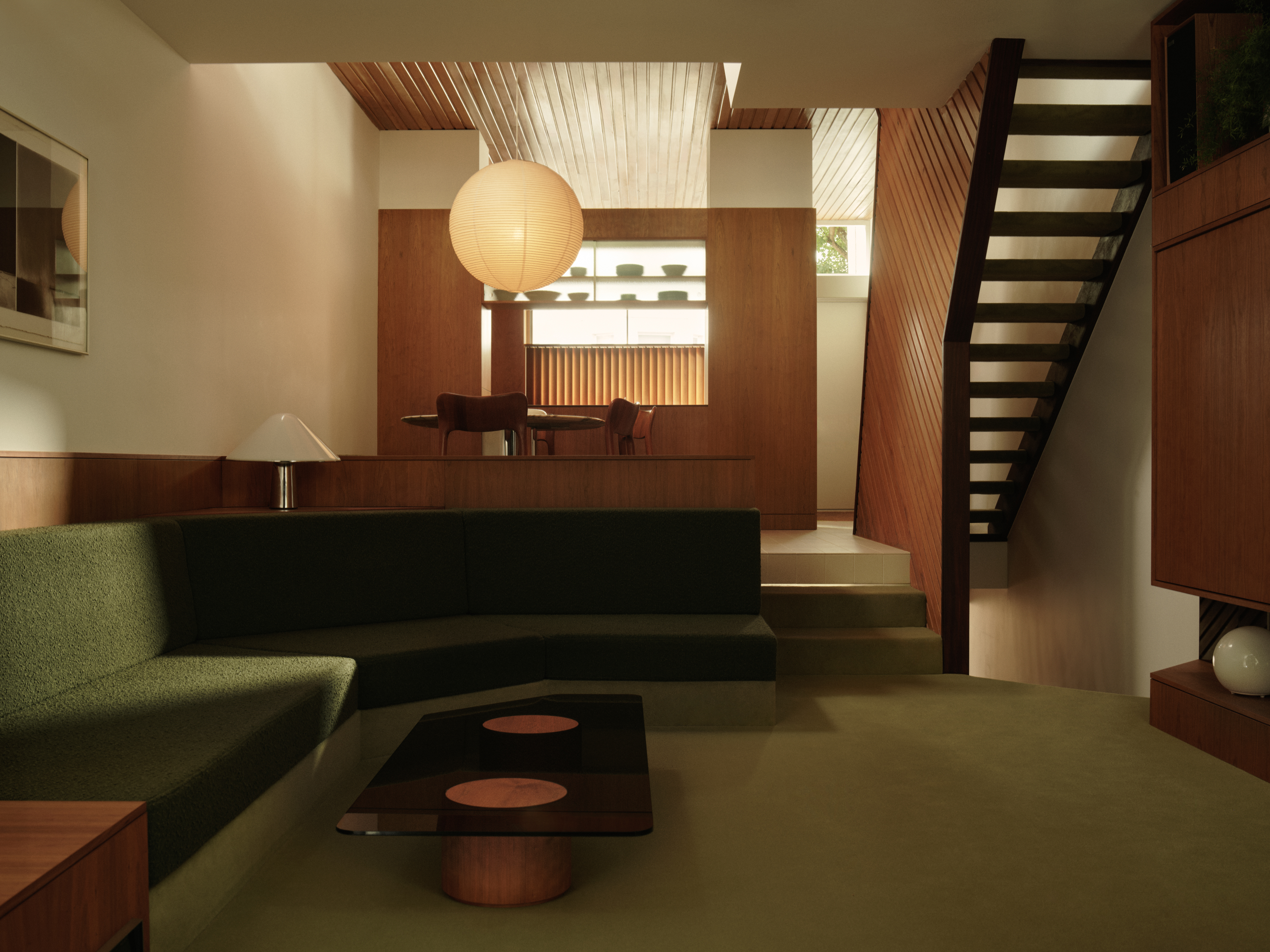 A 1960s North London townhouse deftly makes the transition to the 21st Century
Thanks to a sensitive redesign by Studio Hagen Hall, this midcentury gem in Hampstead is now a sustainable powerhouse.
By Ellie Stathaki
-
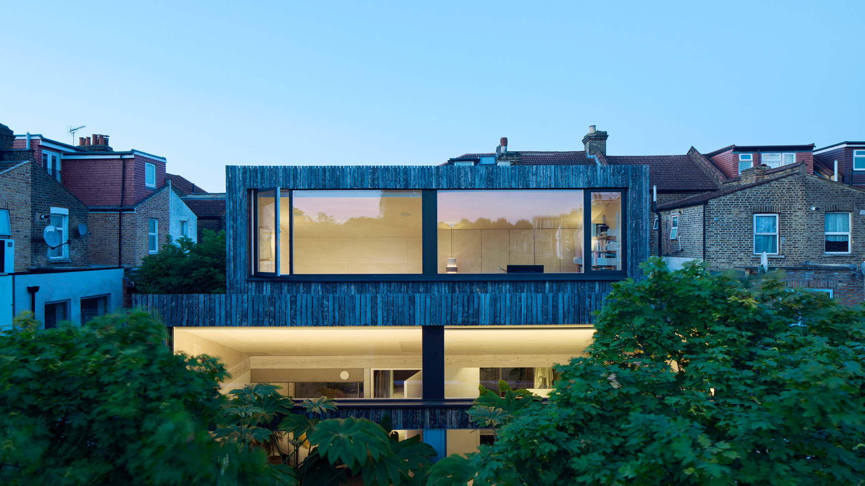 An architect’s own home offers a refined and leafy retreat from its East London surroundings
Studioshaw has completed a courtyard house in amongst a cluster of traditional terraced houses, harnessing the sun and plenty of greenery to bolster privacy and warmth
By Jonathan Bell
-
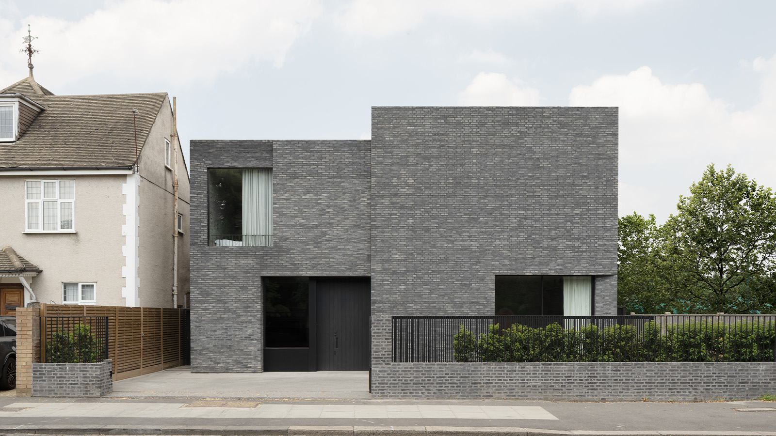 'Bold and unapologetic', this contemporary Wimbledon home replaces a 1970s house on site
This grey-brick Wimbledon home by McLaren Excell is a pairing of brick and concrete, designed to be mysterious
By Tianna Williams