Food for thought: the best pavilions of Expo Milan 2015
Receive our daily digest of inspiration, escapism and design stories from around the world direct to your inbox.
You are now subscribed
Your newsletter sign-up was successful
Want to add more newsletters?
The global architectural extravaganza that is the World Expo is once again upon us and it is Milan's turn to play host.
The original master-planners, a team that included Swiss architects Jacques Herzog and Pierre de Meuron, walked out in 2011 after their vision for a new typology of the Expo, one based on content rather than the individualist (and often propagandist) architecture of national pavilions, was rejected by the organisers.
The results - despite much decried construction delays and other colourful scandals - were in turn demented, elegant, garish and at times audacious; a sort of global Eurovision song contest in building form. Often the exhibition's avowed theme, Feeding the Planet - Energy for Life, seemed merely an excuse to have a restaurant outlet and/or a shop selling national produce.
Standout designs were few and far between, though the pavilions of Bahrain and UK alone did much to restore the faith. The former was a rich collection of fragrant walled fruit gardens intersected by roofed exhibition areas that provided moments of mystery, surprise and release. Entirely made out of 350 curved and straight prefabricated concrete panels, it will be disassembled and shipped to Bahrain for a second life as a botanical garden.
The latter tackled the exhibition's theme head-on by creating a small oasis that celebrated the very necessary toils and endeavours of bees in global food production. The climax was a metaphorical hive made out of 169,000 aluminium components and LED light fittings that sparkled and pulsated according to the activity of a real hive in Nottingham.
In some cases the architecture was not aesthetically pleasing but the concept was strong. Switzerland's pavilion resembled a supermarket depot, with four towers filled with products abundant in the country - coffee, water, apples and salt (who knew?). Visitors were allowed to take as much of each item as they wanted. 'When the food runs out, it runs out,' said a young woman dramatically as people walked in. 'The life of these towers is in your hands.' The structure is designed to come down floor-by-floor as the food is consumed. The underlying idea was neat and thought-provoking: if we all consume in moderation there's enough for everybody. If we don't, well… you get the picture.
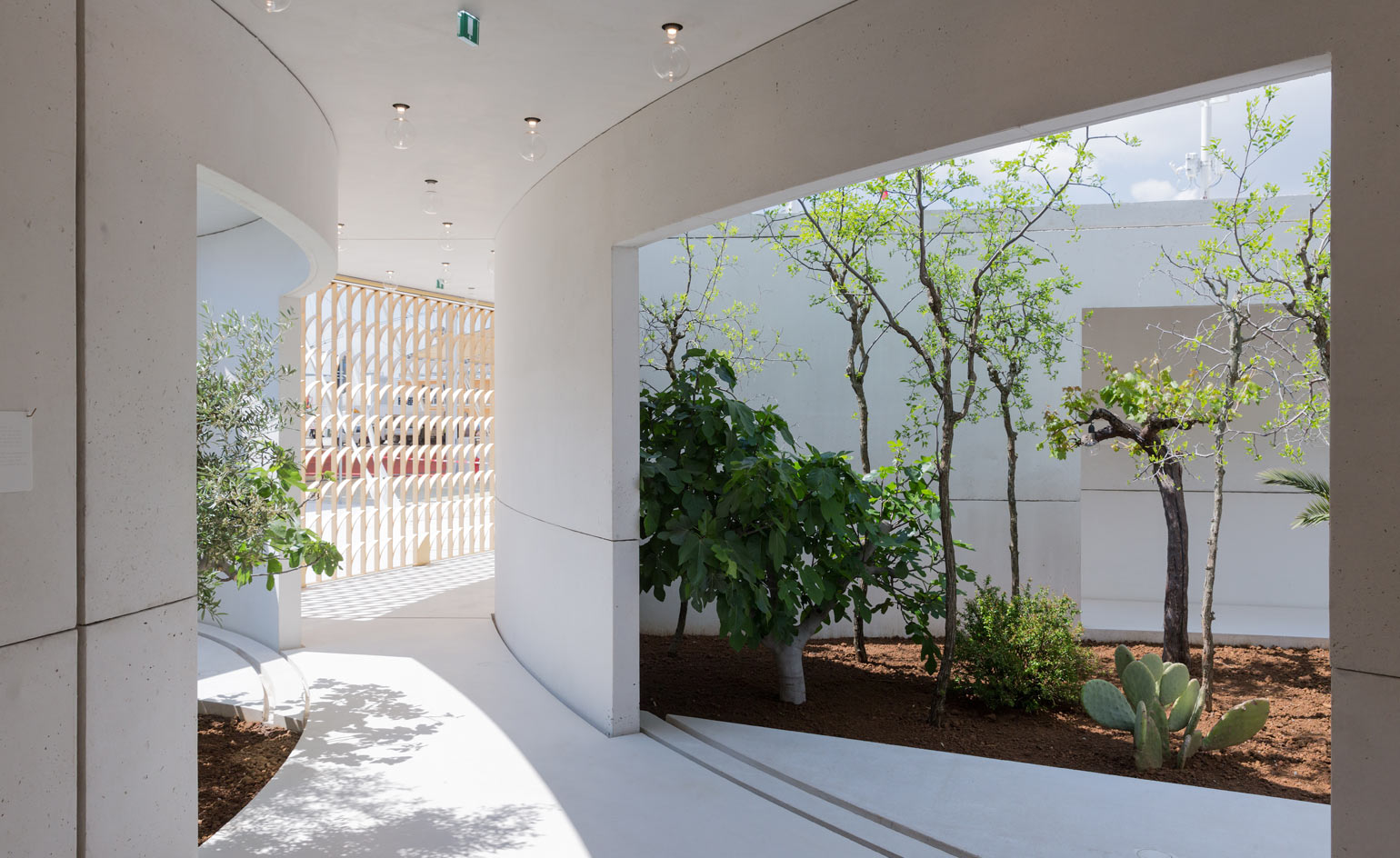
Bahrain: ‘Archaeologies of Green’ The distinctive white curving walls of Bahrain’s Expo Pavilion shelter a continuous landscape of gardens, each section containing a particular fruit tree native to the country. Designed by Anne Holtrop, in collaboration with landscape architect Anouk Vogel, the pavilion pays homage to a rich agrarian past, and exhibits the archaeological heritage of this wealthy, ancient land.
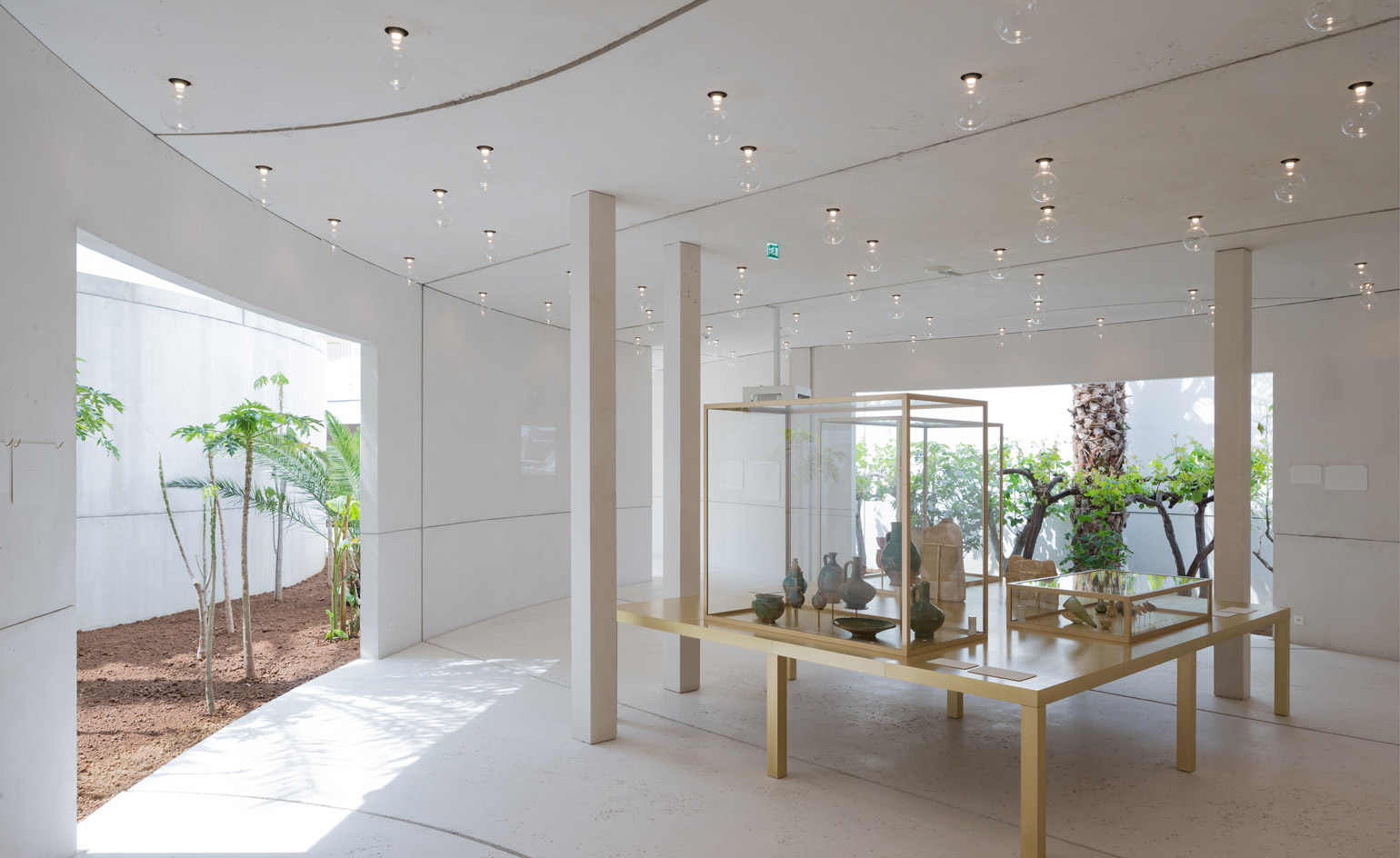
Pre-fabricated concrete panels - manufactured by Italian firm Magnetti – form the shell of the scheme, shaping closed volumes within the garden.
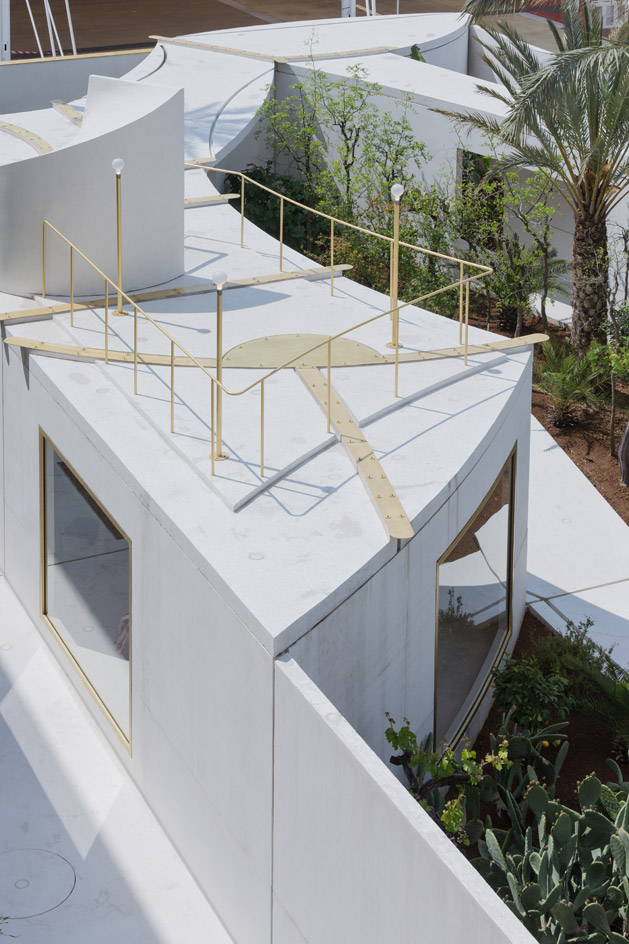
This enables easy disassembly in order to relocate the structure to Bahrain after the Expo finishes, where it will become a botanical garden.
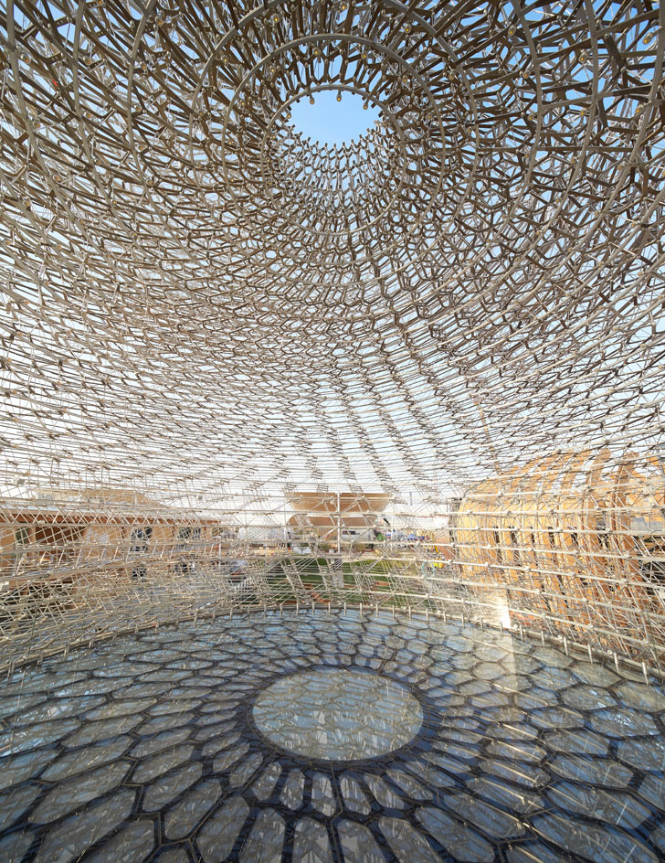
United Kingdom: ‘Grown in Britain: Shared Globally’ Artist Wolfgang Buttress teamed up with BDP for the 2015 UK Pavilion which focuses on the life of the honeybee and mankind’s dependence on these small stripy insects. Photography: Hufton + Crow / Courtesy of UKTI
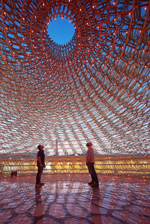
The exhibition conveys how bees are directly and indirectly responsible for one third of every mouthful of food consumed. Courtesy of UKTI
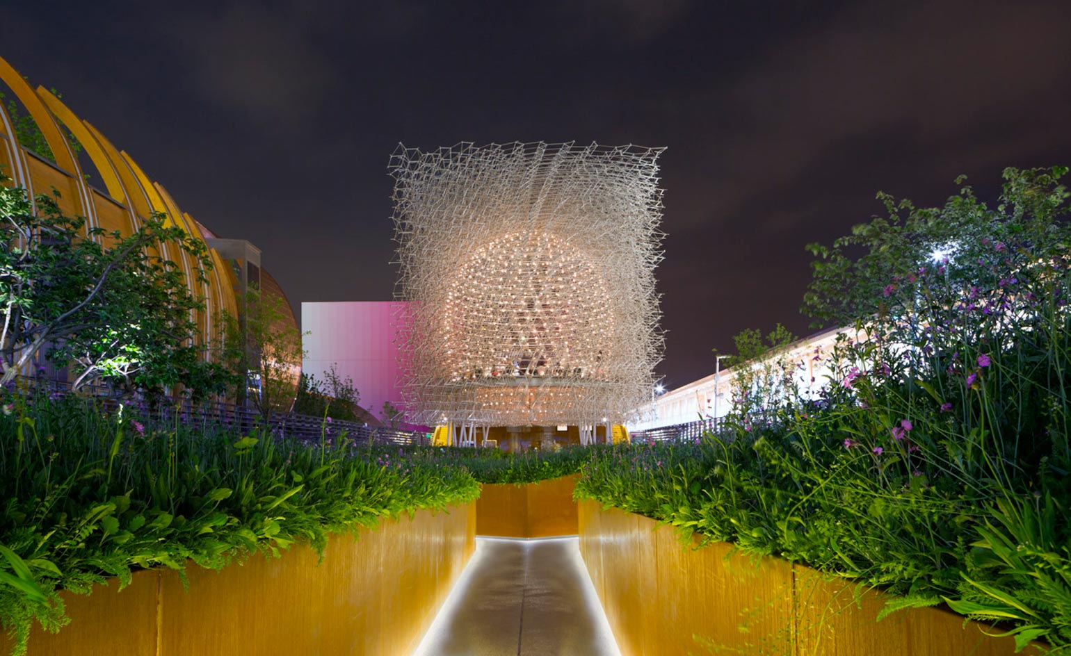
Taking the form of a quintessential British flower meadow, the proposal interprets a journey towards the central ‘beehive’, replicating the flight of a bee.
Receive our daily digest of inspiration, escapism and design stories from around the world direct to your inbox.
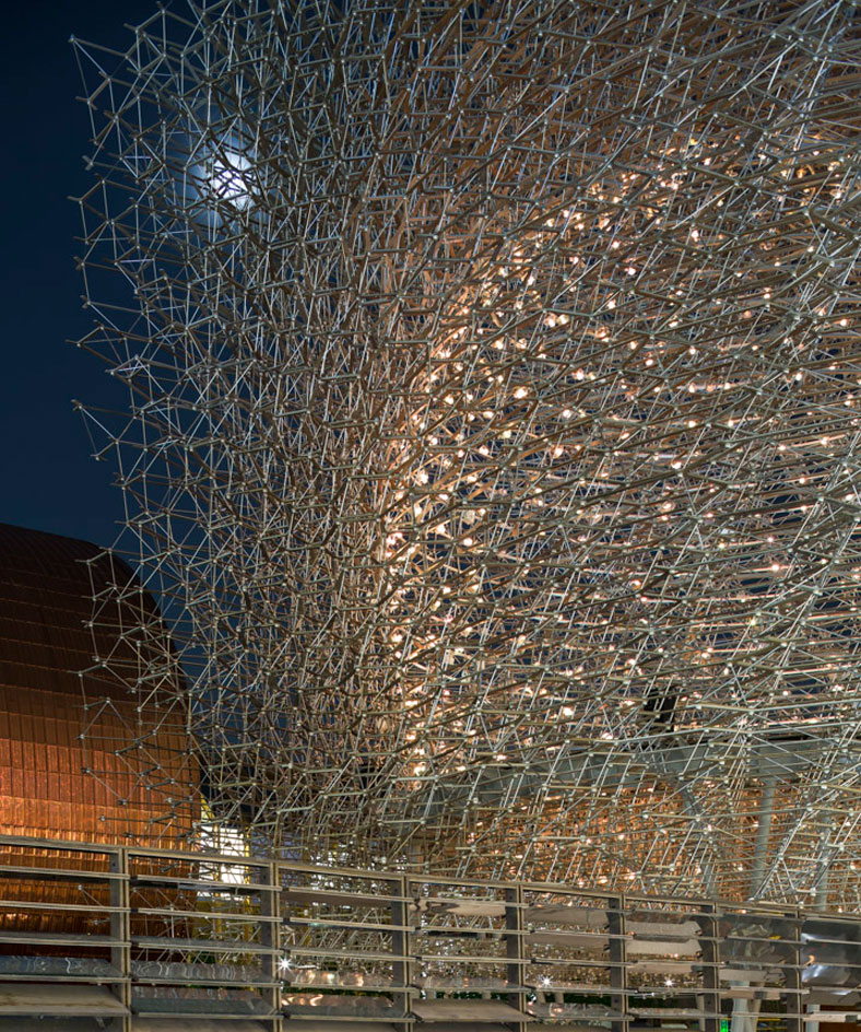
The ‘Hive’ itself (manufactured by Stage One) is a translucent metallic cube, formed with over 169,000 pieces of aluminium meshed together in a multi-layered hexagonal pattern, mimicking the design of a honeycomb.
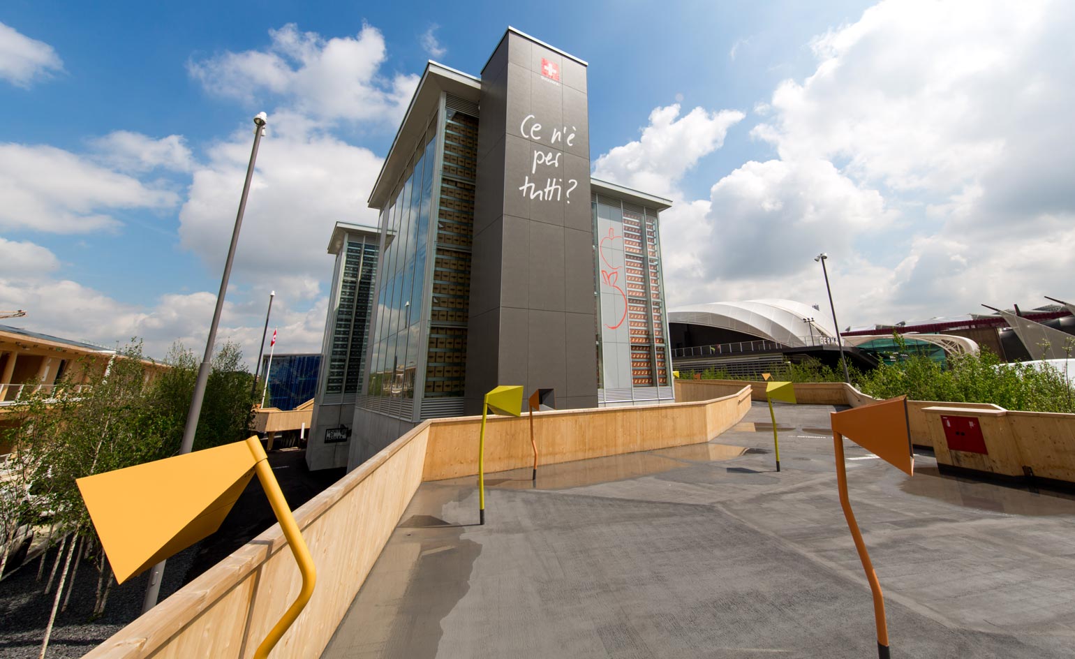
Switzerland: ‘Confooderatio Helvetica’ Switzerland's pavilion resembled a supermarket depot, with four towers filled with products abundant in the country - coffee, water, apples and salt.
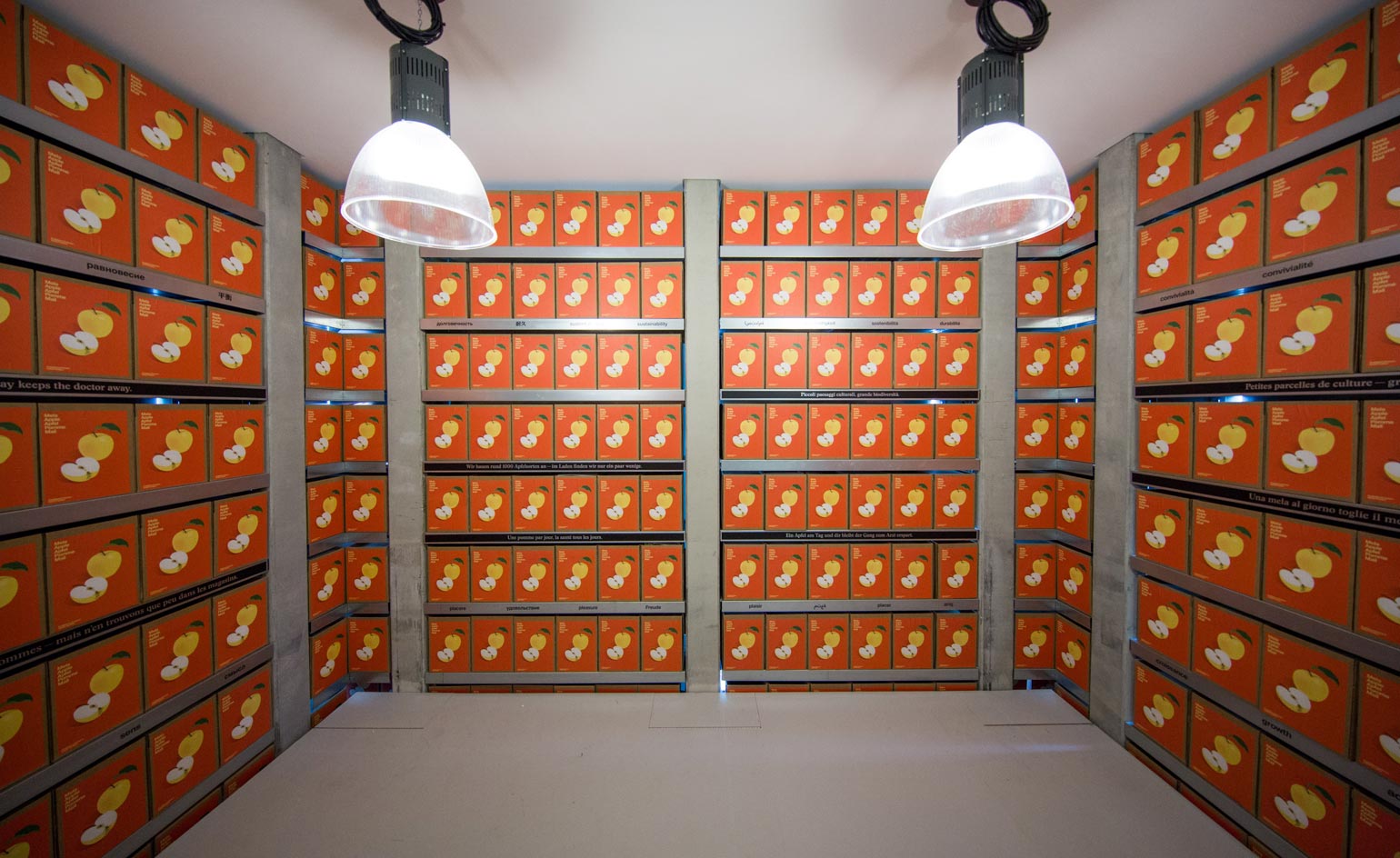
Visitors at the Swiss pavilion are allowed to take as much of each item - water, coffee, apples etc - as they want. 'When the food runs out, it runs out,' said a young woman dramatically as people walked in. 'The life of these towers is in your hands.'
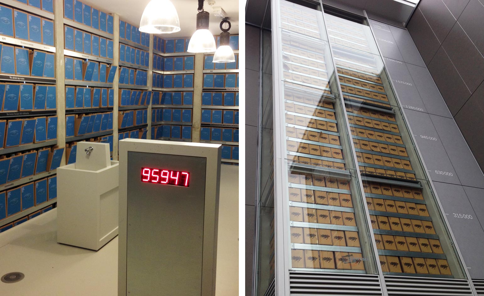
The structure is designed to come down floor-by-floor as the food is consumed. The underlying idea was neat and thought-provoking: if we all consume in moderation there's enough for everybody.
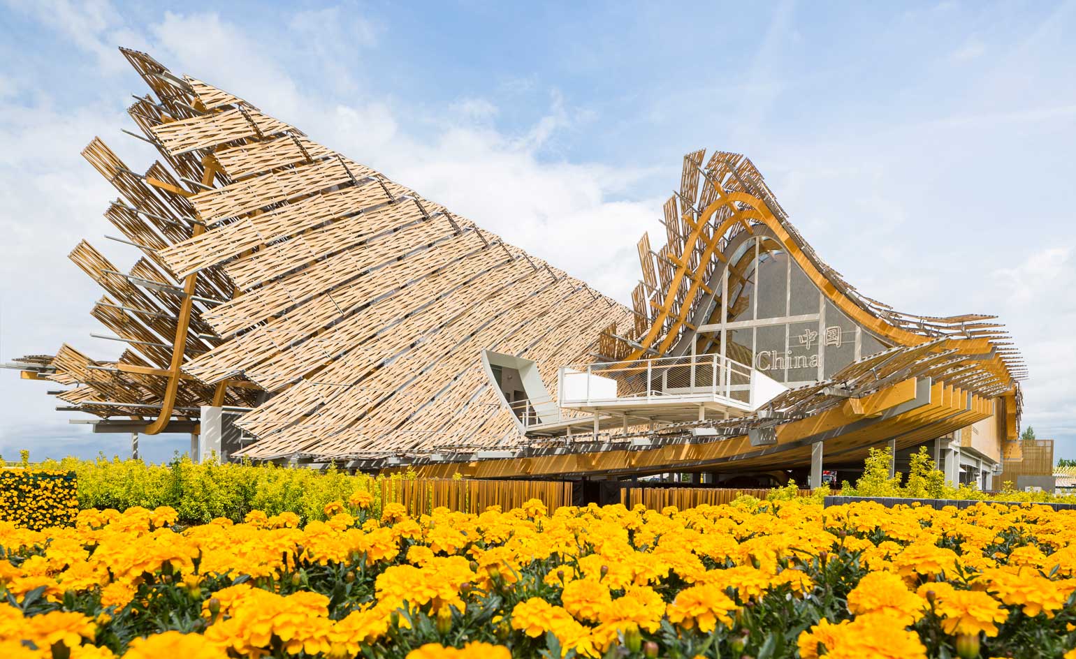
China: ‘Land of Hope, Food for Life’ In partnership with Tsingua University, professor Yichen Lu (also principal of Studio Link-Arc) led the design of the first ever Chinese National Pavilion to occur outside of China.
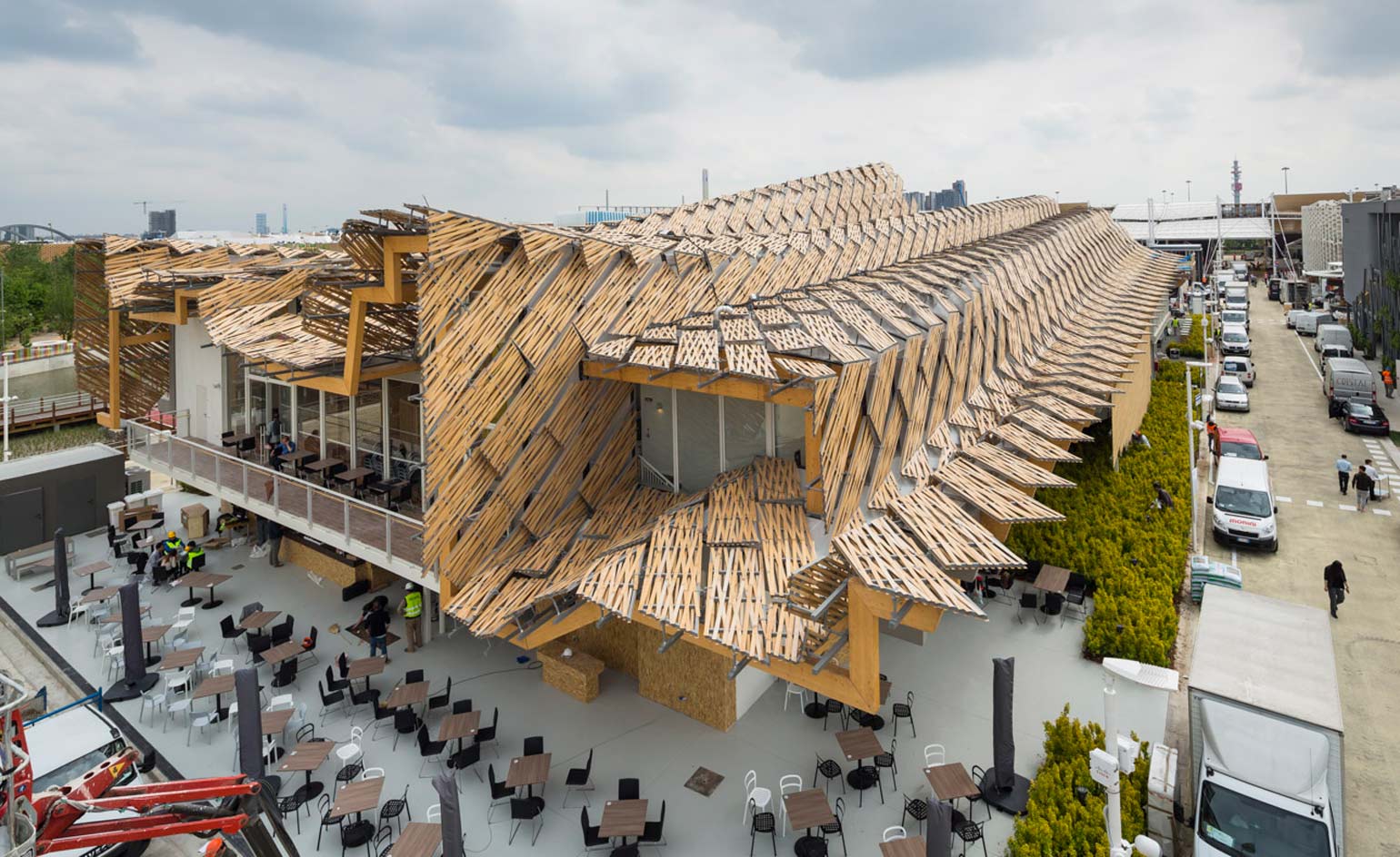
Interpreting the ancient Chinese philosophy - that man is an integral part of nature - the Pavilion simultaneously references the profile of a city skyline and a rolling landscape, displaying an undulating timber roof in the midst of a crop field.
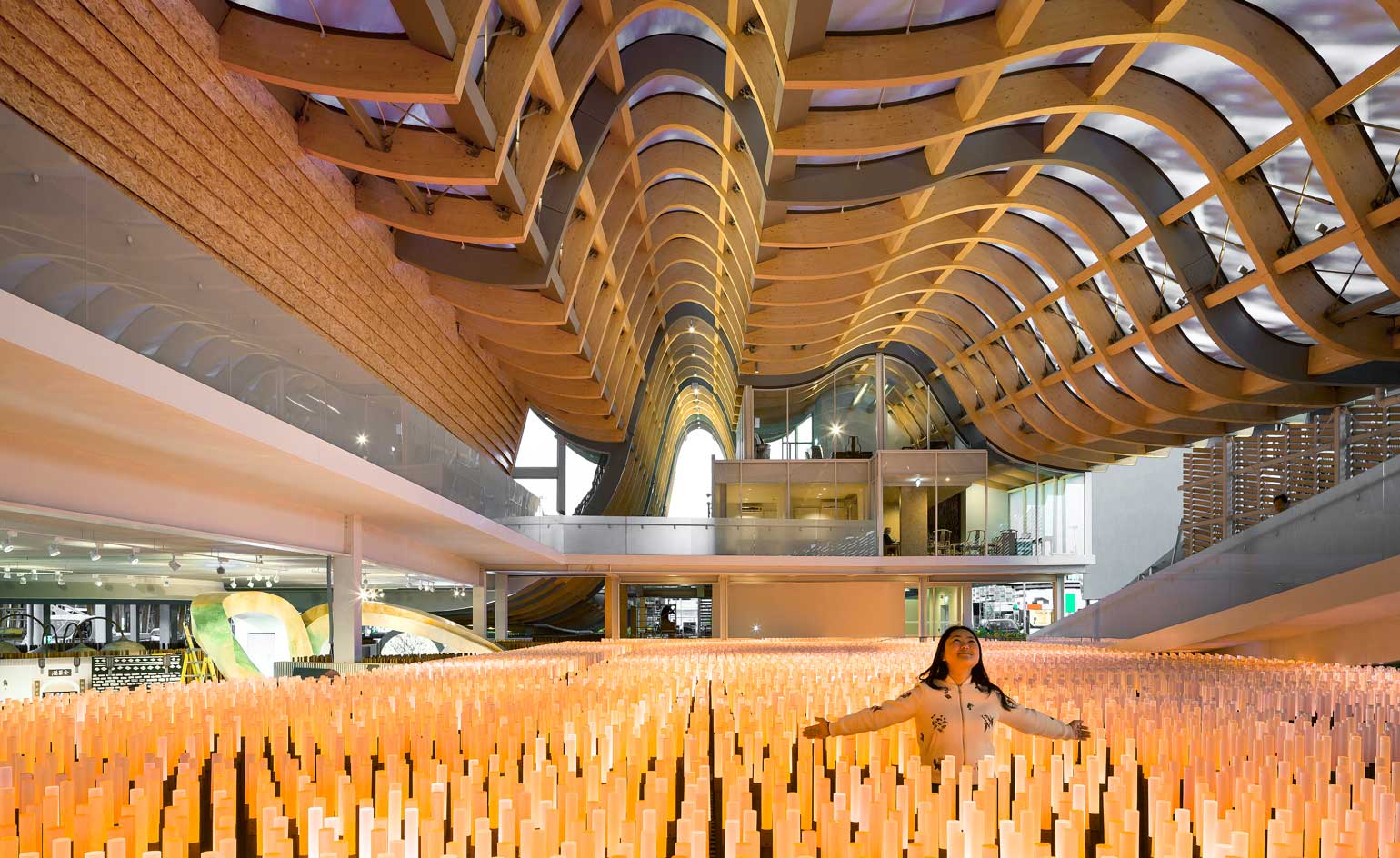
The construction celebrates man’s technological advancements whilst still achieving harmony with nature.
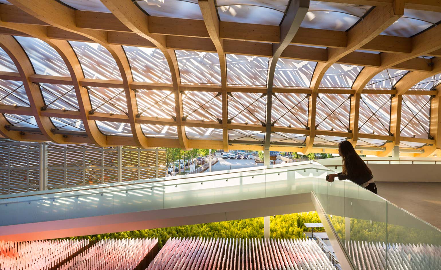
1,052 bamboo panels rest on 266sqm of glulam structure. The airy interior is bathed in sunlight.
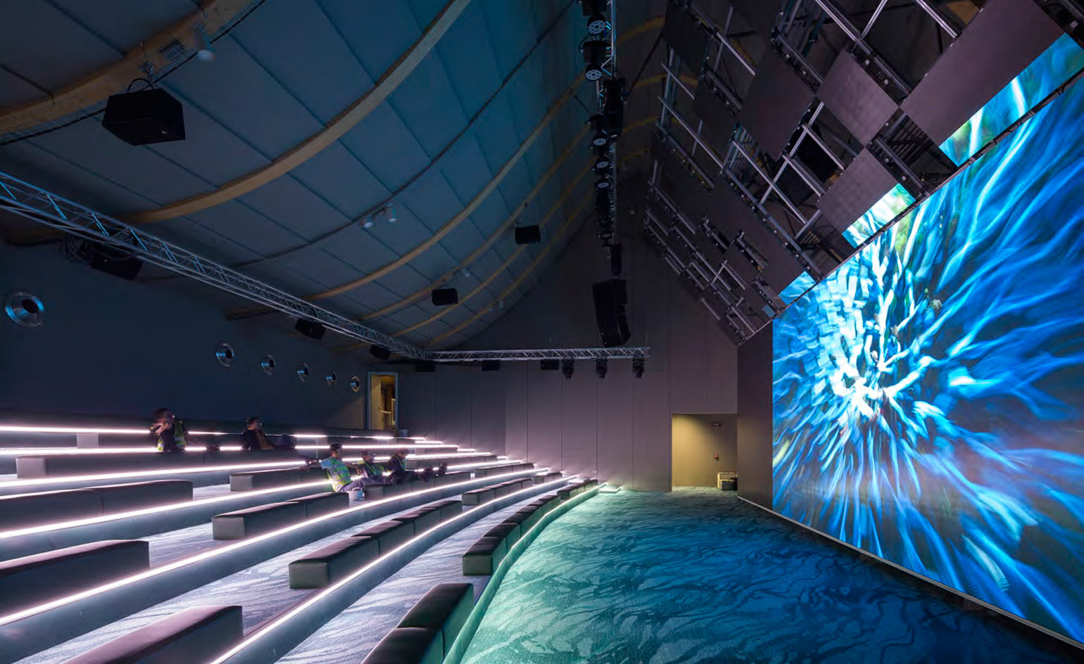
A series of interative exhibits include a large video installation, which uses thousands of tiny LED lights to conjure images of China.
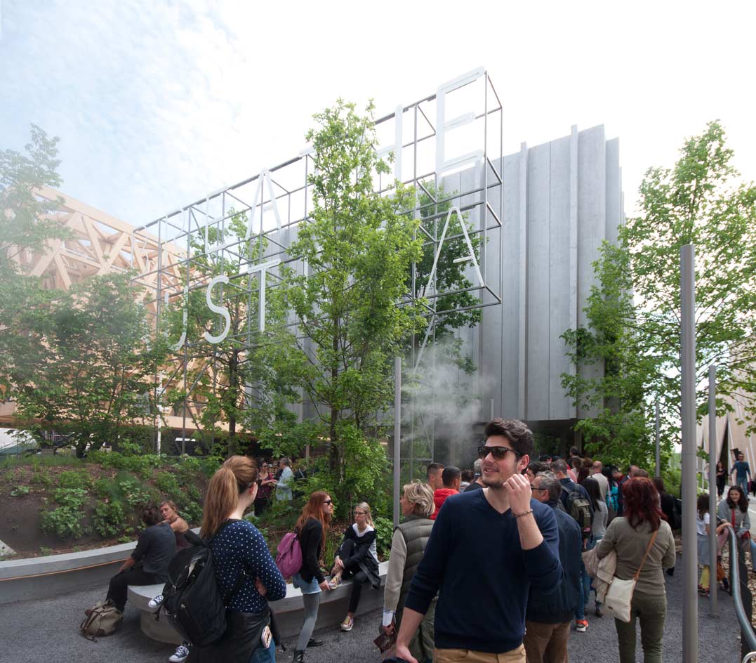
Austria: ‘Breathe. Austria’ Combining natural planting with technological systems to create a prototype air generating system, the Austrian Pavilion by Klaus K. Loenhart and his team.breathe.austria endorses one of the most important natural elements – air.
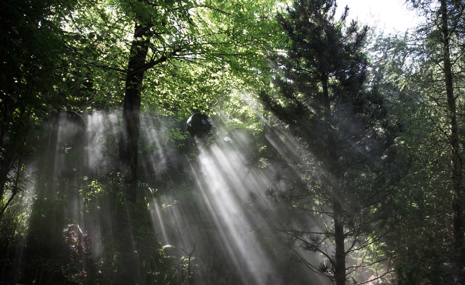
The pavilion acts as an exhibit itself: featuring twelve Austrian ecotypes, from mosses to shrubs and 12m high trees.
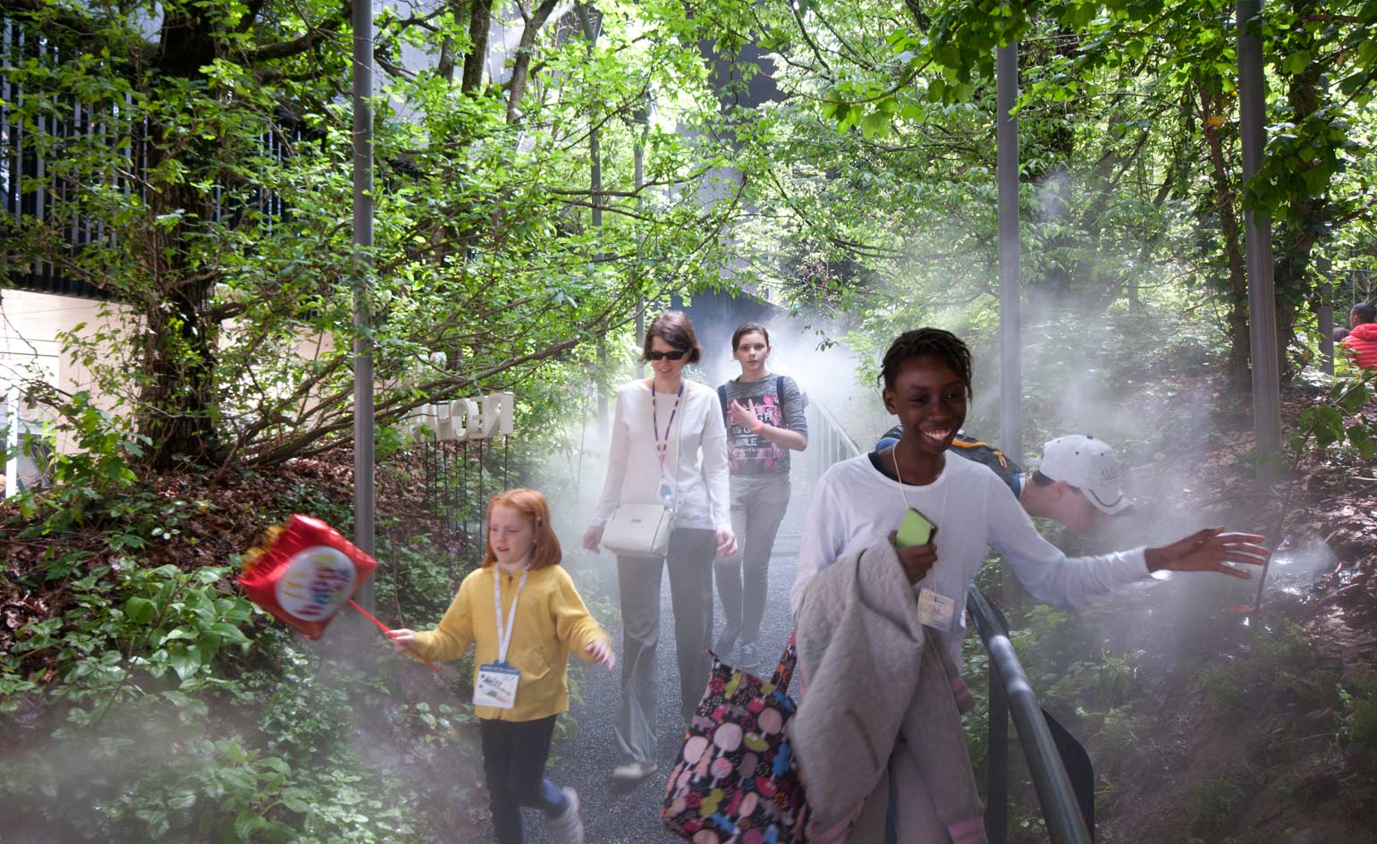
Assisted by thermodynamic misting nozzles which accelerate evaporation rates and oxygen production, the vegetation generates 62.5 kg/h oxygen, enough for 1,800 visitors, whilst also reducing temperatures by 5-7 °C. This breathing microclimate could be a future solution to air shortages.
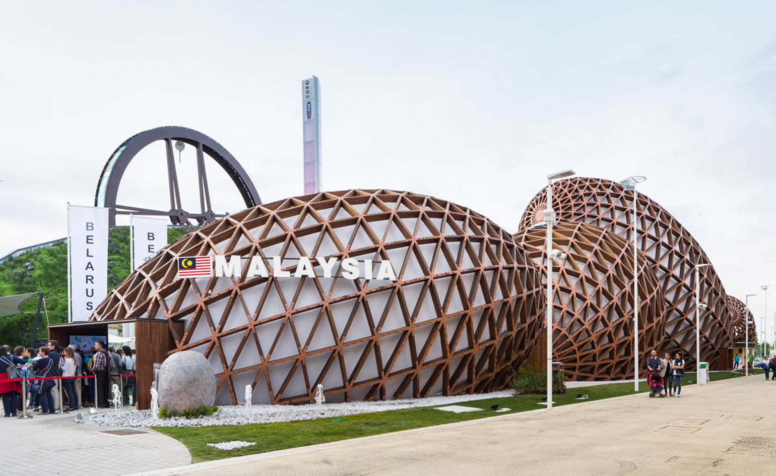
Malaysia: ‘Towards a Sustainable Food Ecosystem’ Conceived by Hijjas Kasturi Associates, the Malaysian Pavilion replicates the shape of four enlarged rainforest seeds of varying proportions. Highlighting Malaysia’s progression from an agrarian society to export-orientated industrialization, the ‘seeds’ tell the story of transformation balanced with preservation of tradition. The seed is a symbol of growth and inner potential, a metaphor for Malaysia’s continuous development and economic evolution. Constructed from weaved glulam timber, the sustainable structures reflect an environmentally conscious nation whilst establishing one of the most dynamic forms at this year’s Expo.
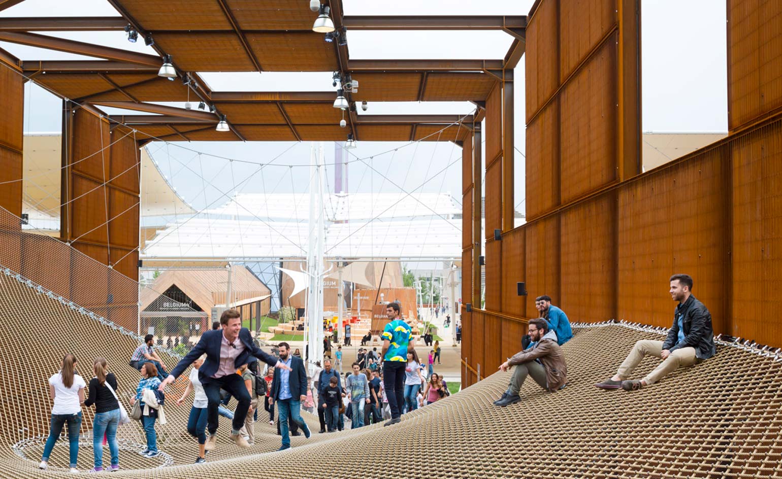
Brazil: ‘Feeding the World with Solutions’ Brazil is well known as a significant producer of food worldwide, but less renowned for technological developments: the pavilion by Studio Arthur Casas and Atelier Marko Brajovic aims to enlighten the world about the country’s research capabilities and promote the values of the Brazilian culture.
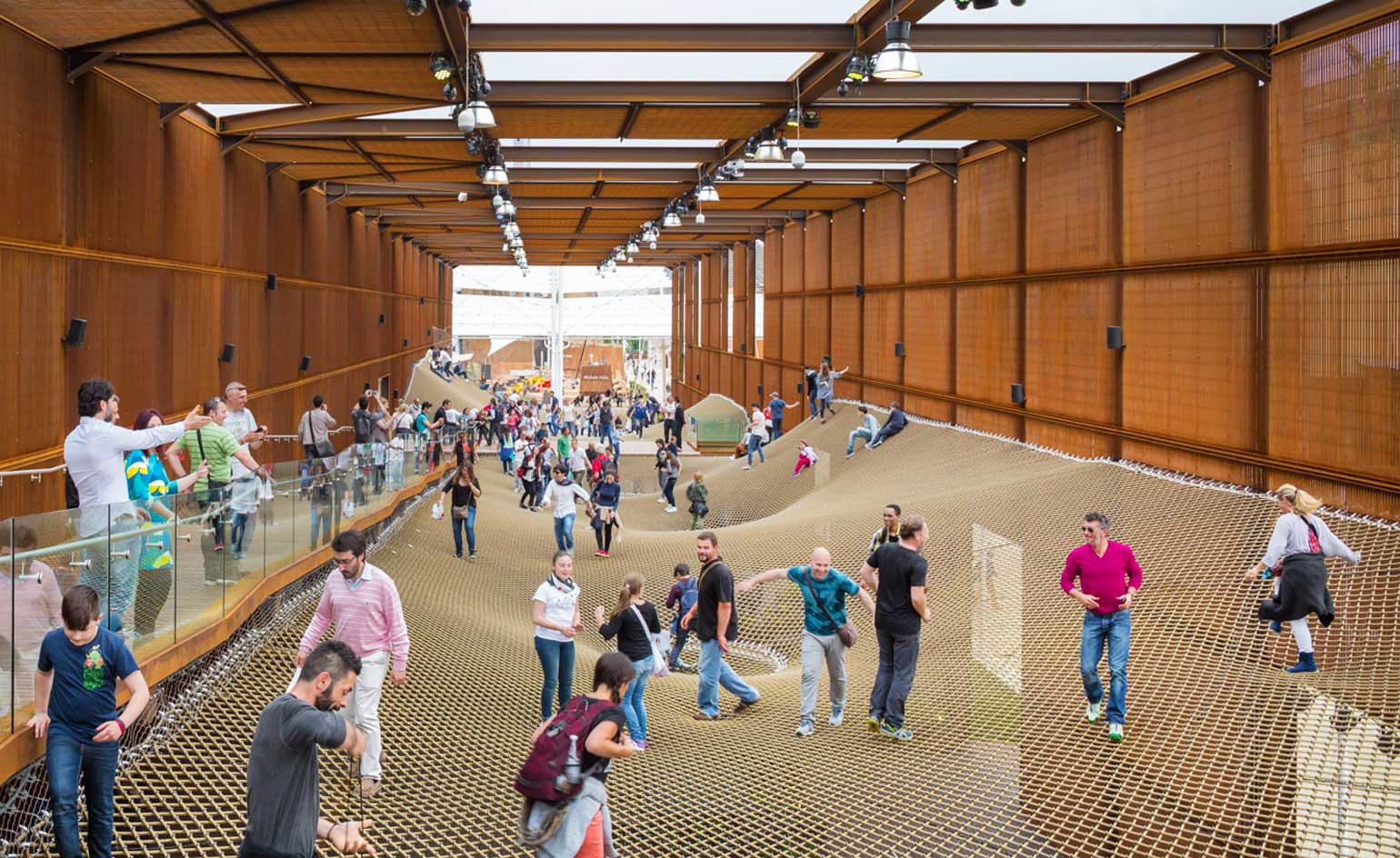
The 'Pavilion proposes a pause', a public place that draws people together and fuels interactions and curiosity.
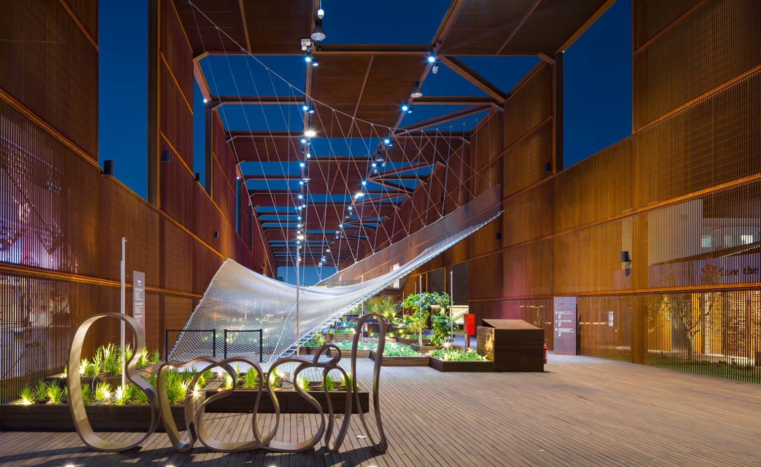
The earthy metal structure supports a tensile net which shapes an undulating terrain over planting and exhibition space beneath. The net promotes new relations, forming a place of leisure and unexpected meetings.
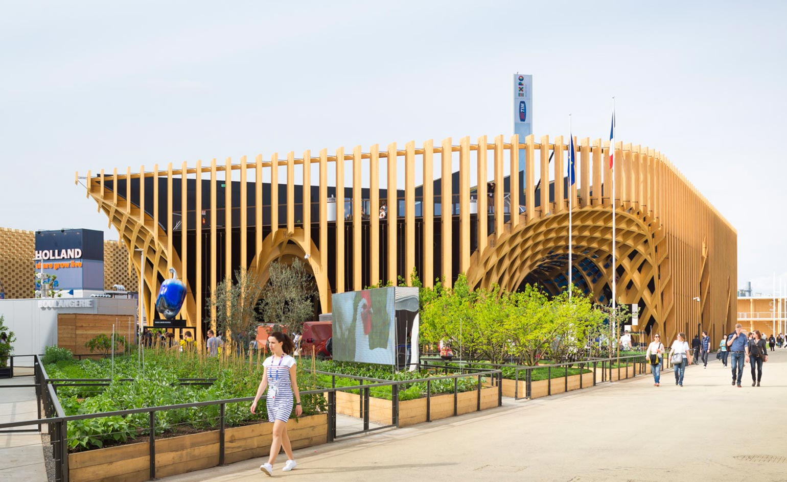
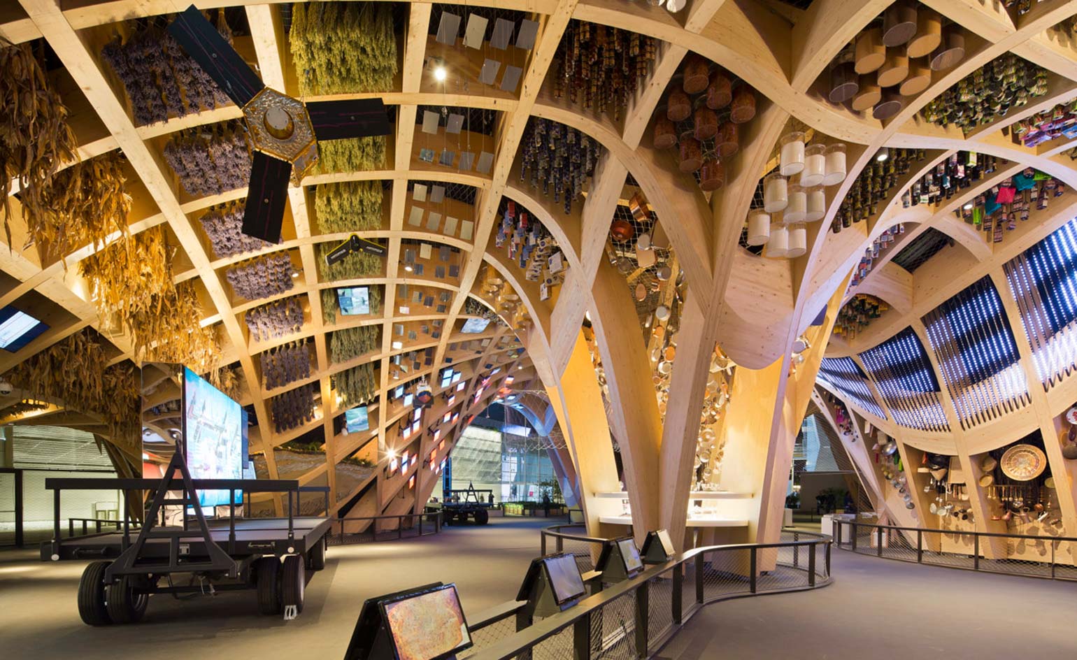
France: ‘Different Ways of Producing and Providing Food’ Depicting a ‘built landscape’ which ‘portrays the geographic diversity of France’s regions, its unique agricultural offerings and culinary traditions’ was the aim of Anouk Legendre of Studio X-TU, who designed the French Pavilion in partnership with Atelien Architecture.
Cuisine is central to French culture, descending from the geological and genealogical heritage of the land.
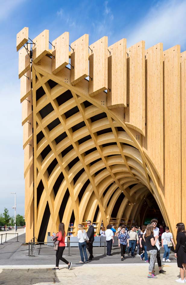
The Pavilion focusses on the landscape which enabled this gastronomical tradition to arise.
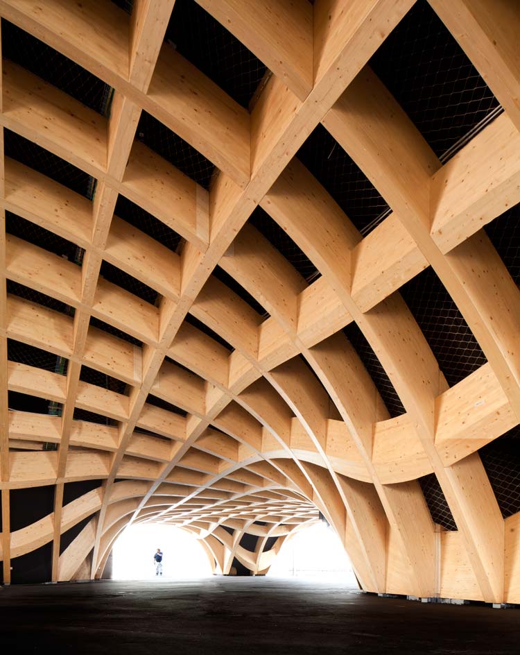
It features a rippling ceiling of glulam French spruce which mimics the contours of the land, shaping inverted hills and valleys to enclose a ‘covered market’ of 3500sqm.
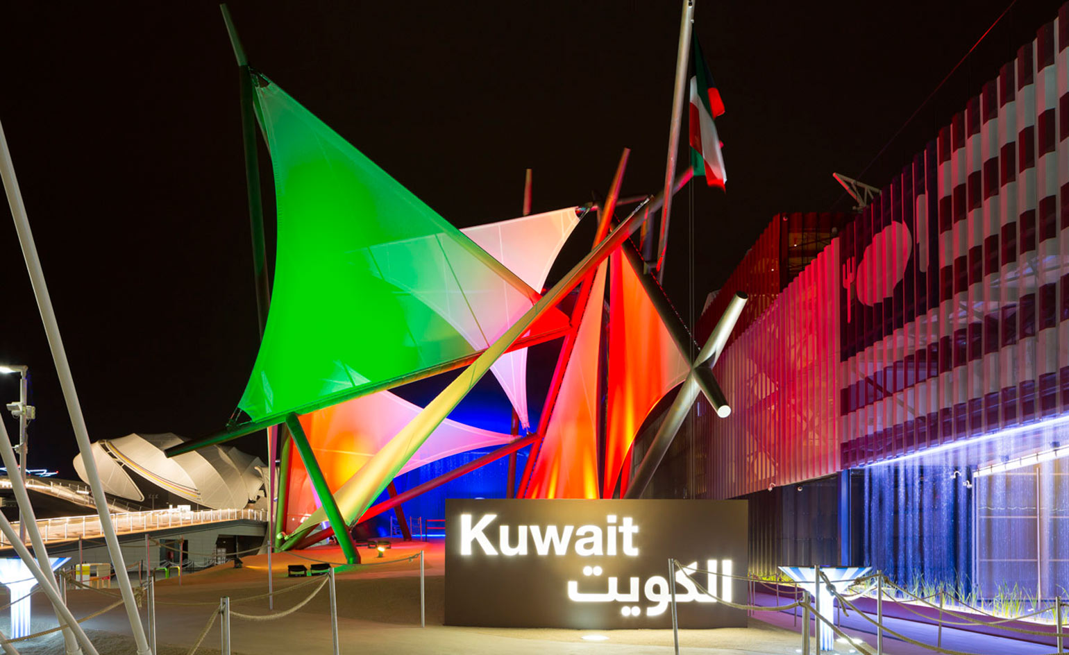
Kuwait: ‘Challenge of Nature’ Kuwait’s first pavilion at the World Expo was formed by Italian architects Studio Italo Rota, and constructed by Nussli Italia. The Expo was seen as a way to strengthen bonds between the two countries, as well as an opportunity to showcase elements of Kuwait custom, balanced with modern sustainable trends. The design represents the sails of a traditional Arabic dhow wooden boat, whilst also exploring natural oil substitutes such as solar and wind power. The centre of the pavilion features a large glass model which narrates the history of this kingdom, explaining how the challenges of a desert landscape were overcome by technology (such as the world's first desalination plant)
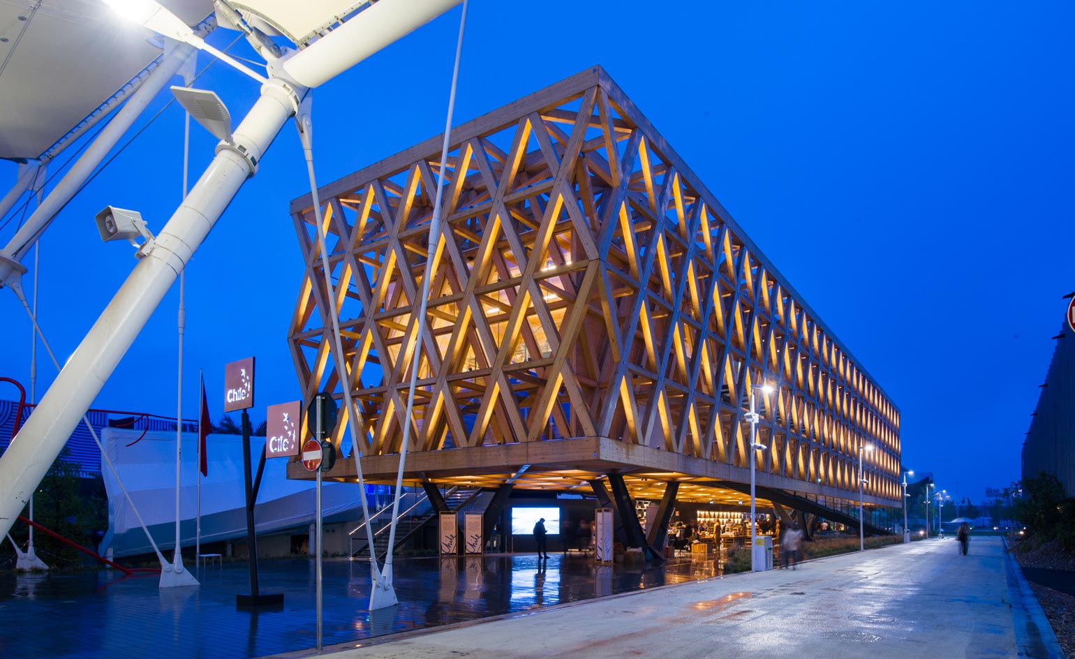
Chile: ‘Chile, a Diverse Country’ Architect Cristián Undurraga designed the Chile Pavilion as a celebration of the diverse geography and scenery of this extensive country, from the Atacama Desert in the North to the glaciers of Patagonia. The building acts as a large suspended lintel, spanning the gap between four supporting concrete columns and enclosed within a framework of timber crosses.
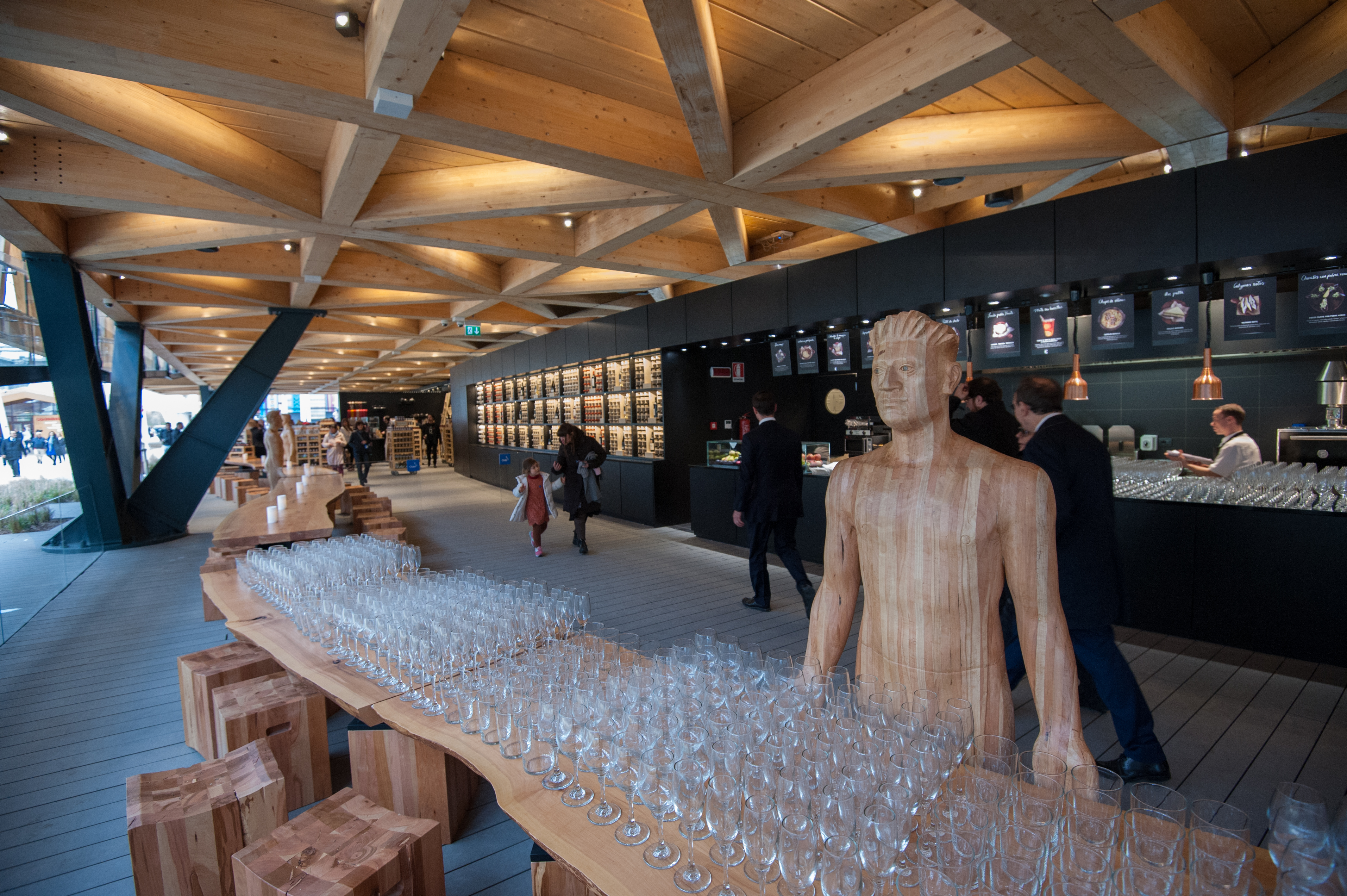
The pavilion guides the visitor on a voyage through the ecosystems, demonstrating how life develops and is sustained throughout the land.
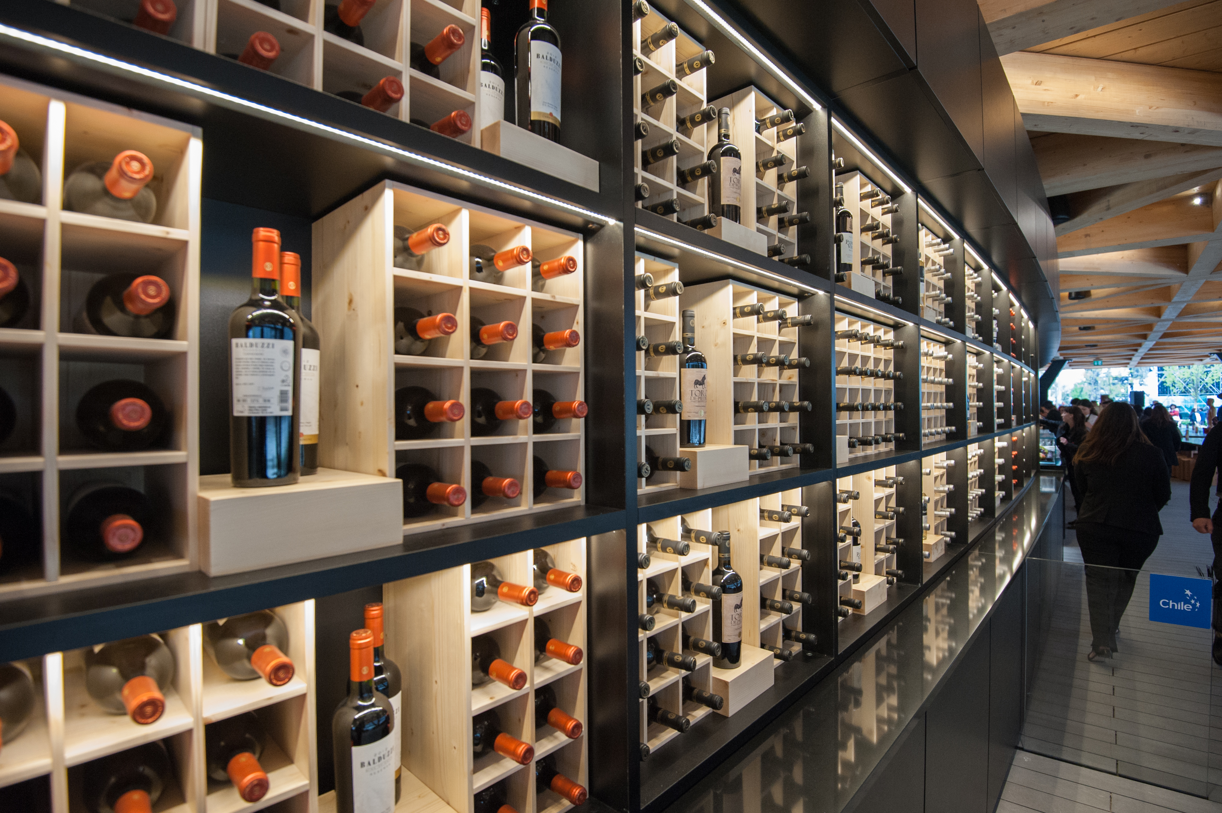
A central ramp welcomes guests inside, where they are treated to ‘the art of hospitality’ with numerous tastings and events.
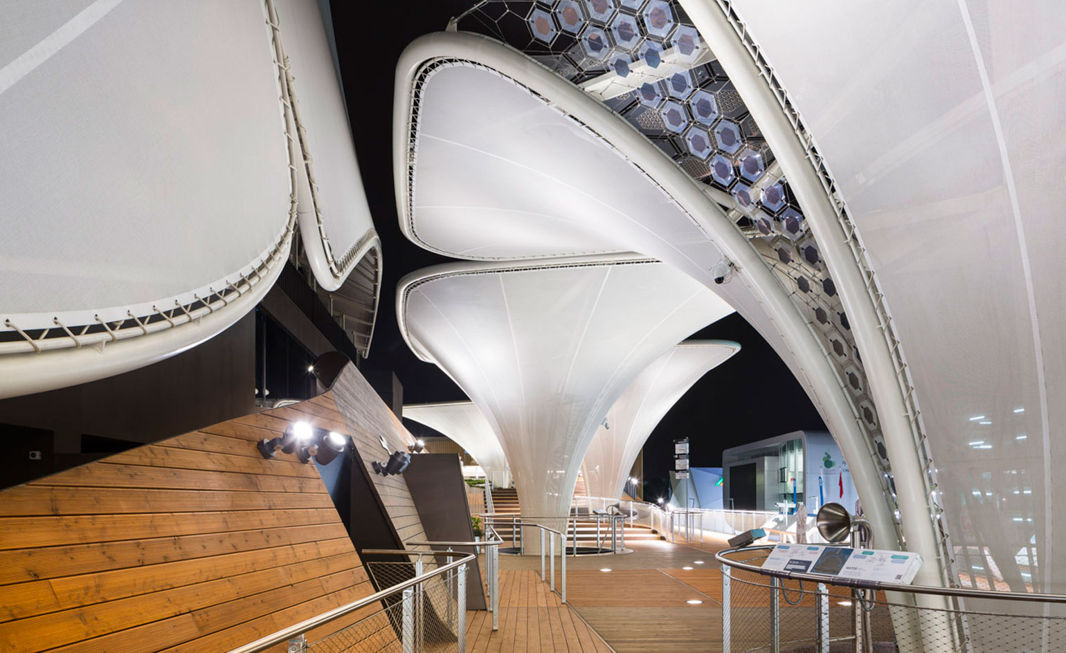
Germany: ‘Fields of Ideas’ The German Pavilion by Schmidhuber explores notions of future human nutrition, and how we should think sustainably today, in order to ensure a continuing food supply.
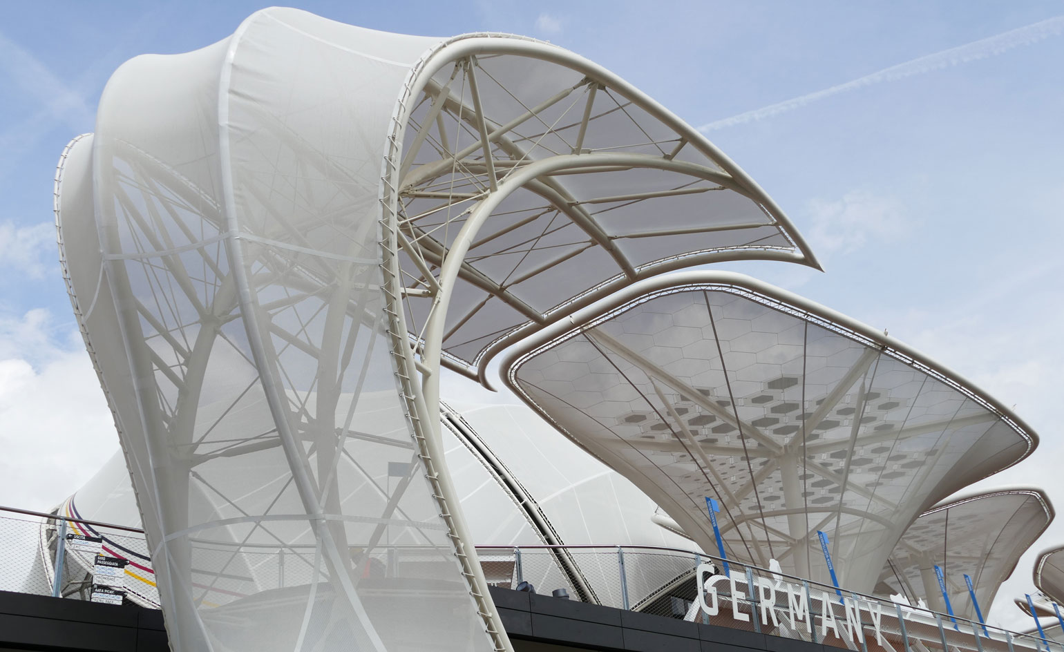
Creating a ‘warm, friendly and whimsical’ portrayal of Germany, the design emulates natural sloping meadows, with a canopy of plant-like structures over the exhibition space.
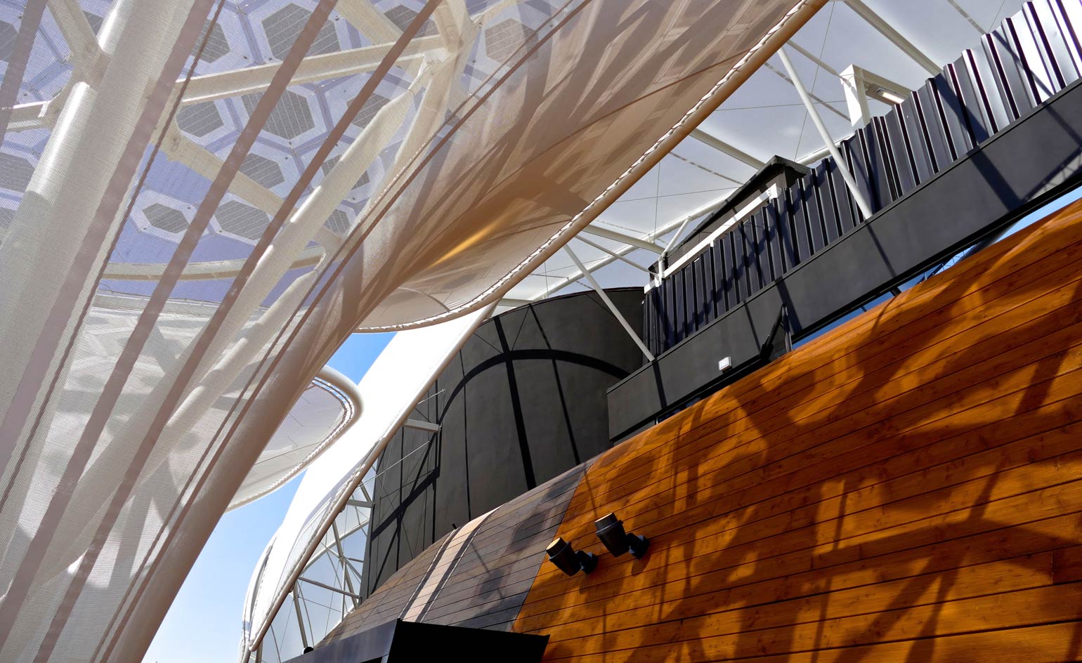
These ‘idea seedlings’ and ‘solar trees’ (utilizing organic photovoltaic modules) are lightweight steel constructions lined with thin white fabric membranes, which continue down inside the covered exhibition space, bringing fresh ‘ideas’ to the people within.
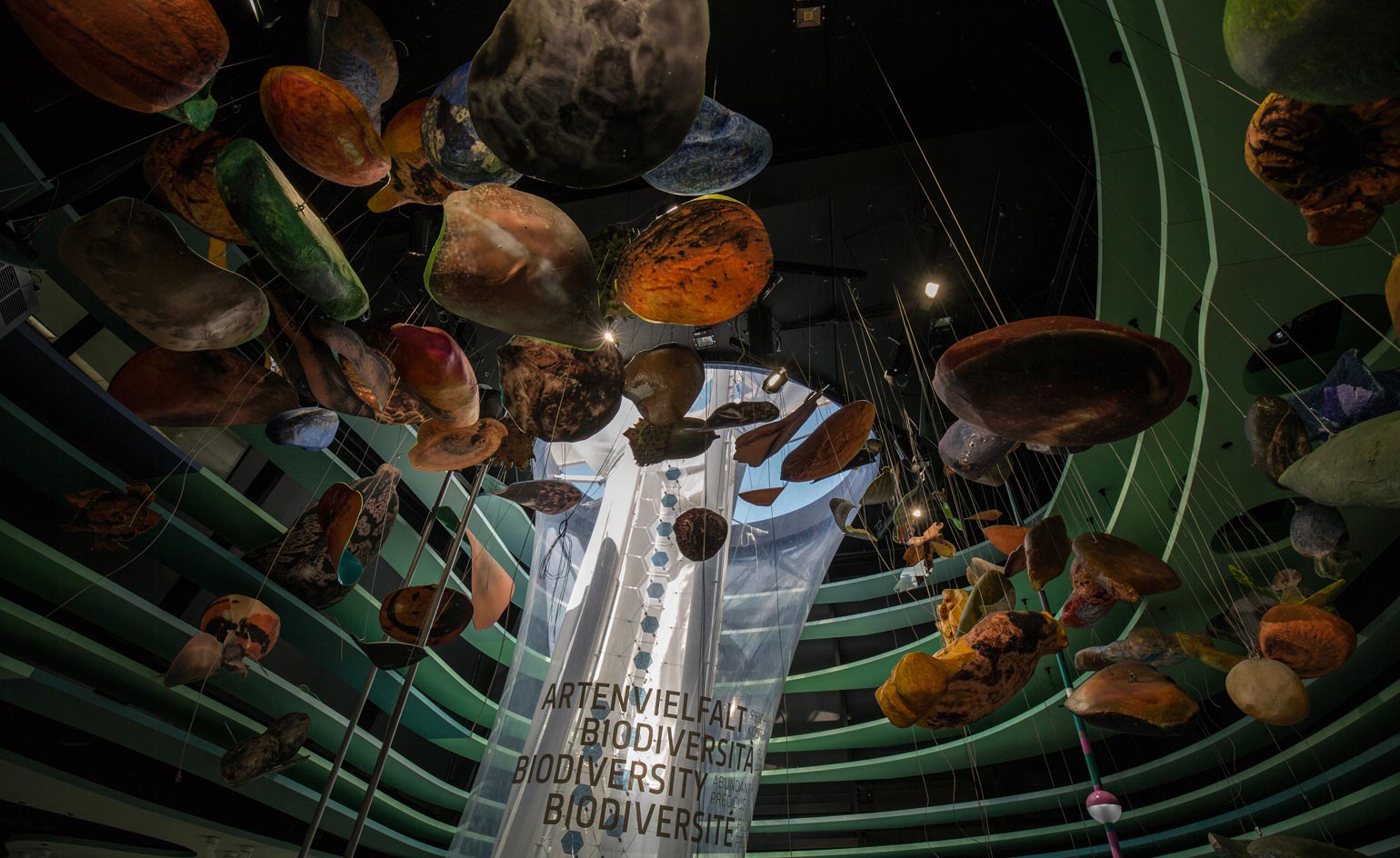
The pavilion divides into four thematic zones: Soil, Water, Biodiversity (shown here) and Climate.
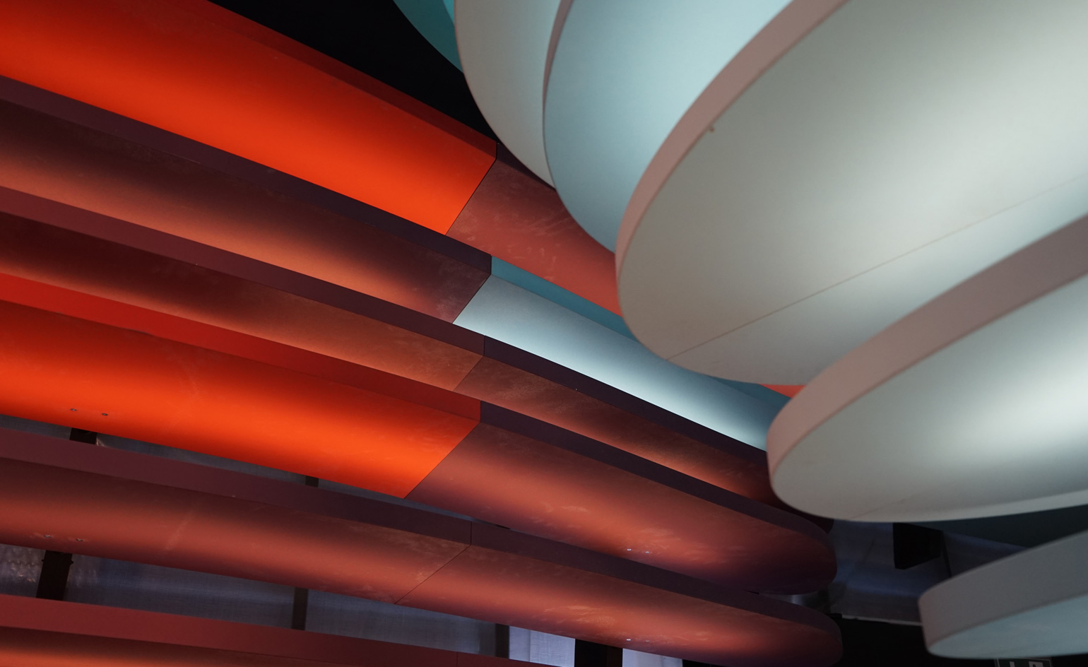
These vital sources of nutrition combine to fuel global food production and consumption.
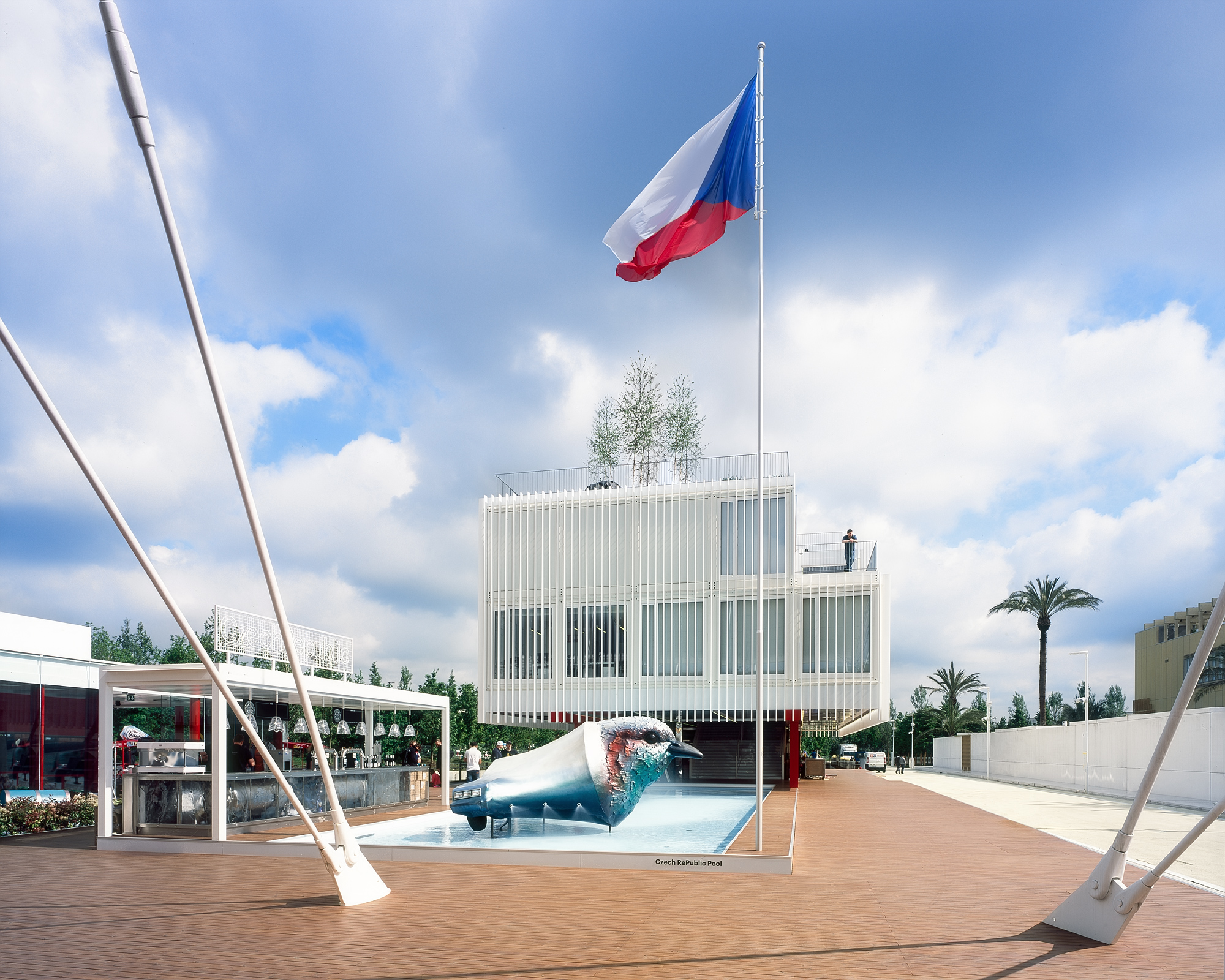
Czech Republic: ‘Laboratory of Life’ The Czech Republic might be a land-locked country, but it is situated on the border of three main drainage basins, whilst some of the most important European rivers – the Elbe, Oder and Danube – flow through its land. Also renowned for thermal springs and a surprisingly large collection of swimming pools, the country has a strong connection to water; the Czech Pavilion, designed by architects Chybík + Kristof, focuses on this relationship with an inviting external pool.
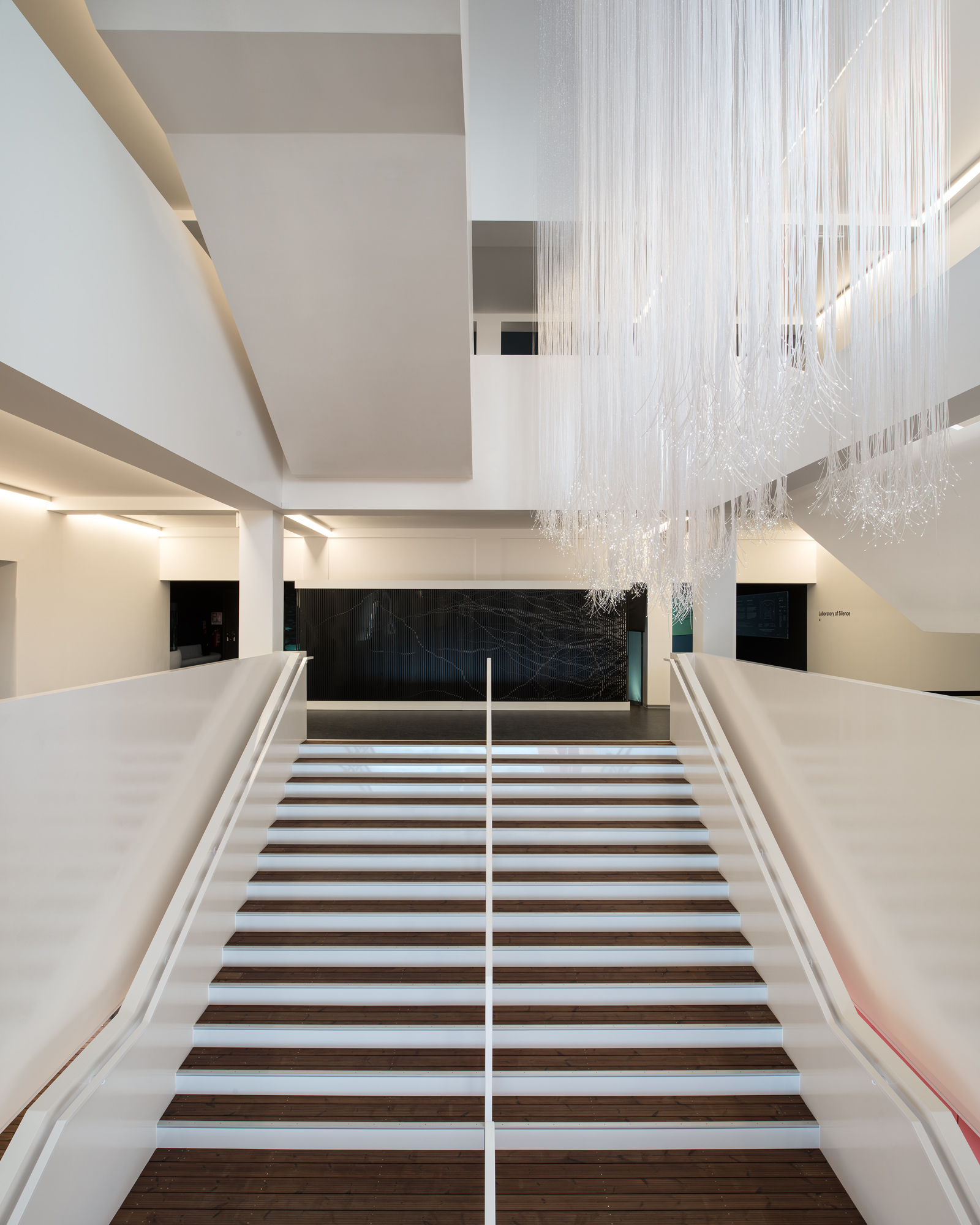
The modern white interior exhibits water purification technology (and nanotechnology) of the Czech Republic. The KOMA pre-fab construction caters for a readily dismountable building, factoring in the life cycle of architecture.
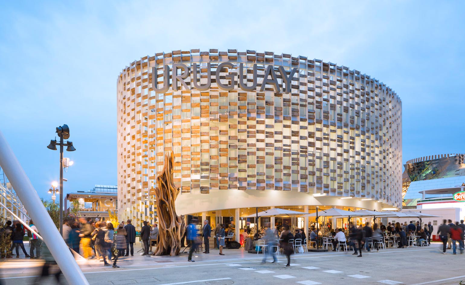
Uruguay: ‘Life Grows in Uruguay’ Being one of the smaller projects at the Milan Expo, with an area of just 747m², the Uruguay Pavilion more than makes up with its attractive ovoid geometry, crafted entirely from reusable and recyclable materials.
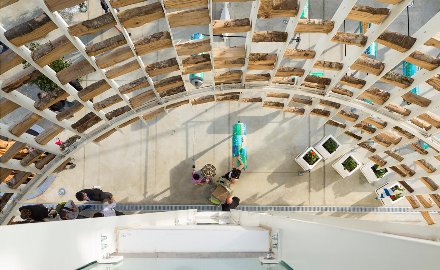
A circumference of vertical steels encloses the three storey design, interspersed with scattered wooden pieces, to form a shadow lattice protecting the solid white interior walls.
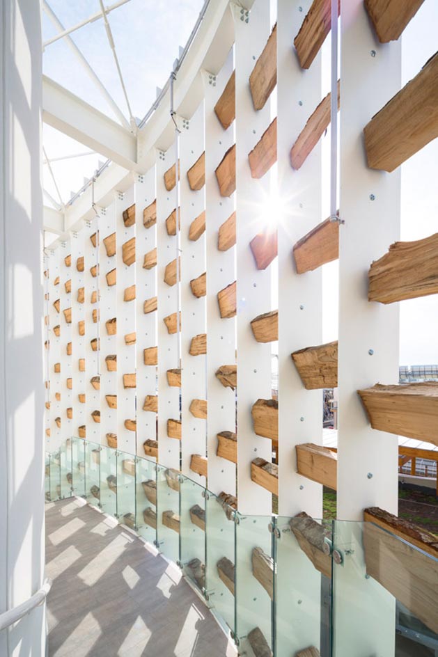
Designed by architects from the National Meat Institute (INAC), the exhibition directs visitors up a ‘sound ramp’ where they experience noises associated with various settings – fields, beaches and customary Uruguayan steak restaurants.
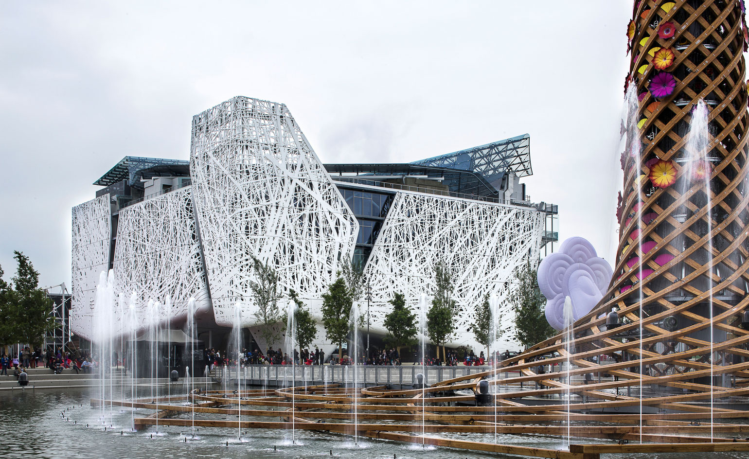
Italy: ‘The Nursery of Italy’ The Palazzo Italia faces the Piazza d’Acqua (the Water Square) in the design of the host country’s pavilion.
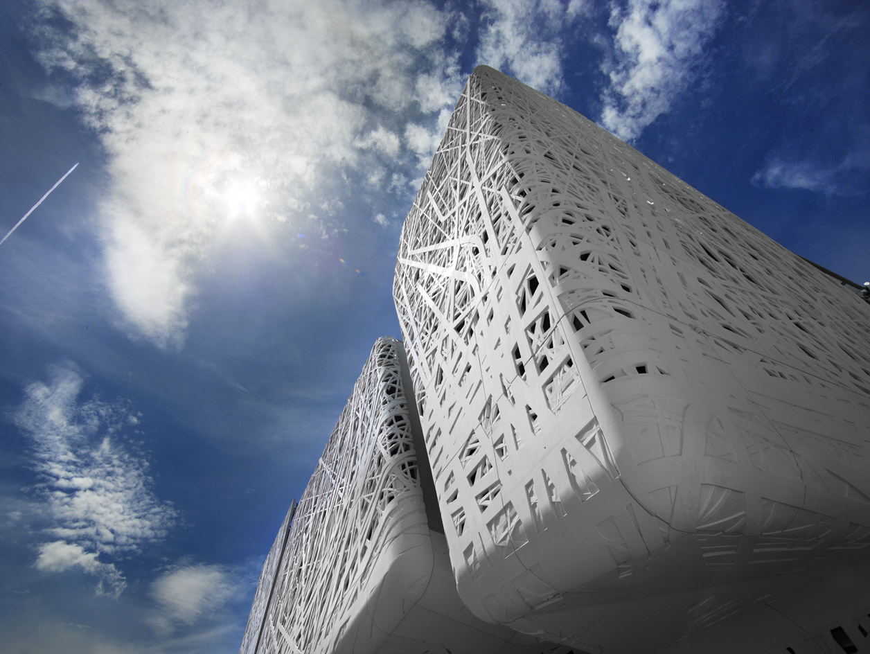
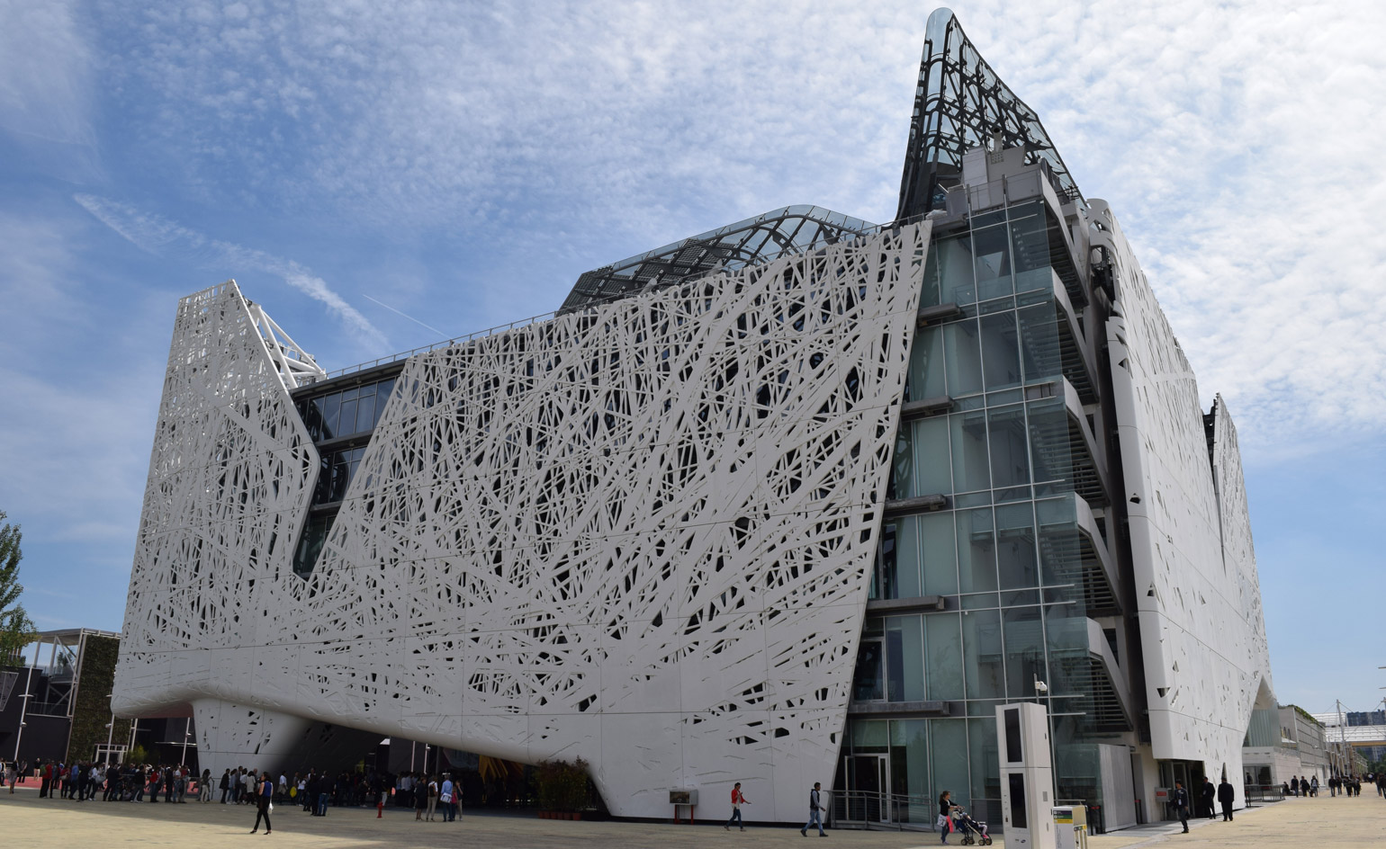
The tallest of all structures at the 2015 Milan Expo - rising 35m over six levels - this is also the only permanent scheme.
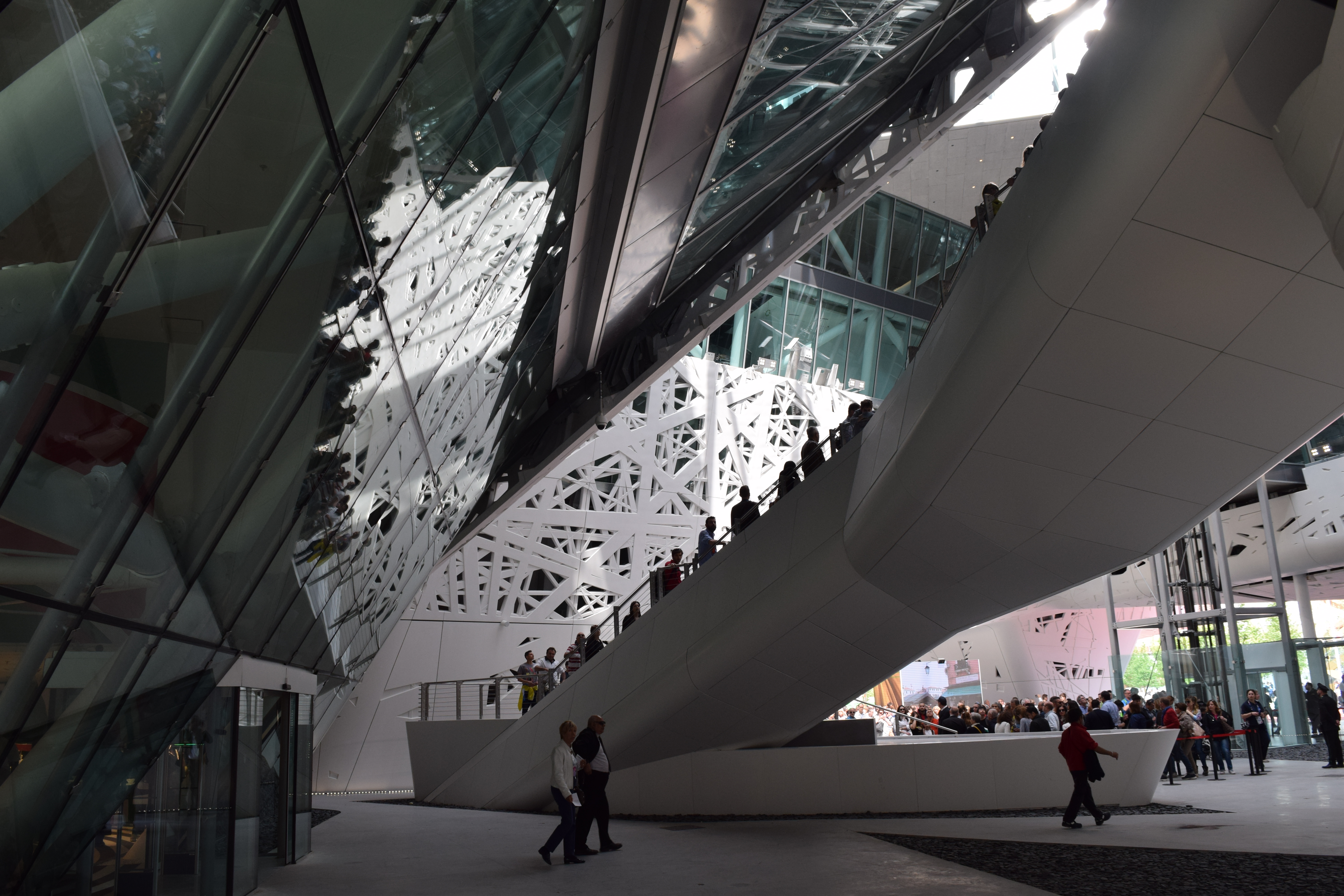
Designed by Nemesi & Partners, the building is an ‘urban forest’ – a white lattice of 2,000 tons of i.active Biodynamic concrete with ‘roots’ supporting the structure, and a crowning glass canopy of solar panels above.
The tree is the symbol of life, and this design is all about nurturing life and promoting new growth and development of skills and technology.
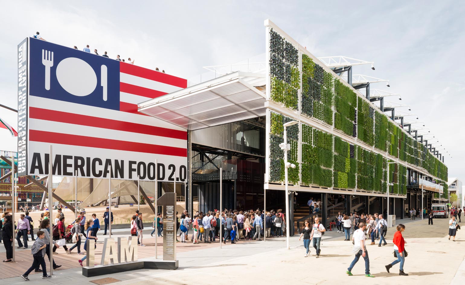
United States of America: ‘American Food 2.0: United to Feed the Planet’ The USA is a leading nation in the food industry, so it is no surprise that the exhibit features gastronomic delights, cooking demos, and ‘Food Truck Nation’
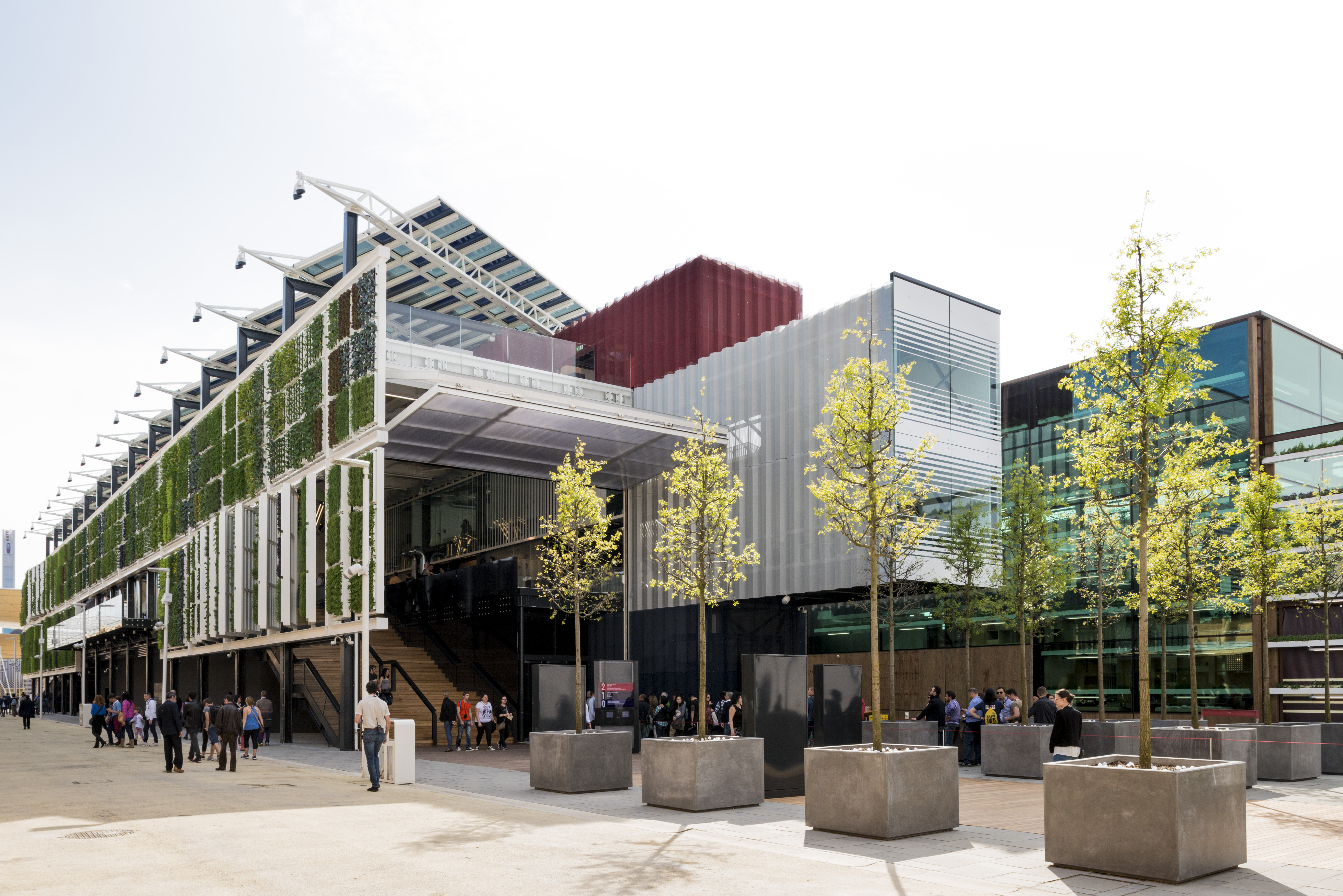
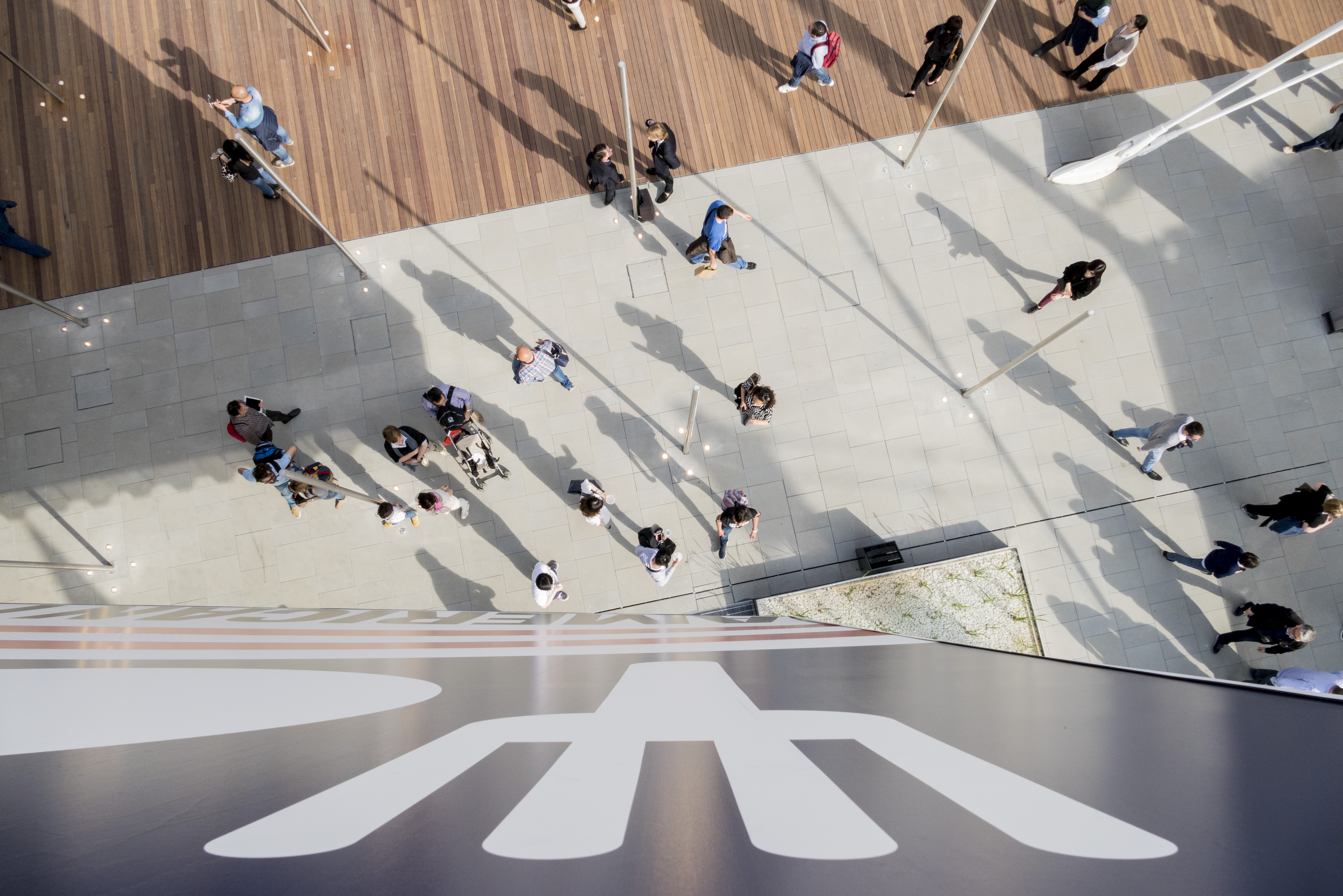
Designed by architect James Biber, the front of the pavilion displays a bold culinary re-interpretation of the American flag, whilst the rest of the design is dictated by sustainable initiatives.
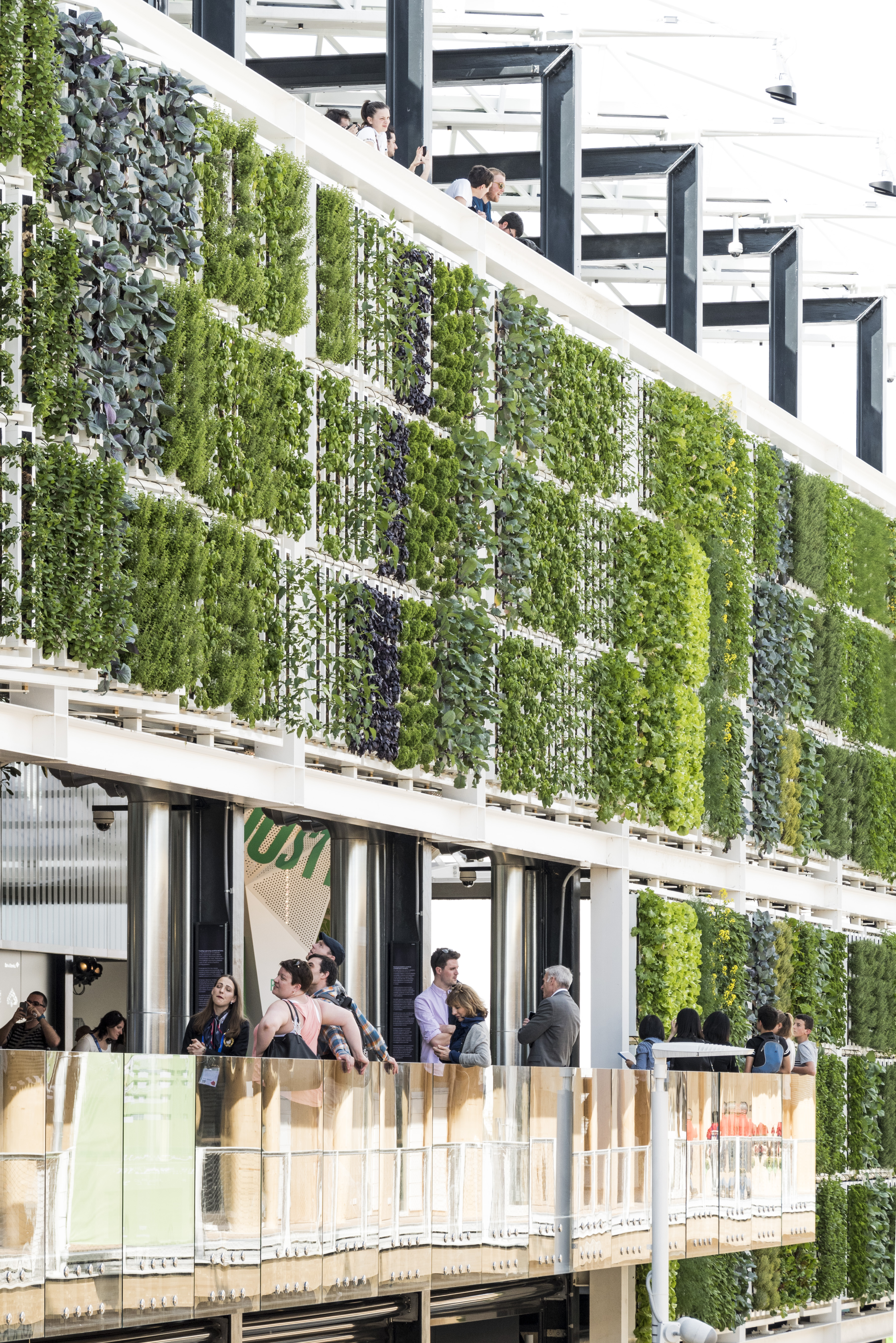
An impressive 670sqm crop wall runs the length of the scheme, cultivating 42 varieties of vegetable and grain.
SPD smartglass on the roof generates shading when required, and misting poles and oak trees at the front and rear entrances offer welcome cooling in the warm Italian climate.
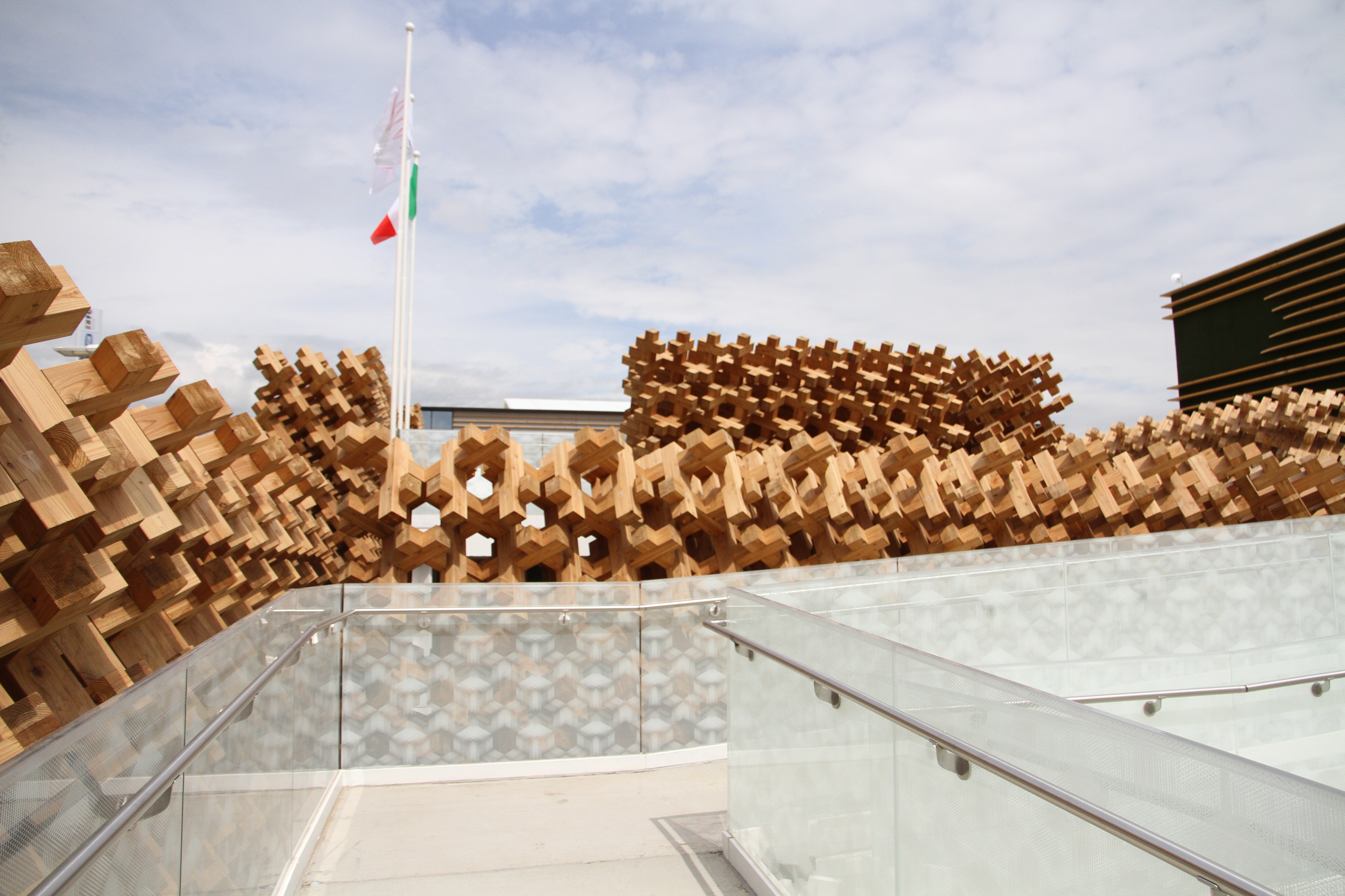
Japan: ‘Harmonious Diversity’ Japan is a nation of ‘harmonious diversity’, where agriculture, forestry and fishing lead to diverse cuisine, and where human life is naturally balanced with rich landscapes. Forests play a vital role in Japan: an ancient coexistence between people and local woodlands ('Satoyama') ensures that trees are actively maintained to endorse nutrient enriched rainwater, encouraging biodiversity.
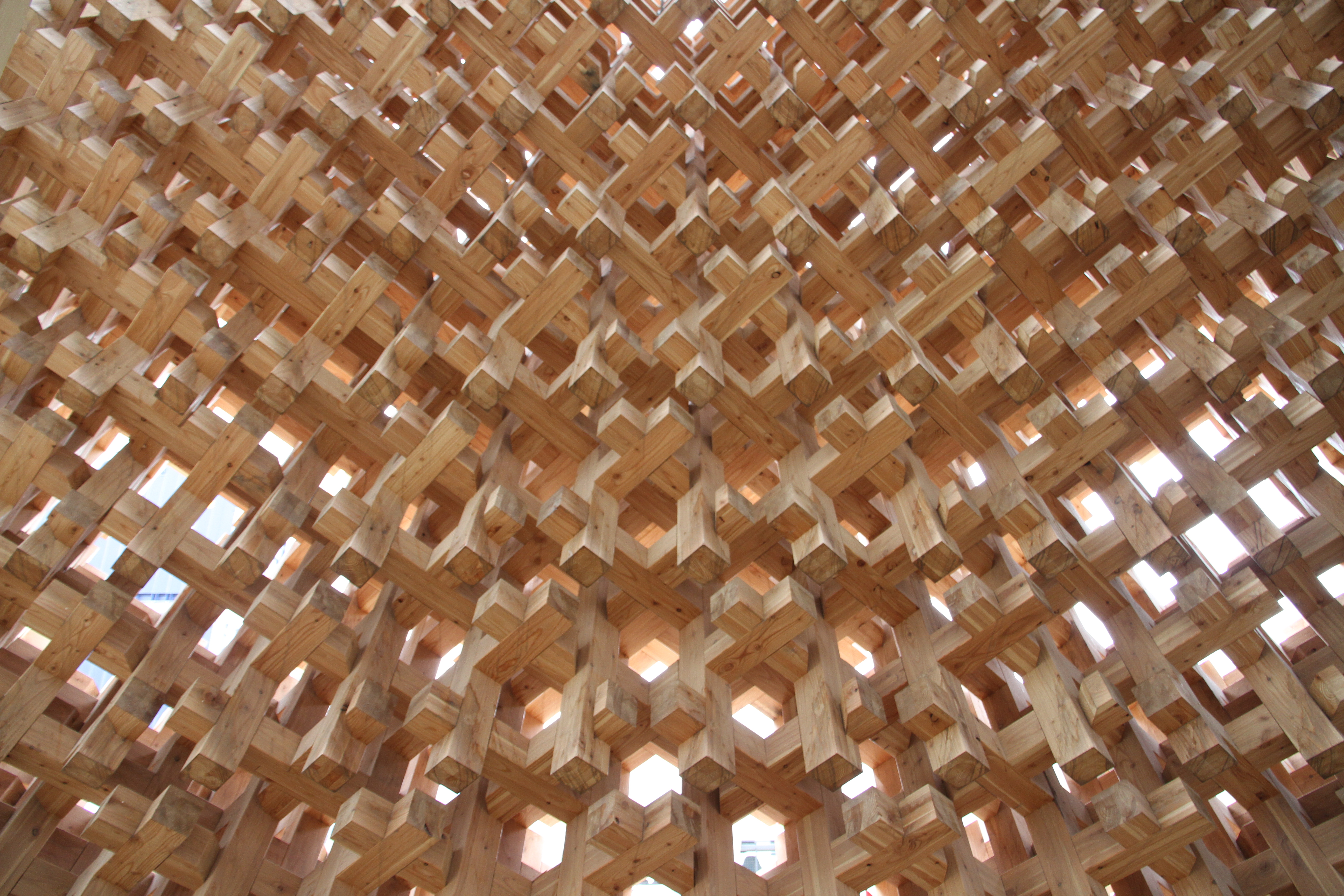
Skilled timber craftwork is also inherent to the Japanese culture, and the pavilion by the Tokyo based Atsushi Kitagawara Architects adapts the traditional ‘compressive strain method’ of construction, seen in several ancient temples, to form a modern reinterpretation in the form of a 3D wooden grid.
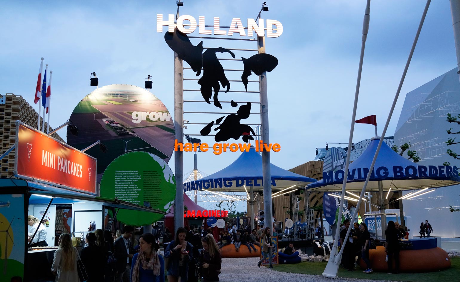
Netherlands: ‘Share, Grow, Live’ The Netherlands Pavilion for the Milan Expo is certain to stand out with its colourful, chirpy appearance. A collection of vibrant festival tents, fairground rides and stalls simulate a pleasurable summer carnival.
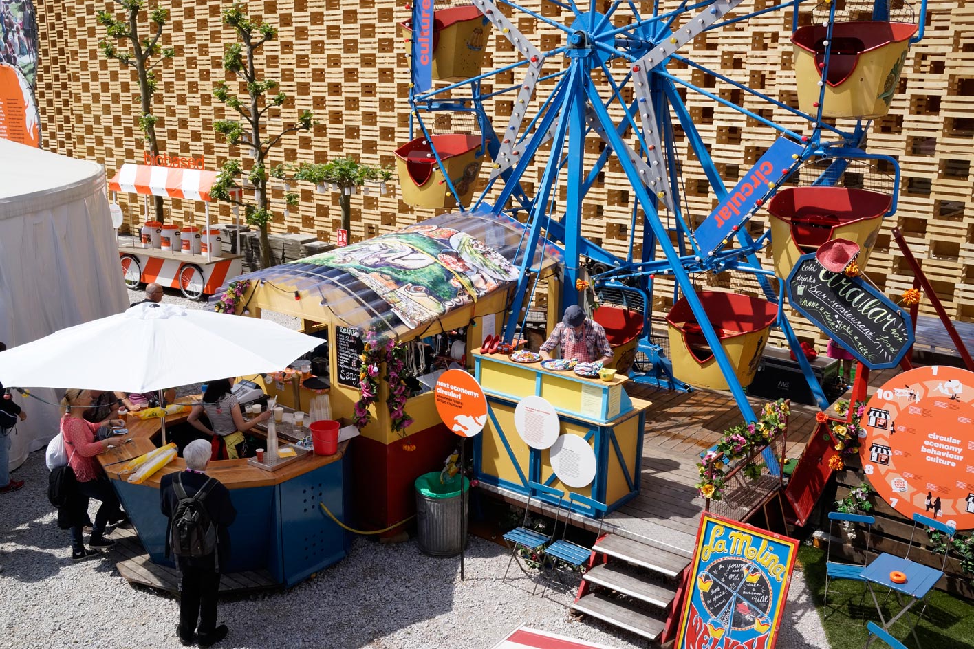
On the surface this design (led by branding agency Totems) is a fun and fanciful concept, yet the exhibition within shares serious, valuable advice.
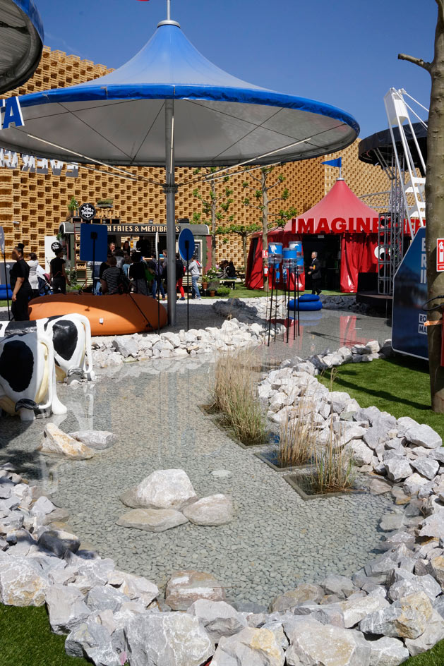
Small countries must respond intelligently to challenges of food production; the Netherlands is actually the second largest food exporting country in the world, thanks to ingenious land reclamation and efficient use of extremely fertile delta landscape.
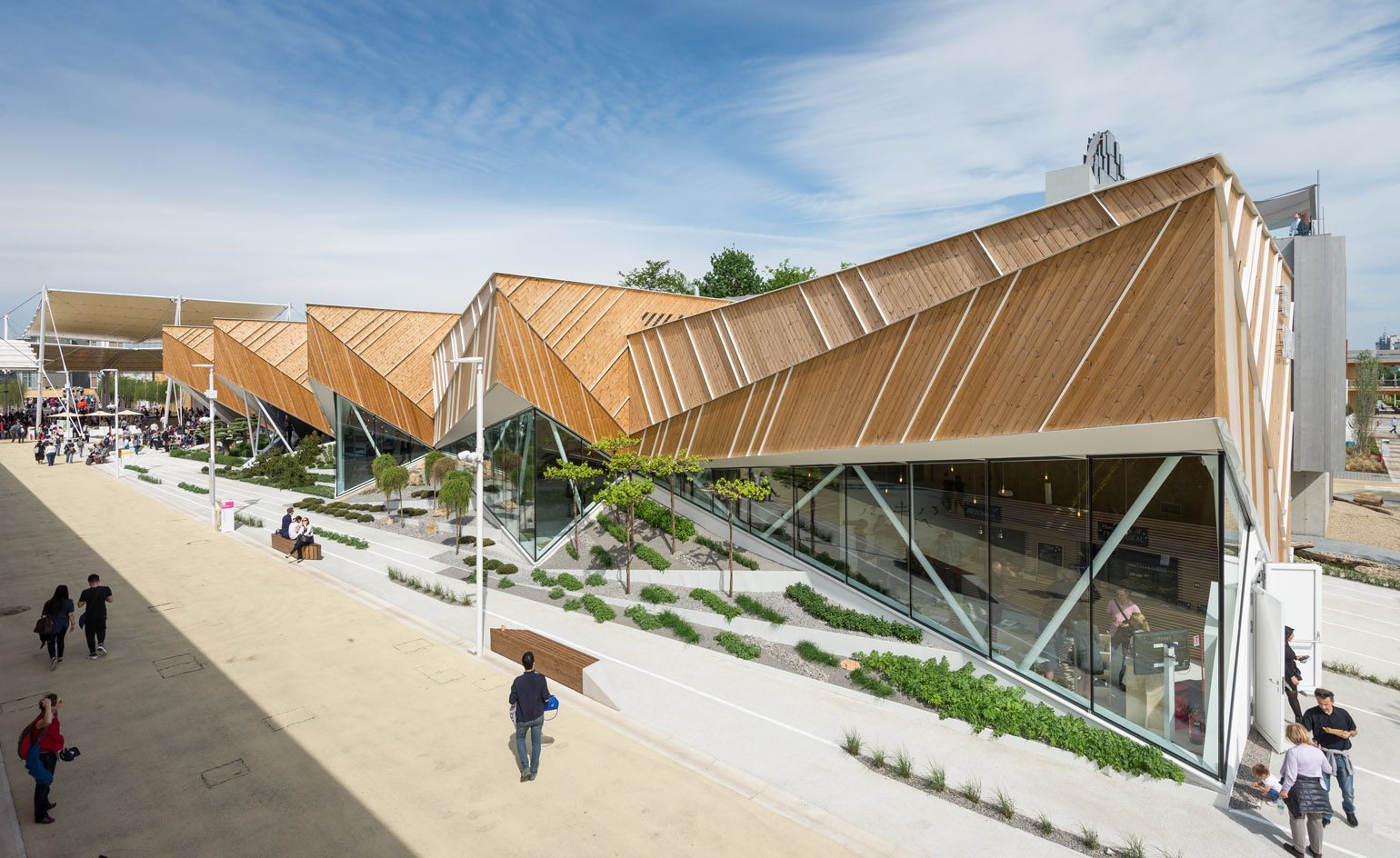
Slovenia: ‘I Feel Slovenia. Green. Active. Healthy’ The natural beauty of the Slovene scenery is propagated through the design of the Pavilion by SoNo Arhitekti. Slovenia’s stunning landscape is swathed in vast forests and Alpine mountains, and peppered with serene lakes; aspects of this geometry and indigenous flora are depicted in the Pavilion architecture
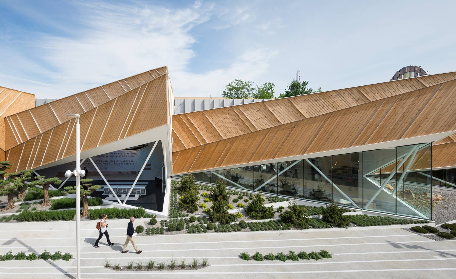
The jutting angular forms of the building reflect a mountainous terrain, whilst the timber composition (of cross-laminated panels supported by a wooden skeleton) and internal green walls draw inspiration from the native vegetation. Large triangular windows frame glimpses into the internal exhibition, which showcases Slovenia’s culinary diversity
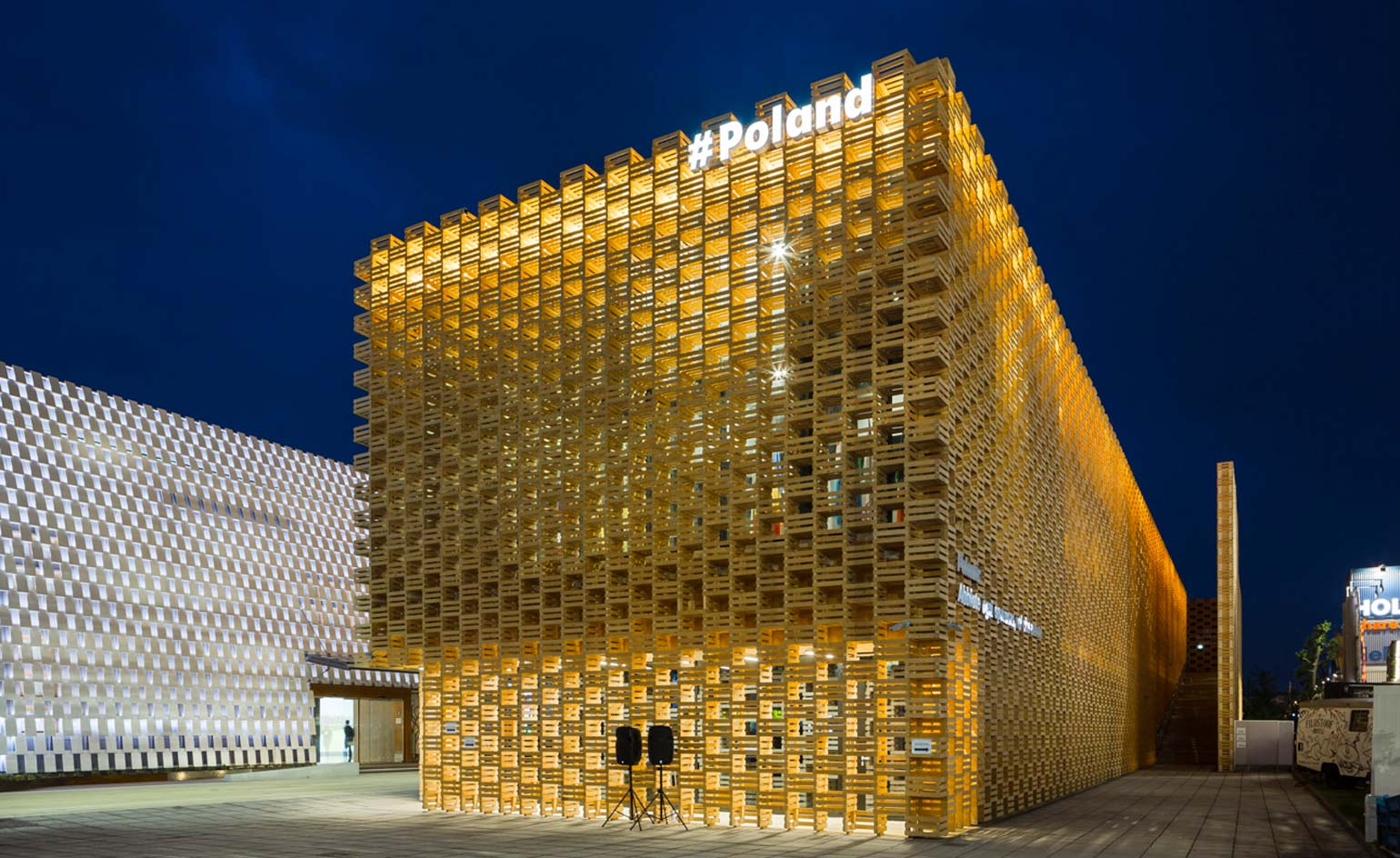
Poland: 'Fill yourselves with all hope, ye who enter here' (Dante, Divine Comedy) As the global forerunner in apple exportation, this humble fruit forms the basis of the Polish Pavilion, designed Warsaw based 2PM Architects.
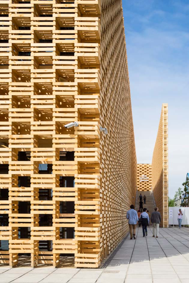
Whilst the external shell of cubic boxes is formed from hundreds of imitation rustic apple crates, the tall, narrow entrance also leads straight into an apple orchard, inspired by Mehoffer’s ‘Strange Garden’ painting.
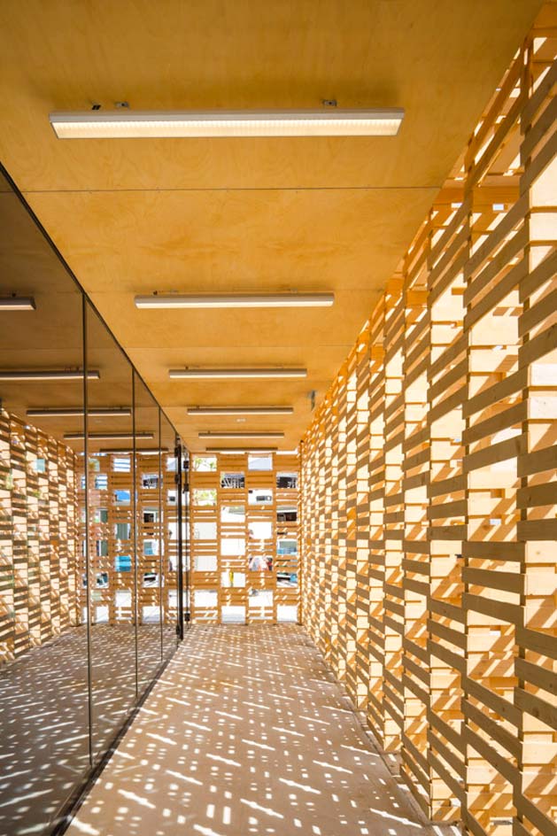
References to art, music and poetry are made throughout, with the construction drawing cultural associations between the Polish and Italian nations.
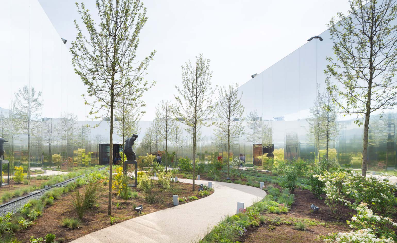
The scheme displays a central garden characteristic of a Polish landscape - completely surrounded by giant mirrors - and accommodates 1400sqm of exhibition space.
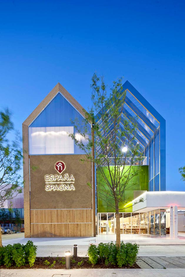
Spain: ‘Cultivating the Future’ ‘Tradition’ and ‘Innovation’ are the focus of the Spanish Pavilion, designed by b720 Arquitectos. Visually divided into two long pitched-roof buildings, the scheme occupies a 2,341sqm L-shaped site, with the base of the ‘L’ accommodating a quaint orchard of orange trees and providing space for open-air activities characteristic to the Spanish way of life.
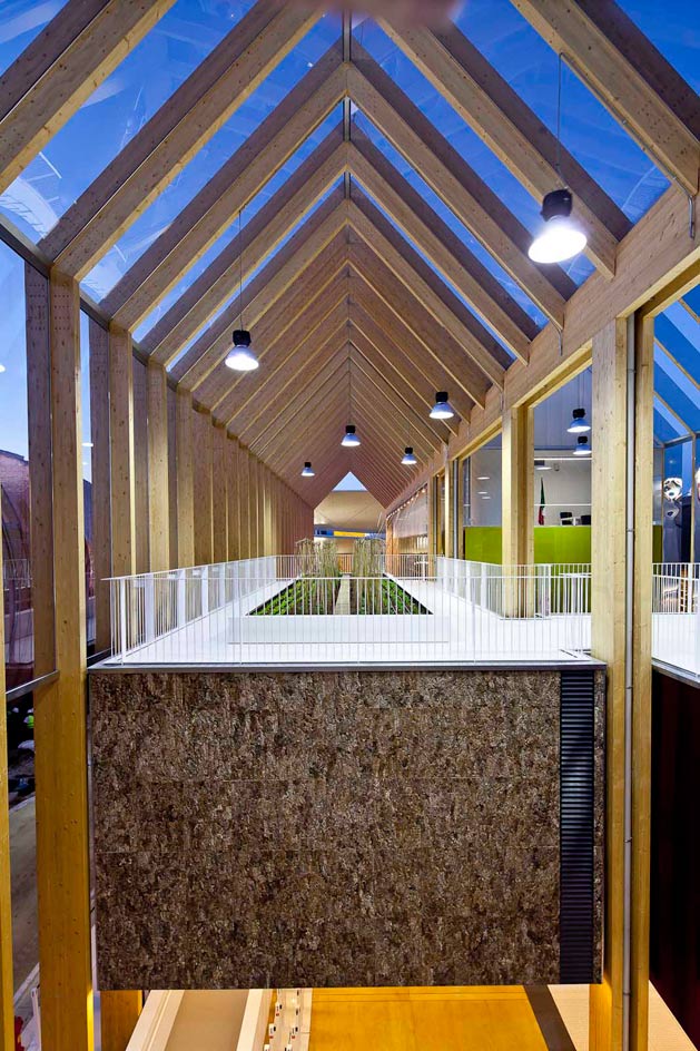
The adjacent pitched structures adopt the language of a greenhouse: geometrically simple but technologically advanced, with fixed roof shutters to control the internal microclimate. The building representing ‘tradition’ features a timber frame, whilst the shed symbolising ‘innovation’ displays the same structural shape, formed from modern polished stainless steel.
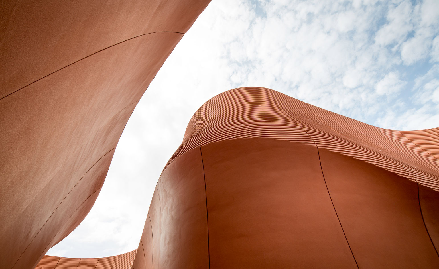
United Arab Emirates: ‘Food for Thought – Shaping and Sharing the Future’ Designed by Foster + Partners, the United Arab Emirates Pavilion is one of the most iconic designs at the 2015 Milan Expo. 12m high rippling fibreglass reinforced concrete walls oscillate through the 4400sqm site, creating shadowy passageways which allude to the characteristic shaded streets of UAE’s historic settlements.
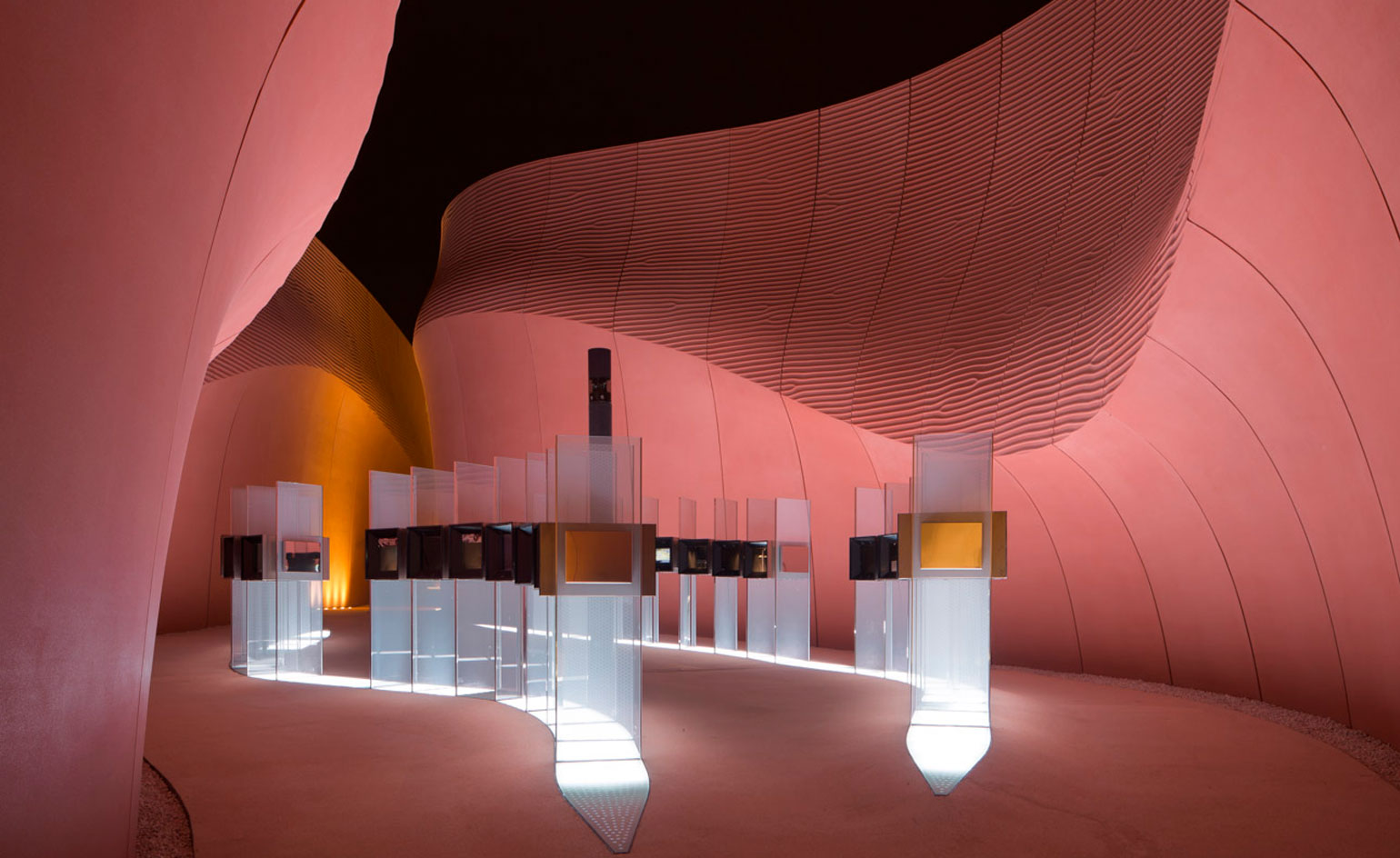
A 3D scanner was used to simulate patterns produced in desert sand dunes, which dictates the curvature of the Pavilion walls.
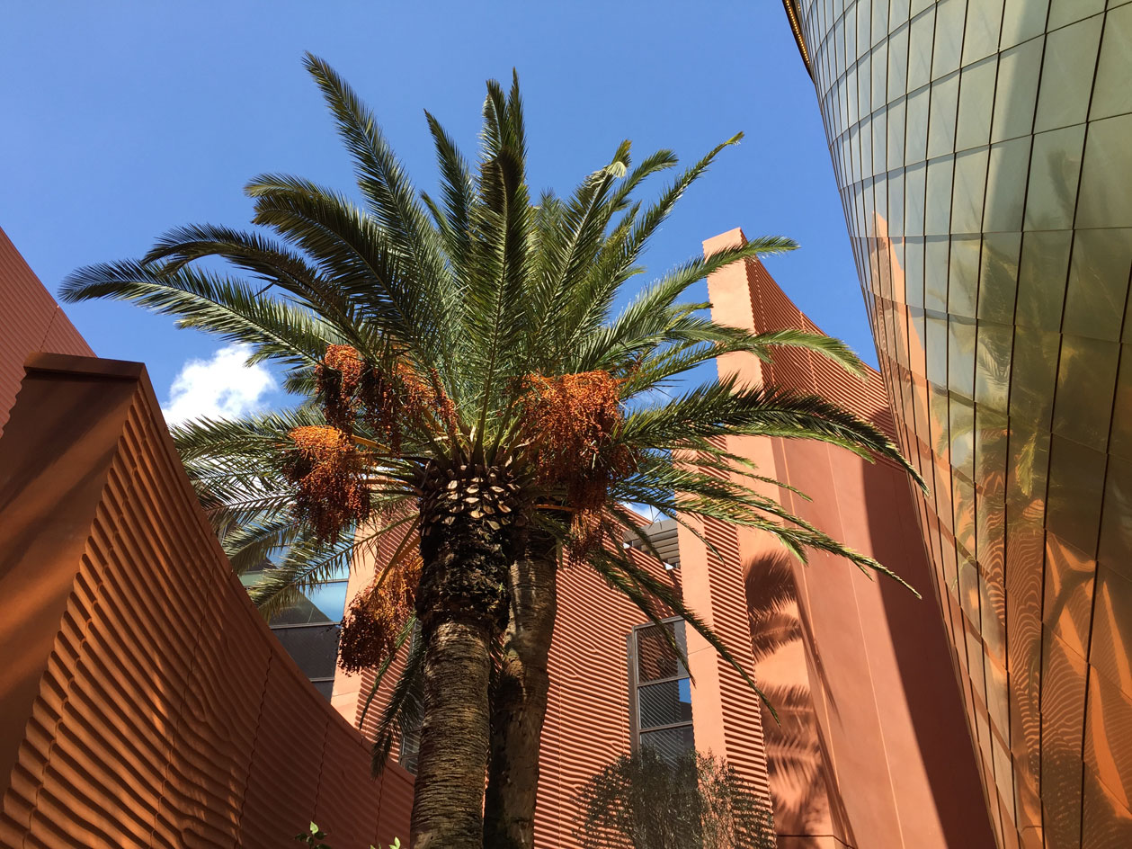
The visitor enters the scheme in which irrigation aqueducts are digitally reproduced, winding through the pathways towards a central auditorium and a special exhibition celebrating Dubai as the host of the 2020 World Expo.
Giovanna Dunmall is a freelance journalist based in London and West Wales who writes about architecture, culture, travel and design for international publications including The National, Wallpaper*, Azure, Detail, Damn, Conde Nast Traveller, AD India, Interior Design, Design Anthology and others. She also does editing, translation and copy writing work for architecture practices, design brands and cultural organisations.