Fosbury & Sons Boitsfort in Brussels brings home comforts into the workplace
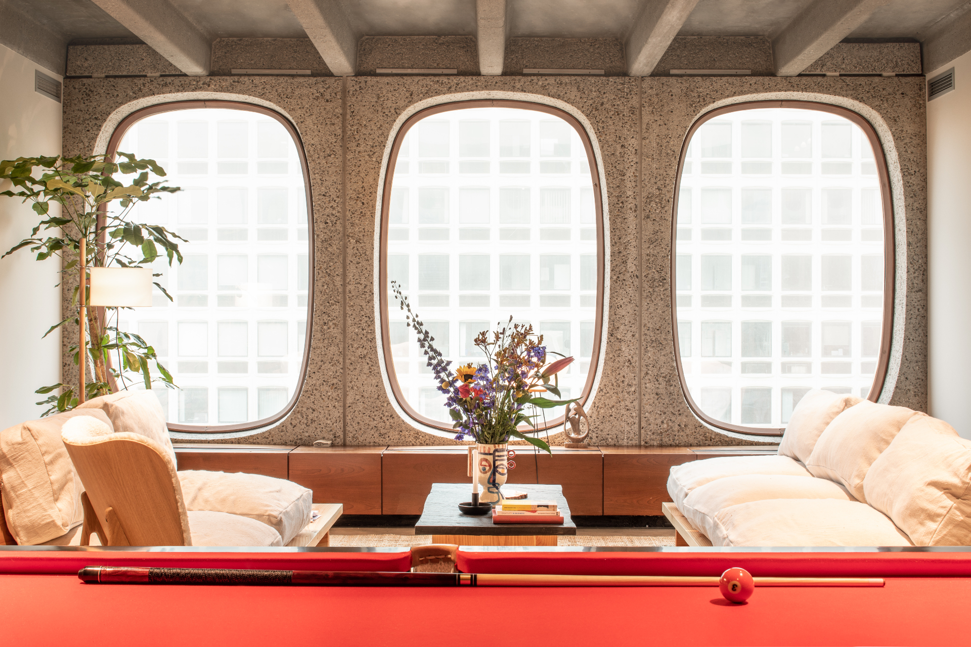
Sinking into a deep sofa, surrounded by candles and ceramic vases filled with flowers, is not something you might associate with a hard day at work, but that’s why co-working company Fosbury & Sons’ ideas are just so radical.
Serge Hannecart, Stijn Geeraets and Maarten Van Gool, who set up Fosbury & Sons in 2016, have just launched their new Brussels outpost, following the opening of a successful first space in Antwerp. They’ve created an environment filled with warmth and comfort, based upon their well-rounded belief that a humanist, elegant and holistic work place is the best route to success.
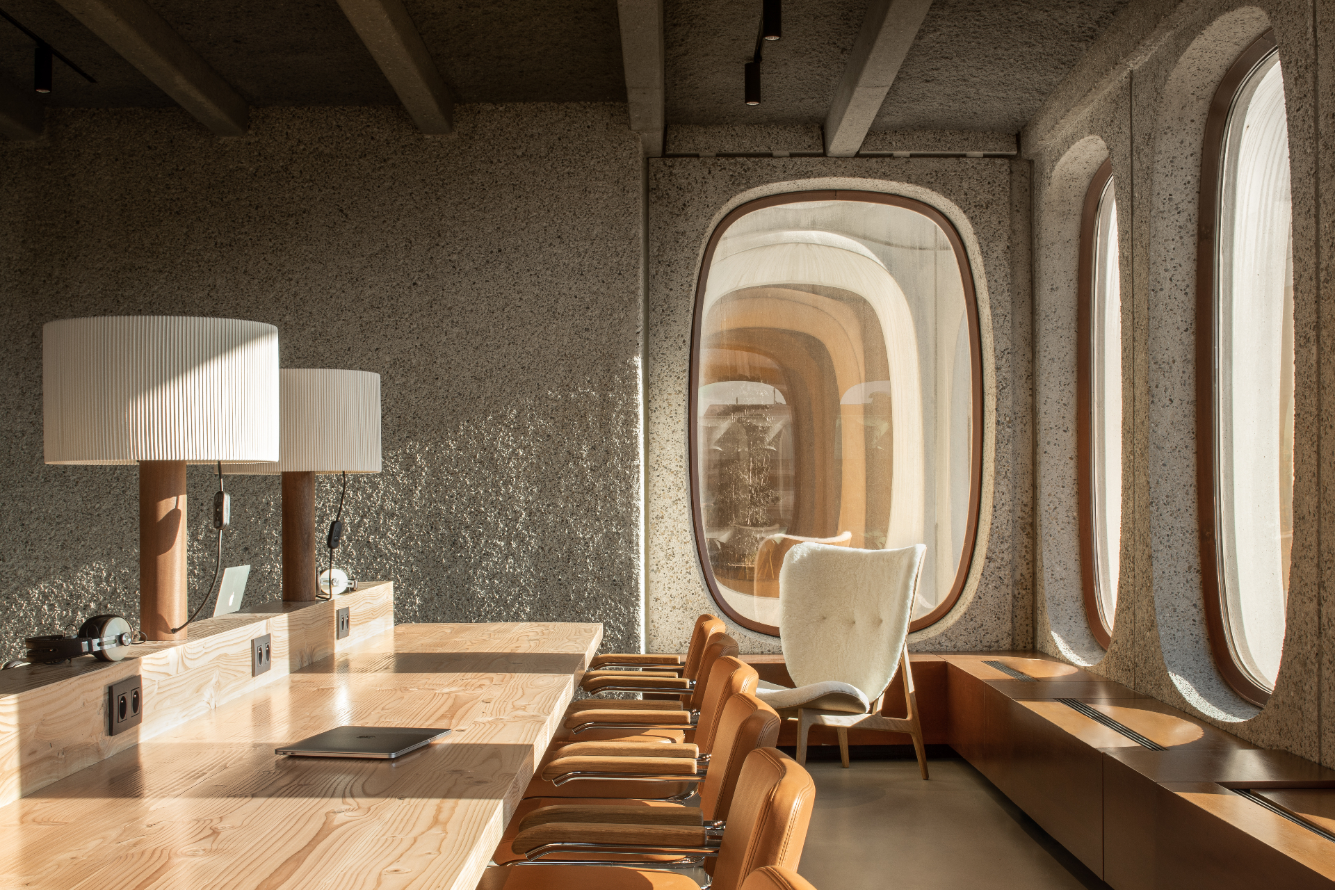
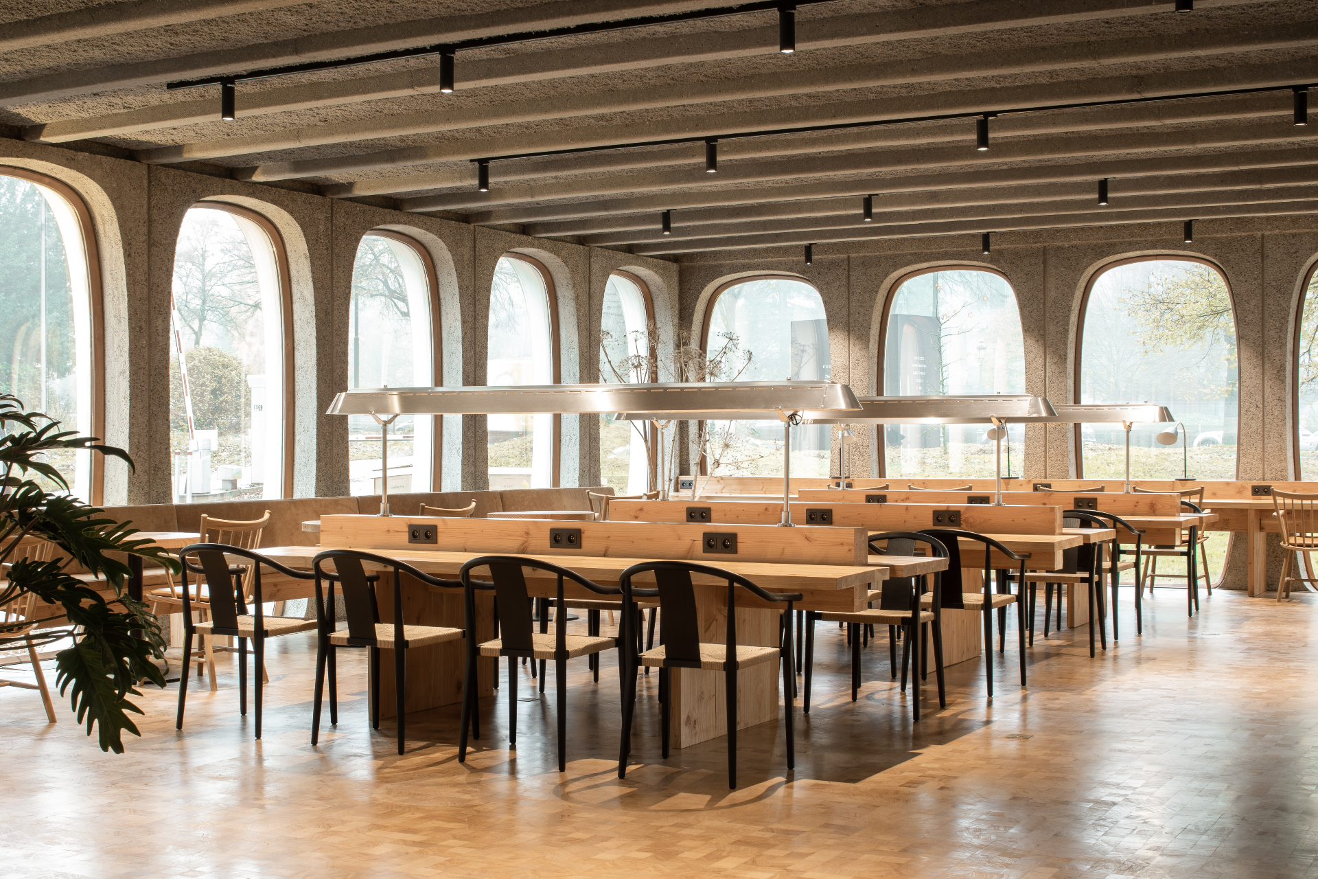
Located just outside of the centre of Brussels, Fosbury & Sons Boitsfort occupies a 1970s office building designed by Constantin Brodzki and is the first of three Brussels spaces opening over the next year. Restoring and renovating the original building created a template for the whole space based on good design, modernism and standing out from the crowd – the architecture of the building is certainly unlike any office building we’ve seen before with its organically shaped, curved windows and amber tinted glazing.
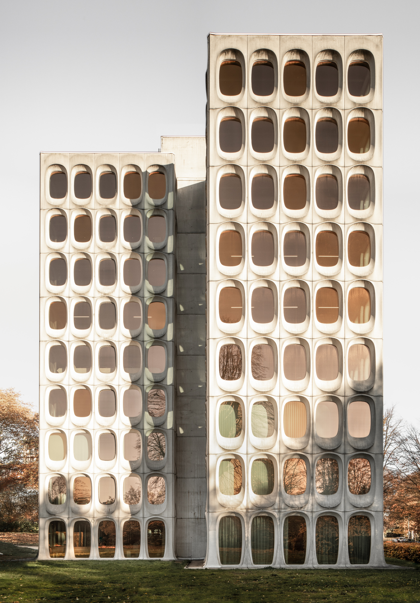
The exterior of Fosbury & Sons’ Boitsfort, Brussels, outpost.
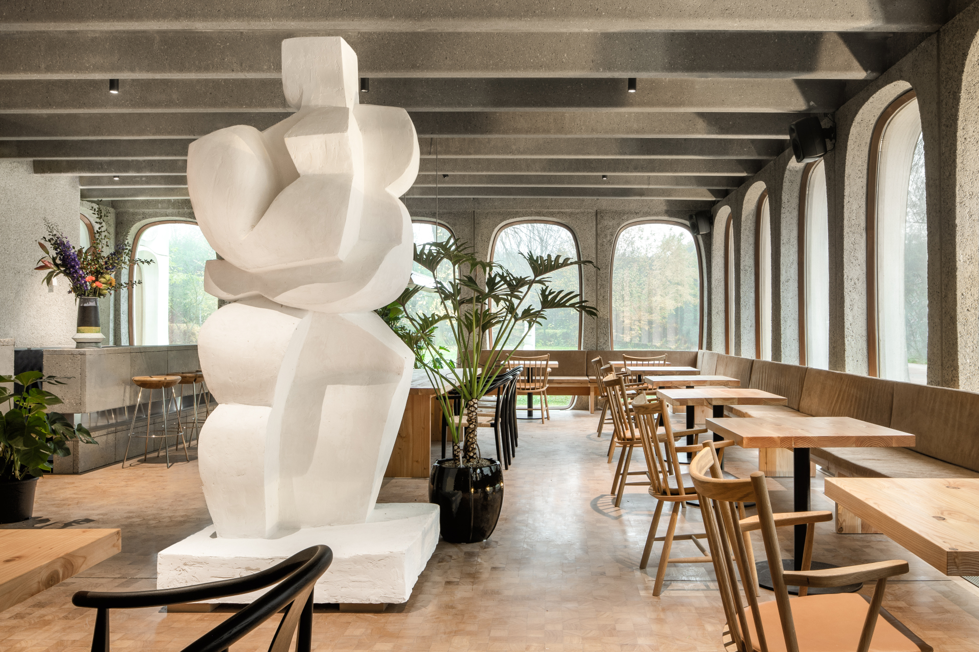
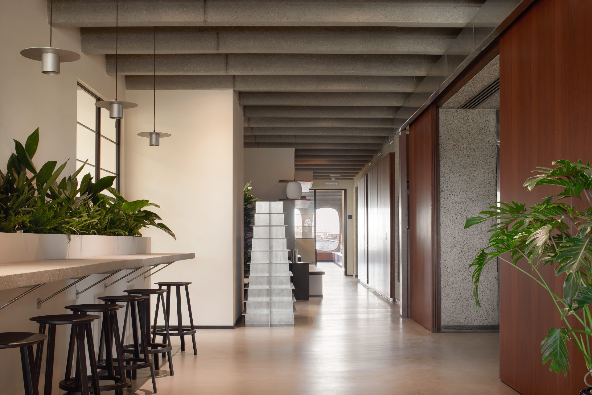
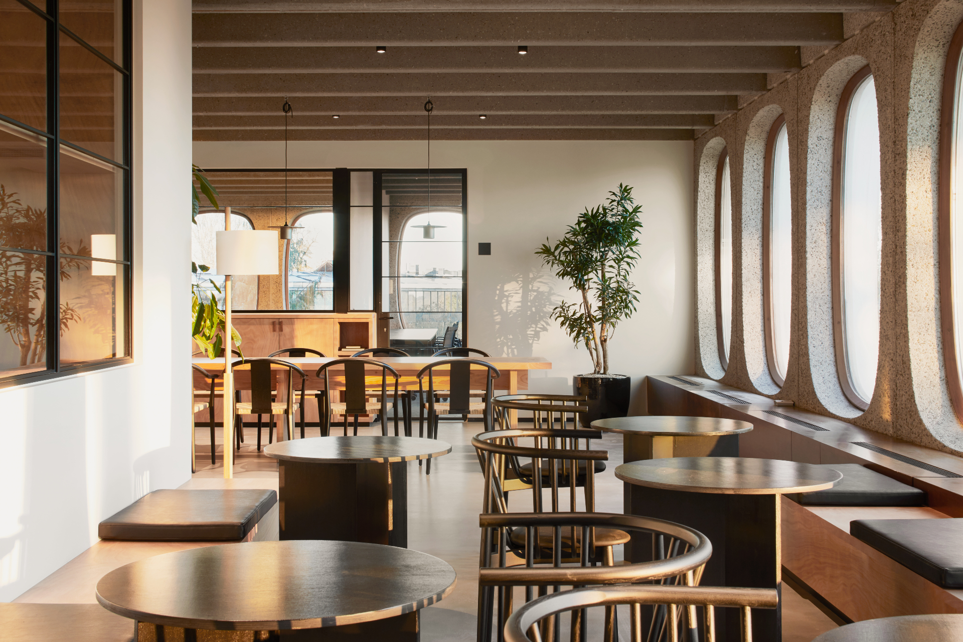
Interiors for the space were designed by Michiel Mertens and Anaïs Torfs of Going East, who also worked on the Antwerp space. They built their temp sur temp palette upon the warm greys of the rough speckled concrete of the interior architecture, the golden tones of the timber flooring, and the lowlights of the cherry wood cupboard doors, all carefully restored and back in use.
‘We wanted to create the right balance between cool and warm materials,’ says Torfs, who brought cream-coloured textiles, handpicked ceramics offering sparks of colour, and pendant lighting in soft metallic hues. All of these are reflected in the curved windows that bring the misty, autumnal colours of the forest beyond into each space.
‘All items are handpicked, even the little pieces,’ says Mertens. ‘We buy things all over the world from Paris to Marrakech – it’s really a design for a home.’ The pair even use their own home as an inventory for all the objects they use in their projects. The effect is welcoming, cosy and human.
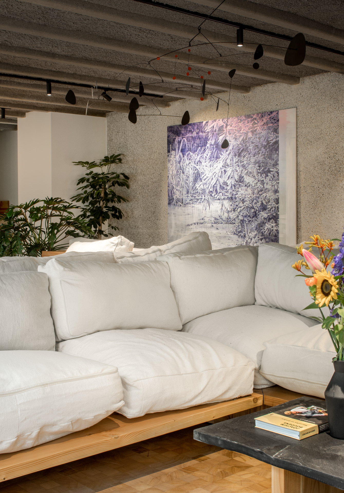
The warm sofas, plants, mobiles and original timber flooring within the design by Going East.
Yet, why associate comfort with a home, and discomfort with an office, we wonder? Ingrained in our associations with work is a whole history of unhealthy practices, from strip lighting and coffee-stained carpets, to unnecessary objects stuffed into filing cabinets.
It was a similarly bad experience that motivated Geeraets to start Fosbury & Sons. ‘I’ve worked for large organisations, I drank my coffee everyday from a plastic cup, surrounded by clutter. It wasn’t an environment where I could find a piece of mind – and that’s what you need from an office. You have to solve problems, you have to have clarity and be on top of things. I started to wonder, why does the office look like this?’
While researching for the space, Geeraets and van Gool travelled to many different cities looking at examples of office spaces, and staying at hotels along the way: ‘What we found in hotel lobbys was much closer to what we wanted than what we found in the offices we were looking at,’ says van Gool.
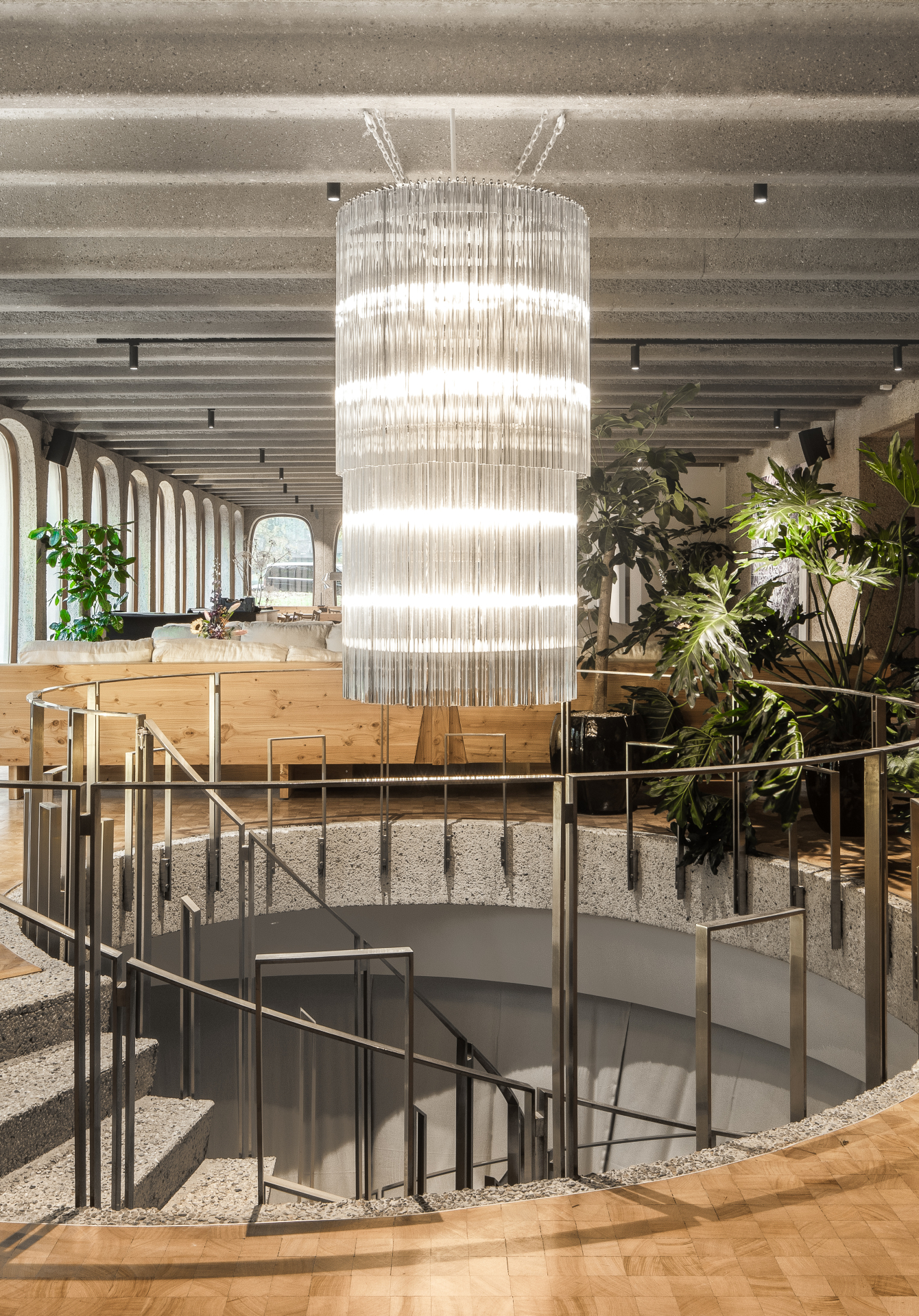
The Fosbury & Sons Boitsfort lobby features a glass chandelier and original spiralling staircase.
Fosbury & Sons’ concept explores a much bigger question of how good design can reflect company values: ‘How can you motivate your people in the best way? Is it through rules or can you help them grow by letting them be who they are, and support them, giving them the best surroundings they can have in a human way,’ says Geeraets.
The forward-thinking duo put these values into practice in their own company that operates out of their Antwerp space (opened in 2016) and has gone from strength to strength, expanding to open up even more desk space. ‘We don’t tell people what to do, because they know best. A lot of companies are still in a state of command and control, we look more to trust and results, and support.’
They find that their Fosbury & Sons tenants also share these common values: ‘It’s not what you do, or the type of company you are, it’s the people who are important,' says van Gool. ‘They are all eager to do what they do, the best they can.’
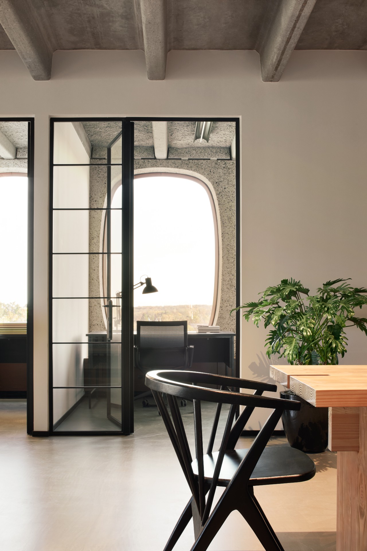
Workspaces at Fosbury & Sons Boitsfort.
Geeraets brings up the most important and overlooked factor needed in the work day – rest. ‘Our brains can’t function straight for eight hours. We try to make people even more productive.’ Instead of just adding the ‘chill corner’ into an office filled with bright lights and hard surfaces, Fosbury & Sons has rethought the whole typology of office design from the ground up.
It all sounds a bit too good to be true. Might you feel a bit too relaxed at Fosbury & Sons Boitsfort? No, says Geeraets: ‘It’s not only the environment that determines how you work, it’s the colleagues, it’s the deadline. We aren’t creating a home, the need is a place where people feel good.’
INFORMATION
For more information, visit the Fosbury & Sons website and the Going East website
Wallpaper* Newsletter
Receive our daily digest of inspiration, escapism and design stories from around the world direct to your inbox.
Harriet Thorpe is a writer, journalist and editor covering architecture, design and culture, with particular interest in sustainability, 20th-century architecture and community. After studying History of Art at the School of Oriental and African Studies (SOAS) and Journalism at City University in London, she developed her interest in architecture working at Wallpaper* magazine and today contributes to Wallpaper*, The World of Interiors and Icon magazine, amongst other titles. She is author of The Sustainable City (2022, Hoxton Mini Press), a book about sustainable architecture in London, and the Modern Cambridge Map (2023, Blue Crow Media), a map of 20th-century architecture in Cambridge, the city where she grew up.
-
 ‘Independence, community, legacy’: inside a new book documenting the history of cult British streetwear label Aries
Rizzoli’s ‘Aries Arise Archive’ documents the last ten years of the ‘independent, rebellious’ London-based label. Founder Sofia Prantera tells Wallpaper* the story behind the project
By Jack Moss
-
 Head out to new frontiers in the pocket-sized Project Safari off-road supercar
Project Safari is the first venture from Get Lost Automotive and represents a radical reworking of the original 1990s-era Lotus Elise
By Jonathan Bell
-
 Kapwani Kiwanga transforms Kvadrat’s Milan showroom with a prismatic textile made from ocean waste
The Canada-born artist draws on iridescence in nature to create a dual-toned textile made from ocean-bound plastic
By Ali Morris
-
 ‘Close to solitude, but with a neighbour’: Furu’s cabins in the woods are a tranquil escape
Taking its name from the Swedish word for ‘pine tree’, creative project management studio Furu is growing against the grain
By Siska Lyssens
-
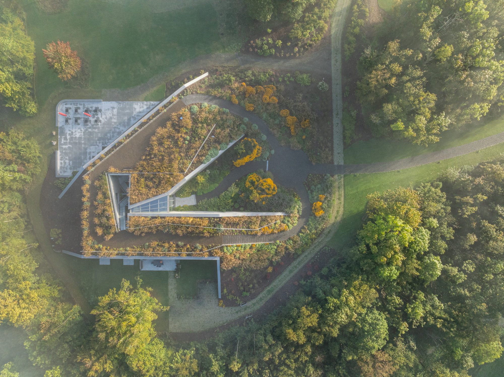 Tour Marche Arboretum, a new 'museum' of plants in Belgium
Marche Arboretum is a joyful new green space in Belgium, dedicated to nature and science – and a Wallpaper* Design Award 2025 winner
By Ellie Stathaki
-
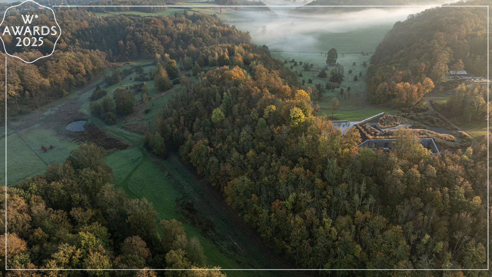 Wallpaper* Design Awards 2025: celebrating architectural projects that restore, rebalance and renew
As we welcome 2025, the Wallpaper* Architecture Awards look back, and to the future, on how our attitudes change; and celebrate how nature, wellbeing and sustainability take centre stage
By Ellie Stathaki
-
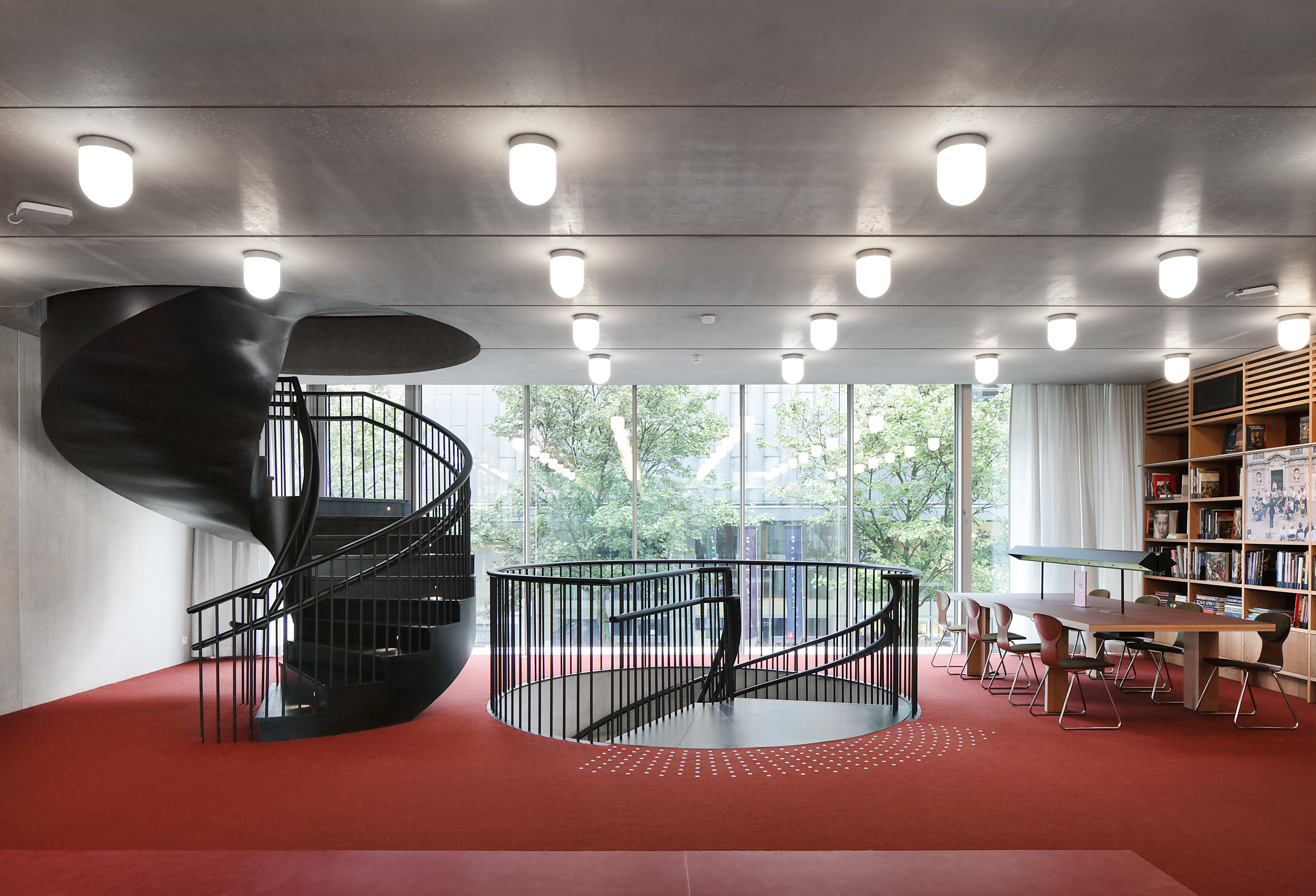 Step through Rubenshuis’ new architectural gateway to the world of the Flemish painter
Architects Robbrecht en Daem’s new building at Rubenshuis, Antwerp, frames Rubens’ private universe, weaving a modern library and offices into the master’s historic axis of art and nature
By Tim Abrahams
-
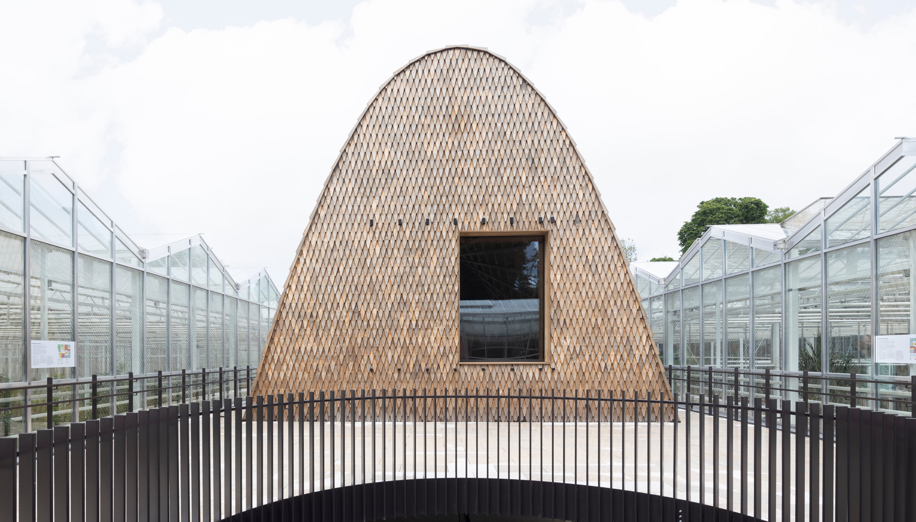 Green Ark, a new garden pavilion from modified softwood, is conceived for plant conservation
The Green Ark, set in the heart of Belgium's Meise Botanic Garden, is an ultra-sustainable visitor pavilion by NU Architectuur Atelier
By Jonathan Bell
-
 Residence Norah is a modernist Belgian villa transformed to its owner’s needs
Residence Norah by Glenn Sestig in Belgium’s Deurle transforms an existing gallery space into a flexible private meeting area that perfectly responds to its owner’s requirements
By Ellie Stathaki
-
 Bruges Triennial 2024 takes over the city with contemporary art and architecture
Bruges Triennial 2024, themed 'Spaces of Possibility', considers sustainability and liveability within cities, looking towards a greener future
By Ellie Stathaki
-
 ‘Interior sculptor’ Christophe Gevers’ oeuvre is celebrated in new book
‘Christophe Gevers’ is a sleek monograph dedicated to the Belgian's life work as an interior architect, designer, sculptor and inventor, with unseen photography by Jean-Pierre Gabriel
By Tianna Williams