Foster + Partners’ Norton Museum expansion rediscovers its West Palm Beach identity
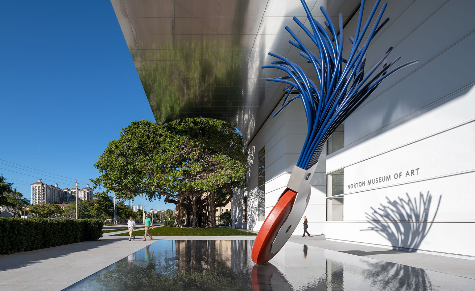
The mood is light and optimistic in West Palm Beach despite Trump’s arrival to Mar-a-Lago; the Norton Museum has reopened to the public with a new design by Foster + Partners. Respectful of site and context, Norman Foster has artfully reworked the original 1940s buildings by local architects Wyeth and King and submerged the museum into a tropical garden creating a private paradise for art. Instead of a Bilbao-style arrival, Foster’s plan celebrates history and builds on it with elegant additions, careful edits and coherent updates.
Equipped with a new architecture, the private collection now seeks to expand its role as a public institution. Once a casual collection begun by industrialist Ralph Norton and his wife Elizabeth, art collecting soon grew into a more serious occupation and the couple founded the Norton Museum in 1941. Now with over 7,600 works crossing multiple eras and styles, it required an institution. Norton Museum trustee Gil Maurer, long-time director at Hearst and business occupant in Foster’s Hearst Tower in New York City provided the connection, and the commission began.
Across the whole plan, only eight per cent is new building. So what has Foster and his hard-working team, headed up Michael Wurzel, partner in charge, with Spencer de Grey, head of design, been up to for the past eight years? ‘Every space has been touched in some way modified, referred or reconnected and when you move around you do have the feeling you’re in a new museum,’ says Norman Foster, reassuringly. Eight percent is 59,000 sq ft after all.
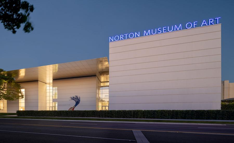
Northeast view of the Norton Museum of Art’s new Kenneth C. Griffin Building, designed by Foster + Partners, as seen from South Dixie Highway.
Northeast view of the Norton Museum of Art’s new Kenneth C. Griffin Building, designed by Foster + Partners, as seen from South Dixie Highway. Photography: © Nigel Young / Foster + Partners
So instead of a reinvention, the design enabled the museum to become a much better version of its original self. An integral change was moving the entrance of the museum from the west, to the north on S. Dixie Highway, reinstating yet reversing the original axis of the 1940s design where entry lay at the south. At the original south entrance you’ll see the decorative, quasi-postmodern, art deco style of architect Marion Sims Wyeth’s build. Interestingly, Wyeth and King were also behind the elaborate Spanish revival architecture of Trump’s ‘winter White House’, Mar-a-Lago, built in the 1920s.
Foster’s new entrance makes more sense to drivers approaching the museum, and has a typographic neon sign neatly stacked atop its facade and a new mascot, the wacky-looking 19ft high ‘Typewriter Eraser, Scale X’ sculpture by Claes Oldenburg and Coosje Van Bruggen floating on a square reflecting pool. As a rule of thumb across the museum, anything new added by Foster somehow seems already ‘inevitable’ – a word he uses himself when describing his approach.
‘Which other museum celebrates an 80-year-old tree, or a relic from an analogue typewriter past?’
It’s hard to miss the huge 65 ft banyan tree at the front of the museum, with colossal dripping roots, which is quite clearly not new. It’s been there since 1935. Foster’s vast new canopy curves in deference to the tree at 43 ft. It half-cocoons it in shiny metal, blurrily reflecting the dense form of its rain shower soaked bark. In an age of an architecture and public that demand new thrills and the next big thing, this deference is perhaps the most daring statement of all.
Major new elements such as the 210-seat auditorium, great hall, restaurant and sculpture gallery fall seamlessly into step with the existing core plan – only quietly reinstating their modernity with a muted grey micro-terrazzo flooring. On a rational path through the ground floor galleries – where one can find the best of the collection’s European, American and Chinese art – the flooring is the only indicator of new and old.
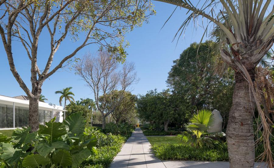
The Norton Museum of Art gardens, looking east.
The new garden was another simple act of reconnection, this time with the local climate. Now the museum lives in an oasis of mahogany trees, hanging lobster claws (a species of shrub), Bahamian trumpets (a type of flowering tree) and other strange and beautiful sounding native and non-native species. Formations of square grassy plots divided up by long straight paved pathways, softly echoing the ground floor gallery plan, hold colourful sculptures by Leger, Lalanne and Rondinone.
Running the length of the new light-filled 150ft-long indoor sculpture gallery, a new colonnade layers the transition between inside and out. It’s a lighter, more modern version of Wyeth and King’s central courtyard colonnade, shaded by the generous overhang of the canopy that shields the hurricane-proof glazing of the gallery from direct sunlight. White chairs and tables by Richard Shultz, designed with the Palm Beach lifestyle in mind, gather on the restaurant terrace.
‘I was thrilled to be able to work with Foster because he is a modernist. I knew they weren’t going to give me a piece of sculpture, they were going to give me a building that worked,’ says Hope Alswang, outgoing director of the Norton, who sees the museum as public institution in the making. Her wish was for the museum was to be ‘profoundly practical’ and reflect an American classical modern, in reference to the ‘golden age of American museums’ – she cites the Breuer Building and the MET.
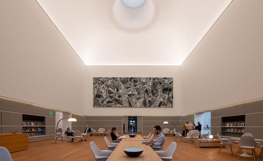
The Norton Museum of Art’s new Ruth and Carl Shapiro Great Hall, designed by Foster + Partners, featuring Pae White’s Eikón, a 40-foot-long, 15-foot-tall tapestry.
While from the outside the museum appears as a series of white cuboids, it is far from a ‘white cube’ gallery inside. Toeing a conservative line between classical and modern, the design positions the Norton as a museum with great aspirations – as seen in the Great Hall, which Alswang describes as the Norton’s living room.
This is Palm Beach, so it’s of a substantially higher pedigree than your average living room – but comfortable and welcoming nonetheless. The room has wide oak flooring, soft fabric and timber wall panelling and a specially commissioned tapestry by Pae White. Chairs by Eames and Saarinen cluster about, their formations adjusting frequently as people arrive and depart. High above the classical proportions, midcentury design and polite conversations, is a scooped oculus casting down the warm Florida light.
The oculus was a late addition to the design – ‘it completely changed the room’ says Alswang. Likewise was the neon sign – which Alswang fought for planning for from the City: ‘We had to prove that the sign wasn’t advertising, but that it was part of the architecture,’ she says.
‘Some way into the design, I found myself sketching and drawing [the neon sign],’ explains Foster. ‘We approached the museum and they got excited about it. In the studio in London, where we have a big double-height space, I had the team experiment with really large letters, profiling and incorporating light and colour. That’s one of those design exercises that emerged quite late in the day, but I would like to think when you see it now, it looks as inevitable as the Typewriter Eraser does coming out of that reflecting pool.’
It’s interesting to learn how these identity-defining moments, modern linchpins across the conservative design, emerged almost by chance. Maybe it’s linked to really understanding a place and a context, and once grasping that, being able to contribute to the specific nature of that site. ‘In a world which is becoming increasingly homogeneous and anonymous, anything that makes one place different from the other [is important]. Which other museum celebrates an 80-year-old tree, or a relic from an analogue typewriter past?’ asks Foster.
Despite being known for designing for a future on Mars, Foster is more than comfortable in the realm of the past, seeking a contextual solution for each project, wary of the layers of history. Similarly to the Norton, restoring the original 20th-century Beaux Arts plan was integral to the solution for the Museum of Fine Arts Boston expansion completed in 2010. While Foster’s first museum project in the US in 1994, a new wing for the Joslyn museum in Omaha, Nebraska, gracefully extended the original art deco building from 1931 with matching pink Etowah Fleuri marble sourced from the same Georgian quarry as the original material.
In Europe, his notable intervention at the Great Court at the British Museum restored accessibility and extended function to the central courtyard with a glass roof, while preserving all original functions of the museum. Now Foster & Partners is working on an renovation of the Prado in Madrid where a similarly radical yet respectful intervention is being made: ‘We are bringing to life and conserving the oldest most venerated internal space the Hall of Realms then creating the biggest most flexible space with 17m spans on top of it for contemporary art,’ says Foster.
Throughout the Norton project, Alswang recognised Foster and his team’s love of art. Walking through the galleries, Foster exclaims at the brilliance of a Donald Judd stacked on the wall, and pauses by a Danh Vo explaining how the work is a piece of a scale version of the statue of Liberty. Foster’s own sketches of the Typewriter Eraser sculpture outside the museum are on display in an exhibition – he presented them to collector Ronnie Heyman, who gifted the museum its forecourt mascot, to show her how it would appear in situ.
Over the next 12 years, the Norton Museum campus will continue its organised sprawl further still with a second phase of expansion towards the water, which Foster will oversee. Phase one has already attracted new donations, as well as the atmosphere of optimism in West Palm Beach, and the next few years will show how the architecture might also contribute to the community through its extended programming, evening events and its free admission days on Fridays and Saturdays.
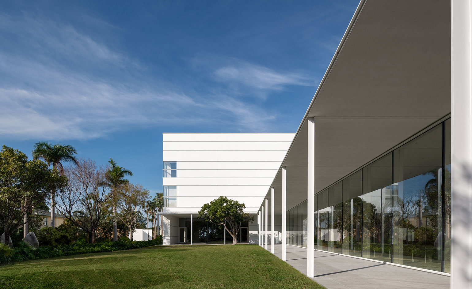
The Pamela and Robert B. Goergen Garden at the Norton Museum of Art.
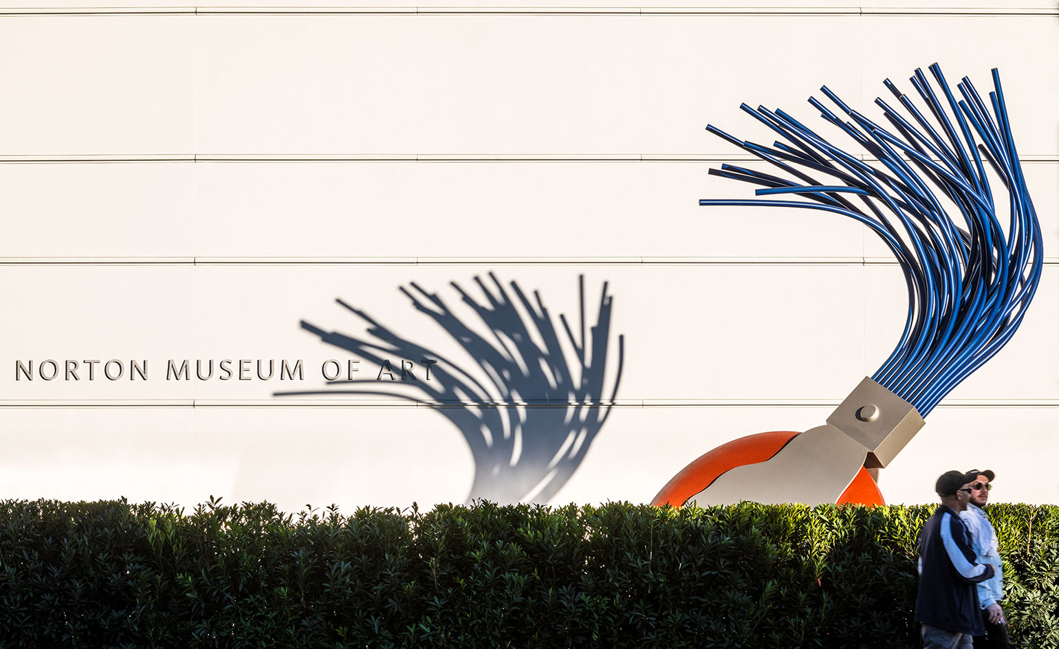
Typewriter Eraser, Scale X (1999) by Claes Oldenburg and Coosje Van Bruggen in front of the Norton Museum of Art.
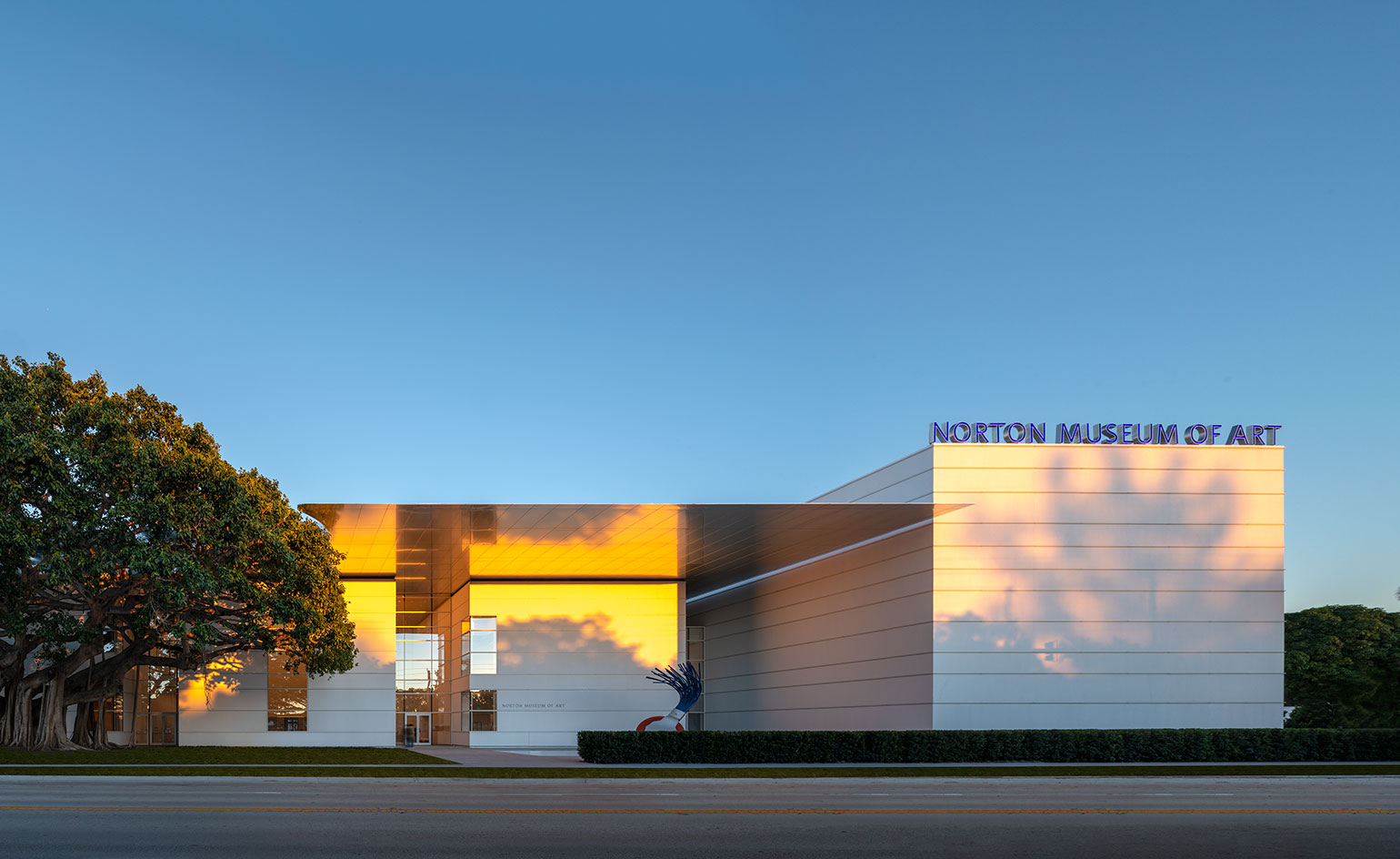
The Norton Museum of Art’s new Kenneth C. Griffin Building, designed by Foster + Partners, as seen from S. Dixie Highway.
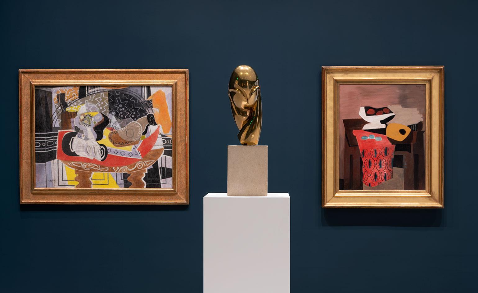
Installation view of collection highlights at the Norton Museum of Art.
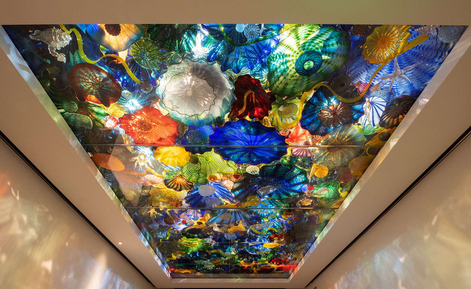
Installation view of Dale Chihuly’s Persian Sea Life Ceiling (2003) at the Norton Museum of Art.
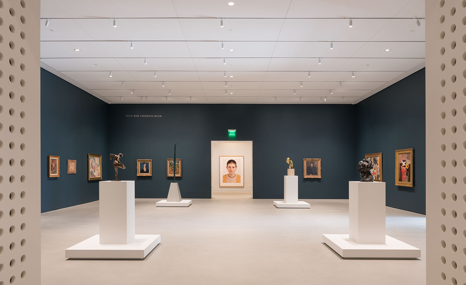
Installation view at the Norton Museum of Art
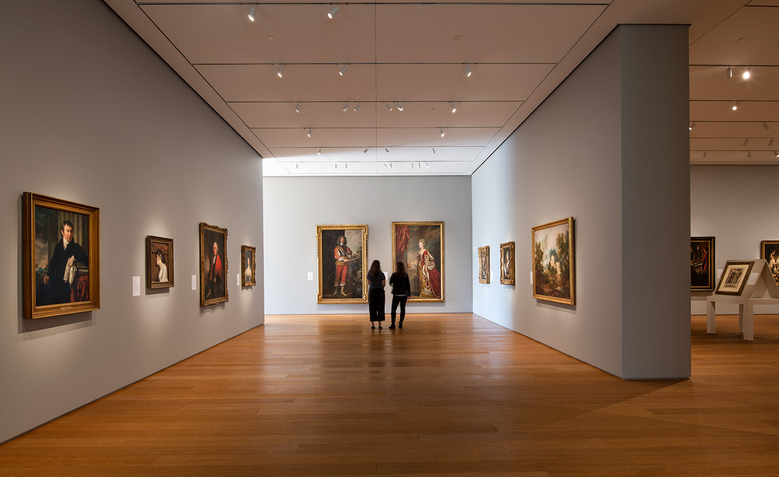
Installation view at the Norton Museum of Art.
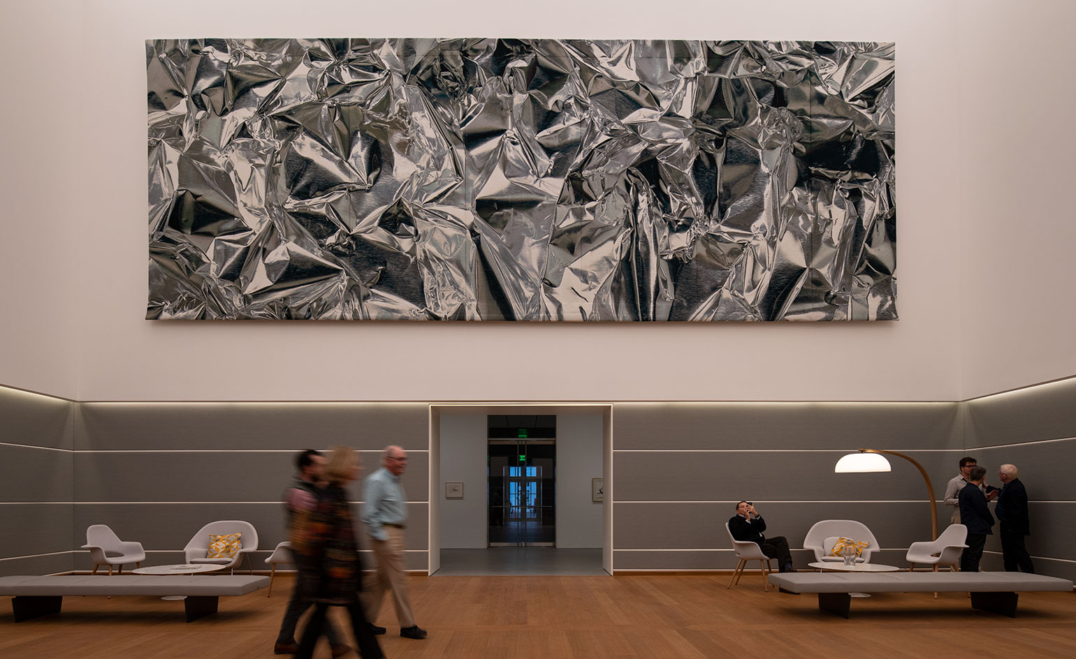
Pae White’s Eikón, a 40-foot-long, 15-foot-tall tapestry in the Norton Museum of Art’s new Ruth and Carl Shapiro Great Hall, designed by Foster + Partners.
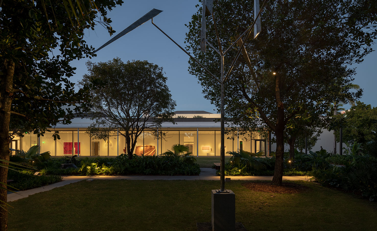
The Pamela and Robert B. Goergen Garden at the Norton Museum of Art.
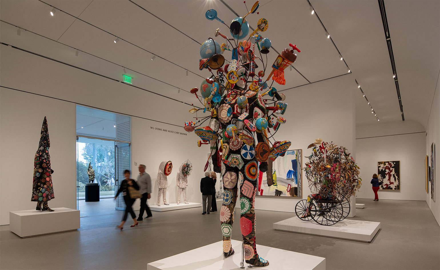
Installation view of ‘Going Public: Florida Collectors Celebrate the Norton’.
INFORMATION
The Norton Museum opens to the public on 9 February. For more information, visit the Foster and Partners website, the CBT, executive architects, website, and the Norton Museum website
Wallpaper* Newsletter
Receive our daily digest of inspiration, escapism and design stories from around the world direct to your inbox.
Harriet Thorpe is a writer, journalist and editor covering architecture, design and culture, with particular interest in sustainability, 20th-century architecture and community. After studying History of Art at the School of Oriental and African Studies (SOAS) and Journalism at City University in London, she developed her interest in architecture working at Wallpaper* magazine and today contributes to Wallpaper*, The World of Interiors and Icon magazine, amongst other titles. She is author of The Sustainable City (2022, Hoxton Mini Press), a book about sustainable architecture in London, and the Modern Cambridge Map (2023, Blue Crow Media), a map of 20th-century architecture in Cambridge, the city where she grew up.
-
 Maserati joins forces with Giorgetti for a turbo-charged relationship
Announcing their marriage during Milan Design Week, the brands unveiled a collection, a car and a long term commitment
By Hugo Macdonald
-
 Through an innovative new training program, Poltrona Frau aims to safeguard Italian craft
The heritage furniture manufacturer is training a new generation of leather artisans
By Cristina Kiran Piotti
-
 Wallpaper* checks in at The Eve Hotel Sydney: a lush urban escape
A new Sydney hotel makes a bold and biophilic addition to a buzzing neighbourhood that’s on the up
By Kee Foong
-
 This minimalist Wyoming retreat is the perfect place to unplug
This woodland home that espouses the virtues of simplicity, containing barely any furniture and having used only three materials in its construction
By Anna Solomon
-
 We explore Franklin Israel’s lesser-known, progressive, deconstructivist architecture
Franklin Israel, a progressive Californian architect whose life was cut short in 1996 at the age of 50, is celebrated in a new book that examines his work and legacy
By Michael Webb
-
 A new hilltop California home is rooted in the landscape and celebrates views of nature
WOJR's California home House of Horns is a meticulously planned modern villa that seeps into its surrounding landscape through a series of sculptural courtyards
By Jonathan Bell
-
 The Frick Collection's expansion by Selldorf Architects is both surgical and delicate
The New York cultural institution gets a $220 million glow-up
By Stephanie Murg
-
 Remembering architect David M Childs (1941-2025) and his New York skyline legacy
David M Childs, a former chairman of architectural powerhouse SOM, has passed away. We celebrate his professional achievements
By Jonathan Bell
-
 The Yale Center for British Art, Louis Kahn’s final project, glows anew after a two-year closure
After years of restoration, a modernist jewel and a treasure trove of British artwork can be seen in a whole new light
By Anna Fixsen
-
 The upcoming Zaha Hadid Architects projects set to transform the horizon
A peek at Zaha Hadid Architects’ future projects, which will comprise some of the most innovative and intriguing structures in the world
By Anna Solomon
-
 Frank Lloyd Wright’s last house has finally been built – and you can stay there
Frank Lloyd Wright’s final residential commission, RiverRock, has come to life. But, constructed 66 years after his death, can it be considered a true ‘Wright’?
By Anna Solomon