Gagosian 541 West 24th Street shows off architectural simplicity by Caplan Colaku
Gagosian 541 West 24th Street in New York shows off its sophisticated space, by Caplan Colaku Architecture, with Damien Hirst’s ‘Forgiving and Forgetting’
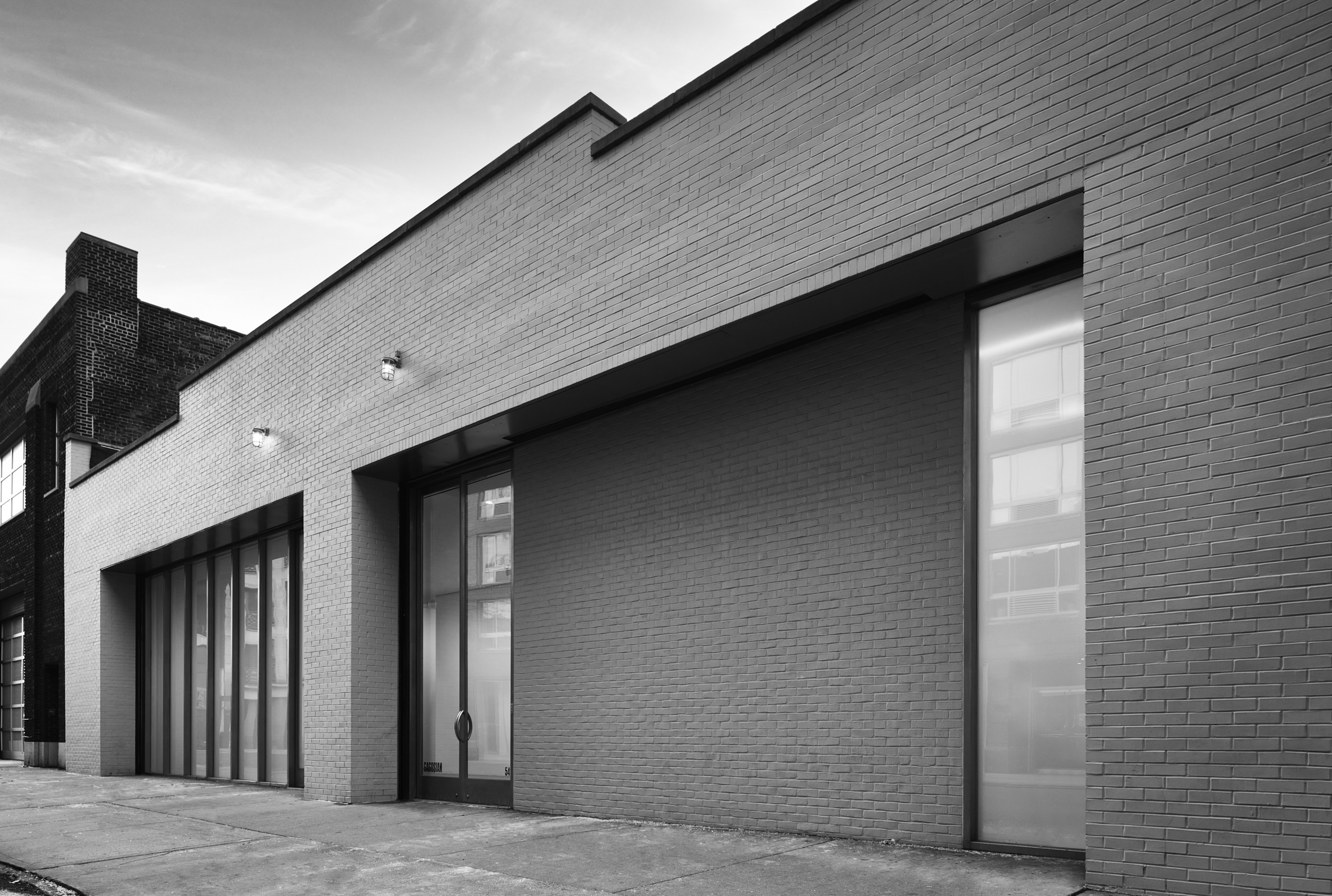
Among Gagosian’s 19 locations worldwide, its latest Manhattan gallery, Gagosian 541 West 24th Street, in New York’s Chelsea neighbourhood, has flown under the radar, having opened in March 2020, just a few weeks before the city went into lockdown. The 541 space’s relative obscurity belies its roster of heavy-hitting shows, which has included Ed Ruscha, Gerhard Richter, John Currin, Brice Marden and, as of this month, Damien Hirst, with a body of work entitled ‘Forgiving and Forgetting’, which debuted in Rome in 2021.
Gagosian has ample square footage in the neighbourhood, including a commanding foothold at 555 West 24th Street (home to its most ambitious programming, such as last year’s ‘Social Works’, curated by Antwaun Sargent), and another space on West 21st Street. But the space at 541 West 24th Street possesses a refined and mercurial quality that seems to have resonated with art’s aforementioned big names.
There is an element of provenance – the space used to accommodate two galleries, the once legendary Mary Boone Gallery and the still illustrious Pace Gallery (the latter has moved into larger premises one block north). But the new inhabitant’s appeal is more likely down to its sophisticated renovation by Caplan Colaku Architecture, the New York firm that has collaborated with Gagosian recurrently over the years. Caplan Colaku also oversaw the overhaul of Gagosian’s uptown space at 980 Madison Avenue, and is currently finishing the gallery’s offices right above.
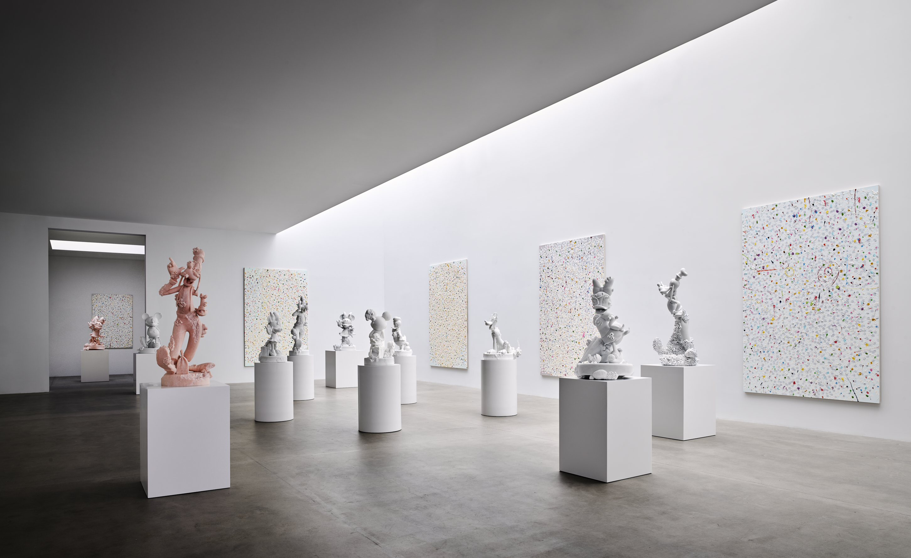
Installation view of Damien Hirst: ‘Forgiving and Forgetting’, at Gagosian’s new 541 West 24th Street gallery
‘What is unique about gallery design is that it is an entirely empty space that is effectively invisible,’ says Jonathan Caplan, a veritable gallery specialist given his past work with The Bass museum in Miami, Gladstone Gallery and Petzel Gallery in New York, as well as numerous exhibition designs. ‘Invisibility is an interesting challenge in itself, especially when the space also needs to be capable of showing from one month to another vastly different kinds of exhibitions: huge abstract paintings, miniature portraits, monumental sculptures, ephemeral installations, film, performance, light works, group shows.
‘Designing a gallery is in certain respects like [designing] a church hall or school gym, which has the potential to be a badminton court, a basketball court, a running track, a dance floor, an assembly hall, a vaccination centre, a theatre, a place of worship, a polling station, an examination room, a storage space. But the similarity ends with the diversity, because other multi-programmatic spaces do not need to be simultaneously neutral and undistracting, and at the same time characterful and sympathetic.’
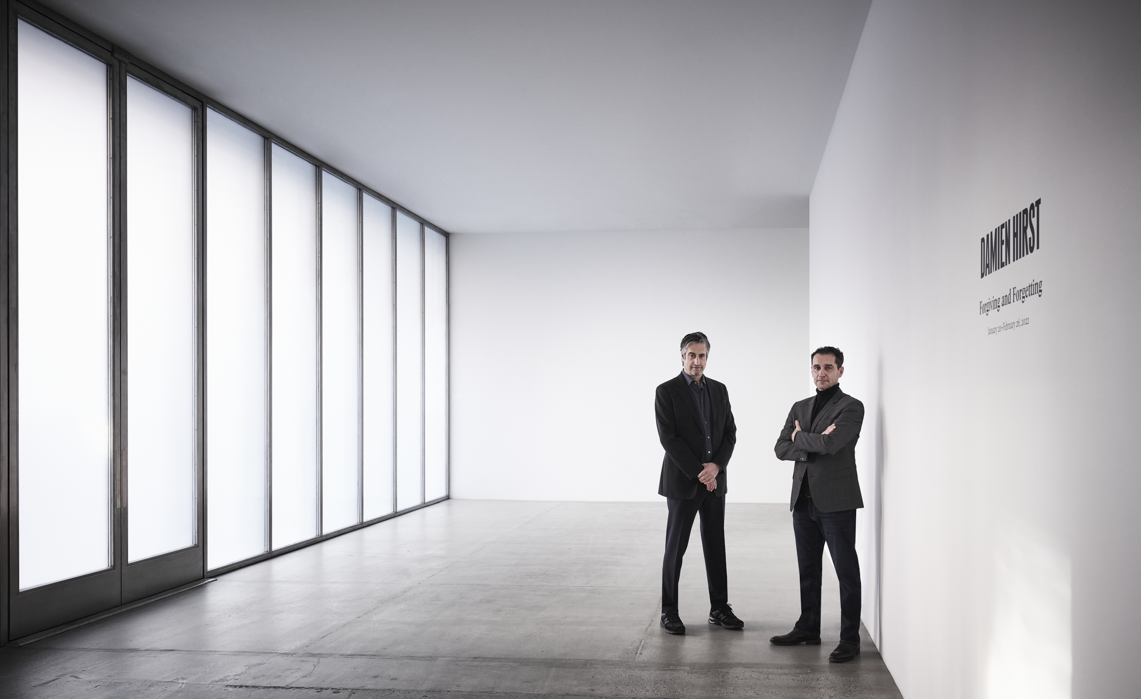
Jonathan Caplan and Mani Colaku, co-founders of Caplan Colaku Architecture
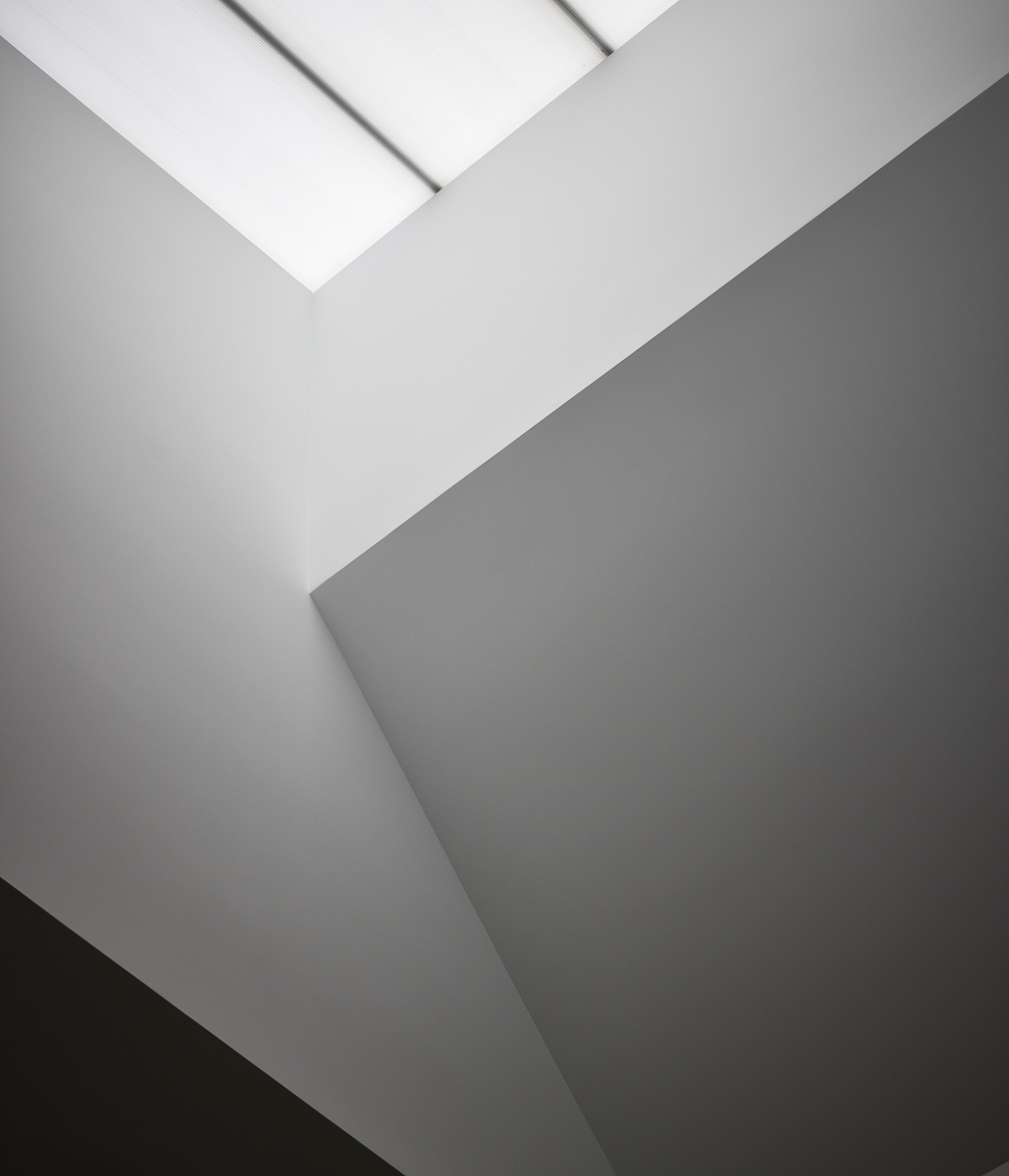
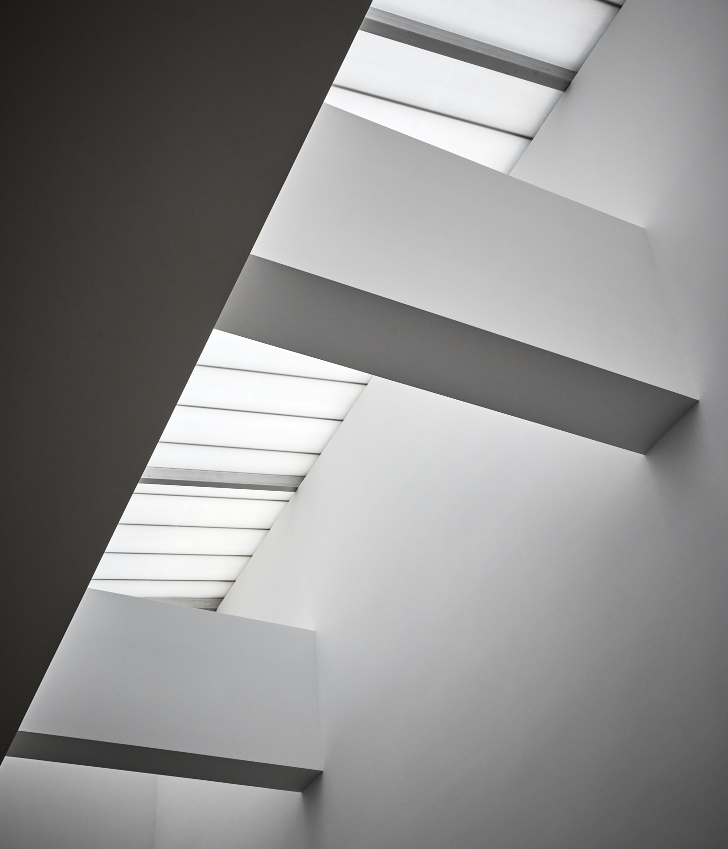
At 541 West 24th Street, the firm refreshed the street-level space by combining two separate areas and concealing some of the distinctive features that had remained, including historic wood trusses and an exposed decked ceiling. In its place, a clean horizontal plane extends towards the space’s luminous skylight, which in turn hovers above the length of the gallery at double-height.
The mix of volumes elegantly contracts and expands at different points throughout the space, often opening up towards sources of natural light, be it in the main gallery space or in the more introspective auxiliary space, where the skylight has been manipulated and reconfigured to ensure an even distribution of natural light below.
Wallpaper* Newsletter
Receive our daily digest of inspiration, escapism and design stories from around the world direct to your inbox.
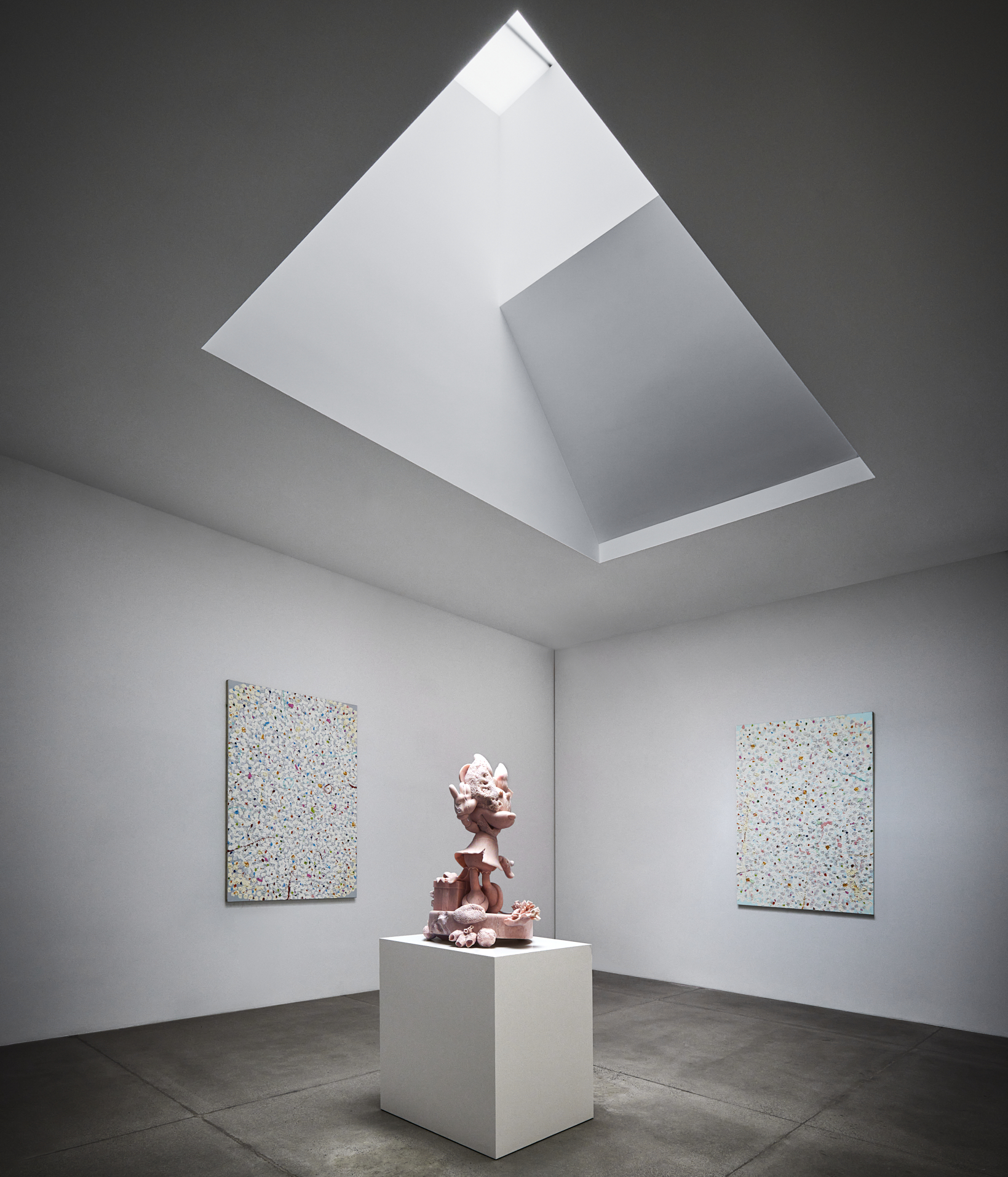
Damien Hirst: ‘Forgiving and Forgetting’, installation view at Gagosian 541 West 24th Street
In such a setting, Hirst’s mash-up of cartoon character sculptures, made from white Carrara and pink Portuguese marble, and new Reverence Paintings take on an otherworldly aura. Caplan says that it was important to ‘[anticipate] how all sorts of artworks, sometimes from very different eras and many that haven't been imagined yet, [could] each be shown to their own best effect. The space itself [needs] to provide a feeling of continuity and permanence through time, with its own particular character and atmosphere, maintaining an unassuming demeanour while embodying and expressing the mission and identity of the gallery as an organisation.’
He adds, ‘Points of differentiation in part evolve from the givens of the site itself and existing conditions of the property, not least the proportions of the space. In the case of 541, you could say that the special feature that we were striving for was simplicity and spareness. We wanted to [give] flourish [to] the space, and make it feel emotionally lighter by paring it down to a feeling of just space and light.’
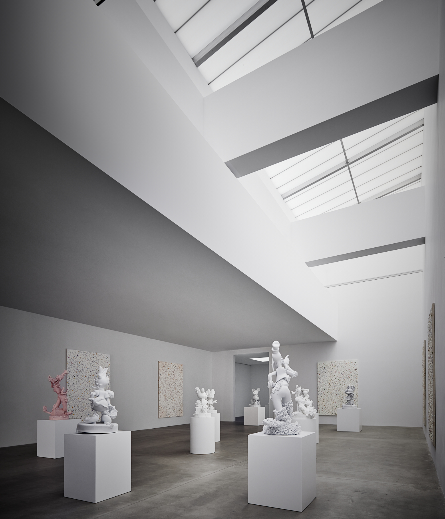
Damien Hirst’s show under the dramatic, exposed decked ceiling of the redesigned space
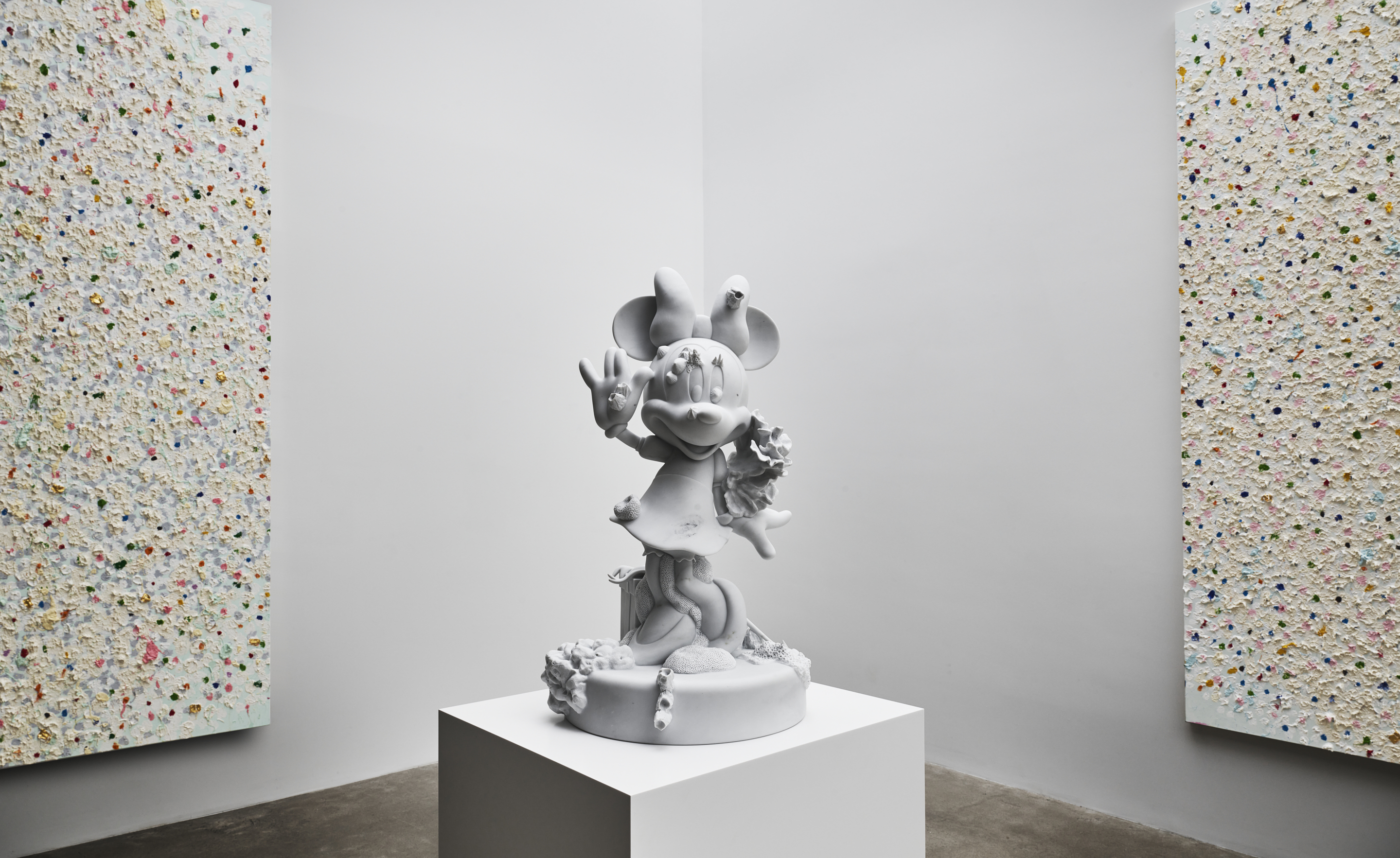
Left to right: Sacrament, 2020, oil and gold leaf on canvas; Minnie, 2019, Carrara marble; Samaritan, 2020, oil and gold leaf on canvas, all from Damien Hirst: ‘Forgiving and Forgetting’
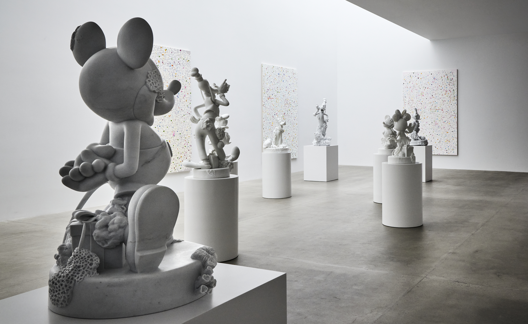
Damien Hirst: ‘Forgiving and Forgetting’, installation view at Gagosian 541 West 24th Street
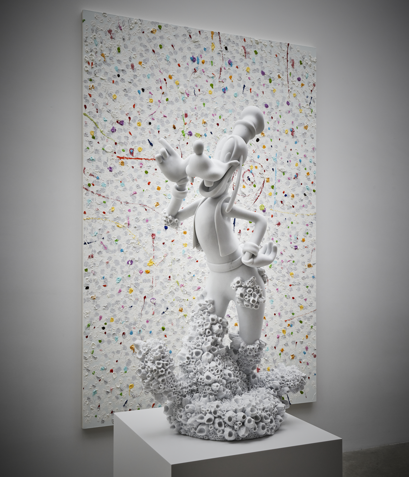
Damien Hirst, Goofy, 2017, Carrara marble; Light, 2020, oil and gold leaf on canvas
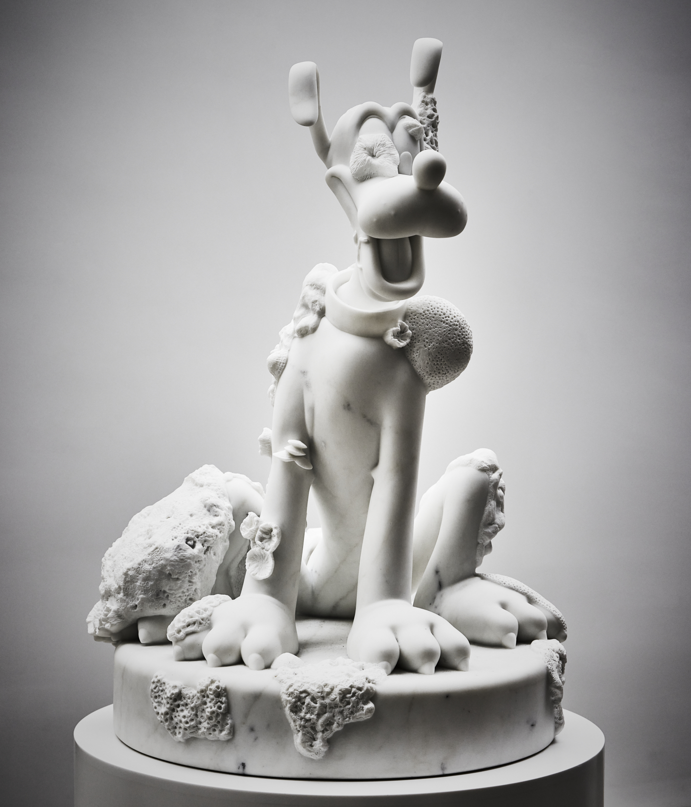
Damien Hirst, Five Friends (detail), 2018
INFORMATION
Pei-Ru Keh is a former US Editor at Wallpaper*. Born and raised in Singapore, she has been a New Yorker since 2013. Pei-Ru held various titles at Wallpaper* between 2007 and 2023. She reports on design, tech, art, architecture, fashion, beauty and lifestyle happenings in the United States, both in print and digitally. Pei-Ru took a key role in championing diversity and representation within Wallpaper's content pillars, actively seeking out stories that reflect a wide range of perspectives. She lives in Brooklyn with her husband and two children, and is currently learning how to drive.
-
 Japan in Milan! See the highlights of Japanese design at Milan Design Week 2025
At Milan Design Week 2025 Japanese craftsmanship was a front runner with an array of projects in the spotlight. Here are some of our highlights
By Danielle Demetriou
-
 Tour the best contemporary tea houses around the world
Celebrate the world’s most unique tea houses, from Melbourne to Stockholm, with a new book by Wallpaper’s Léa Teuscher
By Léa Teuscher
-
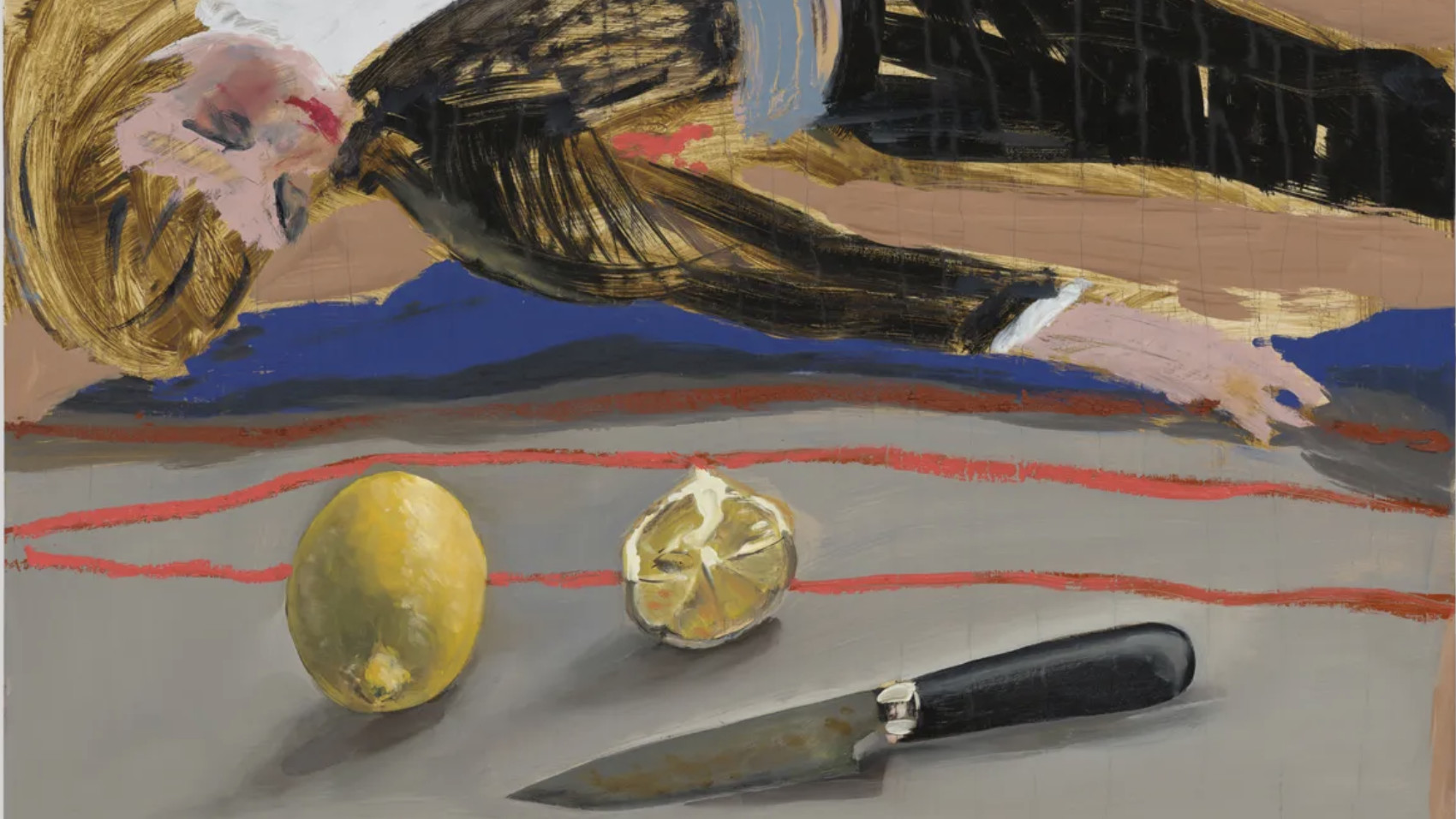 ‘Humour is foundational’: artist Ella Kruglyanskaya on painting as a ‘highly questionable’ pursuit
Ella Kruglyanskaya’s exhibition, ‘Shadows’ at Thomas Dane Gallery, is the first in a series of three this year, with openings in Basel and New York to follow
By Hannah Silver
-
 This minimalist Wyoming retreat is the perfect place to unplug
This woodland home that espouses the virtues of simplicity, containing barely any furniture and having used only three materials in its construction
By Anna Solomon
-
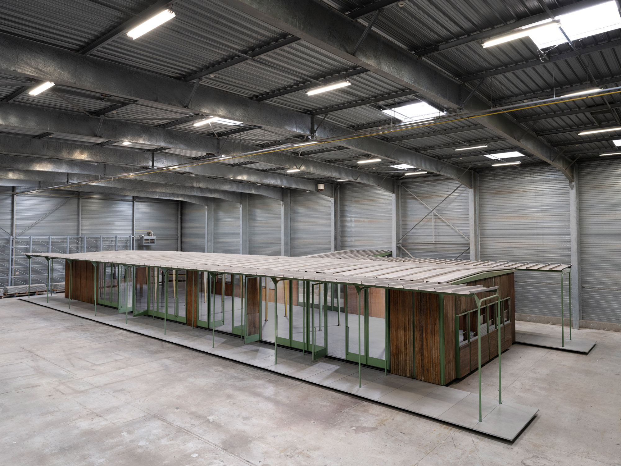 Croismare school, Jean Prouvé’s largest demountable structure, could be yours
Jean Prouvé’s 1948 Croismare school, the largest demountable structure ever built by the self-taught architect, is up for sale
By Amy Serafin
-
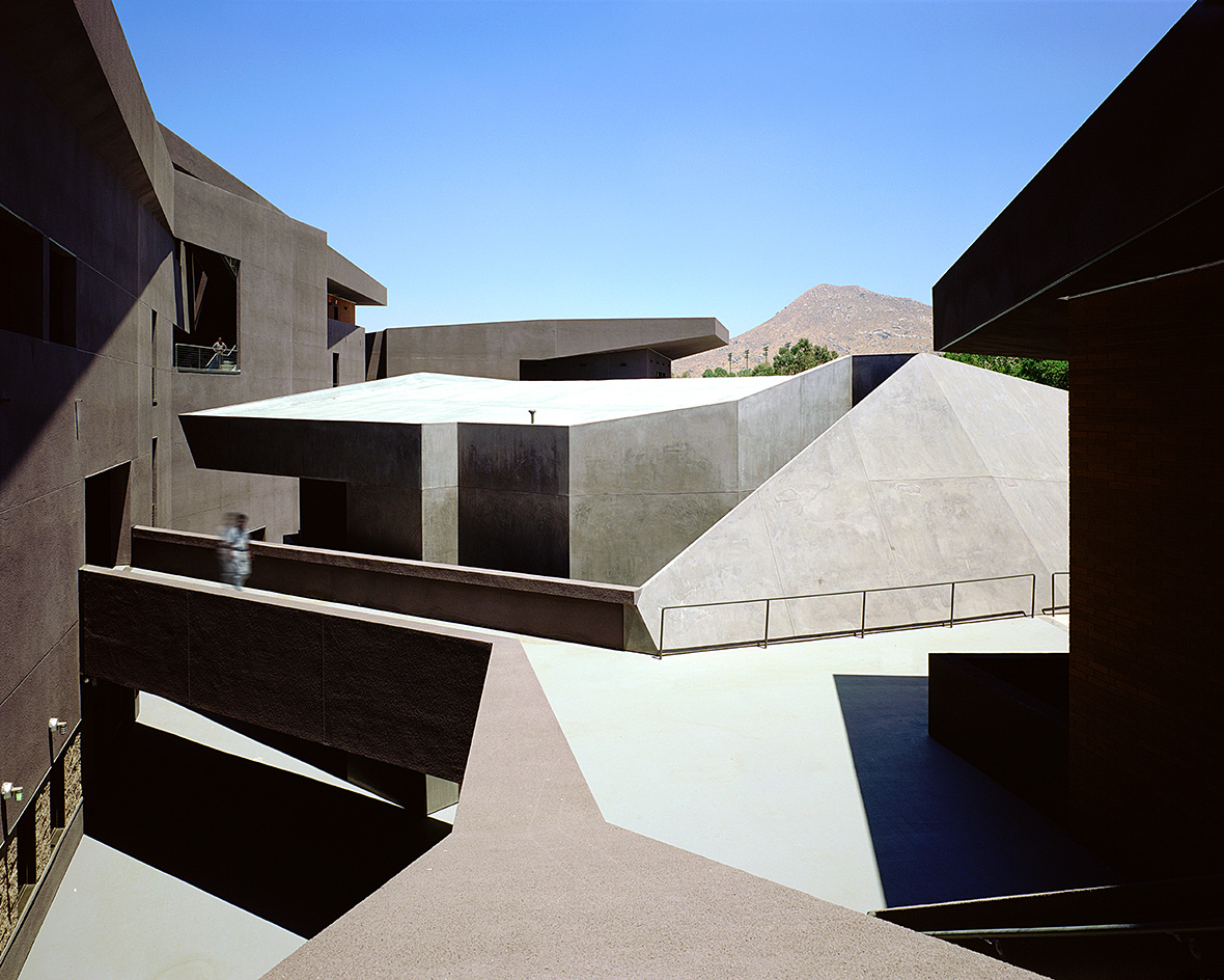 We explore Franklin Israel’s lesser-known, progressive, deconstructivist architecture
Franklin Israel, a progressive Californian architect whose life was cut short in 1996 at the age of 50, is celebrated in a new book that examines his work and legacy
By Michael Webb
-
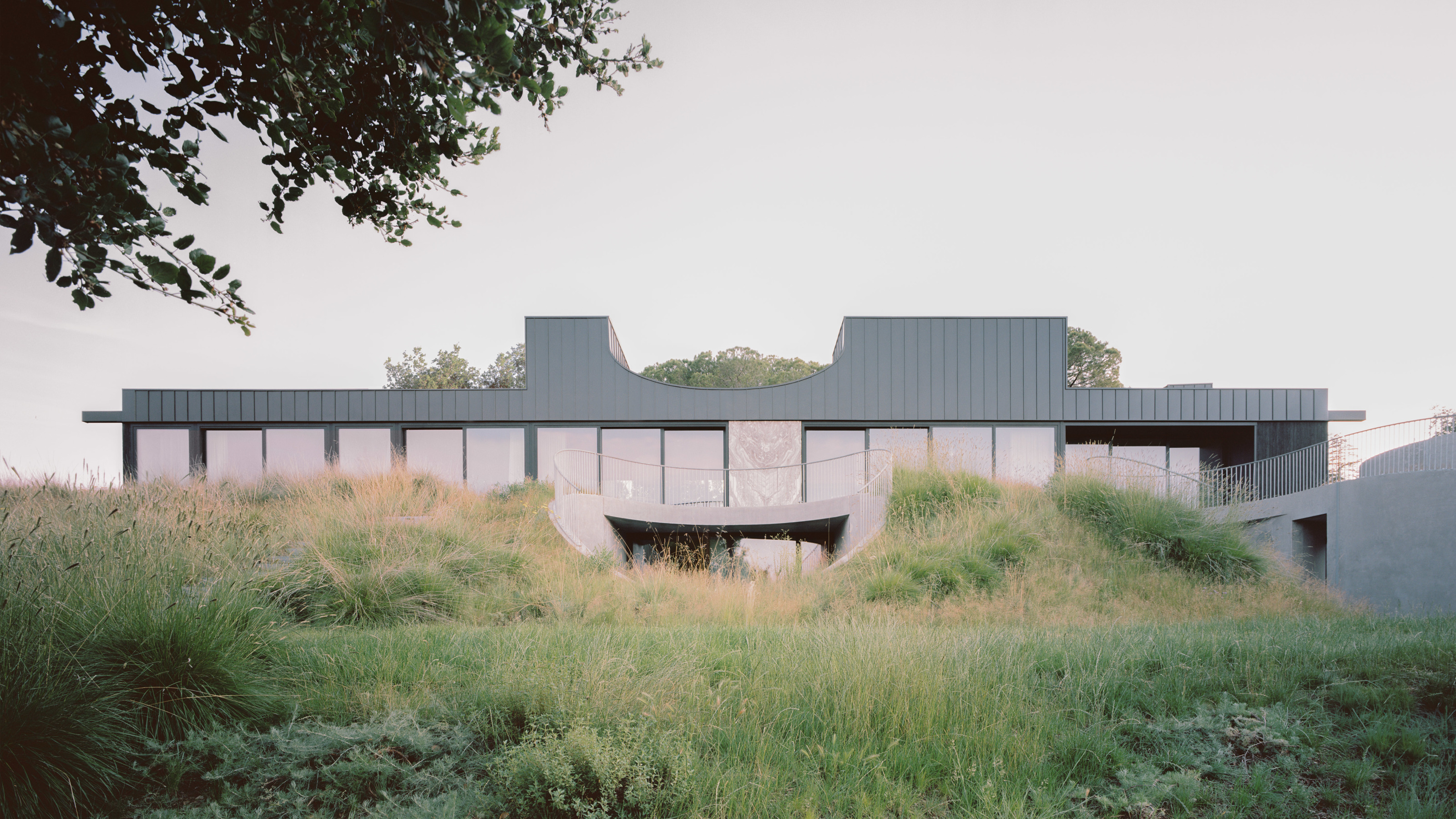 A new hilltop California home is rooted in the landscape and celebrates views of nature
WOJR's California home House of Horns is a meticulously planned modern villa that seeps into its surrounding landscape through a series of sculptural courtyards
By Jonathan Bell
-
 The Frick Collection's expansion by Selldorf Architects is both surgical and delicate
The New York cultural institution gets a $220 million glow-up
By Stephanie Murg
-
 Remembering architect David M Childs (1941-2025) and his New York skyline legacy
David M Childs, a former chairman of architectural powerhouse SOM, has passed away. We celebrate his professional achievements
By Jonathan Bell
-
 What is hedonistic sustainability? BIG's take on fun-injected sustainable architecture arrives in New York
A new project in New York proves that the 'seemingly contradictory' ideas of sustainable development and the pursuit of pleasure can, and indeed should, co-exist
By Emily Wright
-
 The upcoming Zaha Hadid Architects projects set to transform the horizon
A peek at Zaha Hadid Architects’ future projects, which will comprise some of the most innovative and intriguing structures in the world
By Anna Solomon