Halloween architecture: building design in horror films
Halloween architecture and the intricate building design that's transformed horror films
The genre of horror requires many elements to be brought to life. From soundtracks to jumpscares, many films become iconic for their stand-out choices, ideas, and environments that seamlessly come together to make a horror movie a true one-of-a-kind. There is one element in horror films that deserves notice as an integral and major player in shaping these pieces of art. For instance, what place is a major key to the film Halloween? It was the Century House, owned by David Margrave, in which Michael Myers essentially grew up. Where did most of the jumpscares happen in Nightmare on Elm Street? It's at the Lincoln Heights basement boiler room where Krueger went toe to toe with his victims. Us, The Shining, and The Fly are a few more loose names of horror films that emphasise the importance of design in making the perfect Halloween architecture film.
Explore Halloween architecture
When a film goes beyond the average dungeon, it might frighten its viewer through the element of surprise. It is typical for horror to unfold around gothic, grotty, or haunting components, but it's actually even scarier to experience fear in an environment that is aesthetically pleasing. For this All Hallows' Day, we’ve conjured a list of Halloween architecture to enjoy - all found in films that have used buildings and interiors as the catalyst for the experience of horror.
House on Haunted Hill (1959)
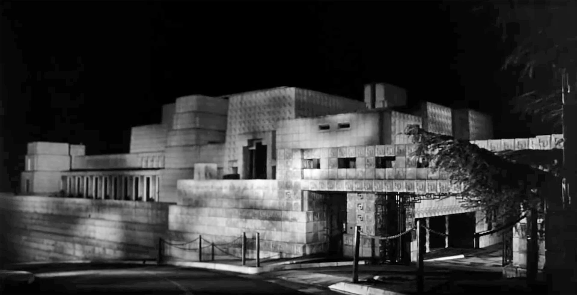
Ennis House featured in 'House on Haunted Hill', Allied Artists Pictures, directed by William Castle
Directed by William Castle, this horror film is crafted over the idea of competition. The protagonist proposes a prize for five guests staying overnight at a mansion - that’s potentially haunted. If these guests can make it through the night, ten thousand dollars will be added to their names. The Ennis House created by Frank Lloyd Wright located in Los Angeles is quintessential to the film. The house's unusual forms is modernist architecture at its idiosyncratic best. Meanwhile, with its many rooms, intricate shadow play, and isolated presence, it marks a hollowed physique that invites the possibility of ghosts and spiritual forces.
Wait Until Dark (1967)
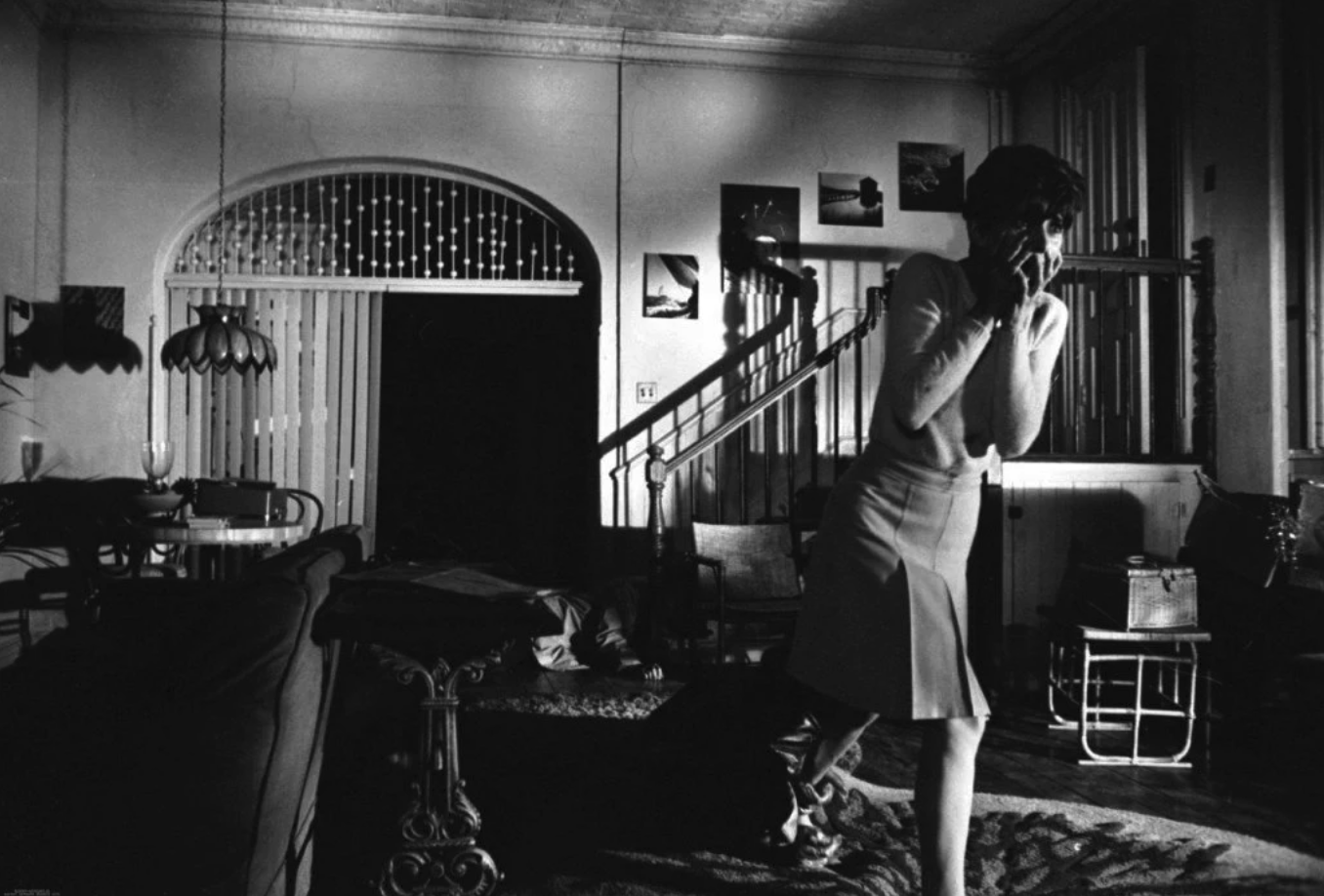
'Wait Until Dark', Warner Bros.-Seven Arts, directed by Terence Young
This cat-and-mouse film, directed by Terence Young, expands upon the premise where one of the protagonists purchases a doll that he’s unaware is filled with narcotics. The main antagonist takes hold of this information, following Hendrix back to his apartment to retrieve the doll and obtain the drugs. Instead of coming in contact with Hendrix, the crook begins a dangerous game with the protagonist’s visually impaired wife. The set design of the apartment, designed by Jeff Cunningham, played a pivotal part in the terror of the film, because of its irony of coziness. The basement apartment uses brick walls, timber kitchen stairs, and arched walls to allude to a sense of homeliness which then is promptly entirely crashed when the villain invades and terrorises the resident, who in turn feels increasingly entrapped.
The Towering Inferno (1974)
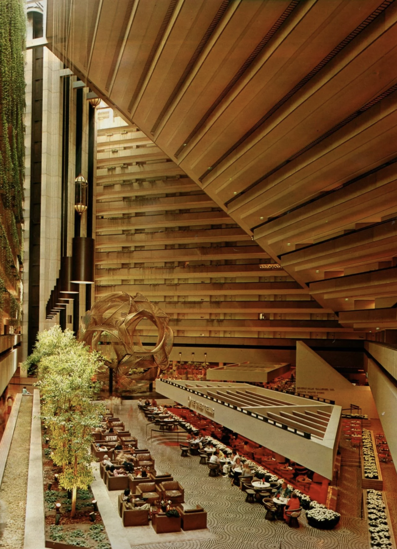
The Hyatt Regency San Francisco featured in 'The Towering Inferno', 20th Century Fox, directed by John Guillermin
John Guillermin, quite literally, brings the heat with this film. Its climax follows an unquenchable fire that’s broken out in a well known San Francisco skyscraper, during an eventful ceremony containing high-status guests. In order to take out the fire, a team must come together to save the lives of the citizens inside the building. One of the film's most intrinsic architectural components is its usage of the Hyatt Regency in San Francisco, which was created by John Portman & Associates. The Hyatt Regency is a foreshadowing of the persistent fire, as portrayed through the floor levels' angle — which echoes the incline of the fire.
American Psycho (2000)
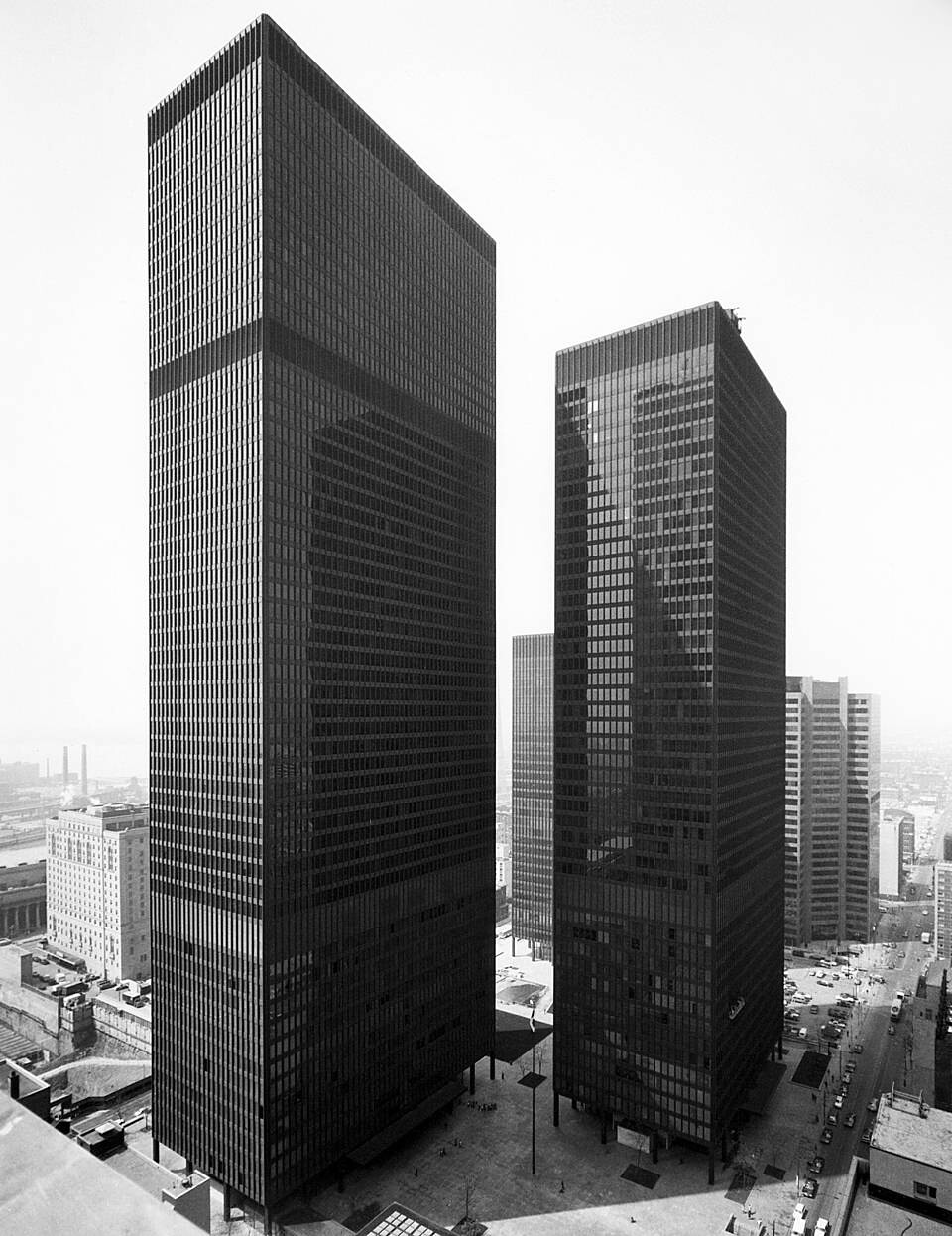
The Dominion Centre featured in 'American Psycho', Lions Gates Films, directed by Mary Harron
Taking place in the late 1980s, Mary Harron’s critically-acclaimed classic centres on the Batman of murder. The film’s protagonist is a flawless businessman who spends his nighttime murdering his clientele. The film juxtaposes its gory concept with allegories of comedy, and this shows in its usage of space. The set designer of this film, Jeanne Develle, and production designer Gideon Ponte, created a similarly ironic architectural environment. The protagonist's apartment is a special part of the film because of its minimalist modernist design - no surprise that it was filmed in the Dominion Centre in Toronto, designed by Ludwig Mies van der Rohe. All clean white walls, spotless white couches, and modern, abstract portraits, it's not the typical murder location. This only makes the scenes of blood splatters more captivating because of their contrast with the surrounding monochromatic palette.
The Lighthouse (2019)
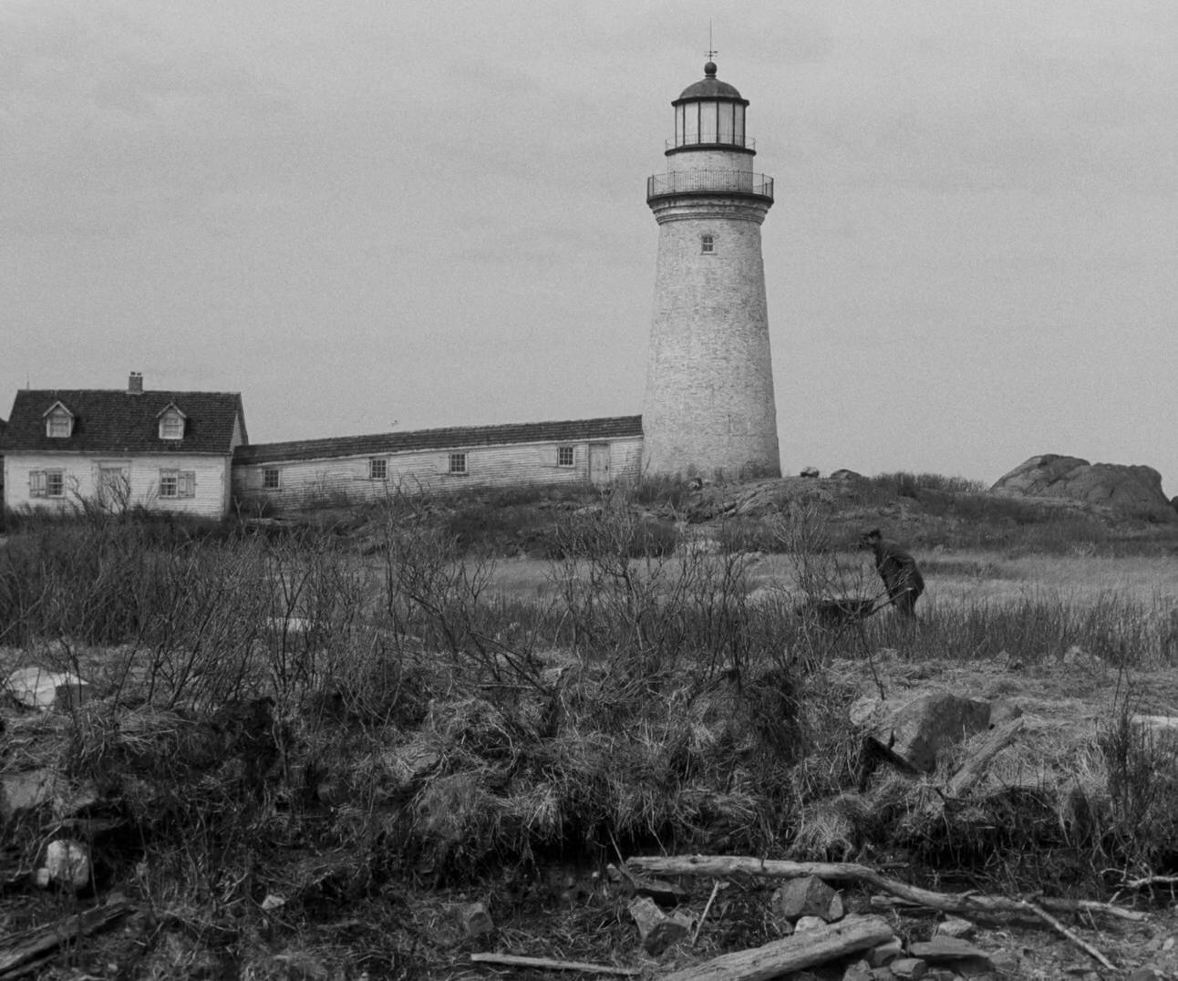
'The Lighthouse', A24 Films, directed by Robert Eggers
Robert Eggers’ experimental horror film is shot completely in black and white. The film focuses on lighthouse keepers with declining sanity as they maintain the upkeep of their isolated New England Island spot around the 1890s. Designed by Craig Lathrop and his team, the lighthouse, which lends the film its name, is seventy feet of peculiarity and mysteriousness that create the perfect backdrop for the narrative. The film takes the viewer on a rampage of magical realism, with the tower at its heart, since the farther up the lighthouse keeper goes, the more mystical everything becomes.
Wallpaper* Newsletter
Receive our daily digest of inspiration, escapism and design stories from around the world direct to your inbox.
Don’t Worry, Darling (2022)
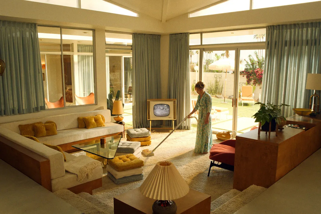
'Don't Worry, Darling', Warner Bros. Pictures, directed by Olivia Wilde
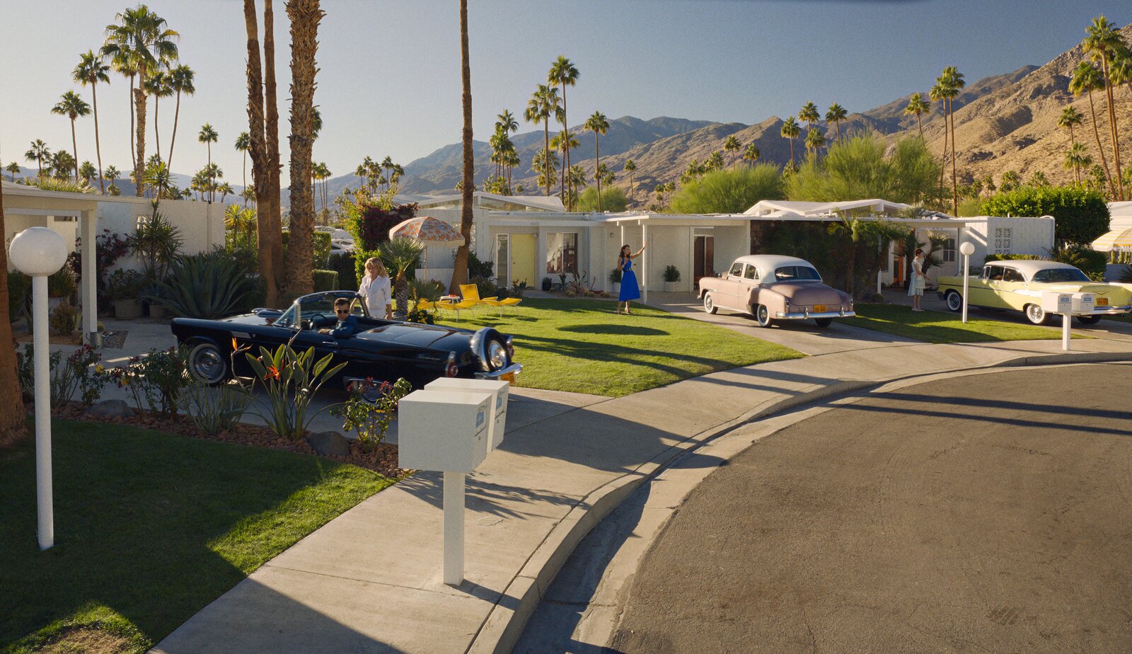
Just a month ago, Olivia Wilde allowed us into her take of the synthetic world of the 1950s. This film follows a protagonist and her seemingly content and tranquil marriage that begins to go downhill the more she’s provoked by lies created to keep her local community - Victory - going. Everything about this film presents as picture-perfect. The production designer, Katie Byron, conveys this sense of perfection through iconic mid-century architecture - using set design for the interiors and Canyon View Estates, a Palm Springs neighbourhood designed by William Krisel, for the exteriors. The architecture in the film is attractive to the eye, but its furniture feels suffocating - just like the protagonist is by their community. The hub that the protagonist tries to escape to feels like the opposite of the interior in the Victory houses.
-
 Put these emerging artists on your radar
This crop of six new talents is poised to shake up the art world. Get to know them now
By Tianna Williams
-
 Dining at Pyrá feels like a Mediterranean kiss on both cheeks
Designed by House of Dré, this Lonsdale Road addition dishes up an enticing fusion of Greek and Spanish cooking
By Sofia de la Cruz
-
 Creased, crumpled: S/S 2025 menswear is about clothes that have ‘lived a life’
The S/S 2025 menswear collections see designers embrace the creased and the crumpled, conjuring a mood of laidback languor that ran through the season – captured here by photographer Steve Harnacke and stylist Nicola Neri for Wallpaper*
By Jack Moss
-
 We explore Franklin Israel’s lesser-known, progressive, deconstructivist architecture
Franklin Israel, a progressive Californian architect whose life was cut short in 1996 at the age of 50, is celebrated in a new book that examines his work and legacy
By Michael Webb
-
 A new hilltop California home is rooted in the landscape and celebrates views of nature
WOJR's California home House of Horns is a meticulously planned modern villa that seeps into its surrounding landscape through a series of sculptural courtyards
By Jonathan Bell
-
 The Frick Collection's expansion by Selldorf Architects is both surgical and delicate
The New York cultural institution gets a $220 million glow-up
By Stephanie Murg
-
 Remembering architect David M Childs (1941-2025) and his New York skyline legacy
David M Childs, a former chairman of architectural powerhouse SOM, has passed away. We celebrate his professional achievements
By Jonathan Bell
-
 The upcoming Zaha Hadid Architects projects set to transform the horizon
A peek at Zaha Hadid Architects’ future projects, which will comprise some of the most innovative and intriguing structures in the world
By Anna Solomon
-
 Frank Lloyd Wright’s last house has finally been built – and you can stay there
Frank Lloyd Wright’s final residential commission, RiverRock, has come to life. But, constructed 66 years after his death, can it be considered a true ‘Wright’?
By Anna Solomon
-
 Heritage and conservation after the fires: what’s next for Los Angeles?
In the second instalment of our 'Rebuilding LA' series, we explore a way forward for historical treasures under threat
By Mimi Zeiger
-
 Why this rare Frank Lloyd Wright house is considered one of Chicago’s ‘most endangered’ buildings
The JJ Walser House has sat derelict for six years. But preservationists hope the building will have a vibrant second act
By Anna Fixsen