'Het Huis' by Robbrecht and Daem for Middelheim Museum, Antwerp

Receive our daily digest of inspiration, escapism and design stories from around the world direct to your inbox.
You are now subscribed
Your newsletter sign-up was successful
Want to add more newsletters?
'It's absolutely not a white cube,' says Belgian architect Paul Robbrecht about the new pavilion his Ghent-based practice Robbrecht and Daem (also responsible for the renovation and extension of London's Whitechapel Gallery) has designed for the Middelheim open-air sculpture museum in Antwerp. Pointing out the exposed columns and 'knots' where the beams have been welded into the green steel structure, he adds: 'What we really wanted to do was make a building that shows how it is built, that shows the tectonics of construction.'
Het Huis (house or home in Dutch) has been purposely laid out at diagonal angles to the straight paths of the formal gardens it was built in so that it looks 'woven into the surrounding landscape'. This is a theme Robbrecht refers to repeatedly, revealing that one of his greatest sources of inspiration was 19th century German architect and art historian Gottfried Semper's notions of the 'textile origins of building'.
The brief for the semi-open structure was straightforward. 'It was for a pavilion that would have real contact with nature, with the landscape around it, a place where smaller or fragile works of art could be shown, or works that needed a more framed setting,' says Robbrecht. The colourful but unsettling glossy ceramic heads and urns of German artist Thomas Schütte displayed here were created especially for the pavilion's inauguration and contrast ingeniously with the smooth concrete floors, geometric lines and angles of the roof and the special 'topography' of the ceiling, which 'looks as if it's moving'.
The pavilion represents nature in architecture, says Robbrecht. Two trees have been planted at opposite ends of the space and steel lattice-patterned screens (which can be pulled across the four openings to close the pavilion at night) create extraordinary dappled effects as if light is coming through the branches of a tree. 'You could almost think it's a roof of leaves above you,' Robbrect says excitedly.
After touring the 200-plus sculptures (including new site-specific works by Ai Weiwei, Philippe Van Snick and Roman Signer) in the freshly extended 75-acre park and revamped museum, visitors will find Robbrecht and Daem's angular steel-and-concrete 'house' a place of extraordinary peace, intimacy and poetry.
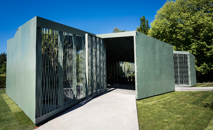
'Het Huis' is laid out at diagonal angles to the straight paths of the formal gardens, so that it looks 'woven into the surrounding landscape'
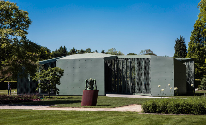
The architects' brief was for a pavilion that 'would have real contact with nature,' says Paul Robbrecht. They were asked to create 'a place where smaller or fragile works of art could be shown, or works that needed a more framed setting'
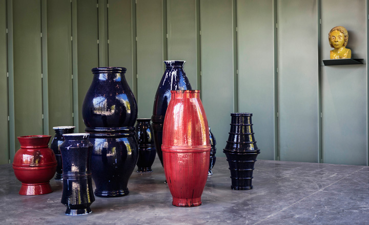
On display inside the pavilion are a series of glossy ceramic urns and heads by German artist Thomas Schütte, created especially for the structure's inauguration
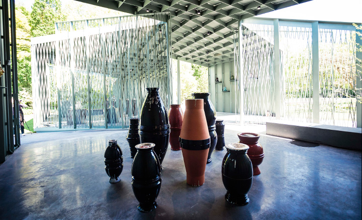
They contrast ingeniously with the smooth concrete floors, geometric lines and angles of the roof, as well as the special 'topography' of the ceiling, which 'looks as if it's moving'
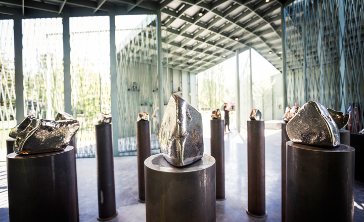
Robbrecht, who has guest curated the works in the pavilion and surrounding sculpture park, has long been an admirer of Schütte's work. '[His works] inspired me to become an architect,' he says
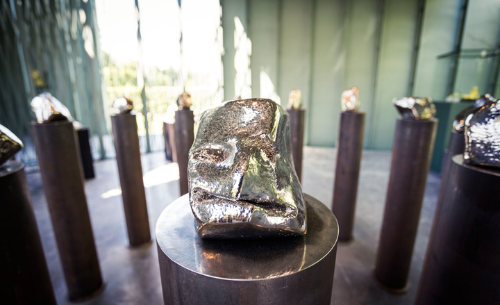
The pieces fall somewhere between the abstract and the figurative
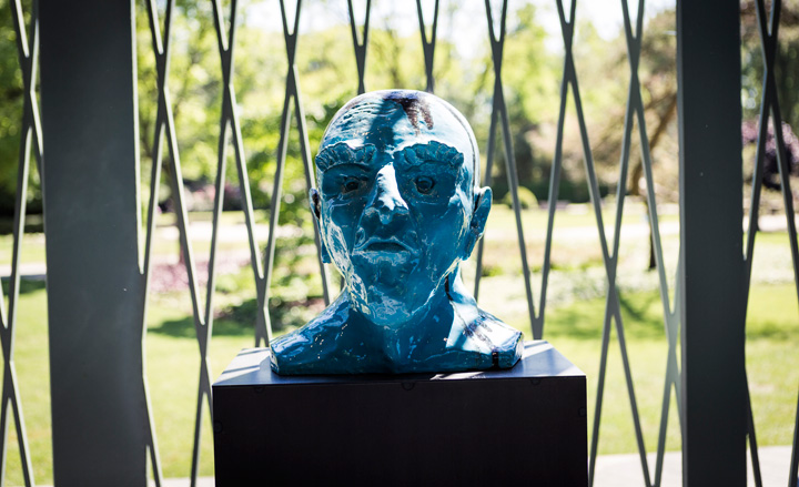
One of Schutte's more representational busts
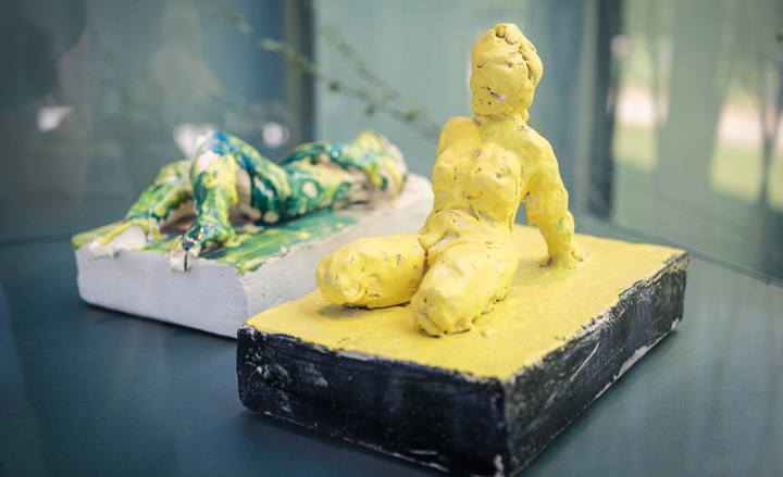
Schütte's works will be on display until 16 September
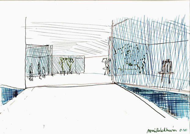
A sketch of the pavilion by Robbrecht and Daem architects
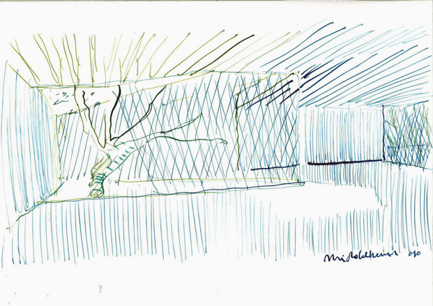
A sketch of the pavilion by Robbrecht and Daem architects
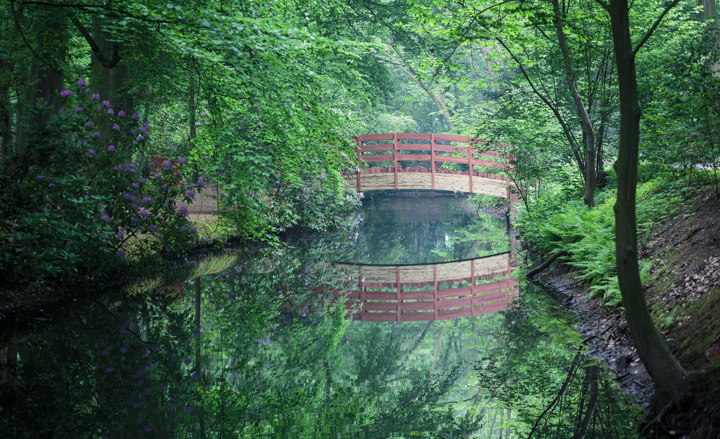
The opening of the pavilion coincides with a major reinvigoration of the museum and its surrounding sculpture garden (which has been extended by 12 acres), as well as the unveiling of new site-specific works of art by Ai Weiwei (pictured is his 'The Bridge Without a Name'), Roman Signer and Philippe Van Snick
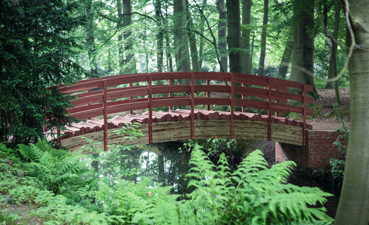
When invited to create a bridge by the museum, Ai Weiwei - known for using materials sparingly - recycled an existing one in the sculpture garden, replacing the deck with planks that form the contours of China, his homeland
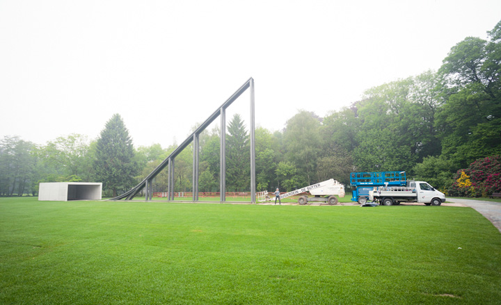
The sculpture 'Bidon Bleu', by Roman Signer, is part of a series of actions in which the artist launches objects into the open-air with the help of a slope. During the performance on Saturday, 26 May (the opening day of the revamped Middleheim Museum), a metal barrel rolled at high speed down the slope and exploded against a concrete wall at the bottom. Pictured is the sculpture before the performance
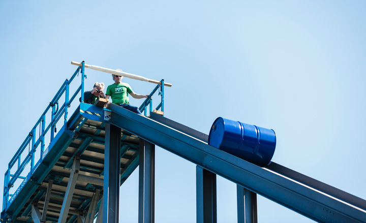
Bidon Bleu in motion
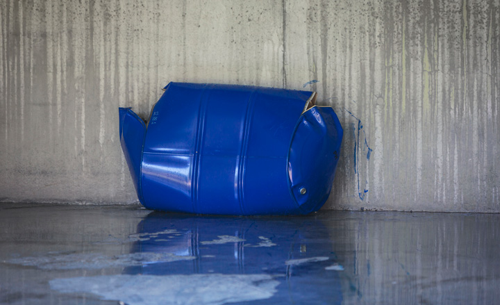
The remains of Signer's creation is the artwork that will stay in the sculpture garden
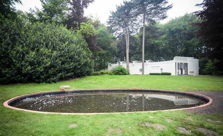
Philippe Van Snick repurposed an existing pond outside the sculpture garden's Braem Pavilion to create 'Poëzie'. The bottom and sides of the pond are covered with black stones. From between the stones, tiny air bubbles rise from ten columns spread across the water’s surface. The cadence of the various columns causes rippling or areas of calm on the water
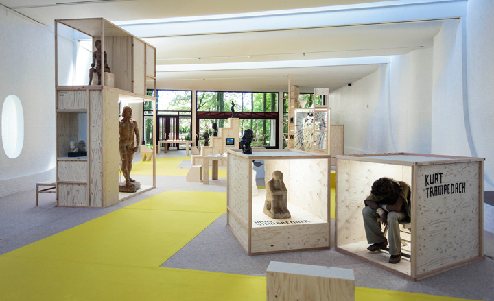
The Braem Pavilion, formerly the space for temporary shows, is now completely reserved for fragile pieces from the permanent collection. For the reopening of Middelheim, fashion designer Bernhard Willhelm and his creative partner Jutta Kraus have curated a selection of pieces that examine the human body. Pictured are 'John the Baptist' (left), by August Rodin, 1978 - 1880; 'Seated Figure' (centre) by Hans Steinbrenner, 1954-1955; and 'Boy on a Chair' (right), by Kurt Trampedach, 1977
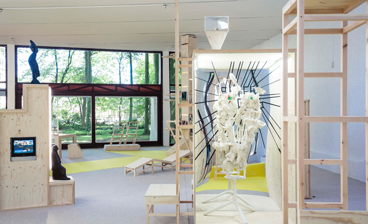
'Double Whipped Cream Remastered' (centre), by Peter Rogiers, 2007-2008
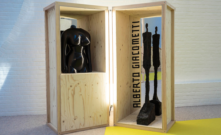
'Female Torso', by Ewald Mataré, 1933, and 'Venice II', by Alberto Giacometti, 1956
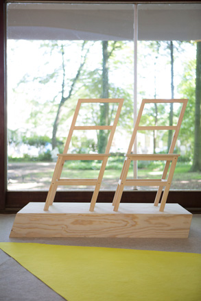
Throughout the Braem Pavilion, chairs, sofas and ladders, designed by Willhelm and Kraus, give visitors a chance to reflect on their own physicality
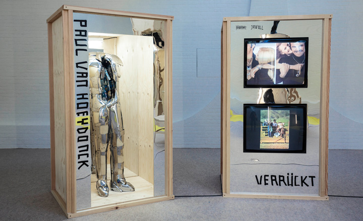
'Astro', by Paul Van Hoeydonck, 1970, and internet footage, titled 'crazy people'
ADDRESS
Middelheim Museum
Middelheimlaan 61
2020 Antwerp
Receive our daily digest of inspiration, escapism and design stories from around the world direct to your inbox.
Giovanna Dunmall is a freelance journalist based in London and West Wales who writes about architecture, culture, travel and design for international publications including The National, Wallpaper*, Azure, Detail, Damn, Conde Nast Traveller, AD India, Interior Design, Design Anthology and others. She also does editing, translation and copy writing work for architecture practices, design brands and cultural organisations.