Shingle vision: Roy McMakin’s designer retirement home in Venice, California
Receive our daily digest of inspiration, escapism and design stories from around the world direct to your inbox.
You are now subscribed
Your newsletter sign-up was successful
Want to add more newsletters?
There is this big, hyper-contemporary, super-slick modernist condo on a tiny pedestrian street in Venice Beach, California. It might have orange panels, or green, it’s hard to remember exactly, even though they don’t blend in – but it’s got that look, that ‘look at me, I’m architecture’ look, and if you walk down that Venice alleyway, towards the ocean, you might find your head turning to the right, trying to take it in, trying to figure out what’s going on, and definitely being sort of half-intrigued and half-confused. What you should do, though, is turn your head left. Because if you turn your head left, you will see something worth looking at.
You’ll see a little green house, the retirement home of Stuart and Mary Bloomberg, a television producer and his wife, who met their friend and architect Roy McMakin decades ago. In the late 1980s, McMakin had run Domestic Furniture in Los Angeles, a shop devoted to producing – as he still does – eerily and kindly and warmly and devastatingly and perfectly articulated tables and chairs and dressers that are at once emotionally evocative and impossibly well made. And then the Bloombergs asked him to do a kitchen renovation of their Los Angeles Arts & Crafts house, and McMakin shifted to include architecture – adding an outfit he called Domestic Architecture. The simplicity of the name – so much architecture is inherently domestic but is it as essentially domestic as McMakin’s? – belies the complexity of what McMakin produces, and they were hooked. After that kitchen, McMakin designed a Massachusetts house for the family and their four children, and then, when it was time for them to retire, and to build a smaller nest, the Bloombergs came to him to talk about building something in Venice.
For a city that has long been described as a series of towns closely interlocked by sweeping highways, a city that has moodily informed the filmmaking of directors such as David Lynch (whose Mulholland Drive both named and exposed the city’s glamorous-seeming yet tragically dark underbelly) and writers such as Bret Easton Ellis (whose novel Less Than Zero opens with the line ‘People are afraid to merge on freeways in Los Angeles’), Los Angeles is surprising in its capacity to also hold Venice, the most intimate of these tiny towns. The houses are smaller than they are out in Bel Air or Brentwood, and the narrow pedestrian passageways – or ‘walk-streets’ – make the particularly Angeleno reliance on cars almost moot. Venice is a kinder, more laid-back, calmer place. Perfect for retirement, and for a house-sized experiment in faith.
‘The thing about Roy is that we trust him a 1,000 per cent,’ says Mary Bloomberg. Seeing the completed house for the first time was ‘like being kids at Christmas again’. The Bloombergs avoided getting too involved in any of the design process, with Stuart even averting his eyes when McMakin wanted to show him a sketch of his planned colours for the living room furniture. They wanted the magic of walking into a home that they knew would be just right for them.
Figuring out what was right for a pair of empty-nesters who still found family important required some careful thinking about what a retired life could look like. Issues of privacy, security and future-planning were different than they would have been for a family all living together. ‘There was a different set of priorities about how the two of them would live, so it was both very familiar and a new and nuanced discussion,’ McMakin says. ‘On some level it was a pure analysis of choreographing daily life.’ The roof garden, for example, includes space for laundry to hang-dry, and chairs that overlook the ocean through framed windows that create a vista out of a cityscape. There’s also a lift – the house comprises five levels, including a basement, a split-level second floor and the roof terrace.
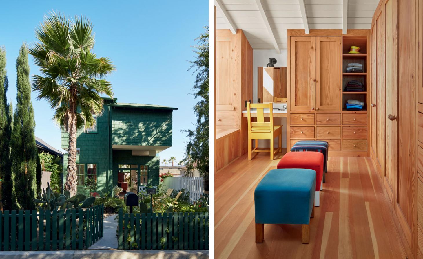
The property at first looks like a seamless version of the idealised house, and it’s an identity slippage that appears in so much of McMakin’s work. Green shingle-cladding made of recycled plastic covers an essentially boxy shape, set back from the sidewalk past a drought-sensitive garden full of cacti. A massive picture window lets people look in and, actually, almost through the entire house. But it’s when the door opens that McMakin’s playfulness, as well as his ability to understand and spatially articulate human emotions, comes through.
For the first project he did for the Bloombergs, McMakin found a conflict between an exterior door – which needed to swing a certain way – and a set of steps. ‘I realised the steps could just have the arc of the door-swing cut out in a deliberate and celebrated way,’ McMakin says. ‘It opened up meaning in the steps, and in that decision there was a certain grace and easiness.’ It taught him, in all his work, ‘to celebrate the conflict’. Here, the conflict isn’t a set of steps but rather a piano, and so the front door swings open to the right and just swishes past a cut-off edge of the piano. It’s at once a totally McMakin move – he has explored such conflict in projects that play with our expectations around paint, continuity and furniture – and also deeply personal to both his relationship with the Bloombergs and the way that they live. ‘There was a chance to celebrate the memory of how that was created,’ says McMakin.
The house has a long and slightly skewed axis, an angle that appears and reappears throughout the structure. McMakin wanted to demarcate the new house from its neighbourhood just as subtly as everything else is shifted. And so the 100ft-long house is 22ft wide at the front and 24ft at the back, whereas every other house is a straightforward 24ft-wide rectangle, following exactly the lot lines instituted by the city. And even though the angle isn’t major, it changes the way the space feels as one walks through the airy main living and kitchen area, where a comfortably upholstered, L-shaped sofa sits beside a tan-painted, multi-sided table and quintessential bar chairs line a smooth wooden kitchen island. The chairs are like the Platonic ideal of a sports bar chair, down to the little bar on the bottom that’s perfect for a foot rest, and they allow Stuart to sit at the counter, eat his breakfast and watch some television. This space leads out into a central courtyard – outdoor living is an LA expectation – furnished with a swing seat that can be moved to face either the fireplace or a table and chairs.
On the second floor, two bedrooms offer space for the kids when they come back, and the master bedroom repeats that same angle. Mary’s office space is divided from the couple’s McMakin-designed bed, painted teal, while openings in the partition keep the whole room spatially cohesive.
The angle is repeated as a motif throughout the house, emphasised by windows with cut-off corners or a striking red-brick fireplace skewed to allow a door to open. Also apparent in every room is McMakin’s sensitive and playful take on furniture arranging and grouping, his skill at putting together iconic pieces to create more than the sum of their parts. The whole house is deeply evocative and powerfully meaningful in a subtle and holistic way.
For McMakin, the project feels like a culmination of his exploration into ‘memory in relation to architecture’, and the tension between creating ‘familiarity and a certain warmth and friendliness at the same time as a certain dissonance and newness’. He is interested in time, and memory, and ‘how one’s memory affects one’s relationship to the built world’, and it is all evident here, in this tiny lot in this tiny village in this sprawling town. Just look left.
As originally featured in the November 2015 issue of Wallpaper* (W*200)
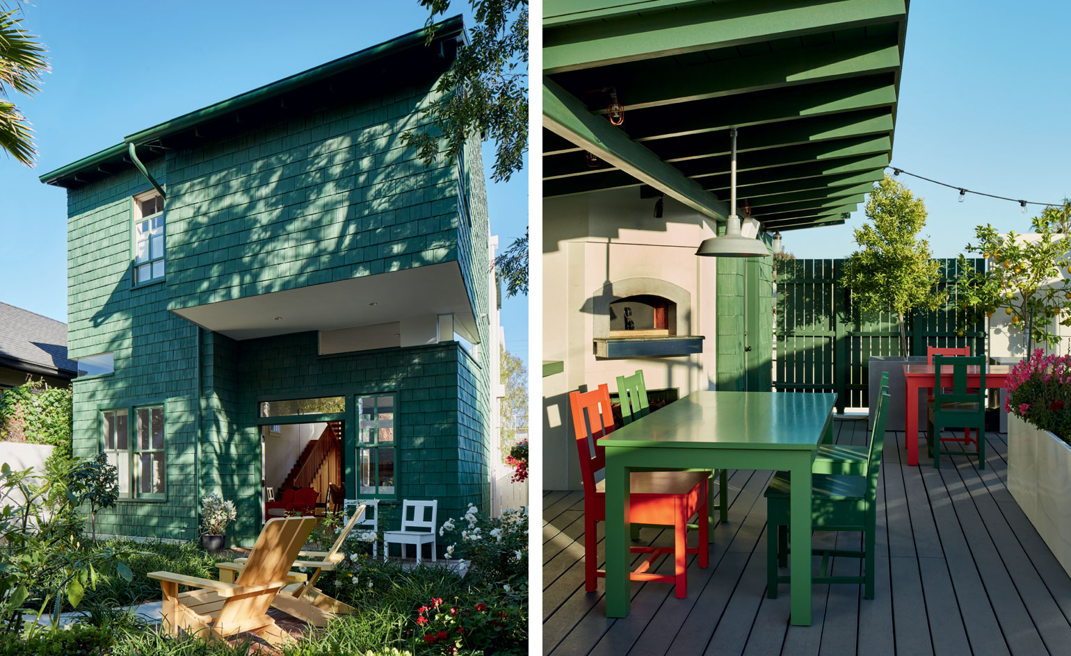
Pictured left: a cantilevered section on the first floor creates a porch above the front door, which opens onto one of Venice Beach's narrow 'walk-streets'. The green shingle is made of recycled plastic. Right: the roof terrace, with McMakin furniture and a pizza oven, where the whole family can gather when they are in town. The colours are classic McMakin – having a table and chair set and then having one of the chairs not match. And then the inverse in the second set. Much of his work is about groupings and things that both fit together and don't fit
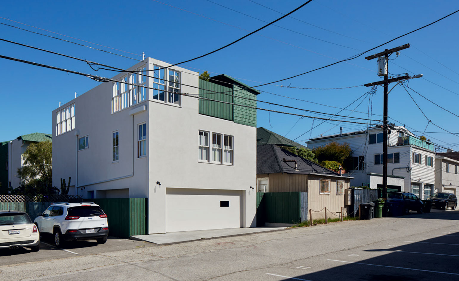
Accessible by car, the back of the house is somewhat larger than the front, creating a slightly skewed volume that contrasts with the otherwise uniform, rectangle-shaped houses of the neighbourhood
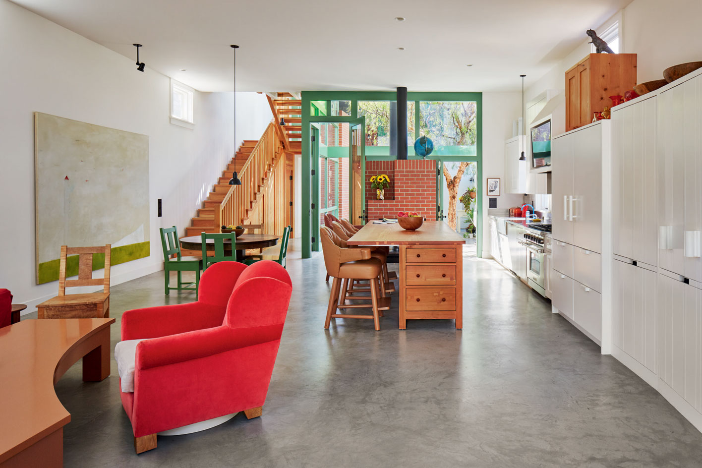
The open-plan living space is furnished with McMakin's slatback chairs and a spinning wingback armchair, as well as a custom-made kitchen island in douglas fir
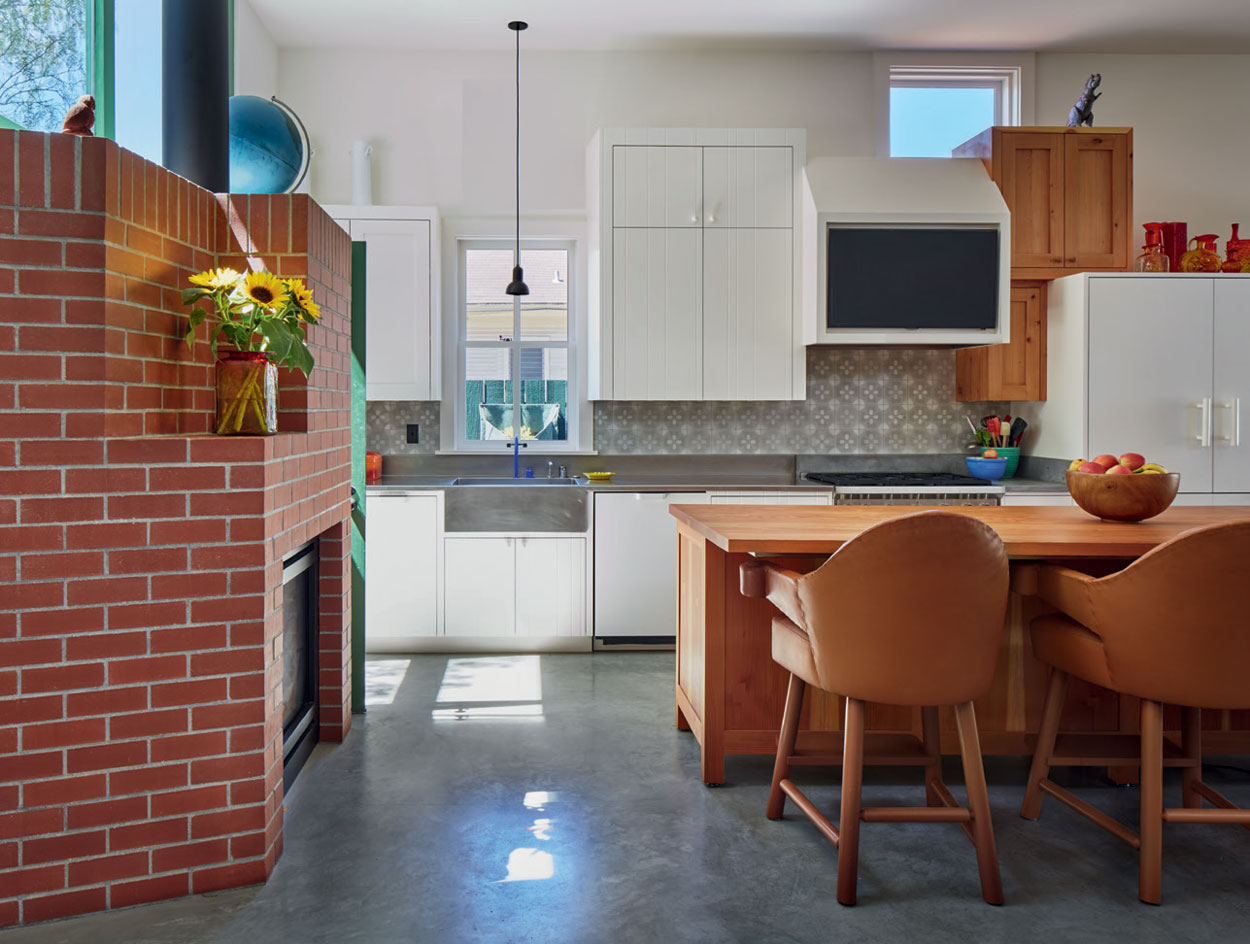
The kitchen area, with McMakin's signature grouping of cabinets in various finishes and a bold red-brick fireplace
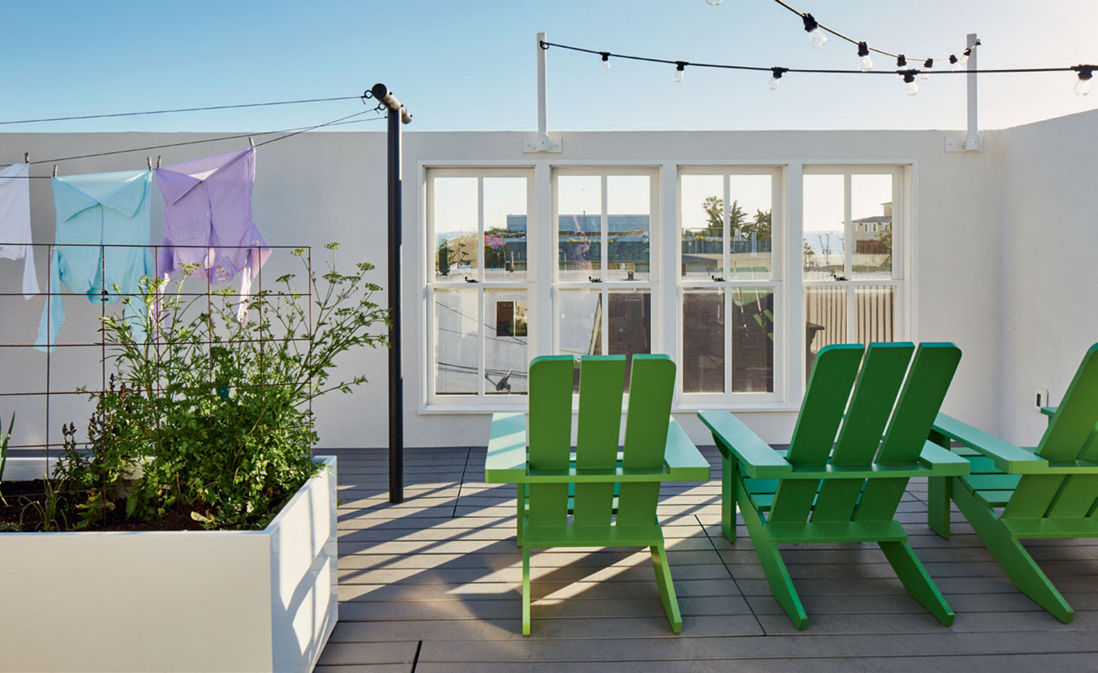
Painted chairs on the house's roof terrace
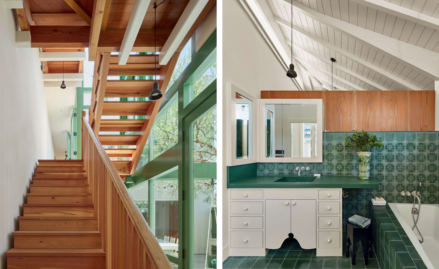
From the window frames in the staircase to the bathroom tiles, green accents throughout the house complement the colour of the facade
INFORMATION
For more information, visit the Domestic Architecture website; or the Domestic Furniture website
Receive our daily digest of inspiration, escapism and design stories from around the world direct to your inbox.