Interactive floor plan: 4x30 house, São Paulo

Receive our daily digest of inspiration, escapism and design stories from around the world direct to your inbox.
You are now subscribed
Your newsletter sign-up was successful
Want to add more newsletters?
When designing their family home on a narrow plot in São Paulo, architects Clara Reynaldo of CR2Arquitetura and Lourenco Gimenes of FGMF knew from the outset that it was going to be a challenge. 'How do you make the entire program of a house fit in a 4x30m lot, relying on a few illuminated surfaces?' they asked themselves. 'Even though the result looks simple, the solution required a lot of research.'
Reynaldo and Gimenes looked at the distinctive Japanese style of small-scale homes, as well as compact Dutch dwellings for inspiration. And after three years of design and construction, they have now moved in. 'Our search for natural illumination and ventilation conditioned the emphasis on a central garden, cut into the constructed volume in order to create three façades generously bathed in light,' they explain.
The architecture comprises two blocks, situated on either side of the central courtyard, connected via a corridor on ground level and a mesh footbridge on the first floor. The front volume, which is also the larger one, contains the main living areas - a kitchen and sitting room, as well as bedrooms on the upper floor. The smaller, back volume supports the front one, hosting the service areas and circulation, as well as an office and TV room.
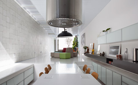
The duo's desire to have the living room orientated towards the private garden led to the unconventional decision of having the kitchen space facing the street. 'Highlighting its form and integrating it spatially into the house passed from being an obstacle to a project opportunity,' they explain. The architects sunk the kitchen by 75cm into the ground, thus creating an elevated corridor running by it and leading straight to the living room.
Internally as well as externally, the house is finished in a monochromatic palette and several clean white light-reflecting surfaces, while featuring large openings towards the courtyard, all cleverly adding to the illusion of a large space. Incorporating recyclable materials, the final result is bright and airy despite its small size - an efficient building where no part of the plot goes to waste.
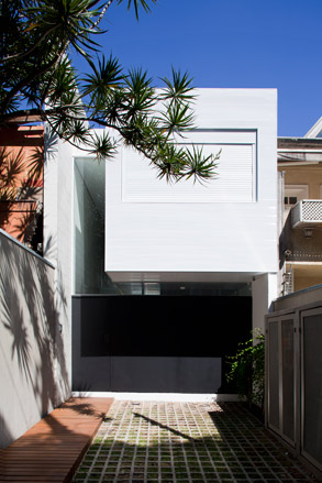
The exterior of the São Paulo family home of architects Clara Reynaldo and Lourenco Gimenes
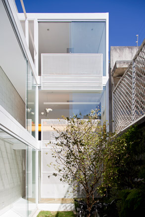
Designing a home on a 4x30m plot was no easy feat for the duo. 'Our search for natural illumination and ventilation conditioned the emphasis on a central garden, cut into the constructed volume in order to create three façades generously bathed in light,' they explain
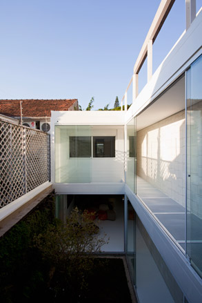
The architecture comprises two blocks, situated on either side of the central courtyard, connected via a corridor on ground level and a mesh footbridge on the first floor
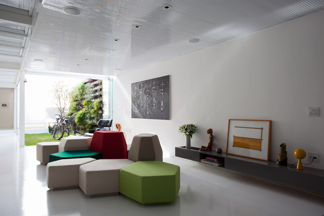
The living area in the main volume of the house opens onto the courtyard garden
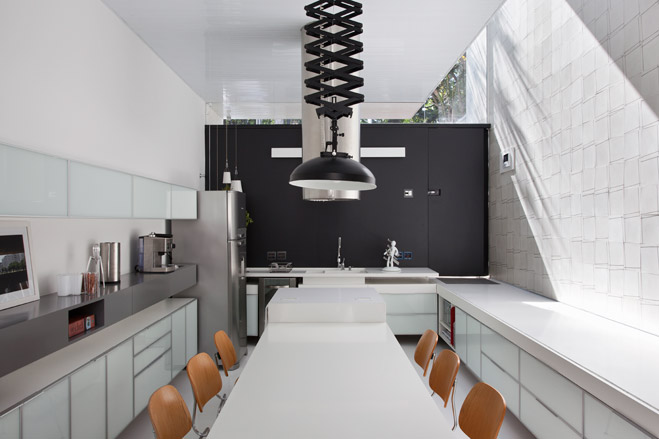
The duo’s desire to have the living room orientated towards the garden led to the unconventional decision of having the kitchen space facing the street
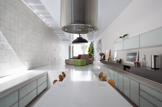
'Highlighting the kitchen's form and integrating it spatially into the house passed from being an obstacle to a project opportunity,' they explain. They sunk it by 75cm into the ground, thus creating an elevated corridor running by it that leads straight to the living room
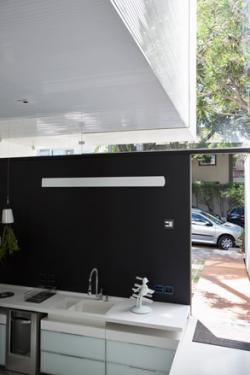
Strategically placed openings ensure the house is filled with natural light
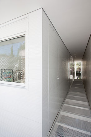
The first floor corridor in the main volume of the house
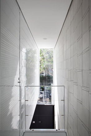
...a landing, lit by a large opening in the facade of the house
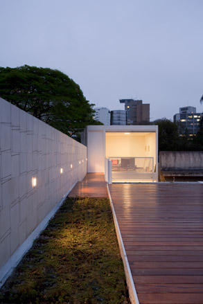
The roof top terrace above the main volume of the building
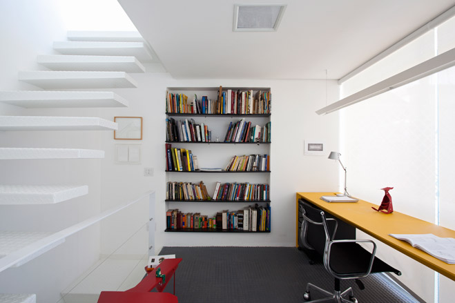
The smaller volume at the back of the plot hosts the service areas, as well as an office and...
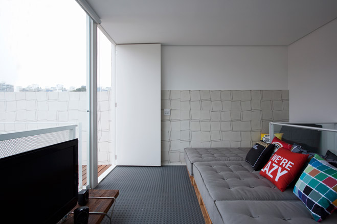
.. a small TV room
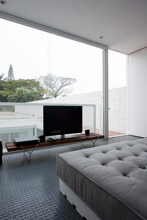
View from the TV room across to the rooftop terrace
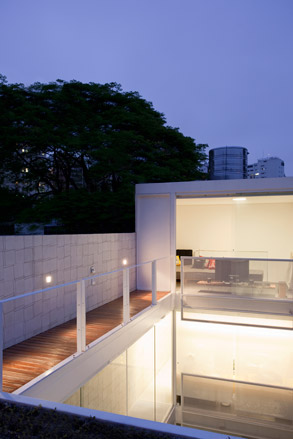
Internally as well as externally, the house is finished in a monochromatic palette and several clean white light-reflecting surfaces
Receive our daily digest of inspiration, escapism and design stories from around the world direct to your inbox.
Ellie Stathaki is the Architecture & Environment Director at Wallpaper*. She trained as an architect at the Aristotle University of Thessaloniki in Greece and studied architectural history at the Bartlett in London. Now an established journalist, she has been a member of the Wallpaper* team since 2006, visiting buildings across the globe and interviewing leading architects such as Tadao Ando and Rem Koolhaas. Ellie has also taken part in judging panels, moderated events, curated shows and contributed in books, such as The Contemporary House (Thames & Hudson, 2018), Glenn Sestig Architecture Diary (2020) and House London (2022).
