Inspirational interior landscapes to expand horizons during lockdown
Being indoors doesn't mean an absence of landscape, as our built context becomes more important than ever, so join us as we explore a range of residential interiors that showcase the range and creativity of apartment architecture in London, Paris, Nagoya and Melbourne
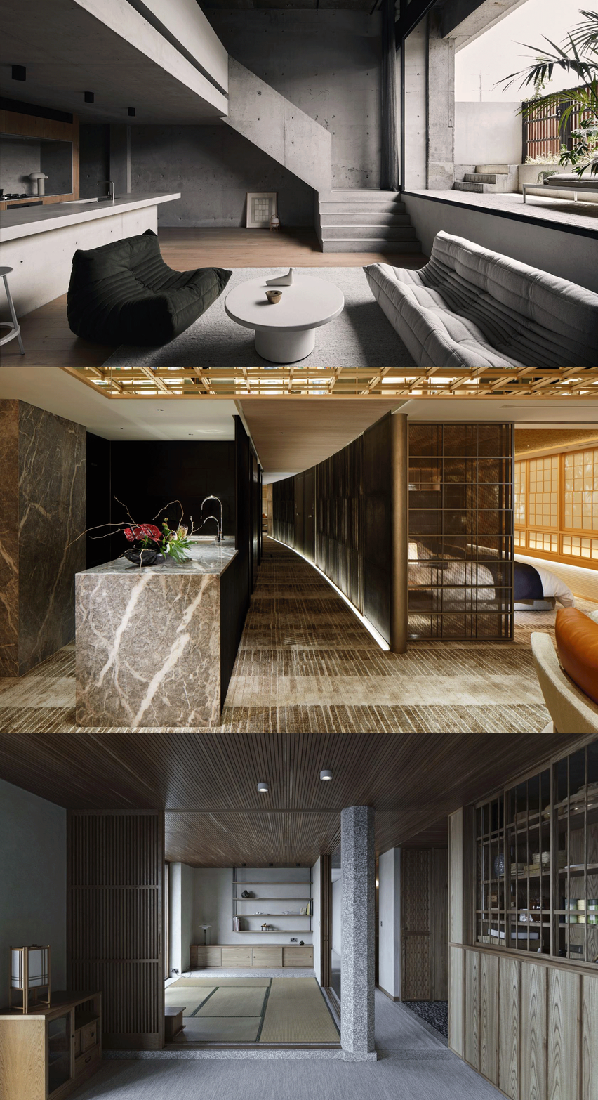
We’ve all become a great deal more accustomed to interiors in recent weeks, with the prospect of much more time to spend staring at the walls, rearranging books and pictures and shuffling bits of furniture around. Yet isolation needn’t mean a lack of inspiration, so here are four examples of new apartment architecture that all start from the premise than an interior needn’t mean an absence of landscape.
The architectural profession has often appeared to dismiss pure interior design as somehow secondary to the heroic achievement of the new build. As these examples show, the limitations placed by an interior can result in impressively architectonic spaces, shaped by clever planning, interesting forms and the careful use of materials.
Apartment BDD, Jean Benoît Vétillard Architecture, Paris
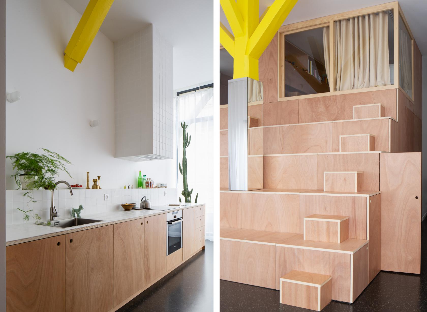
Apartment BDD by Jean Benoît Vétillard Architecture transforms an open-plan apartment with an ‘open valley’, a steep arrangement of storage and steps that leads up from the kitchen and dining space to two sleeping pods tucked away on the upper level of a double-height space.
Working within just 60m2, the architects have somehow managed to create three sleeping areas (two upstairs and one below, in the heart of the ‘mountain’), a modest shower room and separate WC. ‘This is a generous, luminous shared space,’ the architects say, ‘with no walls, just surfaces that can be walked on. The project is the total transformation of an apartment that’s also like a change of life.’
Barbican apartment, Takero Shimazaki Architects, London
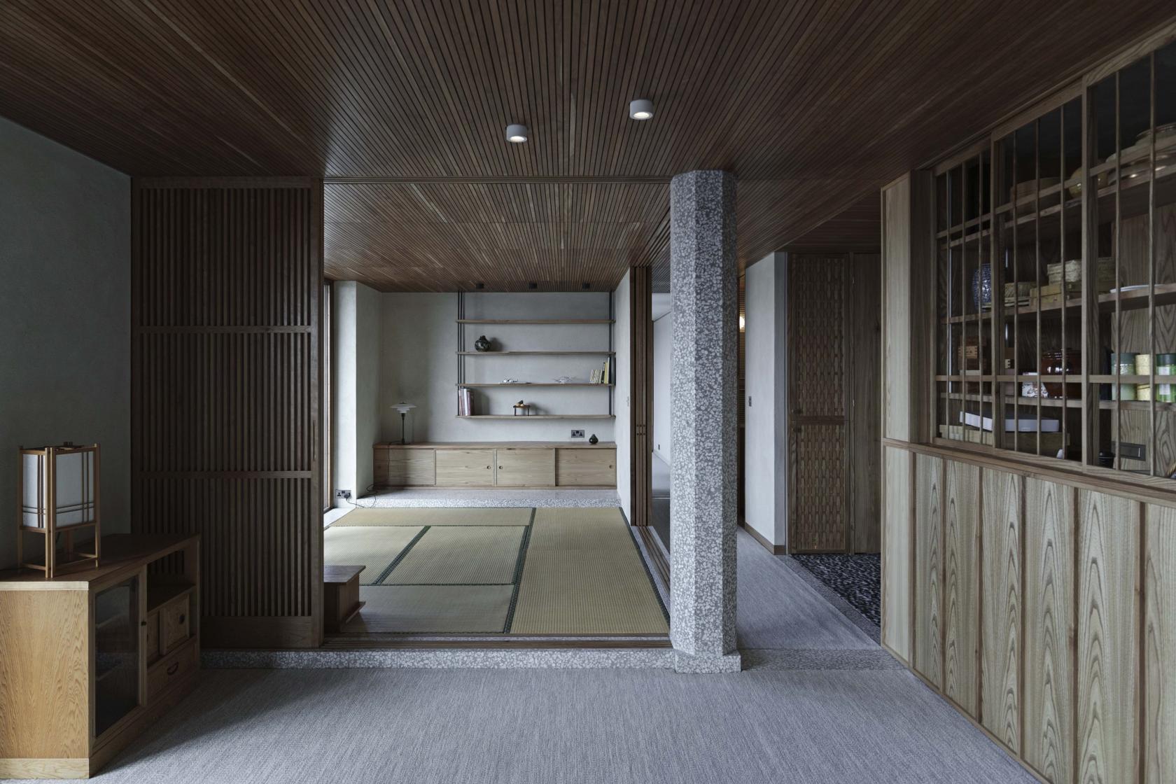
Takero Shimazaki Architects’ project for an apartment within London’s Barbican makes the most of the Shakespeare Tower’s cluster of three long, linear apartments on each floor. By extending the living/dining space and removing internal walls, t-sa has created a spacious sanctum for clients who have spent many years in Japan. Shimazaki worked with lead designer Haruka Nogami, Edward Pepper and Giacomo Pelizzari to find an approach that melded traditional Japanese architectural language with the Barbican’s familiar palette of brutalist concrete and heavy timber.
Taking inspiration from early Japanese Modernism – in particular the work of Seiichi Shirai – t-sa’s design pairs light timber screens, tatami mats, stone pebble flooring and a terrazzo column inserted into the main living space to act as a ‘bridge between the two conflicting languages of this interior architecture.’ Shirai often deployed the column as an ordering device and here the whole plan pivots off this central point, which cleverly retains the original galley kitchen and bathroom layout while maximising the visual distances available. Carpets are soft and grey to match the existing concrete, while the timber slats, screens and cladding is a warm counterpoint to the original heavy wood window frames.
‘The resulting architecture does not belong to Japan, to classicism nor any specific time,’ says Shimazaki, ‘It is a site and client-specific architectural dialogue in language, tradition, renovation and ultimately, a spatial drama that is borne out of a gentle, yet conflicting encounter of language of the details in a small universe, inside a tower in London.’
Clifton Hill apartment, Studio Goss, Melbourne
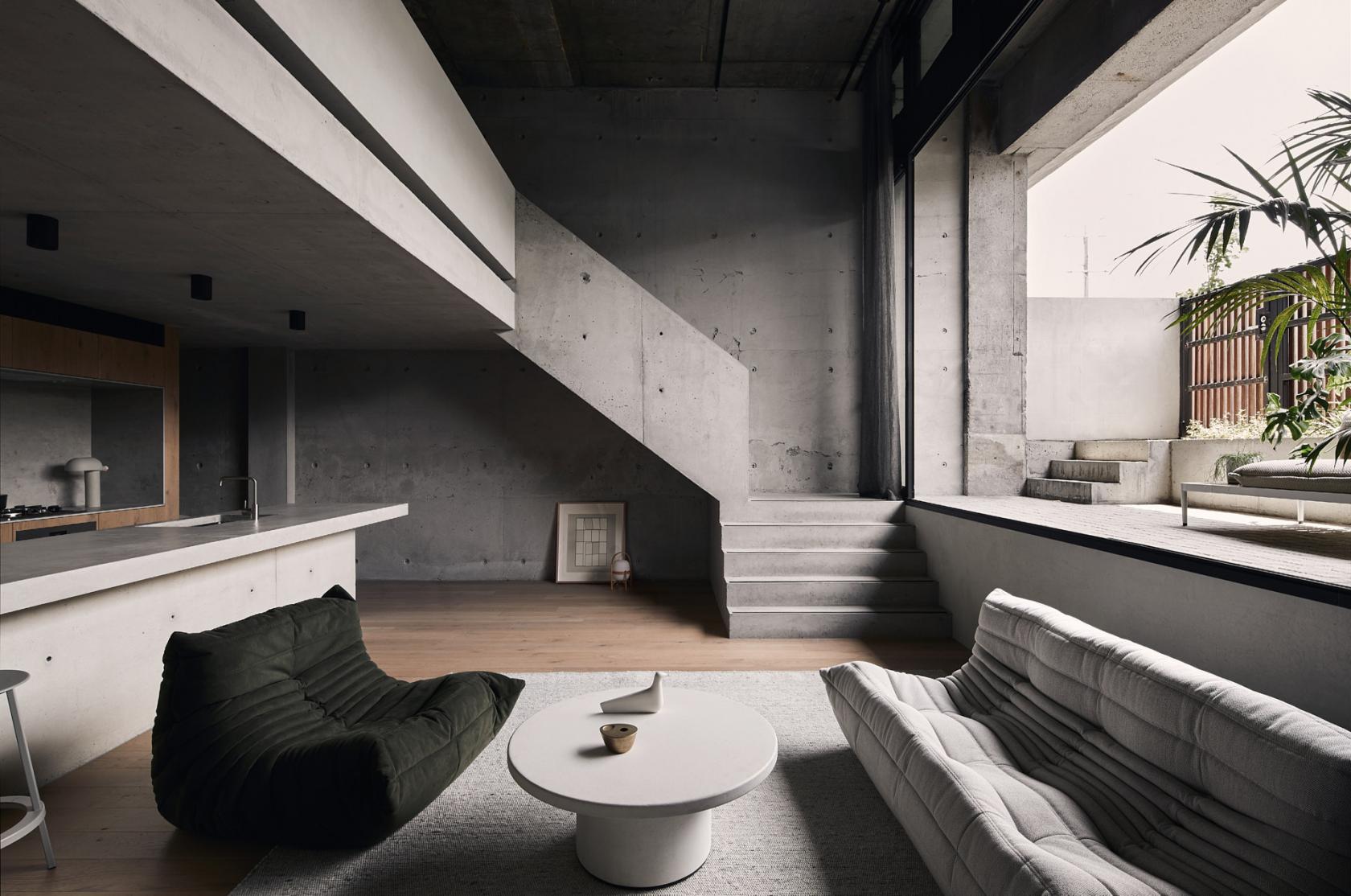
Studio Goss’s Clifton Hill apartment is another symphony in concrete, this time in service of a vertical, almost geological feel. Set within a converted 1970s brutalist commercial building, this Melbourne project takes advantage of the site conditions to create a ground floor that’s dug down 1.5m below existing street level to allow for the creation of a mezzanine bathroom and bedroom.
‘This approach allowed for a more generous floor-plan and dramatic double height space defining the living area,’ says David Goss, ‘it also provides a greater sense of privacy from the adjacent footpath.’ Concrete finishes abound, with new poured in-situ concrete seamlessly matched up to the original structure. Oak is used for all the joinery, which also conceals the services, while the tall gauzy grey curtains add to the rugged, elemental feel. Even the furniture, which includes Ligne Roset’s iconic Togo seating by Michel Ducaroy, is intended to evoke soft outcrops in a landscape, instead of conventional forms.
Private Guest House, Tange Associates, Nagoya
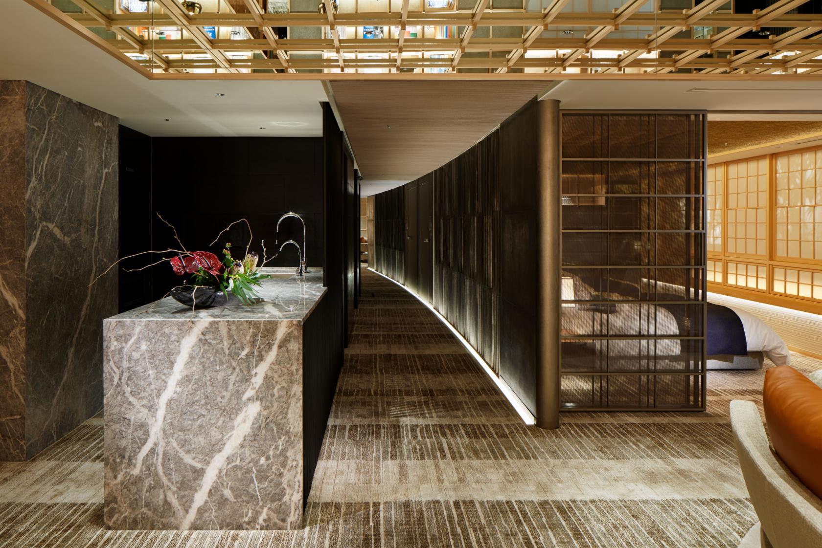
Tange Associates’ Private Guest House transforms a lofty space into an intimate, self-contained environment. The designers’ challenge was to take the centuries-old aesthetic of traditional Japanese design and recreate it on the 33rd floor of a high-rise apartment building in Nagoya. The unit serves as a guest suite for employees of a local company and the brief was very specific – it must house a new group of guests every day. Hospitality is therefore the preeminent concern; think of this as a bespoke, one-off hotel suite that has also has to convey comfortable domesticity as well as seamless service.
The 110 sq m space is carefully modulated through changing patterns and textures, creating a harmonious space with hand-woven carpets, polished stone, marble and timber screening on walls and ceilings to always give the eye somewhere to roam. The living area is arranged before a sweep of windows that offer up a skyline view of Nagoya.
INFORMATION
jeanbenoitvetillard.com
t-sa.co.uk
studiogoss.com.au
en.tangeweb.com
Wallpaper* Newsletter
Receive our daily digest of inspiration, escapism and design stories from around the world direct to your inbox.
Jonathan Bell has written for Wallpaper* magazine since 1999, covering everything from architecture and transport design to books, tech and graphic design. He is now the magazine’s Transport and Technology Editor. Jonathan has written and edited 15 books, including Concept Car Design, 21st Century House, and The New Modern House. He is also the host of Wallpaper’s first podcast.
-
 Nikos Koulis brings a cool wearability to high jewellery
Nikos Koulis experiments with unusual diamond cuts and modern materials in a new collection, ‘Wish’
By Hannah Silver
-
 A Xingfa cement factory’s reimagining breathes new life into an abandoned industrial site
We tour the Xingfa cement factory in China, where a redesign by landscape specialist SWA Group completely transforms an old industrial site into a lush park
By Daven Wu
-
 Put these emerging artists on your radar
This crop of six new talents is poised to shake up the art world. Get to know them now
By Tianna Williams