Solo show: architect Jake Moulson transforms a Dublin townhouse

Receive our daily digest of inspiration, escapism and design stories from around the world direct to your inbox.
You are now subscribed
Your newsletter sign-up was successful
Want to add more newsletters?
Many architects design a house as their first solo project, so in that sense Jake Moulson’s case is not unusual. But far from being a typical residential conversion, Moulson’s renovated Georgian townhouse is a true one-off: an intricate collage of different materials and atmospheres that has been carefully orchestrated to feel almost like several different projects folded into one. The resulting home is a real architectural treasure trove that begs to be explored and experienced.
As elaborate and extravagant as the space may seem, there is a surprisingly pragmatic thinking behind it and a method in the madness of its London-based author. Before setting up his own studio in Hackney, Moulson worked at practices known for their considered, material-led and hands-on attitude: he was with Carl Turner Architects for almost two years and, straight out of the Royal College of Art, worked for Peter Salter on his fantastically idiosyncratic Walmer Yard housing project. Both architects have a distinctive, tactile and craft-led approach that resonates with Moulson’s ethos. ‘I have always been intensely involved with the testing and making of things,’ he admits.
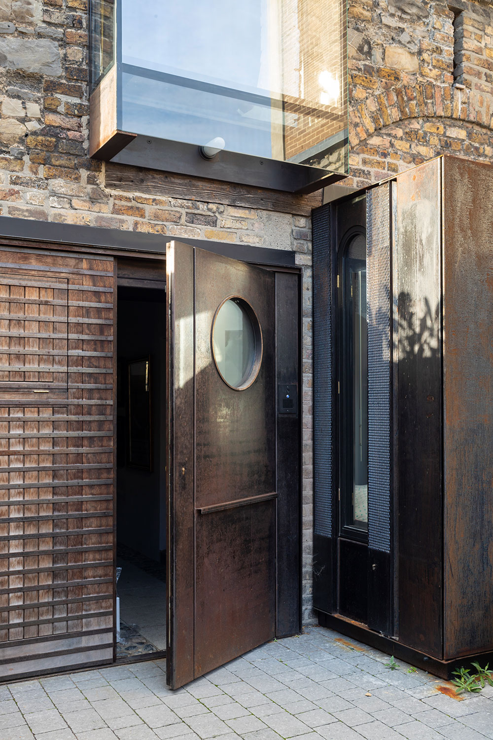
The annex’s garage door, with an oculus that mirrors the coach house’s original circular windows.
Moulson also served time with Gerrard O’Carroll, and was designing a house in Ireland with him when O’Carroll passed away in 2010. The project involved the transformation of a cottage in Glendalough into a weekend home for Adrian and Jennifer O’Carroll, Gerrard’s brother and his family. ‘This was the beginning of developing a language with Adrian and Jennifer, and an understanding,’ Moulson recalls. ‘We kept in touch on and off over the following years. Then, out of the blue, they emailed and said, “Do you want to come and visit us in Dublin? We’ve got something we’d like to show you”.’
What they showed him was an old townhouse in the heart of Dublin 2, part of the city’s untouched Georgian fabric. It had been used as office space and at the time was completely run down, although retained its grand character, beautiful light and large windows. ‘What really surprised me was discovering an overgrown mass of green to the rear of the house in this part of Dublin – an oasis among a barrage of car parks and offices. And then, crossing to the end of it, finding the ruined classical façade of a coach house, like a real-life Piranesian vision,’ says Moulson. ‘Seeing this amazing building and knowing Adrian and Jennifer’s interest in design and their taste, it was an offer I couldn’t turn down.’
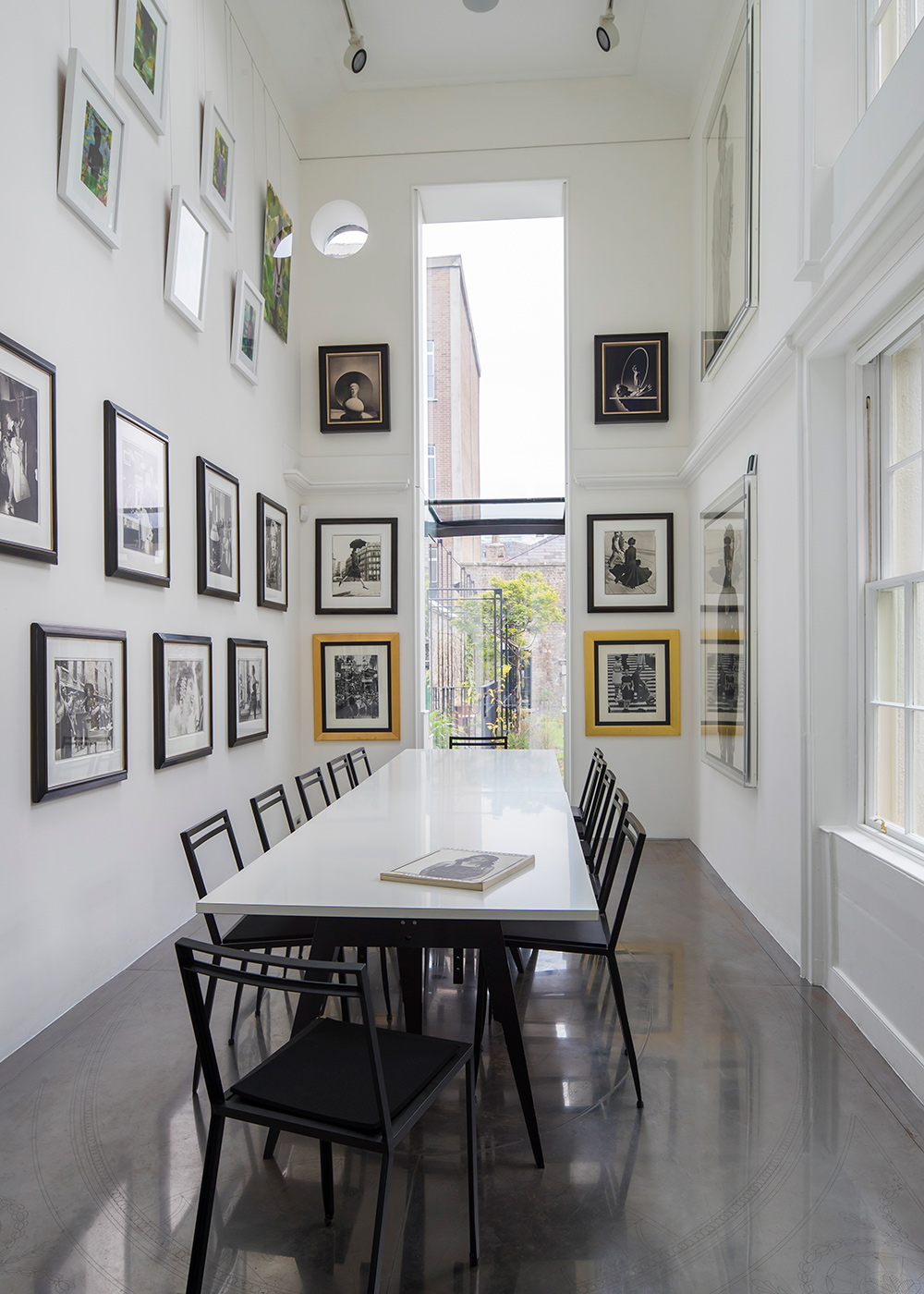
The double-height formal dining room and gallery space.
The O’Carrolls gave him lots of design freedom, remaining involved and supportive throughout the project, and the result is a meticulous sequencing of spaces that spans five levels (one is underground) and unites the main house and the coach house annex through a garden designed by specialist horticulturalists Liat and Oliver Schurmann of Mount Venus Nursery.
‘The design is multi-referential; it draws on diverse sources across disciplines and eras,’ explains Moulson. ‘I was thinking very much about the flow through the house, the dilemma of how much to open up or separate and what leads onto what. In getting to know and uncover the spaces of the house I was drawn to historical precedents where each room has a distinctive quality, material and atmosphere, according to inhabitation and routine. In some cases, these might come together over time, designed by multiple architects. I wanted a rhythm of hiding and revealing, and of coming into unexpected places. As it’s a protected building, we couldn’t, and didn’t want to, impact on the historic structure so we used bespoke elements throughout to work with, amplify or modify the qualities of the rooms and light for different moods and times of day. Having the variety of spaces to stimulate and facilitate this approach has been amazing.’
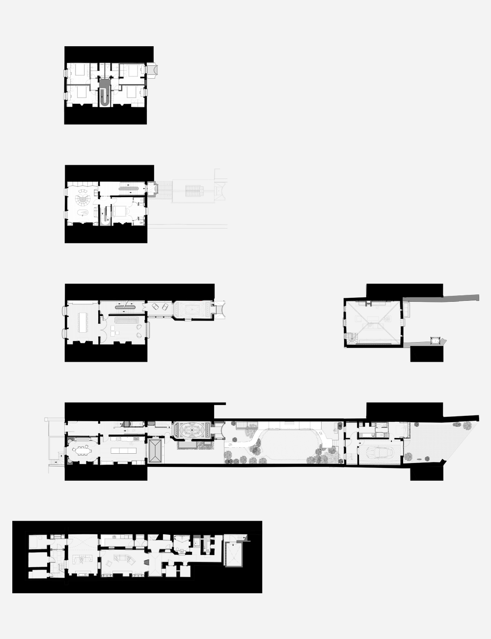
The floor plan of the townhouse
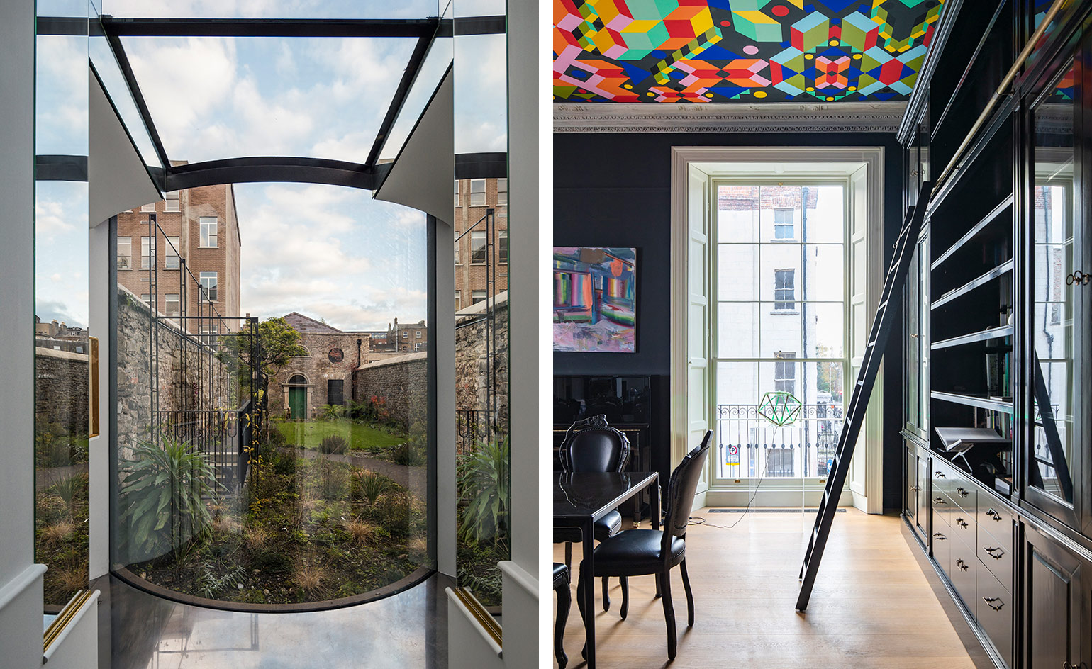
The main entrance leads into the kitchen, made of undulating Corian, and a deep blue breakfast room clad in brass and leather to the right, or through a dark timber-panelled corridor to a light-filled, double-height art gallery and formal dining room at the rear of the house. This sequence from darkness to light was deliberate for dramatic effect. The tall, almost cathedral-like gallery room ends in an inverted curved bay looking out into the foliage, where ‘you can practically walk into the view’. The floor is lined in etched steel sheet in a pattern designed by Moulson to reference Georgian plaster ceilings.
One floor up from the corridor, a glazed roof, uncovered during the works, shelters a winter garden. Above it, a small volume hanging off the main house, which used to be an old asbestos construction, has been replaced by a lush Azul Imperial quartzite-clad toilet with a structural glass floor and wall, as ‘a sort of inhabited window’. One flight up leads to the master bedroom, with its large dressing room and bathroom space full of hidden cabinetry; it is a cross between an upmarket fitting room, a bathroom and a club. ‘It needed to work on a practical level but I also wanted there to be theatre in using it,’ Moulson admits.
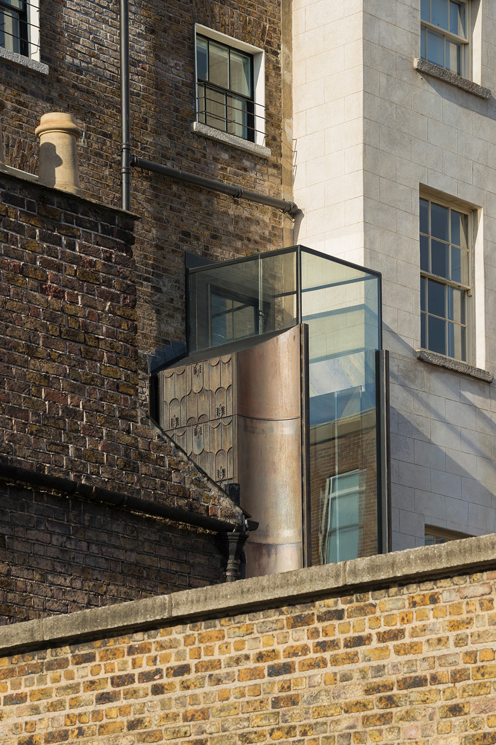
Flanked by curved and patterned cast-iron panels, the first floor’s ‘inhabited window’ houses a quartzite-clad toilet.
The top floor contains the four brilliantly white children’s bedrooms, brightened further by pops of colour and seamless white Corian bathrooms. The basement is dedicated to a more moody lounge and spa, while the coach house has been converted into a guest studio with a garage underneath.
The main living space is on the first floor, next to a dining area featuring a ceiling piece by artist Morag Myerscough. This was Mouslon’s clever way of adding drama to the room, but with minimum architectural intervention. ‘Morag’s painted artwork gave us a chance of switching traditional plasterwork for a contemporary ornate ceiling. Besides, the best Georgian examples often used colour with plasterwork, which is lost in the monochrome presentations of today’, he says. Elsewhere, new plasterwork references the original house’s decorative spirit, mixed with arches and round openings that soften the interior while highlighting its expressive character.
While variety and individuality prevail, everything comes together effortlessly in a space that is more family-home-with-a-twist than architect’s folly. The owners seem to agree: ‘It has been exciting to bring family life back into this building, mixing so many ideas into a harmonious outcome, thanks to Jake and his team,’ they say. And who will argue with a happy customer?
As originally featured in the June 2018 issue of Wallpaper* (W*231)
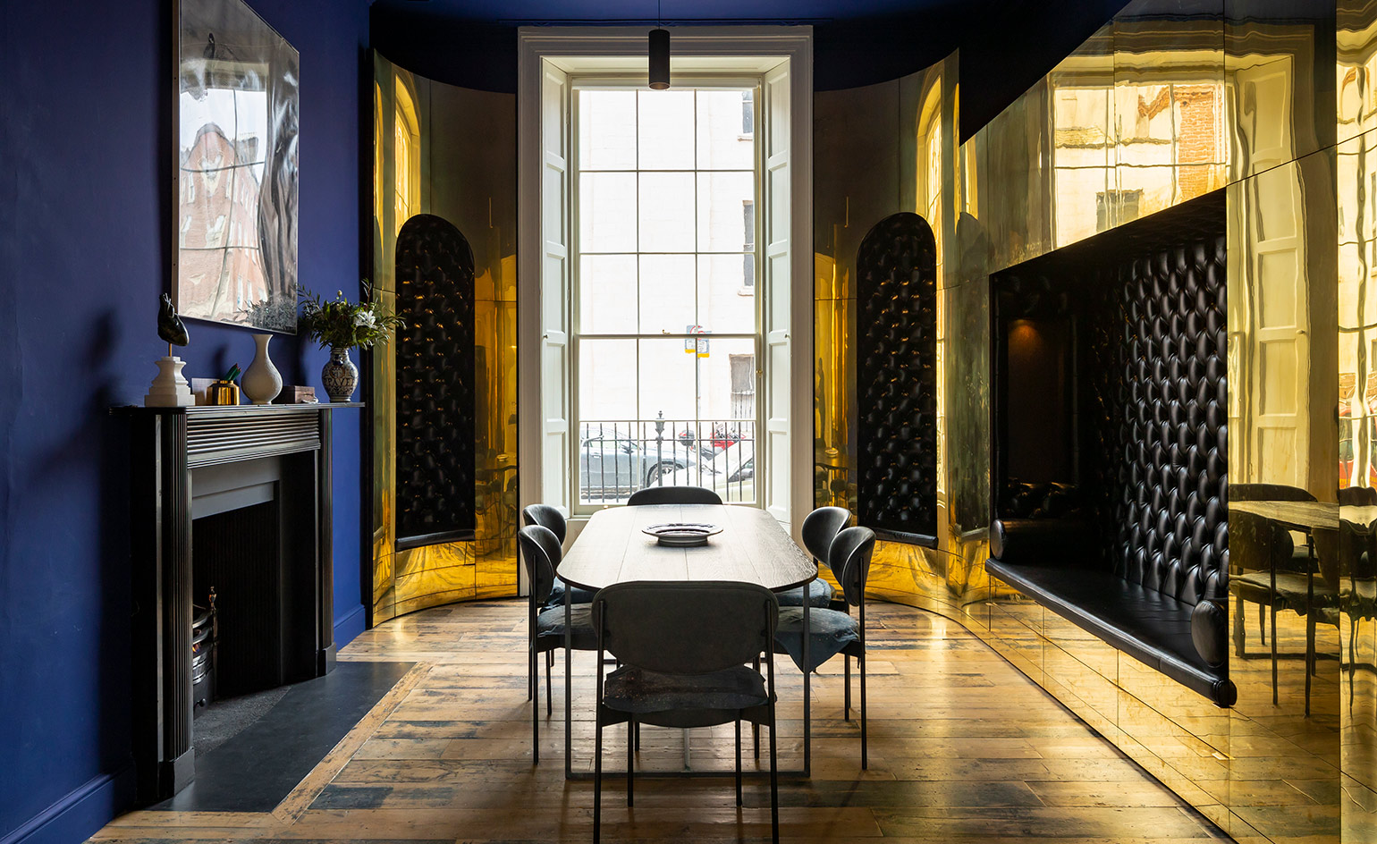
The ground-floor breakfast room, with deep blue walls, leather banquettes and brass storage elements
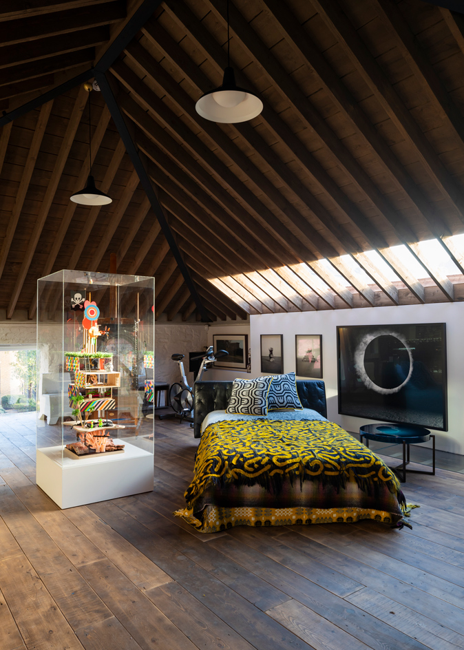
The guest suite, on the first floor of the former coach house. In the display case is a dolls’ house designed by Morag Myerscough and Luke Morgan
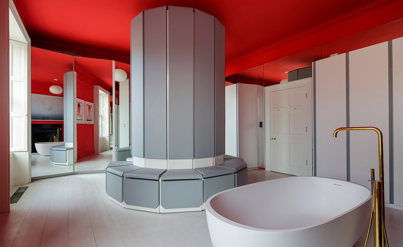
The master dressing room and bathroom, full of leatherwork, mirrors and hidden cabinetry
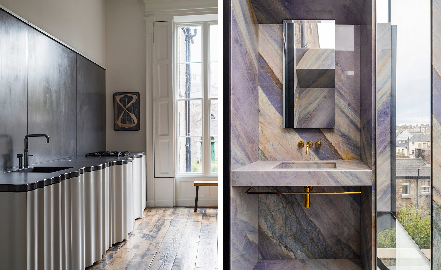
Left, the curvy kitchen cabinets at the townhouse. Right, the cantilevered toilet with quartzite interior
INFORMATION
For more information, visit the Jake Moulson website
Receive our daily digest of inspiration, escapism and design stories from around the world direct to your inbox.
Ellie Stathaki is the Architecture & Environment Director at Wallpaper*. She trained as an architect at the Aristotle University of Thessaloniki in Greece and studied architectural history at the Bartlett in London. Now an established journalist, she has been a member of the Wallpaper* team since 2006, visiting buildings across the globe and interviewing leading architects such as Tadao Ando and Rem Koolhaas. Ellie has also taken part in judging panels, moderated events, curated shows and contributed in books, such as The Contemporary House (Thames & Hudson, 2018), Glenn Sestig Architecture Diary (2020) and House London (2022).
