Omaha’s Joslyn Art Museum's newest addition effortlessly complements the institution’s existing complex
The third addition to Joslyn Art Museum is designed by Snøhetta, which opted for voluminous common spaces and illuminating atriums
Receive our daily digest of inspiration, escapism and design stories from around the world direct to your inbox.
You are now subscribed
Your newsletter sign-up was successful
Want to add more newsletters?
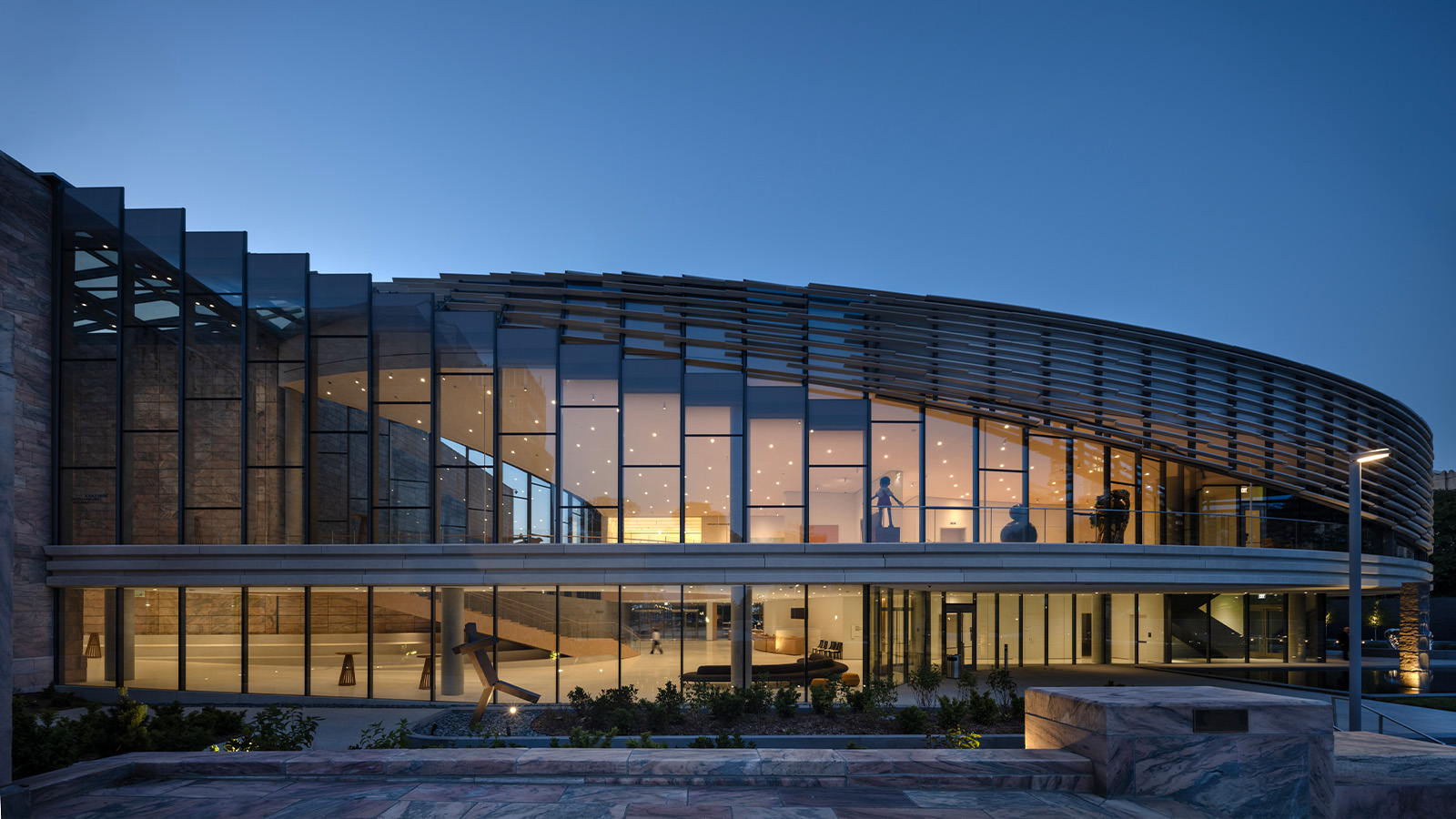
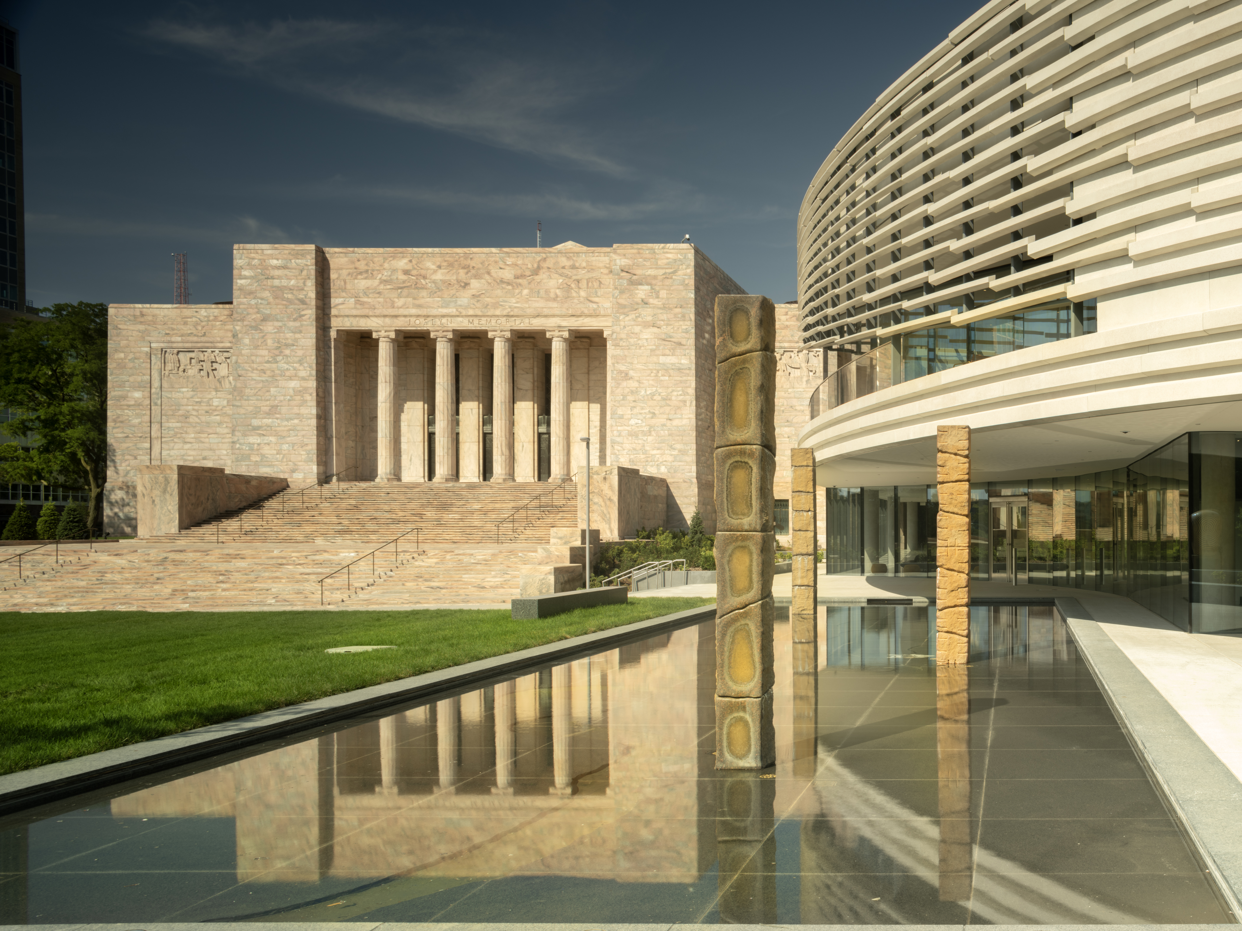
When Snøhetta worked on Omaha's Joslyn Art Museum, the architects faced a very particular challenge. Their project was the complex's third addition, so its task was to shine without blinding its predecessors. The museum already consisted of an excellent 1931 Egyptianate deco building by John and Alan McDonald and an unusually deferential 1994 addition by Norman Foster (his first in the US). Snøhetta accomplished this task exceptionally well in grafting on a kinetic 42,000 sq ft addition that provides voluminous common spaces that show off their predecessors to great effect. That's the right manner for a third wheel to spin.

Inside the new Joslyn Art Museum's third addition
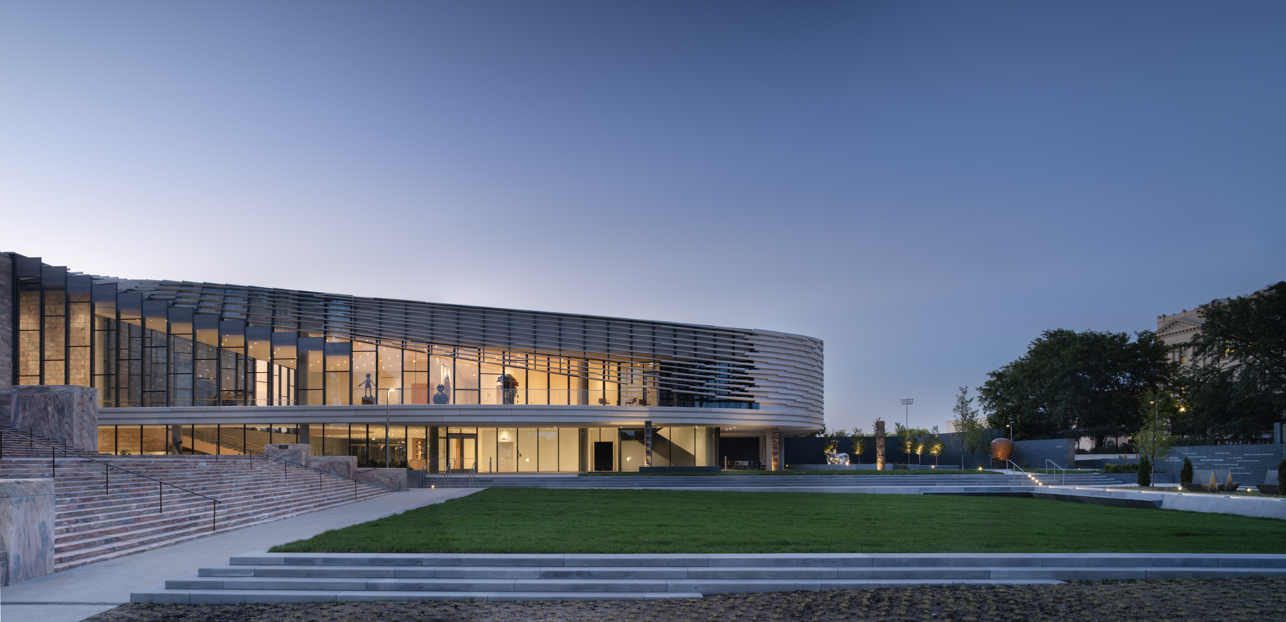
Snøhetta was free to choose where to put the addition on the museum's grounds and picked a perfect spot, essentially plugging a sort of artful lightbulb into the socket of the existing Foster-designed atrium. Aaron Dorf, senior architect at the firm, explained that this was a means to 'enhance the feeling that the three buildings had a common centre of gravity, and more importantly, could avoid creating hierarchy'.
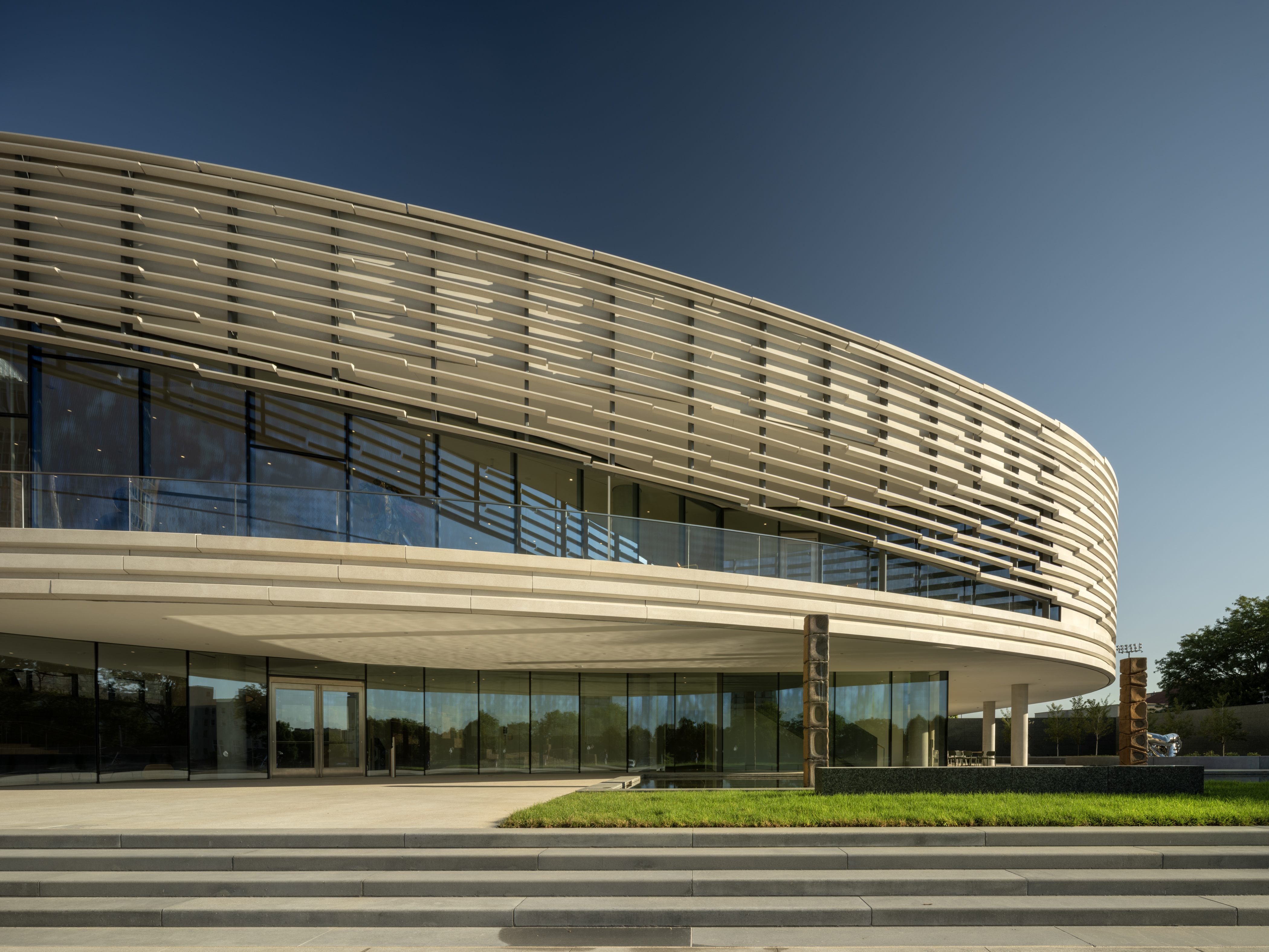
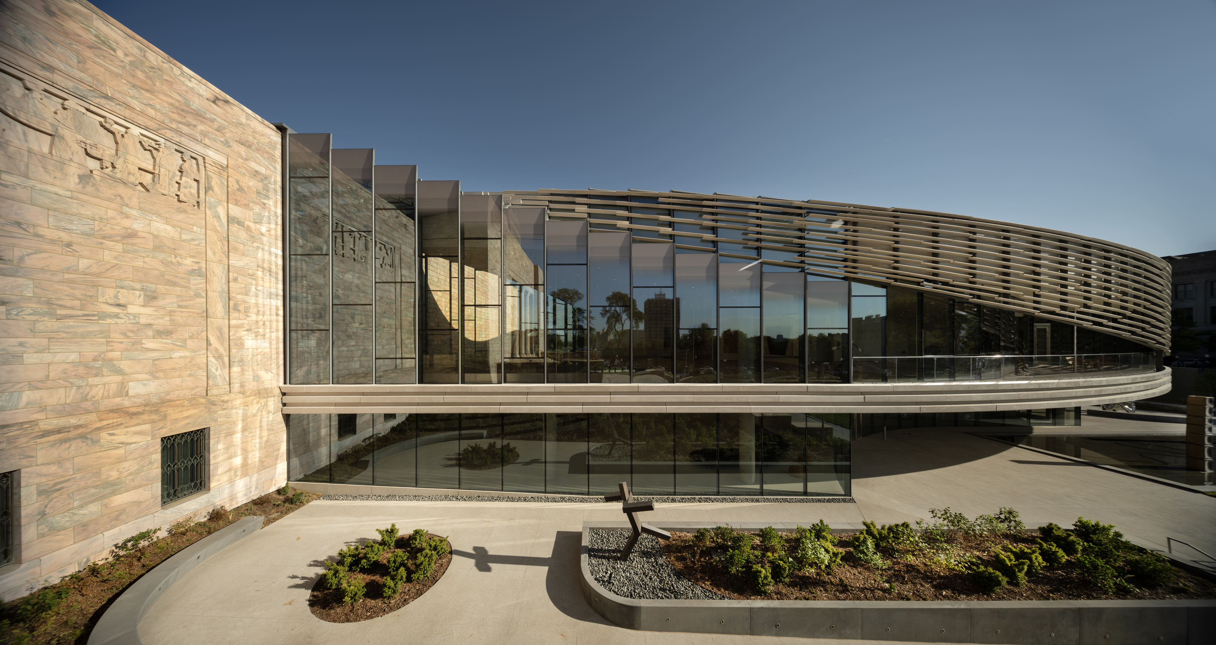
Both of the prior structures were built nearly entirely out of Georgia Pink marble. Snøhetta opted for white concrete – but salted a little pink marble into concrete panels for continuity. One portion of the structure is a third cube, which features a concrete texture to recall the main stairs of the 1931 building. In contrast to its predecessors, which are solid down to the ground, this new section is cantilevered around its edges, a nod to Prairie-style tendencies and a welcome visual jolt.
The structure is nearly entirely glass at its slender waist. Concrete brise-soleil panels, patterned rising upwards to the roof from their gallery volume, allow a sort of stage drapery parting to provide better views of the original building.
The atrium inside is admirably weightless, with a second-floor passageway supported by trusses and thin steel rods to minimise visual interruption. The architects also very deftly managed a visual transition between the rigid rectilinearity of the prior buildings and the swoop of their addition; a very mild slope of under five per cent lends vertiginous interest to the passageway.

Snøhetta also polished up portions of the older structures and repurposed some elements, but these tweaks are largely invisible, with one exception. An excision at one end of the Foster pavilion provides windows for the café and a view of a sculpture garden. Gardens surrounding the museum have been dramatically improved in their connection to a principal street.
With enormous galleries and useful modern mechanicals from the Foster expansion already in place, and the majority of office and classroom space also on hand, this extension was free to focus on galleries of more modest size (a 40 per cent increase for the museum), public space, and a gift shop.
Receive our daily digest of inspiration, escapism and design stories from around the world direct to your inbox.
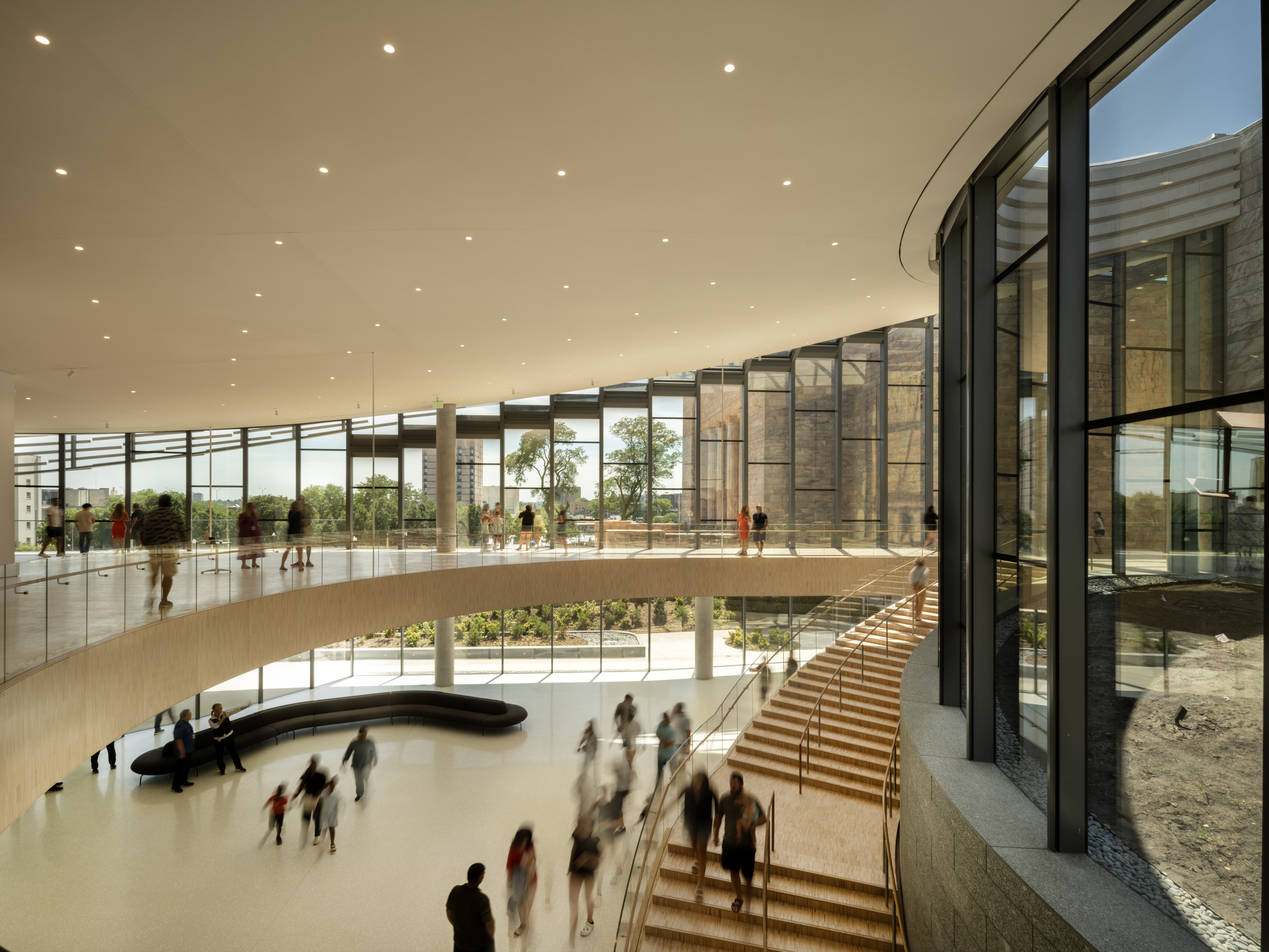
At the museum's preview, Snøhetta's Craig Dykers talked about the eternal predicament of the gallery designer, the task to keep light away from fragile paintings while avoiding building 'freezers for art'. Snøhetta succeeded at this with new upper-floor galleries to house a recent donation of over 50 modern to contemporary pieces, the Phillip G Schrager collection, and specific paper galleries on the ground floor. Possibly the most welcome feature of this addition is the art that faces the atrium; Robert Irwin, Morris Louis, and Laura Owens pieces greet you before you've even crossed the threshold.
Skylights provide shifting natural light, accentuated by hidden electric light when needed. Unusually, they face southward at roof level. Dorf explains: 'By facing southward, we can capture more of the full sky dome, which gives the daylight a more dynamic and complete colour spectrum inside the galleries.'
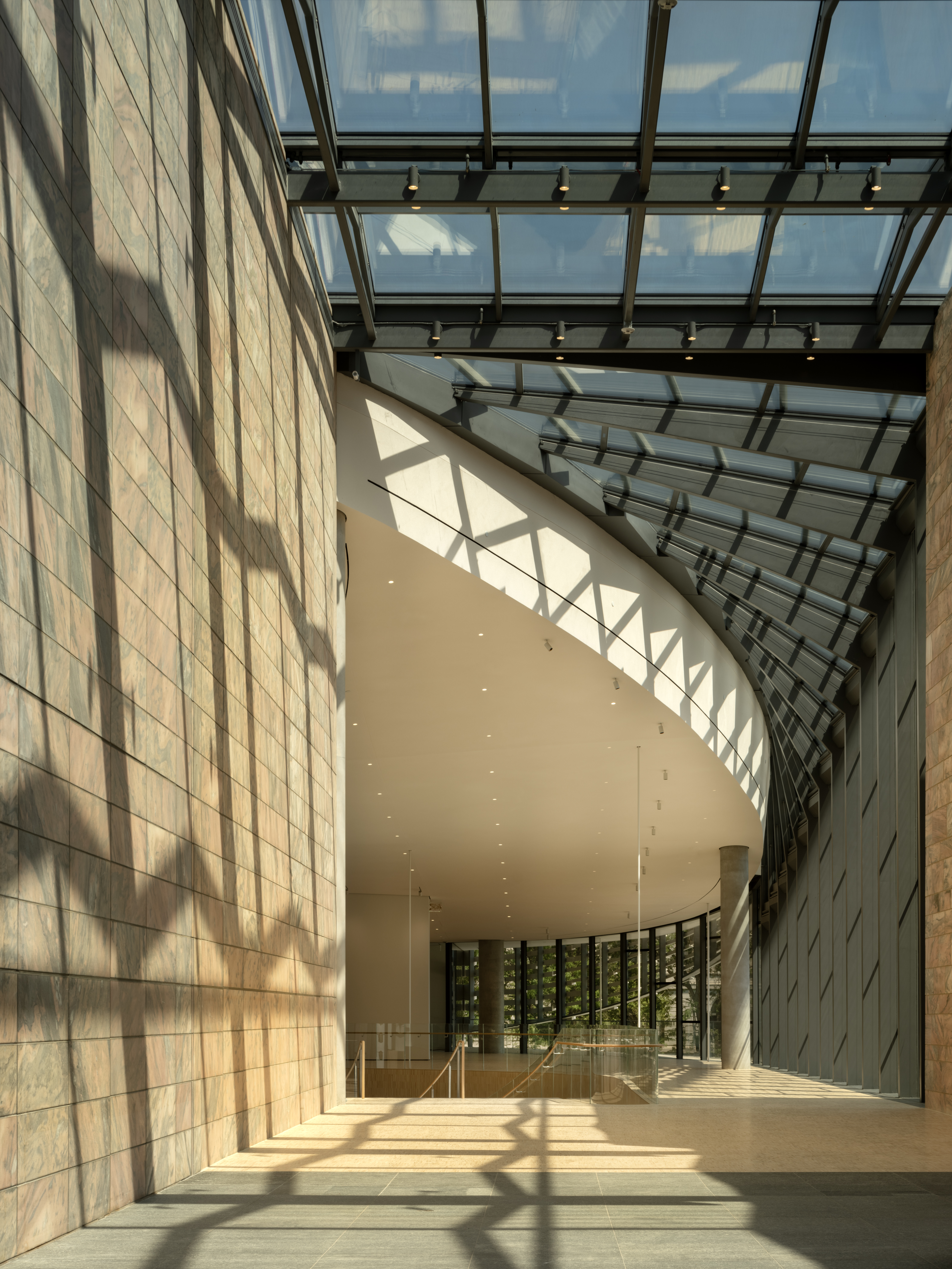
The galleries are also of an appealing scale. Snøhetta benefitted from a clear sense of the size of works intended for these spaces, with the Schrager collection calling for walls between 15ft and 17ft high and slightly smaller paper galleries. The Joslyn's director Jack F Becker explains: 'We wanted a greater sense of intimacy in the galleries. We are not MoMA or the Met, where we have twenty thousand visitors a day. We wanted something that felt a little more intimate than the Foster pavilion.'
The paper galleries currently house an inaugural exhibit on Omaha native Ed Ruscha and will soon host Japanese prints and other items drawn from storage.
The expansion enabled, says chief curator Taylor Acosta, 'the first real reinstallation of the museum since it opened in 1931' with over 100 recent works on display as well as other pieces long dusty in the vaults. You'll find one of Pollack's first action paintings, Courbet, Titian, Eva LeWitt, and much else. A particularly bracing choice was integrating Native American works with both 19th- and 20th-century collections. Dykers praised inchoate design inspiration found in the breadth of the museum's collection, from those very Native American pieces to 'a sensual deco sculpture' and renaissance works.
The finest placement is a Mark Suvero sculpture sitting atop an earthen plinth one storey up, directly outside the addition. It can be admired from the outside but particularly from inside the atrium, which curves around it. Its title is Bodacious and it lives up to the name.