Junya Ishigami designs vast, undulating pavilion in Kanagawa
Japanese architect Junya Ishigami completes KAIT Plaza, a minimalist, column-free pavilion at the Kanagawa Institute of Technology that celebrates oft-unsung, semi-open spaces
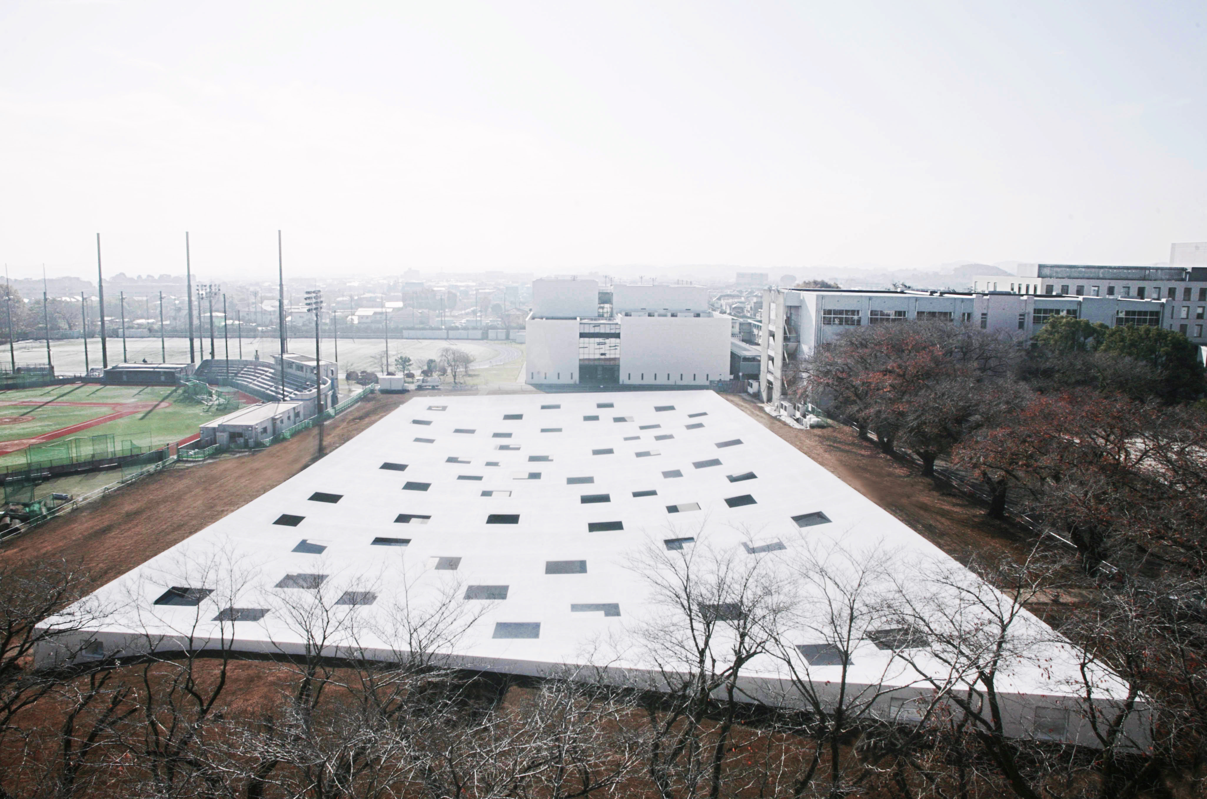
Created as a communal, outdoors break-out space for the Kanagawa Institute of Technology, as well as an architectural experiment around notions of versatility, the KAIT Plaza's minimalist pavilion has just been completed. Designed by Japanese architect Junya Ishigami, the minimalist architecture project follows on its creator's previous work for the university, the Workshop building, which completed in 2008.
Addressing the question of how to create truly multi-tasking spaces, here, Ishigami explores versatility in terms of spatial experience rather than function. Seeking to create a ‘room' for the students to sit and relax, the architect started without a prescribed function or form in mind. Instead, he tried to imagine the different ways the structure could be used.
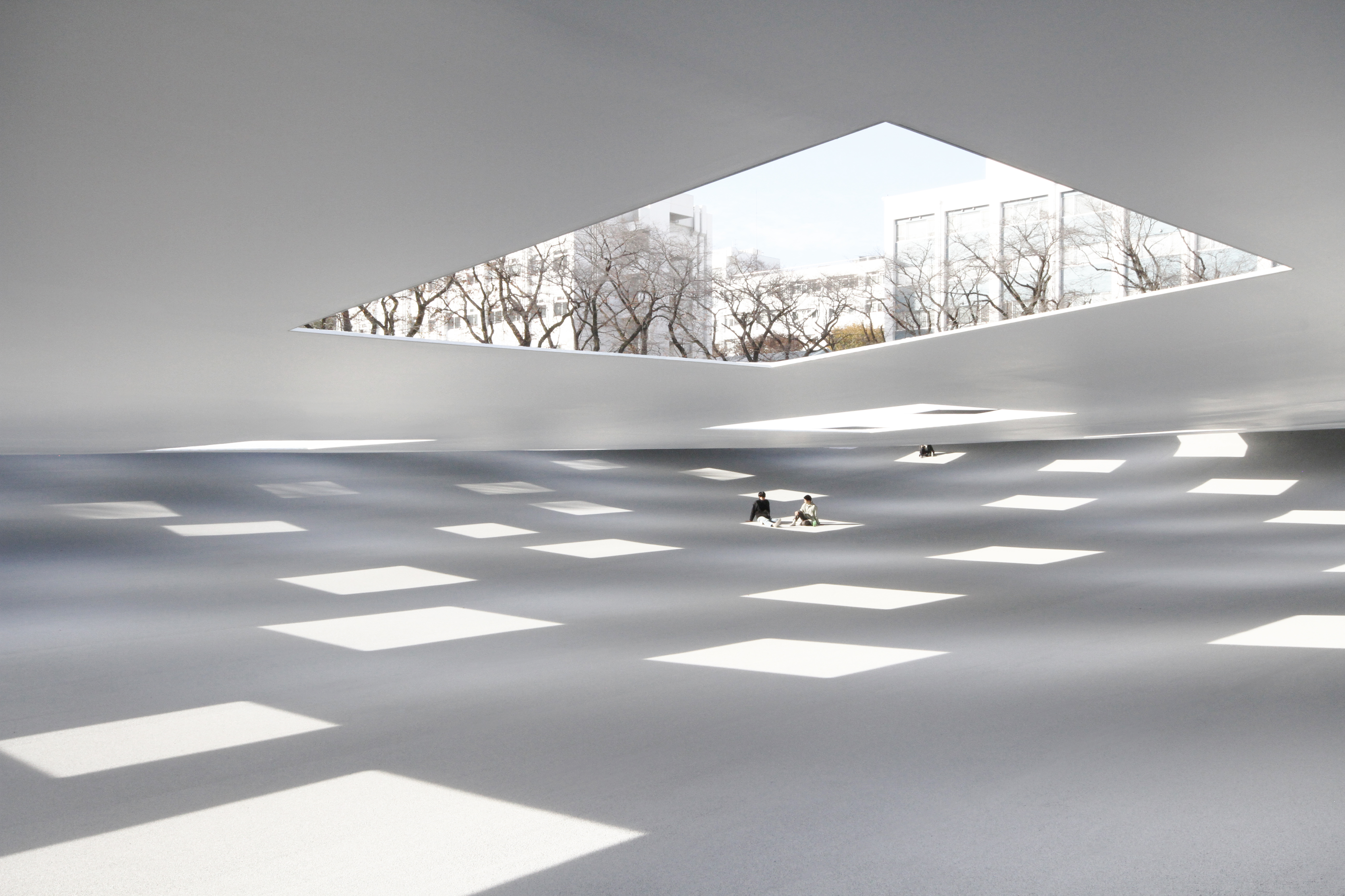
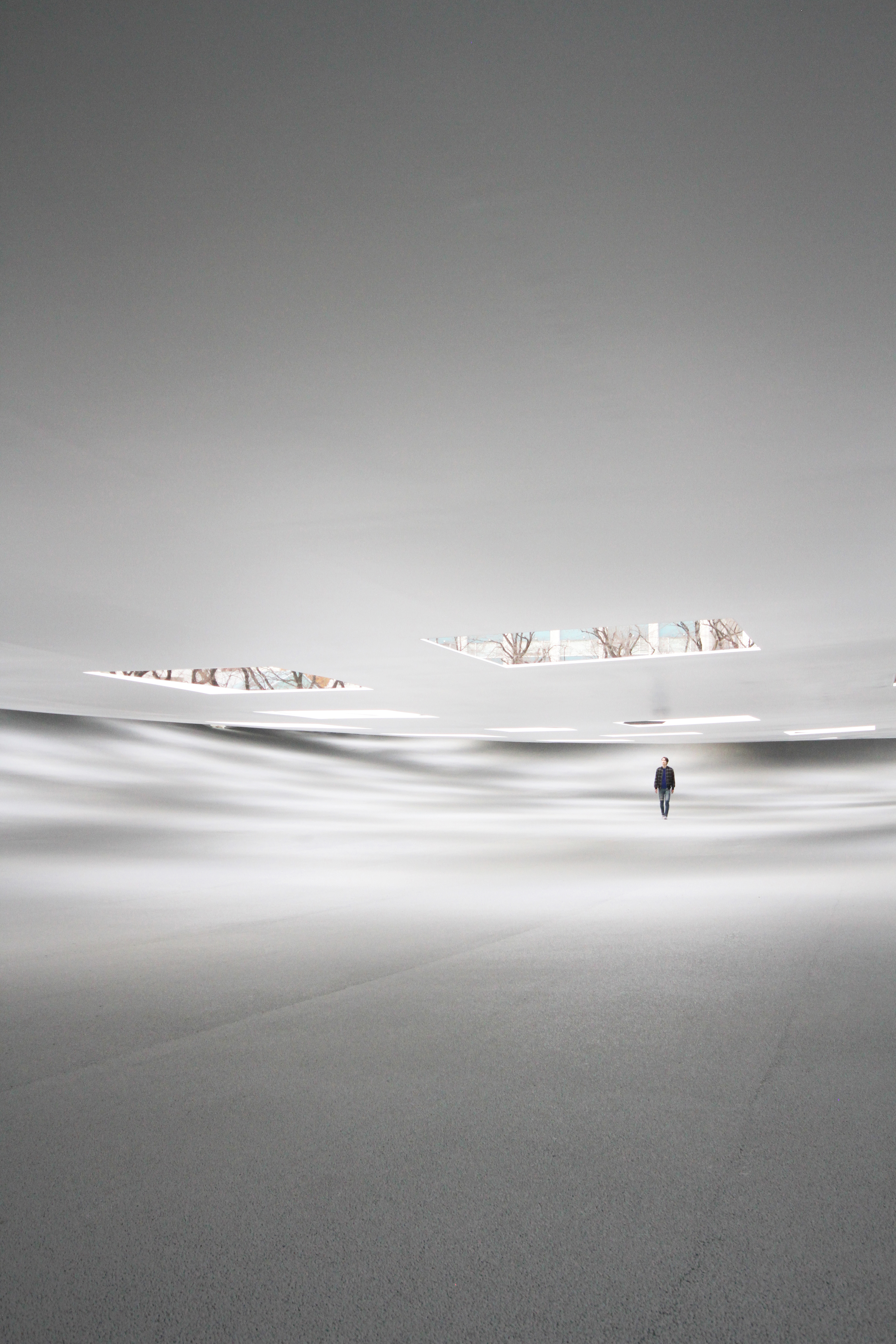
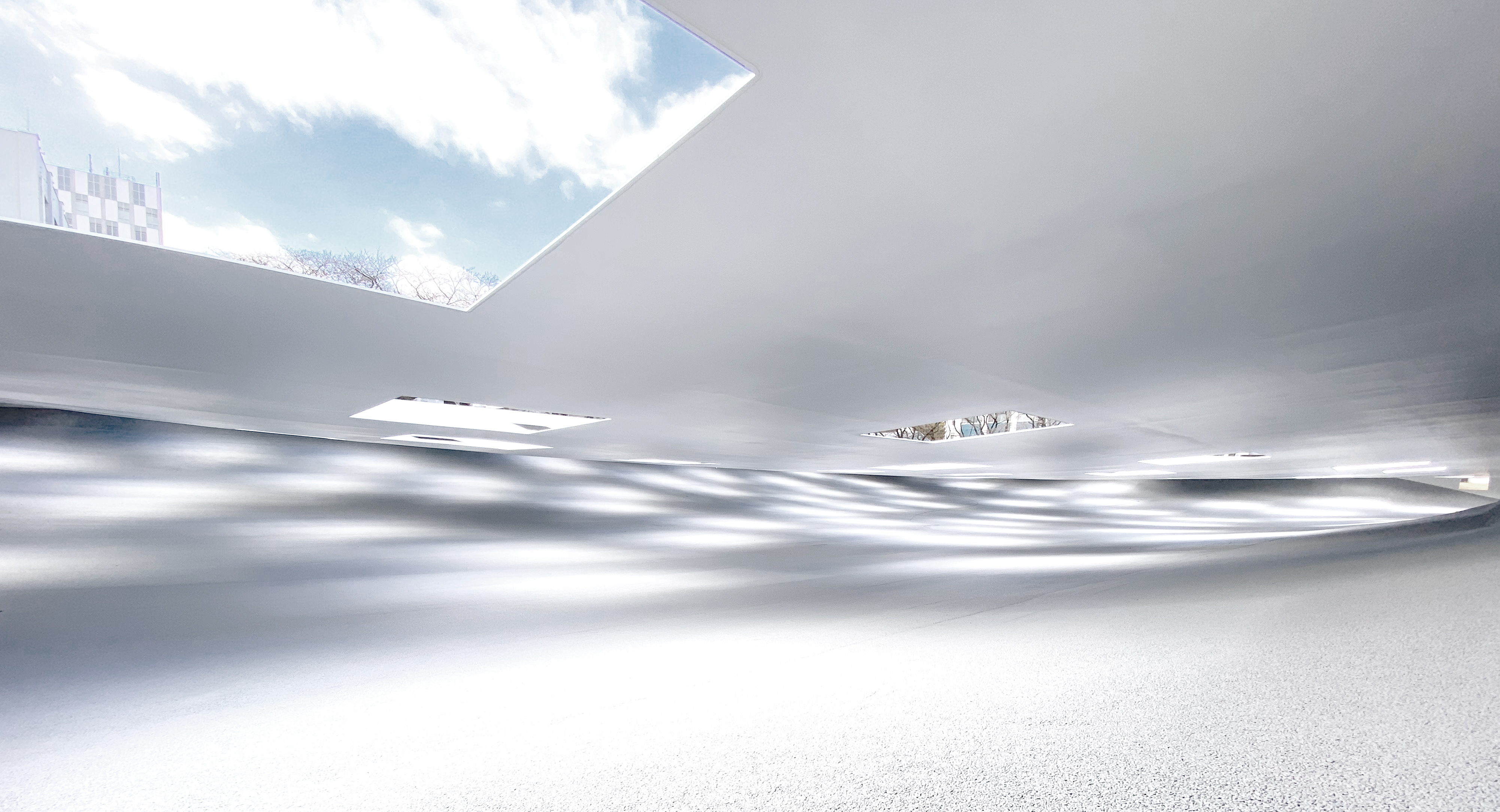
The result is a low volume that feels closely connected to the ground, its roofline rising and falling with the terrain's topographical curves. Inside, a bright, white interior, as crisp and cloud-like as the exterior, is equally ‘hilly', lit by 59 square openings of varied sizes on the roof.
RELATED STORY
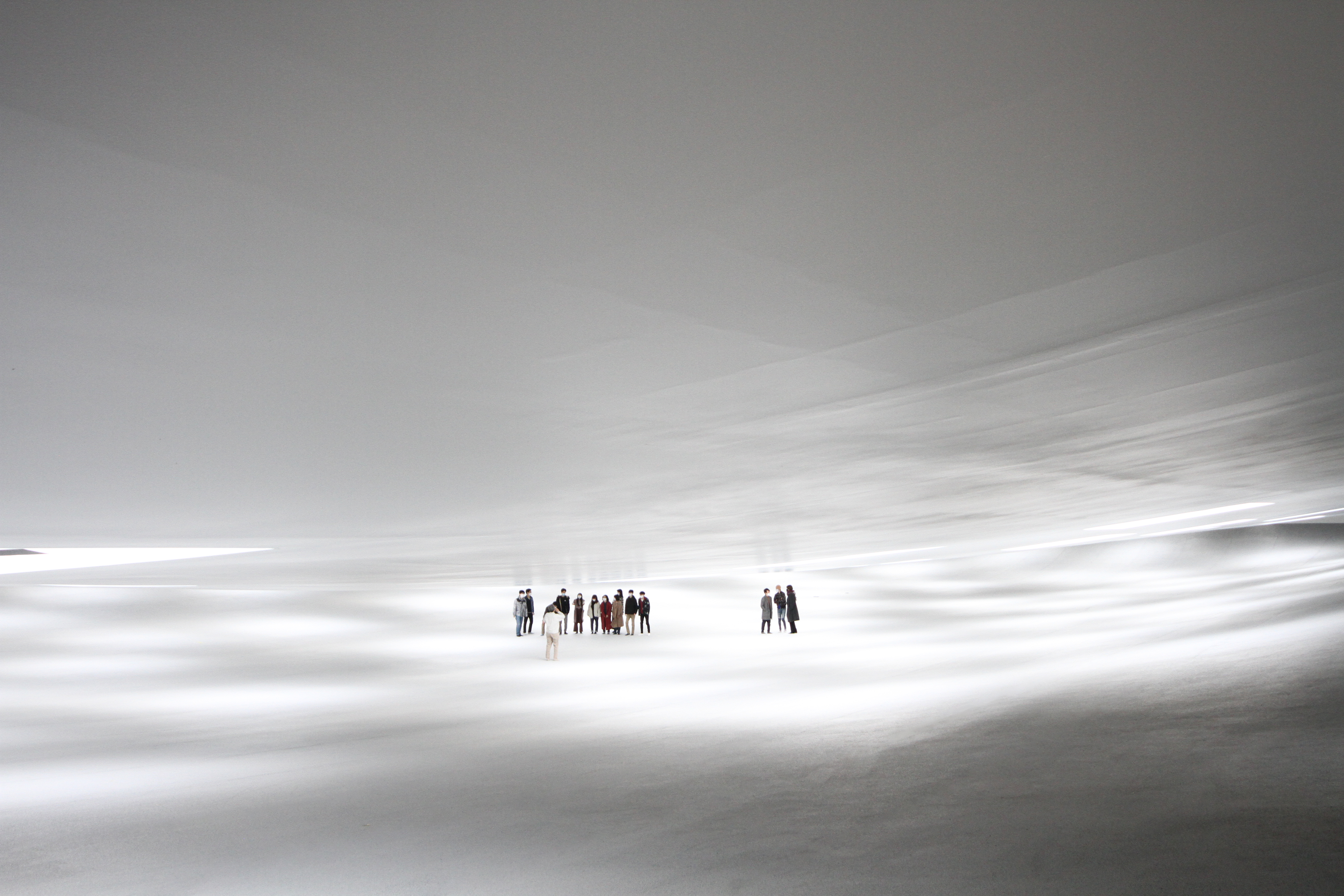
The floor's ‘slopes' and ‘valleys' invite users to appropriate them in their own way. Students can sit on the ground to have their lunch; meet friends; take a nap; use it as a sheltered space to play sports on rainy days; set up temporary stalls during campus festivals; or display thesis projects during end-of-year shows. The interior is entirely column-free, making the undulating floor and ceiling slabs even more impressive.
The minimalist pavilion structure is protected from the elements by its extensive roof, but remains visibly open, without a wall or glass pane in sight. The pavilion should express and mirror the characteristics of the existing environment, and then supplement those with architectural elements, explains Ishigami.
INFORMATION
Wallpaper* Newsletter
Receive our daily digest of inspiration, escapism and design stories from around the world direct to your inbox.
Ellie Stathaki is the Architecture & Environment Director at Wallpaper*. She trained as an architect at the Aristotle University of Thessaloniki in Greece and studied architectural history at the Bartlett in London. Now an established journalist, she has been a member of the Wallpaper* team since 2006, visiting buildings across the globe and interviewing leading architects such as Tadao Ando and Rem Koolhaas. Ellie has also taken part in judging panels, moderated events, curated shows and contributed in books, such as The Contemporary House (Thames & Hudson, 2018), Glenn Sestig Architecture Diary (2020) and House London (2022).
-
 All-In is the Paris-based label making full-force fashion for main character dressing
Part of our monthly Uprising series, Wallpaper* meets Benjamin Barron and Bror August Vestbø of All-In, the LVMH Prize-nominated label which bases its collections on a riotous cast of characters – real and imagined
By Orla Brennan
-
 Maserati joins forces with Giorgetti for a turbo-charged relationship
Announcing their marriage during Milan Design Week, the brands unveiled a collection, a car and a long term commitment
By Hugo Macdonald
-
 Through an innovative new training program, Poltrona Frau aims to safeguard Italian craft
The heritage furniture manufacturer is training a new generation of leather artisans
By Cristina Kiran Piotti
-
 Giant rings! Timber futurism! It’s the Osaka Expo 2025
The Osaka Expo 2025 opens its microcosm of experimental architecture, futuristic innovations and optimistic spirit; welcome to our pick of the global event’s design trends and highlights
By Danielle Demetriou
-
 2025 Expo Osaka: Ireland is having a moment in Japan
At 2025 Expo Osaka, a new sculpture for the Irish pavilion brings together two nations for a harmonious dialogue between place and time, material and form
By Danielle Demetriou
-
 Tour the brutalist Ginza Sony Park, Tokyo's newest urban hub
Ginza Sony Park opens in all its brutalist glory, the tech giant’s new building that is designed to embrace the public, offering exhibitions and freely accessible space
By Jens H Jensen
-
 A first look at Expo 2025 Osaka's experimental architecture
Expo 2025 Osaka prepares to throw open its doors in April; we preview the world festival, its developments and highlights
By Danielle Demetriou
-
 Ten contemporary homes that are pushing the boundaries of architecture
A new book detailing 59 visually intriguing and technologically impressive contemporary houses shines a light on how architecture is evolving
By Anna Solomon
-
 And the RIBA Royal Gold Medal 2025 goes to... SANAA!
The RIBA Royal Gold Medal 2025 winner is announced – Japanese studio SANAA scoops the prestigious architecture industry accolade
By Ellie Stathaki
-
 2025 Serpentine Pavilion: this year's architect, Marina Tabassum, explains her design
The 2025 Serpentine Pavilion design by Marina Tabassum is unveiled; the Bangladeshi architect talks to us about the commission, vision, and the notion of time
By Ellie Stathaki
-
 Architect Sou Fujimoto explains how the ‘idea of the forest’ is central to everything
Sou Fujimoto has been masterminding the upcoming Expo 2025 Osaka for the past five years, as the site’s design producer. To mark the 2025 Wallpaper* Design Awards, the Japanese architect talks to us about 2024, the year ahead, and materiality, nature, diversity and technological advances
By Sou Fujimoto