Testing the water at Copenhagen's 1960s modernist swimming baths
Here, we revist our feature from the July 2012 issue of Wallpaper* (W*159), when we explored a refreshingly-designed Copenhagen public bathing complex

Receive our daily digest of inspiration, escapism and design stories from around the world direct to your inbox.
You are now subscribed
Your newsletter sign-up was successful
Want to add more newsletters?
‘Welcome to the least competitive swimming pool in the world,’ smiles architect Christian Cold. We are at Kildeskovshallen in Copenhagen, a dazzling complex of modernist public baths opened in 1970. There’s a diving pool, a baby pool and a lap pool which stretches to 24.5m. That’s half a metre shorter than a regular training pool. ‘The message is that it’s OK to lose, not to compete. It’s typically Danish,’ says Cold. ‘Try telling architects that!’ he laughs. The non-competitive ideology underpinning Danish society may have reached its peak in the 1960s when the complex was built, but since then there appears to have been a seismic cultural shift. When Cold designed an extension to the baths in 2000, he was asked to include ‘a 50m hardcore training pool’.
The complex has the feel of a Swiss spa; Arne Jacobsen chairs fill a light, airy café that looks over sweeping lawns and offers healthy salads and freshly baked buns. It is clean and calm: there is no whiff of chlorine and a conspicuous lack of snack machines. In other words, it’s as far from a British municipal pool as you can get. Admittedly, Kildeskovshallen (‘the forest of natural springs’ in Danish) is in the upscale Gentofte neighbourhood, one of Copenhagen’s wealthiest suburbs, but it’s still a slick reminder of how much effort Danes put into civic society.

Cold describes the original building as ‘feminine, with lots of details and lightness of structure’.
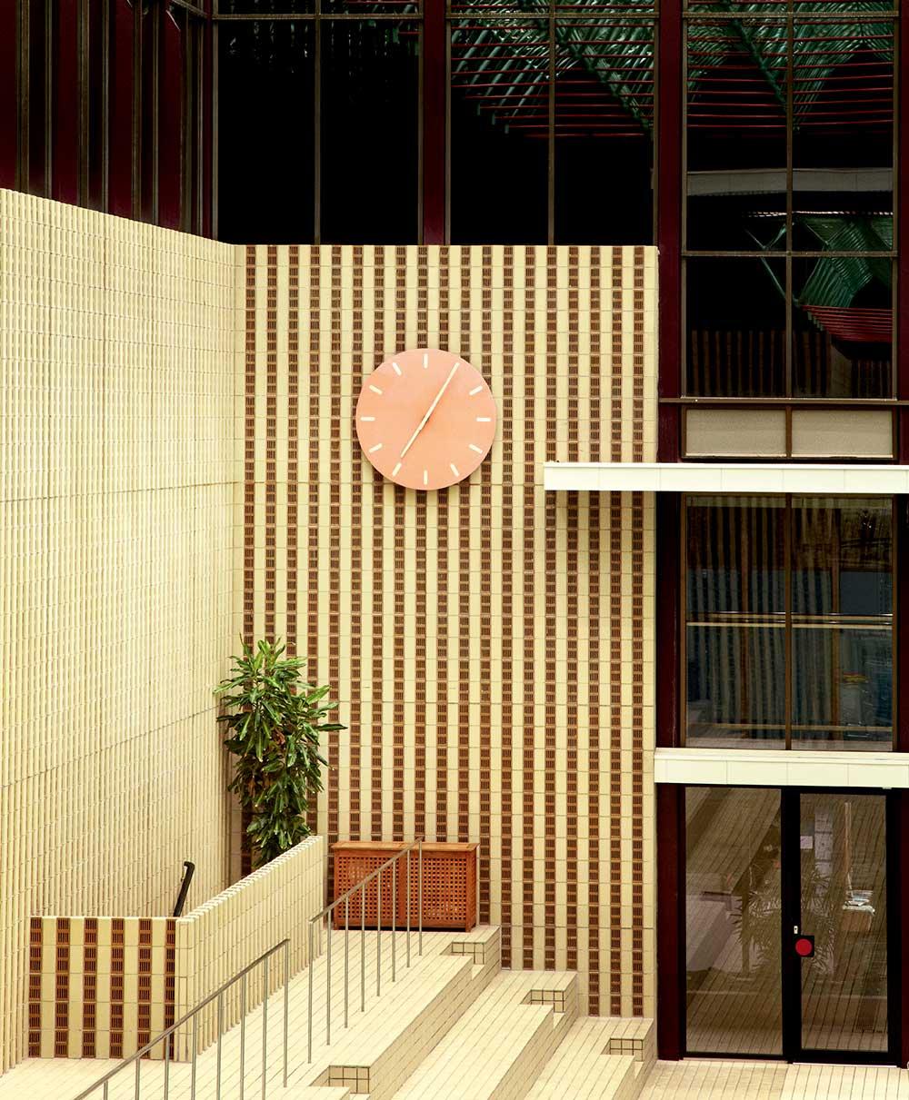
The original complex was designed in 1966 by Danish couple Karen and Ebbe Clemmensen, who also created schools, houses and furniture. The pair were well known when they got the job and were given free reign and an unlimited budget. They used many modernist trademarks: a concealed entrance à la Jacobsen’s National Bank of Denmark; Frank Lloyd Wright-inspired horizontal beams; and walls of glass. The changing rooms, with tiling and signage that now looks retro, are deliberately disorientating, ‘so that by the time you get to the water, you have left all your worries behind’, explains Cold. 'Kildeskovshallen marks a high point in the history of Danish architecture. The space, details, quality of materials and interaction with nature directly result in a better quality of life.’
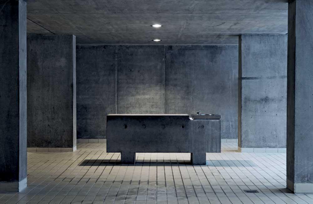
When Cold and his wife Signe set about expanding the complex, they were a tiny outfit with few projects behind them. Today, their practice, Entasis, consists of 15 people. They had a lot to live up to; Kildeskovshallen is well loved and much used. They dug down 5m and built the 50m training pool, a children’s pool and new changing rooms in cast concrete, exposing all its blemishes. The complex became a listed building just before Cold’s work began, so all the fixtures and fittings had to be in keeping with the original. Tiles are ‘Jacobsen shades’ of blue, yellow and grey; skylights echo those in the old pool; changing rooms are as maze-like as the originals. ‘I was inspired by Mies van der Rohe’s Barcelona Pavilion,’ says Cold. ‘Although only 200 sq m, it is something of a labyrinth.’ The addition feels more cavernous, more modern than the old space, yet the transition between the two areas is seamless.

For the extension (including, pictured, a link between the old and new areas) Cold wanted to create the opposite – ‘a masculine, raw space’. The two parts connect seamlessly thanks to the use of sand-coloured floor tiles throughout.
Cold’s concrete walls and pools are reminiscent of Peter Zumthor’s Therme in the Swiss town of Vals, a place of architectural pilgrimage where bathing is elevated to near-spiritual levels. Cold has visited many times. Is his extension an homage to Zumthor? ‘Well, I would say that our pools are the exact opposite. Therme Vals, with its dark intimacy, is for relaxation, while our pools are light and bright and for competition. Where we are similar is that we both try to deal with the core quality of the materials used.
‘I do believe, as Zumthor does, that if you want to do subtle architecture you should keep your practice to 12. It’s dangerous to be 15 or 20 people.’ This is where they are now. So why the extra staff? Because Entasis is at the helm of one of Denmark’s biggest projects: the redevelopment of Copenhagen’s 75-acre Carlsberg City, the brewery’s HQ until 2008. Development is set to run for another 15 years and Cold’s aim is to create a buzzy new district with wide boulevards and narrow alleys.
Twelve years have passed since Kildeskovshallen was remodelled, and Cold’s design has weathered well. ‘I don’t come here very often. I’m not too keen on swimming,’ he confesses. ‘But I hope in some way that we have managed to move the people who do come here.’
As originally featured in the July 2012 issue of Wallpaper* (W*159)
INFORMATION
entasis.dk; kildeskovshallen.dk
Receive our daily digest of inspiration, escapism and design stories from around the world direct to your inbox.
Emma O'Kelly is a freelance journalist and author based in London. Her books include Sauna: The Power of Deep Heat and she is currently working on a UK guide to wild saunas, due to be published in 2025.