Louis Kahn’s renovated Yale Center for British Art unveiled
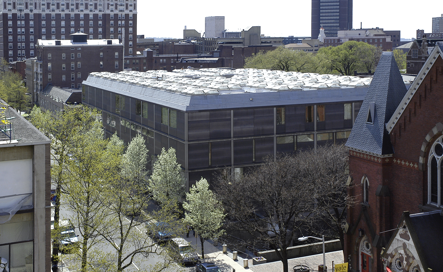
Today, Louis Kahn’s masterful Yale Center for British Art re-opens its doors after the completion of a $33 million, eight-year renovation led by New Haven-based Knight Architecture.
The five-story 1974 building houses the largest collection of British art outside of the United Kingdom, donated in 1966 by Yale Alumnus Paul Mellon. Its intimate, naturally lit galleries are organised around two ethereal interior courtyards, floored in travertine and clad with grids of bared concrete, matte steel and white oak wall panels. Perhaps most famous for its monolithic anchor piece, a drum-like cylindrical grey cement staircase— the centre is an astonishing example of Kahn’s unparalleled gift for eliciting visceral emotion through pure volume, light, and materials.
Much of the renovation, describes Knight Architecture principal George Knight, was 'an effort to defend the architecture in the face of legitimate issues.'
His firm, and a team of conservationists, builders, engineers, and facilities managers, restored original materials, improved the building’s technical systems, and added storage, research space, and guest amenities, all while re-installing and re-organising the more than five centuries of work in the unparalleled collection of paintings, sculptures, and manuscripts by Turner, Constable, Hockney, and so many more.
At the same time they left the building remarkably in tact. Original surfaces, for instance, were kept religiously as they were, even if they showed cracking or other signs of age. 'It’s definitely not pristine, not new,' says Knight. 'The cult of newness is something we wanted to avoid.'
Meanwhile Knight re-implemented details that various updates had 'drifted' from, removing partitions from the exquisite fourth floor Long Gallery (and hanging its walls in quirky, crowded, theme-based salon configuration), opening up the building’s exterior lower court, and implementing Kahn’s original scheme for flexible pogo walls.
The renovation’s three phases took place while the museum was still open, a colossal effort involving sealing rooms and weaving temporary ducts. Knight likens the process to conducting 'life support while the patient is playing tennis.' The result deftly balances incongruous elements like roughness and refinement, compression and expansion, and lets the architecture speak louder than any of its collective insertions.
'You really can’t get away from the architecture here,' explains Scott Wilcox, Deputy Director for Collections at the museum. 'We don’t want to.'
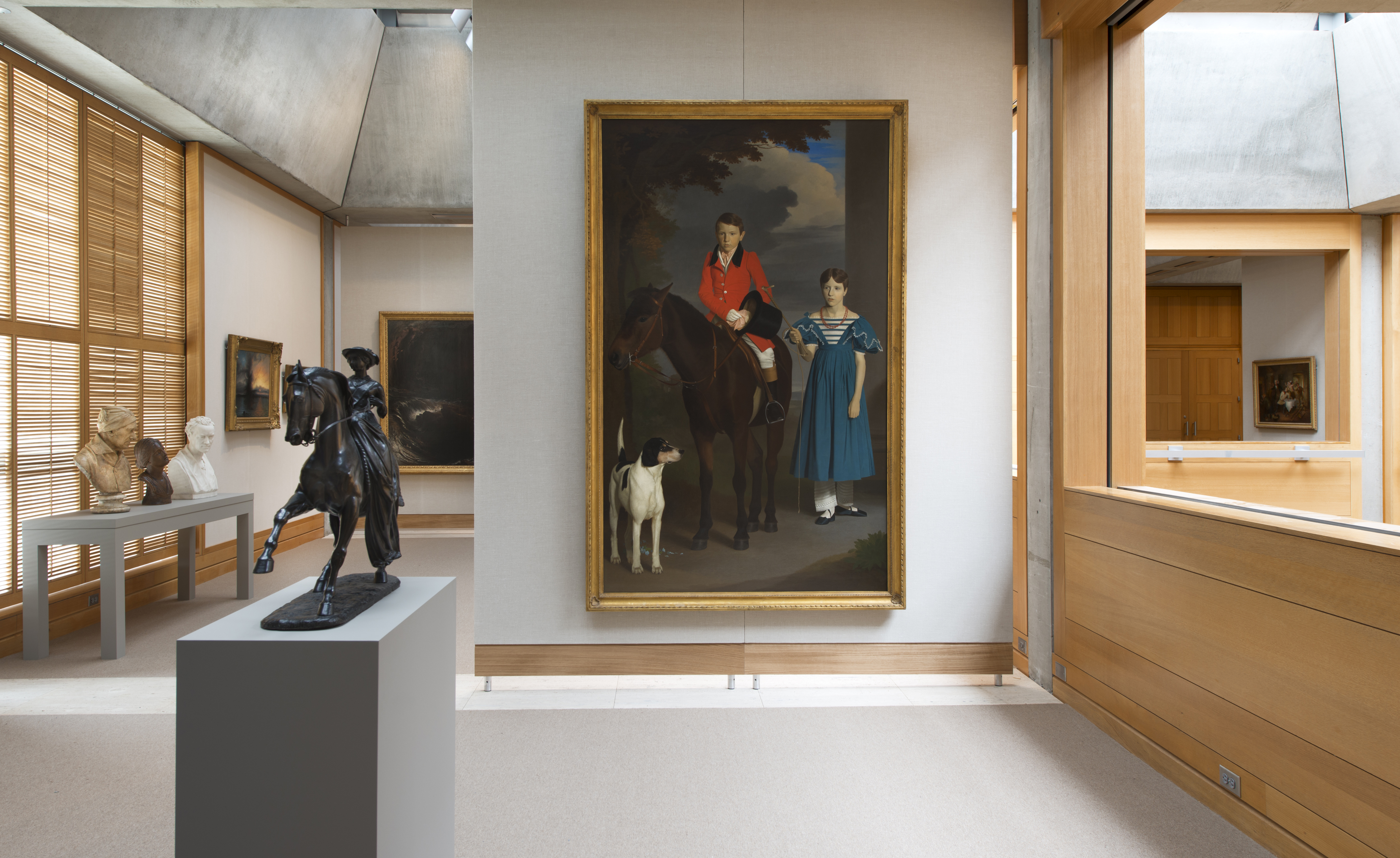
Much of the work, reveal the architects, was about bringing back and restoring original materials, improving the building’s technical systems and adding storage, research space and guest amenities. Photography: Richard Caspole
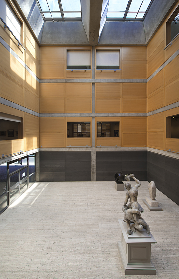
At the same time, the building was left remarkably intact. Photography: Richard Caspole
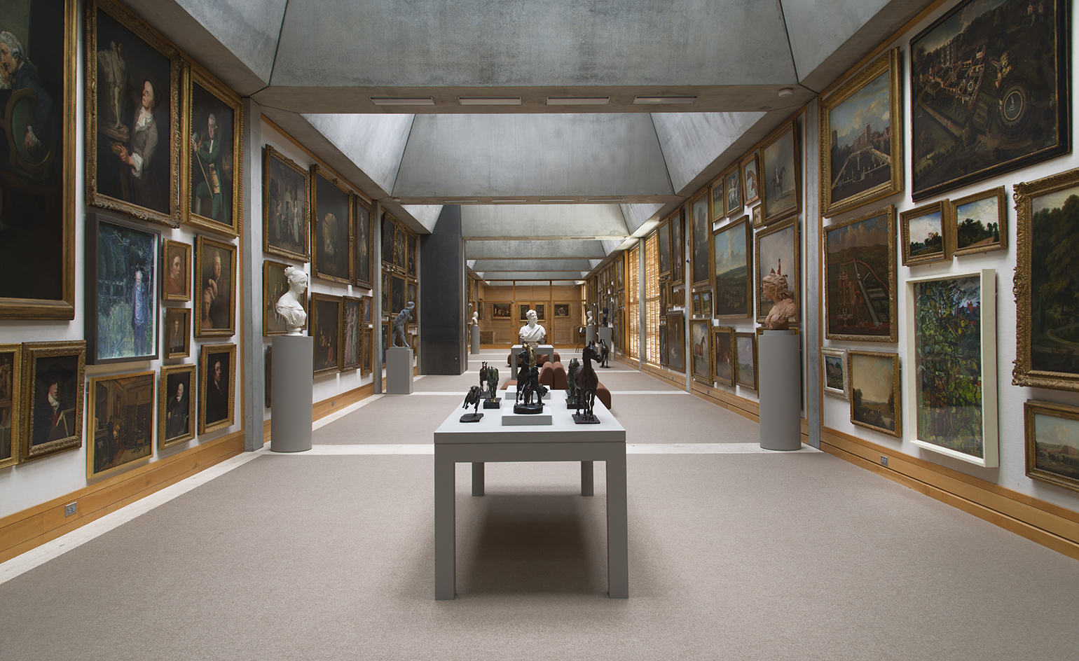
Parts of the building were opened up, for example by removing partitions on the fourth floor's Long Gallery. Photography: Richard Caspole
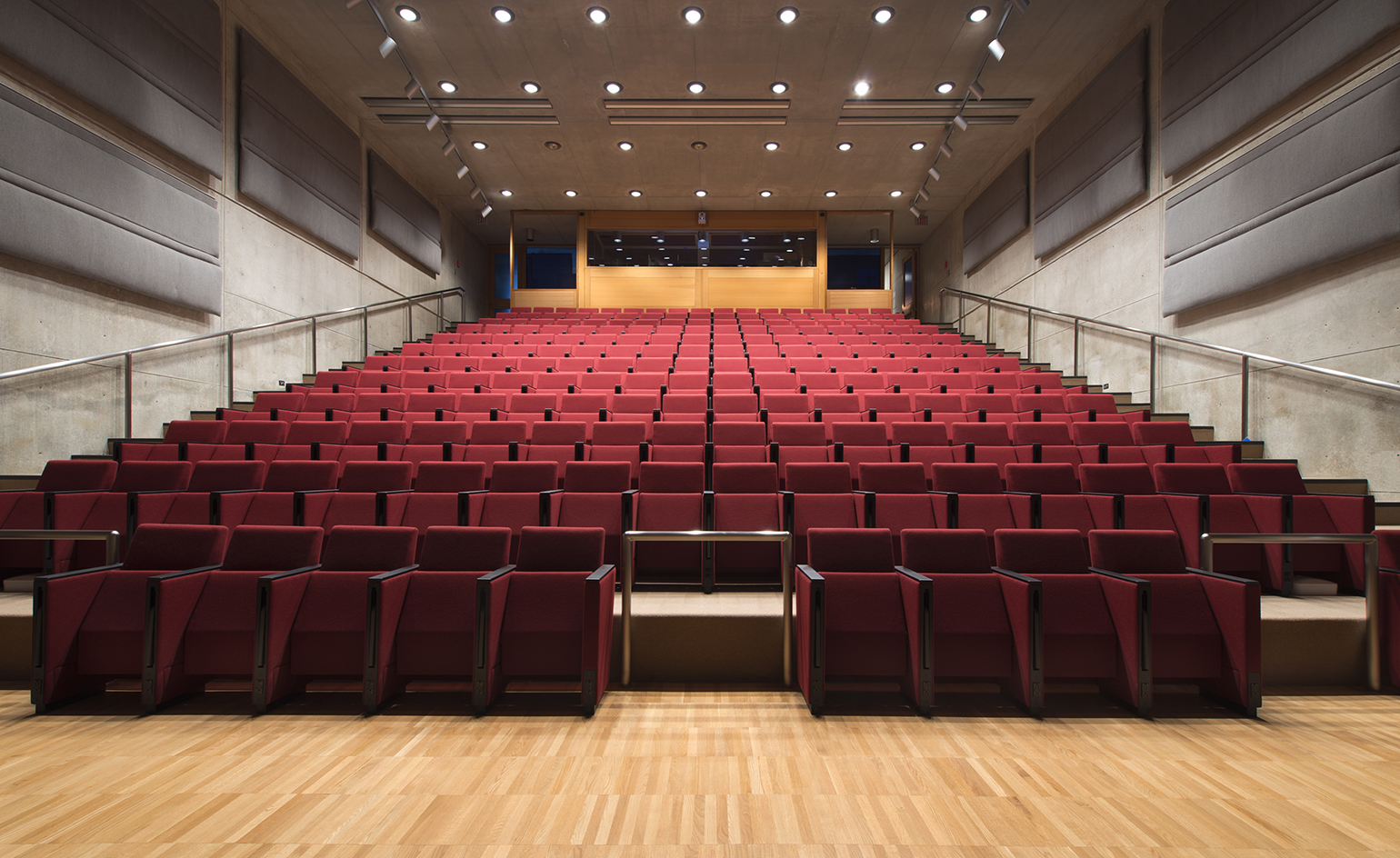
The $33 million restoration took eight years to complete and it took place while the museum was still open to visitors. Photography: Richard Caspole
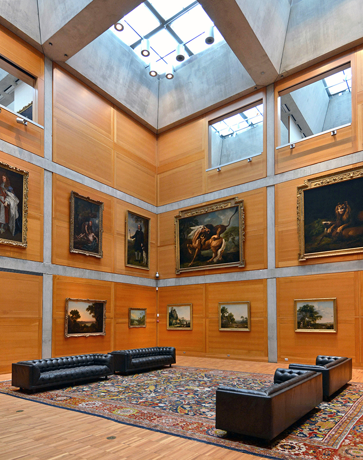
The architects likened the process to conducting 'life support while the patient is playing tennis'. Photography: Michael Marsland
INFORMATION
For more information visit the Knight Architecture website
Wallpaper* Newsletter
Receive our daily digest of inspiration, escapism and design stories from around the world direct to your inbox.
-
 Put these emerging artists on your radar
This crop of six new talents is poised to shake up the art world. Get to know them now
By Tianna Williams
-
 Dining at Pyrá feels like a Mediterranean kiss on both cheeks
Designed by House of Dré, this Lonsdale Road addition dishes up an enticing fusion of Greek and Spanish cooking
By Sofia de la Cruz
-
 Creased, crumpled: S/S 2025 menswear is about clothes that have ‘lived a life’
The S/S 2025 menswear collections see designers embrace the creased and the crumpled, conjuring a mood of laidback languor that ran through the season – captured here by photographer Steve Harnacke and stylist Nicola Neri for Wallpaper*
By Jack Moss
-
 A Medellin house offers art, brutalism and drama
A monumentally brutalist, art-filled Medellin house by architecture studio 5 Sólidos on the Colombian city’s outskirts plays all the angles
By Rainbow Nelson
-
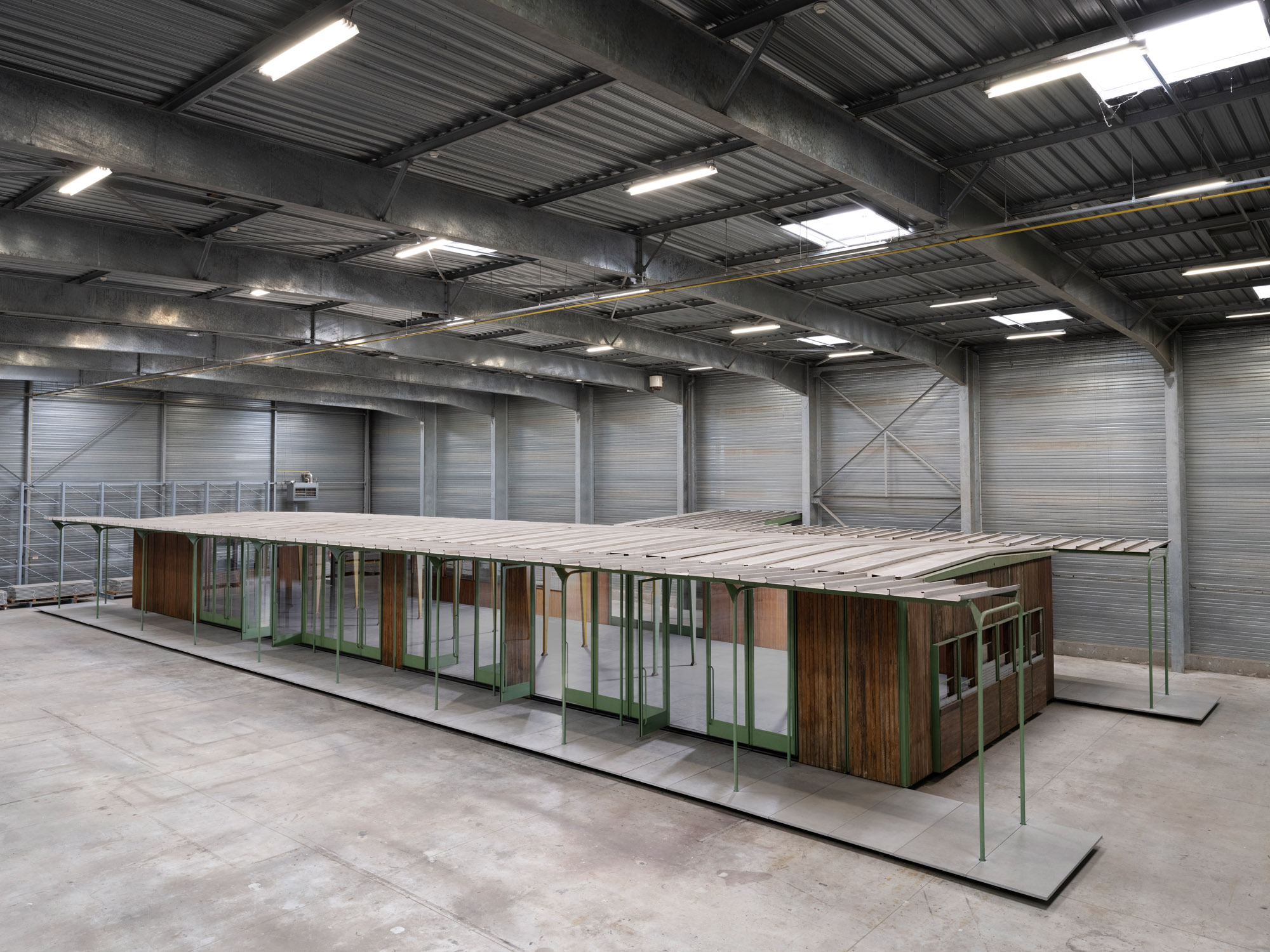 Croismare school, Jean Prouvé’s largest demountable structure, could be yours
Jean Prouvé’s 1948 Croismare school, the largest demountable structure ever built by the self-taught architect, is up for sale
By Amy Serafin
-
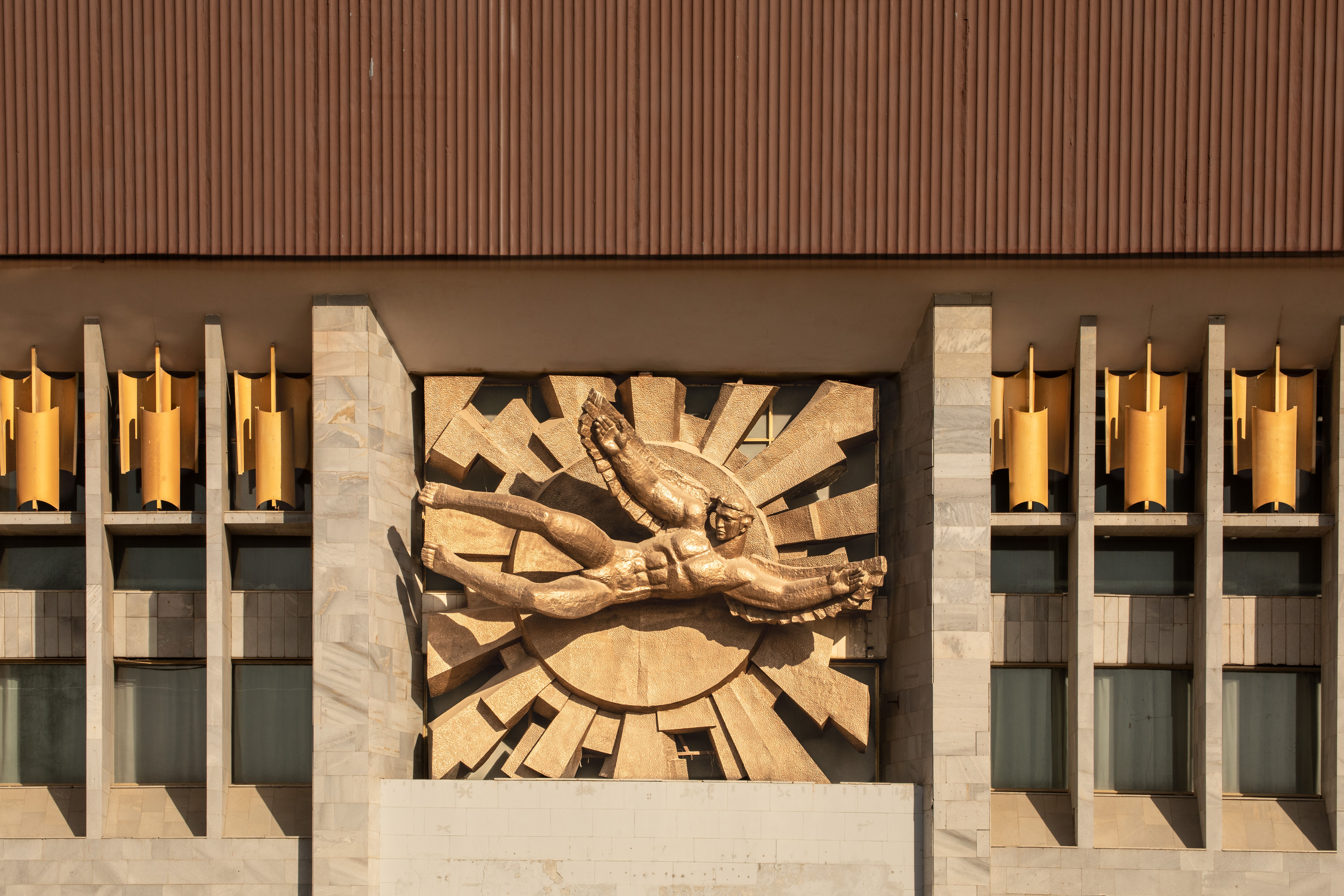 Jump on our tour of modernist architecture in Tashkent, Uzbekistan
The legacy of modernist architecture in Uzbekistan and its capital, Tashkent, is explored through research, a new publication, and the country's upcoming pavilion at the Venice Architecture Biennale 2025; here, we take a tour of its riches
By Will Jennings
-
 The best brutalism books to add to your library in 2025
Can’t get enough Kahn? Stan for the Smithsons? These are the tomes for you
By Tianna Williams
-
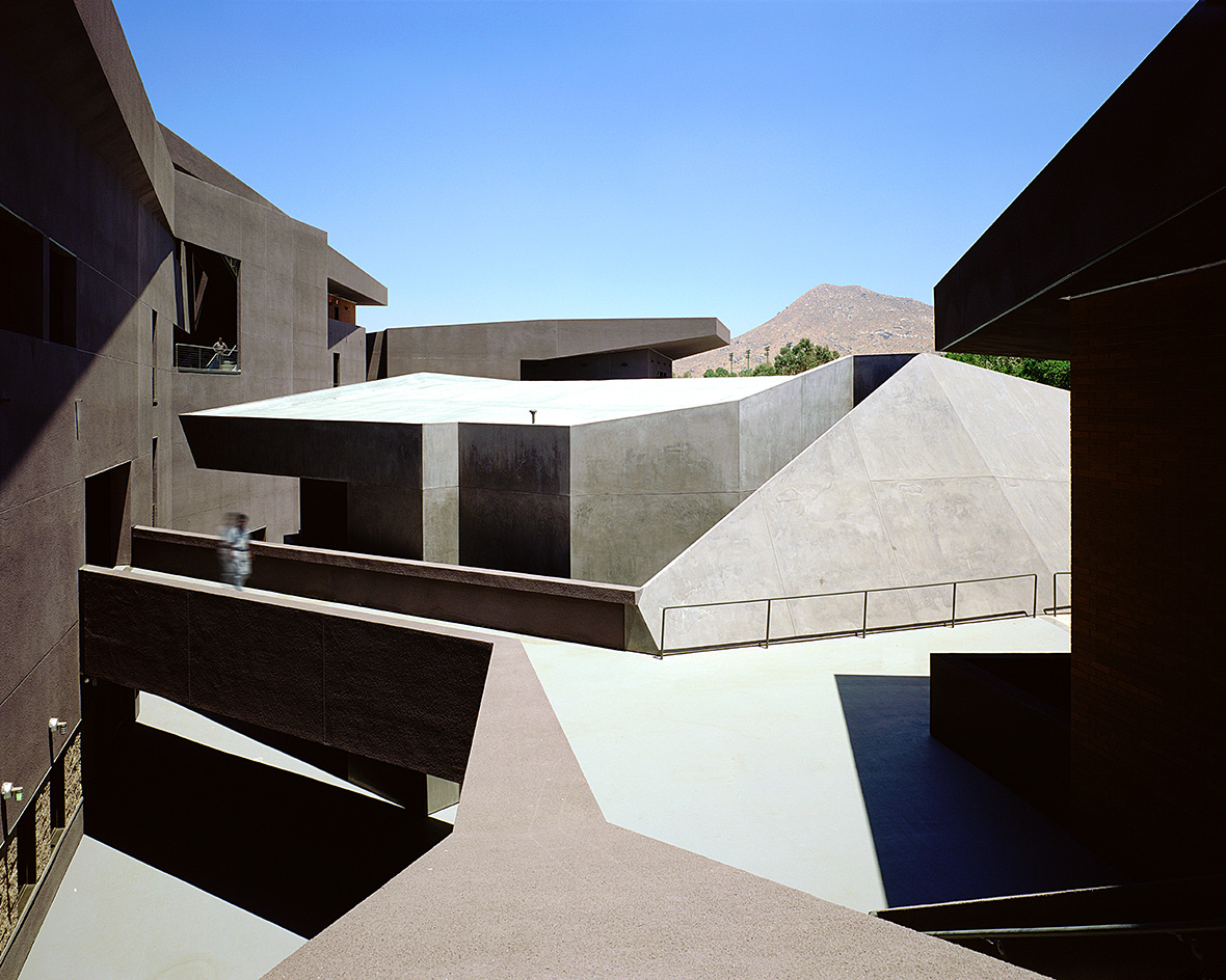 We explore Franklin Israel’s lesser-known, progressive, deconstructivist architecture
Franklin Israel, a progressive Californian architect whose life was cut short in 1996 at the age of 50, is celebrated in a new book that examines his work and legacy
By Michael Webb
-
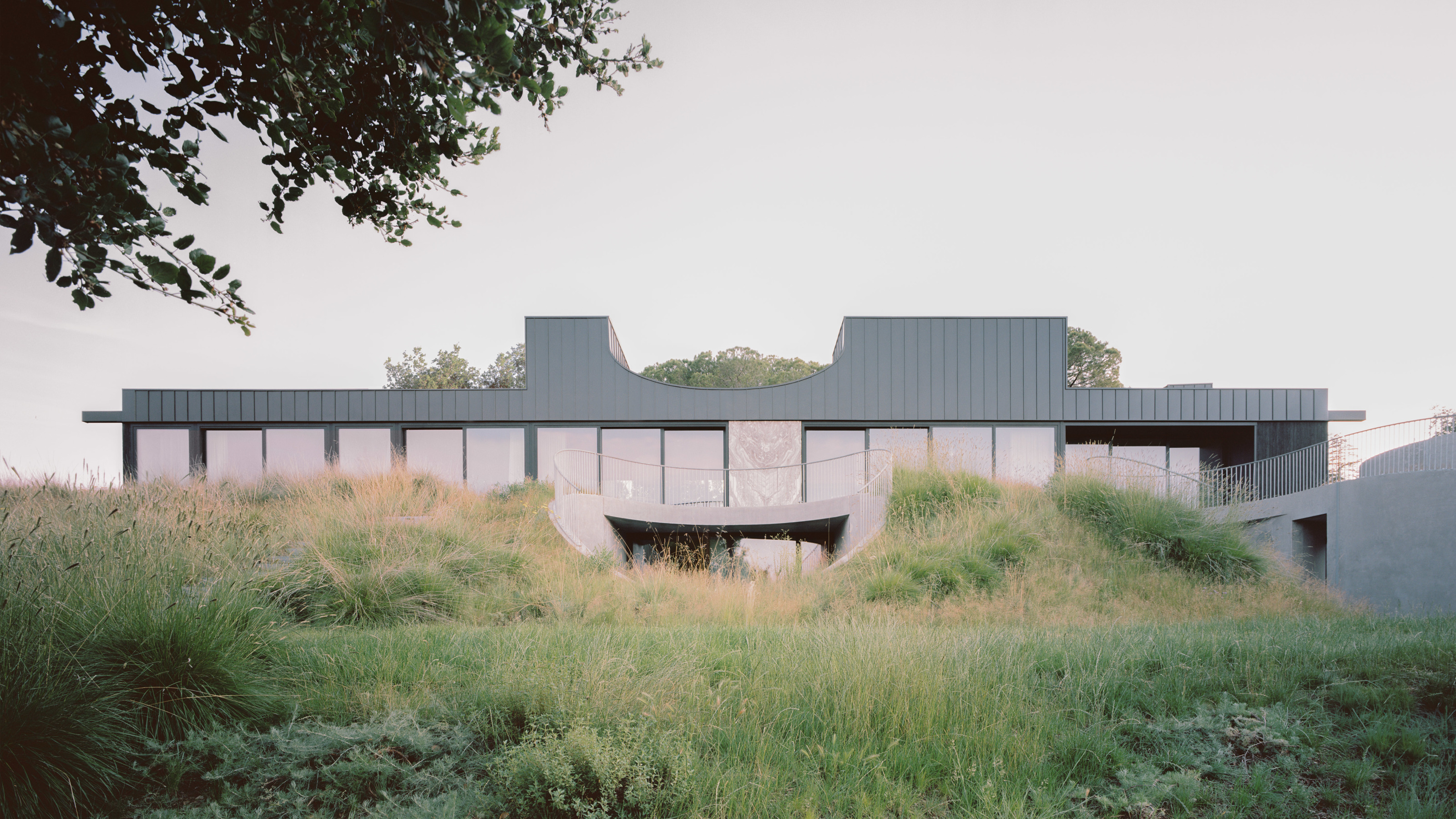 A new hilltop California home is rooted in the landscape and celebrates views of nature
WOJR's California home House of Horns is a meticulously planned modern villa that seeps into its surrounding landscape through a series of sculptural courtyards
By Jonathan Bell
-
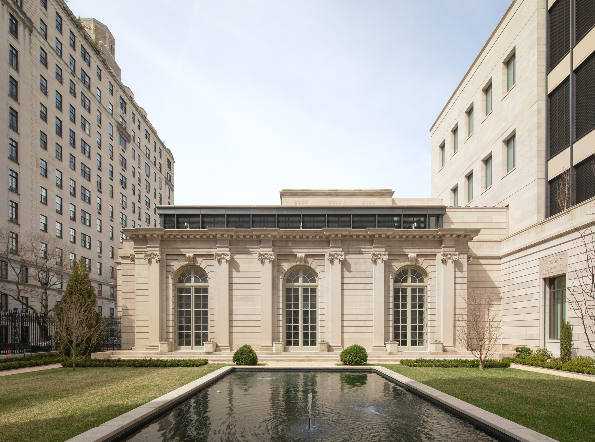 The Frick Collection's expansion by Selldorf Architects is both surgical and delicate
The New York cultural institution gets a $220 million glow-up
By Stephanie Murg
-
 Remembering architect David M Childs (1941-2025) and his New York skyline legacy
David M Childs, a former chairman of architectural powerhouse SOM, has passed away. We celebrate his professional achievements
By Jonathan Bell