Legendary Paris department store La Samaritaine reopens
Following an extensive redesign by a team of international architects and designers, legendary Paris department store La Samaritaine reopens its doors
Matthieu Salvaing - Photography
When iconic Paris department store La Samaritaine closed in 2005 for safety reasons, it had clearly seen better days. It was once the place you went to buy a new broom, or to take visitors for a spectacular view of the Seine, but its art nouveau interior had aged into a state of permanent melancholy.
The store had always been what the French call populaire. In 1870, a salesman named Ernest Cognacq, with his wife Marie-Louise, opened a store on this spot. As it grew, the architect Frantz Jourdain convinced them to erect a new building that would bring ‘art into the street’. They inaugurated his light-filled, iron-framed art nouveau building in 1910, followed by Henri Sauvage’s art deco extension in 1928. But by the 1970s, La Samaritaine’s sales were in decline and, in 2001, the luxury goods group LVMH acquired the store’s four timeworn buildings (along with an adjoining apartment block, which it agreed to renovate and sell back to the city as social housing).
After 16 years of legal wrangling and construction, LVMH has finally unveiled the new, and very swanky, La Samaritaine, run by the group’s travel retailer DFS. The site will also include offices, a daycare nursery, and a Cheval Blanc hotel. LVMH hired four separate firms to redesign the different parts of the store, while specialist contractors were brought in to painstakingly renovate historical features, such as the magnificent glass roof, the monumental staircase, peacock frescoes on the top floor, and enamelled lava panels on the façade.
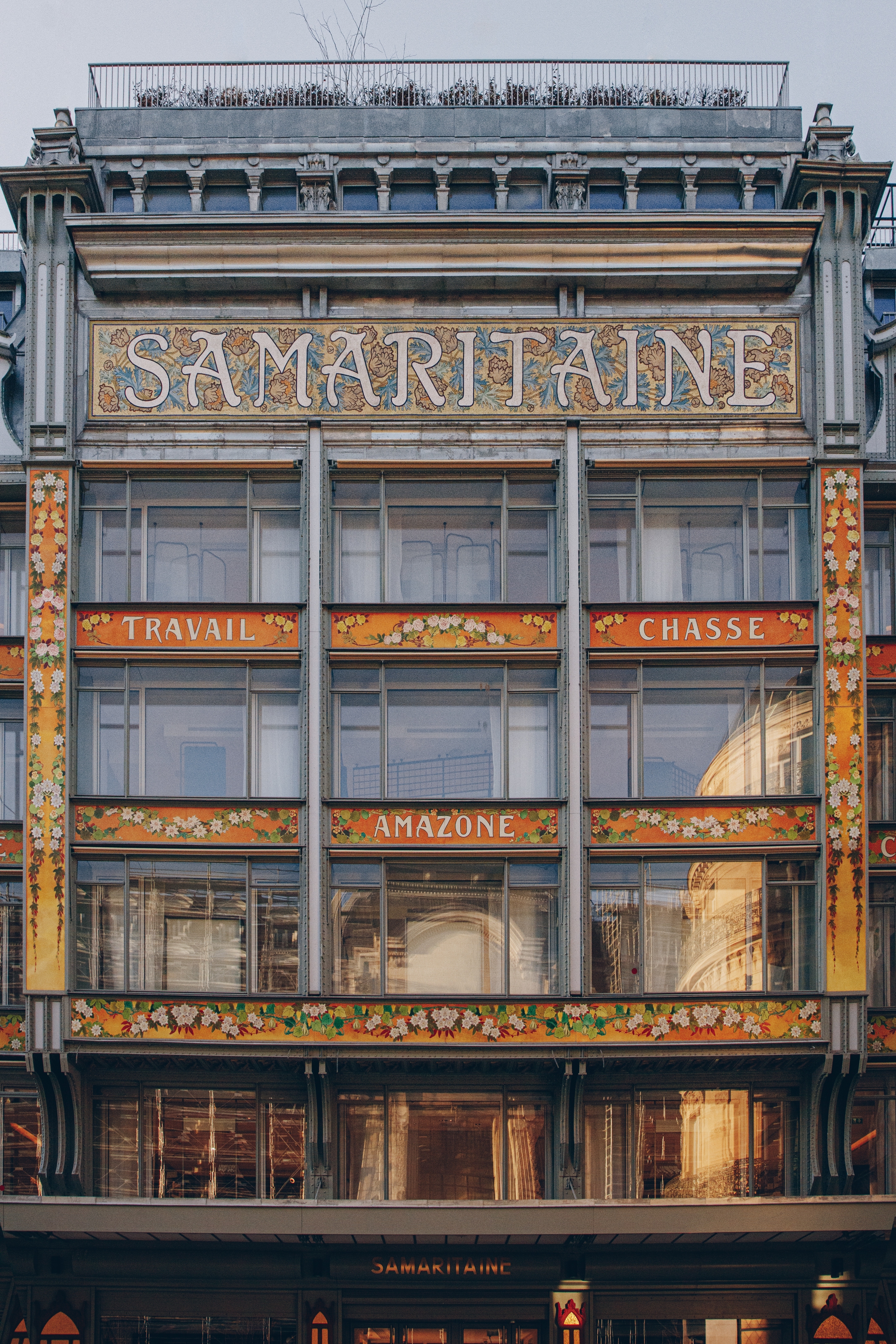
Japanese architecture studio SANAA was given the task of unifying the store. It added two glass-roofed courtyards and replaced a nondescript 19th-century building on Rue de Rivoli with a new structure fronted by rippling glass. Though detractors compare this façade to a shower curtain, it provides a strong, minimalist contrast to the ornate art nouveau façade, and its transparent curves reflect the buildings around it. SANAA also created a glass mosaic floor for the top level of the art nouveau building, referencing the glass floors that covered the entire store in Jourdain’s original design.
Each level of La Samaritaine is now devoted to a carefully curated shopping category, with islands of discovery here and there (art from gallery Perrotin, customised bottles of Ruinart, ‘street caviar’ sandwiches… ) There are 12 unique food vendors scattered throughout, and the top floor is completely devoted to food, with a lounge, bar and formal restaurant.
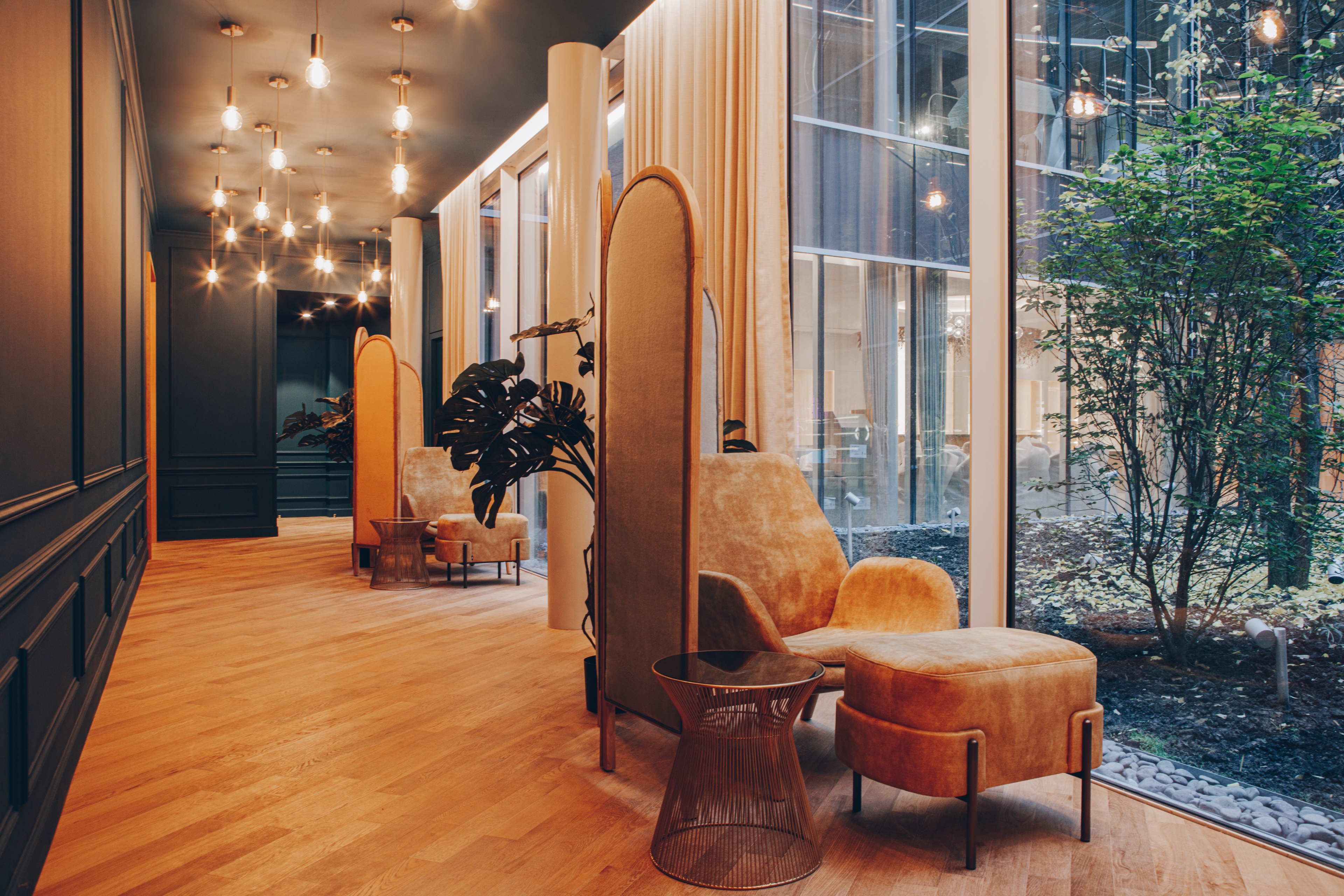
The Toronto/New York firm Yabu Pushelberg redesigned the art nouveau interior, now known as the ‘Pont Neuf’ side. As the designers recall, the original brief was aimed at foreign tourists, but they were determined that the store maintain a Parisian flavour. ‘La Samaritaine had been a big, giant, glorious general store for the people of Paris,’ says George Yabu. ‘So we thought, why don’t we make it resonate with the locals as well?’

The firm set out to find a balance between history and modernity. The ornamental art nouveau context was a challenge, and at times they disagreed with historical choices, such as an original egg yolk yellow. (‘Maybe the architect had a bad day,’ says Yabu.) They managed to soften the shade, and the store’s colours are now an eye-pleasing mix of golden tones, such as bronze metals and blond woods, and the ironwork’s original grey-blue.
The floors – 6,000 sq m of terrazzo handlaid with marble insets – are the work of the New York-based Karen Pearse. The designers had to argue for them, since terrazzo is not French. But they make a nod to the city’s cobblestones, and terrazzo’s fluidity works well with art nouveau. Says Glenn Pushelberg, ‘It’s important that you have this quiet personality that is respectful and responsive to the old building. The pattern gives another layer of character to the whole thing, a romantic meaning that’s appropriate for Paris.’
Inspired by The Flâneur, Edmund White’s book on Paris, they wanted La Samaritaine to be a place for strolling, and the building’s bones lent themselves to this. ‘The floor plates are shallow,’ says Pushelberg. ‘You understand what’s around you, and it seduces you in a serene and intrinsically beautiful way without trapping you or tricking you like an old-school department store.’ Windows offer close-up views of a neighbouring Gothic church.
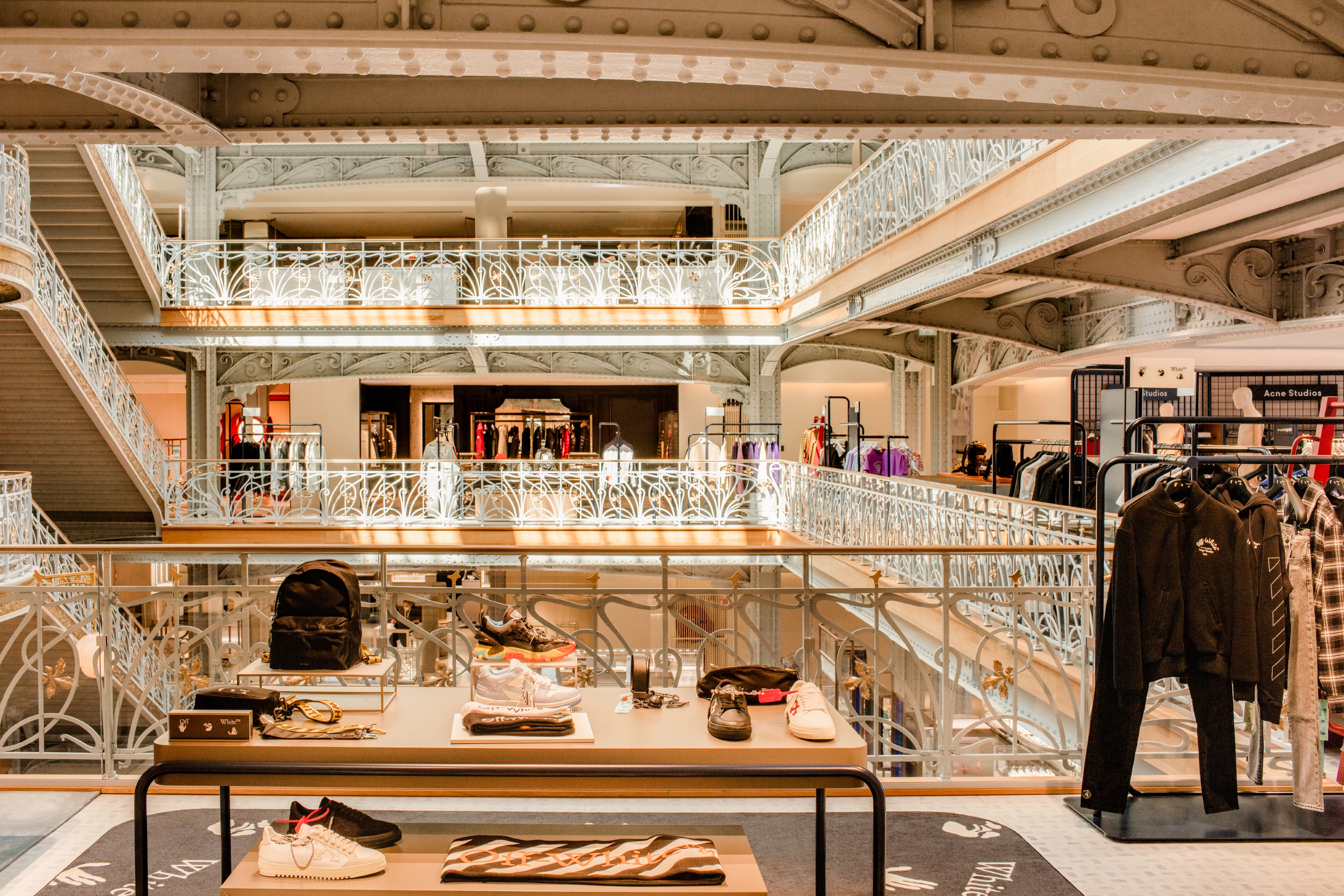
Rather than interior walls, the designers divided the space with custom-made rugs and furniture in simple shapes and classic materials. DFS wanted to put merchandise in the ground floor atrium, so they used the original floor pattern to create a graceful metal-and-glass pavilion. Lit on top, it adds to the building’s intricate layers of perspective, pattern and light.
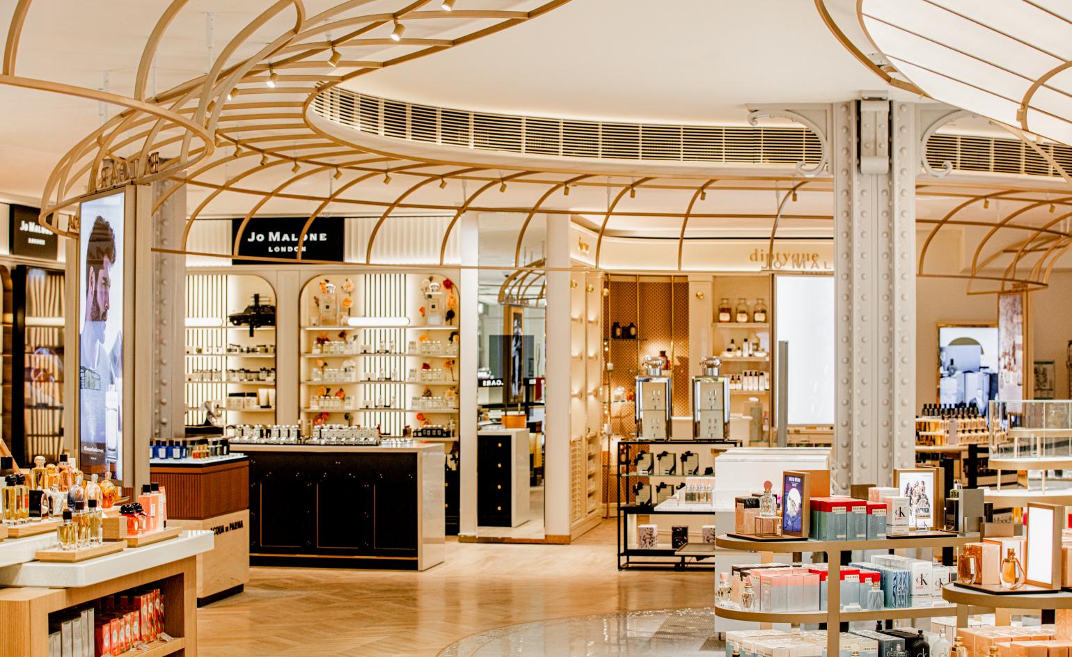
The basement level is now home to the biggest beauty department in Europe, covering the entire 3,400 sq m footprint of the store. This section was designed by French designer Hubert de Malherbe, who also imbued it with a sense of place. ‘The legacy of La Samaritaine is so strong,’ he says. ‘We had to make people know they were in the historic heart of Paris.’
When de Malherbe won the commission, the first thing he did was go to the top of the building and look down at the view. The islands in the Seine and the medieval streets of the Marais inspired him to create a meandering promenade through the beauty stands. Point de Hongrie parquet serves as alleys, while patterned mosaic tiles delineate different spaces – flowers for fragrances, houndstooth for make-up, geometric tiles for skincare. The ceiling is broken up with delicate curving structures of gilded metal tubing. Some resemble café awnings, others the feminine crinolines of Second Empire dresses.

De Malherbe brought elegance to the Eiffel-era columns by adding decorative corbels to the tops and pedestals to the bases. He explains, ‘These add a certain sophistication, so people think “this can’t be a basement”.’ Though the ceiling is not high, the space never feels underground, thanks to a combination of artificial light and daylight from above.
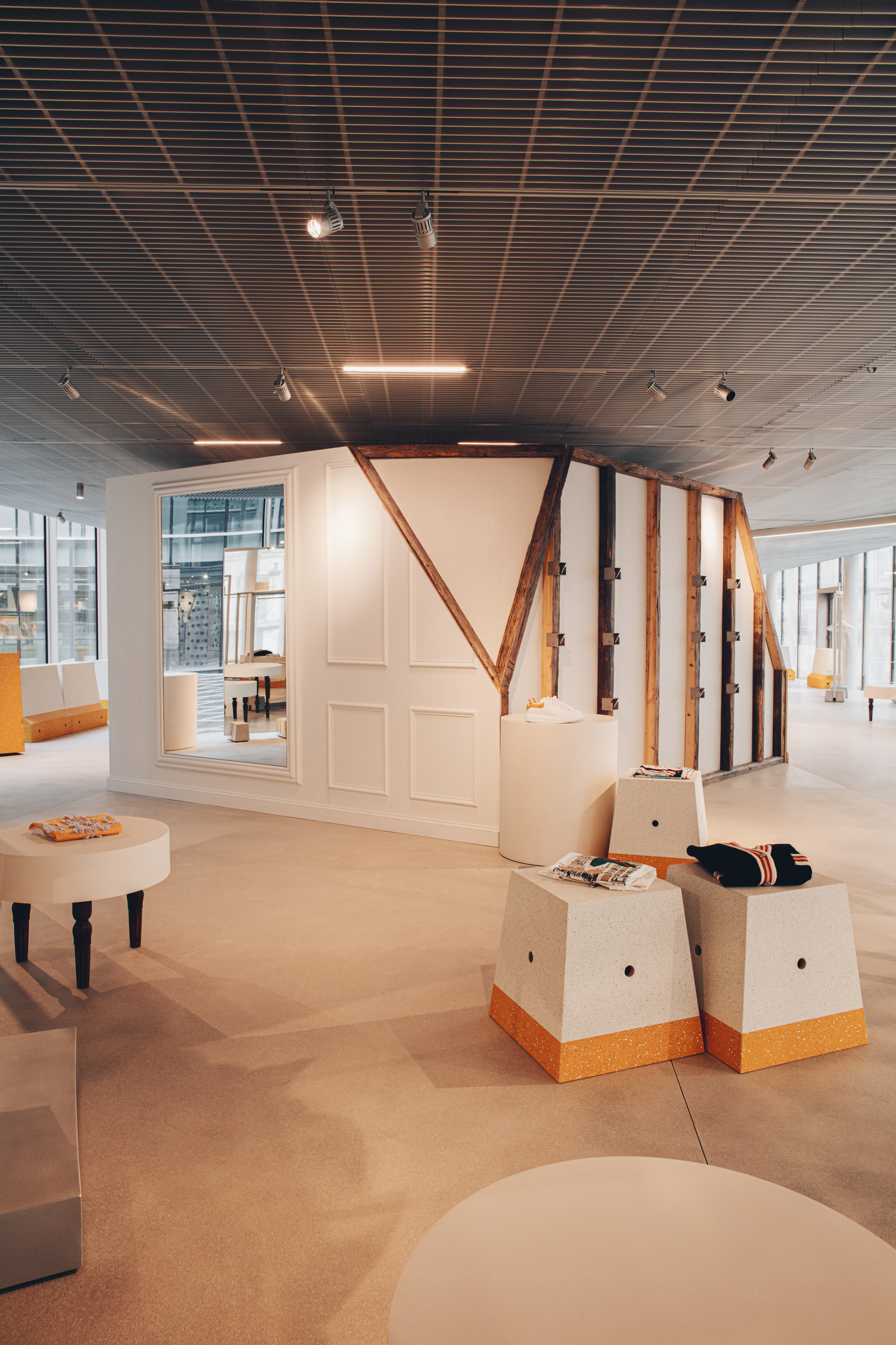
As you reach the north end of the beauty department, the wood floors turn to concrete, and the decorated white ceilings to industrial metal. This is the Rue de Rivoli side, where the vibe is more street than rue. Paris studio Ciguë designed its three levels – young beauty brands underground and two floors of edgier fashion above. SANAA’s transparent wall creates visual continuity between the street and the interior, and Ciguë’s design brings the city into the cylindrical space.
To ensure that visitors entering from the street do not automatically take the lift down to the beauty section and swan off into the historic part of the store, the architects use circular floor inserts and overhead lighting to coax them to either side.
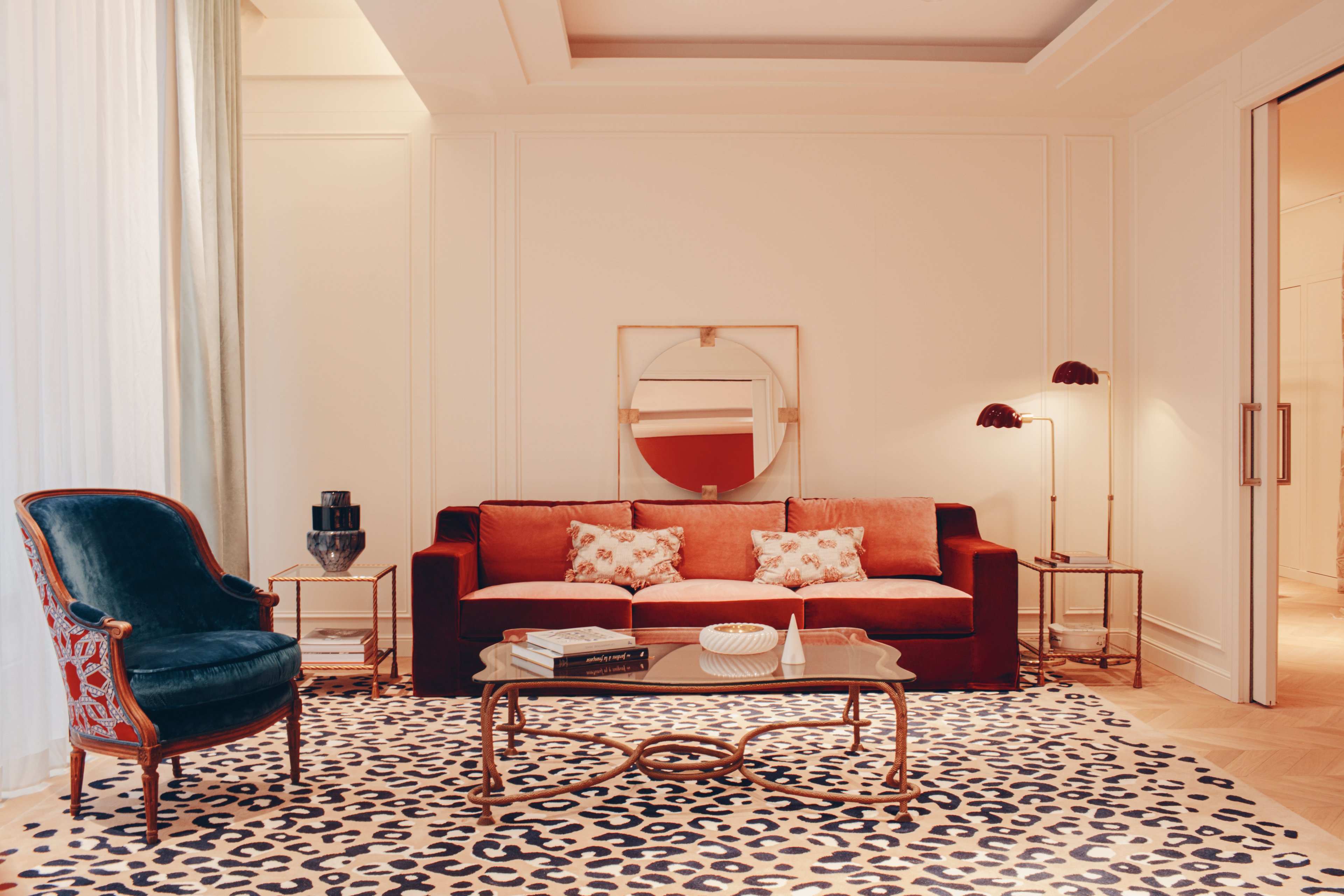
Ciguë’s Alphonse Sarthout says that his firm’s approach to the building was to express Paris, but in a different way: ‘what French style could be without the classic codes’. Drawing a link between the city’s heritage and SANAA’s contemporary design, the team came up with a ‘collage’ of brute materials and historical fragments. Sawn-off pieces of Haussmannian architecture serve as dressing rooms. Classical statues, Morris columns and blocky stools (like road barriers, perfect for checking your phone) punctuate the space. Everything can be moved around, like a construction set, as more experimental brands come or go. ‘The interior is supple and chaotic, in a positive way,’ says Sarthout. ‘It’s alive, fluid, and in perpetual evolution.’
Flexibility will be key to any modern store’s survival in an era where nobody has to leave home to shop anymore. Department stores used to be cathedrals of consumption, but now they must offer unique and ever-changing experiences. With its exclusive brands, tapas-and-cocktails and 21st-century Parisian vibe, the new Samaritaine aims to do just that.

INFORMATION
Wallpaper* Newsletter
Receive our daily digest of inspiration, escapism and design stories from around the world direct to your inbox.
-
 Put these emerging artists on your radar
This crop of six new talents is poised to shake up the art world. Get to know them now
By Tianna Williams
-
 Dining at Pyrá feels like a Mediterranean kiss on both cheeks
Designed by House of Dré, this Lonsdale Road addition dishes up an enticing fusion of Greek and Spanish cooking
By Sofia de la Cruz
-
 Creased, crumpled: S/S 2025 menswear is about clothes that have ‘lived a life’
The S/S 2025 menswear collections see designers embrace the creased and the crumpled, conjuring a mood of laidback languor that ran through the season – captured here by photographer Steve Harnacke and stylist Nicola Neri for Wallpaper*
By Jack Moss
-
 Stay in a Parisian apartment which artfully balances minimalism and warmth
Tour this pied-a-terre in the 7th arrondissement, designed by Valeriane Lazard
By Ellie Stathaki
-
 Marta Pan and André Wogenscky's legacy is alive through their modernist home in France
Fondation Marta Pan – André Wogenscky: how a creative couple’s sculptural masterpiece in France keeps its authors’ legacy alive
By Adam Štěch
-
 The museum of the future: how architects are redefining cultural landmarks
What does the museum of the future look like? As art evolves, so do the spaces that house it – pushing architects to rethink form and function
By Katherine McGrath
-
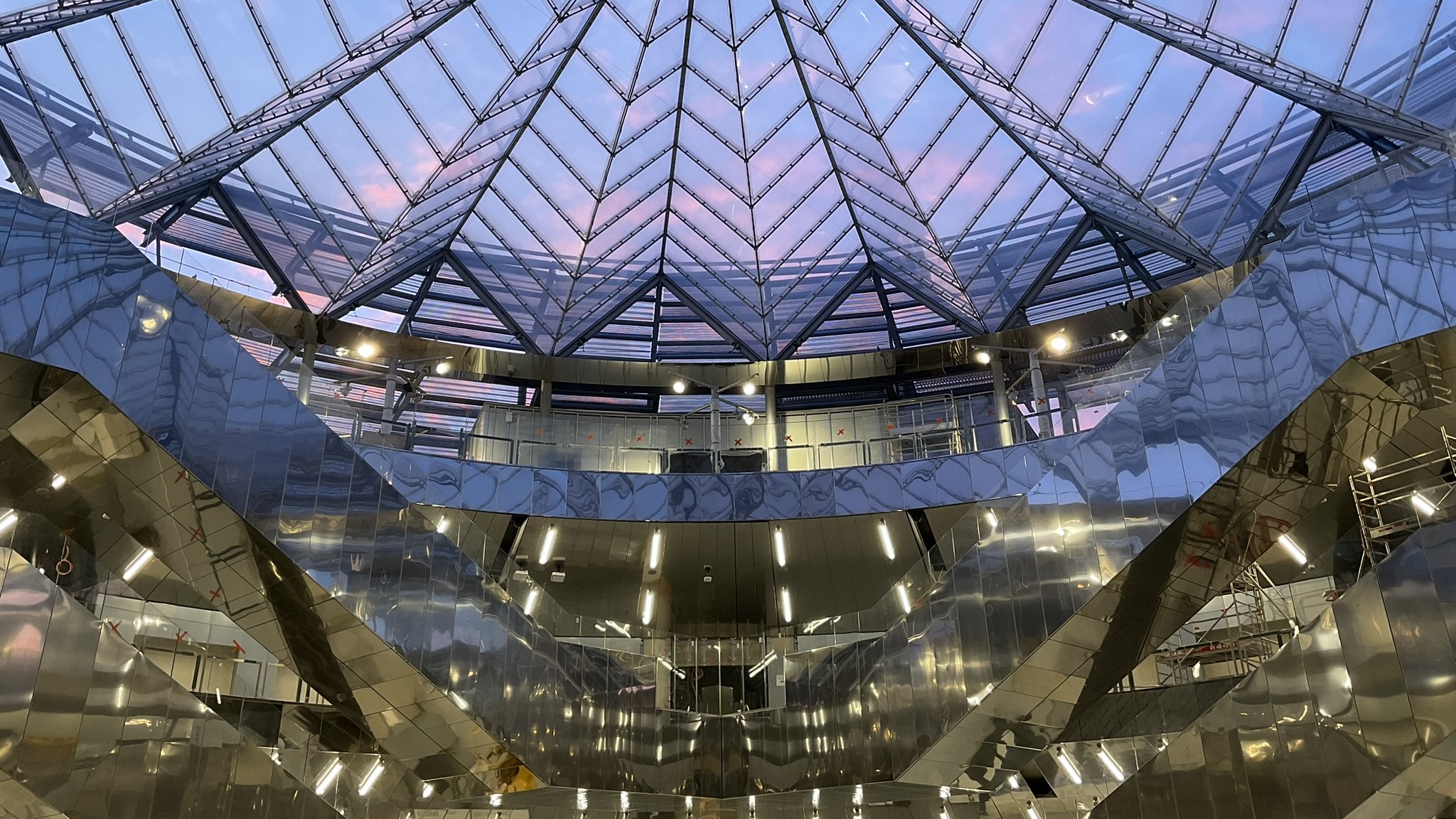 Paris’ architecturally fascinating Villejuif-Gustave Roussy metro station is now open
Villejuif-Gustave Roussy is part of the new Grand Paris Express, a transport network that will raise the architectural profile of the Paris suburbs
By Anna Solomon
-
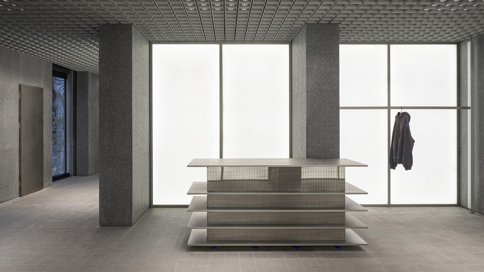 Raw, refined and dynamic: A-Cold-Wall*’s new Shanghai store is a fresh take on the industrial look
A-Cold-Wall* has a new flagship store in Shanghai, designed by architecture practice Hesselbrand to highlight positive spatial and material tensions
By Tianna Williams
-
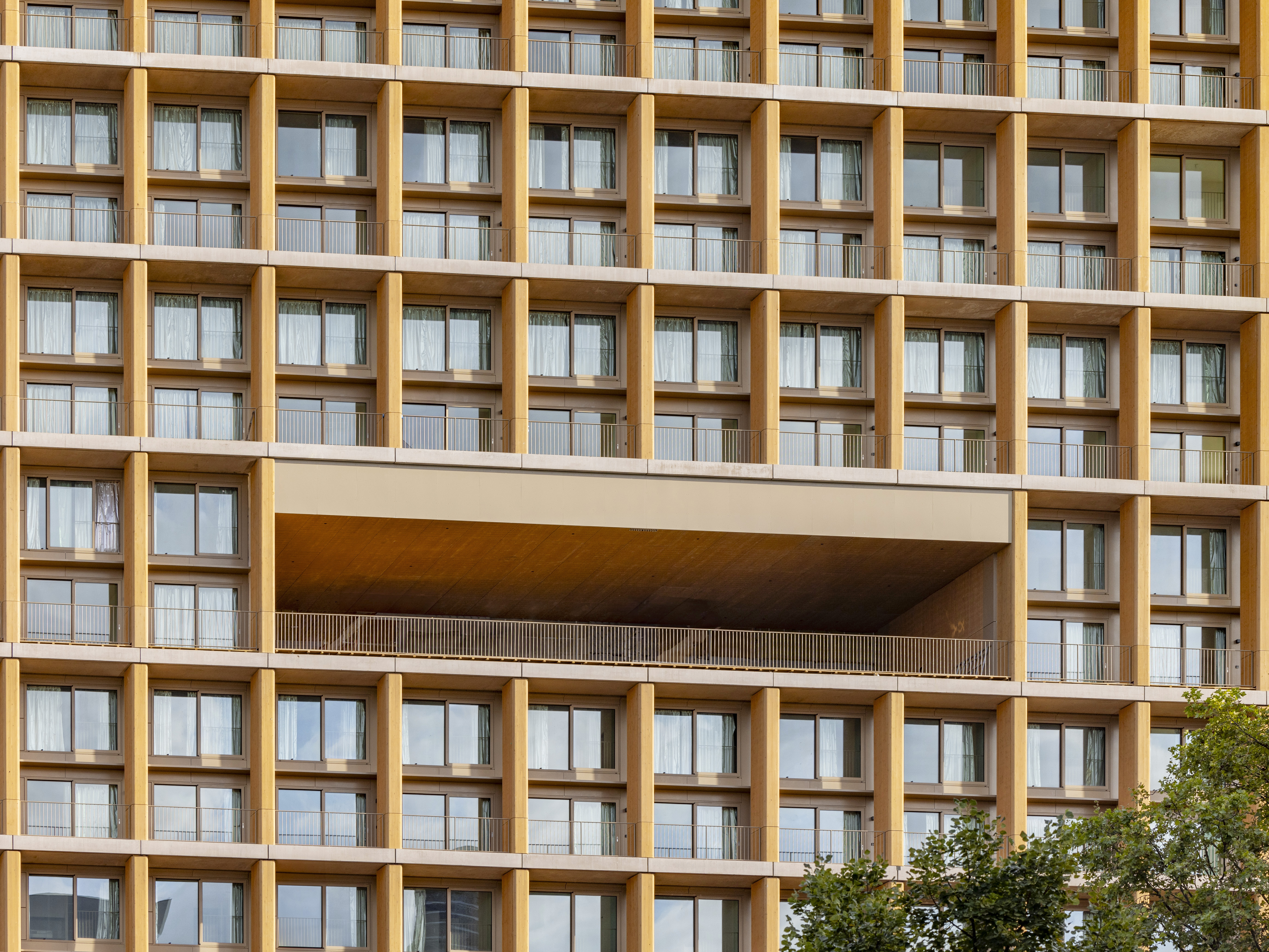 Explore wood architecture, Paris' new timber tower and how to make sustainable construction look ‘iconic’
A new timber tower brings wood architecture into sharp focus in Paris and highlights ways to craft buildings that are both sustainable and look great: we spoke to project architects LAN, and explore the genre through further examples
By Amy Serafin
-
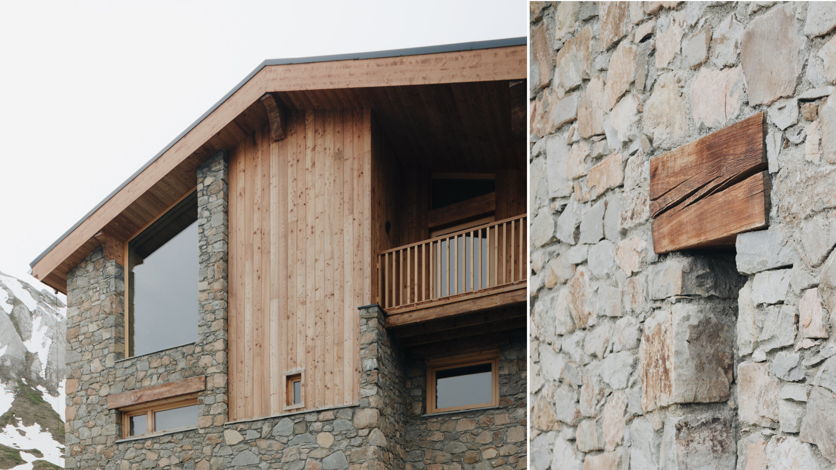 A transformed chalet by Studio Razavi redesigns an existing structure into a well-crafted Alpine retreat
This overhauled chalet in the French Alps blends traditional forms with a highly bespoke interior
By Jonathan Bell
-
 La Grande Motte: touring the 20th-century modernist dream of a French paradise resort
La Grande Motte and its utopian modernist dreams, as seen through the lens of photographers Laurent Kronental and Charly Broyez, who spectacularly captured the 20th-century resort community in the south of France
By Ellie Stathaki