LA carpark transformed into temporary shelter to house transient and homeless people
This new temporary shelter concept aims to support Los Angeles' transient and homeless population as a response to the city's ongoing pandemic and housing crisis
With unemployment reaching unprecedented highs in the United States these past few months, it comes as no surprise that the need to provide housing and shelter for the country’s transient and homeless populations is more urgent than ever.
Earlier this month in Los Angeles, a new community housing project, named the Aetna Street Bridge Home, was unveiled as a pioneering model to help tackle the homelessness crisis in the city. Designed by Lehrer Architects and located in an underused parking lot in the city’s Van Nuys’ neighbourhood, the eye-catching complex is one of the centerpieces of the city’s emergency response. It is set to provide safe and inviting shelter in local communities until they are connected with a permanent home.
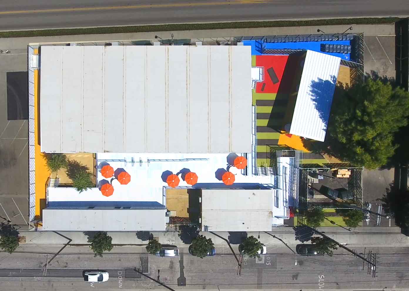
Designed in three weeks and built in just four months, Aetna Street Bridge Home occupies a quarter-acre site. It provides 70 beds within its structures, which are made from trailers. Lehrer Architects, one of the city’s 20 pre-approved architecture firms, won the Van Nuys project after competing in a request for a proposal. They also created the design under accelerated and streamlined budgetary conditions.
‘The City Department of Bureau of Engineering set the requirements for this project, part of a 15 shelter, city-wide ‘A Bridge Home’ program. We decided to pursue it as it is closely aligned with our mission of doing our share to house the homeless,’ recalls the firm’s partner and project lead Nerin Kadribegovic. ‘We are already working on hundreds of units of permanent housing, which take a couple of years to design and build, so a ‘bridge home’, or a temporary shelter, was a great way for us to engage and provide immediate relief to the crisis.’
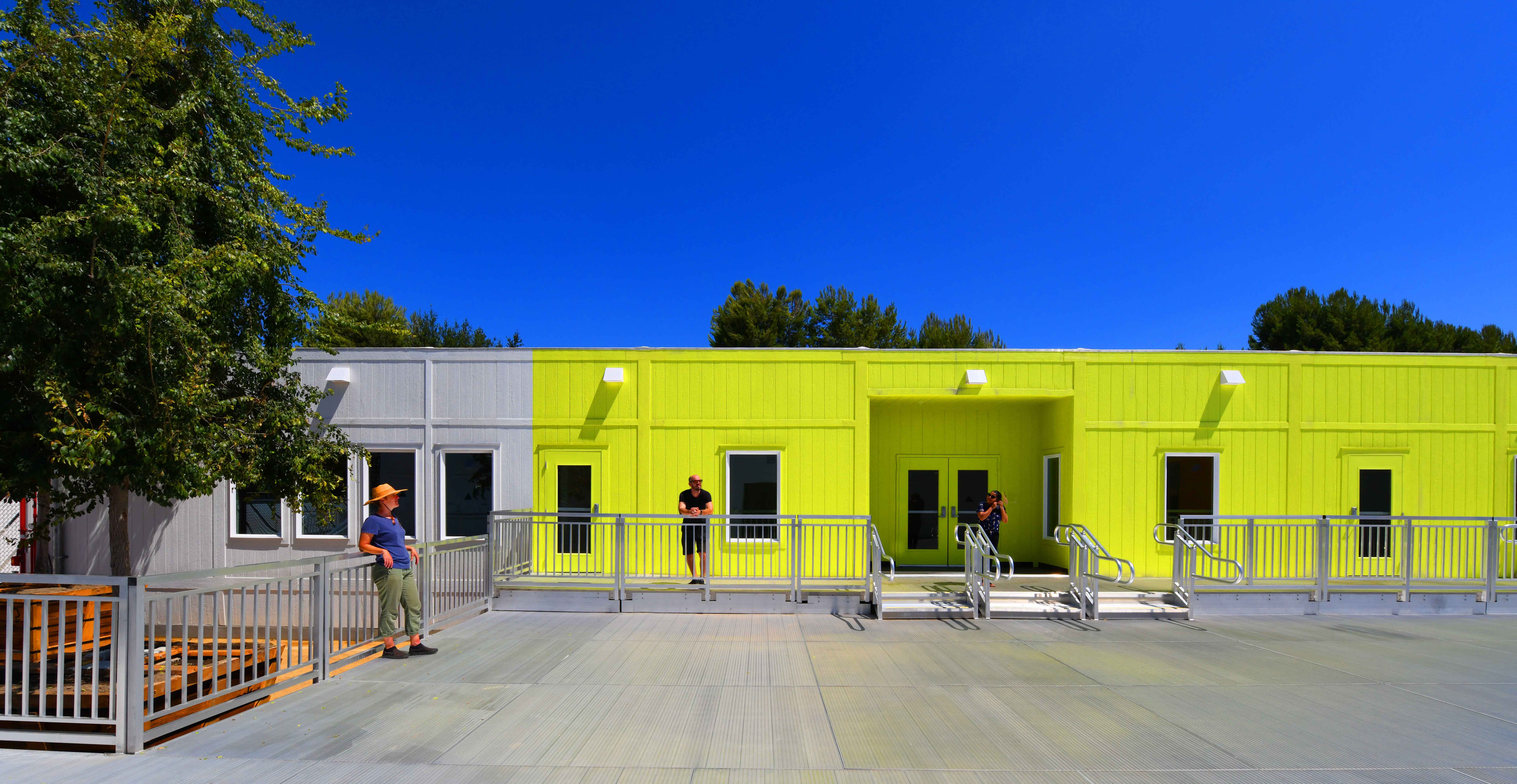
At the Aetna Street Bridge Home, modular, prefabricated units have been shaped into accommodation. This includes shared dining and gathering spaces, a pet play area, showers and restrooms, laundry and a secure storage area. Lehrer Architects deployed a bounty of colourful, graphic details to create a sense of character and bring a unique design and aesthetic sensibility to the spaces – a speedy and effective strategy given the budget, temporary nature and time constraints of the project.
Set back from the sidewalk by a bright green stripe that continues up the sides of the buildings, the complex incorporates existing trees to bring a sense of reprieve. It also adds generous amounts of shade and soft-scaping to counter the angularity of the program’s pre-mandated use of hard surfaces.
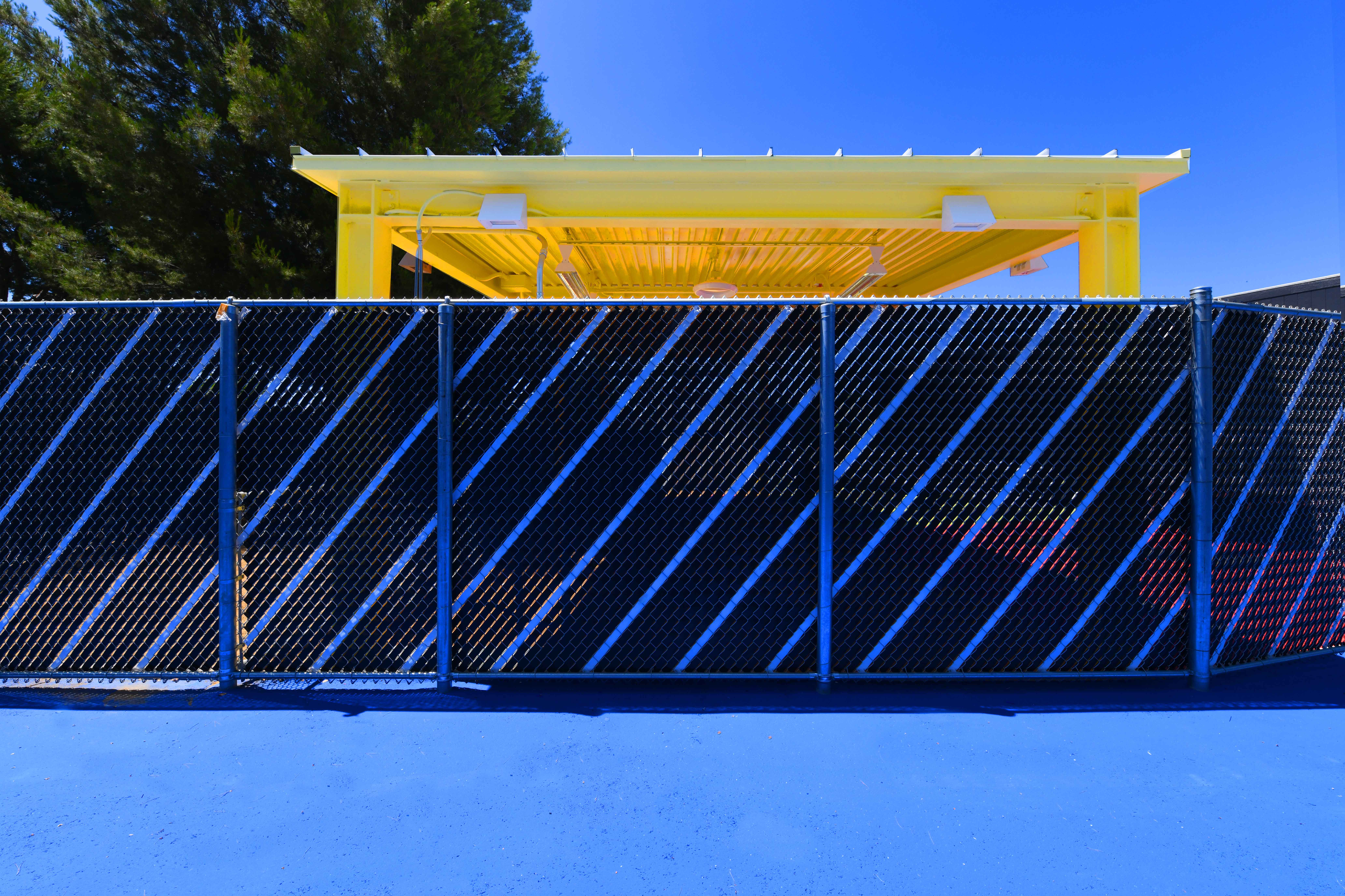
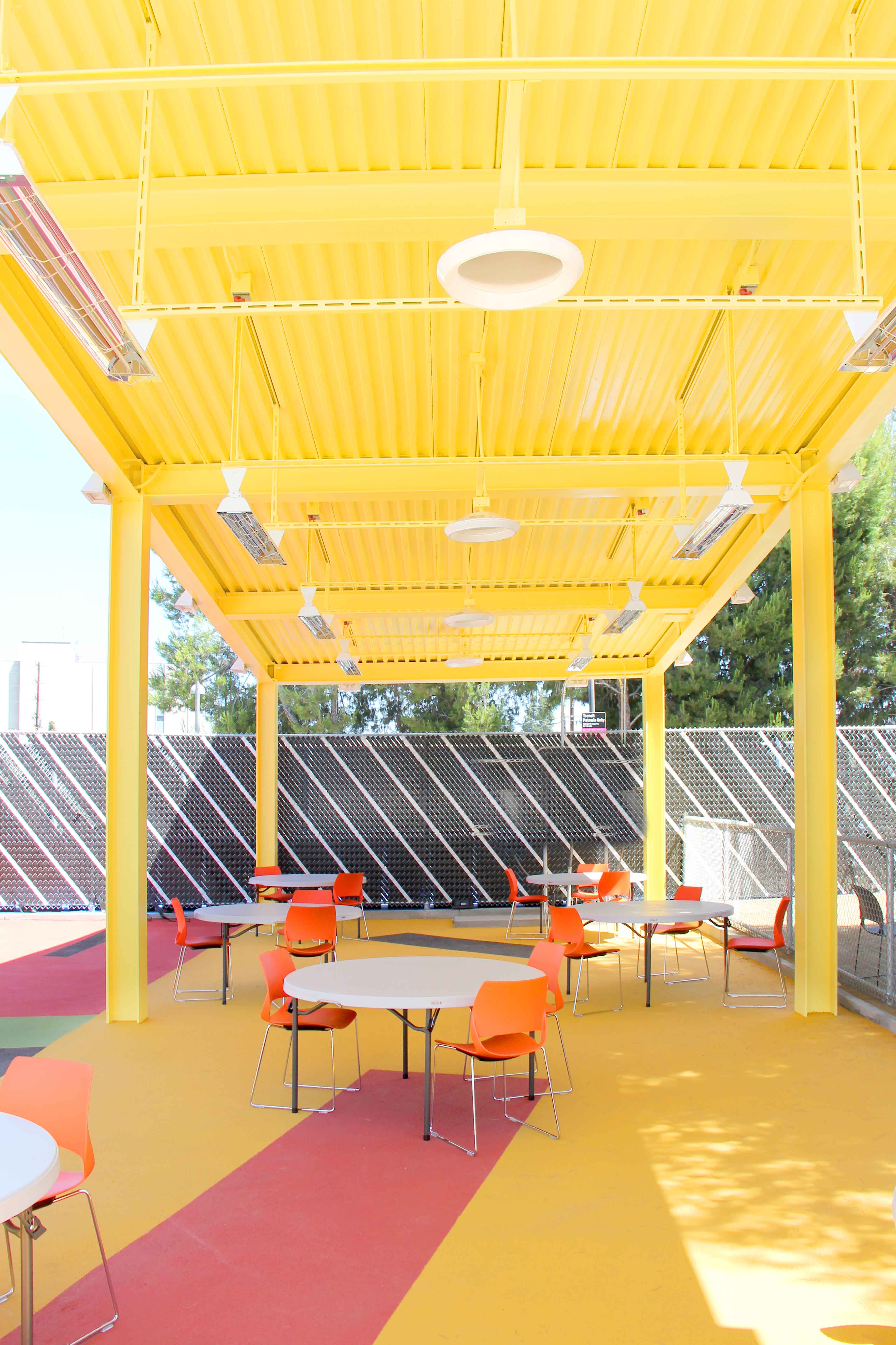
In the dining area, a large, bright yellow canopy equipped with lighting and space heaters provides a space that can be used by all throughout the day. Solar reflective paving helps to cool the campus’ microclimate, while the construction of a raised deck between the structures transforms interstitial spaces into venues for interaction and support.
‘With little maneuvering room, we worked the pre-determined components into a composition of fields of colour, existing trees, and trailers, re-imagined as abstract elements,’ Kadribegovic says. ‘The trailers are like any other found at construction sites throughout the country. We removed all unnecessary details, either through paint or actual removal, hence their unorthodox appearance. As a design strategy, when forced to use ordinary objects, we place them in a field of similar colour to get extraordinary results.’
The firm’s graphic treatments are especially effective in the residents’ storage area, where the city designates standardised blue recycling bins that can be locked to be used to keep personal belongings safe. ‘We responded to this by painting the ground of the storage area blue, resulting in a fun and uplifting feeling for this utilitarian space,’ Kadribegovic shares.
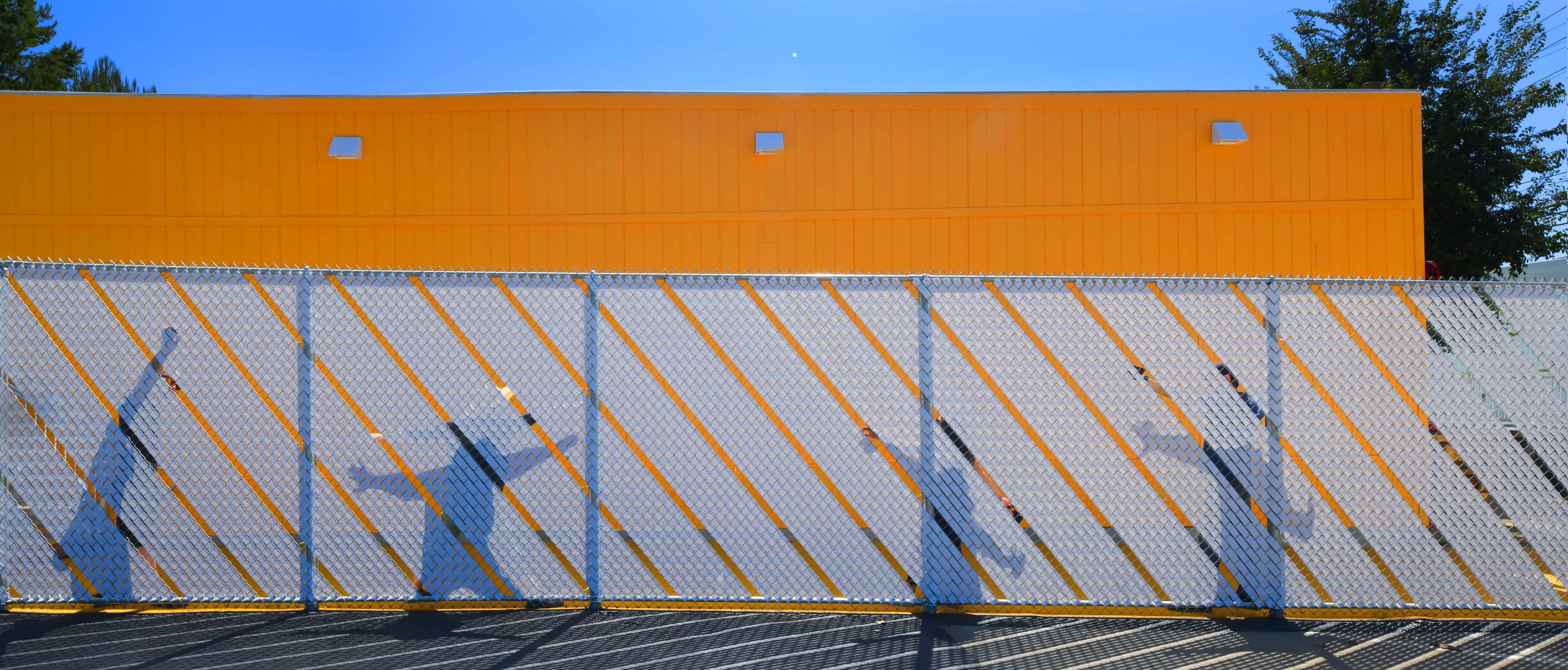
Lehrer Architects also responded creatively to the mandated use of chain link fencing by adding graphic patterns onto them. ‘Using available vinyl privacy strips, we played with light, shadow, and background colour to create artful patterns to offset the industrial nature of the product,’ he says. ‘Naturally, we strive to infuse all of our projects with a sense of dignity and uplifting feeling that touches one’s soul.’

INFORMATION
Wallpaper* Newsletter
Receive our daily digest of inspiration, escapism and design stories from around the world direct to your inbox.
Pei-Ru Keh is a former US Editor at Wallpaper*. Born and raised in Singapore, she has been a New Yorker since 2013. Pei-Ru held various titles at Wallpaper* between 2007 and 2023. She reports on design, tech, art, architecture, fashion, beauty and lifestyle happenings in the United States, both in print and digitally. Pei-Ru took a key role in championing diversity and representation within Wallpaper's content pillars, actively seeking out stories that reflect a wide range of perspectives. She lives in Brooklyn with her husband and two children, and is currently learning how to drive.
-
 Put these emerging artists on your radar
This crop of six new talents is poised to shake up the art world. Get to know them now
By Tianna Williams
-
 Dining at Pyrá feels like a Mediterranean kiss on both cheeks
Designed by House of Dré, this Lonsdale Road addition dishes up an enticing fusion of Greek and Spanish cooking
By Sofia de la Cruz
-
 Creased, crumpled: S/S 2025 menswear is about clothes that have ‘lived a life’
The S/S 2025 menswear collections see designers embrace the creased and the crumpled, conjuring a mood of laidback languor that ran through the season – captured here by photographer Steve Harnacke and stylist Nicola Neri for Wallpaper*
By Jack Moss
-
 We explore Franklin Israel’s lesser-known, progressive, deconstructivist architecture
Franklin Israel, a progressive Californian architect whose life was cut short in 1996 at the age of 50, is celebrated in a new book that examines his work and legacy
By Michael Webb
-
 A new hilltop California home is rooted in the landscape and celebrates views of nature
WOJR's California home House of Horns is a meticulously planned modern villa that seeps into its surrounding landscape through a series of sculptural courtyards
By Jonathan Bell
-
 The Frick Collection's expansion by Selldorf Architects is both surgical and delicate
The New York cultural institution gets a $220 million glow-up
By Stephanie Murg
-
 Remembering architect David M Childs (1941-2025) and his New York skyline legacy
David M Childs, a former chairman of architectural powerhouse SOM, has passed away. We celebrate his professional achievements
By Jonathan Bell
-
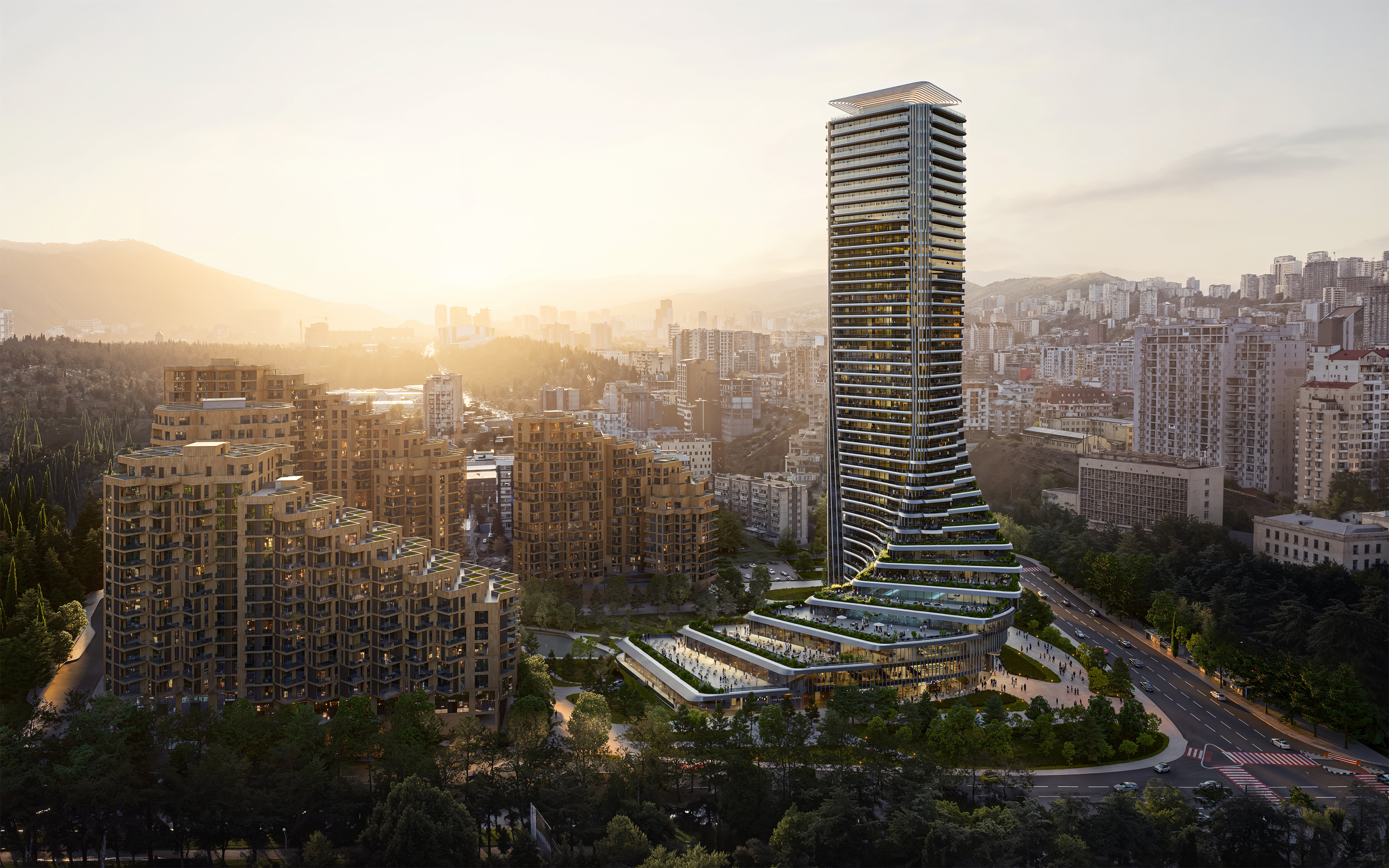 The upcoming Zaha Hadid Architects projects set to transform the horizon
A peek at Zaha Hadid Architects’ future projects, which will comprise some of the most innovative and intriguing structures in the world
By Anna Solomon
-
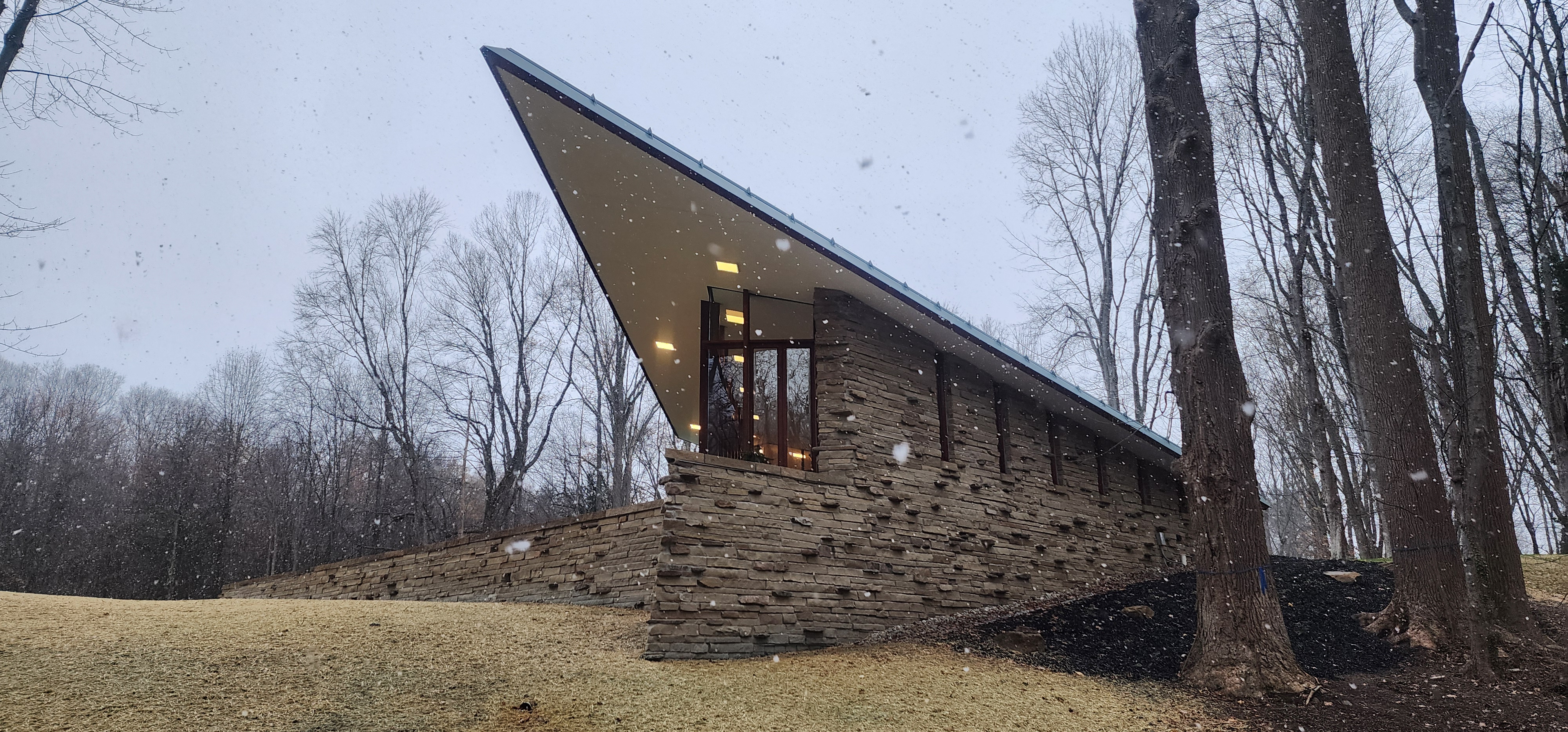 Frank Lloyd Wright’s last house has finally been built – and you can stay there
Frank Lloyd Wright’s final residential commission, RiverRock, has come to life. But, constructed 66 years after his death, can it be considered a true ‘Wright’?
By Anna Solomon
-
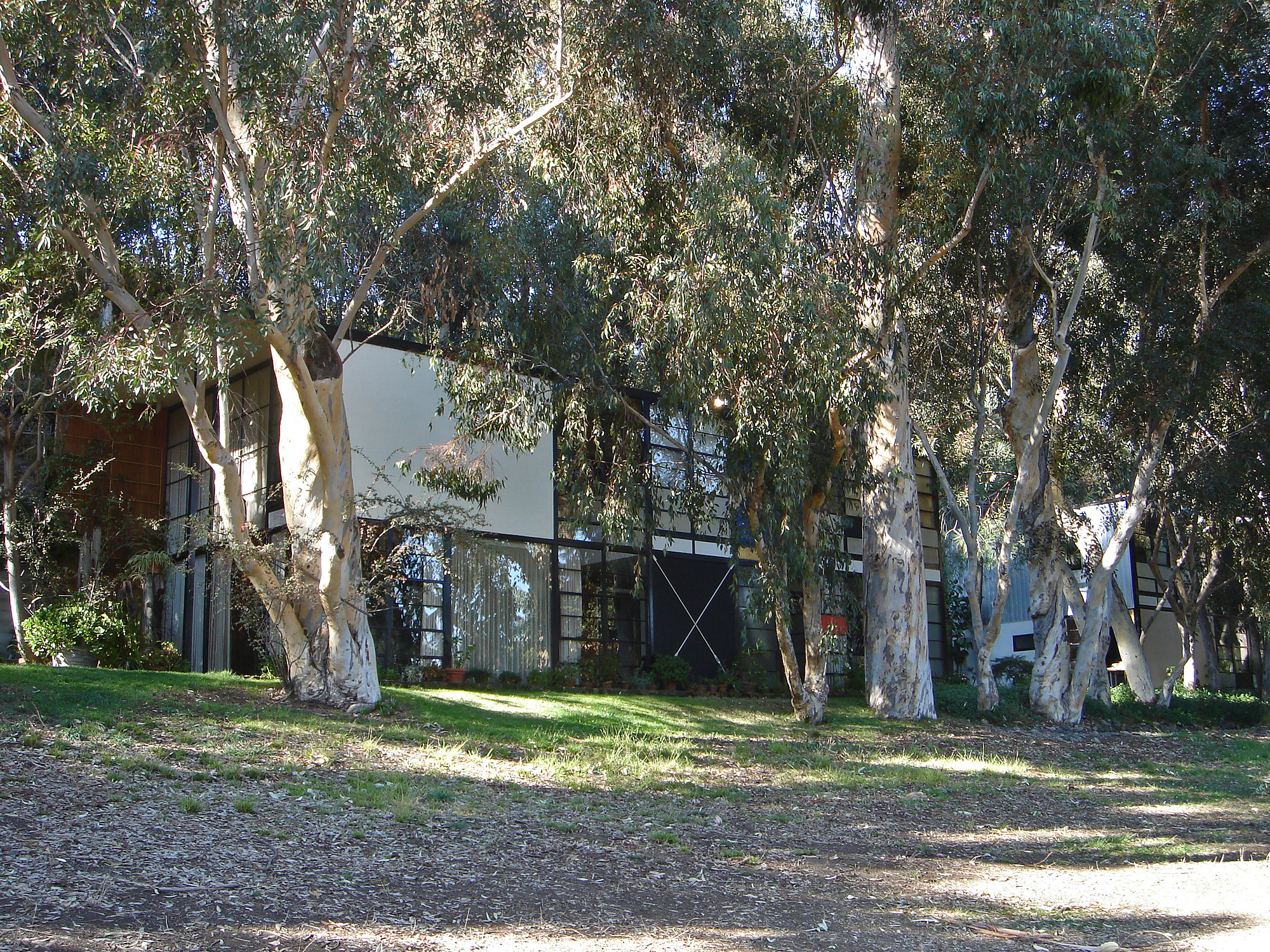 Heritage and conservation after the fires: what’s next for Los Angeles?
In the second instalment of our 'Rebuilding LA' series, we explore a way forward for historical treasures under threat
By Mimi Zeiger
-
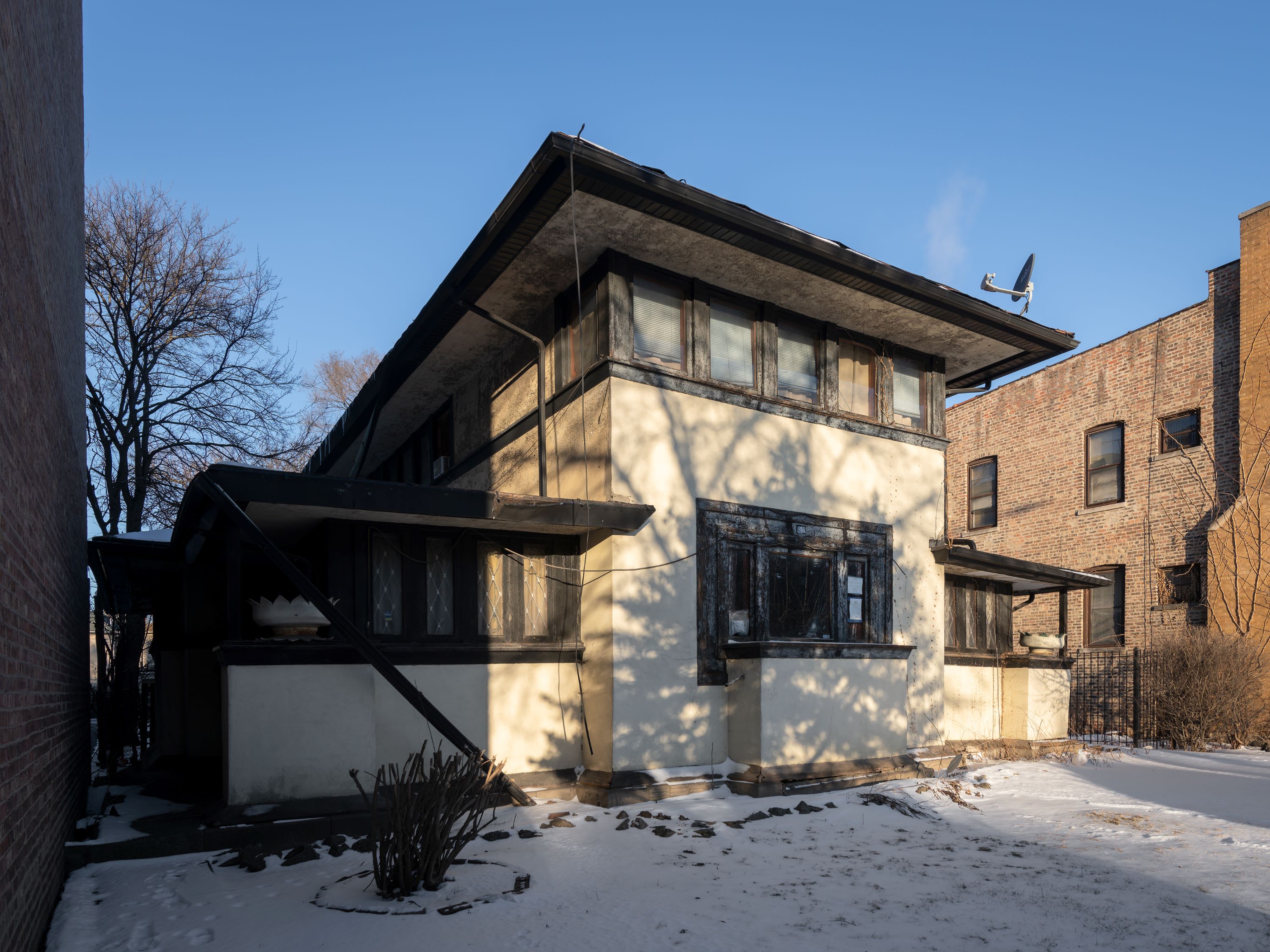 Why this rare Frank Lloyd Wright house is considered one of Chicago’s ‘most endangered’ buildings
The JJ Walser House has sat derelict for six years. But preservationists hope the building will have a vibrant second act
By Anna Fixsen