Lenny Steinberg invites us to her Los Angeles home: watch the film
Inside the Venice Beach home of designer Lenny Steinberg, who takes inspiration from movement and music, and guides us through her treasures
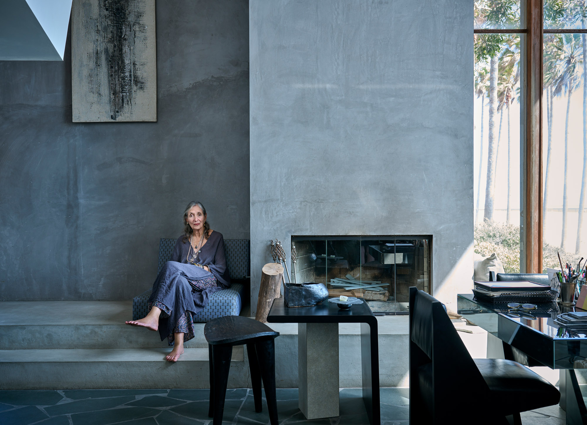
Out of the windows of Lenny Steinberg’s Venice Beach living room, there are a few hundred metres of sand, a line of white surf, then the grey-blue expanse of the Pacific Ocean. It’s a remarkable, pinch-me view, the kind most folks only see from the nearby boardwalk at Muscle Beach, where tourists and roller skaters glide through a perfume of cannabis dispensaries and fish taco stands.
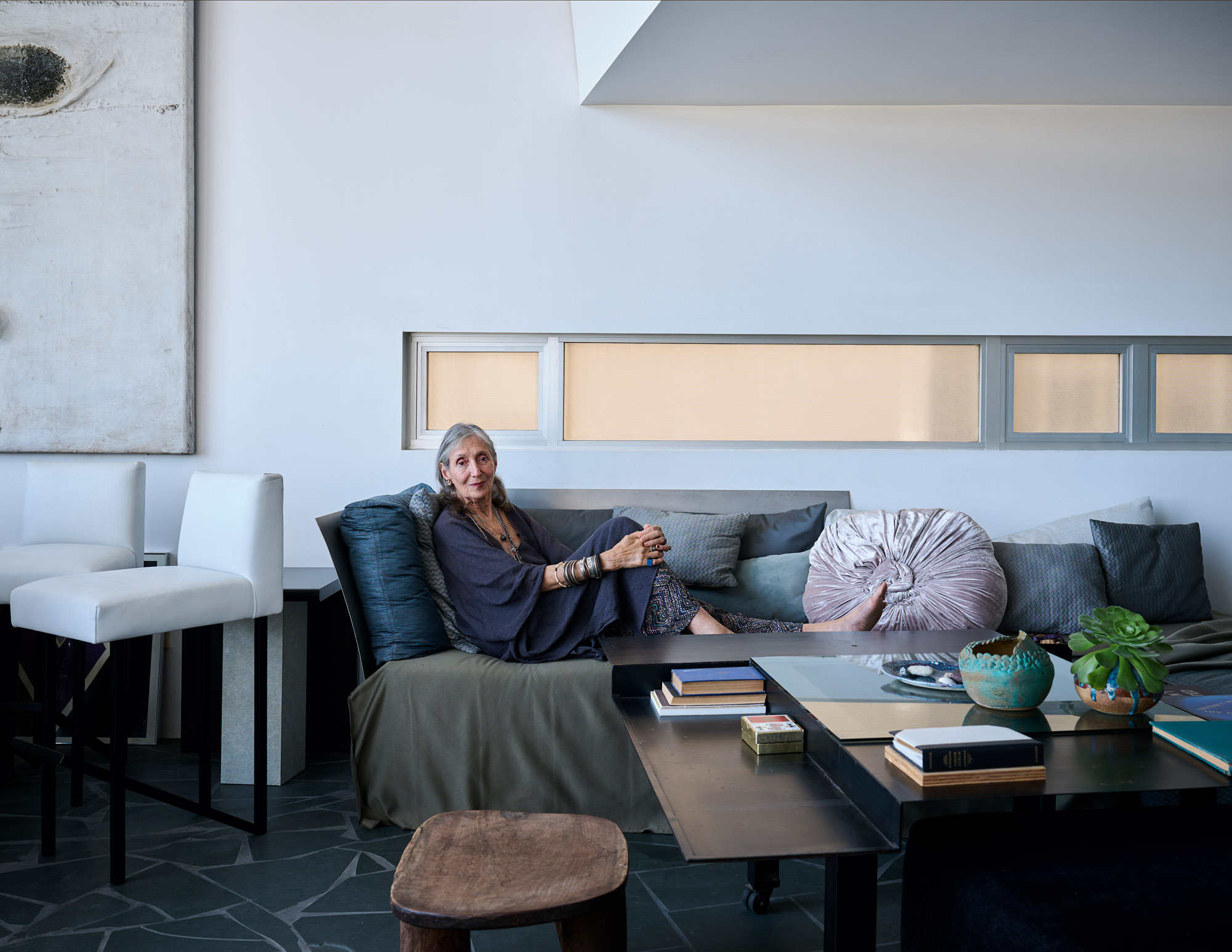
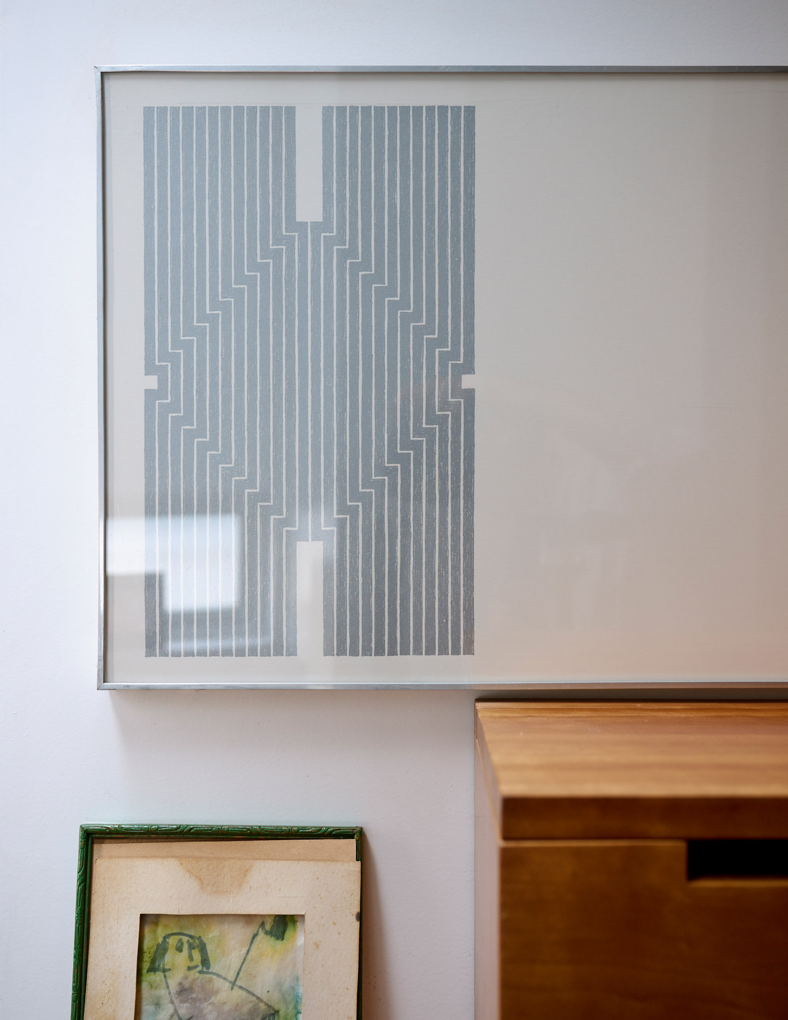
The LA-based designer’s home is just a few doors down from Frank Gehry’s Norton House, a mid-1980s landmark that mimics a lifeguard tower. She and her husband, Bob, a prominent lawyer, moved here in the 1990s, transforming a 1960s post-and-beam duplex into a minimalist roost that now houses an archive and showroom of five decades of her work, alongside her art and object collection. Each piece – from the Lucite high heels on a table by the front door to the Frank Stella print in the main bedroom – reflects, in short, the fruits of a highly creative life.
Lenny Steinberg: watch the film
Visiting her work and home
Seated in a navy blue club chair of her own design, Steinberg – who is featured in the Wallpaper* USA 300 – turns her attention to some light grey upholstered side chairs that have only just returned to the house after being part of a 2015 exhibition that was organised by LA’s Metabolic Studio and on view at The Barn, the former home and studio of midcentury architect A Quincy Jones. Produced as prototypes for a Manhattan apartment, the chairs have arms like the tail fins of a 1950s Ford Fairlane, complete with red lens reflectors. ‘Good furniture should have a little kick to it or something, a little surprise to make things not so serious,’ says Steinberg.
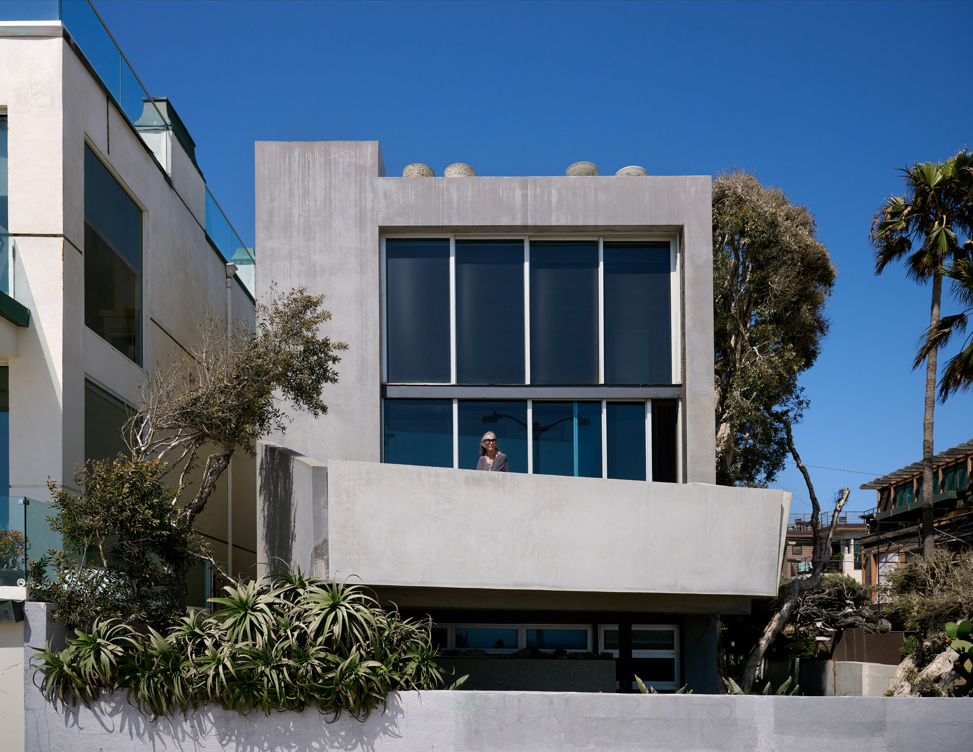
Lenny Steinberg’s LA home was originally a 1960s post-and-beam duplex, which she remodelled to create a minimalist three-storey beachfront retreat
A native Angeleno who grew up in North Hollywood, she spent her childhood among soundstages and backlots. Her father was a cameraman for Universal Pictures, her mother the secretary for studio head Carl Laemmle. There’s a bit of Tinseltown magic in her furniture, in the way it combines art deco and Japanese references with the chrome and polish of LA car culture. She remembers riding in her father’s 1938 Buick, a tank-like sedan made elegant by Streamline Moderne styling and a shiny grill. They would drive up and over the hills from the valley to the basin. As a teenager, Steinberg would repeat this route venturing into Hollywood and to Fairfax High.
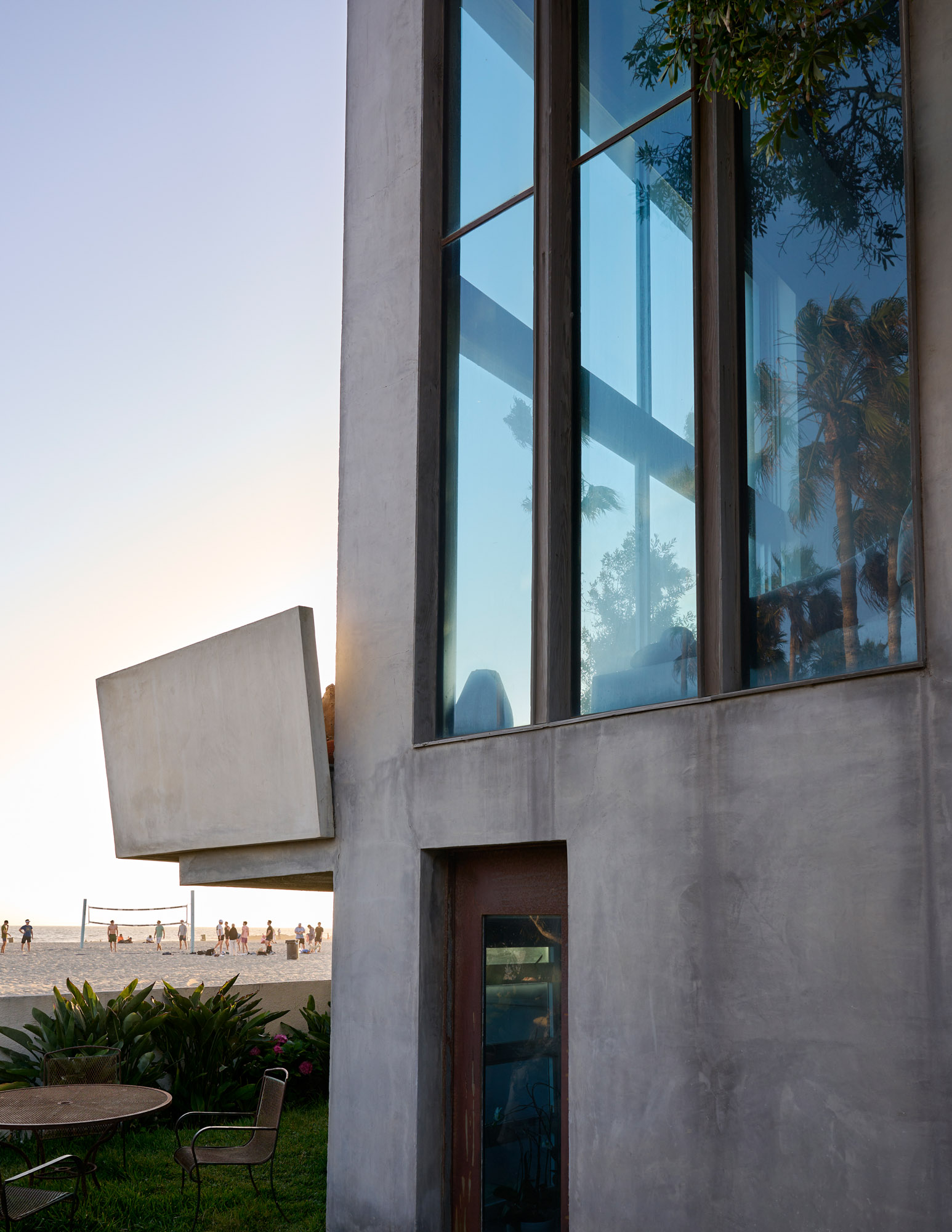
The view from the house looks out across the Venice Beach sand to the Pacific Ocean
‘Driving was a big part of discovering LA,’ Steinberg recalls. ‘I would drive the length of Mulholland Drive from its beginning in Hollywood all the way west, where it stopped. That was the end of everything, any further was just cows and a big pasture.’
To sit and chat with Steinberg is to get glimpses of a city less formed than it is now. There were places still a bit wild where the imagination could wander. Which may explain why, as LA matured, she found herself searching for the next horizon. She enrolled in the music programme at the University of Southern California, but felt hemmed in by its classical bent so transferred to UCLA, where she developed an interest in design (the design school was just across the quad from the music department).
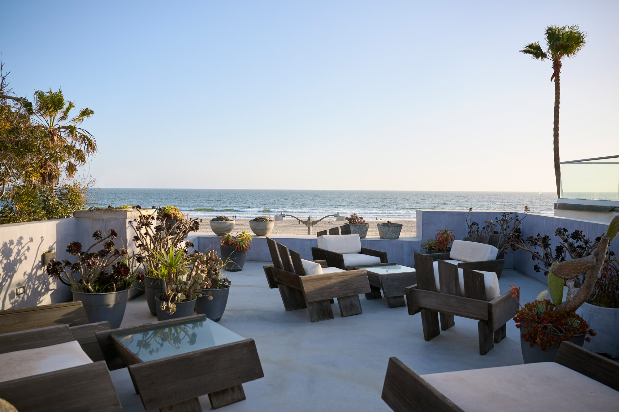
On the roof deck, a grouping of outdoor furniture from Steinberg’s Pyramids & Parallels series leans obliquely as if blown by the wind
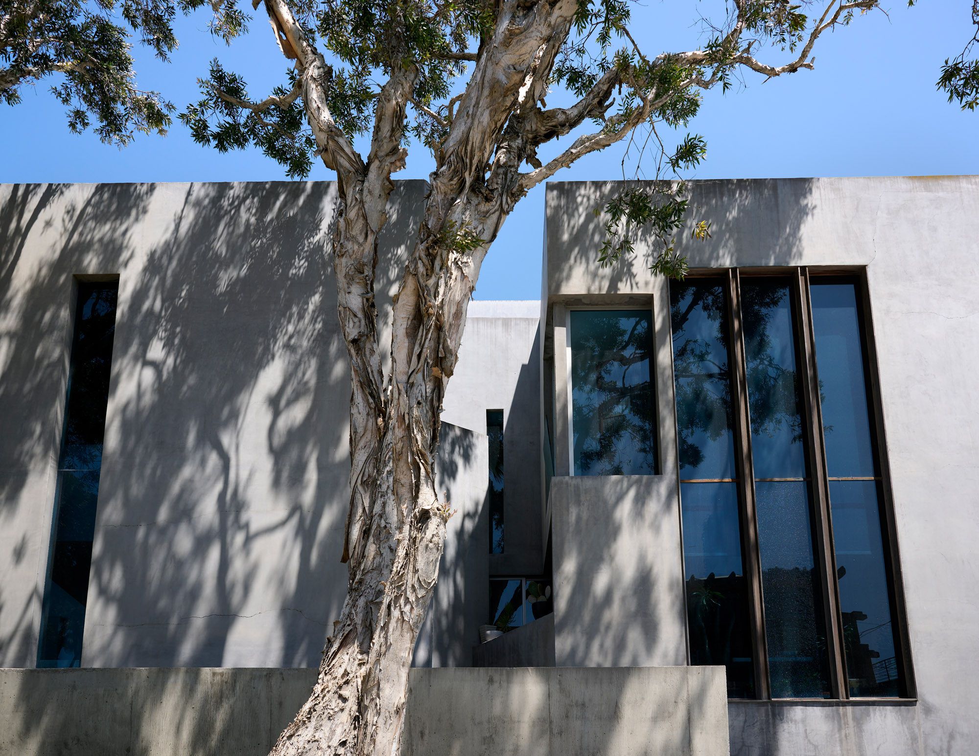
‘My background in music is in all my work,’ she says, pointing across her double-height living room, past the grand piano, to where she put in a cross beam in place of an exterior wall. Light pours in through the floor-to-ceiling windows, inspired by Pierre Chareau’s Maison de Verre. But unlike the designs of the French modernist architect, which were precisely orthogonal, Steinberg’s beam cuts through the room at an angle, setting the mezzanine off kilter. ‘I remember my music professors would say to me, “Play me a new note”. So, even in architecture, I ask myself, “What’s the new note?”.’
Wallpaper* Newsletter
Receive our daily digest of inspiration, escapism and design stories from around the world direct to your inbox.
Those notes play staccato across her career. In the 1960s, Steinberg partnered with designer Sarah Binder and together they developed Vivid, producing a line of mirrored furniture out of a warehouse in Downtown LA. In 1968, they launched Links Design, expanding their material palette to experiment with cork and multicoloured plastic laminates like Formica. By the late 1990s, Steinberg’s practice had evolved from designing furniture and interiors to full architectural projects. She opened her own office, Lenny Steinberg Design, in 1997. Her studio was located at 73 Market Street in Venice, opposite the restaurant 72 Market. Founded by Tony Bill and Dudley Moore (and designed by architects Thom Mayne and Michael Rotondi), the eatery was something of a culinary celebrity hotspot.
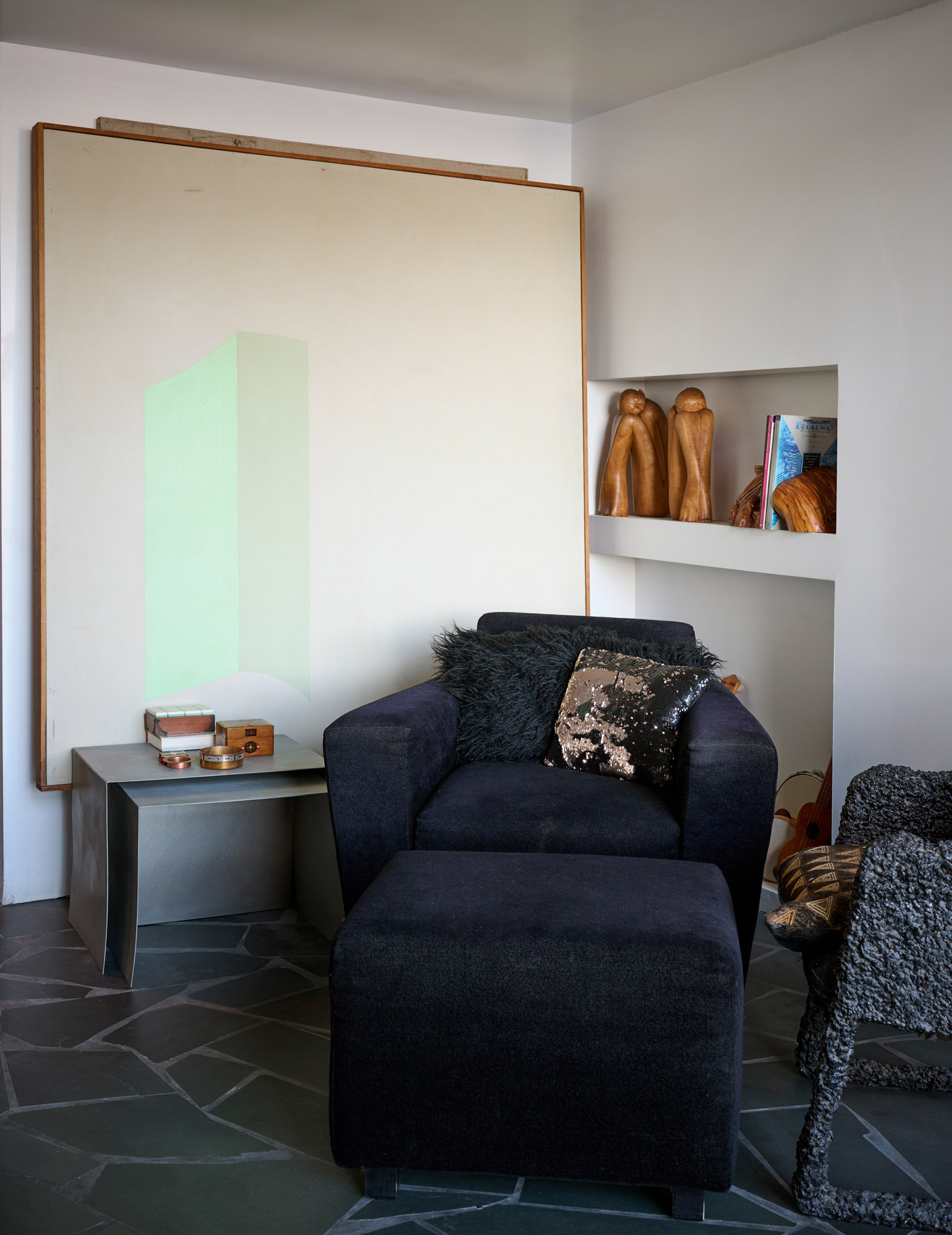
A navy blue club chair designed by Steinberg in front of a painting by American abstract artist Walter Darby Bannard
Works from her broad oeuvre cluster together in her home. A Vivid mirrored side table reflects the irregular pattern of the slate floor. The piece owes as much to art deco as it does to the minimalist Light and Space movement. There’s clearly the vibe of the Venice scene and the artists who had their studios in what was then a shabby bunch of warehouses by the beach, such as Billy Al Bengston and Larry Bell, who are both old friends.
Her ‘Push-me Pull-U’ sofa, meanwhile, is a study in material contrasts. Thin, steel plates wrap around a lounge chair piled high with pillows. While there are certain eccentricities, by and large her collection speaks to a consistent vision – what Steinberg calls ‘space, time and energy’. To illustrate, she flips through a dog-eared 1979 issue of Residential Interiors and stops on a page featuring Gehry’s Cheviot Hills house, a 1977 remodel of a 1940s bungalow for which Steinberg and Binder designed much of the furniture and built-ins. Fashioned from cork and plastic laminate, the house’s boxy chairs, tables and beds are stripped of ornament.
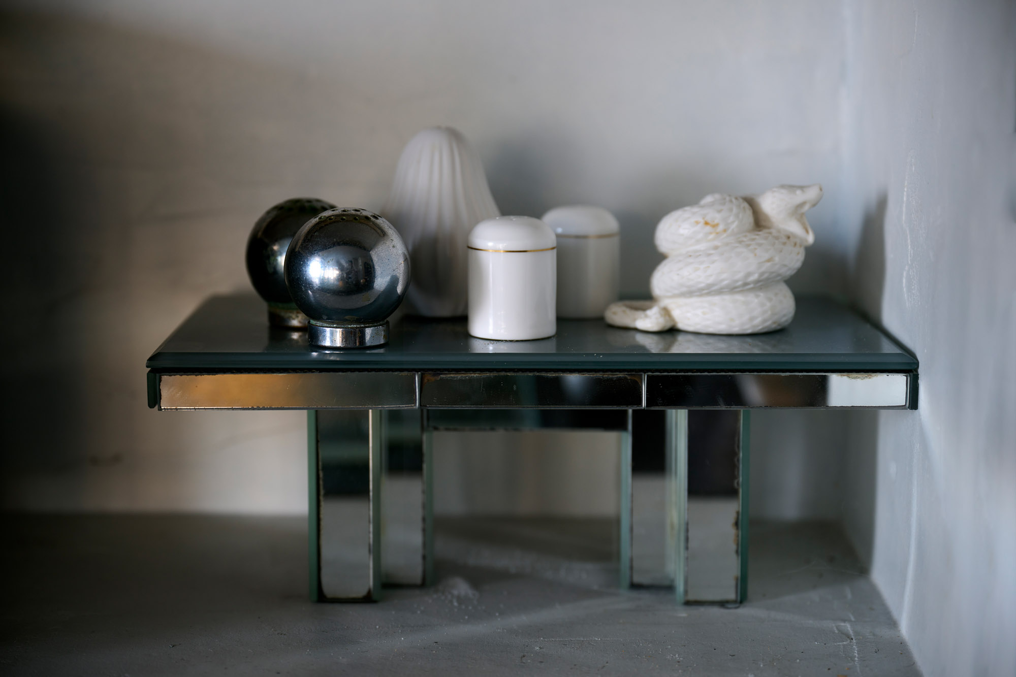
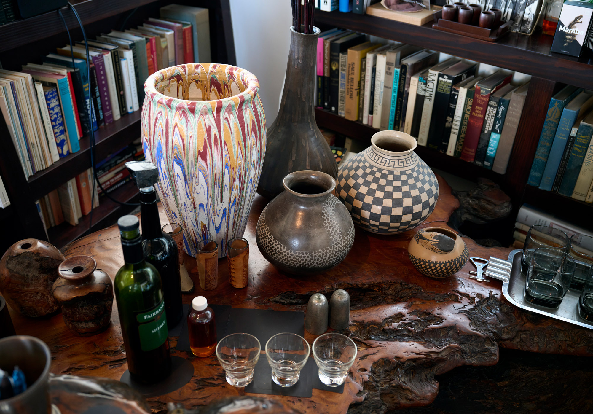
A Vivid mirrored coffee table with some of her objects, a collection amassed over five decades
A sense of movement comes from the geometry; legs and backs slant backwards like a comic book drawing of a speeding car. ‘I called that series Pyramids & Parallels,’ says Steinberg, leading me into the kitchen where the island shares the same jutting angles. Its sculptural form is also functional, masterly incorporating a bar, wine racks, and even a special butter drawer. We head upstairs, past the main bedroom and a library packed with books on Bauhaus, Arata Isozaki, and former collaborators like Gehry and architect Frank Israel. On the roof deck, a grouping of outdoor furniture from her Pyramids & Parallels period is nestled among ceramic pots of succulents. Made from wide, sun-bleached redwood boards, with simple, white canvas cushions, Steinberg’s design gives the classic Adirondack chair a contemporary interpretation by way of Enzo Mari. Her chairs and tables lean obliquely as if blown by Pacific winds.
This dynamism may come from an interest in modern dance. Two of her three daughters are dancers: Morleigh was one of the members of Momix and performed in videos for U2 (she later married The Edge), while Roxanne founded an experimental company rooted in Japanese dance.
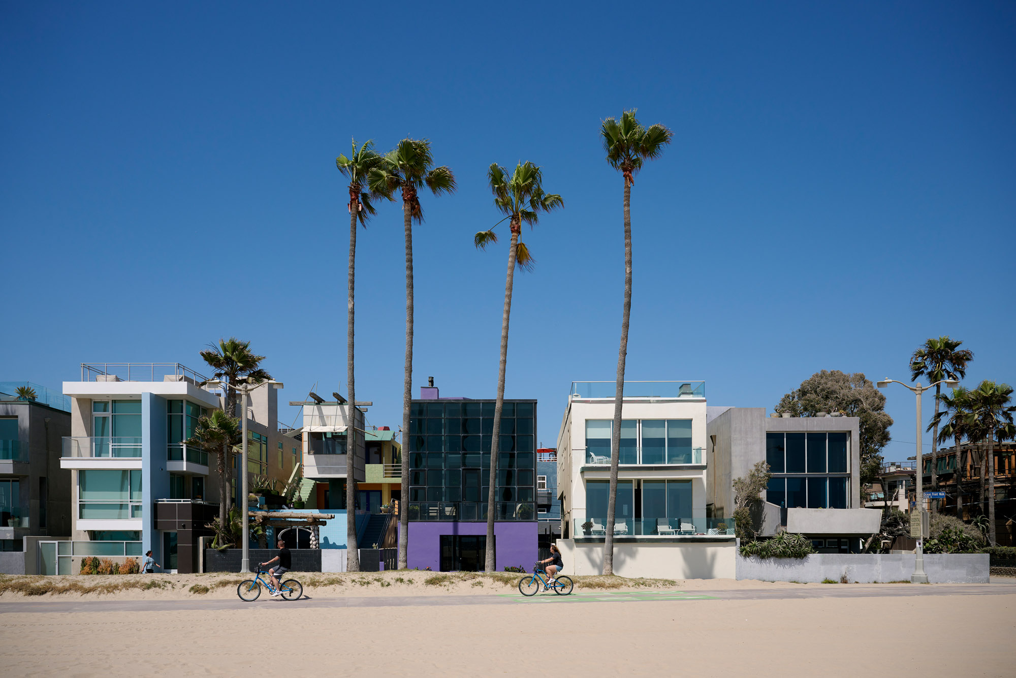
Steinberg’s house, on Ocean Front Walk, is a few doors’ down from Frank Gehry’s Norton House, designed in 1984 to echo the local lifeguard towers
‘Lenny is acutely aware of the shape of the body relative to space and objects. Her strength is in the vignette, in understanding the scale, details and atmosphere of a room,’ notes architect Annie Chu, whose firm, Chu Gooding Architects, collaborated with Steinberg on an unrealised cottage renovation in Dalkey, Ireland, for The Edge.
There’s a sly sense of humour running through Steinberg’s design philosophy. She thinks about the inner life of inanimate objects. ‘Furniture should have some sense of movement to it,’ she says. ‘Like, when you go to sleep at night, it scampers about, then returns to its place in the morning.’ Animation informed her design for the ‘Pony’ chair. Made for a residence on Mulholland Drive, it has a wide seat and a chrome-plated stainless steel back that nestles into the sitter’s shoulder blades. It looks uncomfortable, but Steinberg swears people are always surprised at how it accommodates the body. It’s the legs, however, that give the chair a kick: they kink in profile like the hind limbs of a horse.
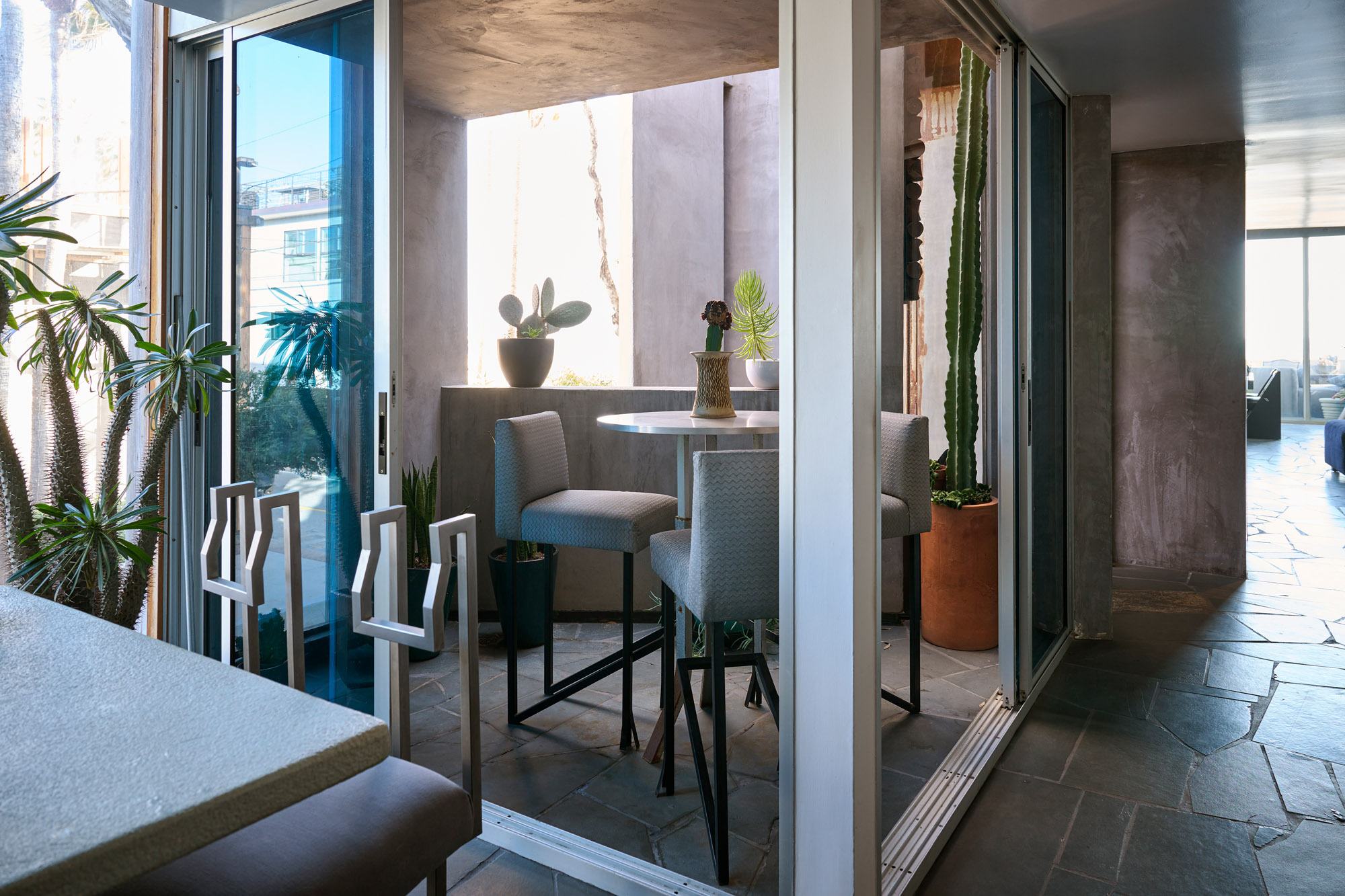
Steinberg’s ‘Pony’ chairs sit around a dining table, while on the patio are her ‘Split-Foot’ bar stools
For the 2015 exhibition of her archive, Steinberg presented a set of ‘Pony’ chairs, each created for different earlier projects but returned over the decades to Venice. Exposed to the salty ocean air, they are pockmarked with rust, which led her to title the set ‘Six Degrees of Disintegration’. Indeed, her home has also weathered over time. The living room window is cracked from an earthquake, and the steel entry gate is corroded. ‘I kind of just live with it,’ Steinberg says. After a long and productive career, entropy is simply another phase of the design process.
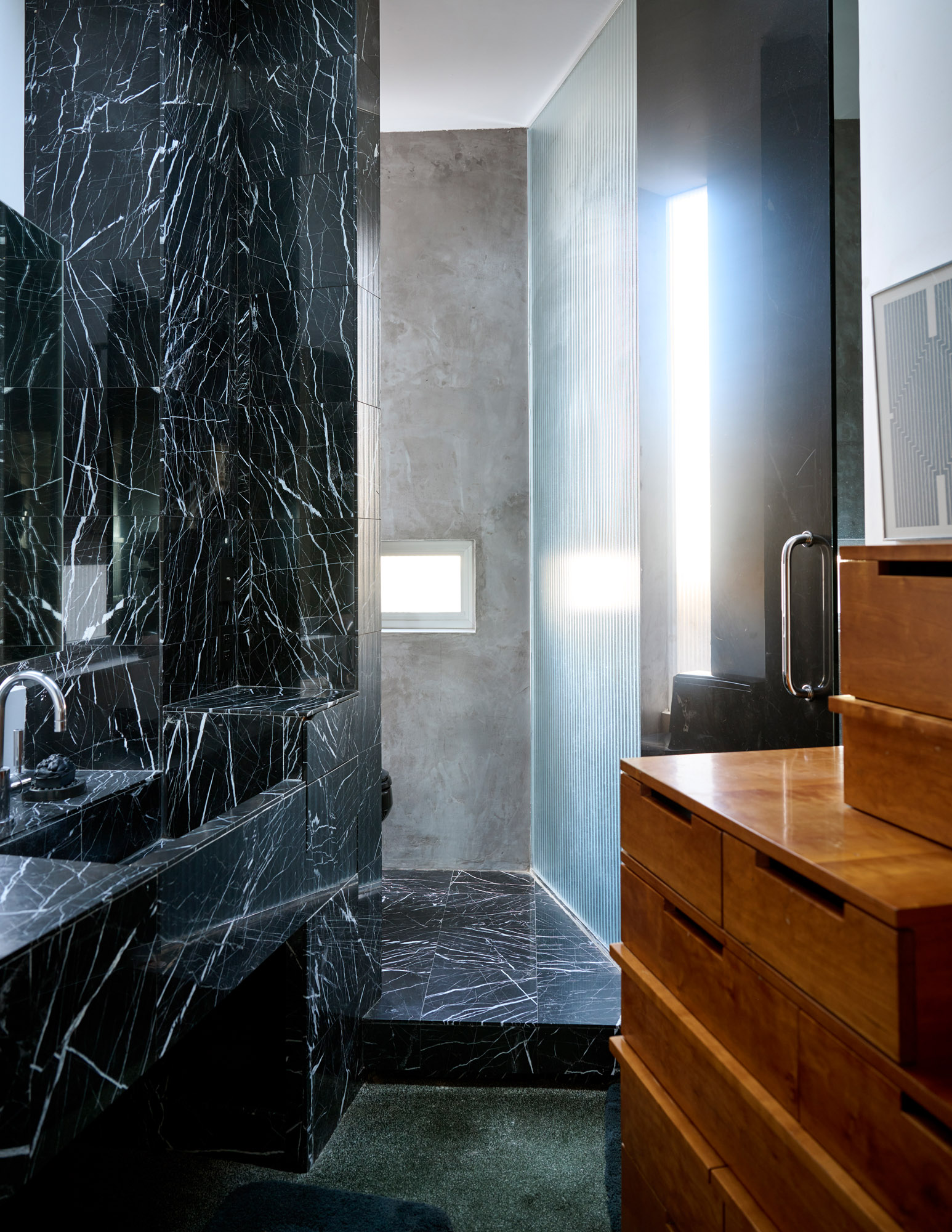
A bathroom features a custom-made storage cabinet that takes inspiration from a Japanese tansu chest
Film directed and produced by Cory Jacobs and Jason Schmidt of Cottage 8 Films, cottage8films.com/
A version of this article appears in the August 2023 issue of Wallpaper*, available in print, on the Wallpaper* app on Apple iOS, and to subscribers of Apple News +. Subscribe to Wallpaper* today
-
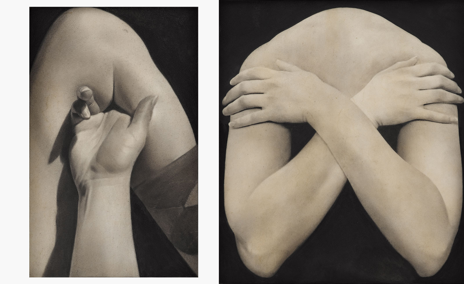 Put these emerging artists on your radar
This crop of six new talents is poised to shake up the art world. Get to know them now
By Tianna Williams
-
 Dining at Pyrá feels like a Mediterranean kiss on both cheeks
Designed by House of Dré, this Lonsdale Road addition dishes up an enticing fusion of Greek and Spanish cooking
By Sofia de la Cruz
-
 Creased, crumpled: S/S 2025 menswear is about clothes that have ‘lived a life’
The S/S 2025 menswear collections see designers embrace the creased and the crumpled, conjuring a mood of laidback languor that ran through the season – captured here by photographer Steve Harnacke and stylist Nicola Neri for Wallpaper*
By Jack Moss
-
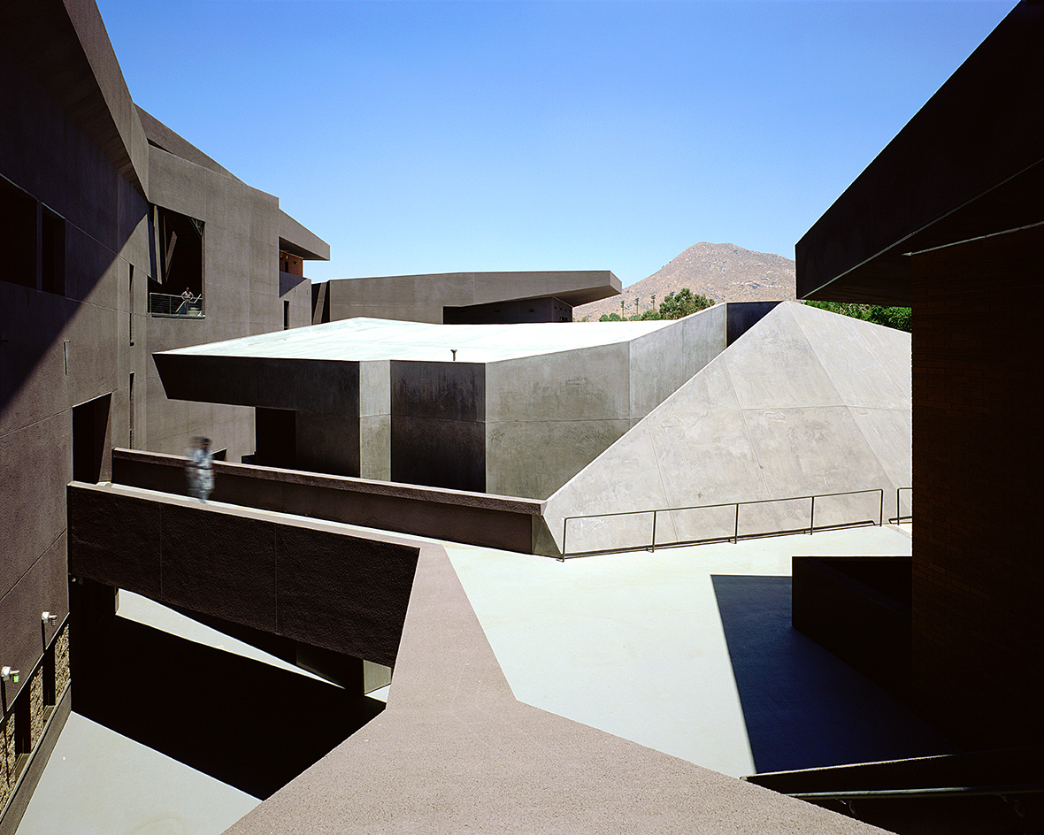 We explore Franklin Israel’s lesser-known, progressive, deconstructivist architecture
Franklin Israel, a progressive Californian architect whose life was cut short in 1996 at the age of 50, is celebrated in a new book that examines his work and legacy
By Michael Webb
-
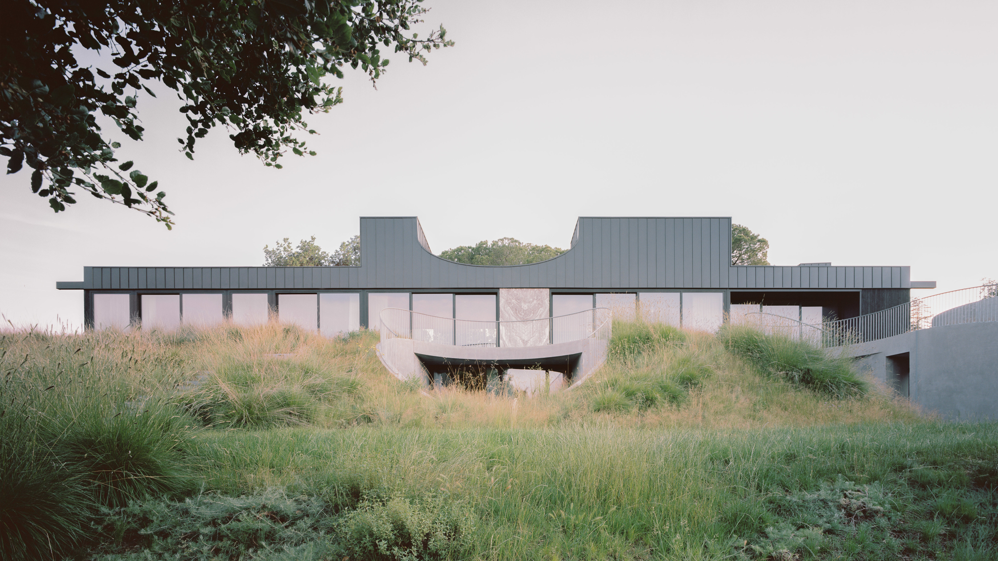 A new hilltop California home is rooted in the landscape and celebrates views of nature
WOJR's California home House of Horns is a meticulously planned modern villa that seeps into its surrounding landscape through a series of sculptural courtyards
By Jonathan Bell
-
 The Frick Collection's expansion by Selldorf Architects is both surgical and delicate
The New York cultural institution gets a $220 million glow-up
By Stephanie Murg
-
 Remembering architect David M Childs (1941-2025) and his New York skyline legacy
David M Childs, a former chairman of architectural powerhouse SOM, has passed away. We celebrate his professional achievements
By Jonathan Bell
-
 The upcoming Zaha Hadid Architects projects set to transform the horizon
A peek at Zaha Hadid Architects’ future projects, which will comprise some of the most innovative and intriguing structures in the world
By Anna Solomon
-
 Frank Lloyd Wright’s last house has finally been built – and you can stay there
Frank Lloyd Wright’s final residential commission, RiverRock, has come to life. But, constructed 66 years after his death, can it be considered a true ‘Wright’?
By Anna Solomon
-
 Heritage and conservation after the fires: what’s next for Los Angeles?
In the second instalment of our 'Rebuilding LA' series, we explore a way forward for historical treasures under threat
By Mimi Zeiger
-
 Why this rare Frank Lloyd Wright house is considered one of Chicago’s ‘most endangered’ buildings
The JJ Walser House has sat derelict for six years. But preservationists hope the building will have a vibrant second act
By Anna Fixsen