Lever House in New York gets a 21st-century makeover
Some 70 years after its completion, SOM returns to Lever House in New York, bringing the high-rise landmark to the 21st century
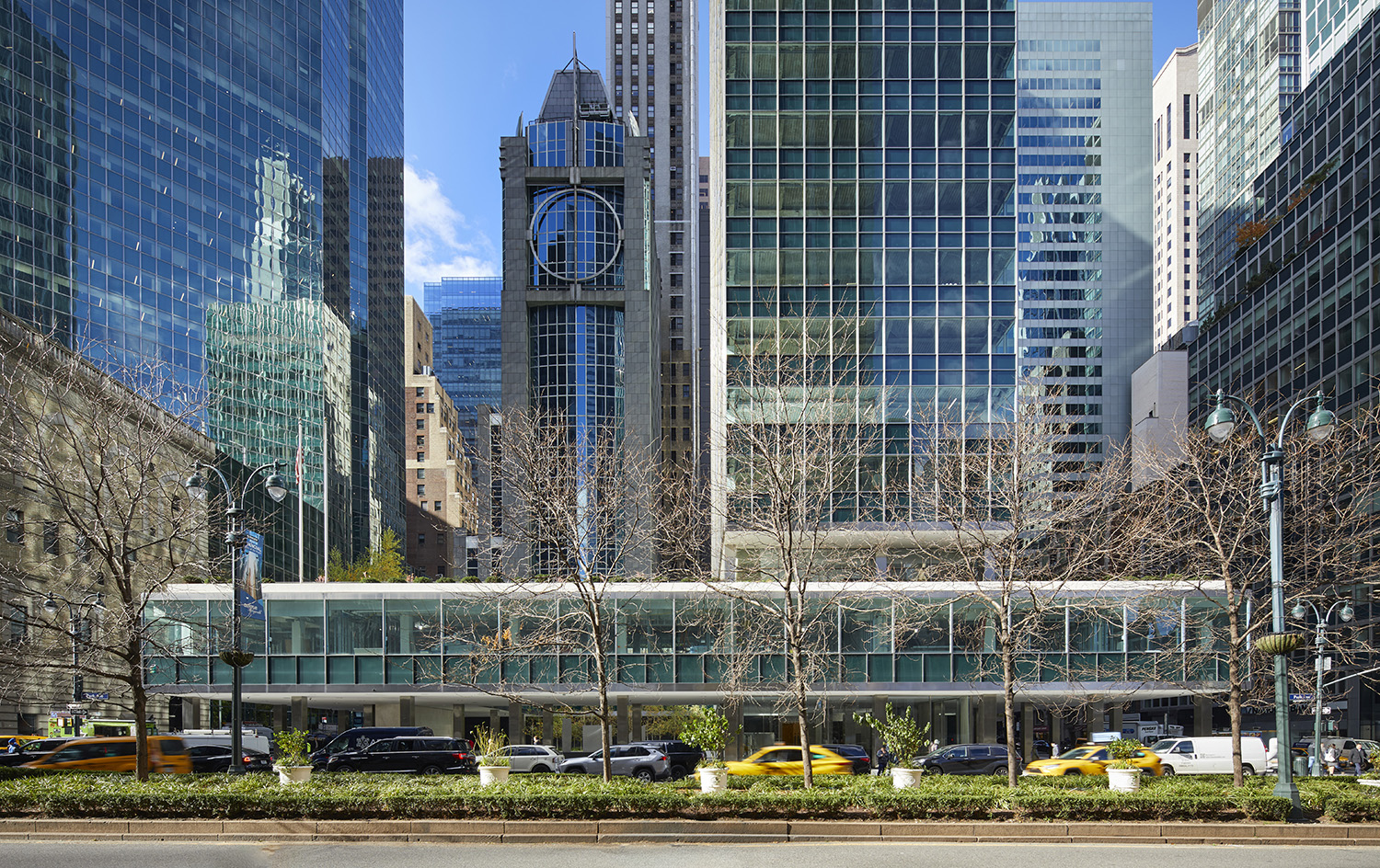
When Lever House opened in 1952, it was immediately received with acclaim and wonder. Commissioned by Unilever for its headquarters, the slender, 21-story blue-green monolith oriented perpendicularly to the street was the first all-glass modernist architecture skyscraper to be built in New York City. It elegantly stretched above its squat neoclassical neighbours and, seemingly, floated above its open plaza and transparent lobby.
In its review at the time, the Architectural Record magazine praised the Skidmore Owings & Merrill-designed building as ‘marvellously ingenious’. Passersby would crowd the sidewalks when window washers descended the skyscraper in a custom gondola to squeegee and polish the four curtain walls. It was a pathbreaking symbol of corporate America and ushered in a generation of International Style headquarters across Manhattan.
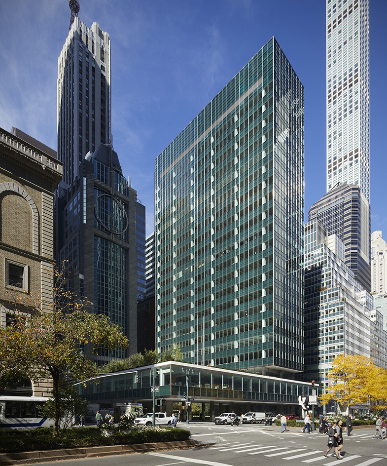
Lever House: from its 1950s beginnings to the present day
Unfortunately, time was not generous to the Lever House. The building staved off a demolition threat in the 1980s, which led to landmarking in 1982; despite recognition that it was a significant structure, it was plagued by financial challenges and steadily began to decay. The facade leaked, the terrazzo pavers and floors cracked, and 70 years of wear and tear dulled the interiors. In 2001, Lever House’s façade was replaced. But in 2020, new owners Brookfield Properties and WatermanCLARK commenced a $100-million overhaul that has included restoring the building's lobby and courtyard, replacing the heating and cooling systems, refreshing its restaurant, and introducing a new lounge and outdoor terrace. Construction concluded this month.
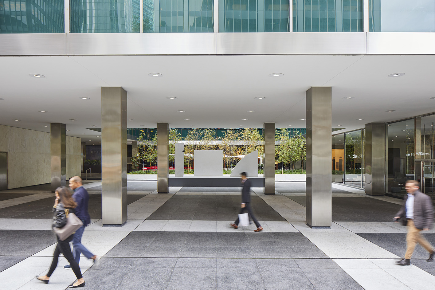
For the architects at SOM, who spearheaded the renovations, and the owners, this decades-long endeavour has been a balancing act between restoring the integrity of the building while modernising it to compete in the cutthroat commercial real estate market.
‘I think it’s a caring, loving approach,’ says Scott Kirkham, the vice president of design for Brookfield Properties. ‘We wanted to make the Lever House as good as it had ever been and reestablish it as a preeminent office space.’ Despite the scale of work involved, the results are subtle – which is perhaps the best outcome for an architectural icon. The Lever House’s midcentury polish and sophistication remain intact and enhanced, even, by the contemporary additions.
A careful and timely restoration
Repositioning a 260,000 sq ft tower required the architects to ‘radically rethink the restoration of a landmark,’ says Frank Mahan, a principal at SOM who specialises in historically significant buildings. What that means is prioritising the spirit of ideas over maintaining a precise time capsule. So out went the obsolete lighting and ventilation and in went diffused lighting and a direct-outside-air heating and cooling system with HEPA filters. (Upgrading these systems also made space for taller ceilings.)
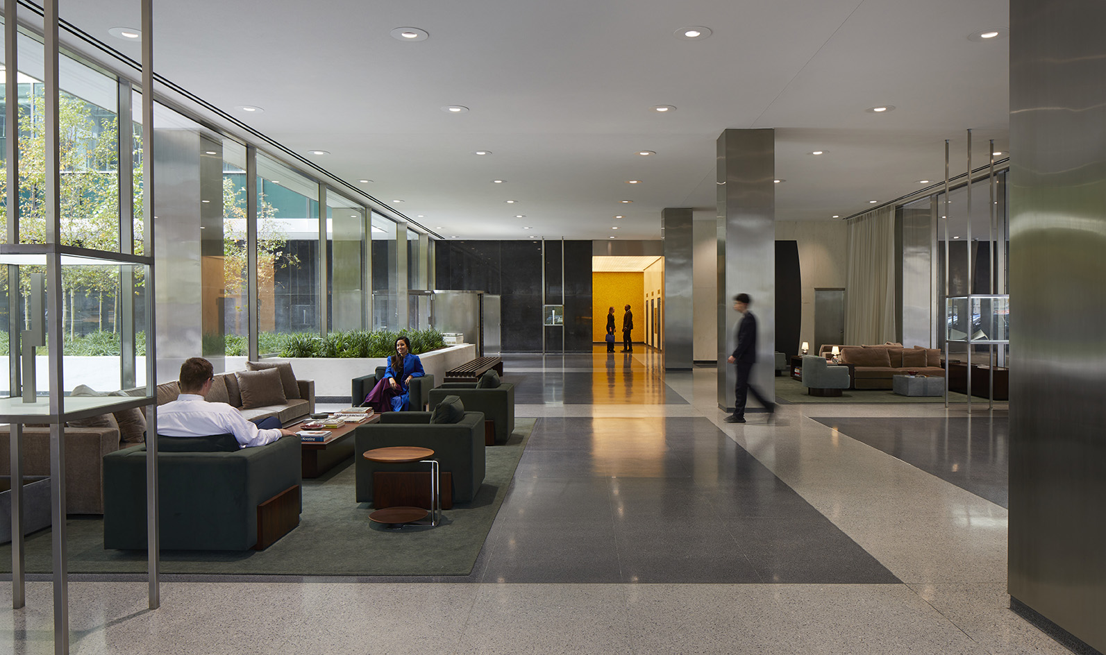
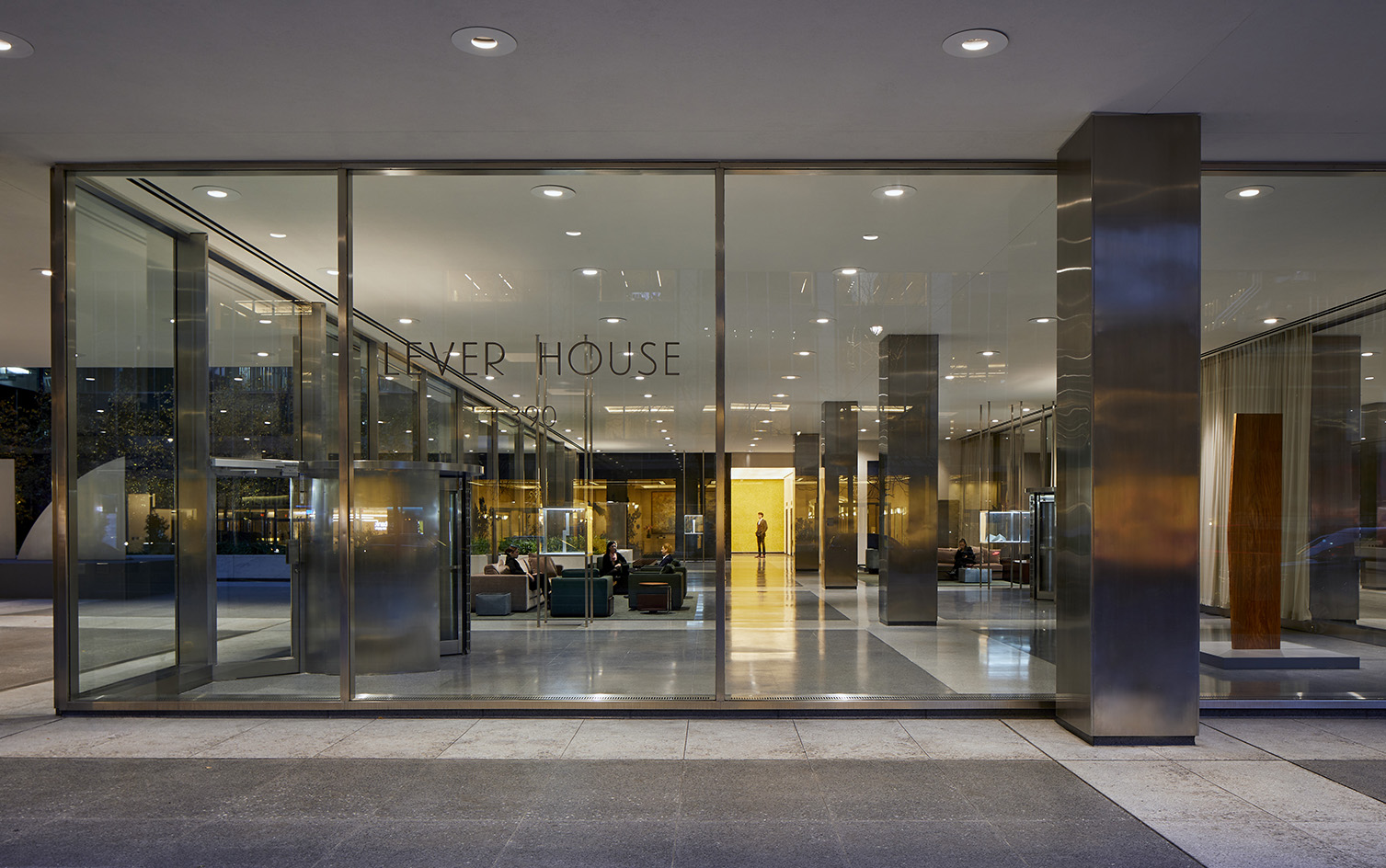
In the lobby – the most distinctive space in the Lever House – Mahan and his team worked like archivists and material scientists to restore the oxidised Champlain limestone walls to the inky sheen that would have been present in the 1950s and removed layers of yellowing lacquers from the white Danby marble around the elevator banks. Because they weren’t able to track down the Murano glassmakers who made the yellow mosaic tiles lining the far wall, they meticulously repaired any broken ones and colour-matched the grout.
Wallpaper* Newsletter
Receive our daily digest of inspiration, escapism and design stories from around the world direct to your inbox.
The space is just as it was in the 1950s, revolving doors, stainless-steel wrapped columns and all – aside from the new custom-designed velvet sofas and rosewood coffee tables and Ellsworth Kelly sculptures in the floating vitrines that once displayed Unilever products.
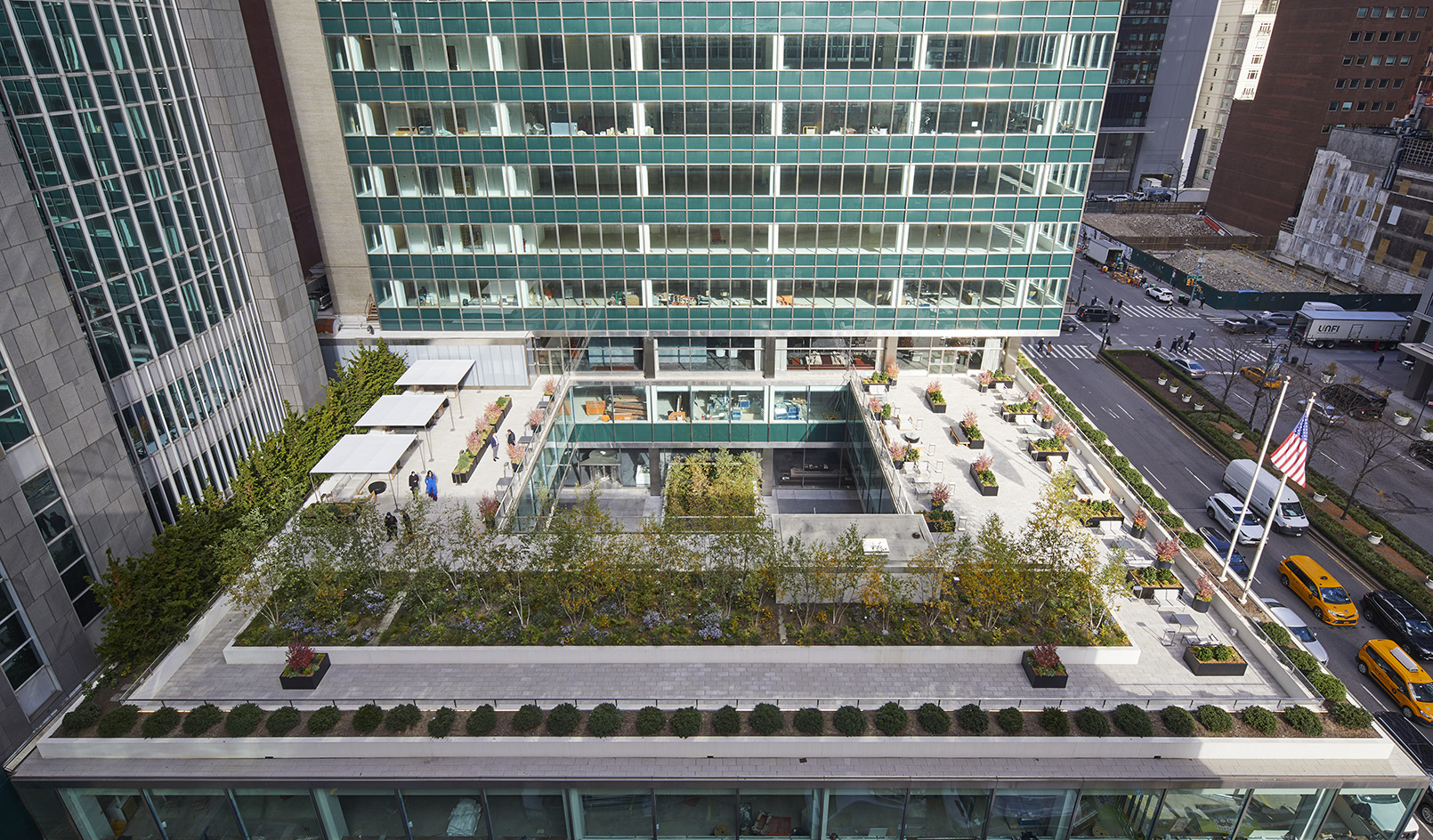
The most visible changes are on the third floor. The designers at Marmol Radziner were tasked with transforming what was once a staff cafeteria into a social club-like lounge for tenants. Upon exiting the elevators, you’re met with a hallway done up in leather that leads to a space furnished with green soapstone walls and marble floors (a nod to the facade’s hue), a rosewood bar that nods to the panelling in the original Four Seasons Restaurant, and a sculptural glass screen that offers privacy to banquettes behind it. The lounge opens to a roof terrace with landscaping by Reed Hildebrand that includes a grove of birch trees.
Even with record vacancies of Class A office space in New York, Brookfield Properties says the Lever House’s architectural history will become a 'trophy' to tenants who are looking for stylish status offices. ‘Only 15 to 20 tenants will be able to have the Lever House as an address,’ says Brookfield executive Sabrina Kanner. So far, three tenants have signed on and the largest floor has been leased.
Diana Budds is an independent design journalist based in New York
-
 Kapwani Kiwanga transforms Kvadrat’s Milan showroom with a prismatic textile made from ocean waste
The Canada-born artist draws on iridescence in nature to create a dual-toned textile made from ocean-bound plastic
By Ali Morris
-
 This new Vondom outdoor furniture is a breath of fresh air
Designed by architect Jean-Marie Massaud, the ‘Pasadena’ collection takes elegance and comfort outdoors
By Simon Mills
-
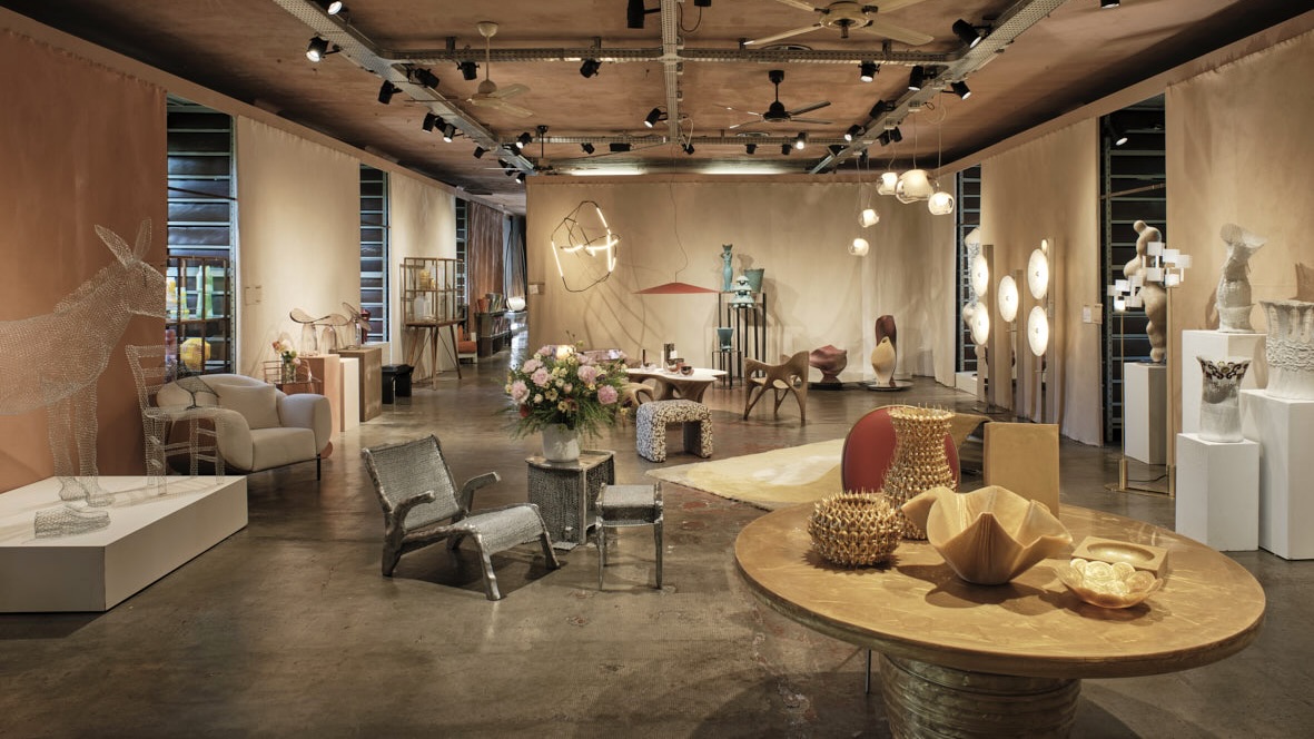 Eight designers to know from Rossana Orlandi Gallery’s Milan Design Week 2025 exhibition
Wallpaper’s highlights from the mega-exhibition at Rossana Orlandi Gallery include some of the most compelling names in design today
By Anna Solomon
-
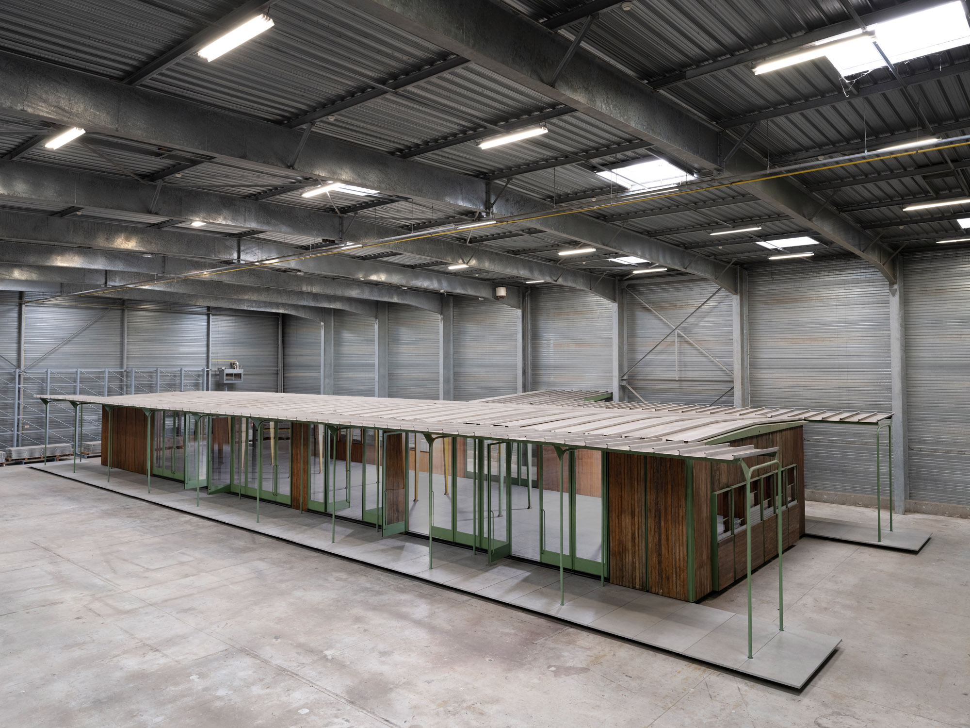 Croismare school, Jean Prouvé’s largest demountable structure, could be yours
Jean Prouvé’s 1948 Croismare school, the largest demountable structure ever built by the self-taught architect, is up for sale
By Amy Serafin
-
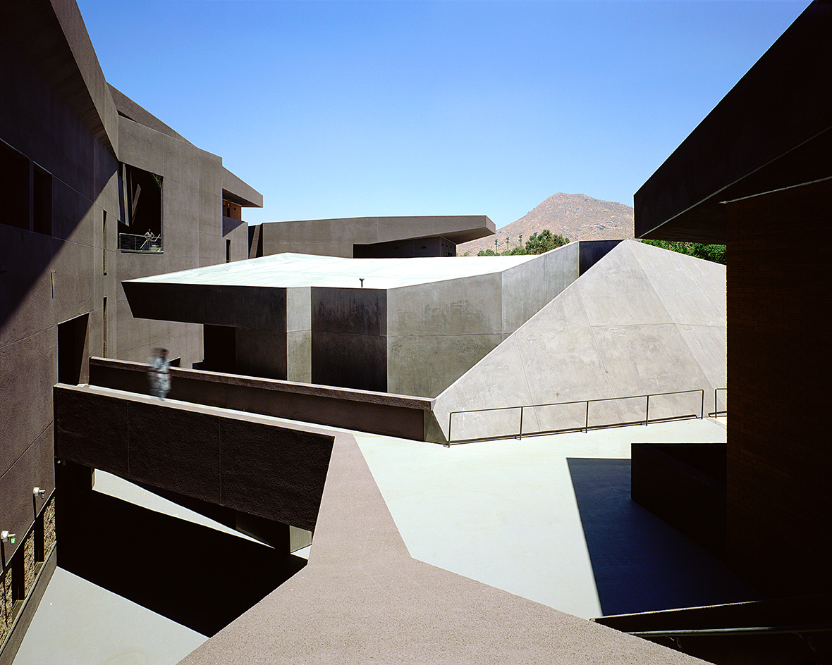 We explore Franklin Israel’s lesser-known, progressive, deconstructivist architecture
Franklin Israel, a progressive Californian architect whose life was cut short in 1996 at the age of 50, is celebrated in a new book that examines his work and legacy
By Michael Webb
-
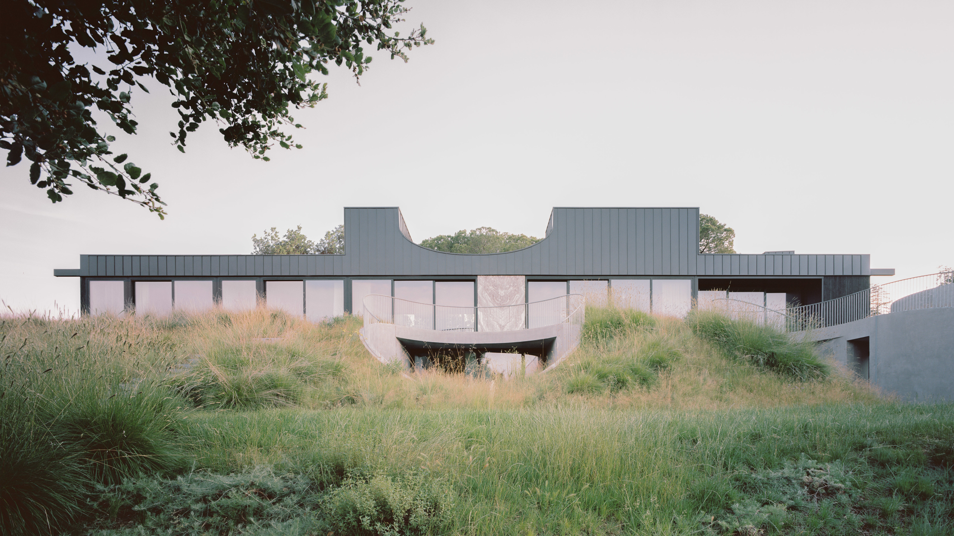 A new hilltop California home is rooted in the landscape and celebrates views of nature
WOJR's California home House of Horns is a meticulously planned modern villa that seeps into its surrounding landscape through a series of sculptural courtyards
By Jonathan Bell
-
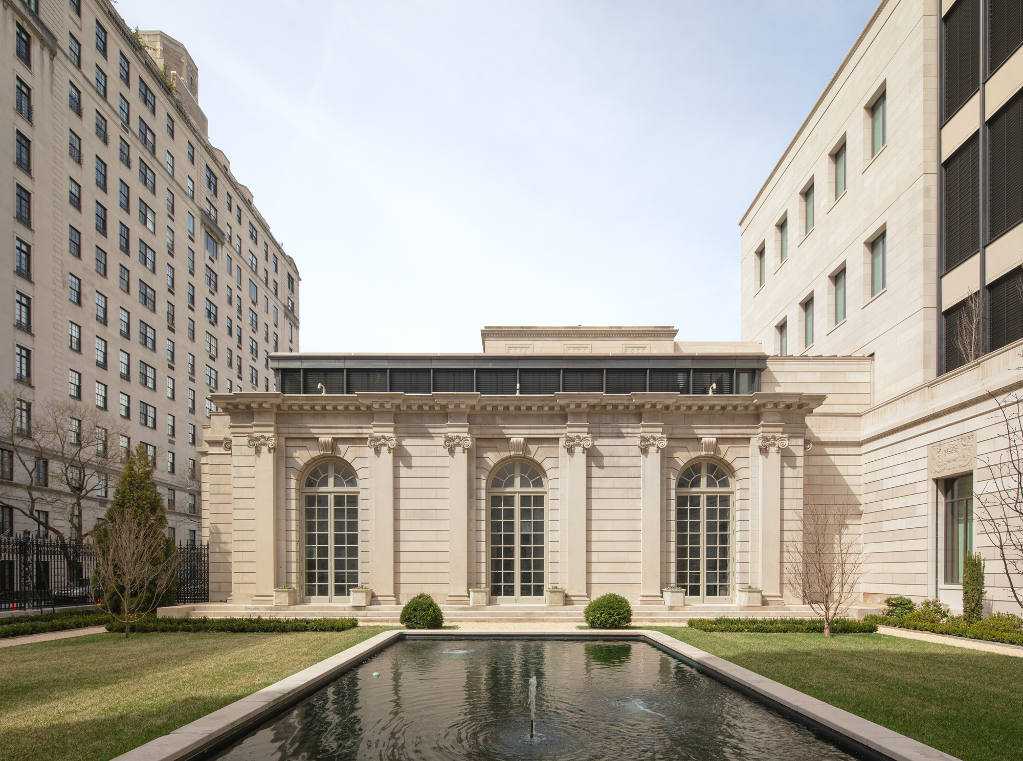 The Frick Collection's expansion by Selldorf Architects is both surgical and delicate
The New York cultural institution gets a $220 million glow-up
By Stephanie Murg
-
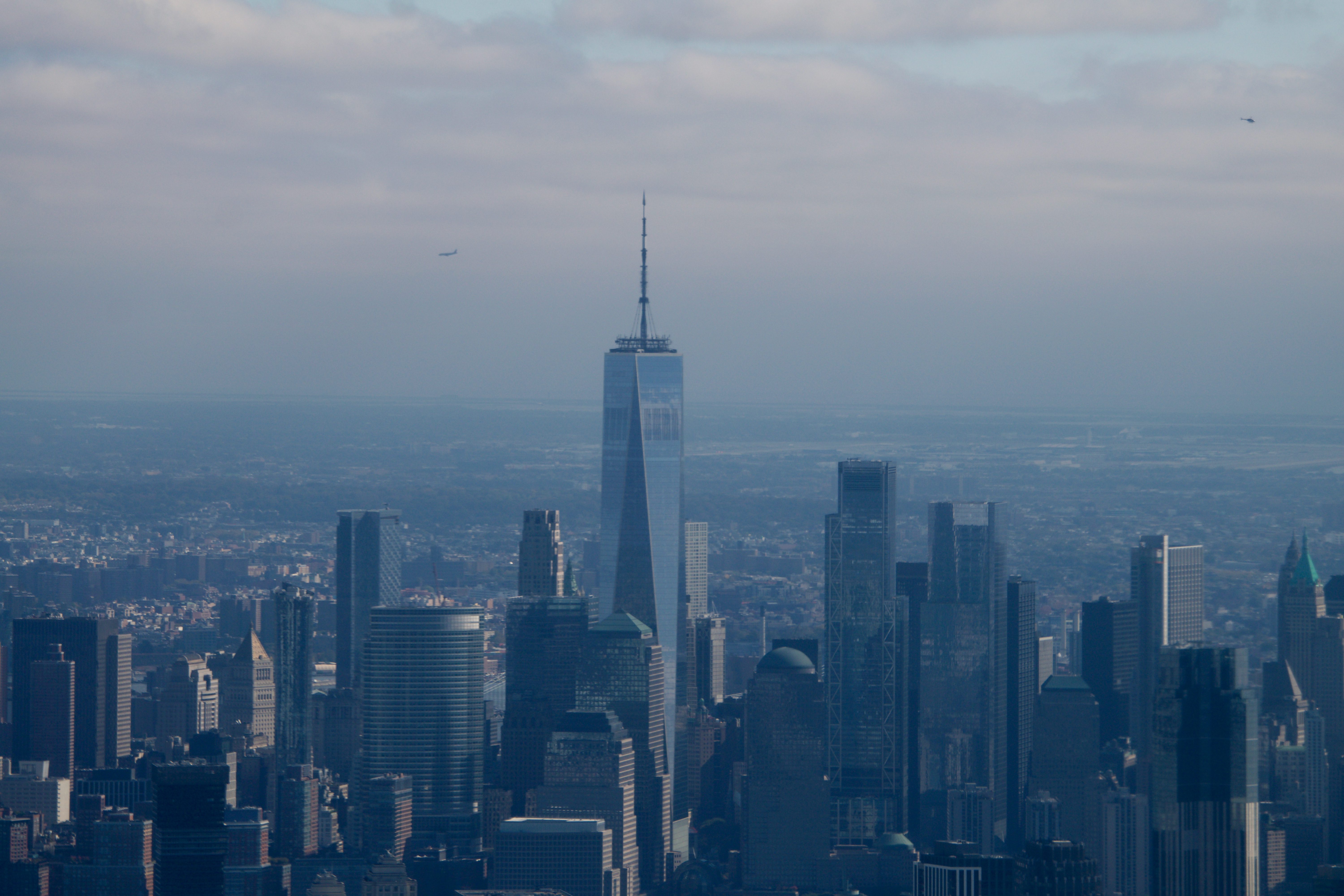 Remembering architect David M Childs (1941-2025) and his New York skyline legacy
David M Childs, a former chairman of architectural powerhouse SOM, has passed away. We celebrate his professional achievements
By Jonathan Bell
-
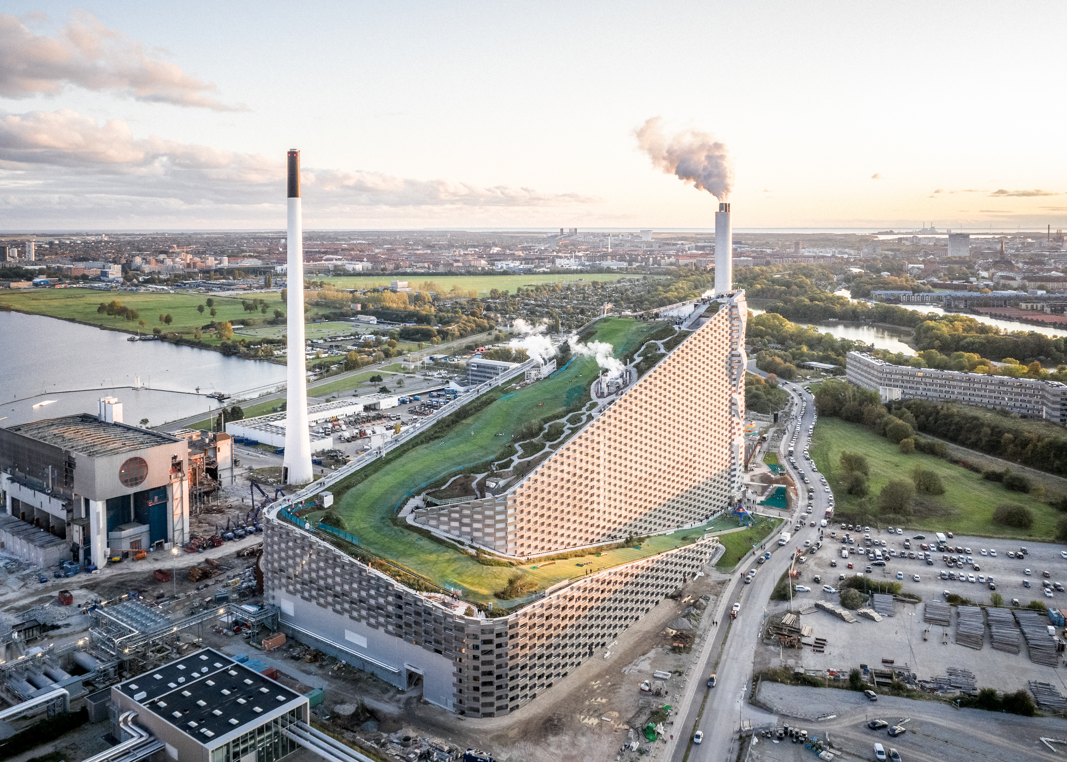 What is hedonistic sustainability? BIG's take on fun-injected sustainable architecture arrives in New York
A new project in New York proves that the 'seemingly contradictory' ideas of sustainable development and the pursuit of pleasure can, and indeed should, co-exist
By Emily Wright
-
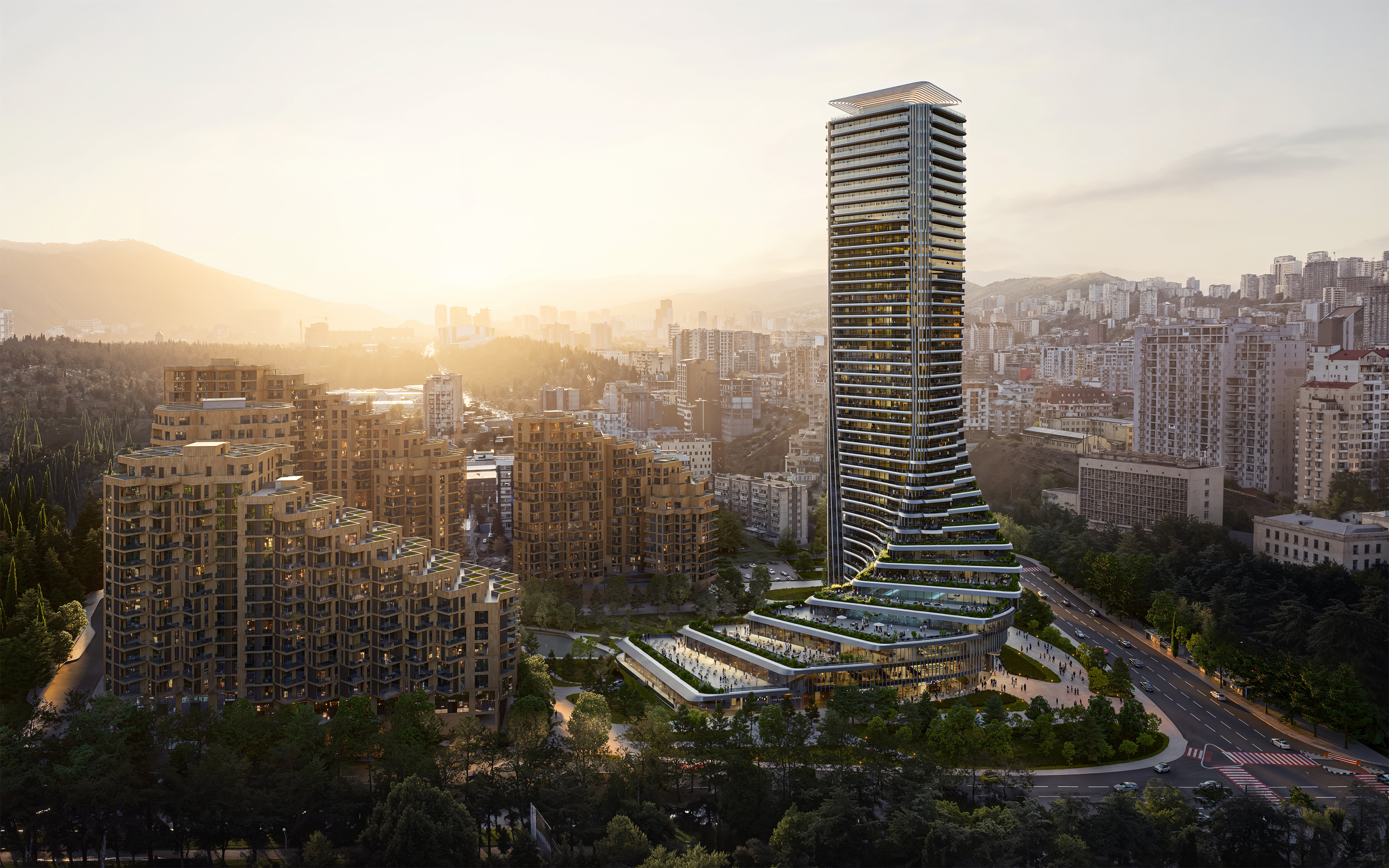 The upcoming Zaha Hadid Architects projects set to transform the horizon
A peek at Zaha Hadid Architects’ future projects, which will comprise some of the most innovative and intriguing structures in the world
By Anna Solomon
-
 Frank Lloyd Wright’s last house has finally been built – and you can stay there
Frank Lloyd Wright’s final residential commission, RiverRock, has come to life. But, constructed 66 years after his death, can it be considered a true ‘Wright’?
By Anna Solomon