Like brother, like sister: two siblings design two new Los Angeles homes
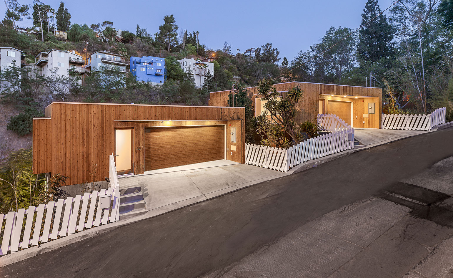
Anonymous Architects are no strangers to outwitting building rules and regulations - take for example their upside down Car Park House in LA, where residents drive straight onto the roof, eliminating the need for a garage or an unsightly parking space. But their most recent project, the Brother and Sister House, may be their most intelligent design yet.
Architect Simon Storey collaborated with his sister Anna Gregory to design the aptly named Brother and Sister houses, located in the hills of Los Angeles. The two almost identical houses are built on adjacent plots and separated by a quirky take on the white picket fence.
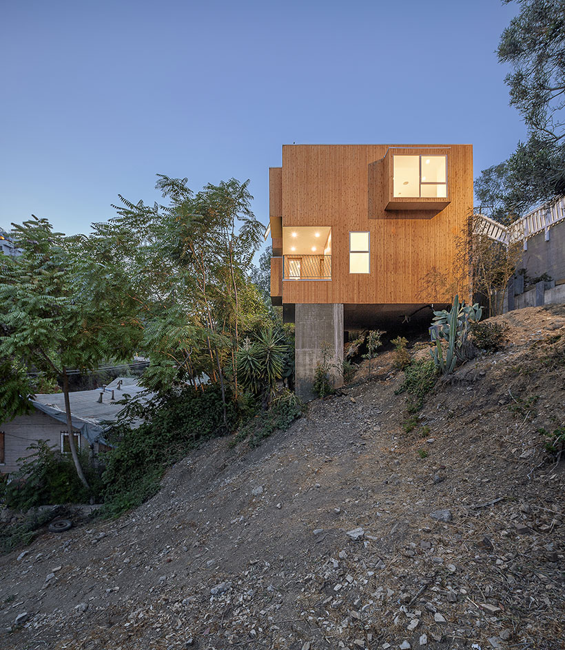
This project embodies Anonymous' signature simple yet thoughtful design. The complex's modest cedar cladding eschews any extravagance and allows the buildings to interact sensitively with their tree-filled site. The two volumes are cantilevered on concrete blocks, lightly floating above the ground, thus preserving much-coveted garden space beneath the houses.
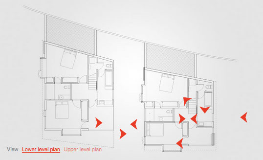
Take an interactive tour of Brother & Sister House
The main challenge facing the architects was the small size of the plots, measuring roughly 200 square metres each. 'Often building code limitations are so great there is little to no freedom to control the footprint of the building', explains Storey. Here however, in true Anonymous style, the team worked its way around this restriction.
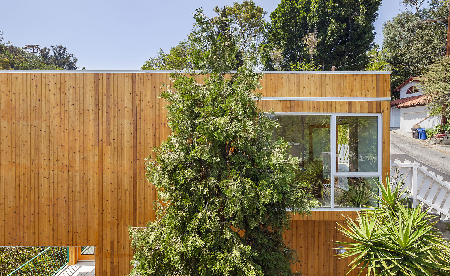
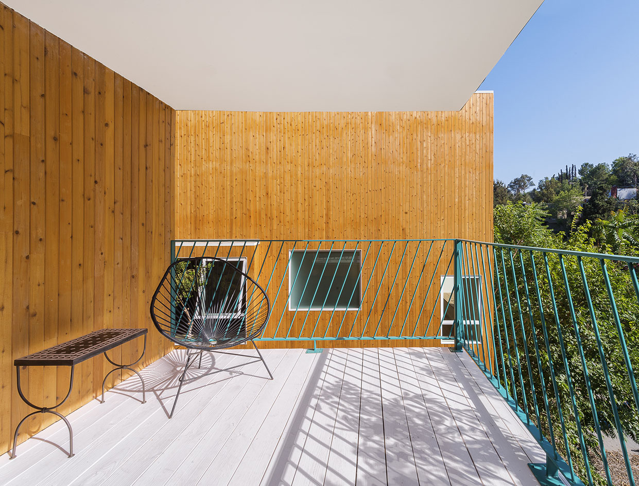
The two designs started off as two simple box shapes. By punching large windows out of each main volume's thick walls, the architects increased the houses' internal space by 10%, transforming them into pieces of furniture the owners can use. Protruding bay windows reach out and embrace the landscape, allowing residents to feel part of their surroundings. Similarly, a rectangular shape cut out of each box creates a sheltered outdoor living area, useable come rain or shine.
Inside, wood remains the star of the show. Storey explains that 'the main goal for the design was to make a small building feel large', and by using the same white oak for the floors, cabinets and doors, the architects create the illusion of a much larger space. The rough concrete walls in the bedroom bring the outside in, drawing on the external concrete pillars whilst adding to interior's natural, tactile feel. The beauty of these houses comes not from superfluous, space-consuming ornamentation but instead from the simplicity of necessity.
The houses are entered via the top floor and a narrow entrance corridor that leads into one light-filled living-cum-dining space. The architects wanted to 'allow as much natural light as possible to penetrate the house' and this is witnessed downstairs, where light passes through the bathroom and floods into the hallway, making this often-enclosed space feel bright and roomy. Two bedrooms off this hallway offer a cosier, more private space for the owners - who can still remain connected to the surroundings via the large openings that frame the trees.
The architects cleverly push bay windows out of the boxy houses to increase interior space without infringing on the building restrictions of the small plot
Clad in cedar, the houses sit naturally in the woody landscape
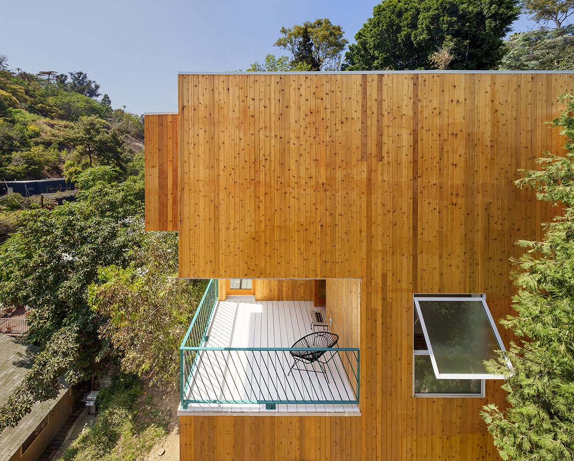
A cut out balcony area offers a sheltered outdoor space to relax and enjoy the views come rain or shine
The Brother & Sister Houses cantilever over a steep slope in Los Angeles, freeing up the space below for a garden area
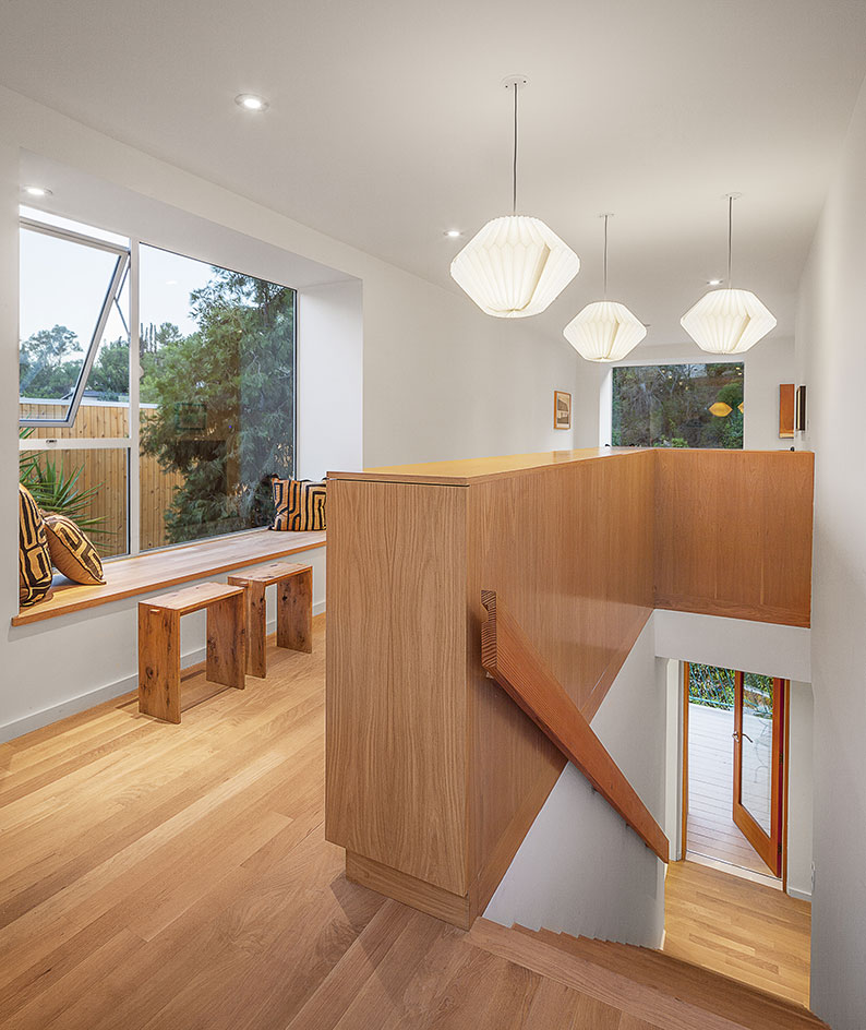
Wood is the star of the show, both inside and out
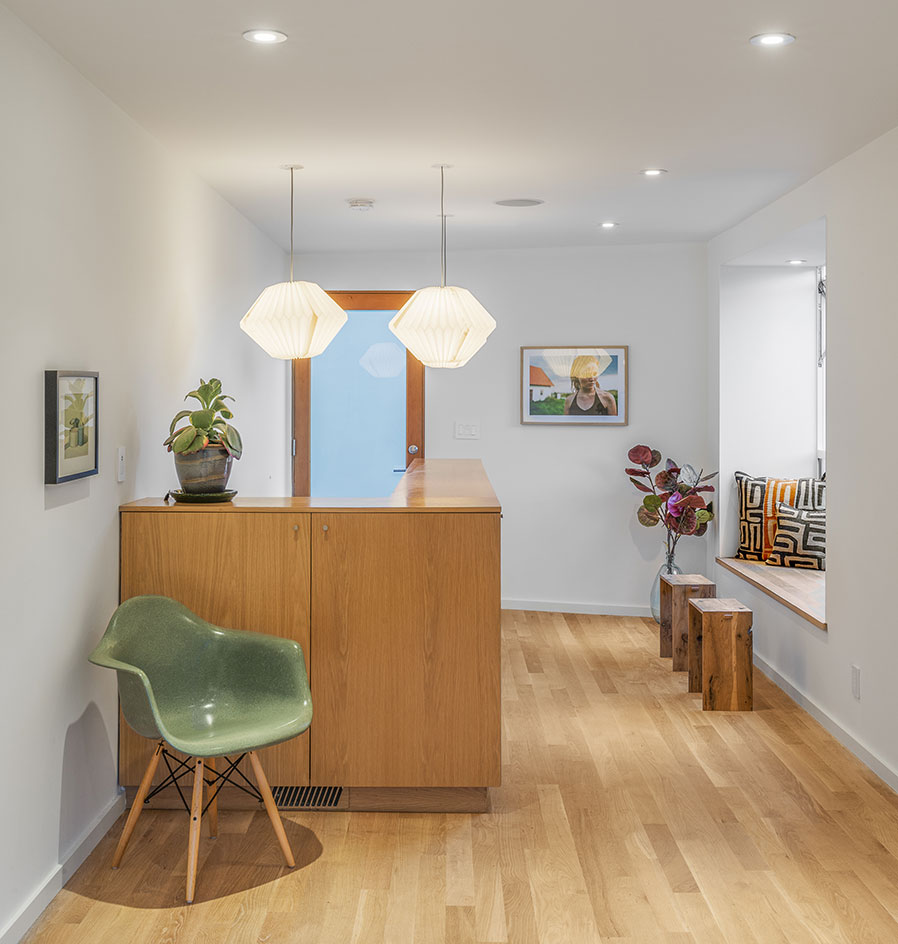
By keeping the design minimal, the house becomes a celebration of natural materials
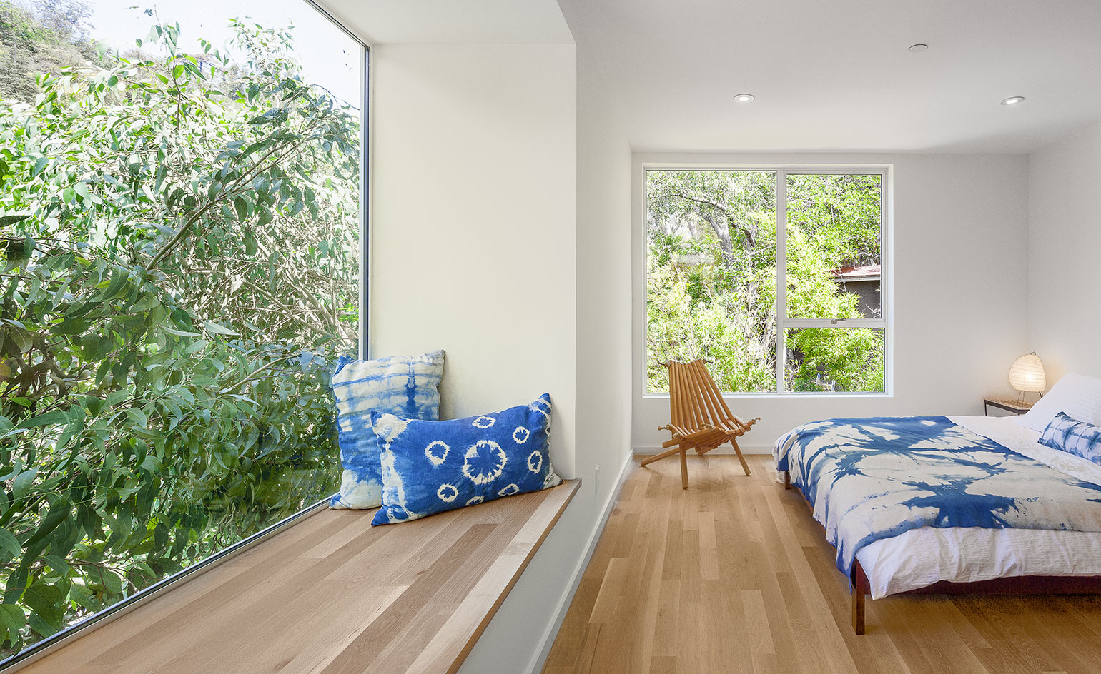
The windows become useable spaces, where occupants can eat and even sleep amongst the treetops
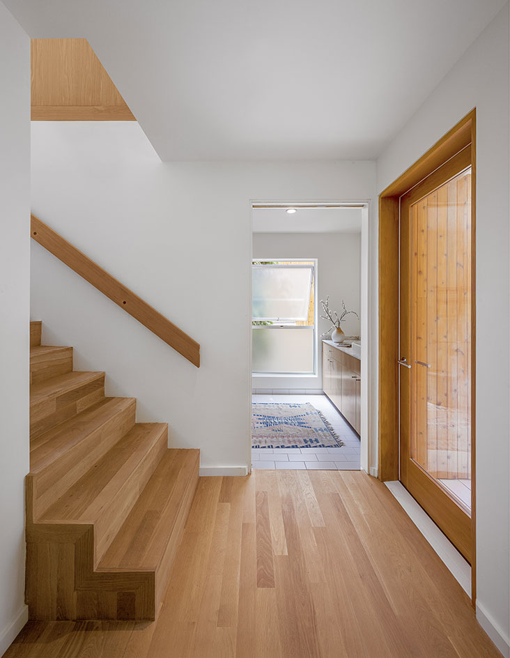
A well positioned window in the bathroom allows the light to flood through into the downstairs corridor
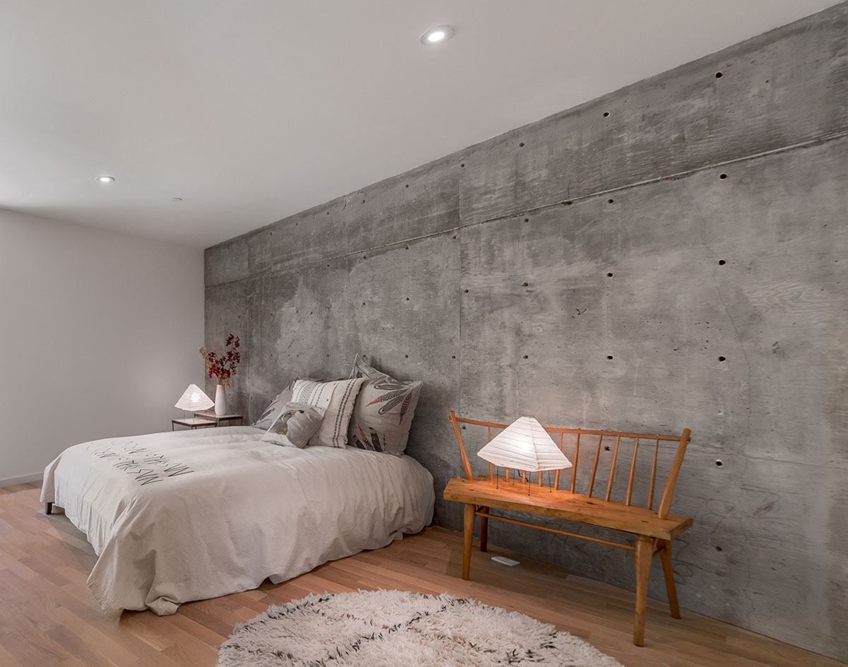
The tactile concrete wall in the bedroom mirrors the rocky surroundings of the site
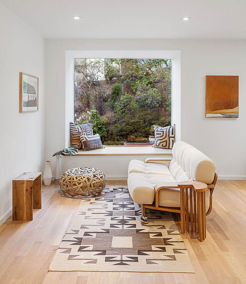
The large square windows frame the landscape and allow natural light to flood the spaces, making the house feel brighter and larger
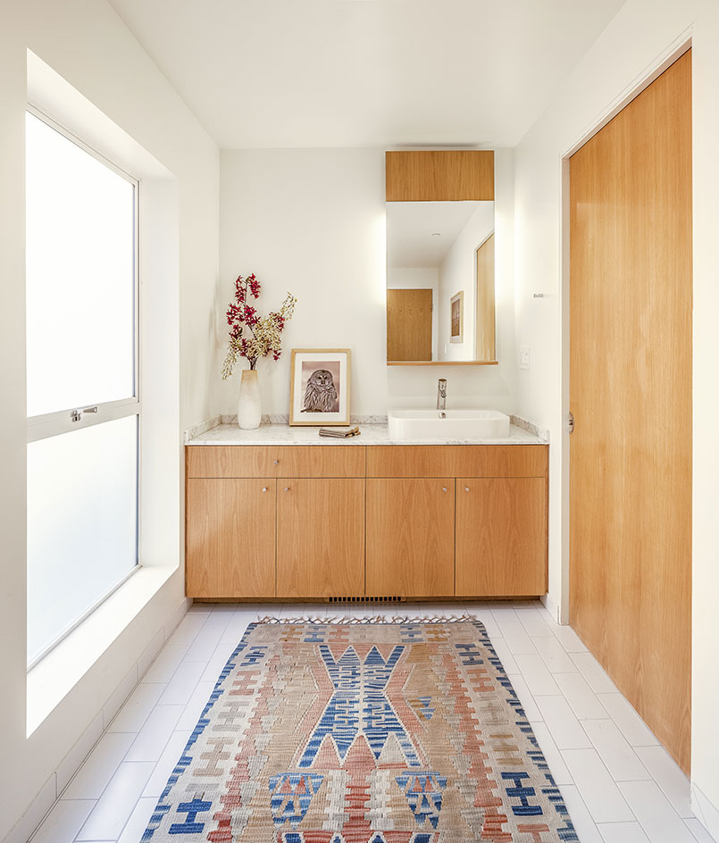
A mix of marble and wood creates a feeling of modest luxury in the bathroom
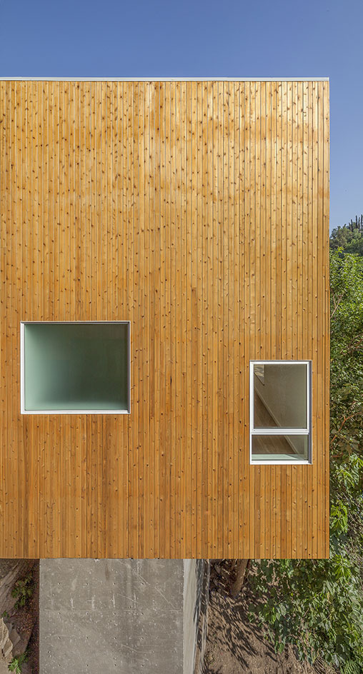
The architect makes the most of the small plots and creates maximum internal space by using a simple box-shaped design
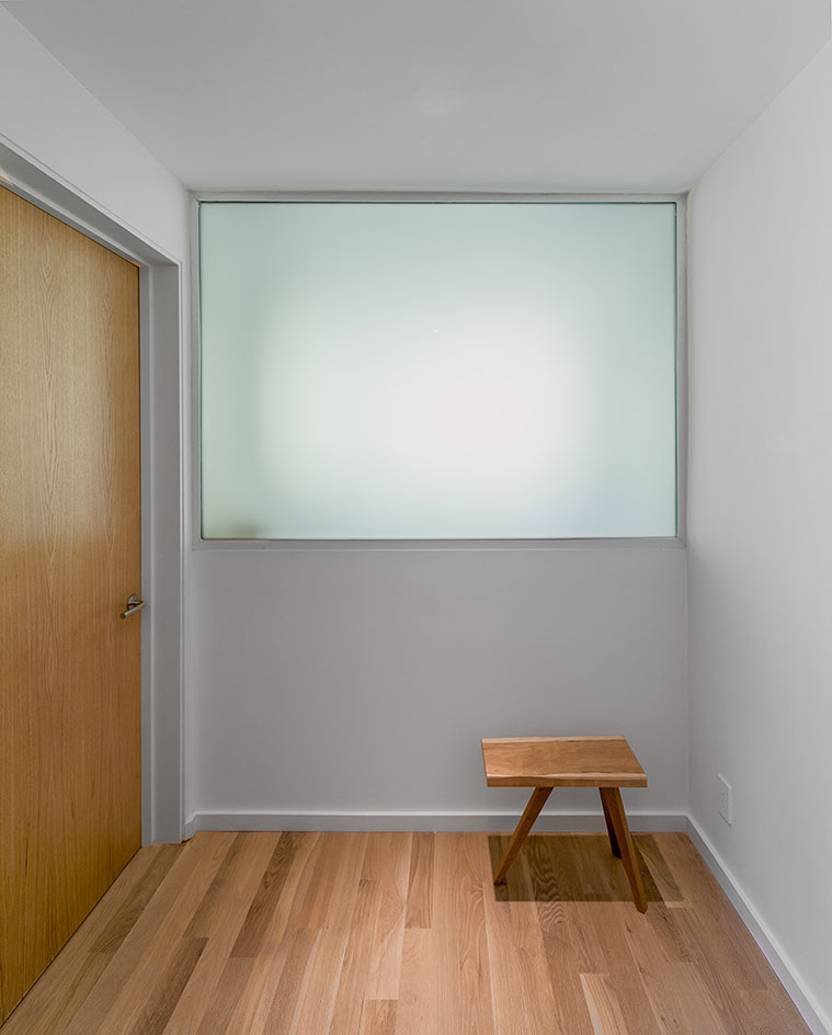
Frosted windows allow as much light as possible to enter the spaces, while maintaining privacy
Wallpaper* Newsletter
Receive our daily digest of inspiration, escapism and design stories from around the world direct to your inbox.
-
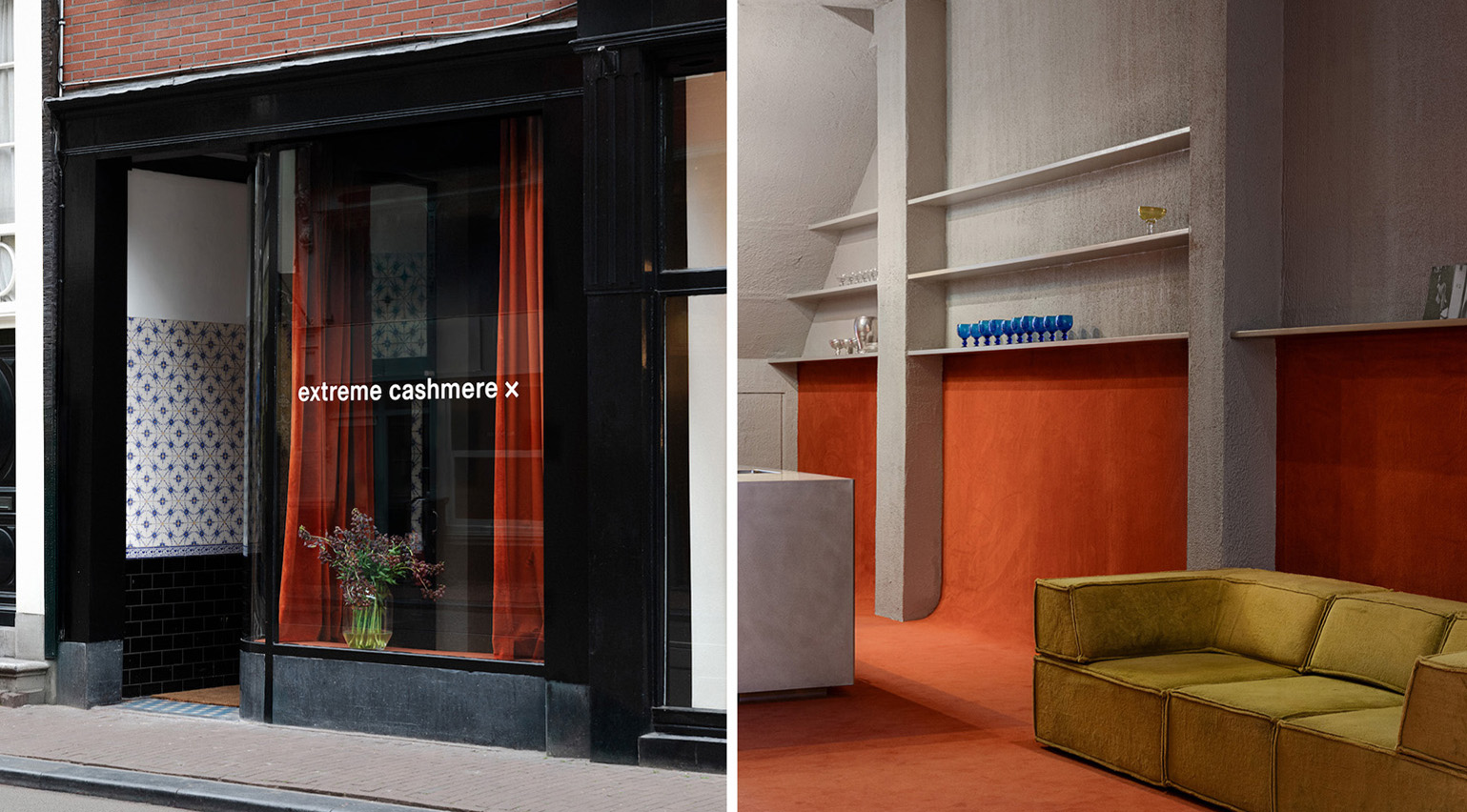 Extreme Cashmere reimagines retail with its new Amsterdam store: ‘You want to take your shoes off and stay’
Wallpaper* takes a tour of Extreme Cashmere’s new Amsterdam store, a space which reflects the label’s famed hospitality and unconventional approach to knitwear
By Jack Moss
-
 Titanium watches are strong, light and enduring: here are some of the best
Brands including Bremont, Christopher Ward and Grand Seiko are exploring the possibilities of titanium watches
By Chris Hall
-
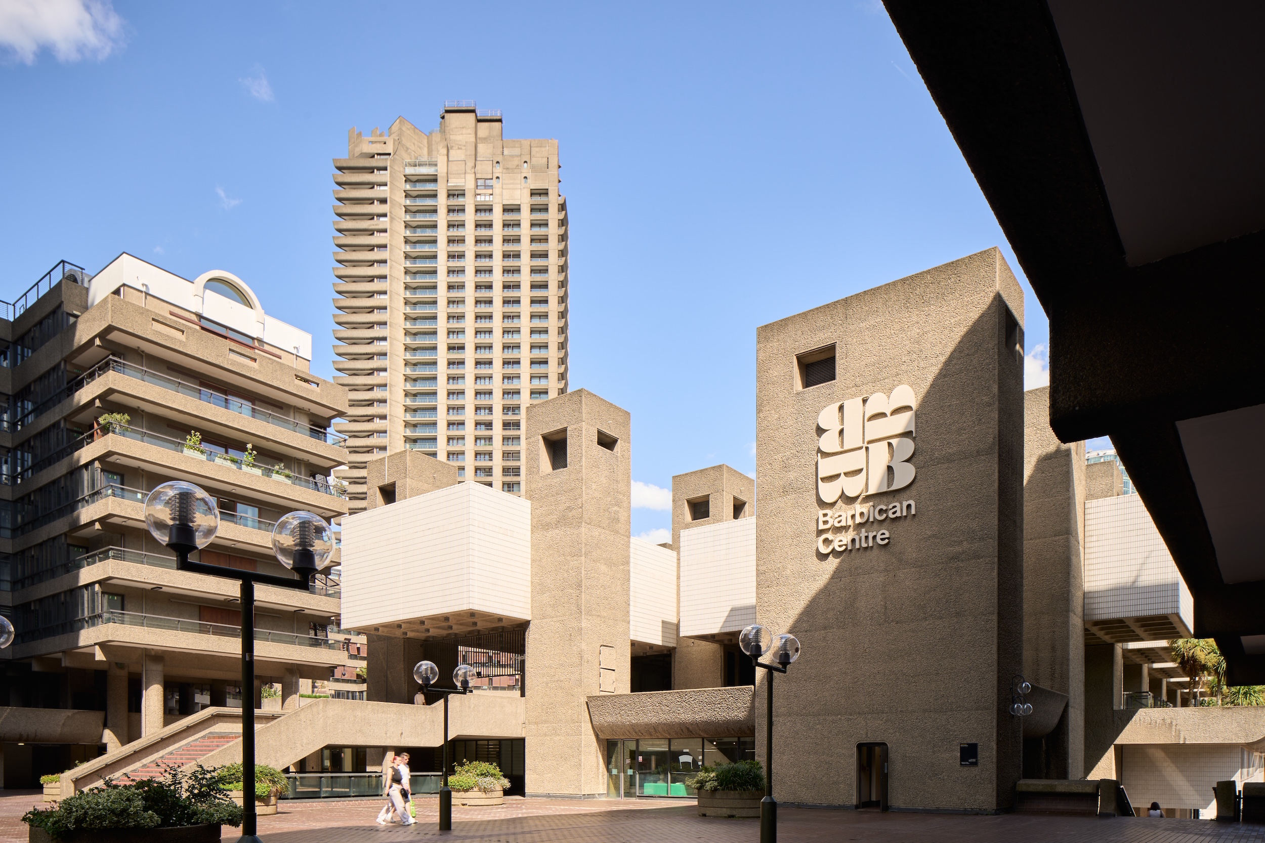 Warp Records announces its first event in over a decade at the Barbican
‘A Warp Happening,' landing 14 June, is guaranteed to be an epic day out
By Tianna Williams
-
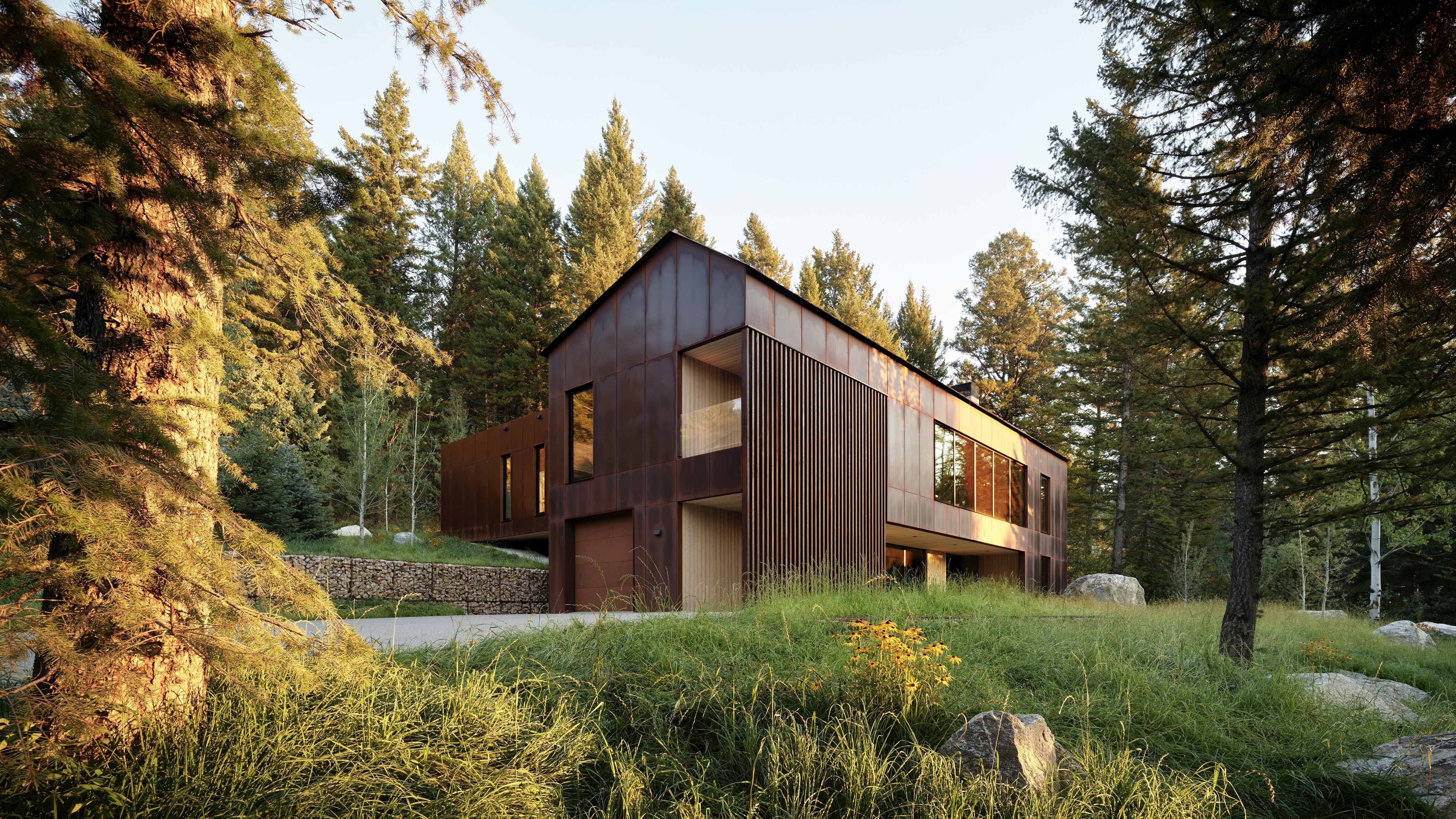 This minimalist Wyoming retreat is the perfect place to unplug
This woodland home that espouses the virtues of simplicity, containing barely any furniture and having used only three materials in its construction
By Anna Solomon
-
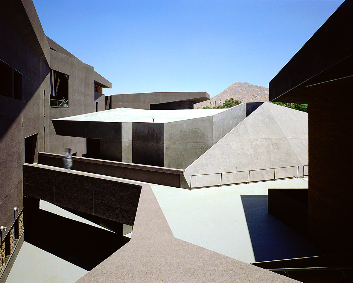 We explore Franklin Israel’s lesser-known, progressive, deconstructivist architecture
Franklin Israel, a progressive Californian architect whose life was cut short in 1996 at the age of 50, is celebrated in a new book that examines his work and legacy
By Michael Webb
-
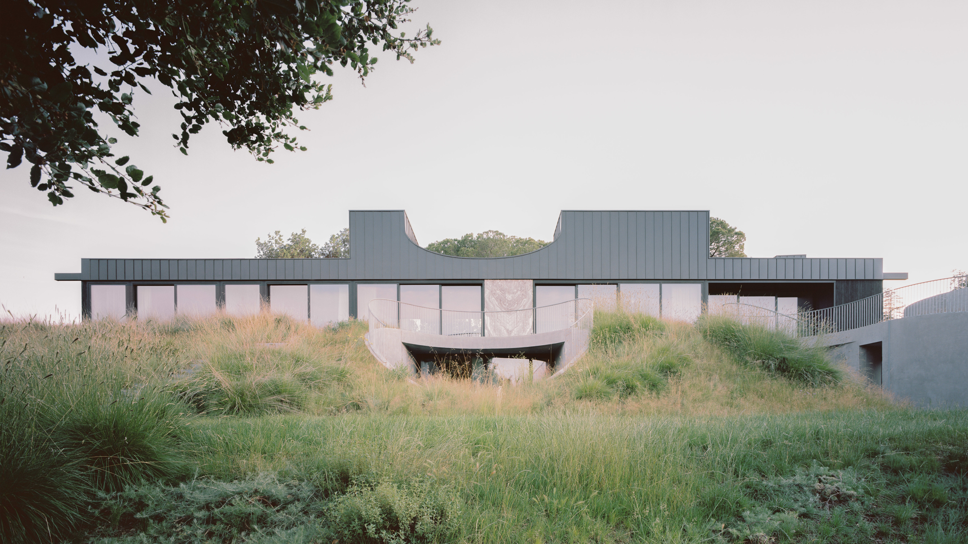 A new hilltop California home is rooted in the landscape and celebrates views of nature
WOJR's California home House of Horns is a meticulously planned modern villa that seeps into its surrounding landscape through a series of sculptural courtyards
By Jonathan Bell
-
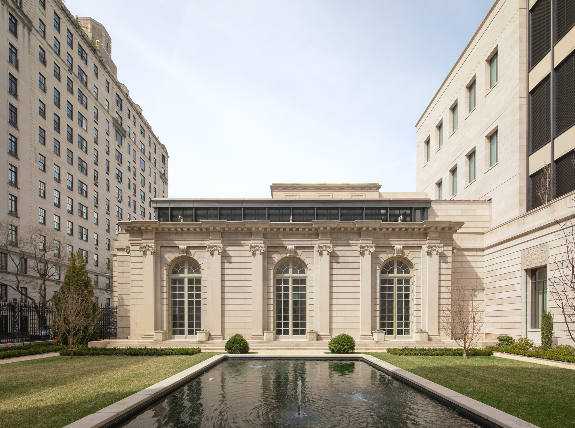 The Frick Collection's expansion by Selldorf Architects is both surgical and delicate
The New York cultural institution gets a $220 million glow-up
By Stephanie Murg
-
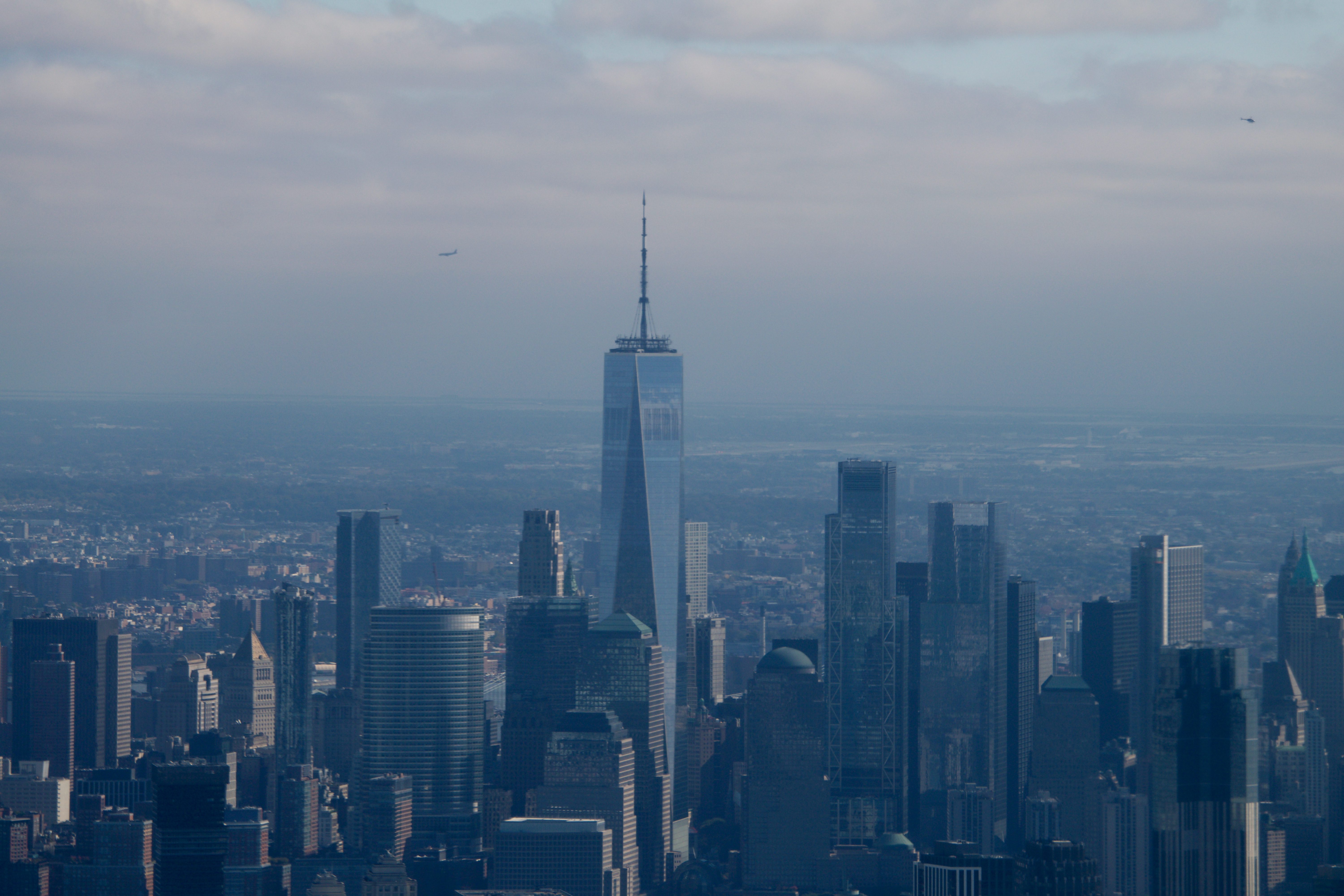 Remembering architect David M Childs (1941-2025) and his New York skyline legacy
David M Childs, a former chairman of architectural powerhouse SOM, has passed away. We celebrate his professional achievements
By Jonathan Bell
-
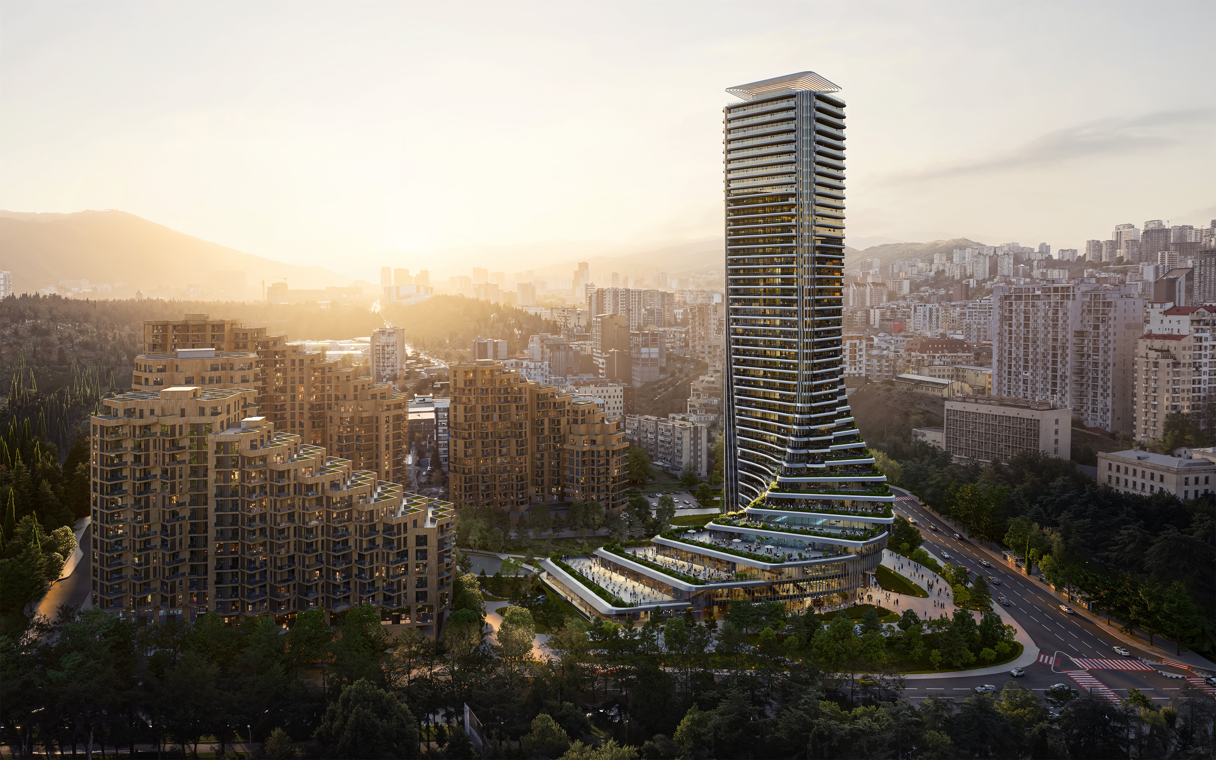 The upcoming Zaha Hadid Architects projects set to transform the horizon
A peek at Zaha Hadid Architects’ future projects, which will comprise some of the most innovative and intriguing structures in the world
By Anna Solomon
-
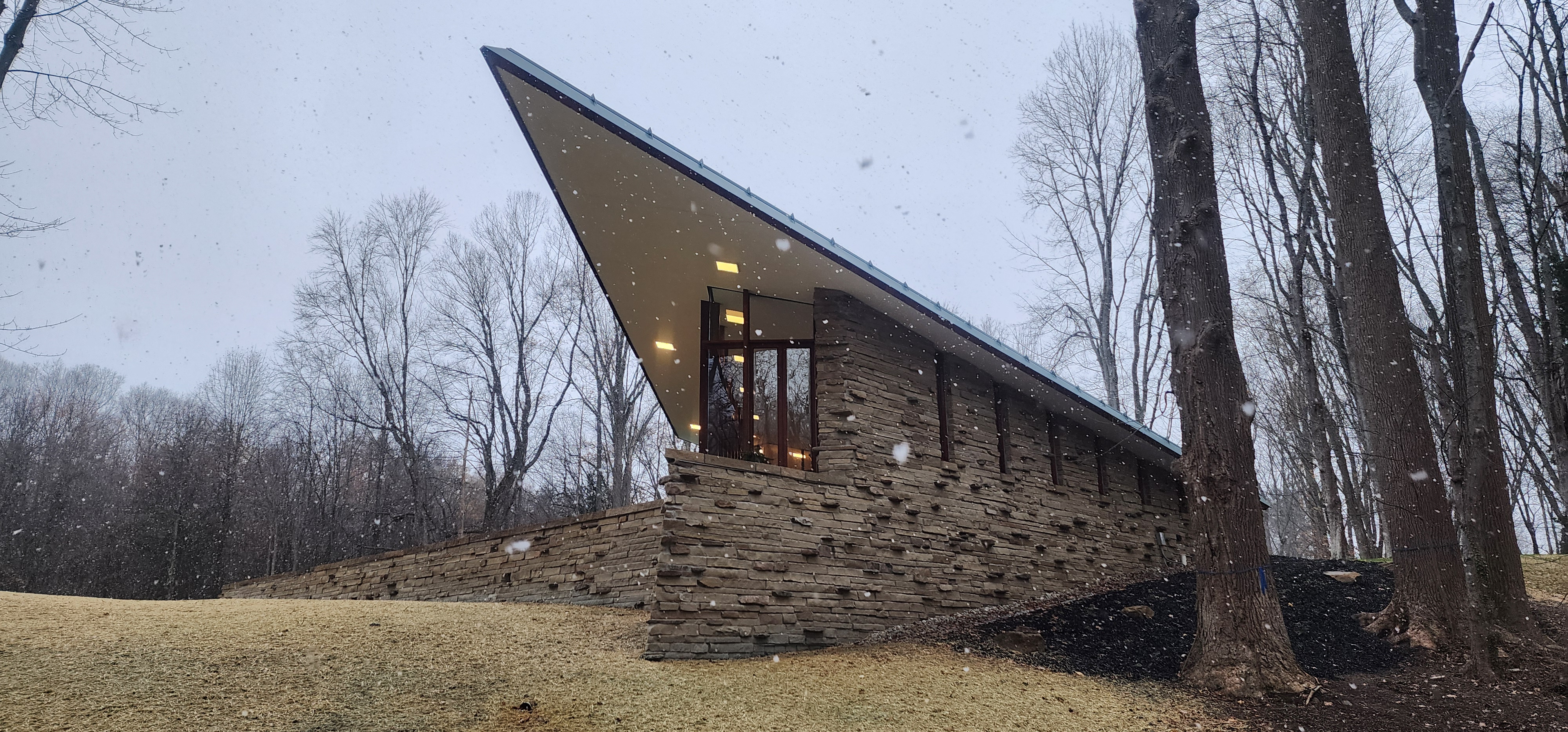 Frank Lloyd Wright’s last house has finally been built – and you can stay there
Frank Lloyd Wright’s final residential commission, RiverRock, has come to life. But, constructed 66 years after his death, can it be considered a true ‘Wright’?
By Anna Solomon
-
 Heritage and conservation after the fires: what’s next for Los Angeles?
In the second instalment of our 'Rebuilding LA' series, we explore a way forward for historical treasures under threat
By Mimi Zeiger