Lloyd Wright’s reinvigorated Sowden House in Los Angeles
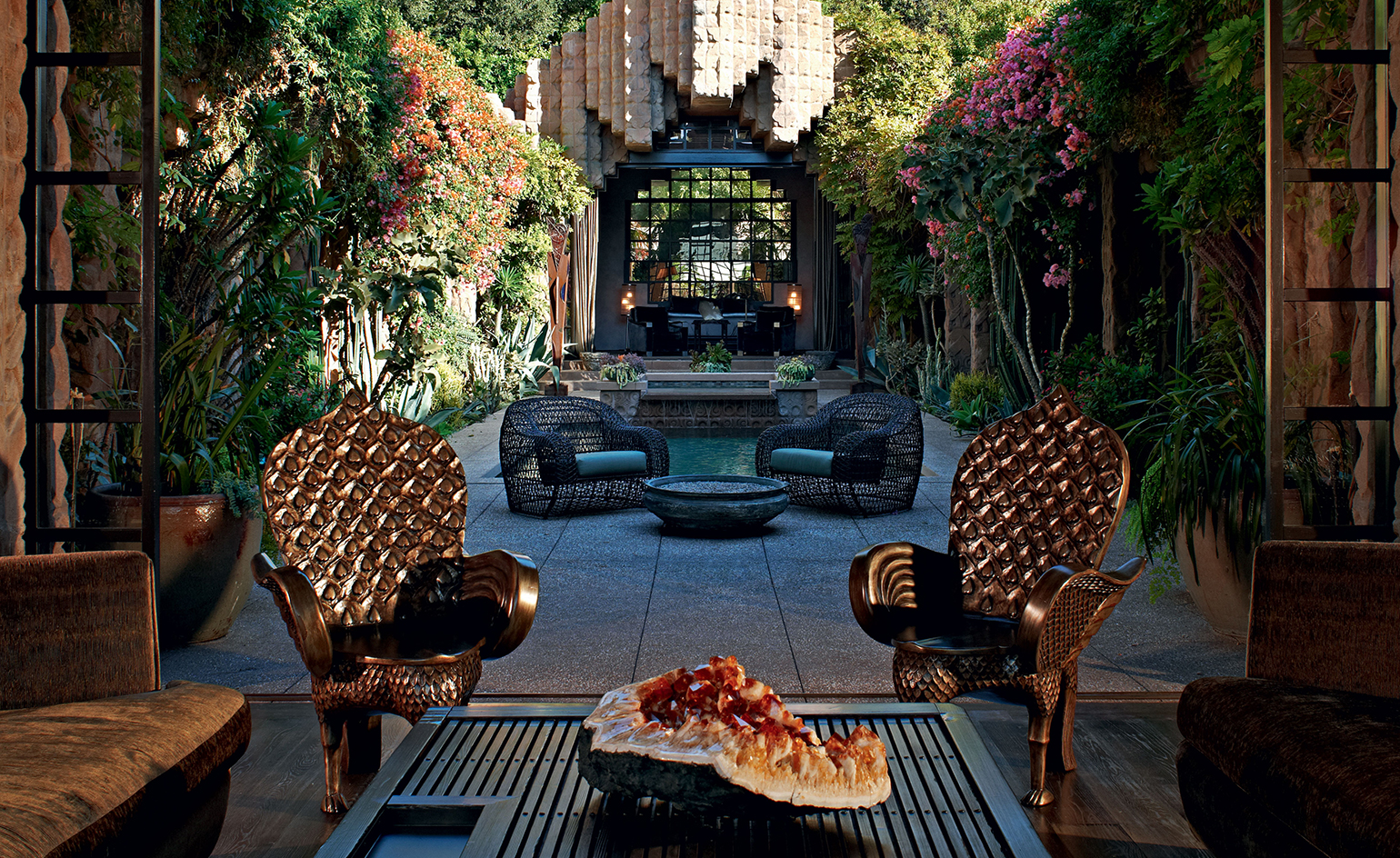
Frank Lloyd Wright once said: ‘Tip the world on its side and everything loose will land in Los Angeles.’ The famously autocratic architect and philanderer may have pooh-poohed the city as a cultural wasteland, but it was there, under the glaring Southern Californian sun, that he built some of the greatest houses of the 20th century.
It was also in Los Angeles, under the same unforgiving sun, that Frank Lloyd Wright Jr attempted to step out from his father’s shadow and establish an independent identity as an architect. He wasn’t very successful. The feeble gesture of dropping the ‘Frank’ and ‘Jr’ from his name failed, predictably to distinguish Lloyd Wright from his grandiose progenitor. Furthermore, throughout his long career, the younger Wright never managed to define a personal style that did not echo, in both sensibility and detail, the work of dear old Dad. It’s no wonder that local LA lore frequently confuses houses designed by Wrights père et fils.
In the early 1920s, Lloyd Wright served as construction manager on three of his father’s classic Mayan-flavoured, concrete-block houses – the Storer House, the Freeman House and the Ennis House (which notably appeared in Blade Runner as the set for Harrison Ford’s apartment). A few years after the completion of those landmarks, the younger Wright made an architectural splash of his own with a daring homage in the LA neighbourhood of Los Feliz.
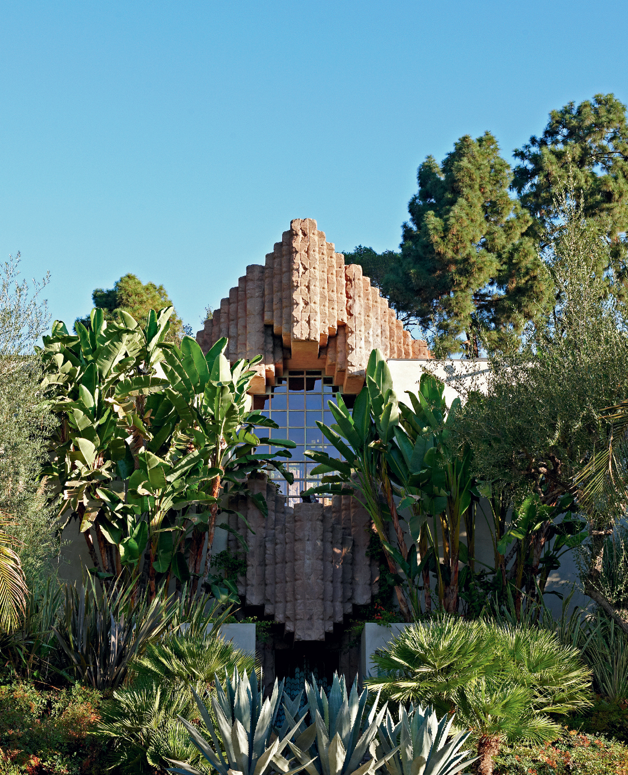
Inspired by ancient Mayan pyramids, the façade’s sandy concrete blocks emerge from a lush Californian garden.
The Sowden House of 1926 gives a nod to the ancient temple references of its forebears, but makes them decidedly more explicit. With its symmetrical façade crowned by a prow of heavily worked concrete and its grand entry stair that leads from the street through a jungle landscape, the structure emerges like a ruined temple nestled in a primordial forest – Angkor Wat by way of Hollywood Boulevard. The formal entry progression leads through a set of copper gates, up another internal staircase and eventually arrives at the threshold proper, where the architectural drama unfolds in one theatrical sweep of space: two peaked pavilions, made of stepped concrete blocks, connected by two low arcades, wrapped around a lushly planted courtyard cloister.
Like so many of Los Angeles’ architectural treasures, the Sowden House had fallen on hard times by the close of the last century. When LA-based designer and developer Xorin Balbes acquired the property in 2001, the immediate need for structural repairs forestalled any questions regarding decoration or aesthetic direction.
‘It was a ruin in more than just a figurative sense,’ says Balbes. ‘We spent two years re-solidifying the porous concrete block, rebuilding the foundations and perimeter walls, and replacing every building system. The enormous amount of work makes you understand why people are often reluctant to undertake this kind of rescue project. But this house called out to me from the moment I stepped inside.’
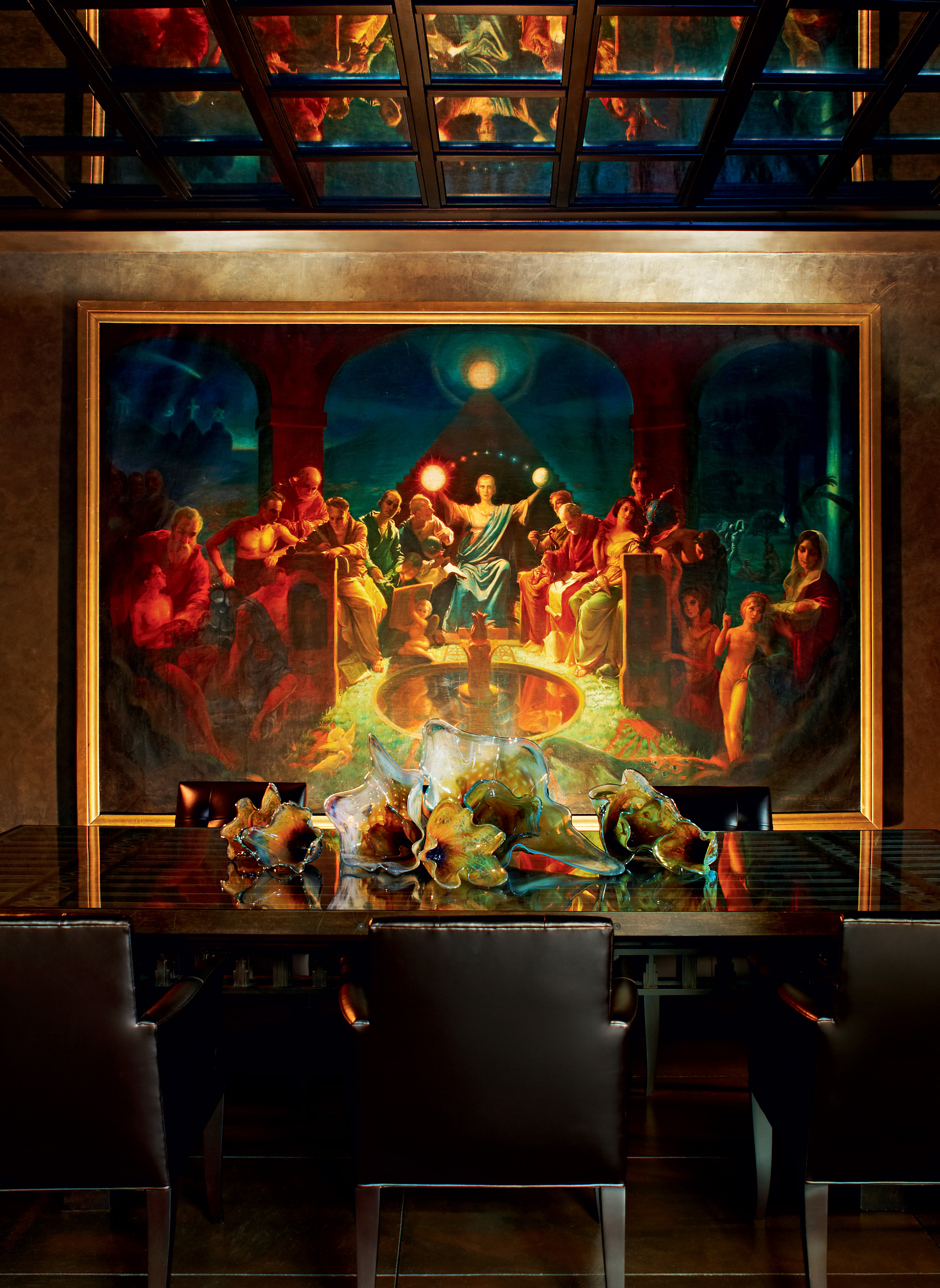
The dining room is dominated by an Alexander Rosenfeld painting depicting different religions coming together as one and a 20th-century glass centrepiece by Lucy Chamberlain.
Balbes worked with Paul Ashley and Norm Wogan, his design partners at the aptly named firm TempleHome, to prepare the house for a meaningful existence in the 21st century. In addition to remedial work on the structure, the team made significant changes to the plan to reflect the needs of a contemporary household. The servants’ wing was transformed into dining, kitchen and lounge spaces, and connected to the courtyard through new openings between the concrete columns. At the far end of the courtyard, under the prow of the second pavilion, an erstwhile studio space was turned into the master bedroom, which, elevated on three broad steps, appears to be the high altar of this temple fantasy.
As for the interiors, Balbes confesses that his original decorative scheme was a bit tame and deferential. ‘I was really intimidated by the pedigree of the house, which suppressed my own creative energy,’ he says. ‘I lived here for six years after the first renovation and over time my sensibilities changed and my confidence grew. I finally felt like I could create interiors that has as much presence as the architecture.’
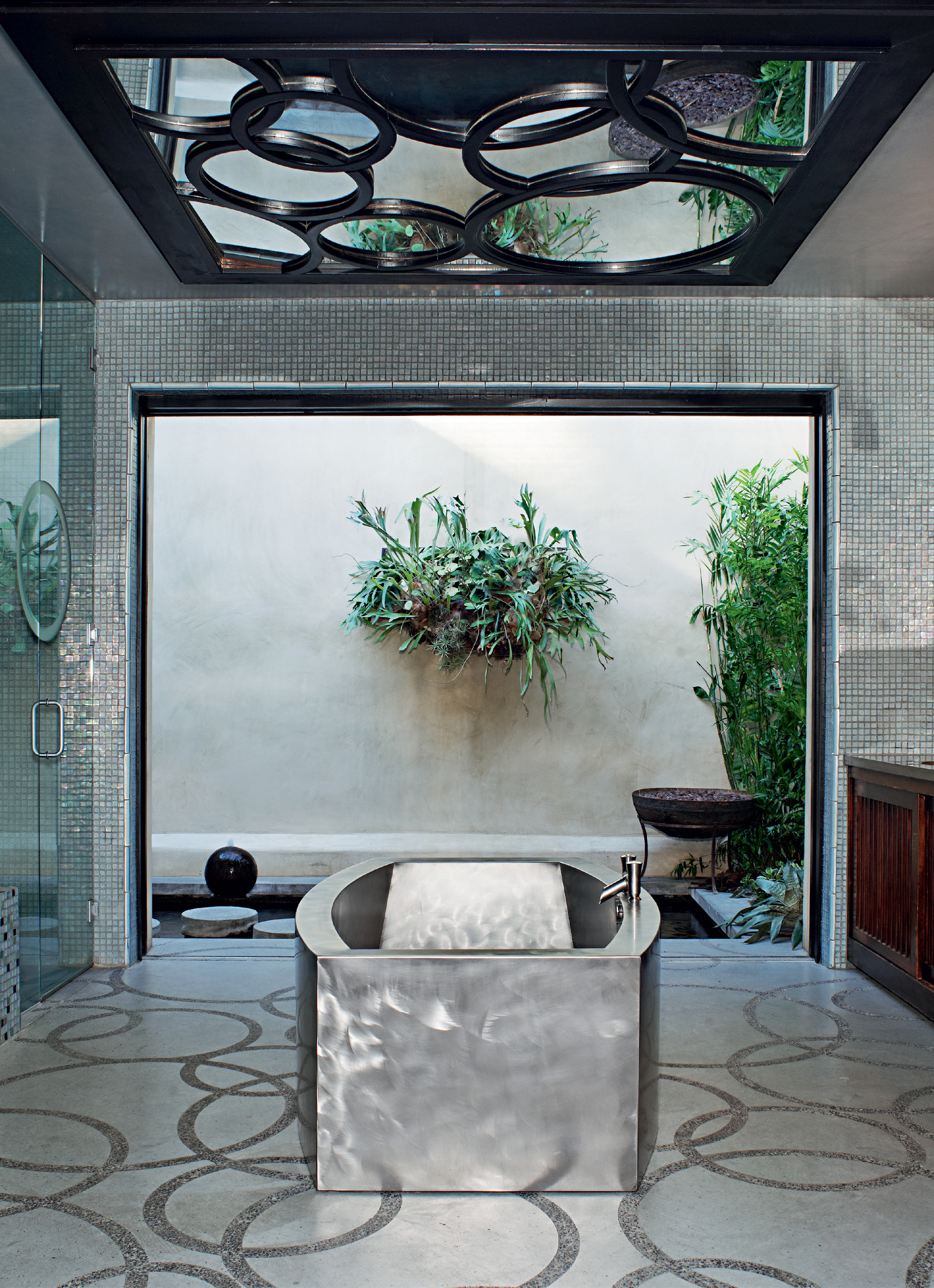
Confidence, indeed. Much to the consternation of stern preservationists and Wrightophiles, Balbes (once again working with Wogan) served up a tangy olio of periods, styles and moods – a mix the homeowner describes as ‘sexy, rich, masculine, modern, deco, Asian, spiritual and industrial’. These typologies have obvious correlations. Asian notes, for instance, are struck by the gilded peacock chairs and repurposed Japanese door-cum-coffee table in the living room, and the tansu chests in the master bathroom. Ubiquitous metallic velvets and vinyl upholstery fabrics qualify as either rich, industrial or masculine depending on one’s point of view. For sex appeal, there’s the master suite’s platform bed with illuminated, leather-wrapped steps, which has a very 1970s, Eyes of Laura Mars quality about it.
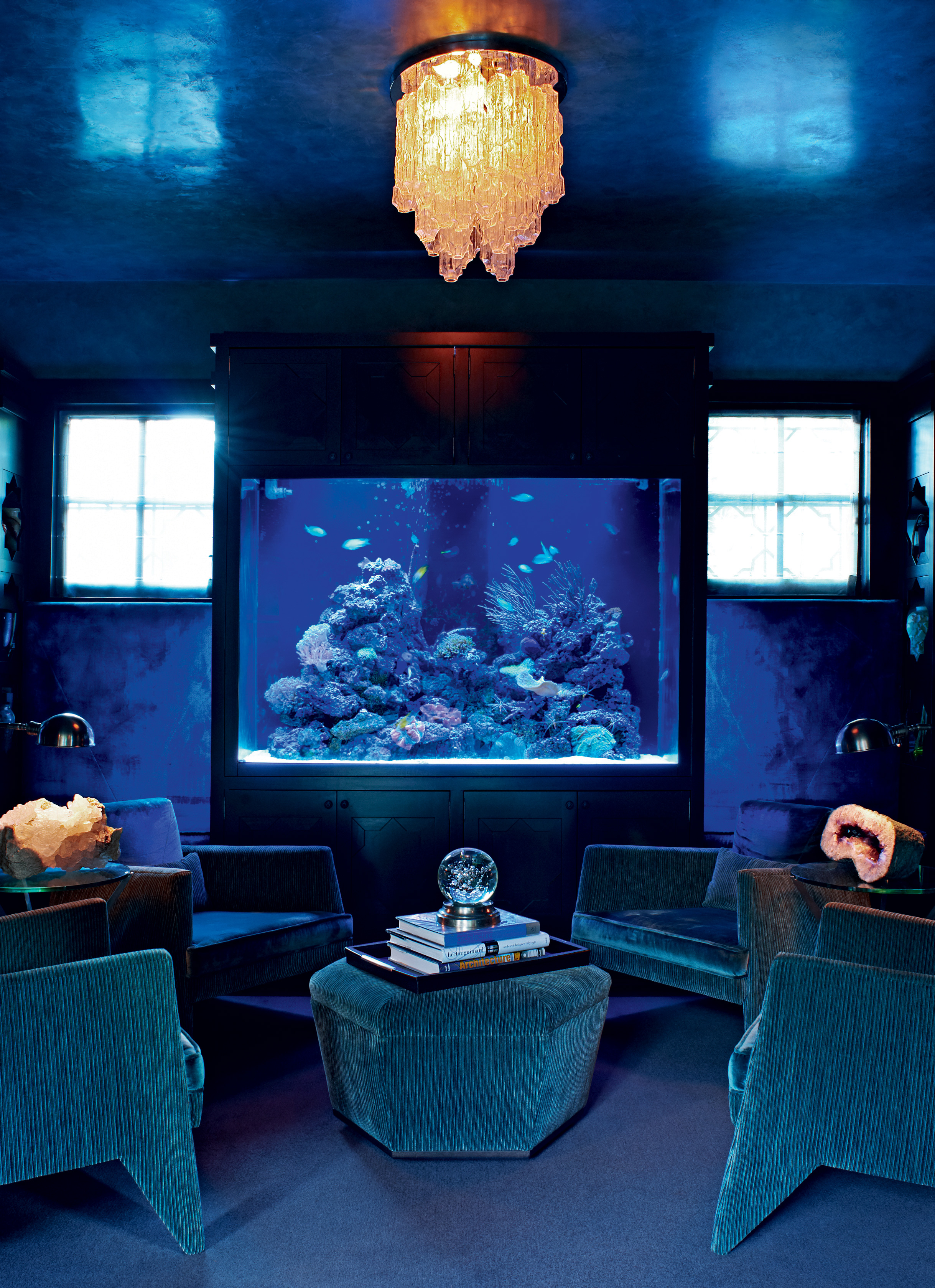
The Reflection room, with chairs and ottoman by Lloyd Wright.
It is in the area of spirituality, however, that Balbes truly brings his idiosyncratic sensibility to life. Consider the abundance of crystals and geodes. ‘They are anchoring elements that connect the house to the energy of the earth. They give off a frequency and vibration that supports the spirit of the house,’ he says. The same New Age spirituality informs the designer’s description of the large oil painting that dominates the dining room, Unity: The Unification of Humanity, by Alexander Rosenfeld: ‘It depicts people of different religions and vocations coming together as one. The composition reminds me of The Last Supper, buy the mood isn’t about masculine energy, it’s about the divine feminine,’ says Balbes. ‘When I stumbled on it at an antiques show, I felt like it belonged to me. It reminds me that I should be doing all I can to create unity in humanity.’
Balbes, who is planning to open a spiritual retreat in Maui, has codified his design philosophy in a book called SoulSpace. ‘Your environment must be connected to the deepest parts of yourself. It should contain reminders to keep you focused on your dreams,’ he explains. ‘I am incredibly fortunate to have a house that is both so inspiring and restful. I realise that I am the steward of this space and that I must pass it on to another generation. The responsibility feels that sacred to me.’ A temple to living, indeed.
As originally featured in the March 2010 issue of Wallpaper* (W*132)
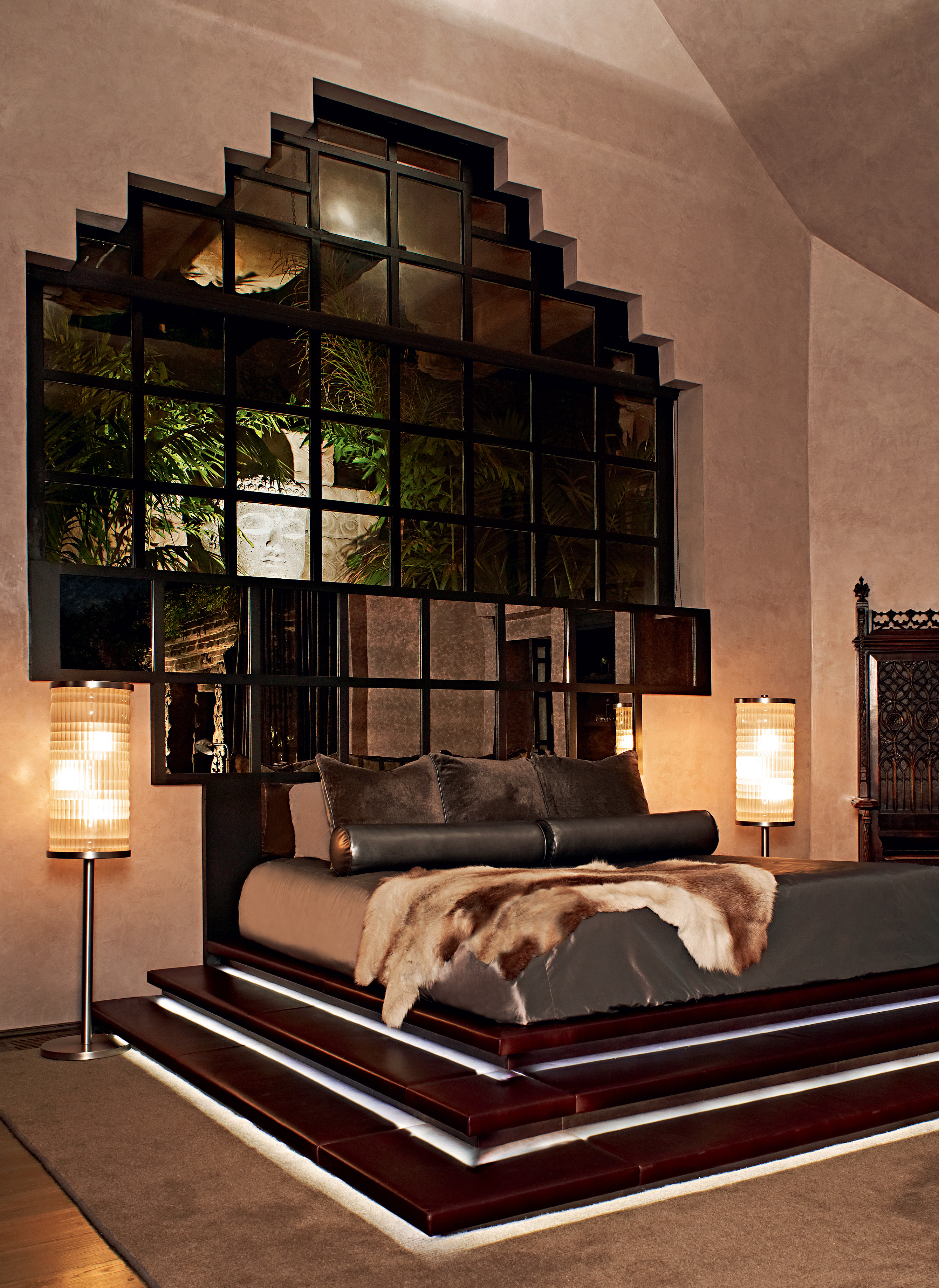
The master suite features a platform bed boasting illuminated, leather-wrapped steps
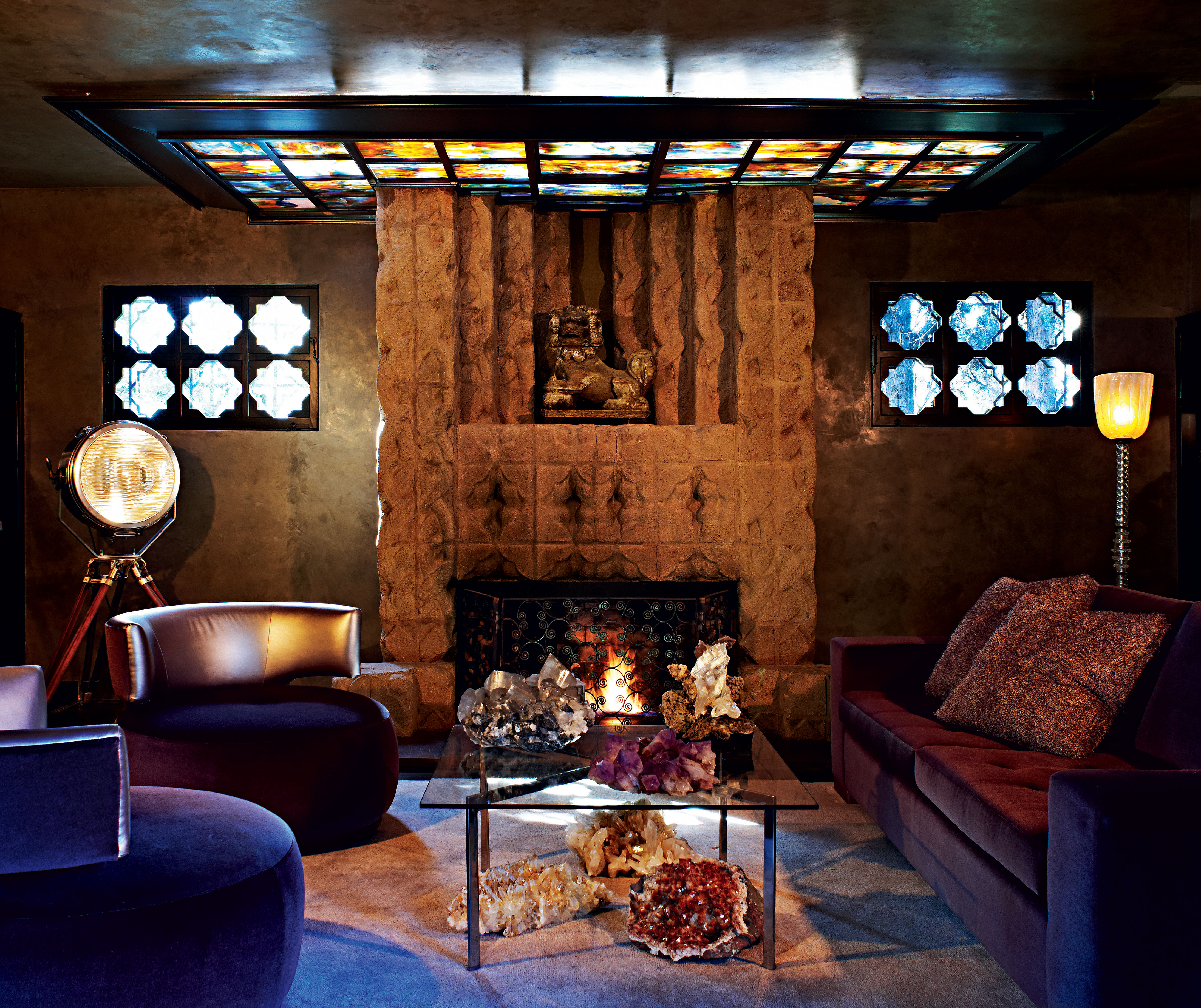
The library features a 1920s Klieg light, once used in film studios, and armchairs and sofa by TempleHome. Crystals and geodes are displayed all around the house, as Balbes believes they help connect it to the energy of the earth
INFORMATION
For more information, visit the TempleHome website
Wallpaper* Newsletter
Receive our daily digest of inspiration, escapism and design stories from around the world direct to your inbox.
-
 Paris art exhibitions to see in May
Read our pick of the best Paris art exhibitions to see in May, from rock 'n' roll photography by Dennis Morris at MEP to David Hockney at Fondation Louis Vuitton
-
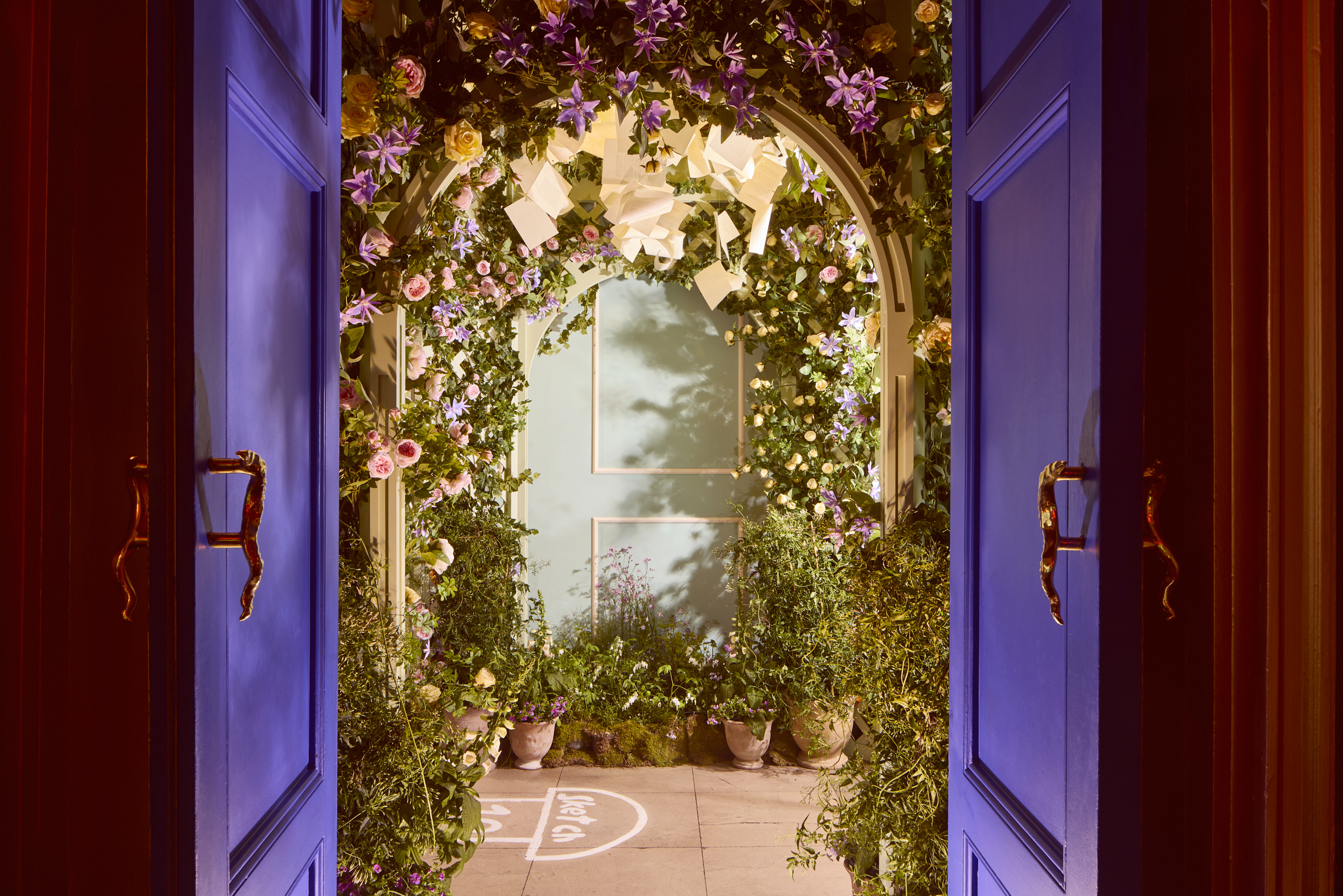 Sketch transforms into an English garden in celebration of Jane Austen’s 250th birthday
The 11th edition of ‘Sketch in Bloom’ nods to the most notable works of Jane Austen with budding floral installations and a quintessentially English afternoon tea
-
 Do Ho Suh is searching for home in a major new exhibition at the Tate Modern
Do Ho Suh's exhibition, 'Walk the House' at Tate Modern, sees the South Korean artist recreate his homes from Seoul, New York, London and Berlin.
-
 Sotheby’s is auctioning a rare Frank Lloyd Wright lamp – and it could fetch $5 million
The architect's ‘Double-Pedestal’ lamp, which was designed for the Dana House in 1903, is hitting the auction block 13 May at Sotheby's.
-
 Room for three and an inbuilt TV: this playful new bed reimagines intimacy
Swedish designer Gustaf Westman and ‘alternative’ dating app Feeld have collaborated to create a three-person bed that blurs the line between function and fun
-
 This Colorado ski chalet combines Rocky Mountains warmth with European design nous
Wood and stone meet artisanal and antique pieces in this high-spec, high-design mountain retreat
-
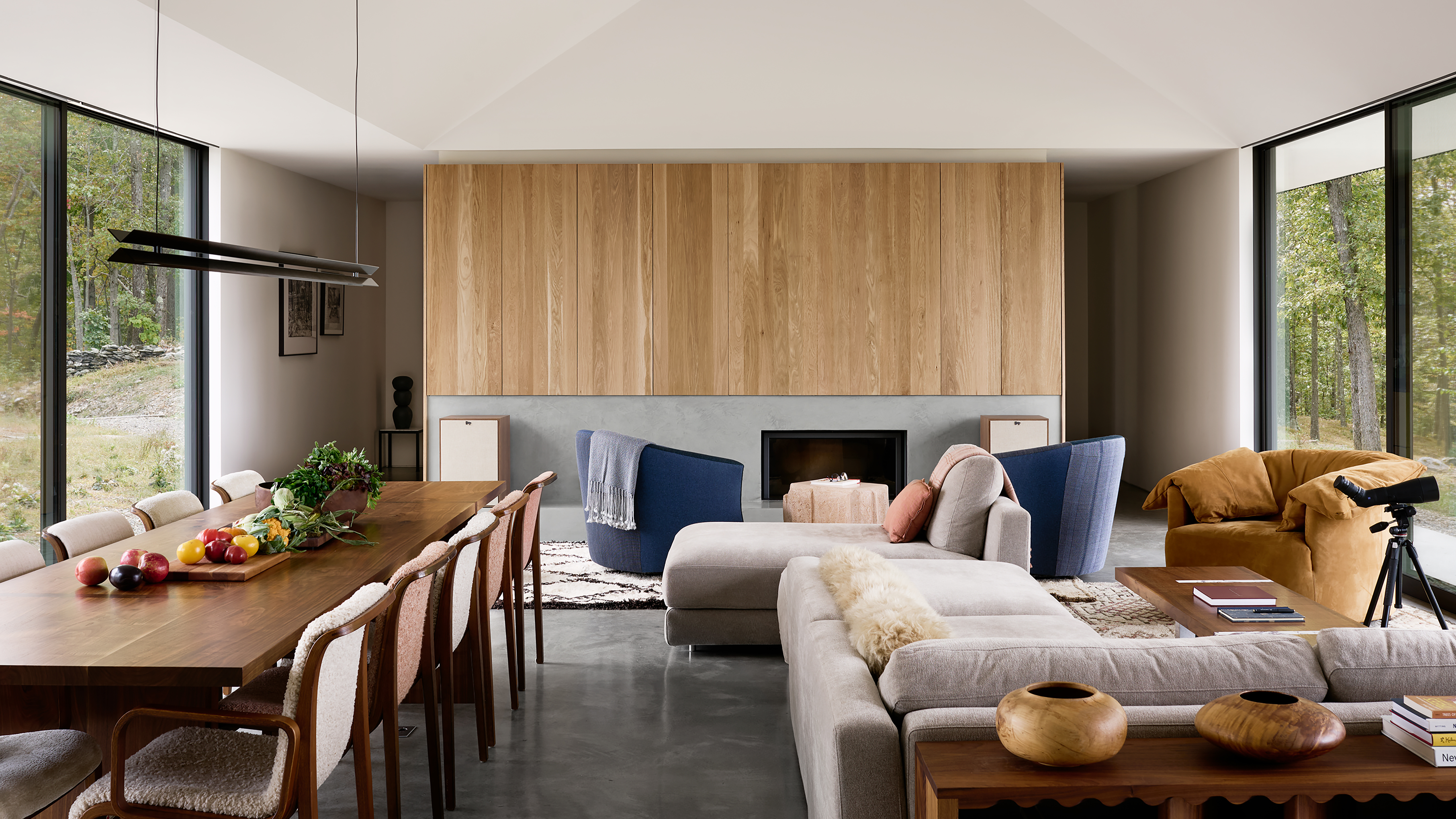 Hilltop hideaway: Colony creates tranquil interiors for a Catskills retreat
Perched between two mountain ranges, this Catskills retreat marries bold, angular architecture with interiors that offer warmth and texture
-
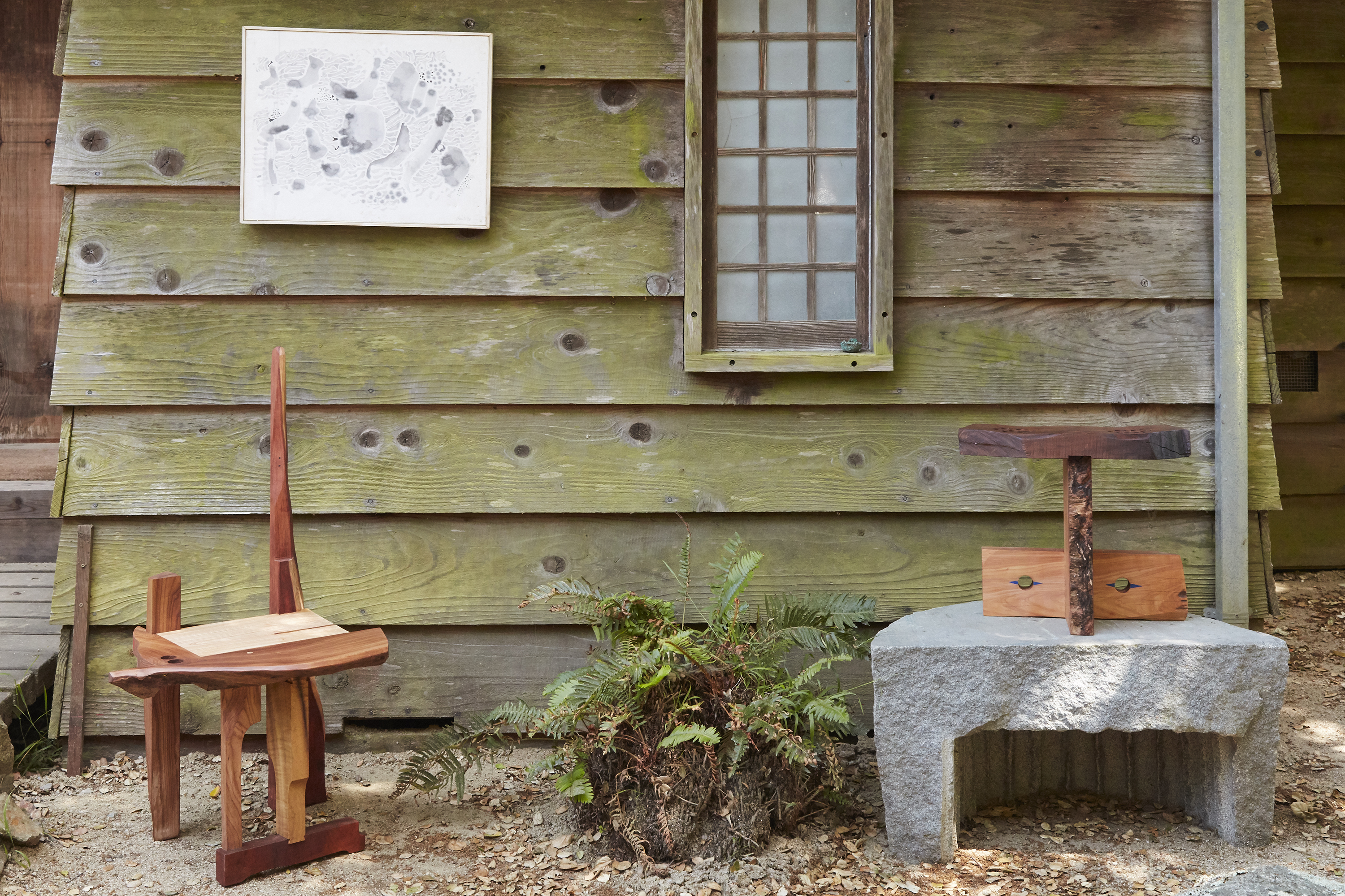 Rio Kobayashi’s new furniture bridges eras, shown alongside Fritz Rauh’s midcentury paintings at Blunk Space
Furniture designer Rio Kobayashi unveils a new series, informed by the paintings of midcentury artist Fritz Rauh, at California’s Blunk Space
-
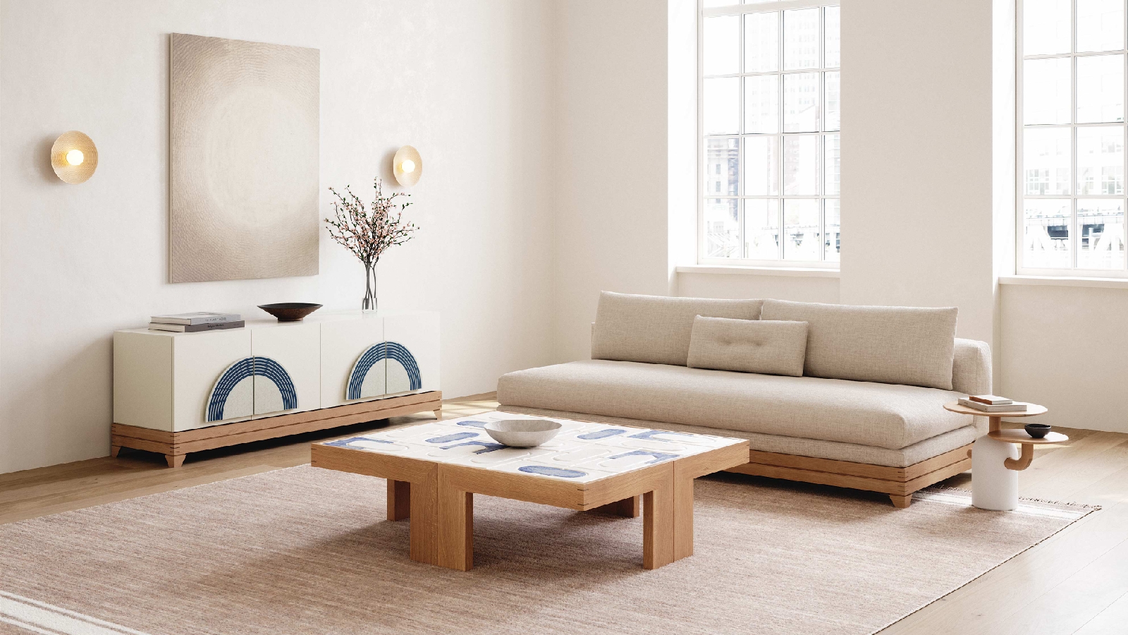 Brooklyn furniture studio Stillmade unveils its first collaborative design series
Stillmade brings to life the designs of four New Yorkers – Pat Kim, Danny Kaplan, Michele Quan and Mignogna Studio
-
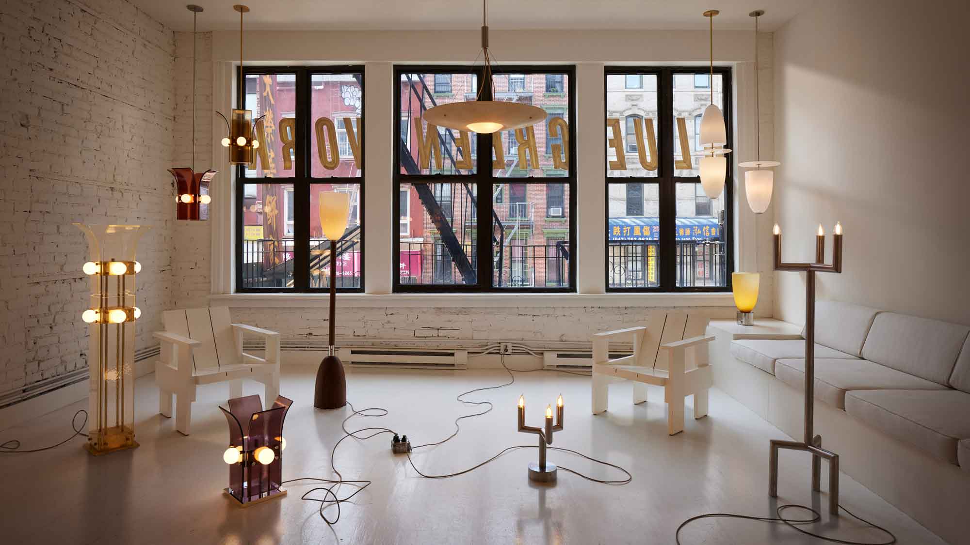 Blue Green Works's lighting champions a new aesthetic in American design
Manhattan-based design studio Blue Green Works fuses sensuality and masculinity to create mellow, mood-enhancing lighting with visual impact
-
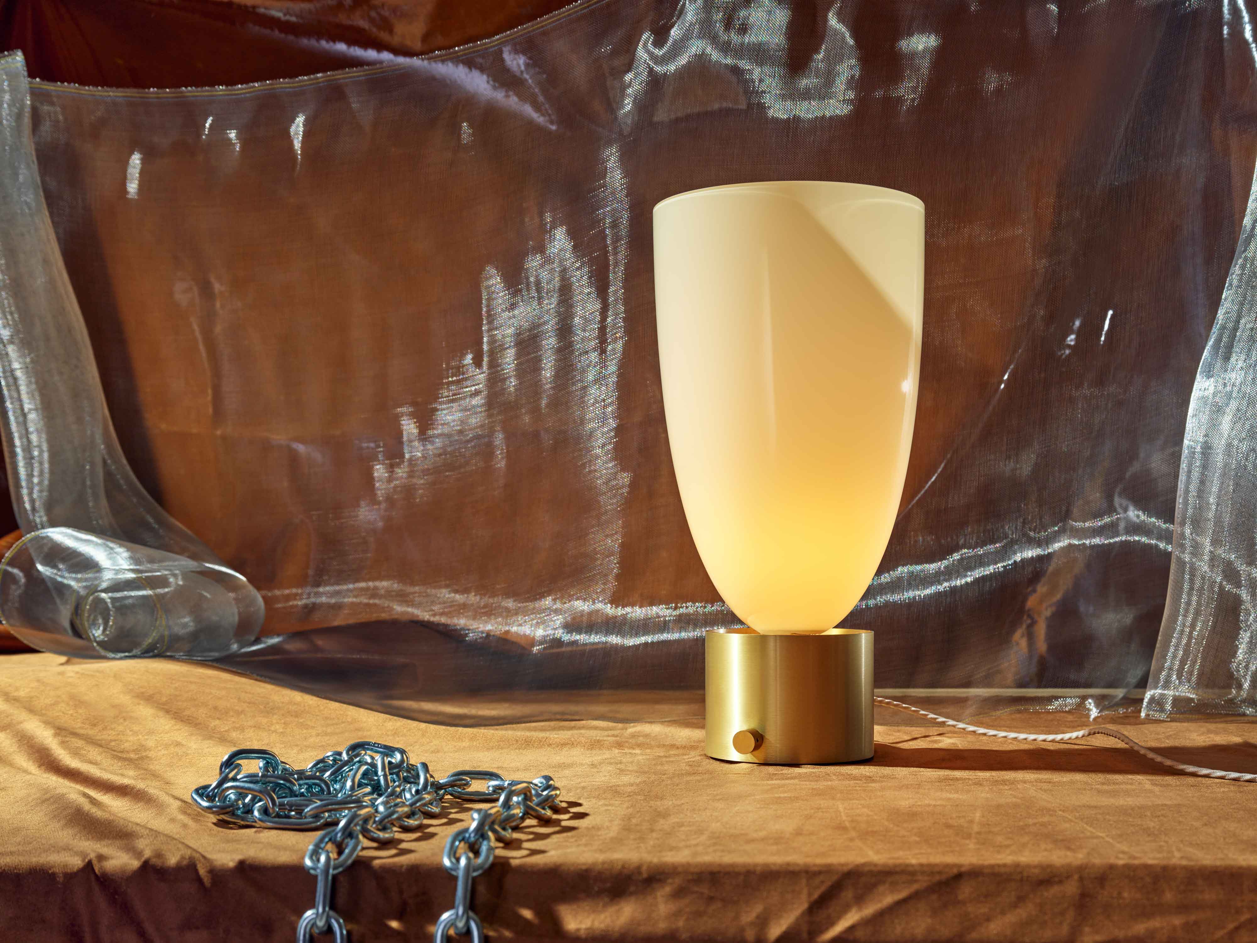 Blue Green Works introduces alluring new lighting collection
Inspired by iconography, American design studio Blue Green Works introduces five new lighting ranges