There’s more than meets the eye at RSHP’s Louvre-Lens campus addition
Rogers Stirk Harbour + Partners pack more into storage facility design
Architects love nothing if not a challenge. Programme and budget are always key factors in making up such a project. Storage facilities, for example, may not immediately jump out as the most obvious opportunities to create something special, often perceived as modest (if not unimportant), auxiliary buildings, rather than design-led creations in their own right. Yet there's plenty to be enjoyed in such a commission, as Rogers Stirk Harbour + Partners demonstrates in its latest offering, a conservation and storage building in France. Then again, their client was the Musée du Louvre.
Located in the campus of the storied French museum's Lens outpost in Liévin, the new building was conceived to house and protect some 250,000 works of art that could not remain in Paris, due to the fact that the main building did not have a flood-risk prevention plan, while being right by the River Seine and partially on a flood zone. In search for space to guarantee the safekeeping of its pieces, the institution initiated discussions for a complex that would combine valuable storage with conservation labs – and RSHP won the commission in 2013. Fast-forward six years and the new addition to the Lens site has just been completed.
For a building with such a serious and important duty, entrusted with the protection of priceless cultural treasures, perhaps one thing that stands out upon approaching is its unexpectedly playful entrance – an arched canopy jutting out at a strangely odd angle to the rest of the, admittedly fairly sober, building. The stairs up to the main door follow the same angle, creating a fun take on perspective, and hinting at the fact that this is not your ordinary warehouse.

Overall and from a distance, the structure is very discreet: a long box made of concrete, close to the ground and semi-submerged into a gentle hill with its one free side fully glazed and looking out towards the main street running along its side. From the outside, all you see ‘is a rising landscape', says RSHP senior design partner Graham Stirk. In a way both this building and the nearby SANAA-designed exhibition pavilion (a few minutes walk away) respond to the flat surrounding landscape by keeping things low and minimalist.
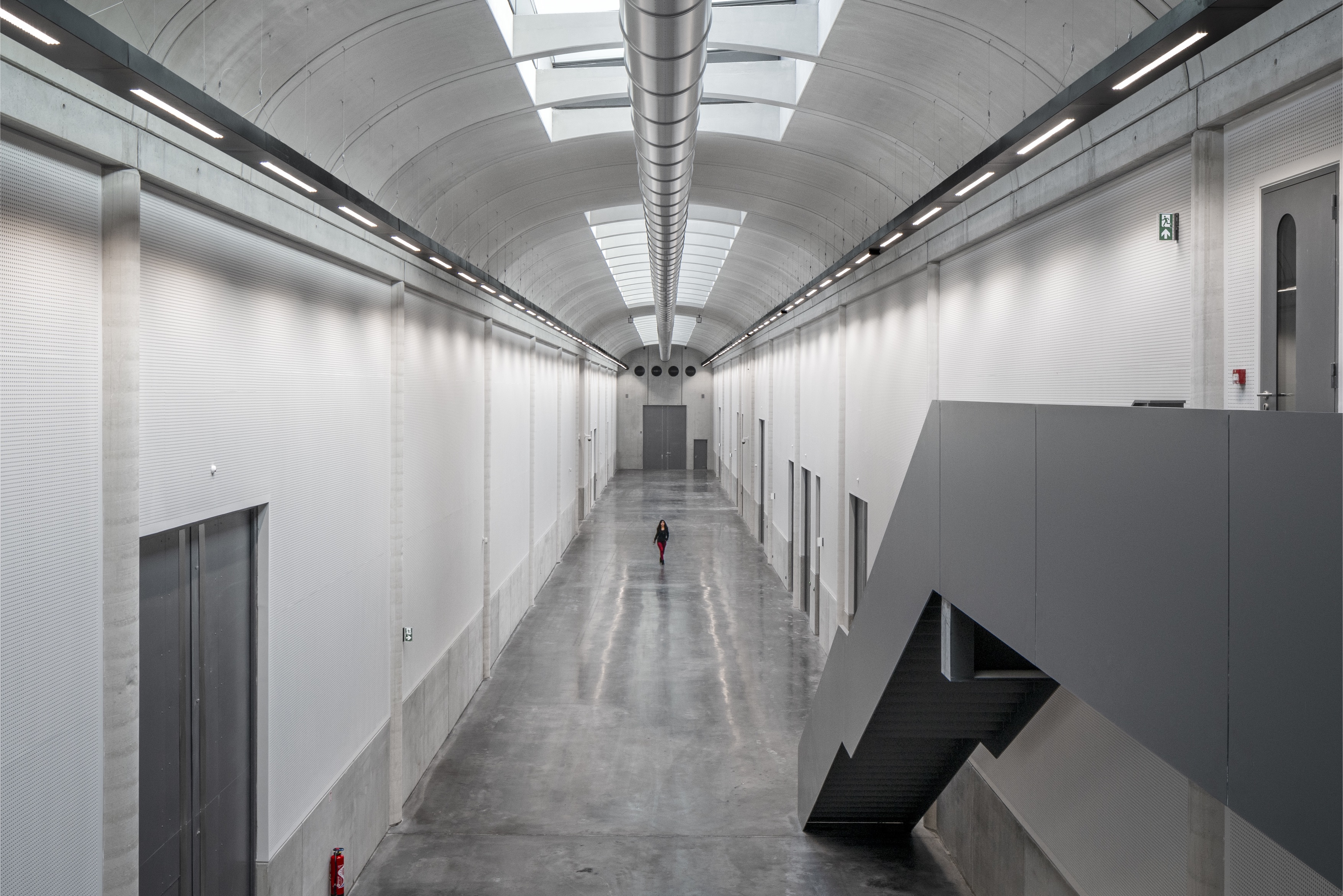
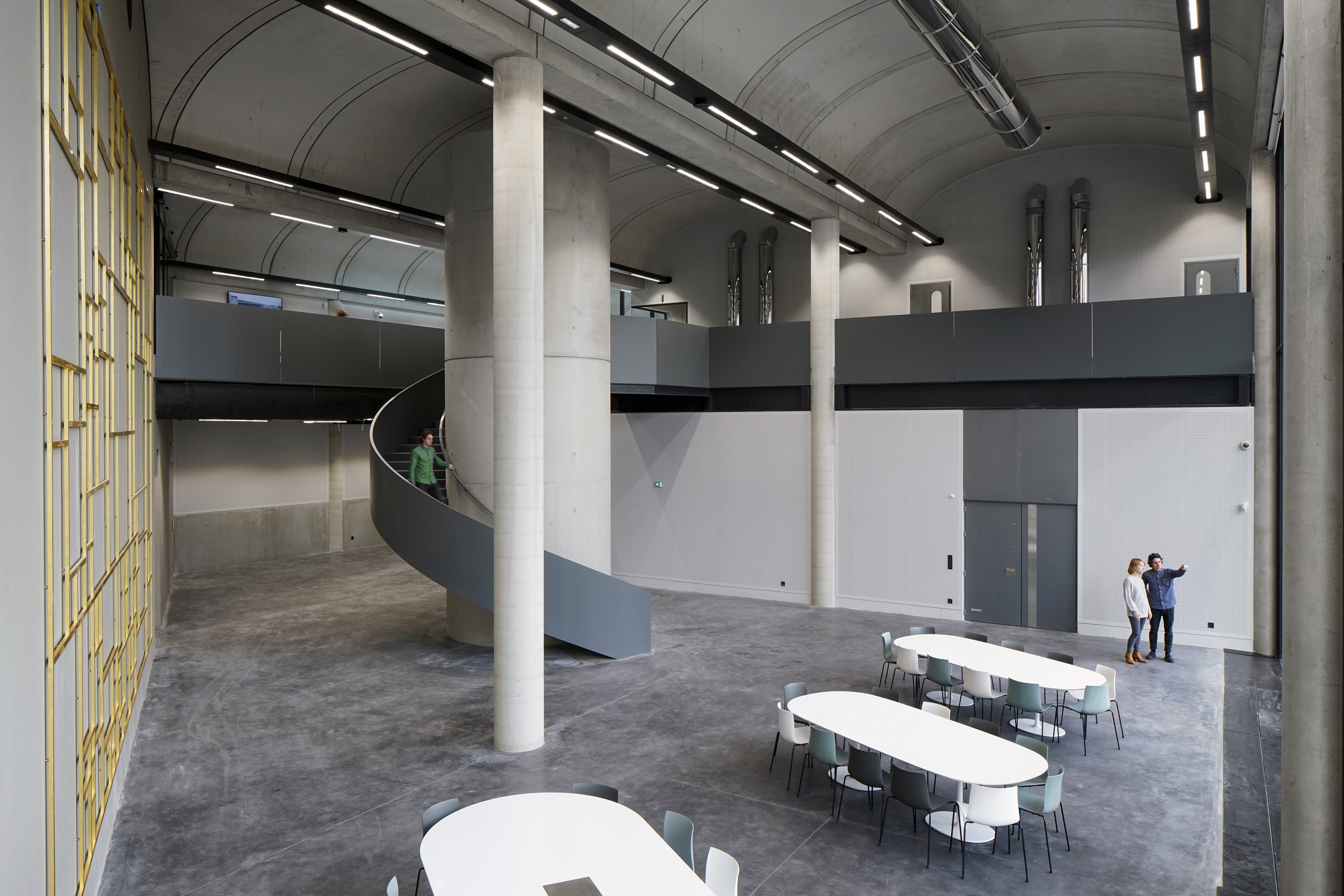
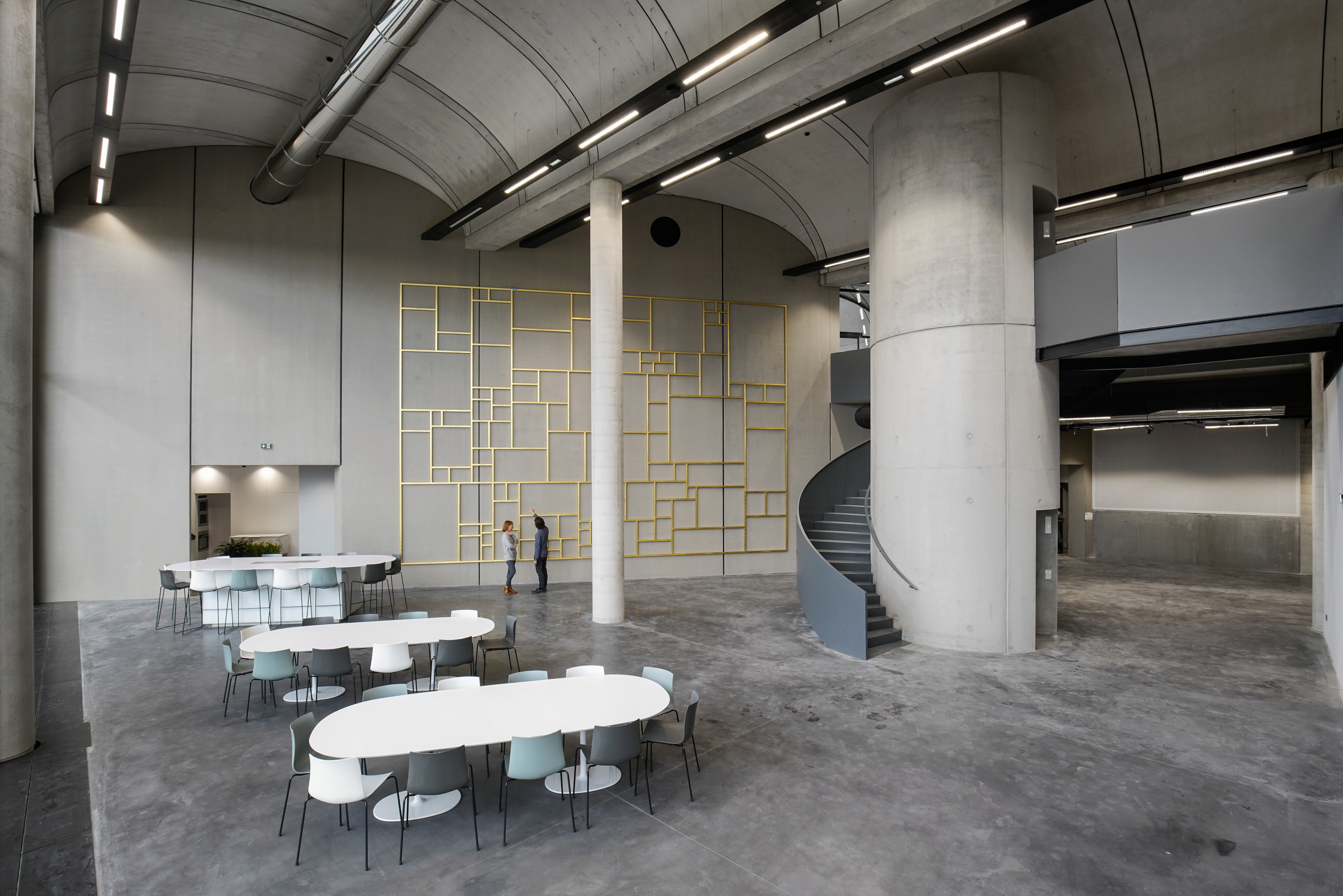
The interior is neatly designed around two ‘boulevards', placed at an angle to each other, and off of which are arranged rows of storage rooms of different sizes. Manipulated perspective comes into action here again, as the building's roof gradually slopes down towards the rear, almost halving in height at the narrow end of the site's trapezoidal shape. This also allowed the architects to ‘stitch the building into the landscape, rather than creating a pavilion building within a landscape', explains Stirk.
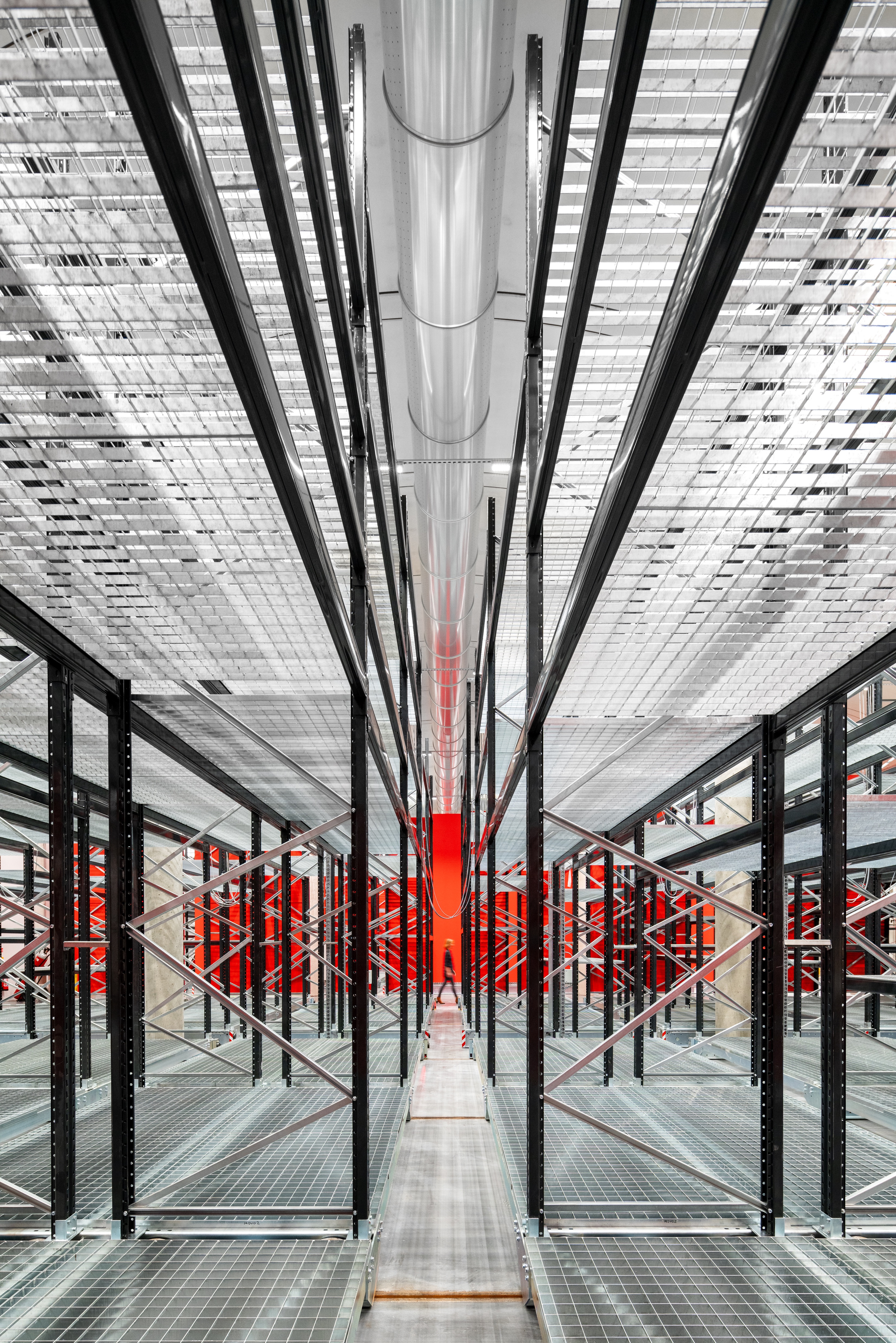
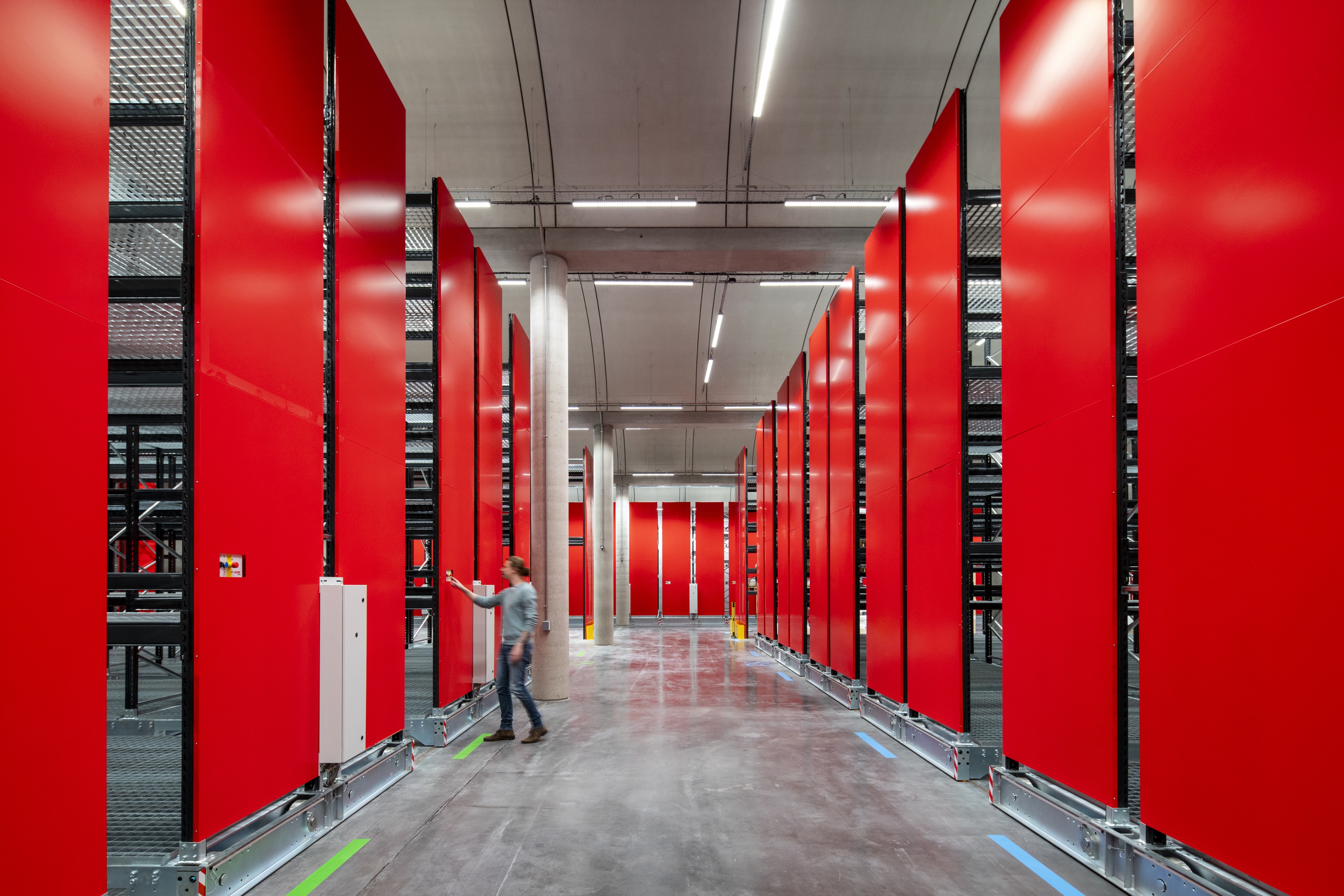
Everything in the storage areas was meticulously designed according to size and artwork requirements – with specific furniture created for certain types of objects so that there's a bespoke home for everything in the collection. ‘And this is not deep storage, where things come never to be seen again', says RSHP partner John McEglunn. ‘There is a rotation of objects going to and from Paris'.
Several conservation laboratories are placed in a row at the front, behind the glazed facade, while storage is further back into the slope, where sunlight becomes less important. ‘We celebrate the spaces for conservation instead of hiding them', says Stirk. A set of offices is located near the entrance, on a mezzanine level created by the extra height allowance there.
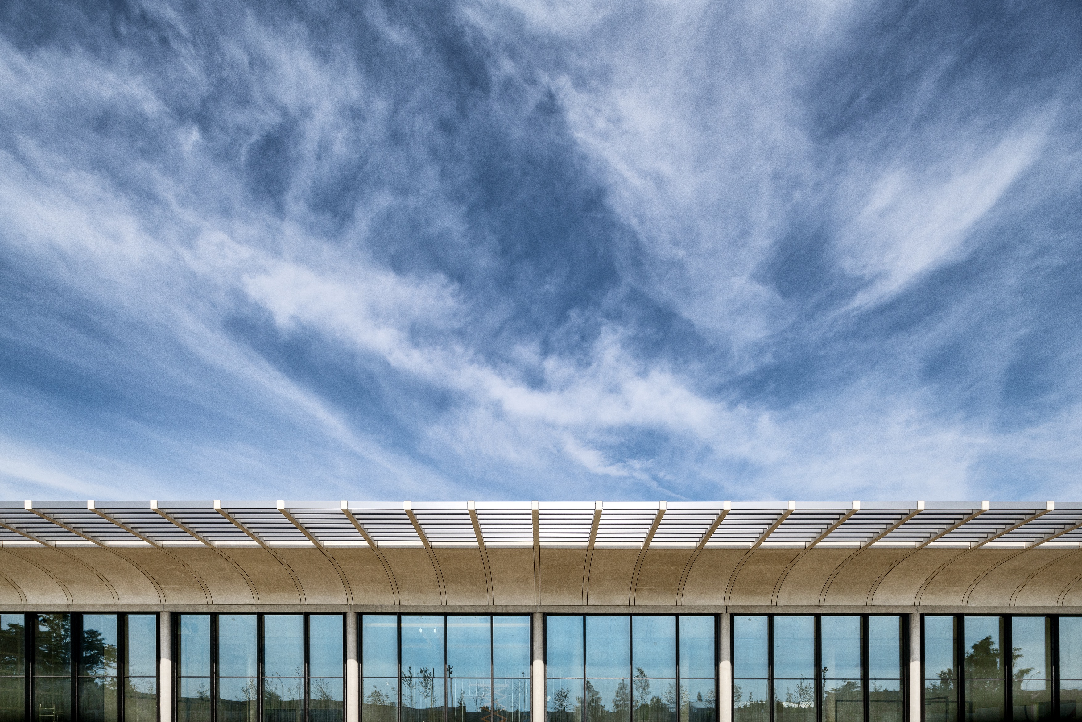
An exterior view of the building showcasing floor to ceiling reflective glass panel doors and windows phptographed during the day
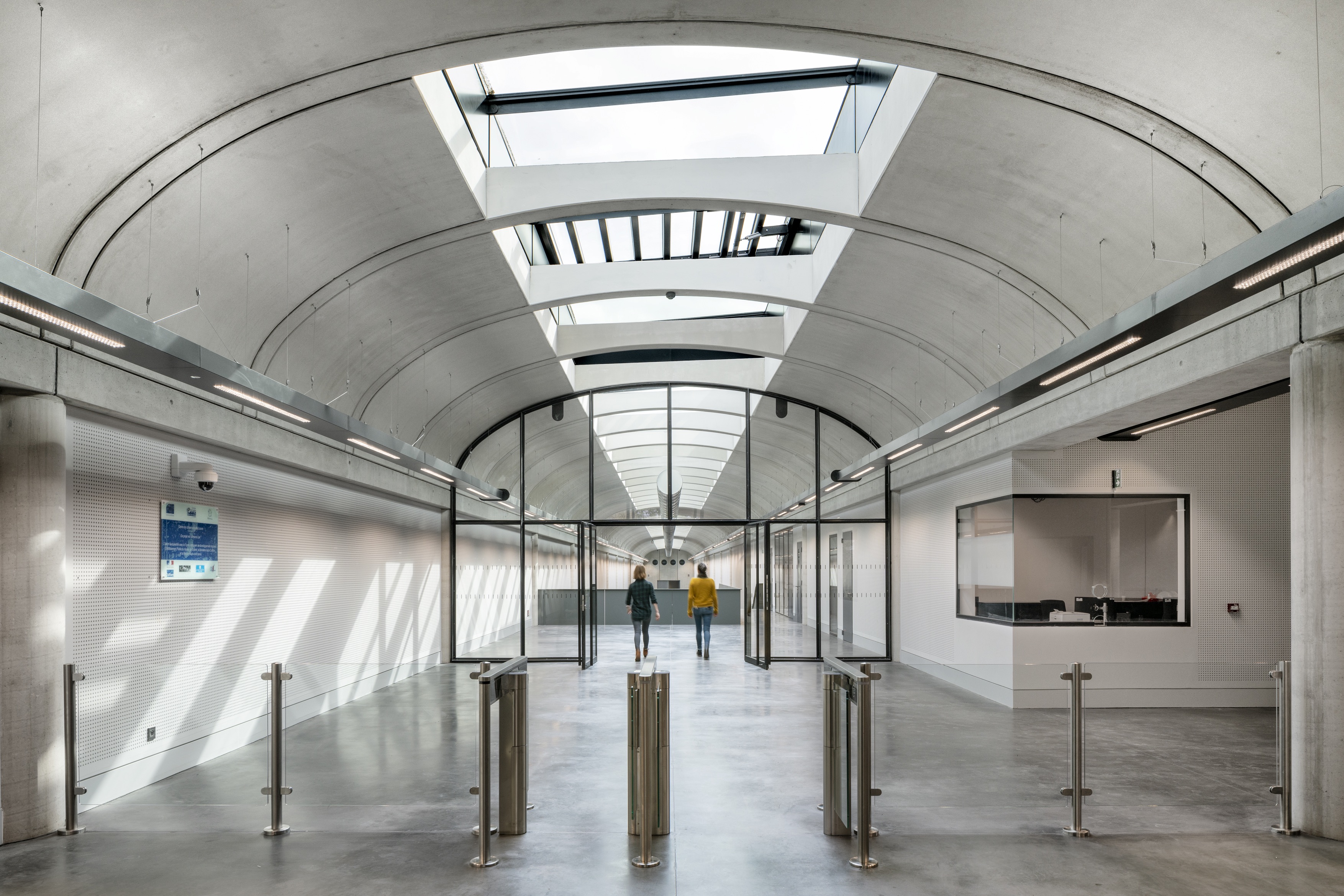
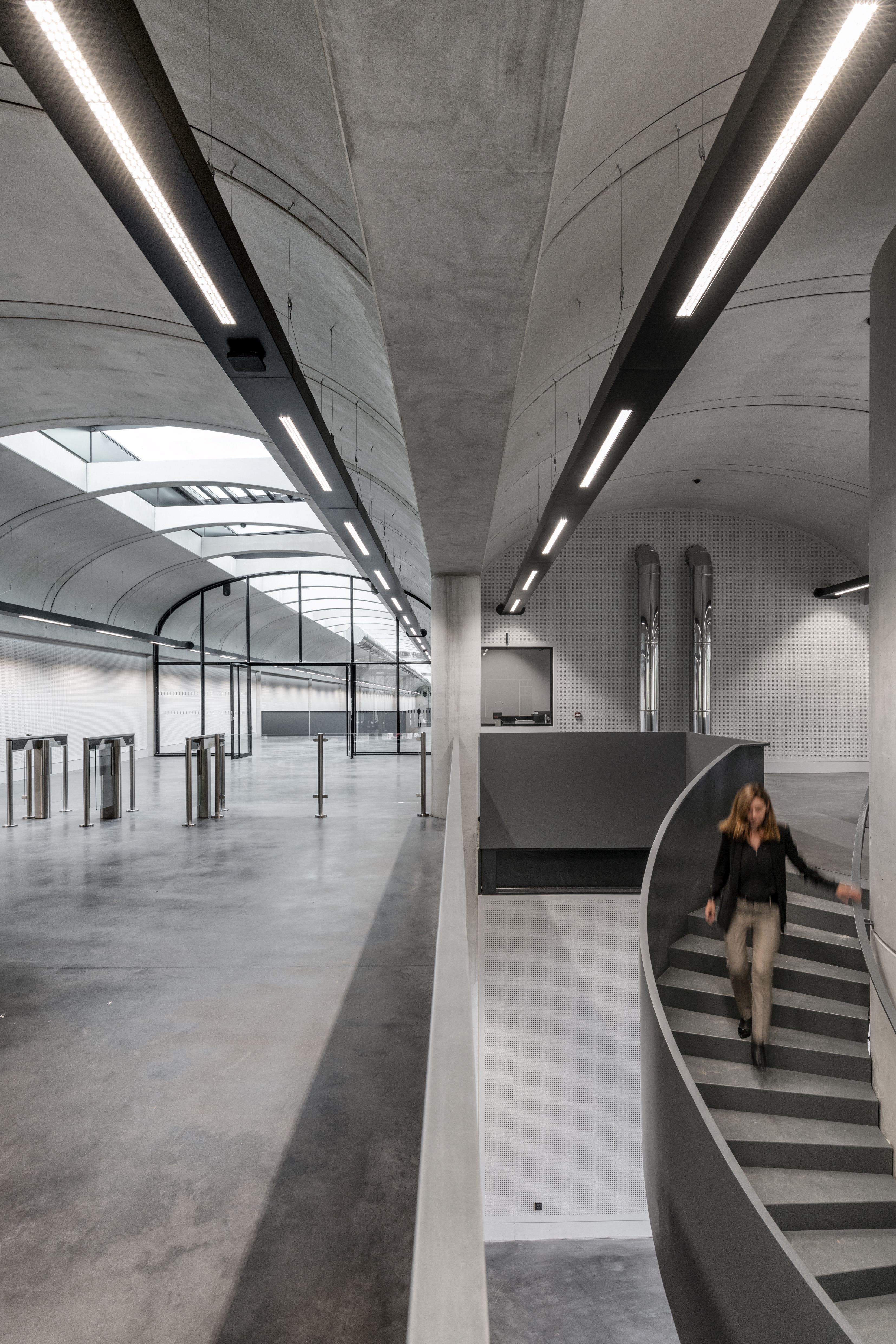
On plan, the layout looks plain and practical enough, but the experience of walking through the space reveals an impressive, almost cathedral-like interior in the main ‘boulevard'. The whole building is topped by an arched concrete ceiling (made of prefabricated elements). The unusual shape might bring to mind a different version of art-filled space – the Kimbell Art Museum by Louis Kahn, although comparisons probably end there as scale, programme and details are different (no clerestory windows here for example, as this ceiling is topped by the soil of a green roof). The reason behind choosing that shape was structural functionality, explains McEglunn. ‘How do you create big open spaces to allow the flexibility for all this kind of furniture? With concrete there's only certain sizes of spans that you can go to. It's about efficiency. All these vaults are precast.'
In a building of this typology, technology needs to be fine tuned to perfection, so there's rigorous climate control everywhere, plenty of natural light where needed and carefully planned fire safety measures throughout. Interiors are wrapped in concrete walls partially clad in plaster panels dotted with tiny holes that help with acoustics. Concrete helps regulate temperature too; one more reason to pick this material (the last time the firm explored it as a pre-cast finish internally was the Lloyd's Register of Shipping in the late 1990s, points out Stirk).
The building was designed to be bio-climatic, using heat pumps to generate power, rainwater collection, recycling 74 per cent of its construction waste, and a meadow of local species on its green roof (landscaping was designed in conjunction with Francais Mutabilis Paysage). The clever layout arrangement also means there's five levels of security between the car park and the storage areas, so that only the people who are supposed to be there have access, adds Stirk.
Even though this is in many ways a relatively modest structure (in style, but also budget, stress the architects), proportions are generous, volumes feel grand, and light is in abundance; making this building, populated mostly by staff and visiting experts, an elegant cross between an industrial building and a space for art. ‘The artwork in here is priceless, so we tried to create something more like a reliquary I suppose', says McElgunn. ‘Something elegant, the noble space that these pieces deserve'.

INFORMATION
Wallpaper* Newsletter
Receive our daily digest of inspiration, escapism and design stories from around the world direct to your inbox.
Ellie Stathaki is the Architecture & Environment Director at Wallpaper*. She trained as an architect at the Aristotle University of Thessaloniki in Greece and studied architectural history at the Bartlett in London. Now an established journalist, she has been a member of the Wallpaper* team since 2006, visiting buildings across the globe and interviewing leading architects such as Tadao Ando and Rem Koolhaas. Ellie has also taken part in judging panels, moderated events, curated shows and contributed in books, such as The Contemporary House (Thames & Hudson, 2018), Glenn Sestig Architecture Diary (2020) and House London (2022).
-
 Japan in Milan! See the highlights of Japanese design at Milan Design Week 2025
At Milan Design Week 2025 Japanese craftsmanship was a front runner with an array of projects in the spotlight. Here are some of our highlights
By Danielle Demetriou
-
 Tour the best contemporary tea houses around the world
Celebrate the world’s most unique tea houses, from Melbourne to Stockholm, with a new book by Wallpaper’s Léa Teuscher
By Léa Teuscher
-
 ‘Humour is foundational’: artist Ella Kruglyanskaya on painting as a ‘highly questionable’ pursuit
Ella Kruglyanskaya’s exhibition, ‘Shadows’ at Thomas Dane Gallery, is the first in a series of three this year, with openings in Basel and New York to follow
By Hannah Silver
-
 The Yale Center for British Art, Louis Kahn’s final project, glows anew after a two-year closure
After years of restoration, a modernist jewel and a treasure trove of British artwork can be seen in a whole new light
By Anna Fixsen
-
 You’ll soon be able to get a sneak peek inside Peter Zumthor’s LACMA expansion
But you’ll still have to wait another year for the grand opening
By Anna Fixsen
-
 NYC's The New Museum announces an OMA-designed extension
OMA partners including Rem Koolhas and Shohei Shigematsu are designing a new building for Manhattan's only dedicated contemporary art museum
By Anna Solomon
-
 East London's disused gasholders are being reinvented
Regent's View by RSHP reinvents a pair of disused gasholders in east London as contemporary residential space and a publically accessible park
By Ellie Stathaki
-
 Gulbenkian Foundation's new art centre by Kengo Kuma is light and inviting
Lisbon's Gulbenkian Foundation reveals its redesign and new contemporary art museum, Centro de Arte Moderna (CAM), by Kengo Kuma with landscape architects VDLA
By Amah-Rose Mcknight Abrams
-
 Richard Rogers exhibition delves into the architect’s ideas at Chateau La Coste
A new Richard Rogers exhibition created by Ab Rogers opens at the late architect’s final design, the Drawing Gallery at Chateau La Coste in France
By Ellie Stathaki
-
 Step inside No. 33 Park Row’s Penthouse 3 by RSHP in New York
We offer a sneak peek inside Penthouse 3 at No. 33 Park Row by RSHP in New York
By Ellie Stathaki
-
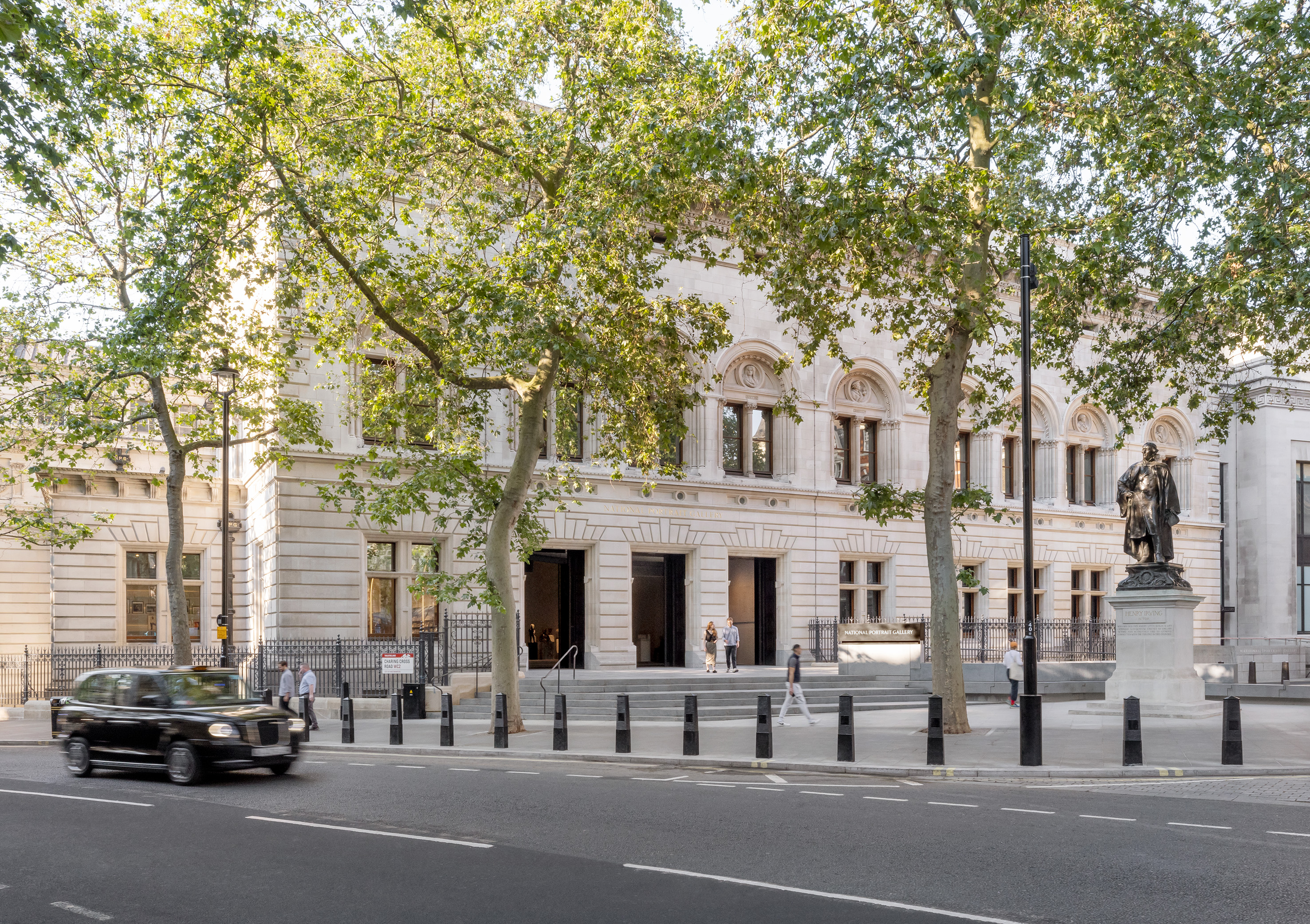 National Portrait Gallery reopens its refreshed home
London’s National Portrait Gallery reopens with a design by leading architect Jamie Fobert and conservation specialist Purcell
By Ellie Stathaki