Ab Rogers unveils the latest Maggie’s Centre at the Royal Marsden hospital in Sutton
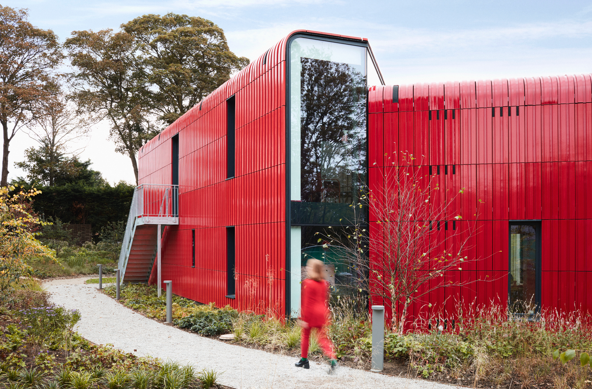
Ab Rogers' Maggie's Centre at the Royal Marsden in Sutton, South England, is a human-centric, peaceful environment for the well known cancer support charity
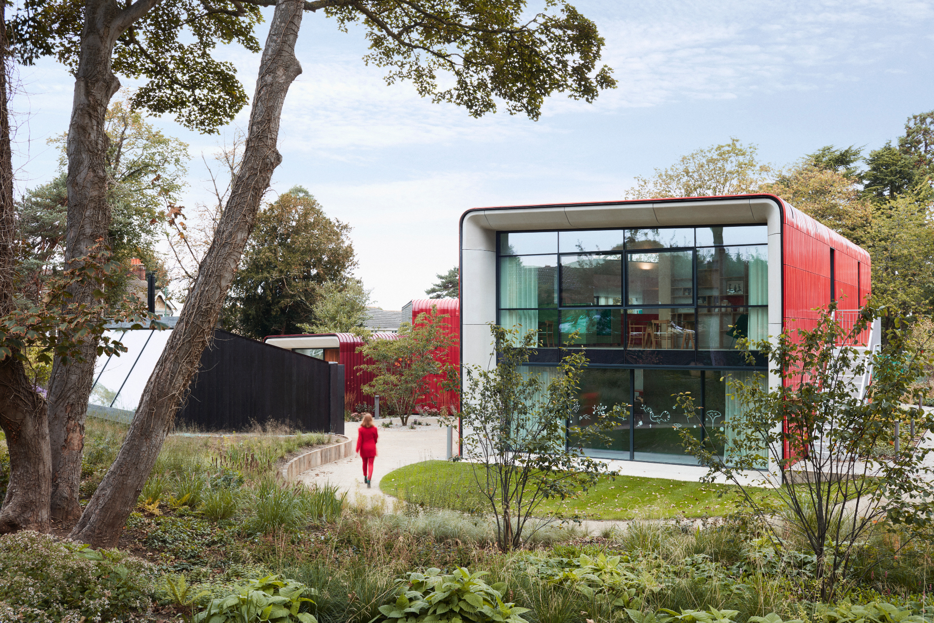
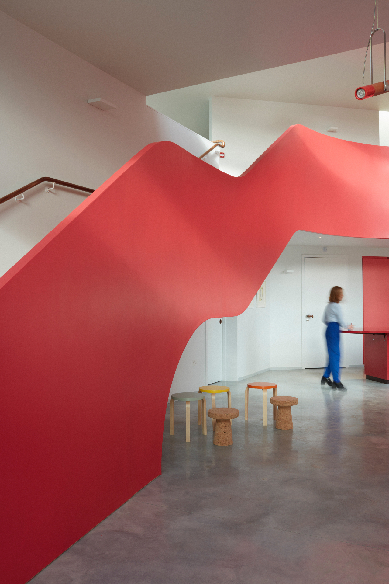
There’s something distinctly soothing about the gentle curves and calculated colour pops at the latest project by Ab Rogers Design; unsurprisingly perhaps, given that the commission was for a Maggie’s Centre, the newest in the series of famous design-driven cancer support centres across the country that have a particularly human-centric approach at their heart.
Set up by the late Charles Jencks and Maggie Keswick Jencks, Maggie’s (as they are often simply and affectionately referred to) features over 20 structures in its arsenal, created by some of the world’s leading names in architecture, including OMA, Steven Holl and Zaha Hadid. Rogers’ has just been launched, set on the site of the Royal Marsden hospital in Sutton, a facility known for its advanced cancer research and treatment.
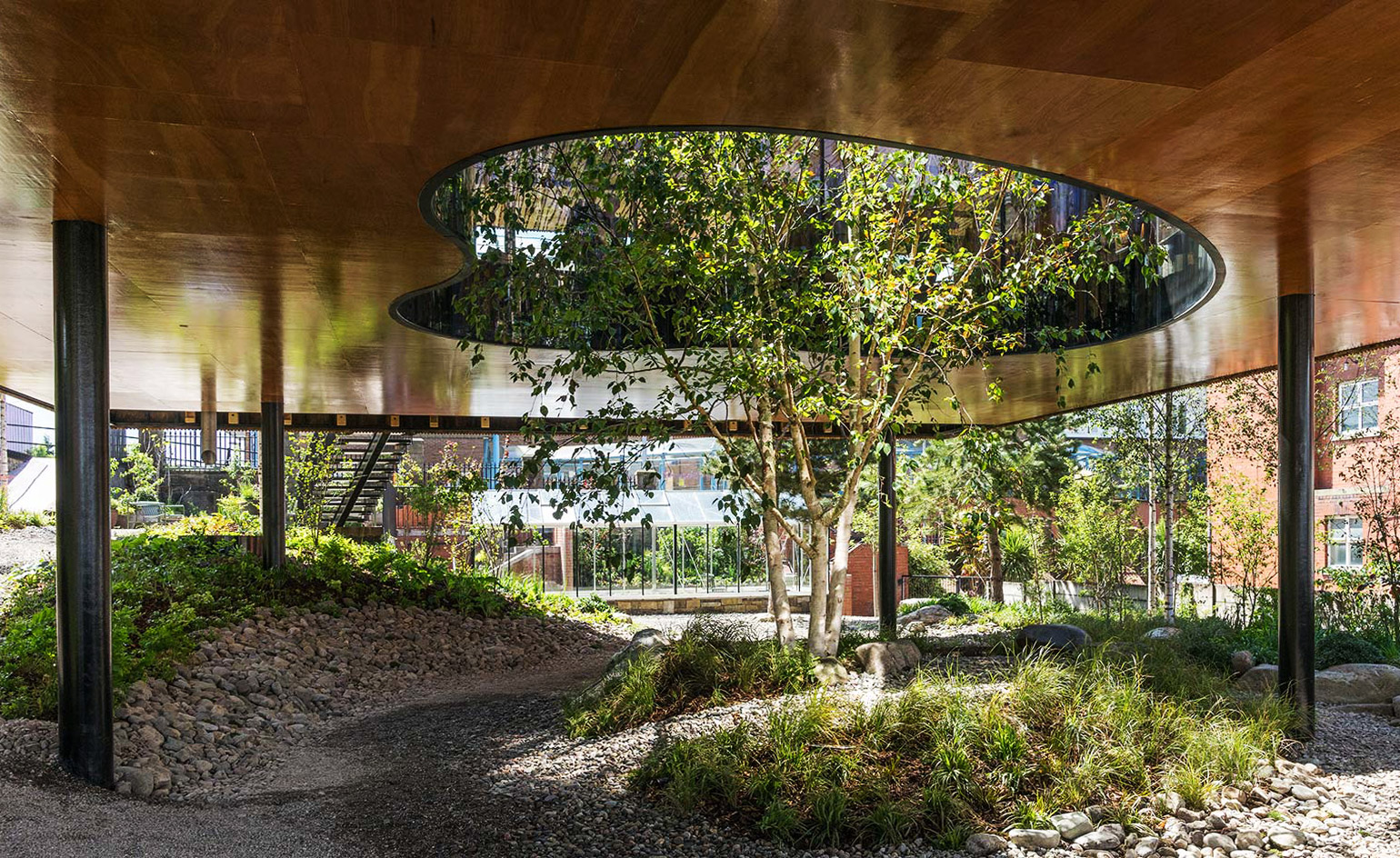
Walking up from the street, there’s little that separates the new building from the public realm – no walls or fencing – just a flowing landscaping plan by renowned Dutch garden designer Piet Oudolf, which, come spring, will turn into a lush garden, bringing nature right up to the street (the site used to host a car park behind a tall wall).
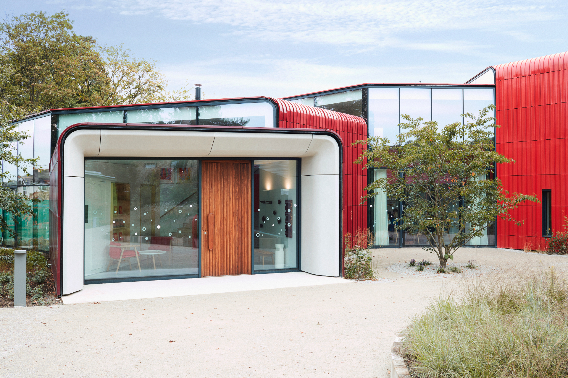
The structure itself would be fairly low key too – a composition of four low volumes, organised in a half-moon shape – were it not for the eye-catching red of its cladding. This was made of ceramic tiles painstakingly planned to follow the roof’s curves through soft variations in their profile, and made in Italy (by the same manufacturer that provides the cladding for Herzog and de Meuron’s M+ Museum in Hong Kong, no less). Upon closer inspection each volume features a slightly different shade of red, creating a pleasant play on shadow and perspective - and softening the effect of the coloured surfaces.
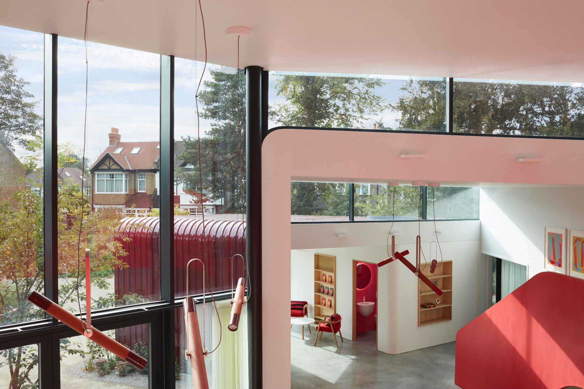
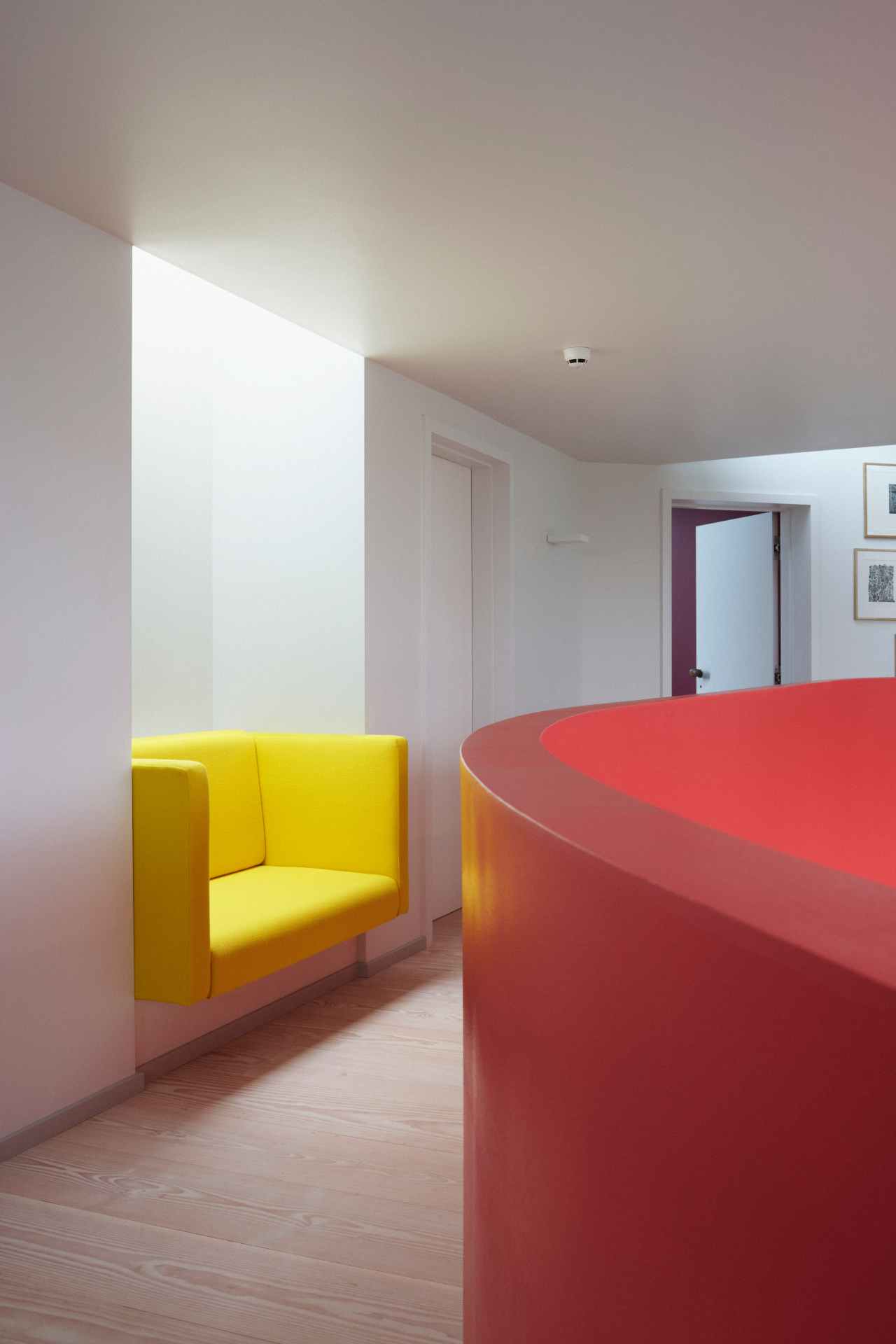
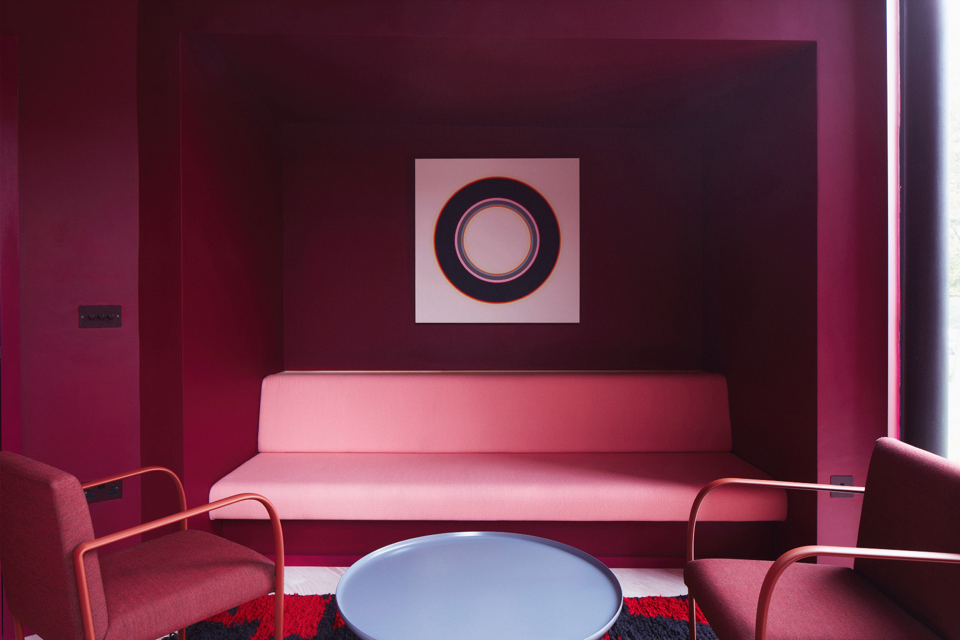
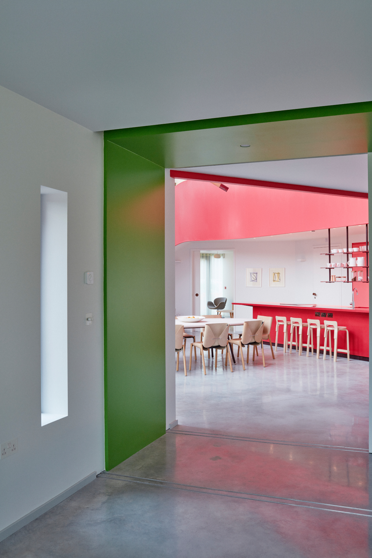
Rogers, whose signature use of colour often involves bright primaries and every shade in-between, did not shy away from bringing some vibrancy into this scheme too, although this is not colour for colour's sake. ‘There was a clear brief, but then also there was a continuous conversation through which the design evolved and everything was created around the movement and function within,’ explains Rogers. So there are darker, more soothing colours in some of the therapy rooms, but brighter colours in communal areas, while a distinctly red staircase clearly highlights the circulation flow and brings everything together.
RELATED STORY
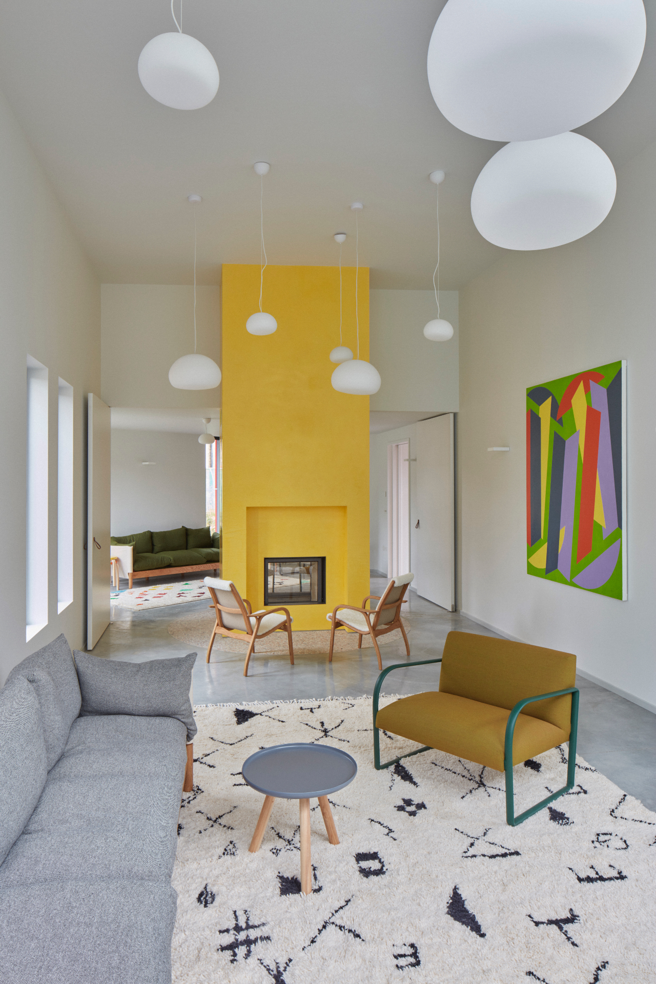
There is a naturally lit, double height central area, as Maggie’s Centres often have, with sitting, kitchen and dinning spots. This open plan space leads to all other areas in the building – the therapy rooms, a large multifunctional space often used for yoga practice, toilets (one of which features a playful Barragan-referencing round skylight, Rogers says), and the main staircase that takes visitors up to the offices, further therapy rooms and a vividly yellow accented library. A shed in the garden, in darker and more neutral colours, developed into a multi-functional ‘garden room' during the design process, offering further flexible space for Maggie's users.
‘Everything was designed around the user experience and what they need,' says Rogers. ‘It is about Maggie's main principles of human-centric care and overall ethos'. To underline this, large openings to every direction bring plenty of light in and make the indoors feel transparent and airy. Clear views across levels ensure the space feels open, welcoming and non-hierarchical, while acoustics were carefully calculated to allow for subtle privacy but not absolute, harsh seclusion. At the same time, the soft curves everywhere, from walls to windows and even the bespoke wooden door handles and cutlery (Rogers worked on every little detail, down to picking furniture and kitchen accessories) make for a gentle, cocooning environment; a perfectly customised shelter.
INFORMATION
Wallpaper* Newsletter
Receive our daily digest of inspiration, escapism and design stories from around the world direct to your inbox.
Ellie Stathaki is the Architecture & Environment Director at Wallpaper*. She trained as an architect at the Aristotle University of Thessaloniki in Greece and studied architectural history at the Bartlett in London. Now an established journalist, she has been a member of the Wallpaper* team since 2006, visiting buildings across the globe and interviewing leading architects such as Tadao Ando and Rem Koolhaas. Ellie has also taken part in judging panels, moderated events, curated shows and contributed in books, such as The Contemporary House (Thames & Hudson, 2018), Glenn Sestig Architecture Diary (2020) and House London (2022).
-
 Japan in Milan! See the highlights of Japanese design at Milan Design Week 2025
At Milan Design Week 2025 Japanese craftsmanship was a front runner with an array of projects in the spotlight. Here are some of our highlights
By Danielle Demetriou
-
 Tour the best contemporary tea houses around the world
Celebrate the world’s most unique tea houses, from Melbourne to Stockholm, with a new book by Wallpaper’s Léa Teuscher
By Léa Teuscher
-
 ‘Humour is foundational’: artist Ella Kruglyanskaya on painting as a ‘highly questionable’ pursuit
Ella Kruglyanskaya’s exhibition, ‘Shadows’ at Thomas Dane Gallery, is the first in a series of three this year, with openings in Basel and New York to follow
By Hannah Silver
-
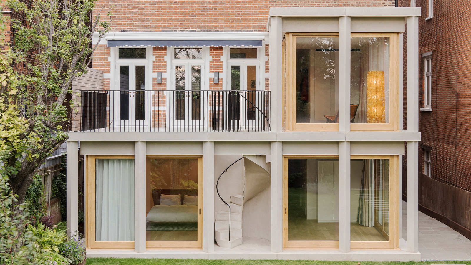 This 19th-century Hampstead house has a raw concrete staircase at its heart
This Hampstead house, designed by Pinzauer and titled Maresfield Gardens, is a London home blending new design and traditional details
By Tianna Williams
-
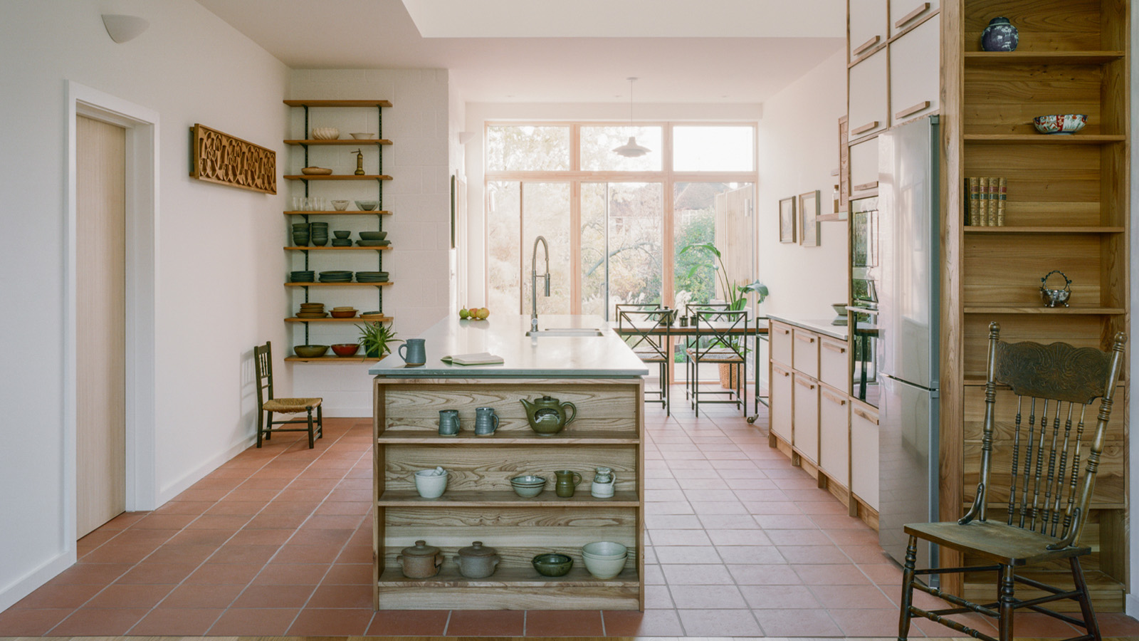 An octogenarian’s north London home is bold with utilitarian authenticity
Woodbury residence is a north London home by Of Architecture, inspired by 20th-century design and rooted in functionality
By Tianna Williams
-
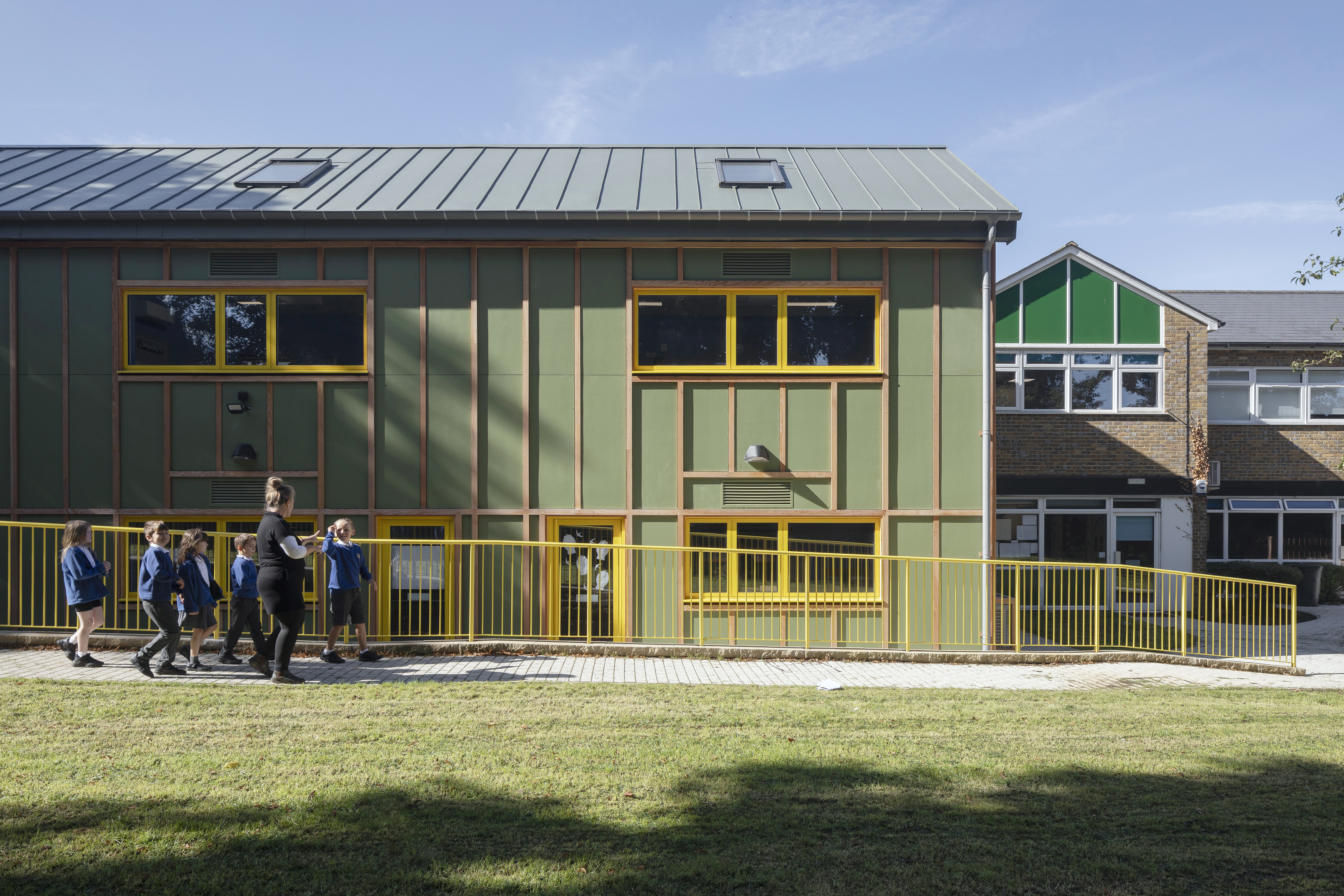 What is DeafSpace and how can it enhance architecture for everyone?
DeafSpace learnings can help create profoundly sense-centric architecture; why shouldn't groundbreaking designs also be inclusive?
By Teshome Douglas-Campbell
-
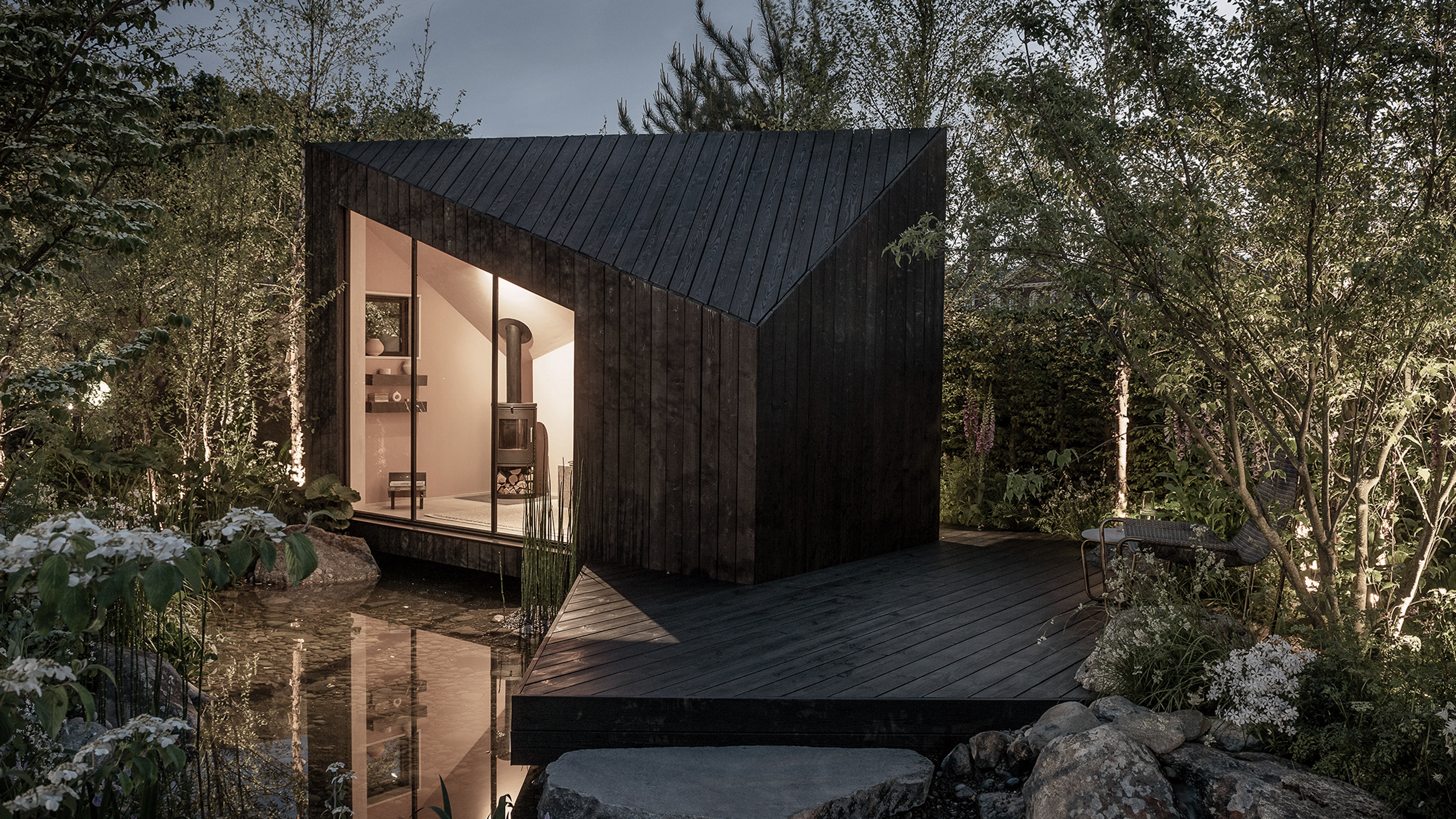 The dream of the flat-pack home continues with this elegant modular cabin design from Koto
The Niwa modular cabin series by UK-based Koto architects offers a range of elegant retreats, designed for easy installation and a variety of uses
By Jonathan Bell
-
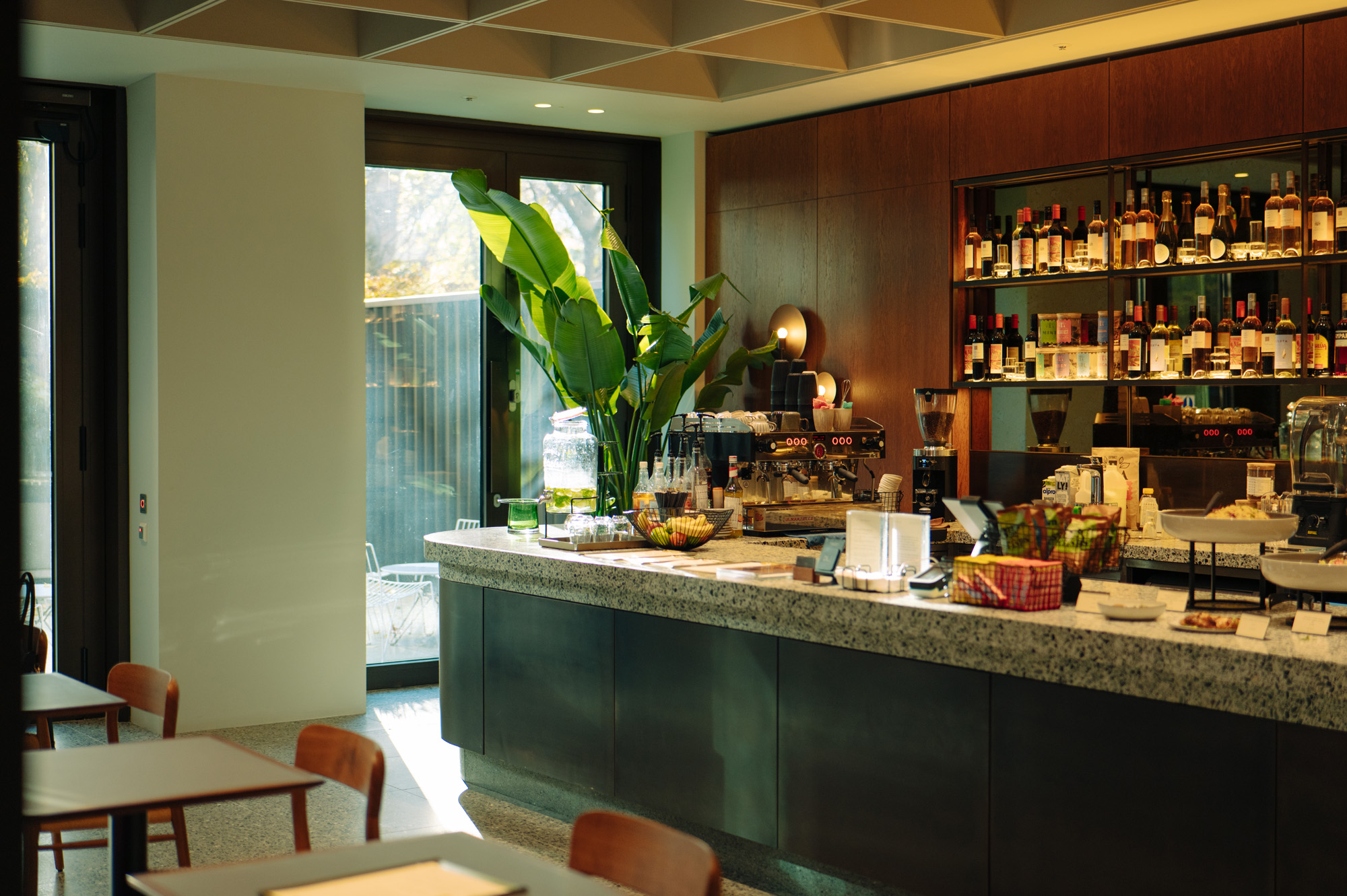 Are Derwent London's new lounges the future of workspace?
Property developer Derwent London’s new lounges – created for tenants of its offices – work harder to promote community and connection for their users
By Emily Wright
-
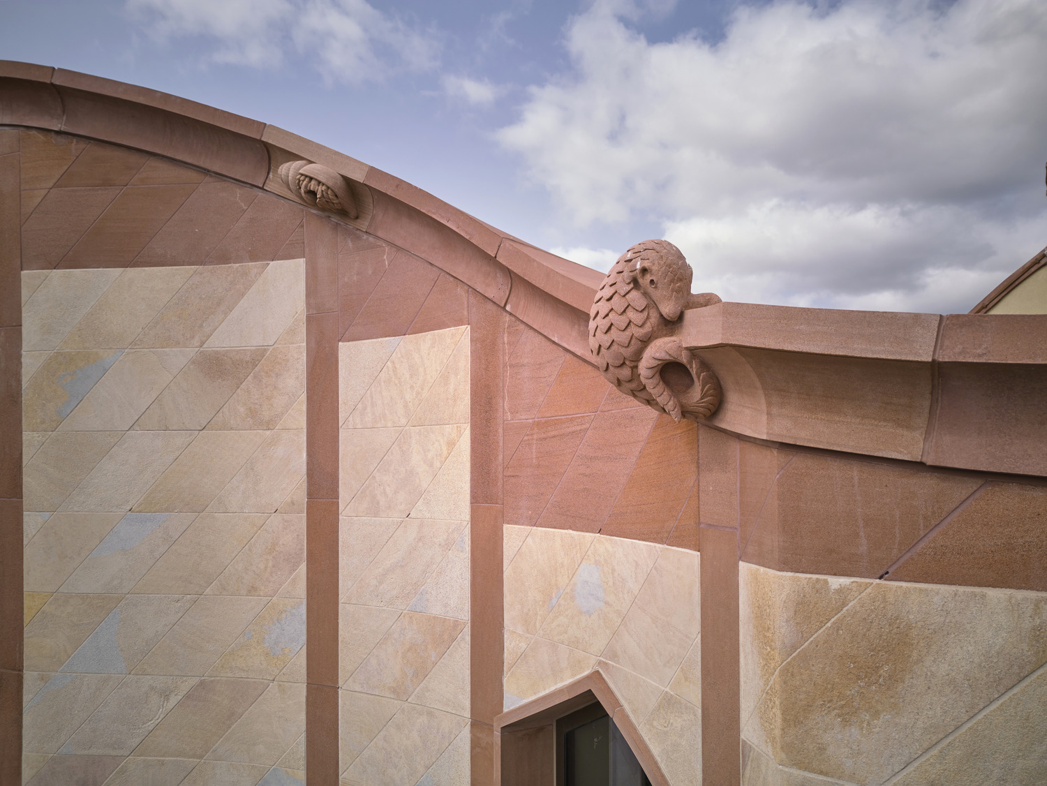 Showing off its gargoyles and curves, The Gradel Quadrangles opens in Oxford
The Gradel Quadrangles, designed by David Kohn Architects, brings a touch of playfulness to Oxford through a modern interpretation of historical architecture
By Shawn Adams
-
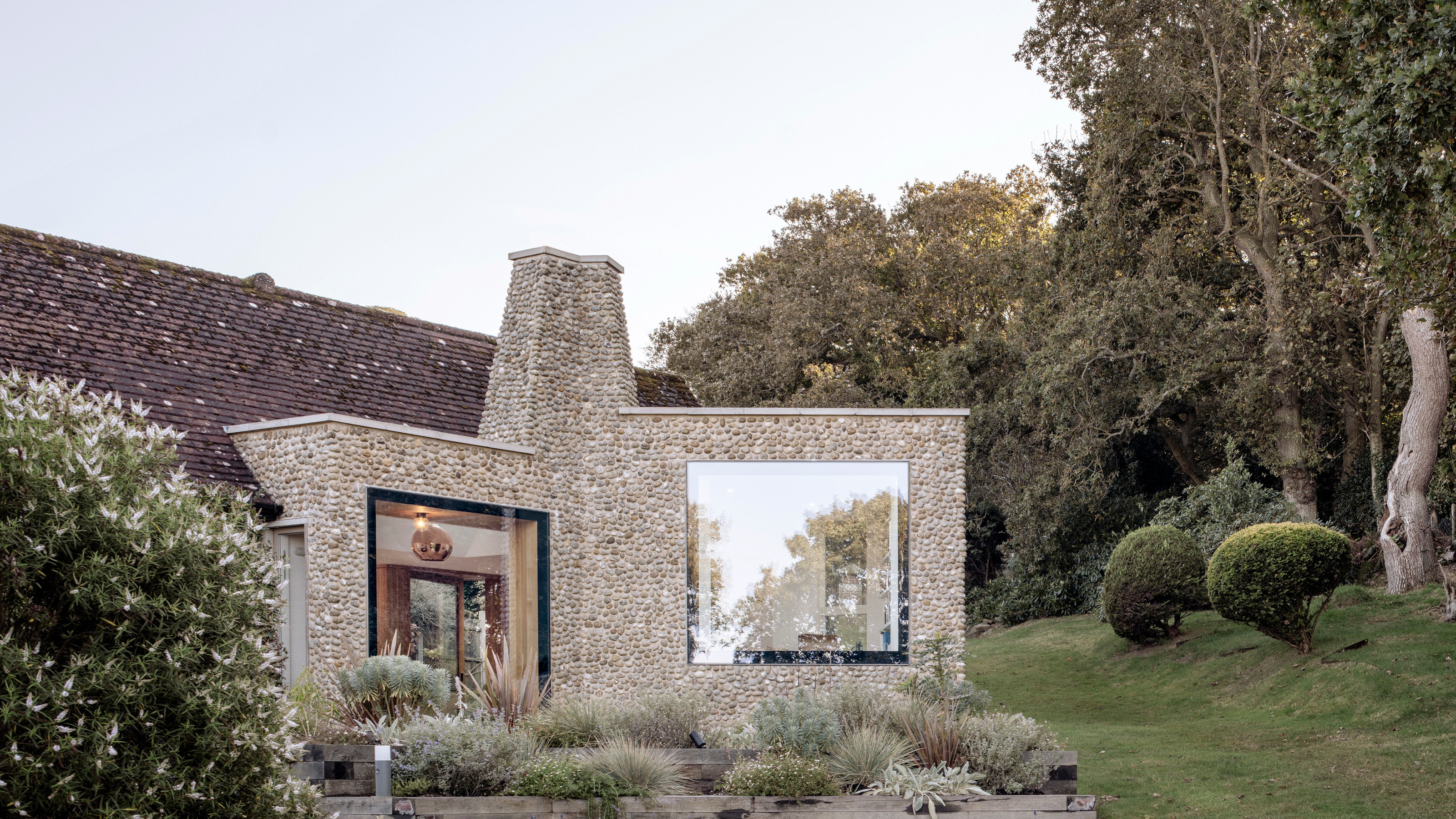 A Norfolk bungalow has been transformed through a deft sculptural remodelling
North Sea East Wood is the radical overhaul of a Norfolk bungalow, designed to open up the property to sea and garden views
By Jonathan Bell
-
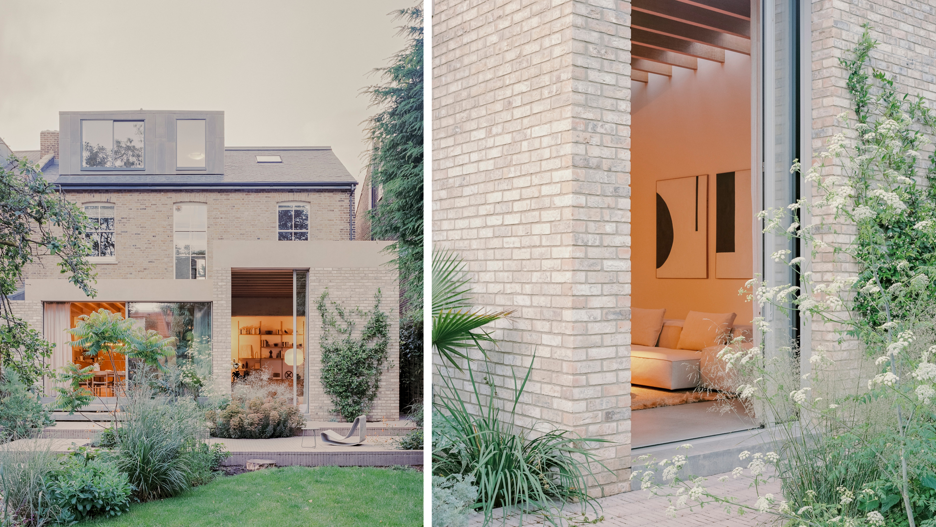 A new concrete extension opens up this Stoke Newington house to its garden
Architects Bindloss Dawes' concrete extension has brought a considered material palette to this elegant Victorian family house
By Jonathan Bell