This airy Martha’s Vineyard retreat by Architecture Research Office is a home for all seasons
In our October 2007 issue (W*103), Wallpaper* took a Stateside trip to the town of Chilmark in Martha’s Vineyard to explore a new home by Architecture Research Office, designed for a retired rabbi and an art and design curator. ARO has received numerous accolades over the years for residential, retail and cultural projects, and celebrated its 25th anniversary in 2018
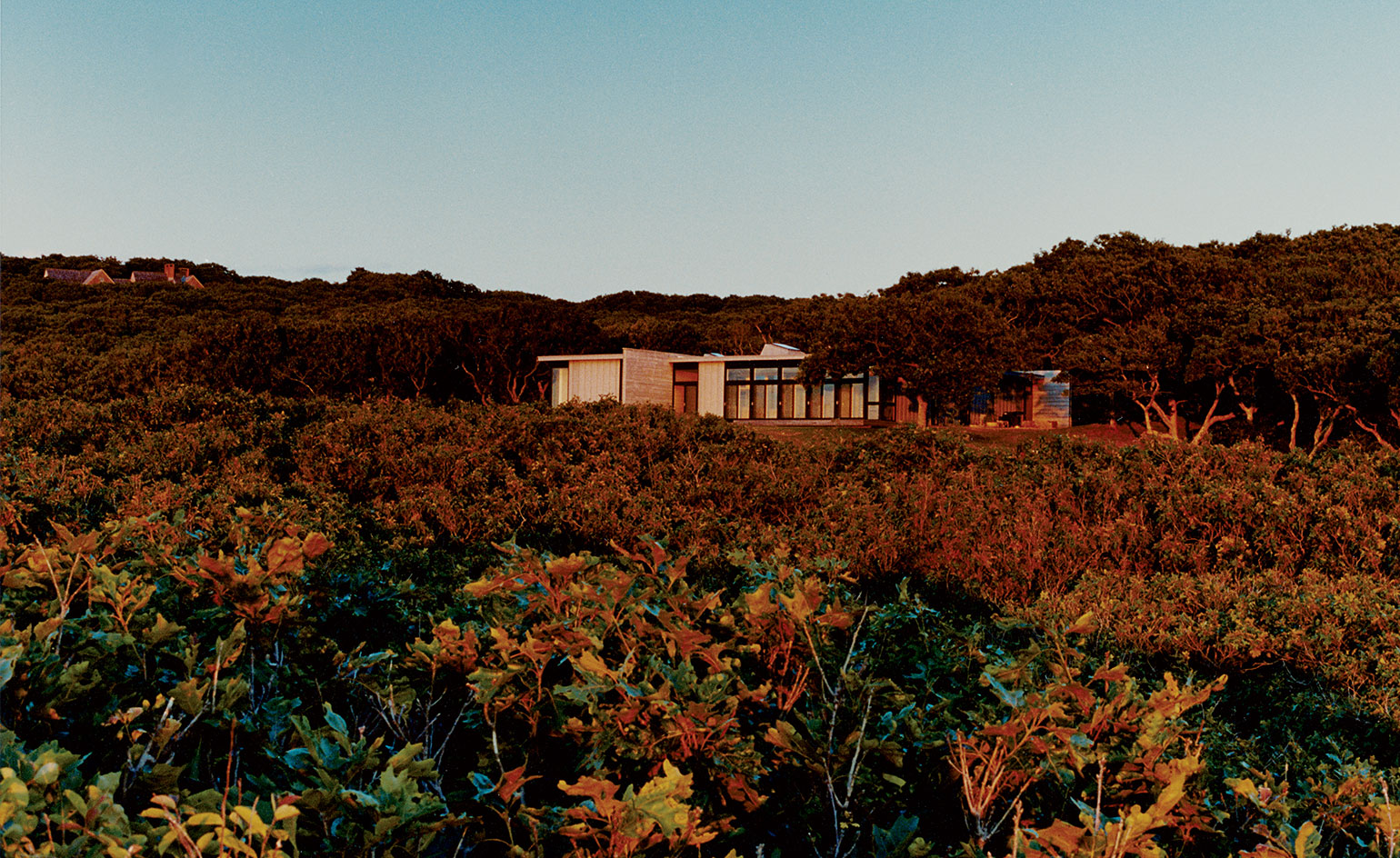
It can be hard to stand out on Martha’s Vineyard. Overstatement – exemplified by, for instance, the actor Larry David’s 70-acre spread, complete with stainless-steel outdoor kitchen – is one way to go about making a dent on this deluxe getaway for the Eastern Seaboard’s liberal élite. The other, and better, way is to understate, understate, understate.
Architecture Research Office (ARO), a Manhattan-based practice, recently completed a sublimely understated house for a retired rabbi and an art and design curator. The couple, who commissioned ARO five years ago, have owned the site, in the town of Chilmark, since the mid-1970s. Their previous house, a single, water-focused band designed by local architect Richard Henderson, was fine for 30 years but, with decreased commitments – the rabbi has retired – the couple were spending more time on the Island, as Martha’s Vineyard is known locally, and wanted something new.
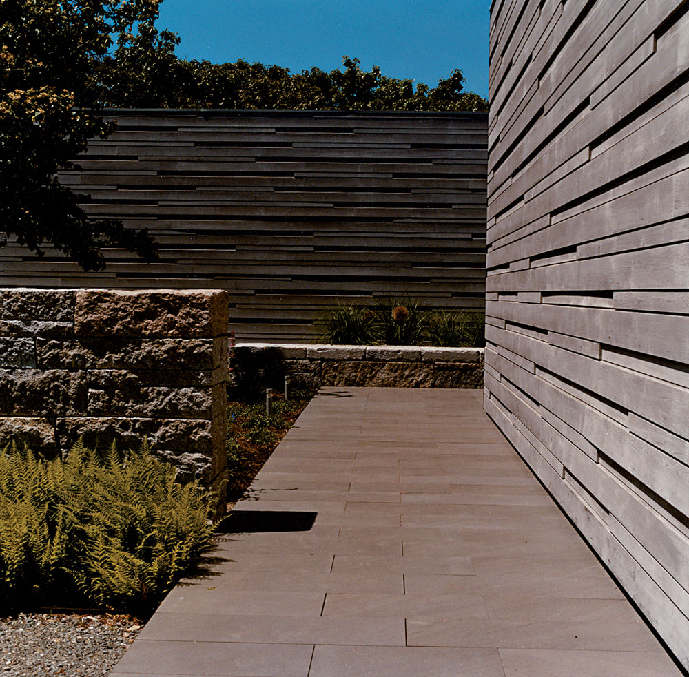
The wooden walls are constructed using specially made tongue-and-groove cladding. Photography: Thomas Brodin
When they first approached ARO in 1999, the firm was just too busy. The success of its Times Square US Armed Forces’ Recruiting Station – a one-note ‘duck’ of a fluorescent flag of a building on a busy Manhattan traffic island – had thrown ARO into a whirlwind of commissions and projects, ones that didn’t allow time for such a (relatively) small and (still relatively) low-budget residence. A few years went by, though, and Adam Yarinsky, principal and co-founder of the firm, found the time to take on the project.
The clients were interested in reintroducing a landscape element into the site – something that had been overlooked with all the attention on the admittedly spectacular water view – and one of the first things a visitor notices is the front courtyard garden, designed in very close collaboration with Maine-based landscape architect Michael Boucher. Low stone walls, the rock chosen following months of local research, create a level of delineation that reiterates what is the house’s main architectural detail – a series of wooden walls constructed of specially made tongue-and-groove cladding.
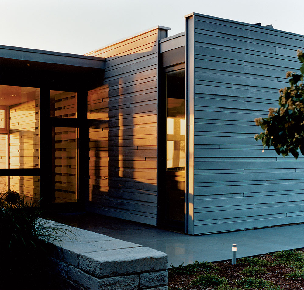
The house is designed to be open to the outside, yet shielded from the winter weather. Photography: Thomas Brodin
The walls jut out from inside and sweep in from outside, and it’s this interrelationship between inside and outside space, private and very private, that continues through the entire house. Yarinsky points to a series of study models based around the clients’ needs – three bedrooms that could also be used as studies; an open and convivial kitchen; flexibility of space; and lots and lots of light – that figure and reconfigure basic blocks into a series of meandering rooms. The final plan locks three similar spaces together in a criss-cross pattern that allows, on a summer day, six people to comfortably inhabit the space without stepping on each other.
The inside-outside play is more considered than it looks, Yarinsky says. Part of the brief was to create a house that was winter-ready, so the architects had to figure out a way of making the interior feel cosy without losing the sense of fluidity between inside and out. A wall of German-designed (architects’ code for simple but hi-tech) glass doors faces the water and opens onto a deck shielded from the harsh New England wind by an extension of the living room wall.
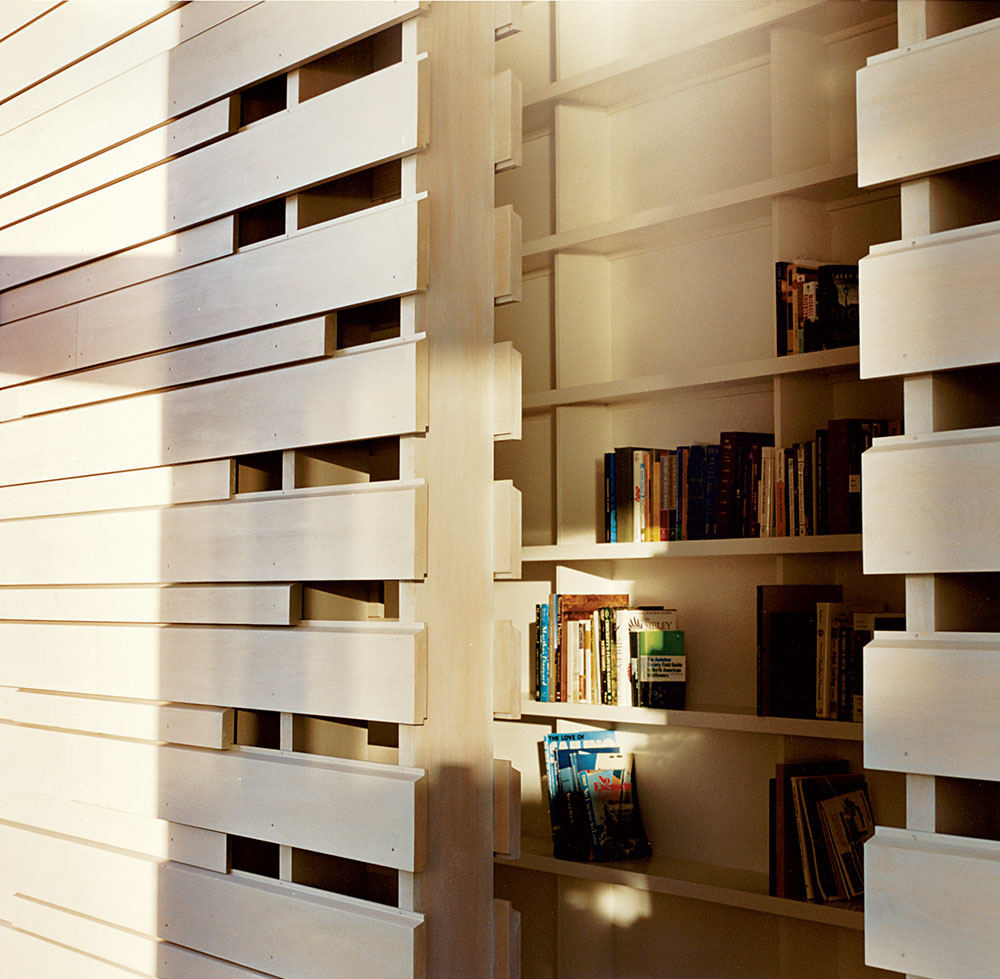
The wall dividing the living room and the master bedroom. Photography: Thomas Brodin
‘You want this kind of generosity of space and openness,’ Yarinsky says of the project. ‘But everything has to be carefully considered and controlled.’ The architects went through six iterations of the wall design, each version of which toyed with ideas of shadow and the interplay between light and darkness, summer and winter, inside and out. It’s a subtle intervention, though, and it’s this subtlety that Yarinsky – and the clients – find most appealing about the project and its scale.
‘What was really refreshing about working on this site is that it’s a normal house; it’s not bloated,’ Yarinsky says. The clients wanted the house to be a third bigger than it is, but ARO, and the threat of higher construction costs, talked them down. Still, at 2,500 sq ft, it’s a good size and feels twice as large due to its airines
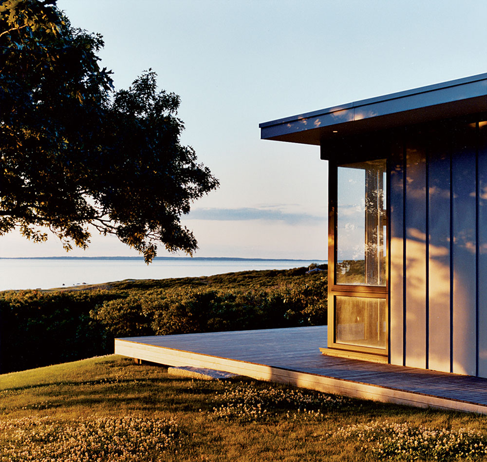
The terrace is open to the sea view. Photography: Thomas Brodin
The walls are in Alaskan cedar, the floor is unstained white oak, and the stone details are in Italian lava basaltina, hand-installed by a mason who was flown in specially. Vertical zinc walls round out the purposefully limited material palette, and three faceted skylights introduce both that all-important daylight and a moment of surprising detail.
It’s this element of subtle surprise that runs through the entire design. Yarinsky mentions the control architects necessarily have, but mitigates that often treacherous moment of ‘I want you to feel this’ with a realisation that these interventions had to be subtle. ‘I don’t think it’s appropriate to live in a statement on that scale,’ he says of domestic architecture. And this house, with its quietly perfect moments – a bedroom skylight, an impeccable sense of proportion – is an argument in favour of simplicity and understatement. It might look quiet, but it speaks volumes. §
As originally featured in the October 2007 issue of Wallpaper* (W*103)
INFORMATION
For more information, visit the Architecture Research Office website
Wallpaper* Newsletter
Receive our daily digest of inspiration, escapism and design stories from around the world direct to your inbox.
-
 Put these emerging artists on your radar
This crop of six new talents is poised to shake up the art world. Get to know them now
By Tianna Williams
-
 Dining at Pyrá feels like a Mediterranean kiss on both cheeks
Designed by House of Dré, this Lonsdale Road addition dishes up an enticing fusion of Greek and Spanish cooking
By Sofia de la Cruz
-
 Creased, crumpled: S/S 2025 menswear is about clothes that have ‘lived a life’
The S/S 2025 menswear collections see designers embrace the creased and the crumpled, conjuring a mood of laidback languor that ran through the season – captured here by photographer Steve Harnacke and stylist Nicola Neri for Wallpaper*
By Jack Moss
-
 We explore Franklin Israel’s lesser-known, progressive, deconstructivist architecture
Franklin Israel, a progressive Californian architect whose life was cut short in 1996 at the age of 50, is celebrated in a new book that examines his work and legacy
By Michael Webb
-
 A new hilltop California home is rooted in the landscape and celebrates views of nature
WOJR's California home House of Horns is a meticulously planned modern villa that seeps into its surrounding landscape through a series of sculptural courtyards
By Jonathan Bell
-
 The Frick Collection's expansion by Selldorf Architects is both surgical and delicate
The New York cultural institution gets a $220 million glow-up
By Stephanie Murg
-
 Remembering architect David M Childs (1941-2025) and his New York skyline legacy
David M Childs, a former chairman of architectural powerhouse SOM, has passed away. We celebrate his professional achievements
By Jonathan Bell
-
 The upcoming Zaha Hadid Architects projects set to transform the horizon
A peek at Zaha Hadid Architects’ future projects, which will comprise some of the most innovative and intriguing structures in the world
By Anna Solomon
-
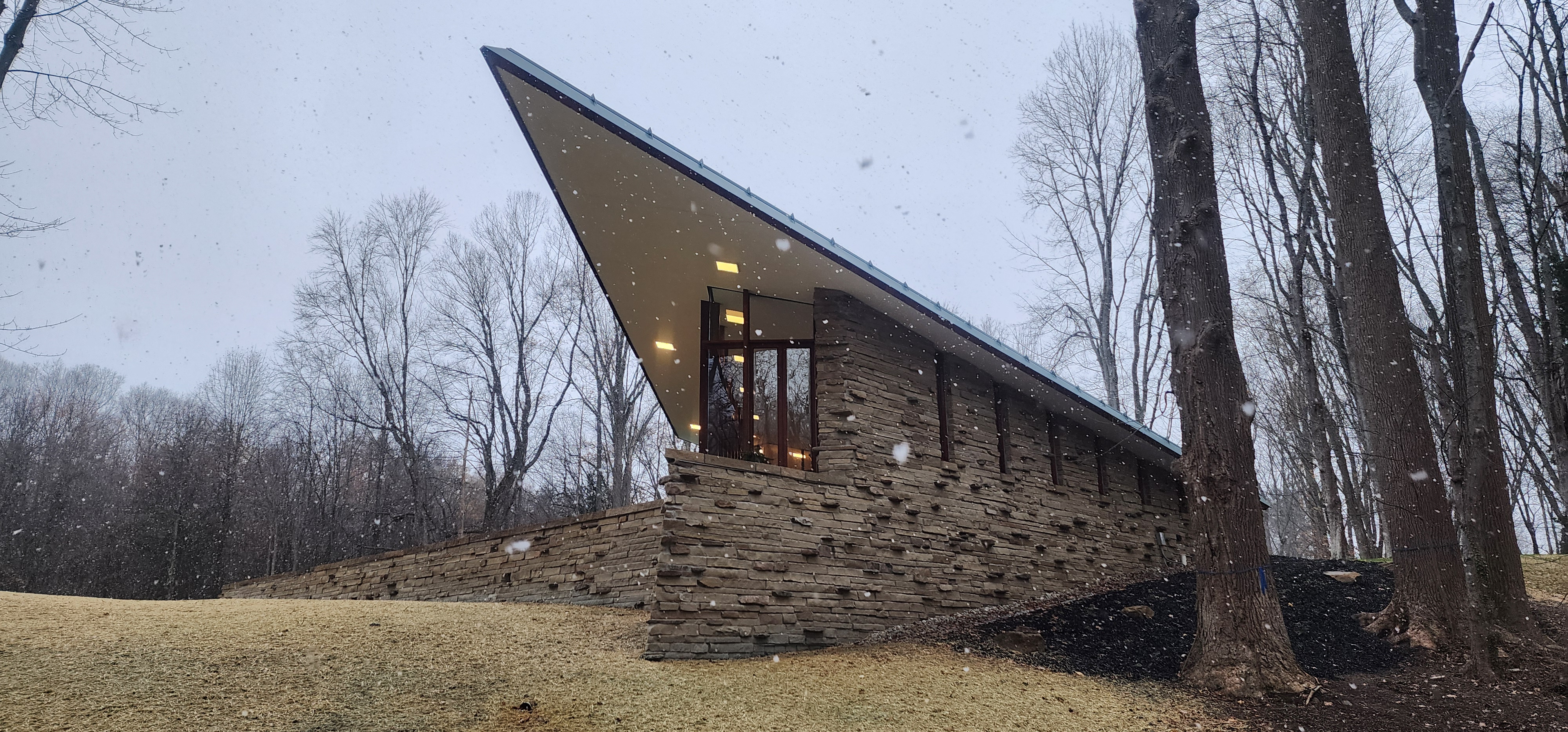 Frank Lloyd Wright’s last house has finally been built – and you can stay there
Frank Lloyd Wright’s final residential commission, RiverRock, has come to life. But, constructed 66 years after his death, can it be considered a true ‘Wright’?
By Anna Solomon
-
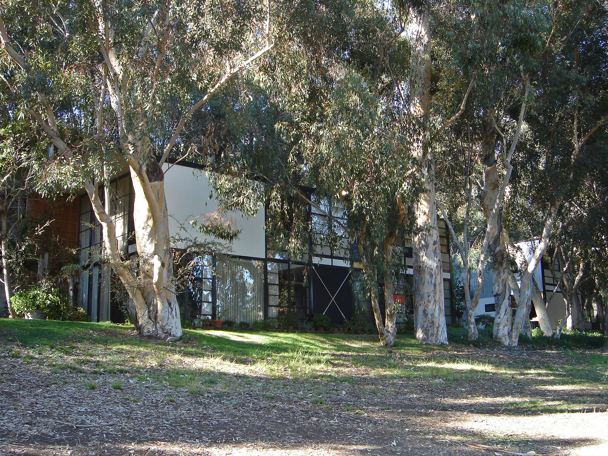 Heritage and conservation after the fires: what’s next for Los Angeles?
In the second instalment of our 'Rebuilding LA' series, we explore a way forward for historical treasures under threat
By Mimi Zeiger
-
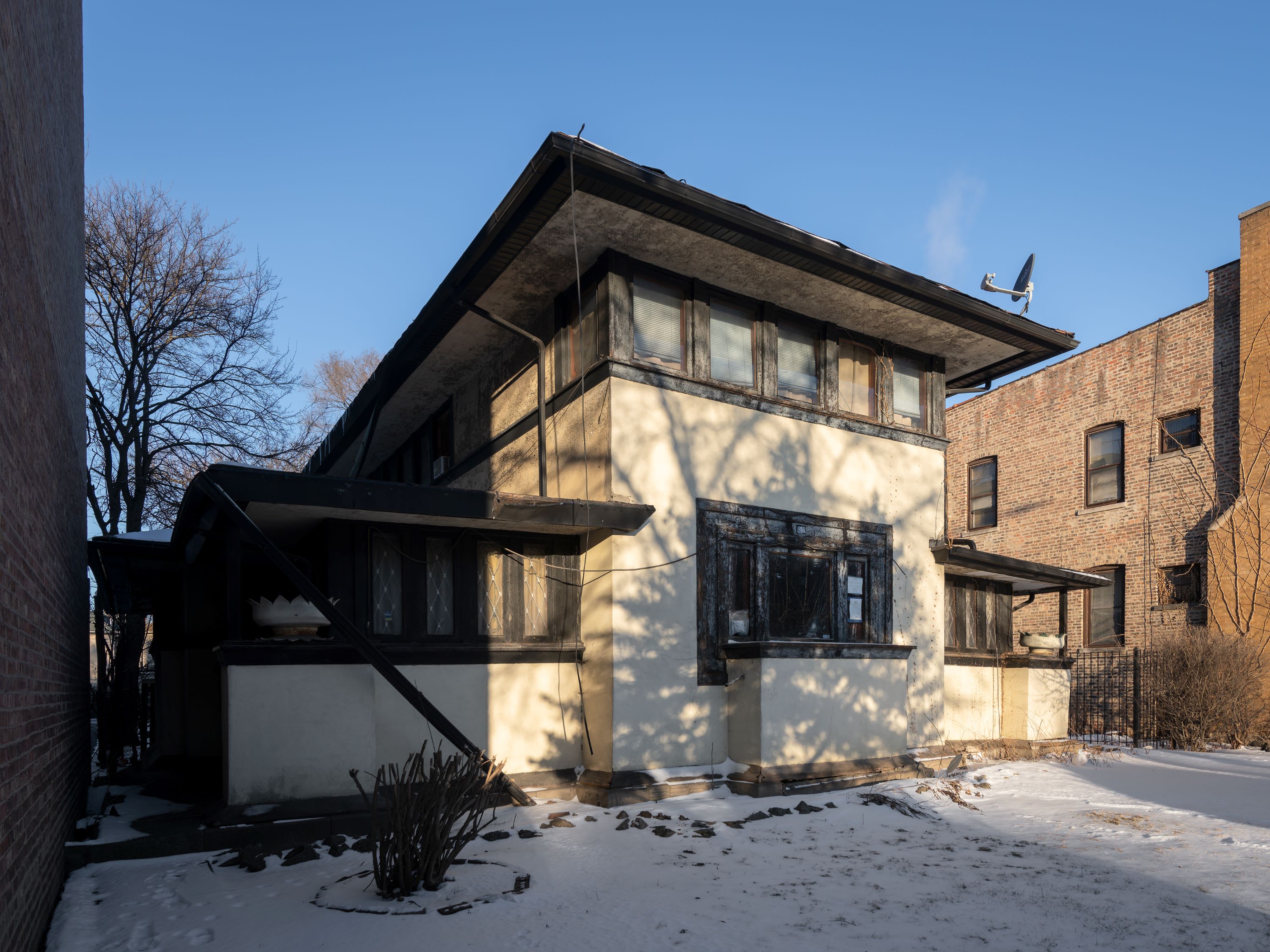 Why this rare Frank Lloyd Wright house is considered one of Chicago’s ‘most endangered’ buildings
The JJ Walser House has sat derelict for six years. But preservationists hope the building will have a vibrant second act
By Anna Fixsen