MAS Museum opens in Antwerp
Receive our daily digest of inspiration, escapism and design stories from around the world direct to your inbox.
You are now subscribed
Your newsletter sign-up was successful
Want to add more newsletters?
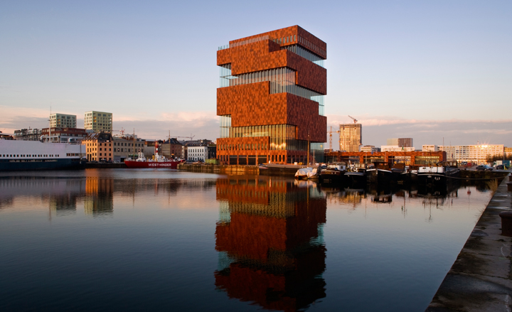
For its first new museum in a century, the Belgian city of Antwerp needed a building that would impress and seduce in equal measure. The commanding sandstone and glass tower designed by Dutch architects Neutelings Riedijk certainly delivers. Built on the city's once-derelict old docks, the MAS (short for Museum on the River) brings together various city and private collections under one roof and displays precious artefacts from around the globe. Its checkered, rusty red skin has already become an icon and symbol of pride for this great port city, and it has only just opened.
The 65m tower was conceived as a series of boxes stacked on top of each other and rotated 90 degrees on each floor to create an internal spiral. 'It's a sort of warehouse for history, a stacking of ten big treasury boxes,' explains Willem Jan Neutelings, one half of Neutelings Riedijk. The exhibition spaces (housed inside these boxes) have no natural light but are countered by the massive glazed staircase that winds its way around the building, bringing you by escalator from floor to floor, and intended as a public street.
This so-called public 'boulevard' will remain open much later than the museum rooms and be free of charge, allowing visitors fantastic views over the city from each of the nine floors and the rooftop terrace. It also won't be air-conditioned like the museum rooms - 'So it's like you're still outside,' explains Neutelings. The contrast between the daylight and seasonal temperature of the boulevard and the climate-controlled artificially-lit museum rooms was intentional. 'It gives this effect of the past, of death, and when you come out of the box again you are in the light, in life and in the present.'
The boulevard is surrounded by giant panes of airy glass that were gently curved to create stability and do away with the need for supports or frames. These undulations also create what Neutelings calls a 'kaleidoscopic effect'. 'Sometimes you can see the cathedral twice,' he points out. Ardent detractors of minimalism, Neutelings and Riedijk have covered the outside of the building with small metal hands (the city's symbol) and the interior walls, floors and ceilings with medallions telling the story of Antwerp. 'In our architecture we try to do contemporary ornaments, because we think it can give a certain tactility to the building, a depth in the composition, but also a depth to the meaning.'
The first temporary exhibition at the museum is 'Masterpieces in the MAS: Five centuries of images in Antwerp', which confronts the world represented by the old masters with that of contemporary artists.
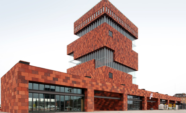
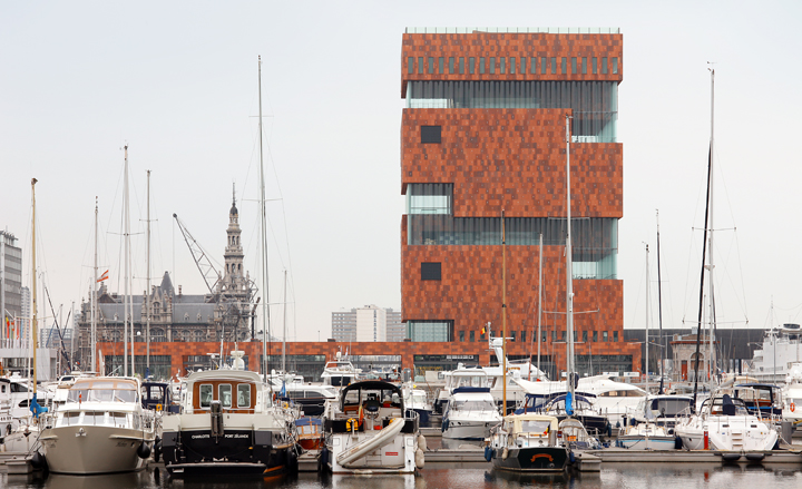
Its checkered, rusty red skin has already become an icon and symbol of pride for this great port city, and it has only just opened its doors
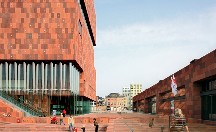
The 65m tower was conceived as a series of boxes stacked on top of each other and rotated 90 degrees on each floor to create an internal spiral
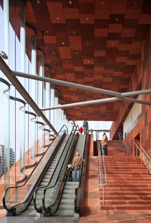
The exhibition spaces (housed inside these boxes) have no natural light but are countered by the massive glazed staircase that winds its way around the building, bringing you by escalator from floor to floor, and intended as a public street
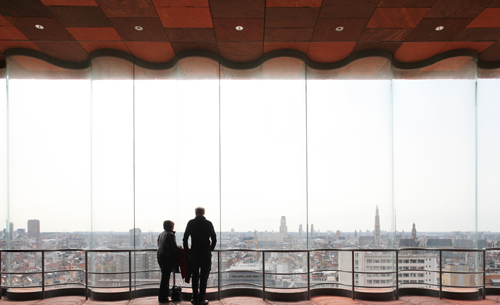
This so-called public 'boulevard' will remain open much later than the museum rooms and be free of charge, allowing visitors fantastic views over the city from each of the nine floors and the rooftop terrace
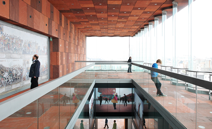
It also won't be air-conditioned like the museum rooms - 'So it's like you're still outside,' explains Willem Jan Neutelings, one half of Neutelings Riedijk
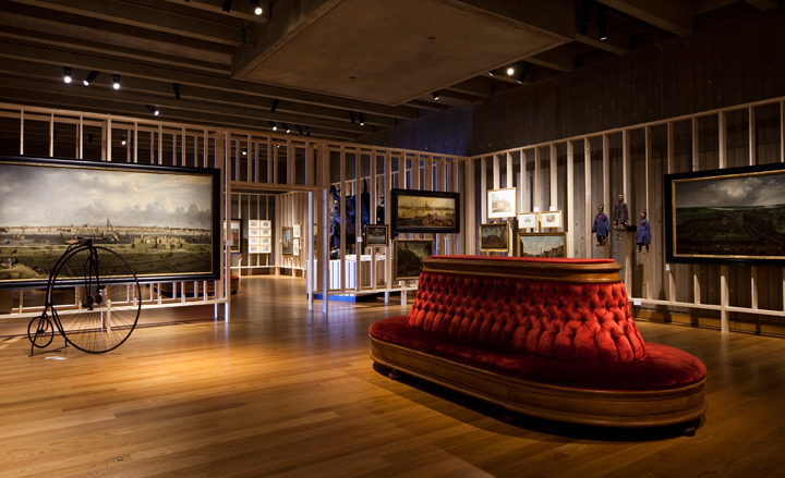
The contrast between the daylight and seasonal temperature of the boulevard and the climate-controlled artificially-lit museum rooms was intentional. 'It gives this effect of the past, of death, and when you come out of the box again you are in the light, in life and in the present,' says Neutelings
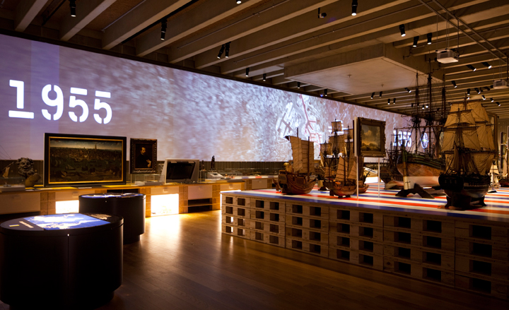
The interior installations are designed
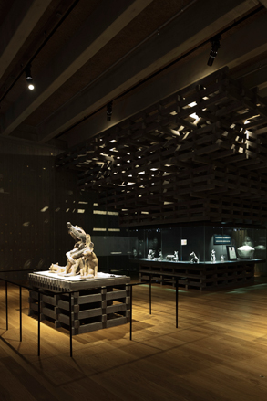
B-architecten's designs incorporate elements from film and theatre
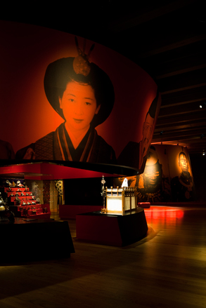
Their scenography is multi-sensory, accompanied by a musical score by Eric Sleichim from Bl!ndman
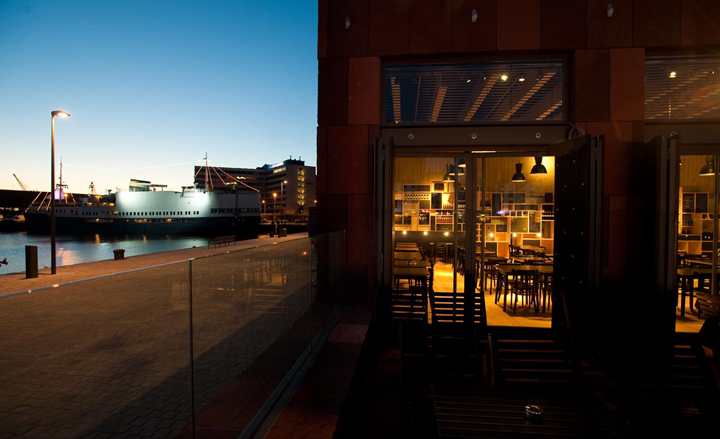
Cafe Storm on the ground floor of the museum was designed by Belgian firm, Not Before Ten
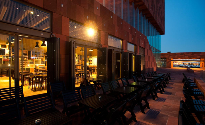
It serves up breakfast, lunch and aperitifs
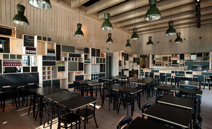
Inside it continues the museum's stacking theme, with walls of birch plywood boxes
ADDRESS
Museum Aan de Stroom
Hanzestedenplaats 1
2000 Antwerpen
Receive our daily digest of inspiration, escapism and design stories from around the world direct to your inbox.
Giovanna Dunmall is a freelance journalist based in London and West Wales who writes about architecture, culture, travel and design for international publications including The National, Wallpaper*, Azure, Detail, Damn, Conde Nast Traveller, AD India, Interior Design, Design Anthology and others. She also does editing, translation and copy writing work for architecture practices, design brands and cultural organisations.