MCA Sydney extension, by Sam Marshall
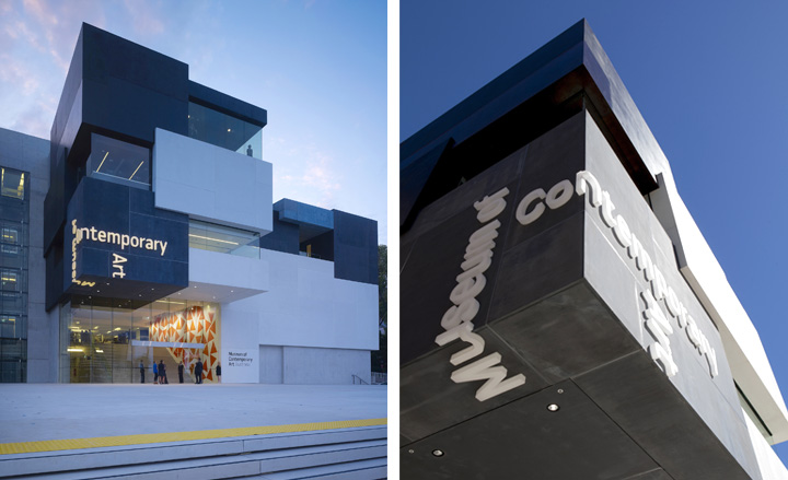
In March 1932, Sydney Harbour got its iconic Harbour Bridge, that steel arch they call the Coathanger. Forty years on the Sydney Opera House debuted and, with it, a defining image of the city. A week after the bridge’s 80th anniversary the harbour’s newest icon, Sydney’s new Museum of Contemporary Art, is completing what has slowly but surely become a pattern.
After a 21-month closure, the museum reopens its original premises – the Art Deco former Maritime Services building – as one half of a fully integrated entity, part serious symmetrical sandstone, and part deconstructed cube, each bracketing the last century. Renovations to the old building include reimagined entrances and a northern flank that opens completely to its sister building for a seamless flow. Yet the new annex is the obvious debutante. Designed by local architect Sam Marshall, it introduces an icon for the city’s post-Opera House generation.
Marshall used a contrasting palette of black, white and brown and a radical configuration of Jenga-like blocks to fight fire with its arresting neighbours. But while his approach may seem incongruous on Circular Quay, fronting Sydney’s oldest district, Marshall has clearly been paying attention. He’s designed the forecourt as a pedestrian ‘street’ to correspond with the network of lanes that see it now as a nucleus. The street spans both entrances, enticing visitors into the foyer, then leading them up through the various levels.
Inside, he treated the galleries like houses in and of themselves, offering views in, out and between them, mirroring the tight community outside. Each block is linked by a glazed wall, which remedies that age-old museum anxiety that surfaces when you’ve lost track of your route. Voids and terraces on every levels makes this museum seem very much a part of the harbour.
The real upshot of all those sightlines? The views are astounding. No gallery is without one. Not even the learning centres are robbed of glorious harbour vistas. A new café and sculpture garden have been placed atop the structure, looking out on the bridge and the Opera House and, 40 years from now, who knows what else?
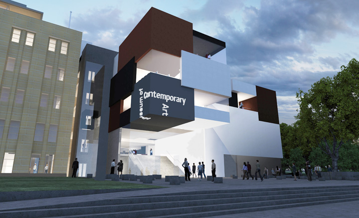
Marshall used a contrasting palette of black, white and brown and a radical configuration of Jenga-like blocks
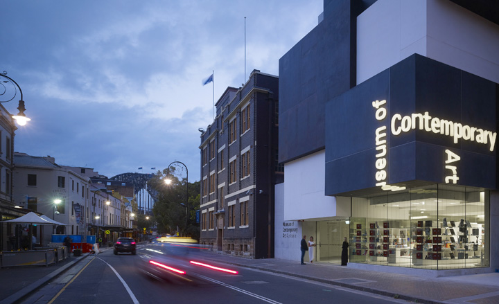
The George Street entrance
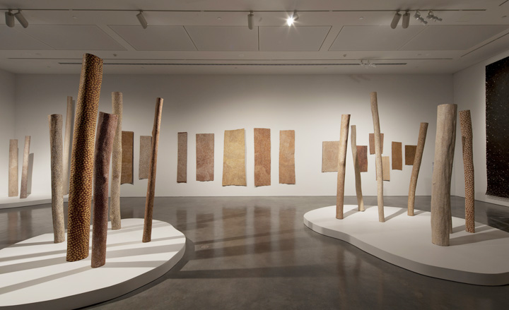
The architect has treated the galleries like individual houses, offering views in, out and between them, mirroring the tight community outside
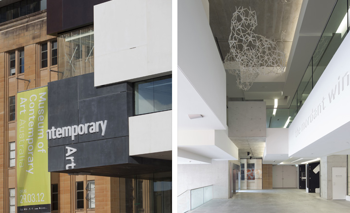
Detail view of the cubist exterior; the foyer of the new annex
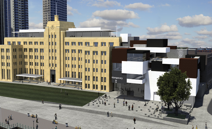
Renovations to the old building include reimagined entrances and a northern flank that opens completely to its sister building for a seamless flow
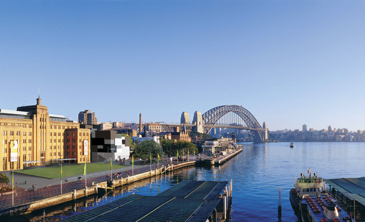
A view of Circular Quay
Wallpaper* Newsletter
Receive our daily digest of inspiration, escapism and design stories from around the world direct to your inbox.
Based in London, Ellen Himelfarb travels widely for her reports on architecture and design. Her words appear in The Times, The Telegraph, The World of Interiors, and The Globe and Mail in her native Canada. She has worked with Wallpaper* since 2006.
-
 Maserati joins forces with Giorgetti for a turbo-charged relationship
Announcing their marriage during Milan Design Week, the brands unveiled a collection, a car and a long term commitment
By Hugo Macdonald
-
 Through an innovative new training program, Poltrona Frau aims to safeguard Italian craft
The heritage furniture manufacturer is training a new generation of leather artisans
By Cristina Kiran Piotti
-
 Wallpaper* checks in at The Eve Hotel Sydney: a lush urban escape
A new Sydney hotel makes a bold and biophilic addition to a buzzing neighbourhood that’s on the up
By Kee Foong
-
 Australia’s first Art Grand Tour unites three biennials in a city-hopping trail
Australia’s Art Grand Tour showcases more than 400 artists, across Sydney, Melbourne and Adelaide in a build-your-own art adventure
By Hannah Silver
-
 At Melbourne’s NGV Triennial 2023, artists consider magic, matter and memory
Melbourne’s NGV has opened its third triennial, uniting art, design and architecture from around the world
By Elias Redstone
-
 Photo 2024: what to expect as Australia’s largest photography festival returns
Photo 2024 International Festival of Photography will take place 1-24 March 2024 across Melbourne and Victoria
By Hannah Silver
-
 William Kentridge on failed utopias and transcending borders: ‘art must defend the uncertain’
Azu Nwagbogu profiles South African artist William Kentridge, whose show at London's Royal Academy of Arts runs until 11 December 2022
By Azu Nwagbogu
-
 Francis Upritchard blends science fiction and folklore in epic new Sydney Modern Project commission
We explore the making of Here Comes Everybody, Francis Upritchard’s fantastical bronzes sculptures for the much-anticipated Sydney Modern Project
By Kate Goodwin
-
 Photo 2022: a trip through past, present and potential futures in Melbourne and beyond
The groundbreaking Photo 2022 International Festival of Photography will return to Melbourne from 29 April – 22 May 2022. Charlotte Jansen spoke to artistic director Elias Redstone ahead of the opening
By Charlotte Jansen
-
 ‘By queers for queers’: NGV hosts largest ever show of queer art in Australia
Celebrating Pride Month, we revisit our article on the major Melbourne show, ‘Queer: Stories from the NGV Collection’, which reveals how LGBTQ+ stories and histories can be told through art (until 21 August 2022)
By Elias Redstone
-
 ‘By queers for queers’: NGV hosts largest ever show of queer art in Australia
Celebrating Pride Month, we revisit our article on the major Melbourne show, ‘Queer: Stories from the NGV Collection’, which reveals how LGBTQ+ stories and histories can be told through art (until 21 August 2022)
By Harriet Lloyd Smith