A hotel magnate’s brutalist base in Mexico City has us green with envy
A peculiar house rises above the green panorama of vine-covered walls that hide the mansions of Mexico City’s upscale Las Lomas neighbourhood. Restored by renowned Mexican architect Alberto Kalach, the building stands four storeys tall and appears to be a small apartment complex, though in reality it is a one-bedroom, modern-day bachelor pad.
The brutalist 1970s property had been abandoned for years before it was purchased by Moisés Micha in 2014. Co-founder of the Grupo Habita boutique hotel brand and an art collector, Micha saw the potential in the unusual, constricted structure, and commissioned Kalach for the restoration. Belgian architect Nicolas Schuybroek and interior designer Marc Merckx collaborated to create the interiors.
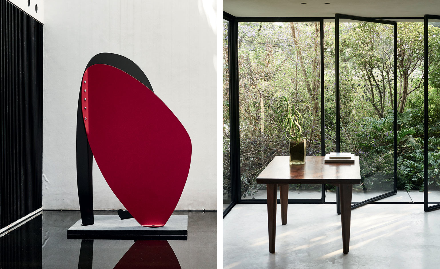
The finished exterior stands confidently in stark contrast to its surroundings; a concrete and black steel façade punctuated by green balconies. From street level, it’s difficult to imagine what it harbours. On entering, one is greeted by a long, light-soaked corridor ending in a water basin that hosts Terence Gower’s The Couple, a defiantly bold artwork of black and red steel. Sunlight creeps into the corridor from the back, where Kalach designed an opening that pierces the building and functions as a new source of illumination.
‘We wondered how we could breathe life into the house,’ Kalach recalls. ‘So we opened it up at the rear, because initially it only received light from the façade. We then proposed hanging gardens that would cascade down onto the street and isolate the house from its context. That was basically the strategy.’
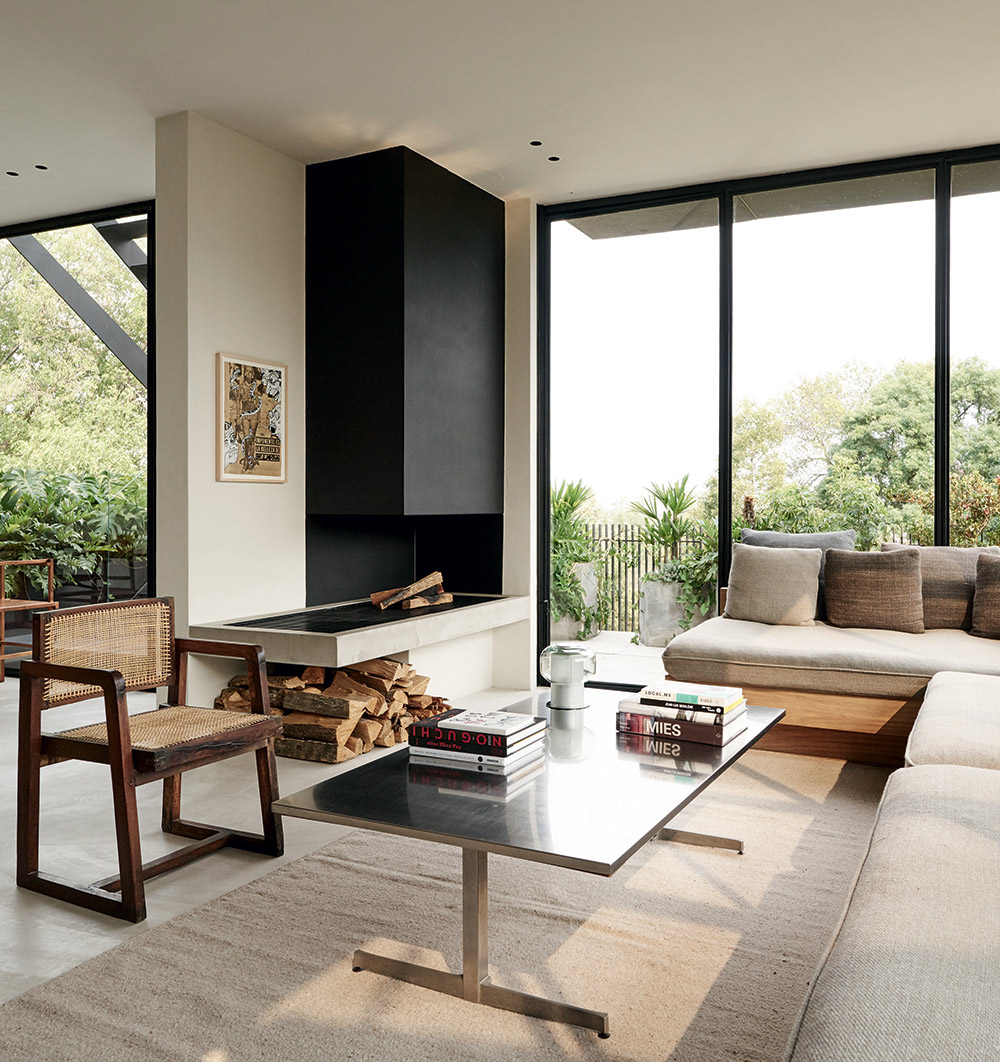
The living room is furnished with a 1960s teak and wicker chair by Pierre Jeanneret; a vintage coffee table found in Paris; a custom-made sofa; and a 2004 drawing by Mexican artist Dr Lakra.
Notoriously reticent about his design process and finished work, Kalach is emphatic about the initial state of the property: ‘It was very ugly, it was horrible. But to be able to transform something that is apparently worthless into something valuable makes me think. In the past, I would have said this needed to be demolished, but perhaps, as an architect, you can create a great building from something terrible.’ With a hint of sarcasm, he concludes that ‘in the end it’s recycling, which is very trendy now’.
The home, however, comes across as anything but recycled, due largely to the role played by the impeccable interior design, a joint effort by Schuybroek and Merckx, based in Brussels and East Flanders respectively. The restrained material palette is maintained throughout the numerous floors, ensuring a sense of connection. ‘We spent a lot of time studying the right proportions for every single room in this house to avoid that empty feeling of disconnected space,’ says Schuybroek, adding that ‘we tried to create a very cosy and warm scale in a house for one’.
From the ground level, a delicate staircase of black steel leads to the first floor, where the kitchen, dining room and a small living room are located. Ascending from the balcony, a breathtaking garden – disorienting in its apparent depth despite its location above ground level – is evidence of Kalach’s mastery at landscaping and calls to mind the late Mexican architect Luis Barragán’s philosophy that you should ‘design houses as gardens and gardens as houses’.
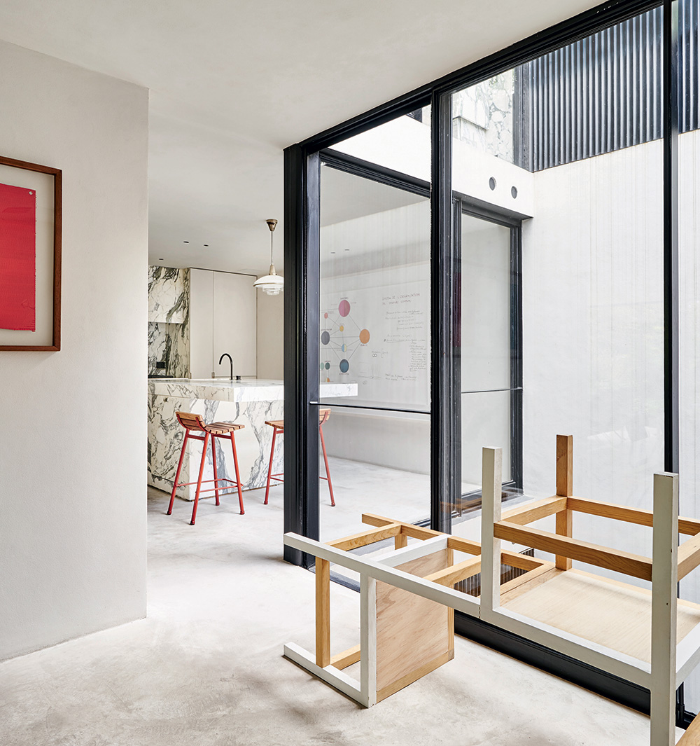
In the kitchen are a pair of 1950s slat stools by Vista of California and an upfolding/filp chair (2004) sculpture by Damián Ortega. A 2003 painting by Gabriel Orozco, from the artist’s flag series, and a 2014 Le Corbusier/Bubble Diagram by Jose Dávila, hang on the walls.
Of course, the true beauty of greenery lies in its unpredictable nature; its inevitable defiance of even the most careful planning, and in a home such as this it coexists in pleasant tension with the otherwise perfectly selected and placed pieces. Such gestures are present on every floor, but perhaps the most striking is one that is a happy accident. A series of fine steel bars rests atop two white walls of the back opening and, in a matter of just a couple of years, have begun to rust, the oxidation dripping downward in perfectly straight, orange-tinged lines that vanish as they race to the basin at the base. This imperfection, Micha says, is one Kalach noticed during a recent visit and gave strict instructions that it never be painted over.
‘The idea itself of wear and patina in a house is extremely important,’ observes Schuybroek. ‘This is why we always work with materials that age beautifully. Over time, the house will change, the parota wood will eventually age, the cracks on the concrete will become more pronounced, and the marble’s appearance will be altered.’
The integration of Micha’s art collection was an important part of the interior approach. Schuybroek describes how design decisions were carefully taken to avoid creating what he describes as a ‘cold and static art experience.’ The furniture was meticulously selected over the span of around a year to ensure that they would ‘perfectly blend and fit into the interiors’.
‘This house is characterised by a mix of well-known and lesser-known design pieces, all of them with an original patina or in a material that fits in the Mexican and urban context,’ says Schuybroek. ‘We bought a small, rare Jeanneret chair in Chicago, found the exterior chairs in Mexico City, and the Pierre Guariche chairs in Paris. Some pieces, such as the dining tables or the marble credenza, were custom-designed specifically for this project, thus creating a nice balance between original and vintage pieces.
As originally featured in the November 2017 issue of Wallpaper* (W*224)
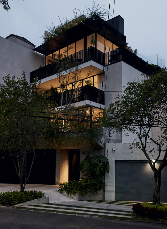
Hanging gardens cascade down onto the street, shielding the revamped 1970s house from the street
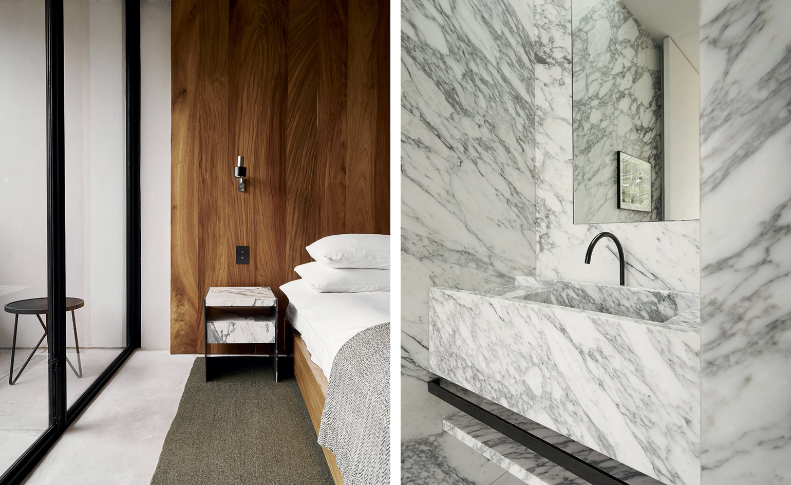
Custom-made designs by Schuybroek and Merckx include a parota and raintree wood panel and bed, and a marble bedside table in the bedroom (left) and an Arabescato marble sink in the bathroom (right)
INFORMATION
For more information, visit the Kalach website, the Nicolas Schuybroek Architects website and the Merckx Interiors website
Wallpaper* Newsletter
Receive our daily digest of inspiration, escapism and design stories from around the world direct to your inbox.
-
 Dior holds an enchanting Kyoto show in the midst of cherry-blossom season
Maria Grazia Chiuri chose the grounds of Kyoto’s serene Tō-ji Temple to present a Fall 2025 collection that celebrated Dior’s longstanding links with Japan
By Jack Moss
-
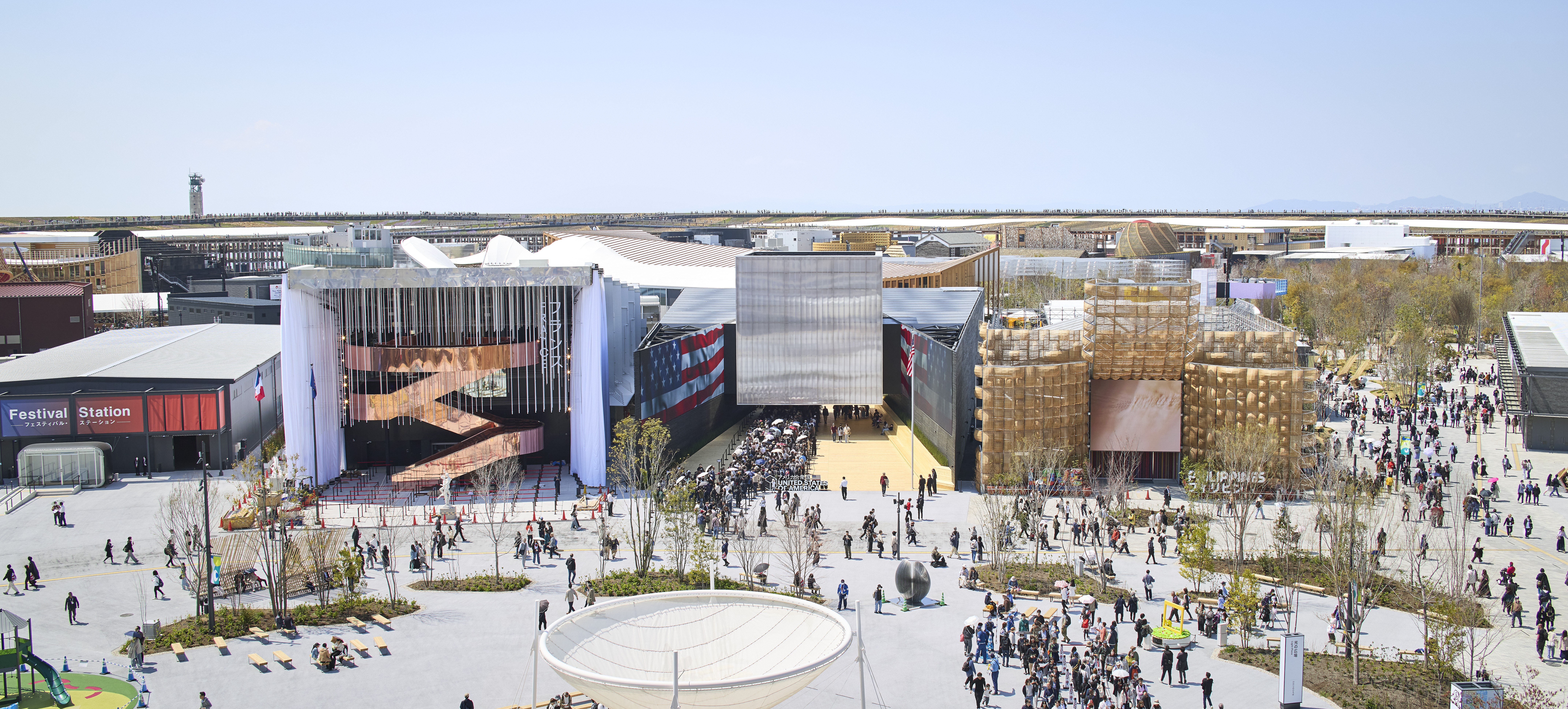 Giant rings! Timber futurism! It’s the Osaka Expo 2025
The Osaka Expo 2025 opens its microcosm of experimental architecture, futuristic innovations and optimistic spirit; welcome to our pick of the global event’s design trends and highlights
By Danielle Demetriou
-
 The new Polaroid Flip unfolds to bring you pin-sharp instant photography
Polaroid announces the Flip, an instant camera that blends its evergreen film technology with better results and more control
By Jonathan Bell
-
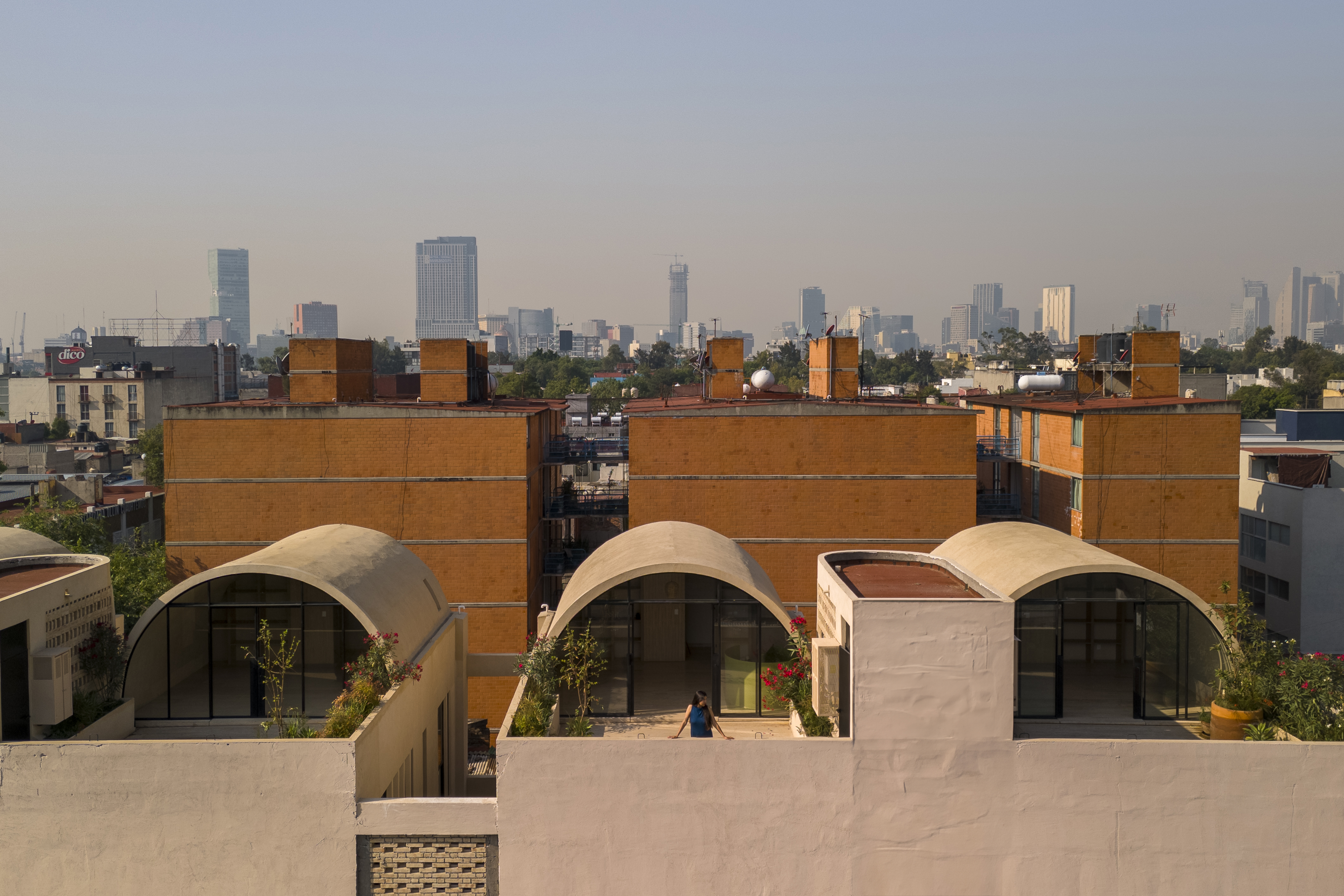 A barrel vault rooftop adds drama to these homes in Mexico City
Explore Mariano Azuela 194, a housing project by Bloqe Arquitetura, which celebrates Mexico City's Santa Maria la Ribera neighbourhood
By Ellie Stathaki
-
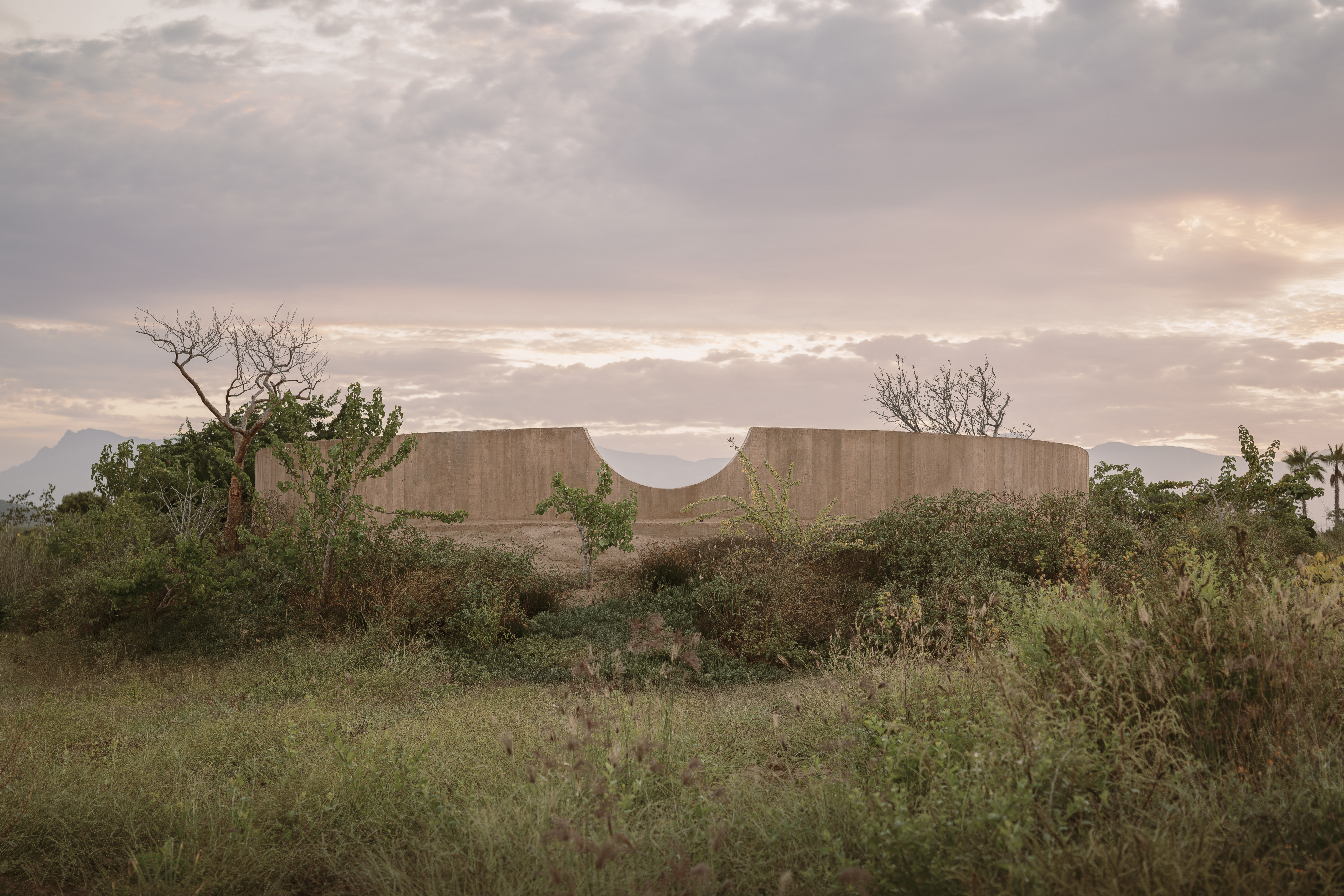 Explore a minimalist, non-religious ceremony space in the Baja California Desert
Spiritual Enclosure, a minimalist, non-religious ceremony space designed by Ruben Valdez in Mexico's Baja California Desert, offers flexibility and calm
By Ellie Stathaki
-
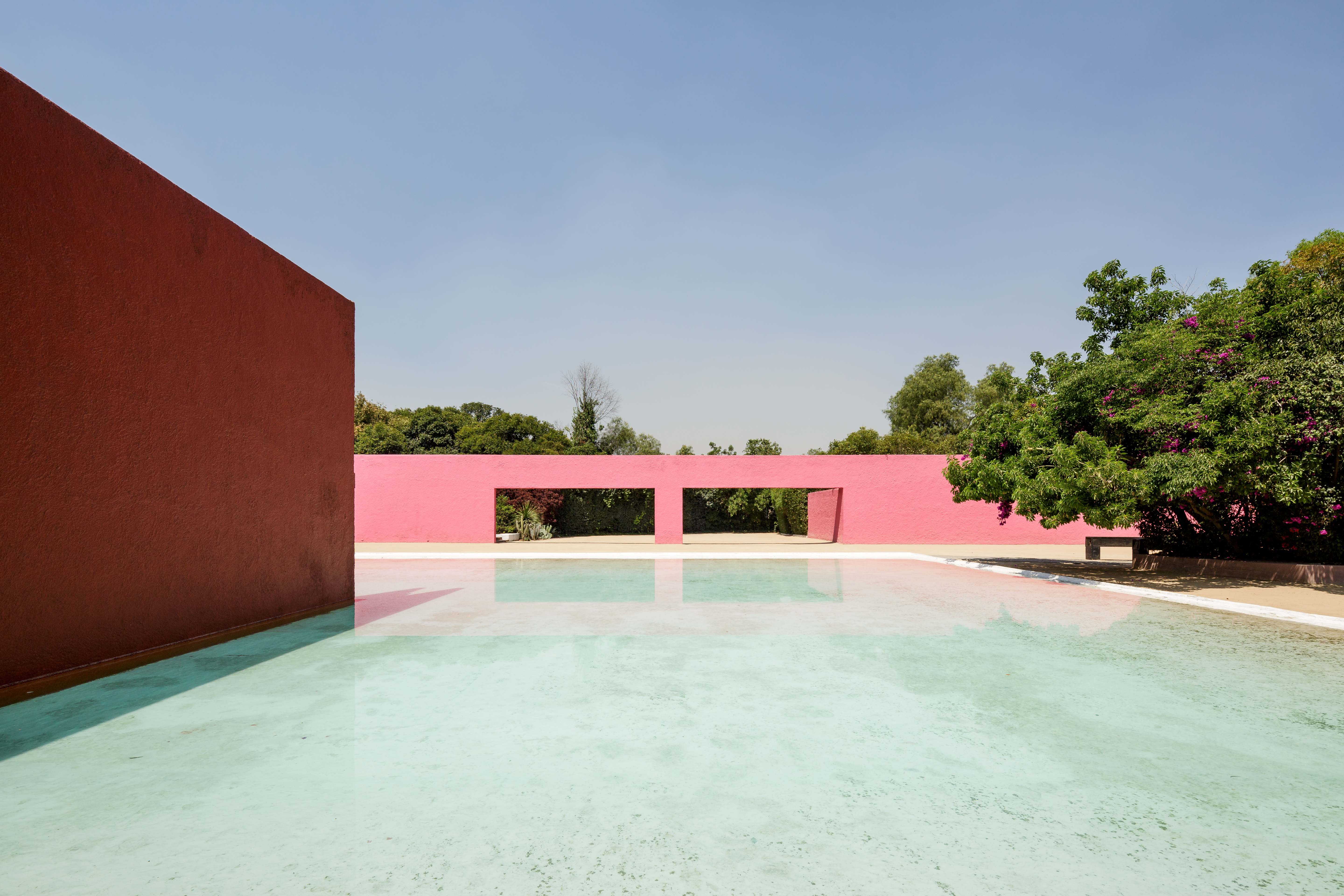 La Cuadra: Luis Barragán’s Mexico modernist icon enters a new chapter
La Cuadra San Cristóbal by Luis Barragán is reborn through a Fundación Fernando Romero initiative in Mexico City; we meet with the foundation's founder, architect and design curator Fernando Romero to discuss the plans
By Mimi Zeiger
-
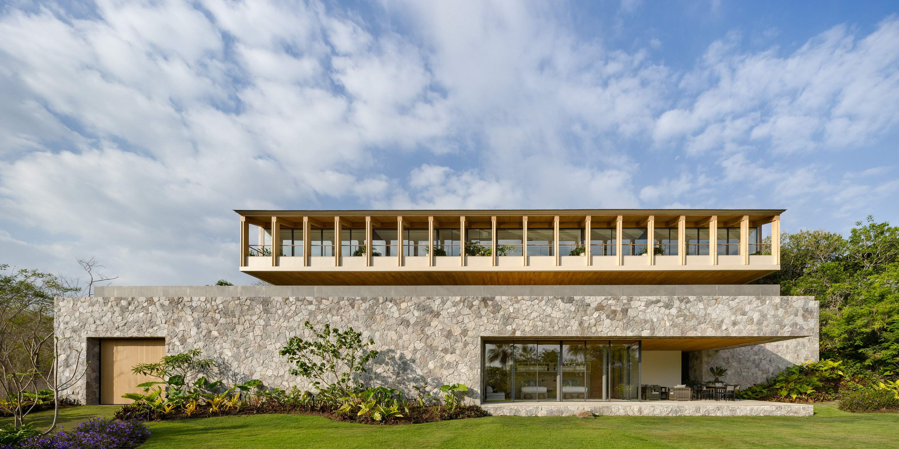 Enjoy whale watching from this east coast villa in Mexico, a contemporary oceanside gem
East coast villa Casa Tupika in Riviera Nayarit, Mexico, is designed by architecture studios BLANCASMORAN and Rzero to be in harmony with its coastal and tropical context
By Tianna Williams
-
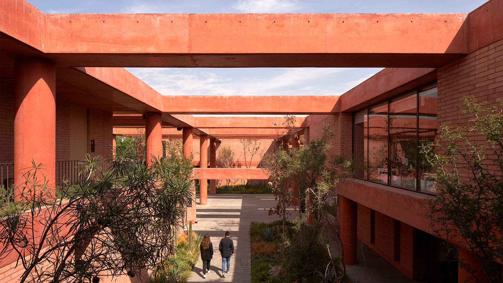 Mexico's long-lived football club Atlas FC unveils its new grounds
Sordo Madaleno designs a new home for Atlas FC; welcome to Academia Atlas, including six professional football fields, clubhouses, applied sport science facilities and administrative offices
By Tianna Williams
-
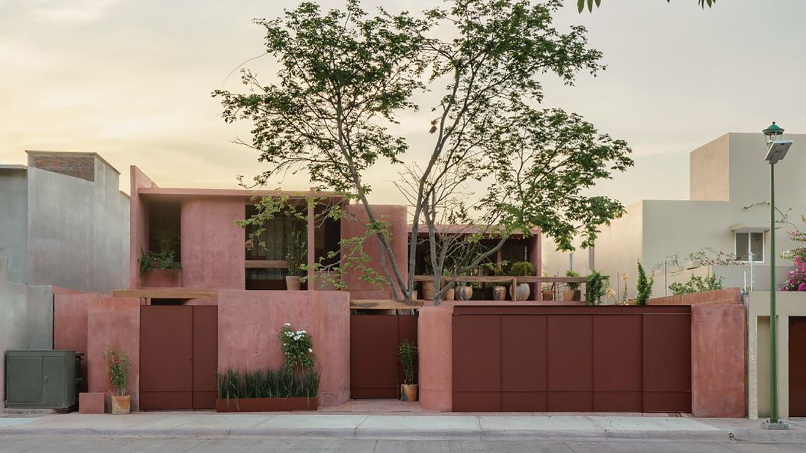 Discover Casa Roja, a red spatial exploration of a house in Mexico
Casa Roja, a red house in Mexico by architect Angel Garcia, is a spatial exploration of indoor and outdoor relationships with a deeply site-specific approach
By Ellie Stathaki
-
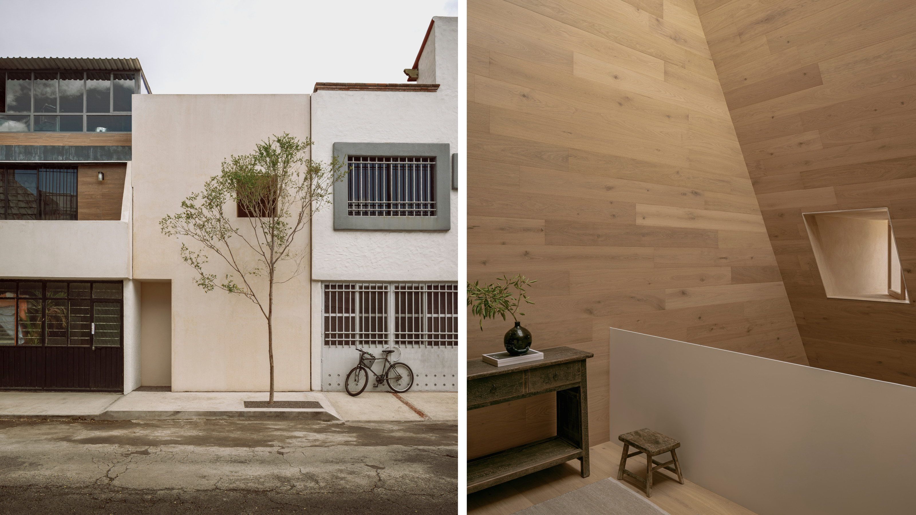 HW Studio’s Casa Emma transforms a humble terrace house into a realm of light and space
The living spaces in HW Studio’s Casa Emma, a new one-bedroom house in Morelia, Mexico, appear to have been carved from a solid structure
By Jonathan Bell
-
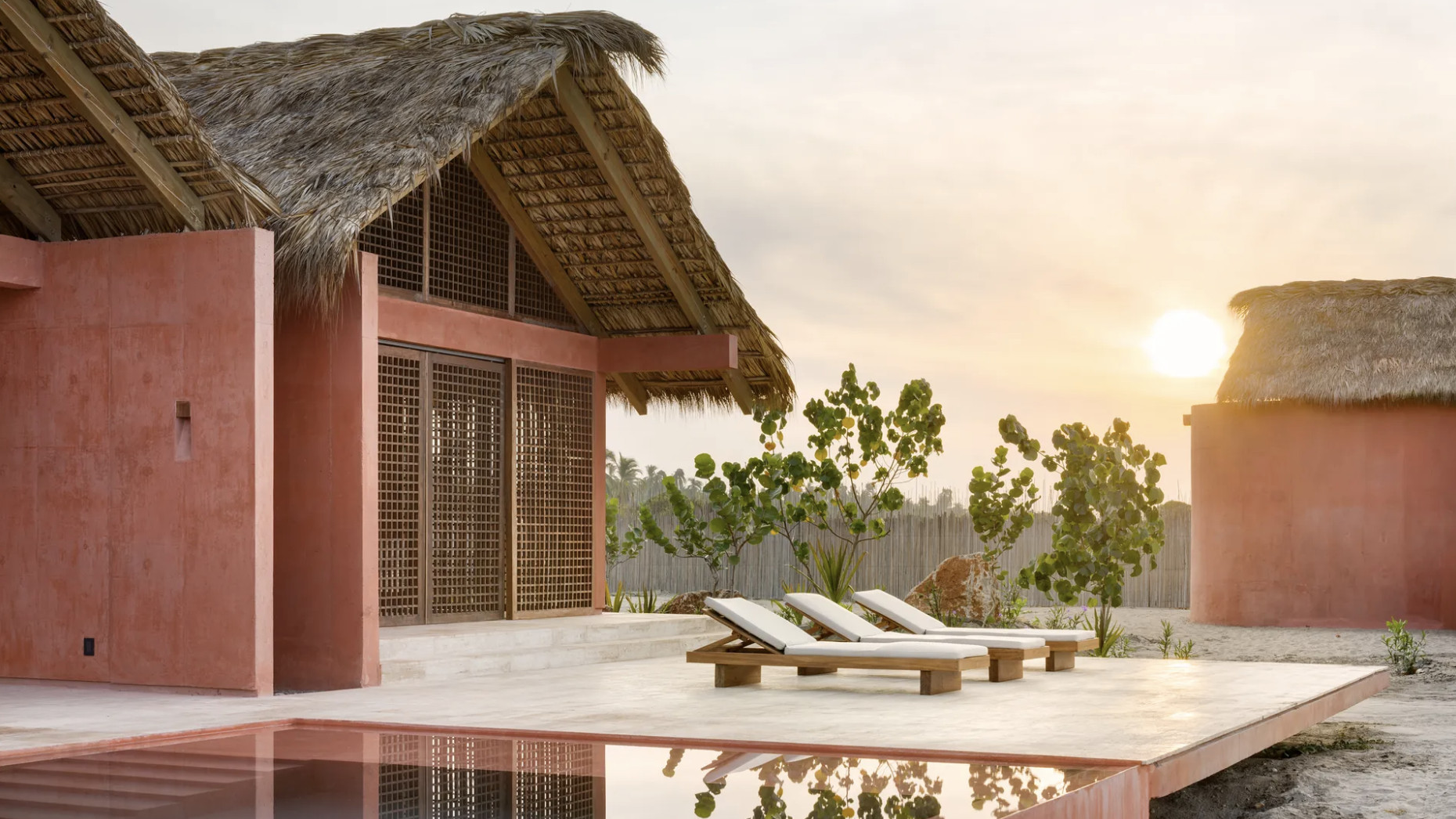 An Oaxacan retreat offers a new take on the Mexican region's architecture
This Oaxacan retreat, Casa Caimán by Mexican practice Bloqe Arquitectura, is a dreamy beachside complex on the Pacific coast
By Léa Teuscher