MoMA’s expansion by DS+R and Gensler prioritises connection
Receive our daily digest of inspiration, escapism and design stories from around the world direct to your inbox.
You are now subscribed
Your newsletter sign-up was successful
Want to add more newsletters?
Space has always been a rare commodity in New York City – something that the Museum of Modern Art, which occupies a piece of prime real estate right in the heart of Midtown Manhattan, knows well. Ever since the establishment of its permanent home, the Goodwin-Stone Building, which opened in 1939 and is still where the current museum is sited, the institution has grappled with finding enough room to house its impressive collection.
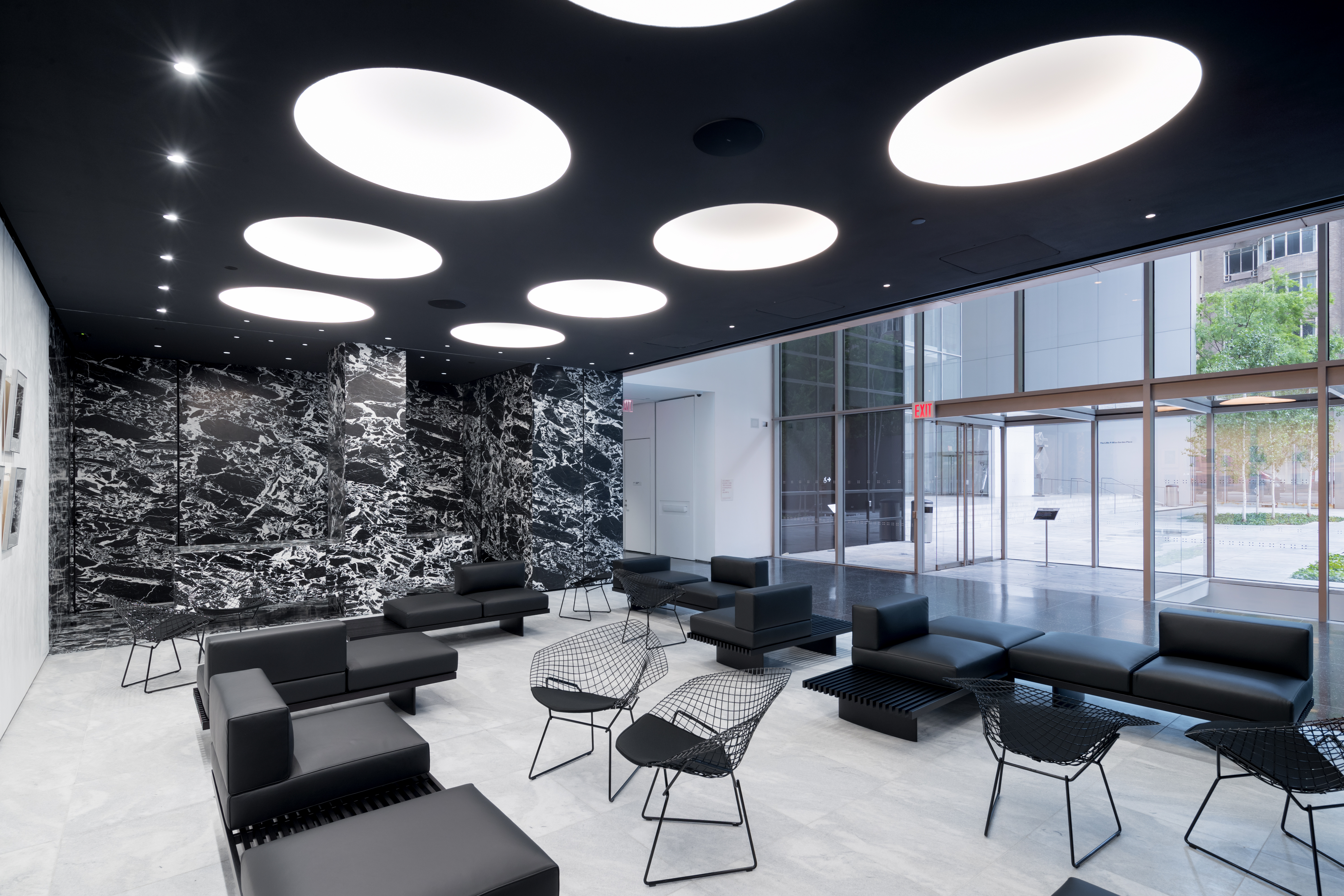
Since then, the museum’s building has been added to multiple times. Philip Johnson contributed the museum’s iconic sculpture garden in 1953 and an expanded East-West Wing in 1964. Cesar Pelli added the Garden Hall and Museum Tower, a mixed-use residential build that also added gallery space to the museum in 1984, and Yoshio Taniguchi’s most recent renovation and extension in 2004 saw the creation of the building’s airy second floor atrium, and its granite and glass façade, which the art-viewing public have come to know so well.
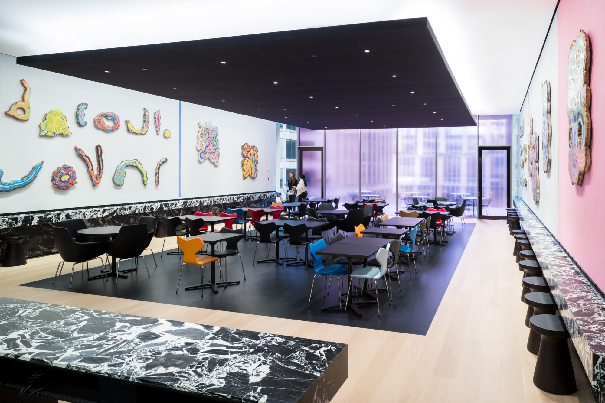
Joining this illustrious group and mélange of architecture is Diller Scofidio + Renfro in collaboration with Gensler, which was bestowed the controversial task of transforming the museum’s acquisition of its neighbouring Folk Art Museum (designed by Tod Williams Billie Tsien Architects) that would ultimately yield a net increase in the museum’s gallery space by a third, bringing its total square footage to 165,000. Opening to the public on 21 October, the re-envisioned MoMA not only boasts a new Creativity Lab, a state-of-the-art Studio and a bounty of much-needed gallery space, but a flagship museum store on the lower ground level, reconfigured circulation and a new café along with an outdoor terrace on the sixth floor as well.
‘We tried to see past the controversy because times change and we were looking at the big picture at how MoMA could improve,’ explains Liz Diller. ‘We set out from the beginning to not only do the expansion galleries but help MoMA realise this program which is a big shift for them to show that much more of their collection across all disciplines.’
‘Beyond that we also wanted to have a much better interface with the public and bring art closer to the street,' she adds. ‘Things like bringing a little bit more intuition to the circulation and to provide beyond the galleries that MoMA had asked some new potential galleries that were not really foreseen. We had a lot to do and working through the noise, there was just such a huge conversation happening inside MoMA about how things can happen that was part of the dialogue.’
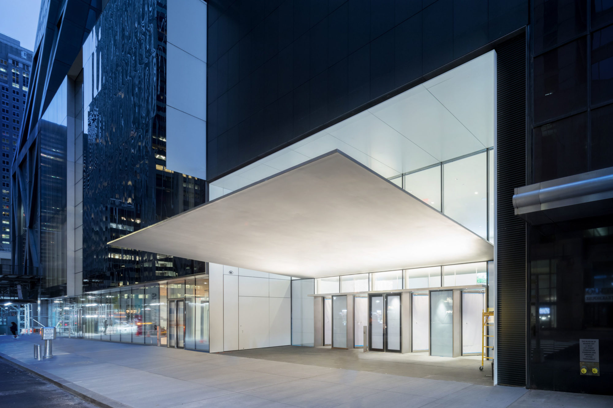
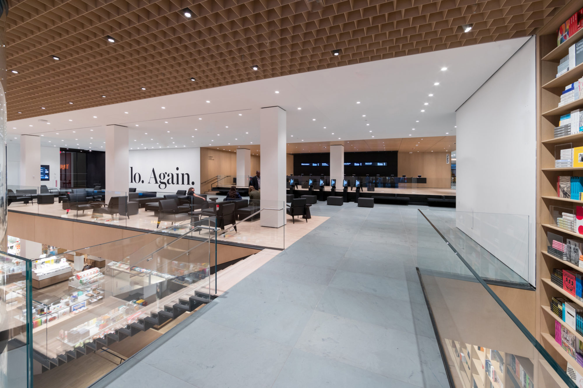
Working within the material palette already present, Diller Scofidio + Renfro’s design taps into the building’s historic DNA while bringing a contemporary sensibility with its abstraction of space, purity of material expression and the use of a sense of thinness throughout its remit. Starting at the new museum entrance, which now sees ticketing and coat check located off the building’s central axis and welcomes visitors with into a double-height space and custom entry canopy, the building exhibits a much more spacious feel, which also allows it to host new site-specific installations, like Philippe Parreno’s specially commissioned ‘Echo (Danny the Street)’, comprised of a series of interconnected objects which splays out through the lobby.
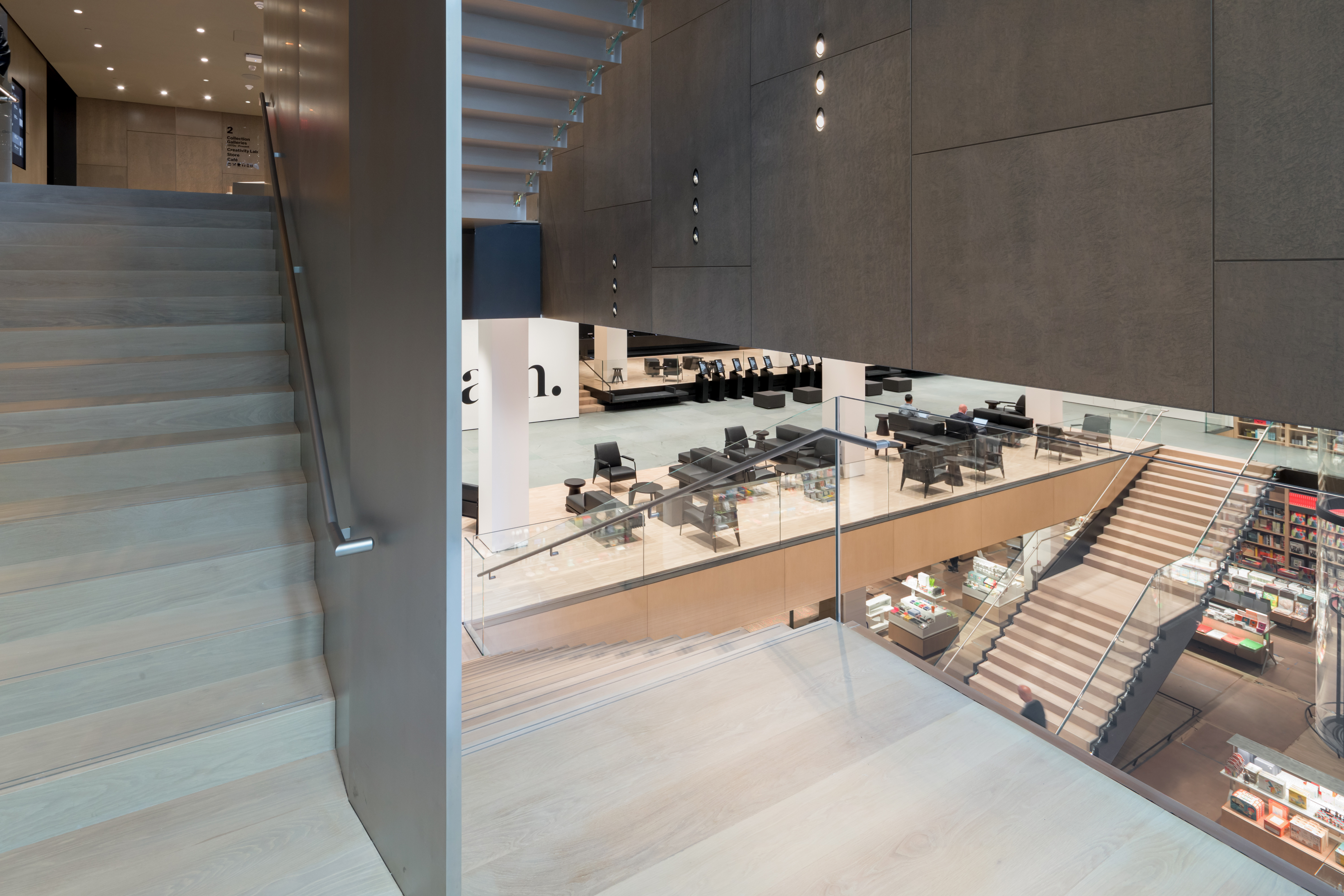
Veering west from here, a new flagship store on the lower level maintains the new visual connection between museum and street. Located under an intricate, millwork ceiling, flanked by an eye-catching double height book wall, the store is easily accessed via an elegant staircase as well as a circular, glass-encased elevator, and perfectly placed beside a connecting lounge area that leads to the new gallery spaces on the ground floor and above.
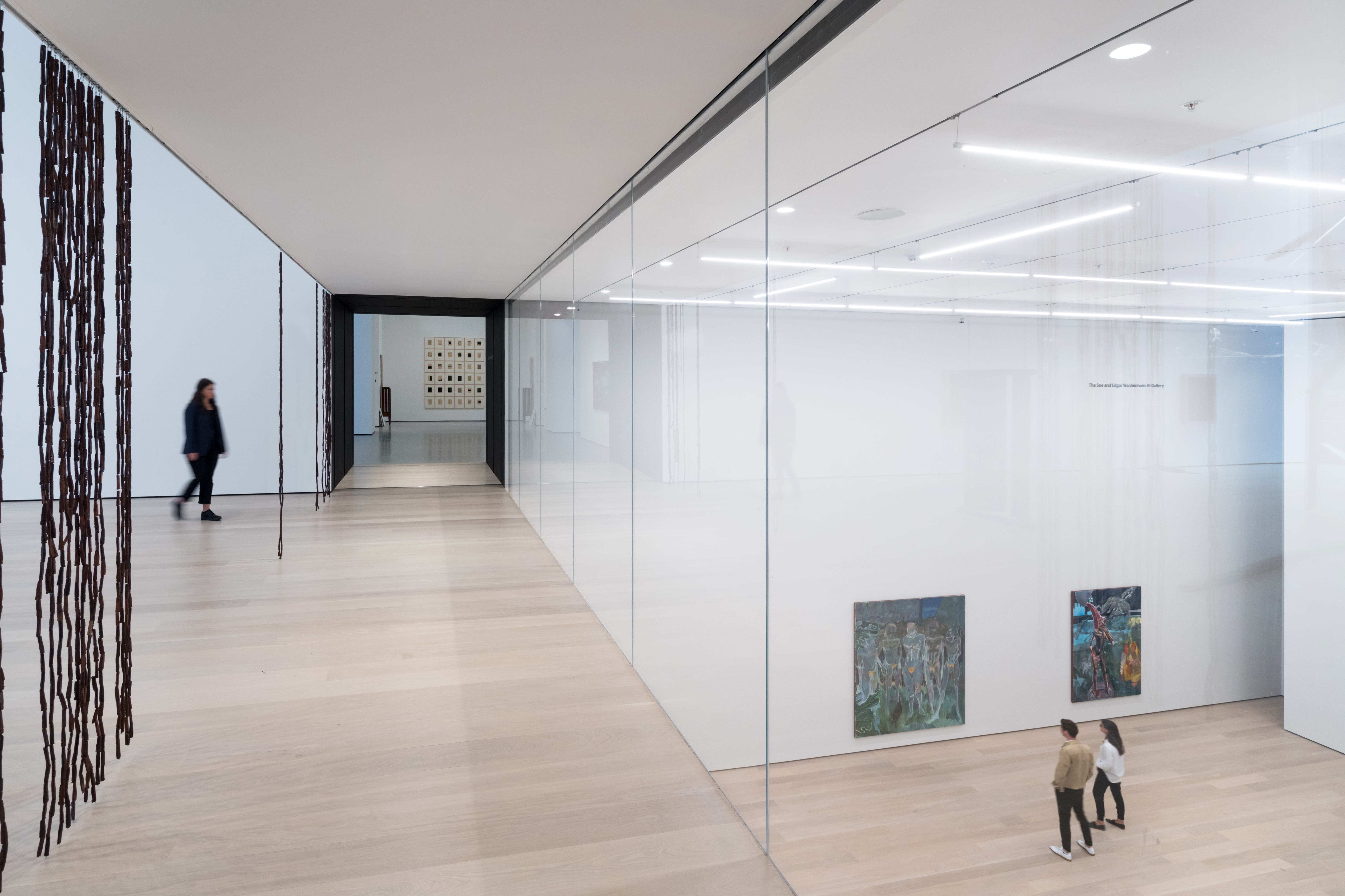
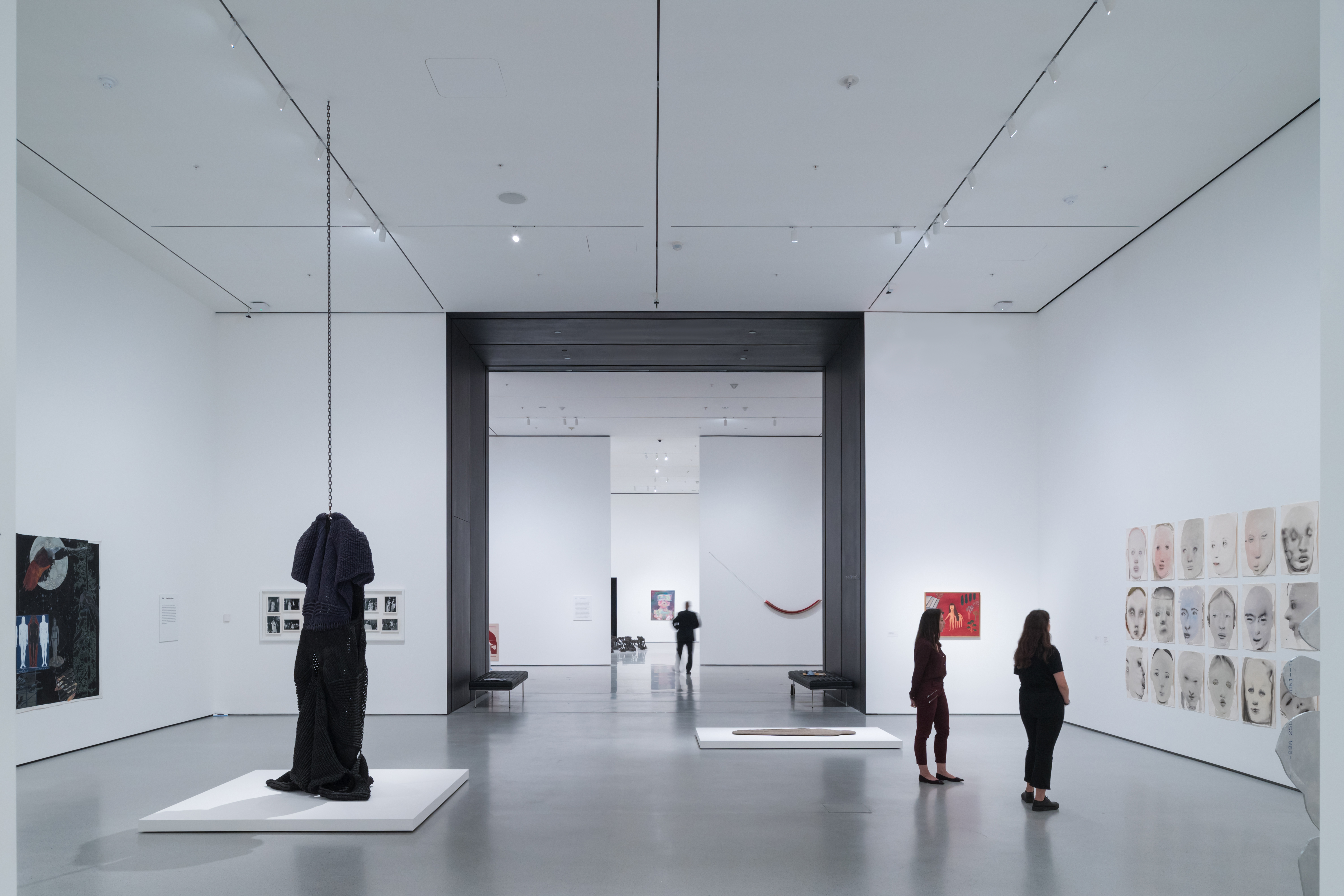
The new galleries located in the expanded building, now named the David Geffen Wing and Jerry Speyer and Katherine Farley Building, are a dynamic interplay of glass, wood and Gypsum board, which makes up the galleries’ walls. Adding about 11,500 sq ft per floor, the fluid and adaptable gallery spaces, which can be reconfigured according to the exhibition on view, are armed with a feeling of intimacy, thanks to the vertically interlocking concept that they are backed by. Some spaces are naturally lit, while others are technically equipped for performance and film. As visitors walk through interstitial spaces, often enclosed in glass, they are able to look into other galleries below or towards the street, thus underscoring the interconnectedness that Diller Scofidio + Renfro sought to bring to the fore.
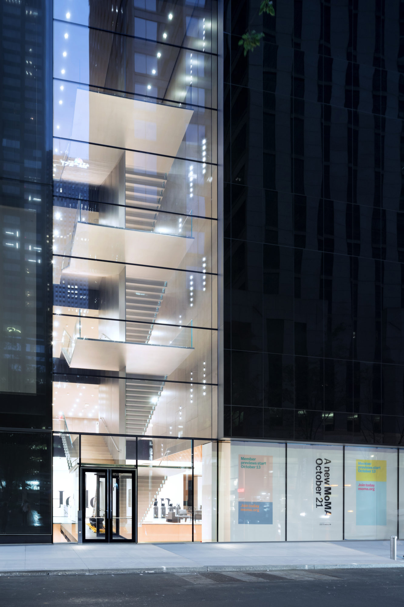
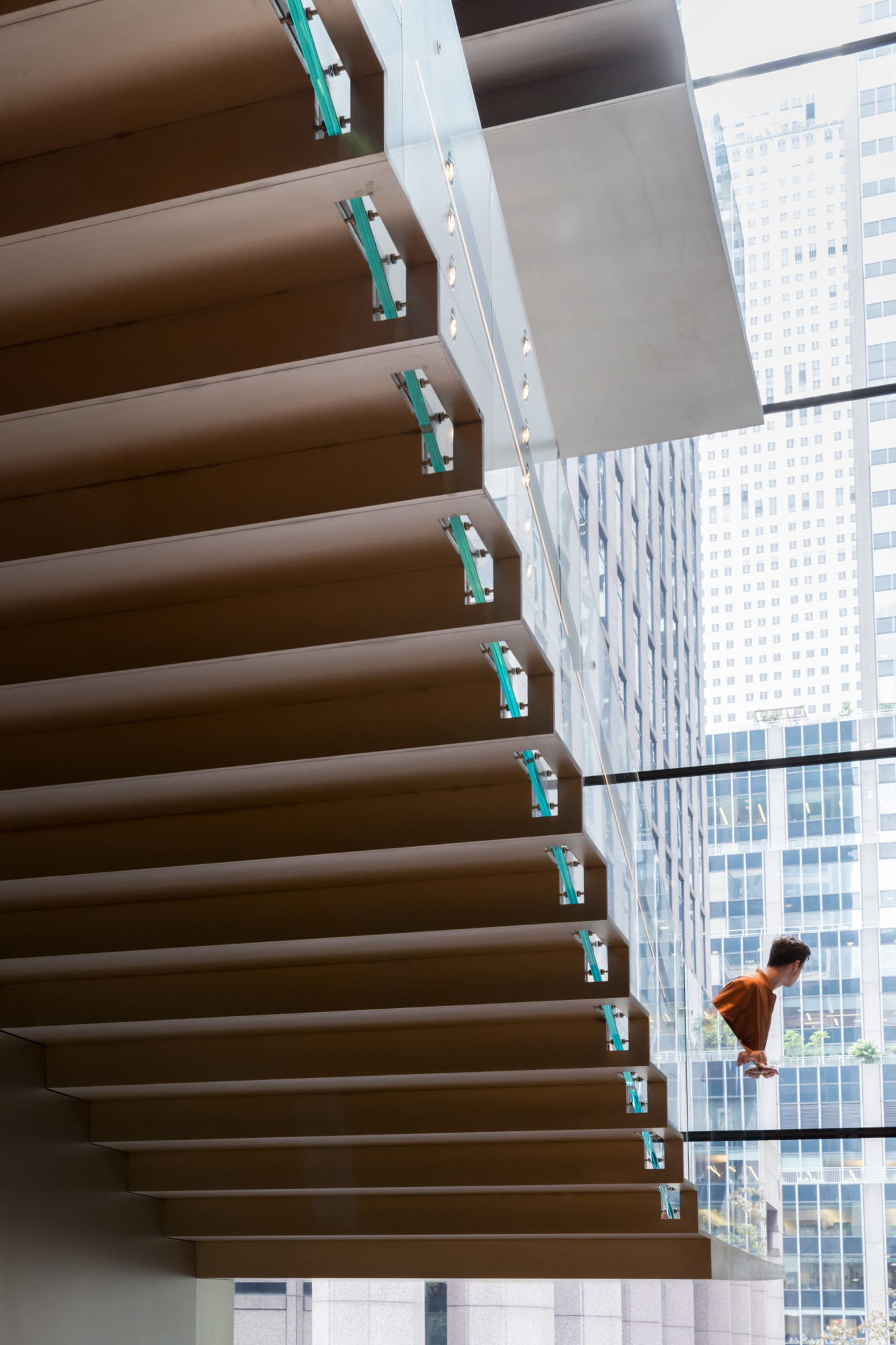
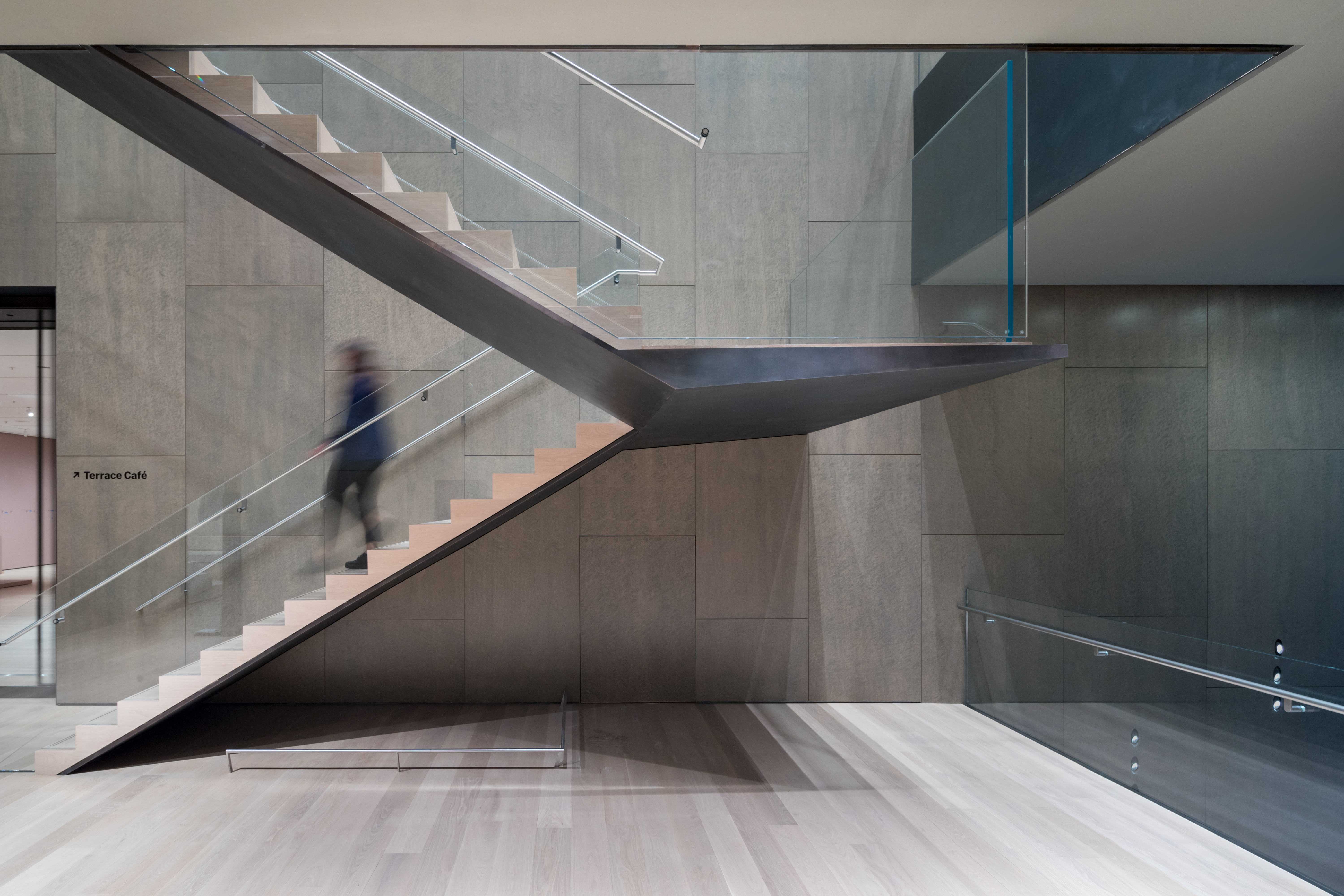
The new spaces’ verticality is held together by the ‘blade' stair – a sculptural element, that demonstrates a material lightness for an ultimately monumental presence – which runs through the height of the expanded building. Composed of glass balustrades that are cantilevered and held in place by pins and a six-inch thin vertical spine that hangs from the roof structure to support the steps and landings, the staircase is a gesture that references the museum’s original Bauhaus stair, while bringing its own contemporary and futuristic flavour that’s set to distinguish the expansion for the years to come.
INFORMATION
Receive our daily digest of inspiration, escapism and design stories from around the world direct to your inbox.
Pei-Ru Keh is a former US Editor at Wallpaper*. Born and raised in Singapore, she has been a New Yorker since 2013. Pei-Ru held various titles at Wallpaper* between 2007 and 2023. She reports on design, tech, art, architecture, fashion, beauty and lifestyle happenings in the United States, both in print and digitally. Pei-Ru took a key role in championing diversity and representation within Wallpaper's content pillars, actively seeking out stories that reflect a wide range of perspectives. She lives in Brooklyn with her husband and two children, and is currently learning how to drive.