Mons' year as European Capital of Culture kicks off with new convention centre by Daniel Libeskind
Receive our daily digest of inspiration, escapism and design stories from around the world direct to your inbox.
You are now subscribed
Your newsletter sign-up was successful
Want to add more newsletters?
'It's not an expensive building but it's an elegant building and that's what we wanted,' says Daniel Libeskind. The architect is showing us around his latest project, a new convention centre - the Mons International Congress Xperience (MICX) - that is part of a wider regeneration masterplan for the pretty southern Belgian town of Mons, and the first of several projects planned for the city's year as European Capital of Culture.
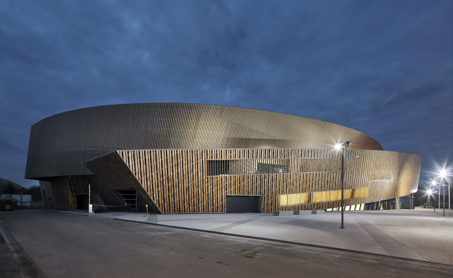
Libeskind's signature style of colliding planes, canted walls and angular points (including a dramatic cantilevered prow) is very much in evidence here, but softened by the spiralling and overlapping curvilinear walls of golden brown anodised aluminium and tactile slats of Robinia wood at ground level that will eventually be transformed into a refined silvery grey. Inside, the play of contrasting geometries continues with intersecting recessed lighting tracks and inlaid stone pathways, spilling out onto the outside plaza in a combination of Belgian pierre bleue and grey concrete.
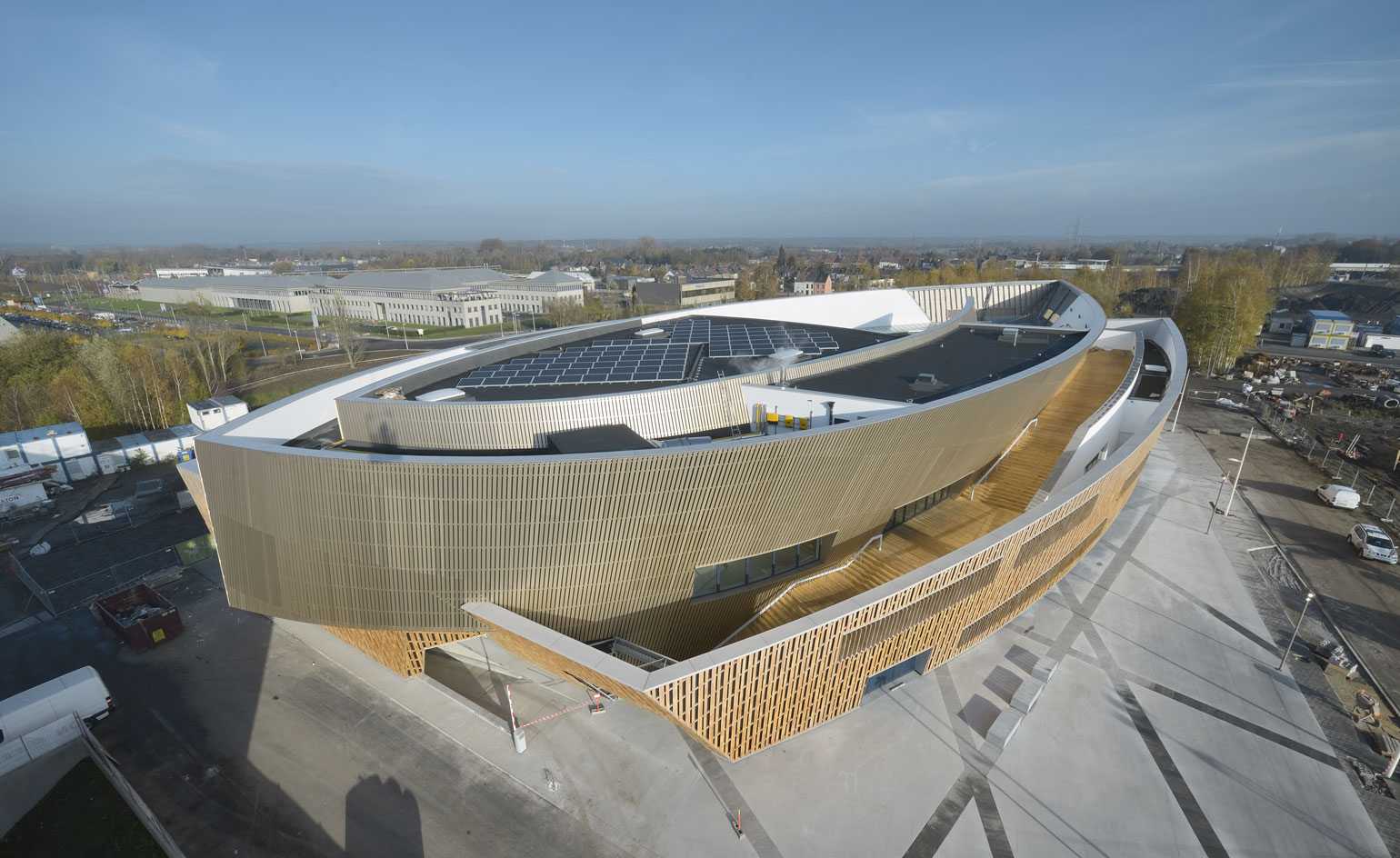
When Libeskind got the commission he knew a relatively compact footprint (12,500 sq m) would have to accommodate a multitude of different spaces and uses, including a large foyer, three auditoriums, a multi-purpose hall, meeting rooms, offices, a restaurant, an underground car park and a roof terrace - and do so for the fairly modest sum of €27m.
The new centre successfully draws in the public and the city with generous glazing and skylights that usher in views and daylight, reflecting activity back to the outside world. It also includes various entry points (including a processional external wooden staircase that leads to a public roof and viewing platform) and a series of framing devices that celebrate the medieval city of Mons and its imposing Belfry tower beyond.
The composition is intense and as with many a Libeskind project, the search for a straight line to rest one's gaze on may not bear fruit. The architect is known for his penchant for sharp points protruding into space and this scheme is no exception. Here, the cuts in the slanted walls, ceilings and railings, the etched patterns on the doors, the angular shape of the auditorium seats, the oblique lines of light created by the ribboned glazing, are part of a compositional whole, explains Libeskind, and about creating 'an ambience, an environment, a rhythm'.
There is no doubt to the project's complex level of detailing, texture and craftsmanship, variety of architectural 'moments' and dynamic quality of light. By Libeskind's own admission, this building is a 'machine that has to be used every day'.
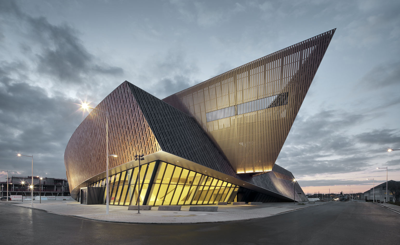
In keeping with the architect's signature style, the centre features colliding planes and angular points, including a dramatic cantilevered prow.
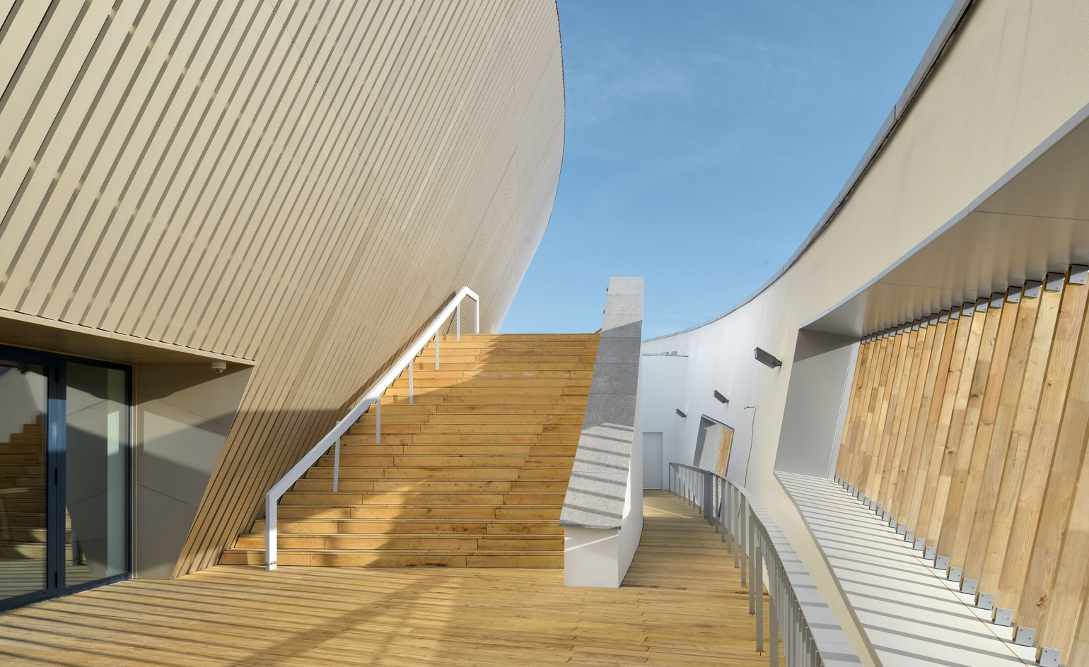
This effect however, is softened by the use of golden brown anodized aluminium and tactile slats of Robinia wood.
The building features a number of framing devices that celebrate the medieval city of Mons and its imposing Belfry tower beyond.
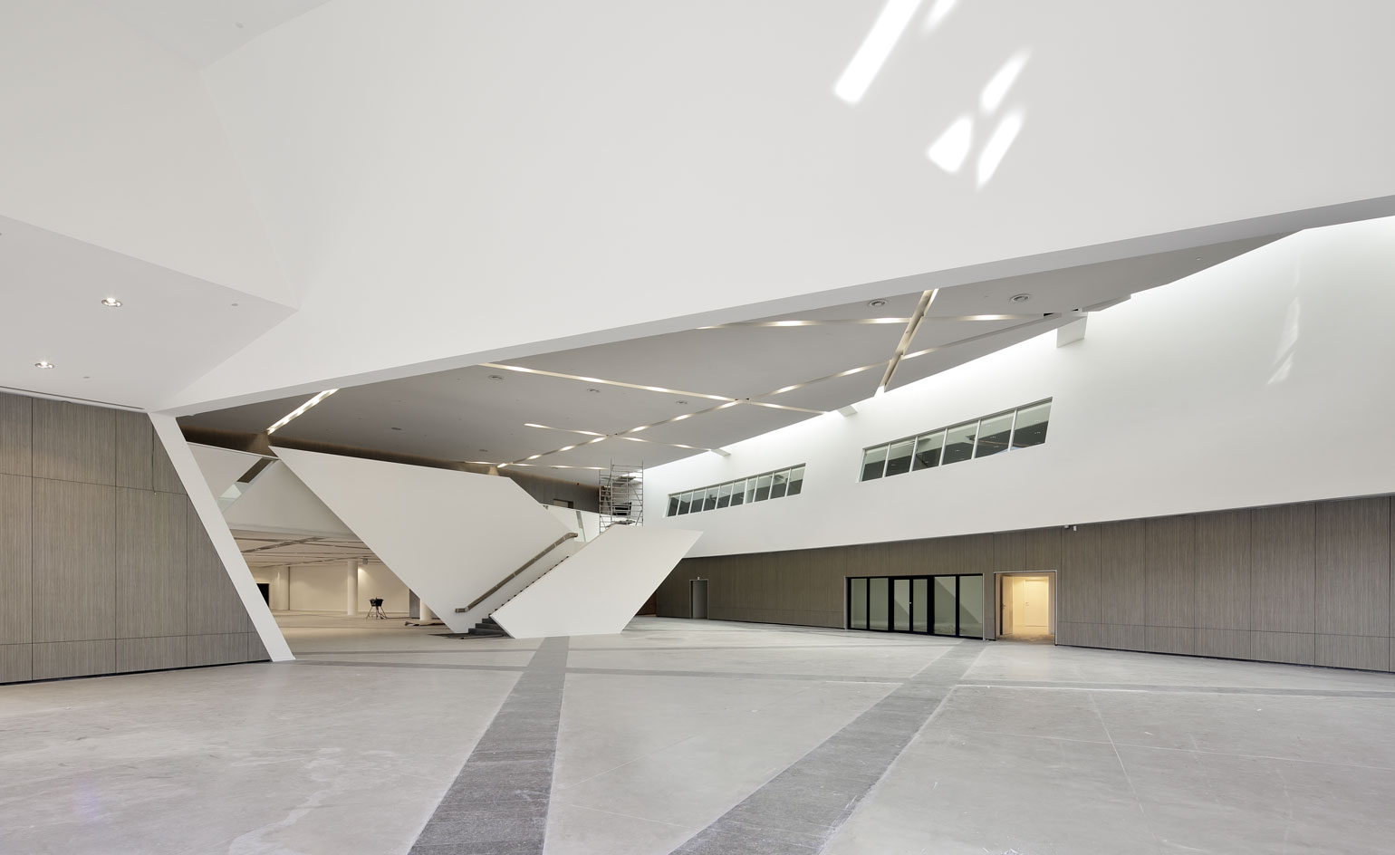
Inside, the centre accommodates a multitude of different spaces and uses, including a large foyer, three auditoriums, a multi-purpose hall, meeting rooms, offices, a restaurant, an underground car park and a roof terrace.
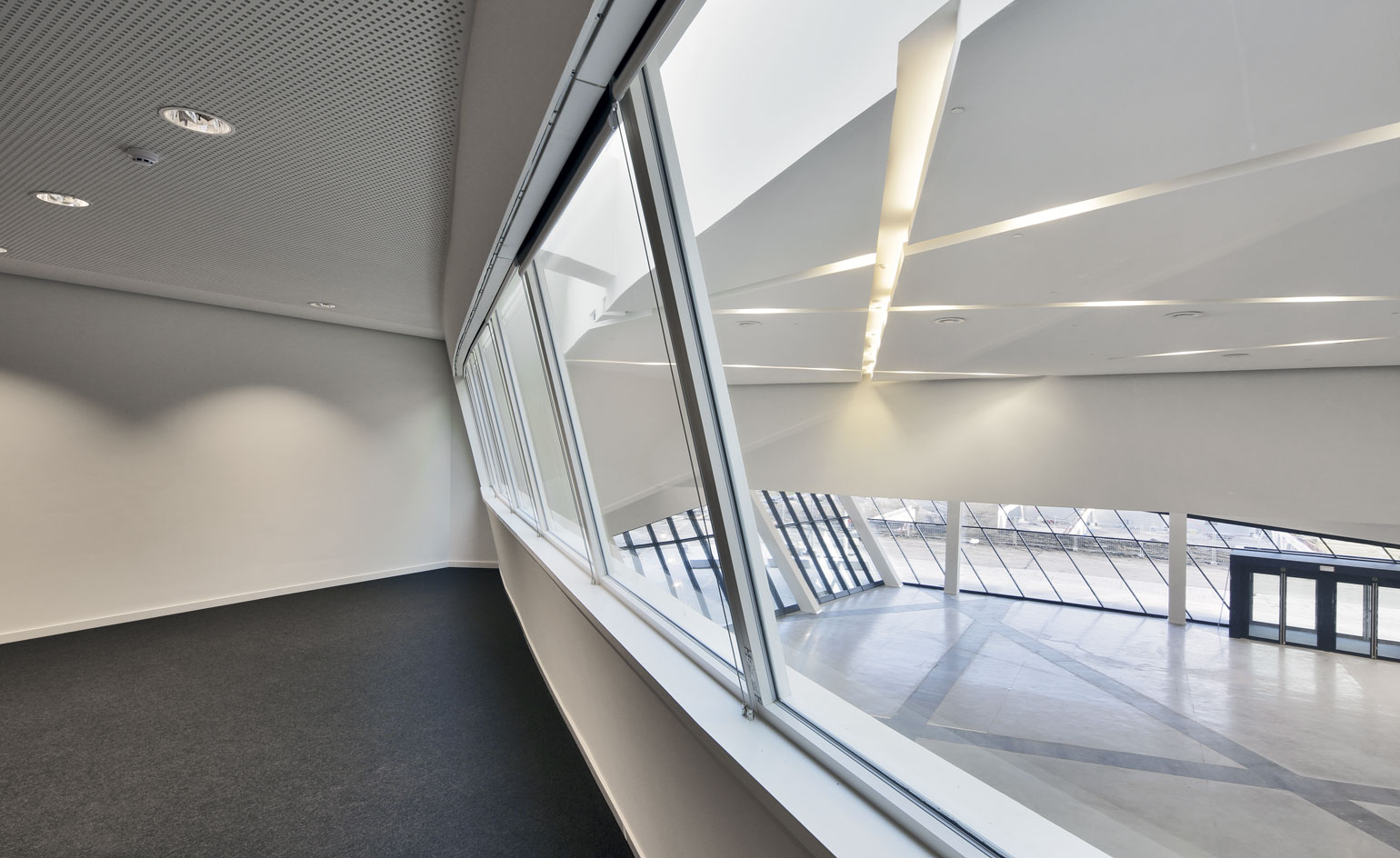
Generous glazing and skylights usher in views and daylight and reflect activity back to the outside world.
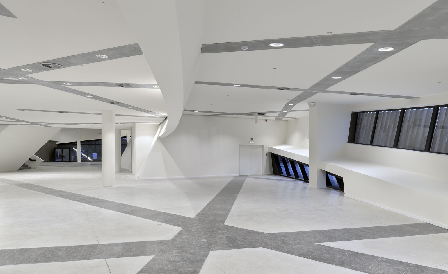
Inside, intersecting recessed lighting tracks and inlaid stone pathways spill out on to the outside plaza in a combination of Belgian pierre bleue and grey concrete
ADDRESS
MICX
Avenue Mélina Mercouri,
2 à 7000 Mons
Receive our daily digest of inspiration, escapism and design stories from around the world direct to your inbox.
Giovanna Dunmall is a freelance journalist based in London and West Wales who writes about architecture, culture, travel and design for international publications including The National, Wallpaper*, Azure, Detail, Damn, Conde Nast Traveller, AD India, Interior Design, Design Anthology and others. She also does editing, translation and copy writing work for architecture practices, design brands and cultural organisations.