MoreySmith designs a global HQ for Dunhill that embodies the brand through the details
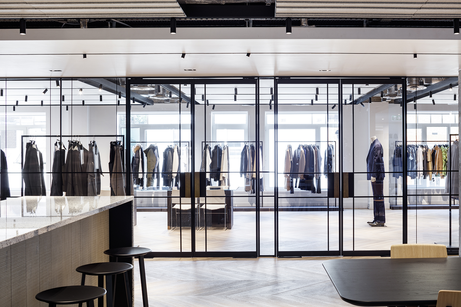
MoreySmith has smoothly embedded a contemporary global headquarters for British luxury goods brand Dunhill into the layered fabric of the historic Mayfair neighbourhood – just a stone’s throne from Selfridges on North Audley street. Staged across two floors of a heritage building with a decorative red-brick façade, the office brings Dunhill’s showrooms, creative studios and head offices together, all connected by a generous statement staircase and wrapped up with bespoke detailing – think leather, horsehair and delicately patterned glazing.
No stranger to the charming cobbled streets lined with grand entrances and jolly doormen, Linda Morey-Burrows, founder and principal at MoreySmith, has five projects in the neighbourhood, all in walking distance. While practically a resident, she was fully prepared to make some drastic changes to the previously cramped office space with low suspended ceilings tiles and a warren of plasterboard cladding.
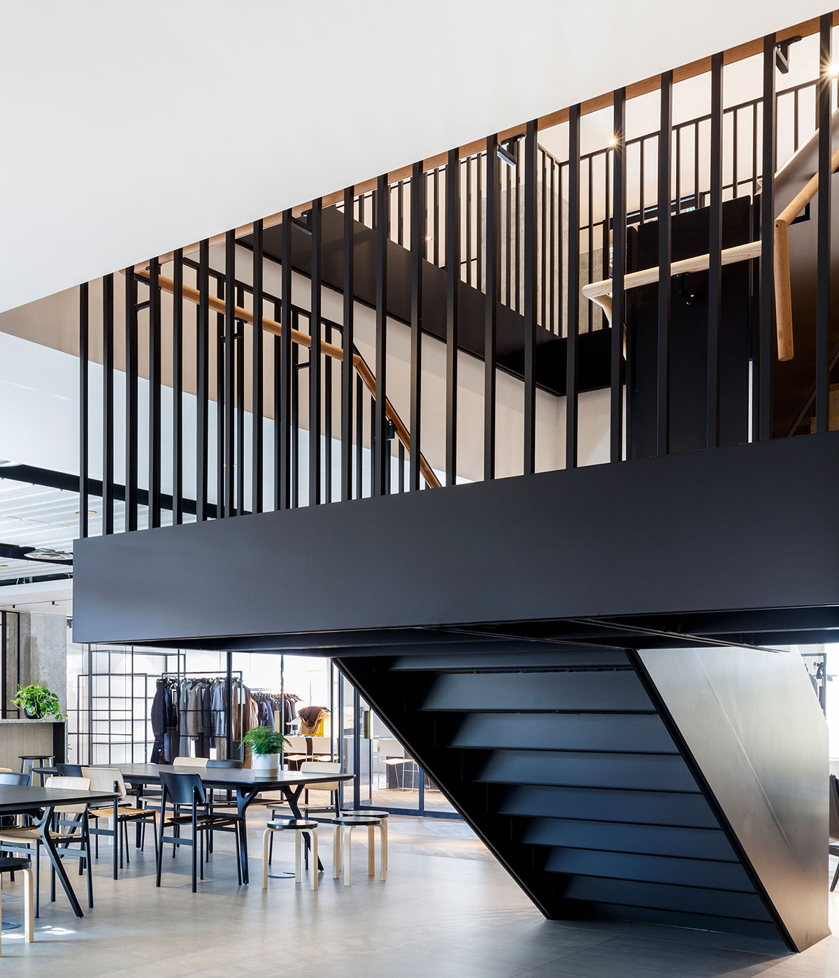
The statement black steel staircase with leather handrail
At first perplexed as to exactly how she could make a difference to the environment which lacked volume or height, Morey-Burrows came up with one bold solution and presented it singularly with confidence to the Dunhill team, headed up by Andrew Maag, CEO of Dunhill, who was closely involved at each stage. Compromise was not an option.
Morey-Burrows’ plan included structural changes that required planning permission, including the new statement staircase – a feature that has become requisite among any well-standing retail brands in design cities across the world – and a 180 sq m outdoor terrace that brought walls of floor-to-ceiling glazing and a new skylight with it. Both of these elements are seamless additions to the original building.
The outdoor terrace floats like a platform floating amongst Mayfair’s turreted spires, contemporary extensions, and secret balconies, extending the interior space and opening up a covetable spot for parties.
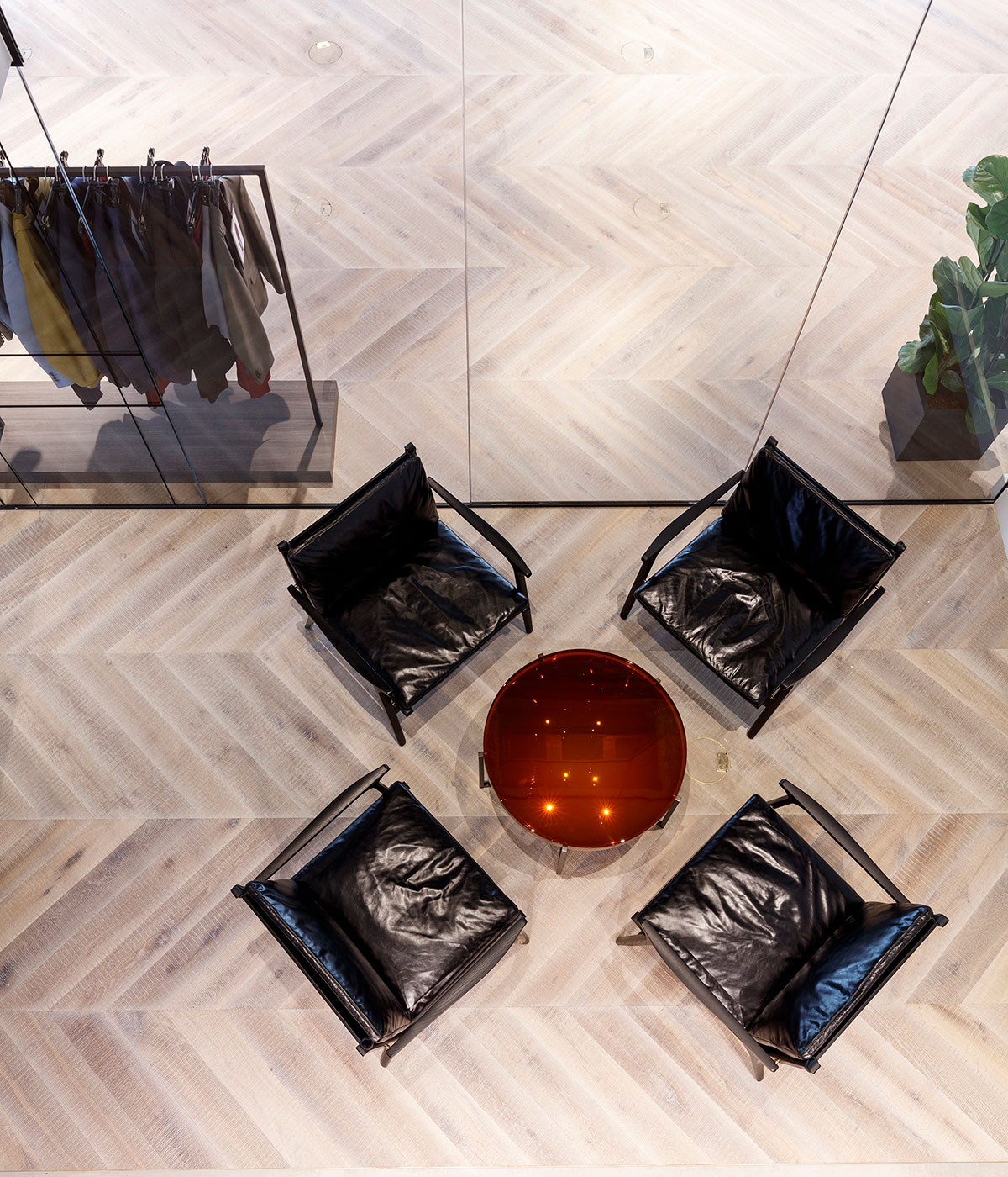
Glazing separates the showroom space from an informal meeting spot with Stellar Works Ren lounge chairs and a McColin Bryan-Lens amber top coffee table
These ambitious changes created the volume and space Morey-Burrows had been searching for. Now the core of the office is flooded with light to create open-plan, collaborative meeting places, a central hub with two smart Stellar Works’ Ren tables in black ash for lunches and informal catch ups, and neat meeting rooms delineated by iron framed glazing. Carefully engineered pockets of double-height space allows for glimpses into different parts of the office – a pattern-cutting table strewn with cuts of fabric and tape measures can be seen below from the boardroom entrance above.
As well as a distinctly bespoke home, flexibility was top of the agenda for Dunhill, as the company is expanding with seven new outposts opening over the next year. Morey-Burrows finds that flexibility is the priority in the brief for most of MoreySmith’s workspace design clients who range from Sony Music to Argent.

Patterned glazing designed by MoreySmith varies from frosted to clear across the offices
Working with Dunhill was a delight for Morey-Burrows who found it refreshing to work with a client who really understood and cared about design. Her challenge was to embody the qualities of tradition and quality synonymous with the Dunhill brand, founded in 1893. It was through the details that she achieved this: the cricket ball stitching, crafted brass work tops, bespoke handles and patterned glazing that harness the masculine qualities of the British brand, combined with exposed concrete columns and steel balustrades of the staircase, that bring warmth and texture to the polished flooring by White & White, London.
In the fourth floor entry space black porcelain tiles are layered above horsehair upholstered walls, Stellar works Ren lounge chairs, McColin Bryan-Lens amber-topped coffee table and a custom leather reception desk – creating a very Dunhill welcome to clients and employees alike.
The office has dramatically changed how the team works, after previously working from two separate spaces for the office and showroom. Now united beneath one roof, the activities, creativity, aesthetics and energy are streamlined and the lucky 170 employees are all breathing the Dunhill brand through design.
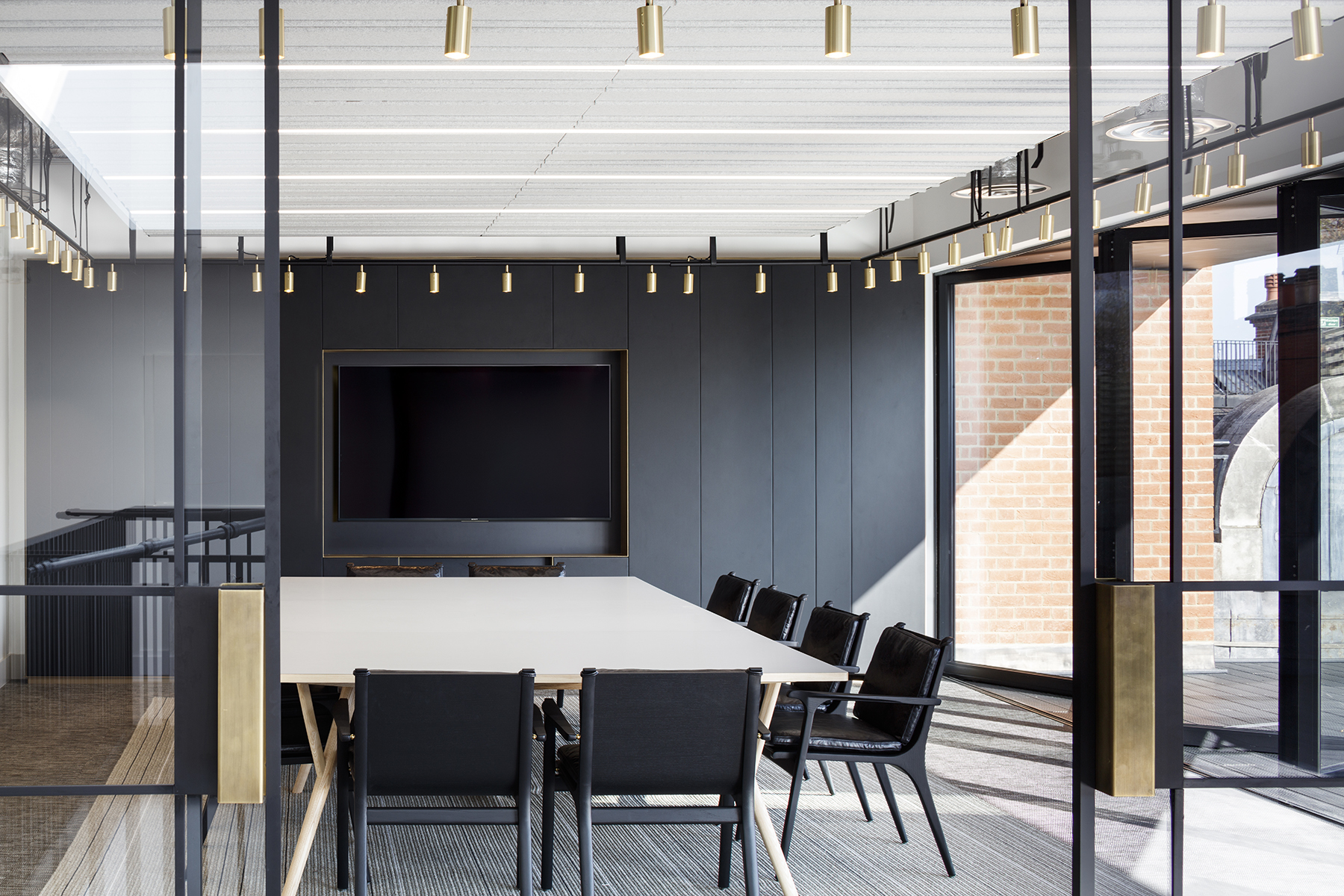
The boardroom opens up to the terrace and features the SCP Peggy table with a grey lam top and ash legs and Stellar Works Ren dining chairs in black fabric and black ash
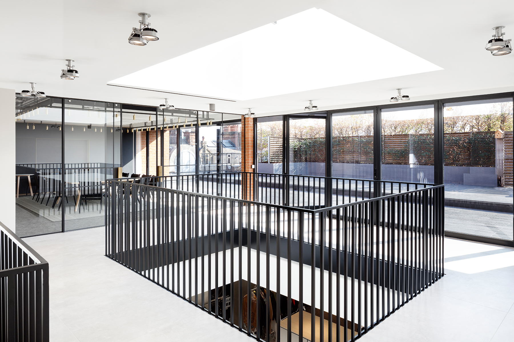
Dunhill’s very own statement staircase
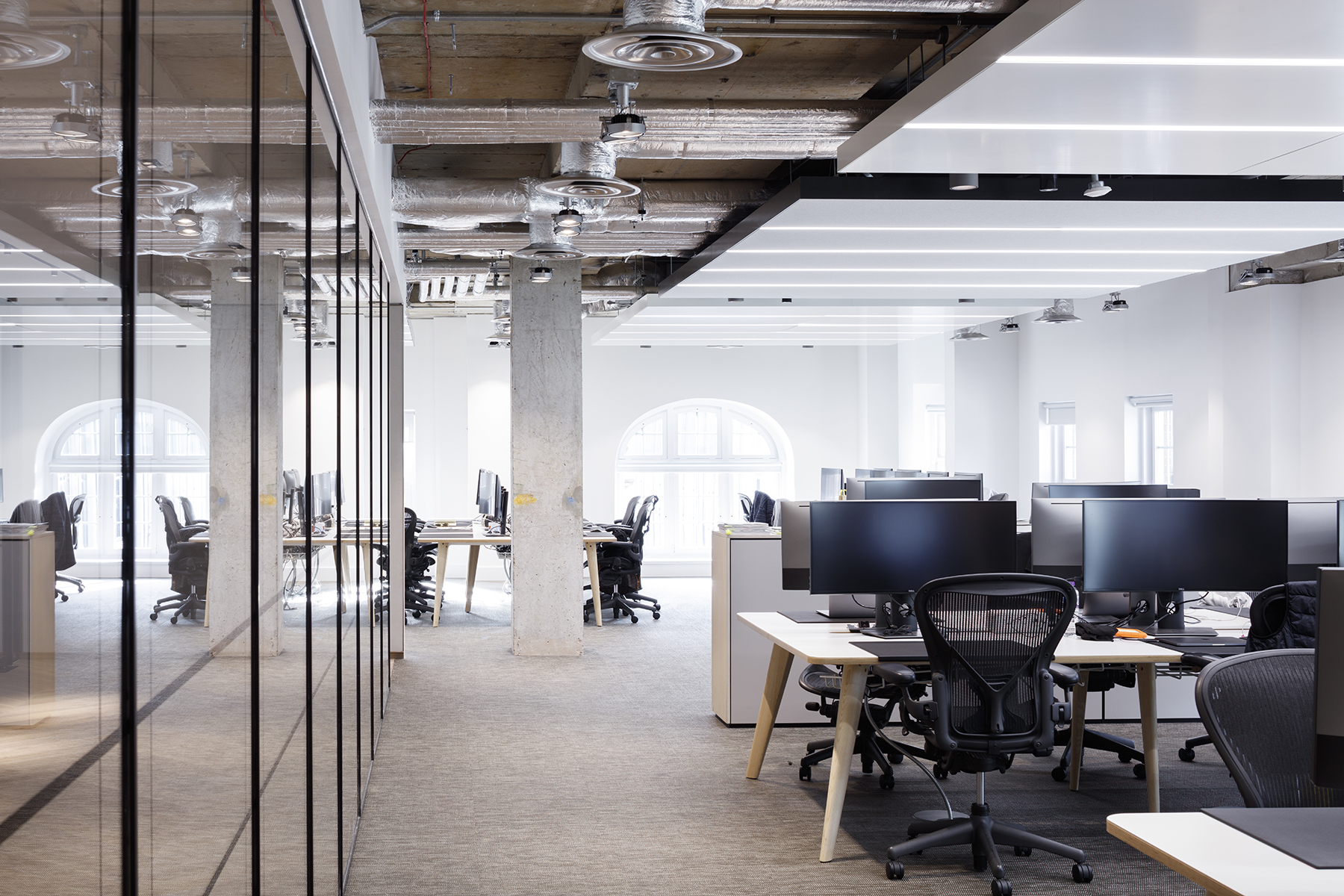
Flexible workspace for ‘plug and play’ style working Senator-Palio Cloud desks with white tops
INFORMATION
For more information, visit the MoreySmith website and the Dunhill website
Wallpaper* Newsletter
Receive our daily digest of inspiration, escapism and design stories from around the world direct to your inbox.
Harriet Thorpe is a writer, journalist and editor covering architecture, design and culture, with particular interest in sustainability, 20th-century architecture and community. After studying History of Art at the School of Oriental and African Studies (SOAS) and Journalism at City University in London, she developed her interest in architecture working at Wallpaper* magazine and today contributes to Wallpaper*, The World of Interiors and Icon magazine, amongst other titles. She is author of The Sustainable City (2022, Hoxton Mini Press), a book about sustainable architecture in London, and the Modern Cambridge Map (2023, Blue Crow Media), a map of 20th-century architecture in Cambridge, the city where she grew up.
-
 Nikos Koulis brings a cool wearability to high jewellery
Nikos Koulis experiments with unusual diamond cuts and modern materials in a new collection, ‘Wish’
By Hannah Silver
-
 A Xingfa cement factory’s reimagining breathes new life into an abandoned industrial site
We tour the Xingfa cement factory in China, where a redesign by landscape specialist SWA Group completely transforms an old industrial site into a lush park
By Daven Wu
-
 Put these emerging artists on your radar
This crop of six new talents is poised to shake up the art world. Get to know them now
By Tianna Williams
-
 An octogenarian’s north London home is bold with utilitarian authenticity
Woodbury residence is a north London home by Of Architecture, inspired by 20th-century design and rooted in functionality
By Tianna Williams
-
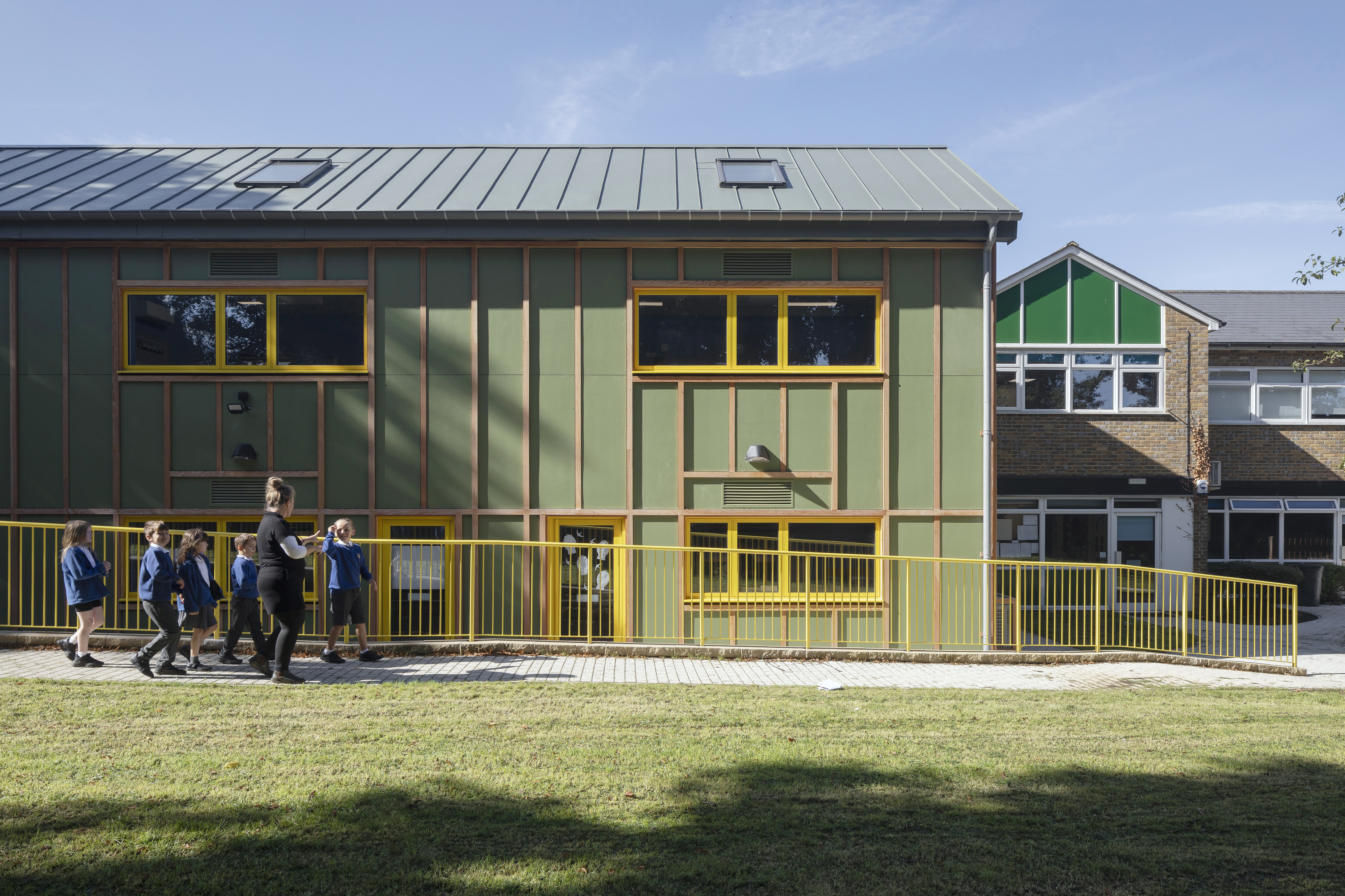 What is DeafSpace and how can it enhance architecture for everyone?
DeafSpace learnings can help create profoundly sense-centric architecture; why shouldn't groundbreaking designs also be inclusive?
By Teshome Douglas-Campbell
-
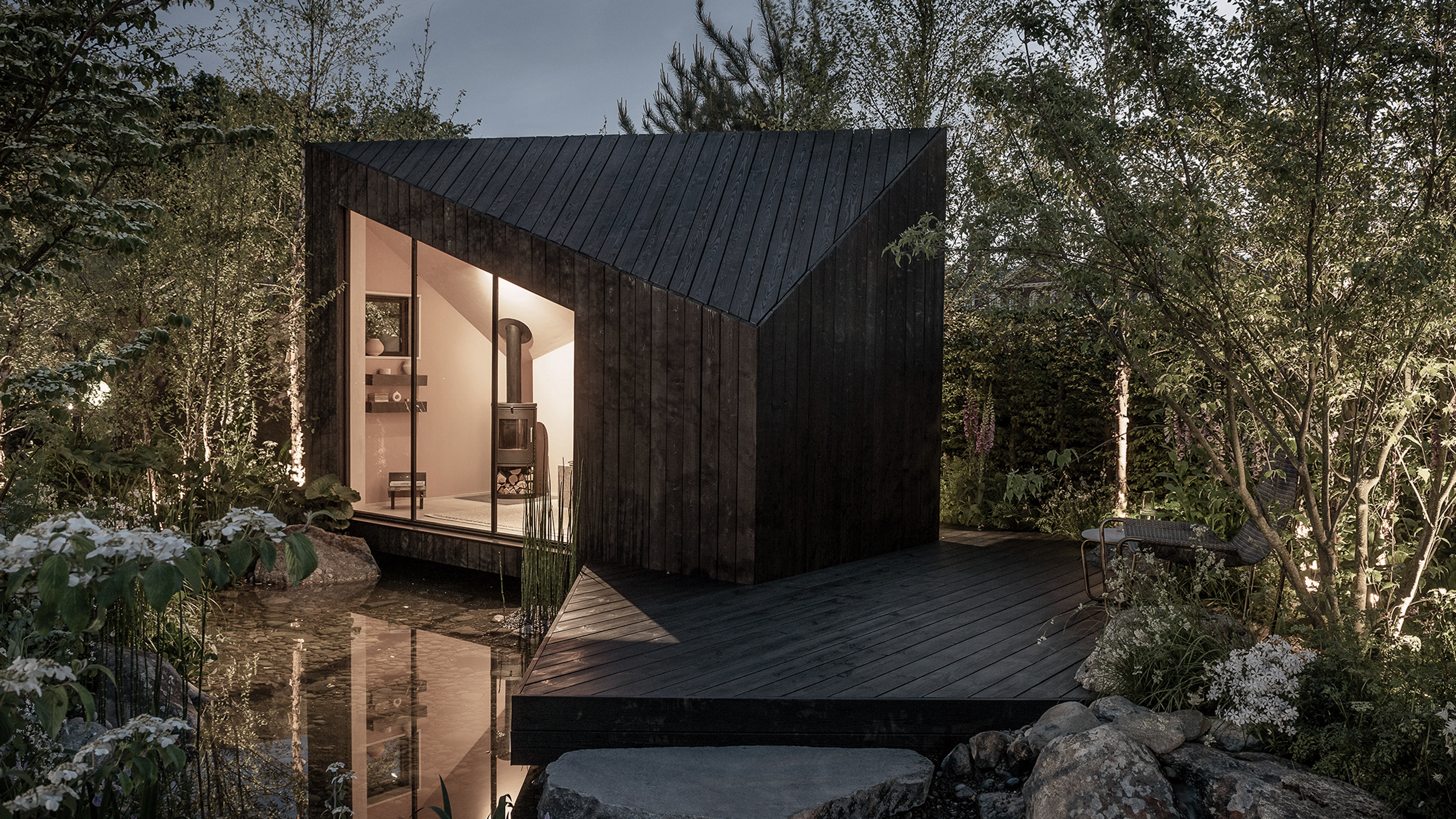 The dream of the flat-pack home continues with this elegant modular cabin design from Koto
The Niwa modular cabin series by UK-based Koto architects offers a range of elegant retreats, designed for easy installation and a variety of uses
By Jonathan Bell
-
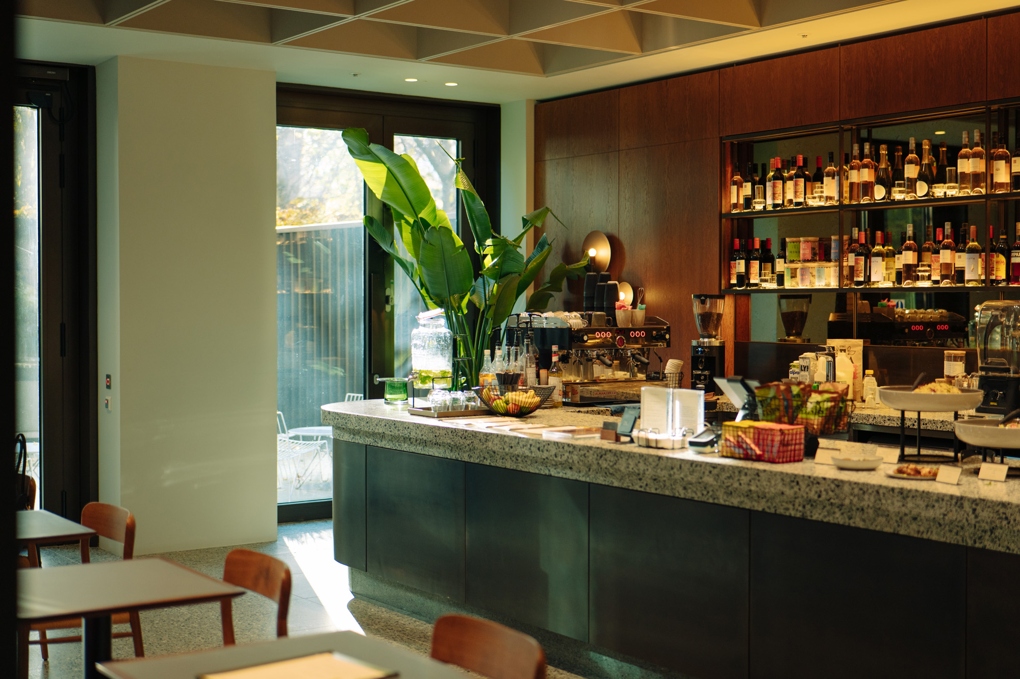 Are Derwent London's new lounges the future of workspace?
Property developer Derwent London’s new lounges – created for tenants of its offices – work harder to promote community and connection for their users
By Emily Wright
-
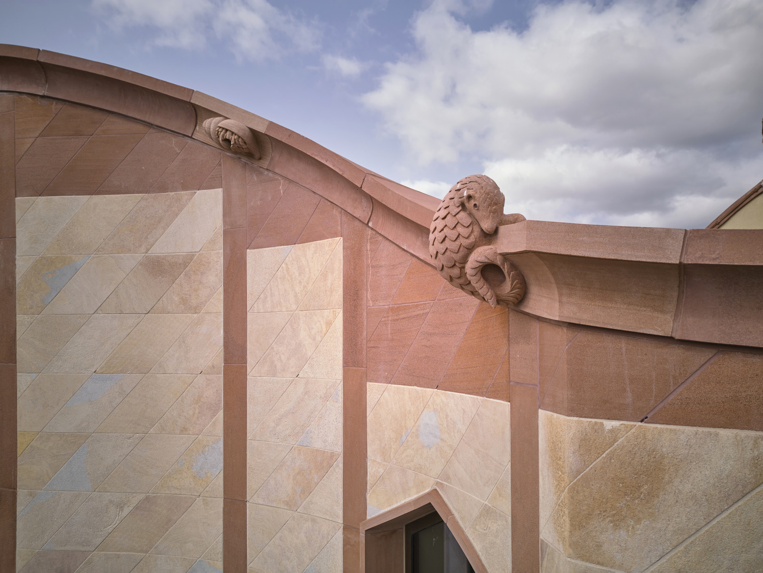 Showing off its gargoyles and curves, The Gradel Quadrangles opens in Oxford
The Gradel Quadrangles, designed by David Kohn Architects, brings a touch of playfulness to Oxford through a modern interpretation of historical architecture
By Shawn Adams
-
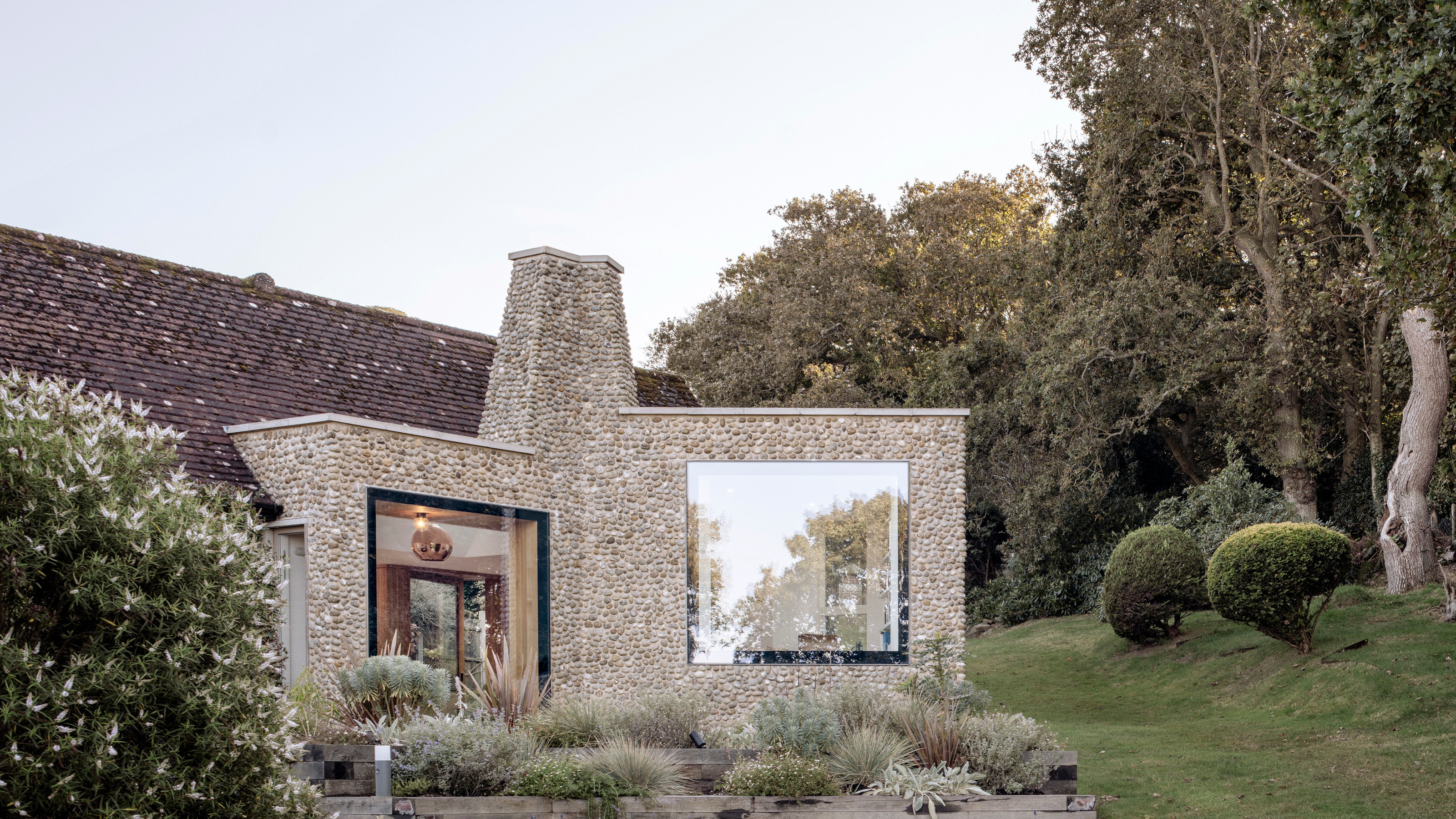 A Norfolk bungalow has been transformed through a deft sculptural remodelling
North Sea East Wood is the radical overhaul of a Norfolk bungalow, designed to open up the property to sea and garden views
By Jonathan Bell
-
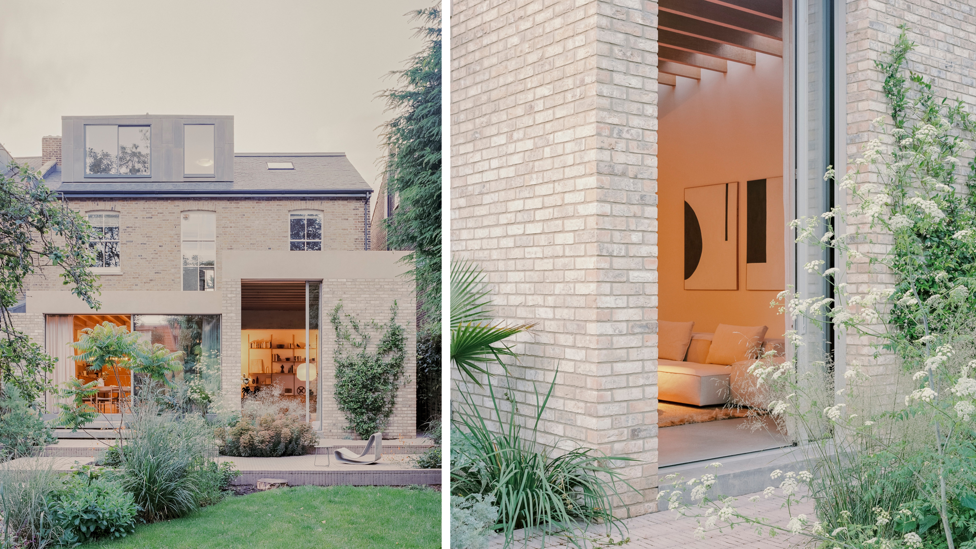 A new concrete extension opens up this Stoke Newington house to its garden
Architects Bindloss Dawes' concrete extension has brought a considered material palette to this elegant Victorian family house
By Jonathan Bell
-
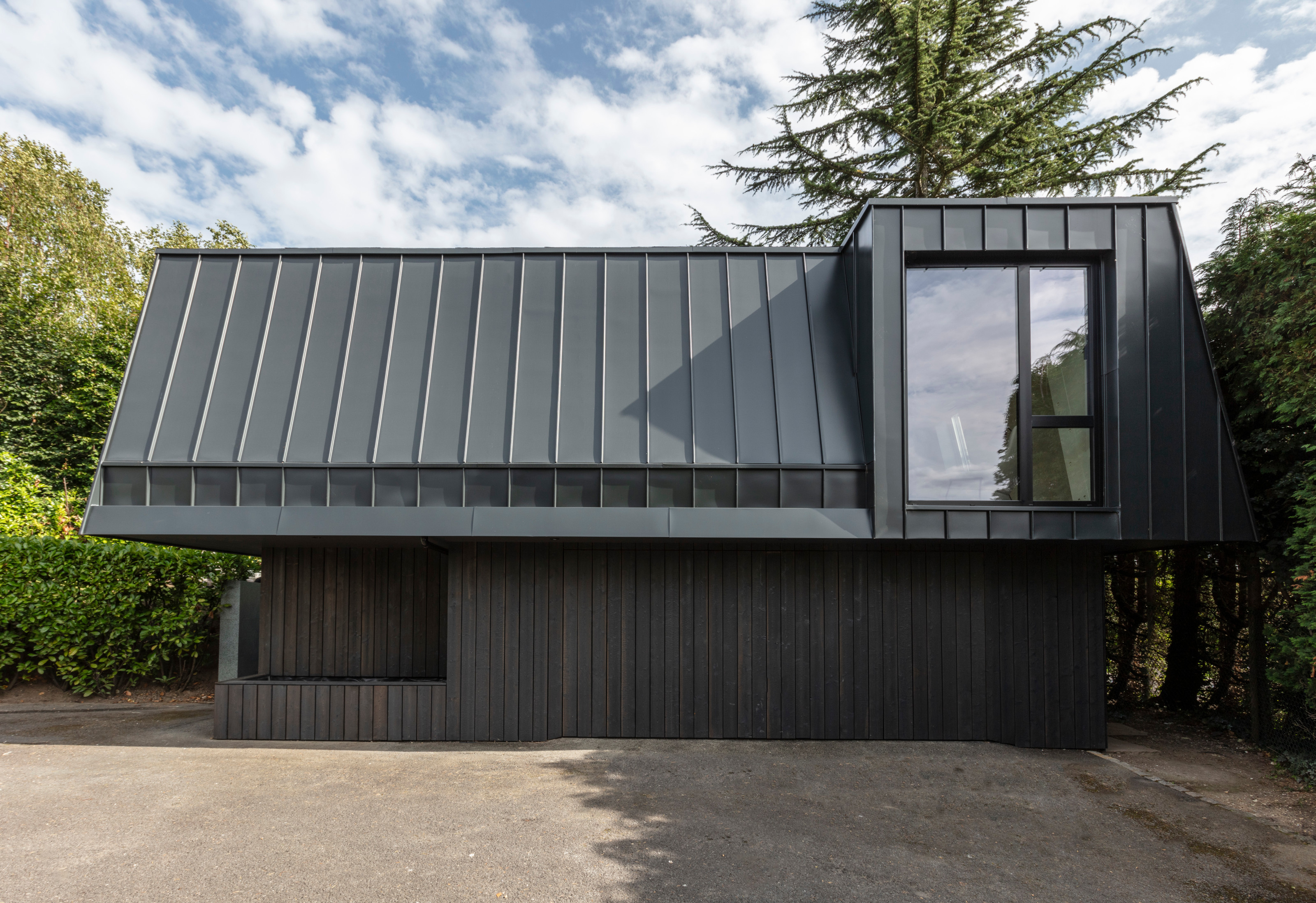 A former garage is transformed into a compact but multifunctional space
A multifunctional, compact house by Francesco Pierazzi is created through a unique spatial arrangement in the heart of the Surrey countryside
By Jonathan Bell