Museum of Contemporary Art Cleveland, designed by Farshid Moussavi
Receive our daily digest of inspiration, escapism and design stories from around the world direct to your inbox.
You are now subscribed
Your newsletter sign-up was successful
Want to add more newsletters?
'The first building we designed, in Japan, took six years. It felt like forever,' says architect Farshid Moussavi, dressed in a Maison Martin Margiela Artisanal sheath made entirely from plastic barber's combs. 'MOCA Cleveland was also six years, but it flew by.'
The Iranian-born architect and principal of London-based Farshid Moussavi Architecture is standing beside a dramatically canted wall as people stream up and down the vertiginous staircase that anchors the Museum of Contemporary Art Cleveland, which opened to the public this month after a protracted (and intricately linked) process of fundraising and design that Moussavi ended up using to challenge, troubleshoot, and fine-tune her concept.
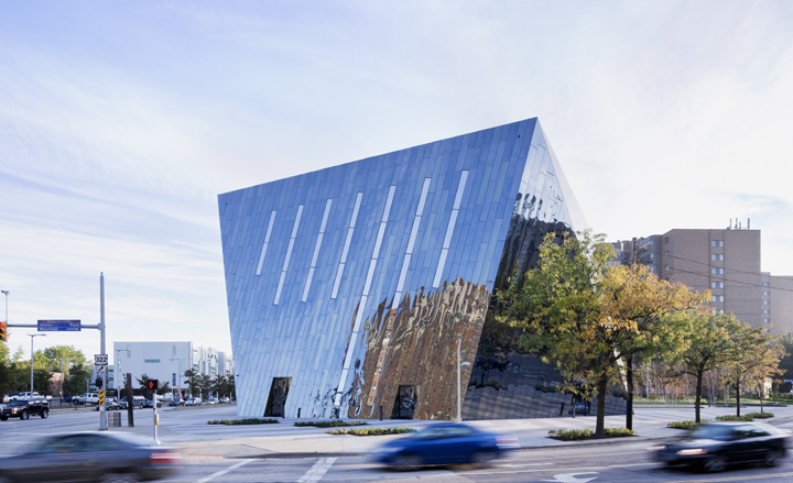
Clearly, time was on her side. Sleek, surprising, and incredibly versatile, the $27.2 million new home of MOCA Cleveland - Moussavi's first museum commission and her first building in the United States - is a slow-motion spectacular, unfolding gradually over four stories and approximately 34,000 sq ft.
The building envelope, a craggy carapace that is independent of the load-bearing floors, has six faceted sides, one of them a tall triangle of transparent glass that echoes the three-cornered building site. The others are clad in panels of black stainless steel for a unique finish that is part funhouse mirror, part mood ring.
'This material was an exciting find,' says Moussavi, who stumbled upon the dusky Rimex paneling after the museum's board nixed her first choice of gold anodized aluminum. 'We discovered that this black steel acquired different dynamics when applied to our shape, with its surfaces that are tilted to different orientations and that catch the light differently. It started playing with time,' she adds. 'We eventually understood the significance of this for a contemporary art museum, which should play with the idea of the now.'
Inside the eccentric exterior - which culminates in a square top - is a more conventional orthogonal plan atop a squat hexagonal base. The contrast between inside and outside could have been jarring, but Moussavi proposed the bold move of lining the building shell with colour: a midnight blue that suggests an inky, matte wink to Yves Klein ultramarine. 'Artists gave us feedback about the intensity of the blue paint,' she explains. 'They said that if it was dark enough, it would recede and give this sensation of a boundless space,' an effect that is heightened by the diagonal zips of glass that are the building's windows.
Allowing the building's dark shell to infiltrate what would have been a basic white cube gallery on the top floor is just one of the invasions-and innovations-in evidence. Floors deliberately alternate between public and non-public museum activities, affording visitors glimpses into the wood workshop or the loading dock.
The fire stairs, painted bright yellow and locked in a helical embrace with the main staircase, double as a sound gallery. With entrances on all sides, the double-height ground floor can be configured as a gallery, performance venue, or social hub. Even the museum store floats, thanks to collapsible fixtures that can make way for event space.
'We aspired to nothing less than to create a model for a 21st century art museum,' says Jill Snyder, who has been director of MOCA since 1996, when it was known as the Cleveland Center for Contemporary Art and occupied the second floor of a former department store. 'What we strived for was flexibility, transparency, and sustainability.' The finished product is three for three, with the neighbouring public plaza concealing 36 geothermal wells, and a LEED Silver designation in sight for the building.
With attendance expected to triple to 65,000 visitors per year, the non-collecting institution has planned an ambitious exhibition schedule, beginning with 'Inside Out and From the Ground Up,' on view until 24 February 3013. Organized by chief curator David Norr, the group show responds to the architecture of the new building through works ranging from the shimmering canvases of Jacqueline Humphries to Henrique Oliviera's 'Carambóxido' (2012), which thrusts a giant plywood-covered gourd through a gallery wall.
Downstairs, Katharina Grosse has aimed her industrial spray gun at the wall of the museum's three-story atrium, while the second-floor gallery hosts David Almetjd's 'The Orbit,' a room-sized Plexiglas box installation that marks the first time he has incorporated architectural elements-along with coconuts, artificial eyes, werewolf paws, and plenty of mirrors.
The artist's vision for the work applies equally well to the museum itself. 'I always deal with structures and of course I'm always confronted with their limitations, but I like the idea of constantly breaking that limitation,' says Almetjd. 'I want to make an object that's complex enough to generate or secrete new meaning.'
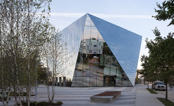
The building envelope, a craggy carapace that is independent of the load-bearing floors, has six faceted sides, one of them a tall triangle of transparent glass that echoes the three-cornered building site...
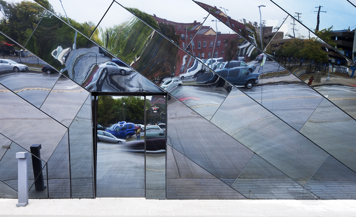
... while the others are clad in panels of black stainless steel for a unique finish that is part funhouse mirror, part mood ring
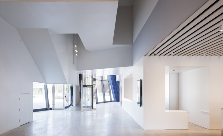
With entrances on all sides, the double-height ground floor can be configured as a gallery, performance venue, or social hub
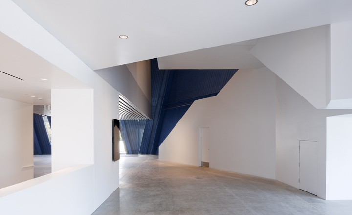
The contrast between inside and outside could have been jarring, but Moussavi proposed the bold move of lining the structural shell with colour: a midnight blue that suggests an inky, matte wink to Yves Klein ultramarine
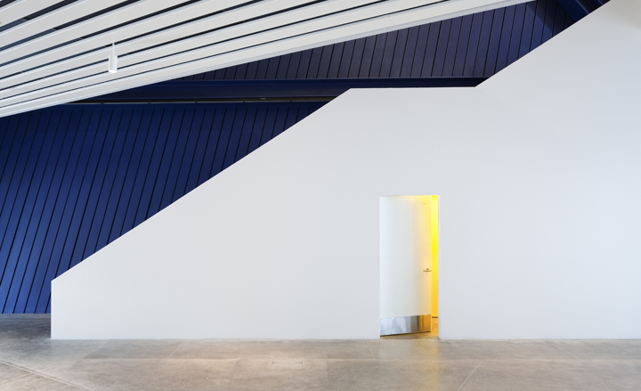
'Artists gave us feedback about the intensity of the blue paint,' Moussavi explains. 'They said that if it was dark enough, it would recede and give this sensation of a boundless space'
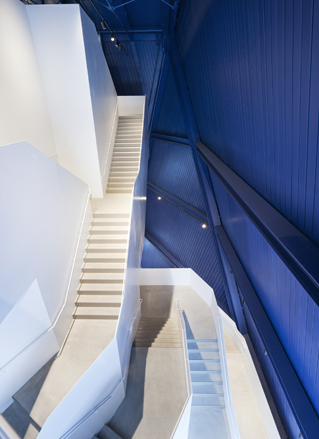
The vertiginous staircase anchors the building
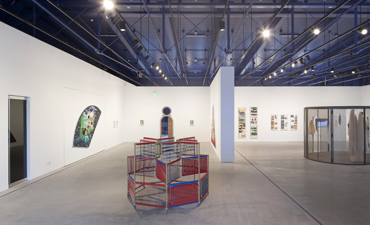
The ambitious exhibition schedule begins with 'Inside Out and From the Ground Up,' on view until 24 February 3013
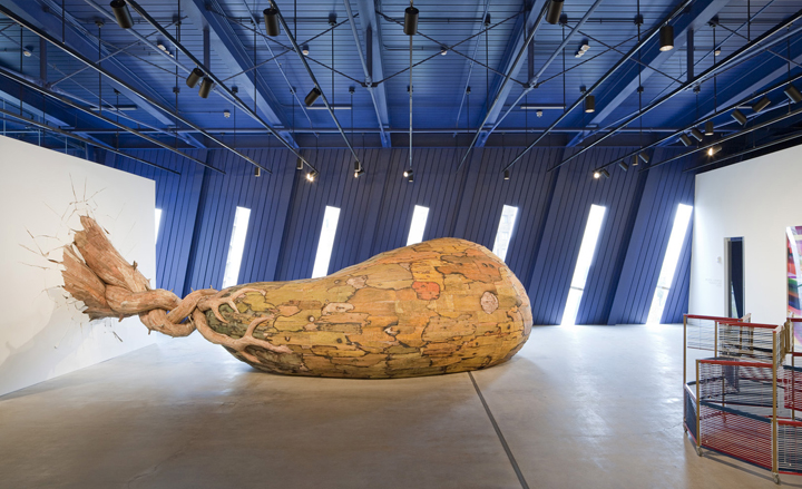
The group show responds to the architecture of the new building through works ranging from Henrique Oliviera's 2012 'Carambóxido' (pictured), which thrusts a giant plywood-covered gourd through a gallery wall, to the shimmering canvases of Jacqueline Humphries
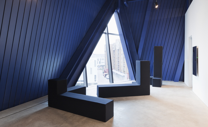
The building's windows are diagonal zips of glass

Even the office space is enlivened by the blue backdrop
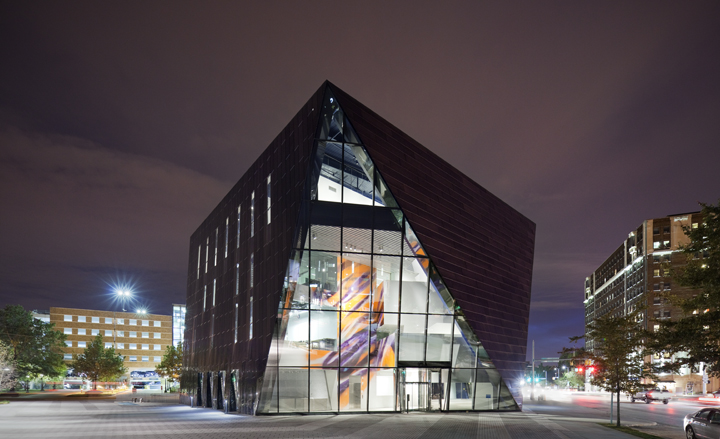
The MOCA Cleveland's $27.2 million new home is sleek, surprising, and incredibly versatile
ADDRESS
11400 Euclid Avenue
Cleveland
Ohio 44106
United States
Receive our daily digest of inspiration, escapism and design stories from around the world direct to your inbox.
Stephanie Murg is a writer and editor based in New York who has contributed to Wallpaper* since 2011. She is the co-author of Pradasphere (Abrams Books), and her writing about art, architecture, and other forms of material culture has also appeared in publications such as Flash Art, ARTnews, Vogue Italia, Smithsonian, Metropolis, and The Architect’s Newspaper. A graduate of Harvard, Stephanie has lectured on the history of art and design at institutions including New York’s School of Visual Arts and the Institute of Contemporary Art in Boston.