Sporting inspiration triumphs at 3XN’s new Olympic House in Lausanne
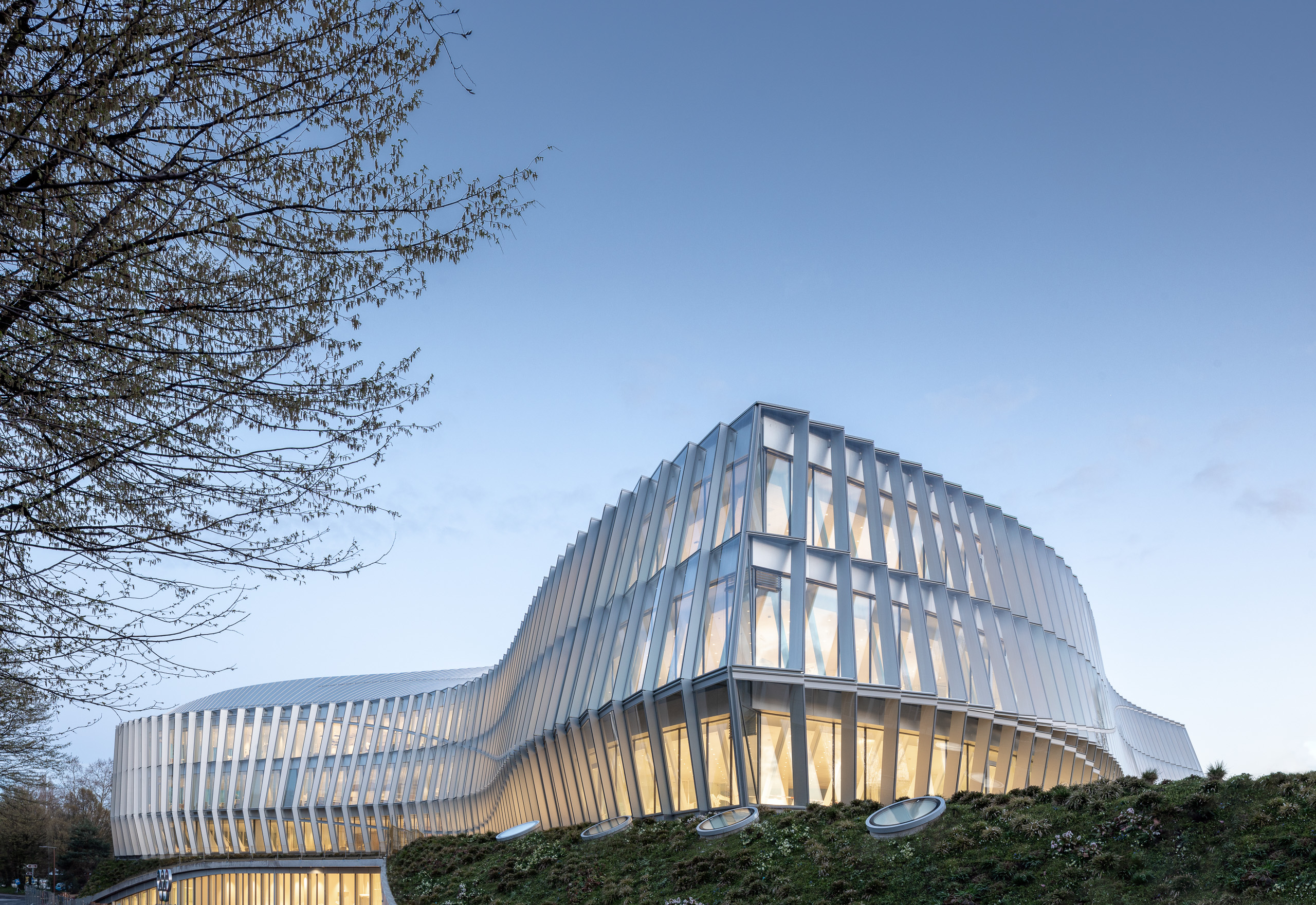
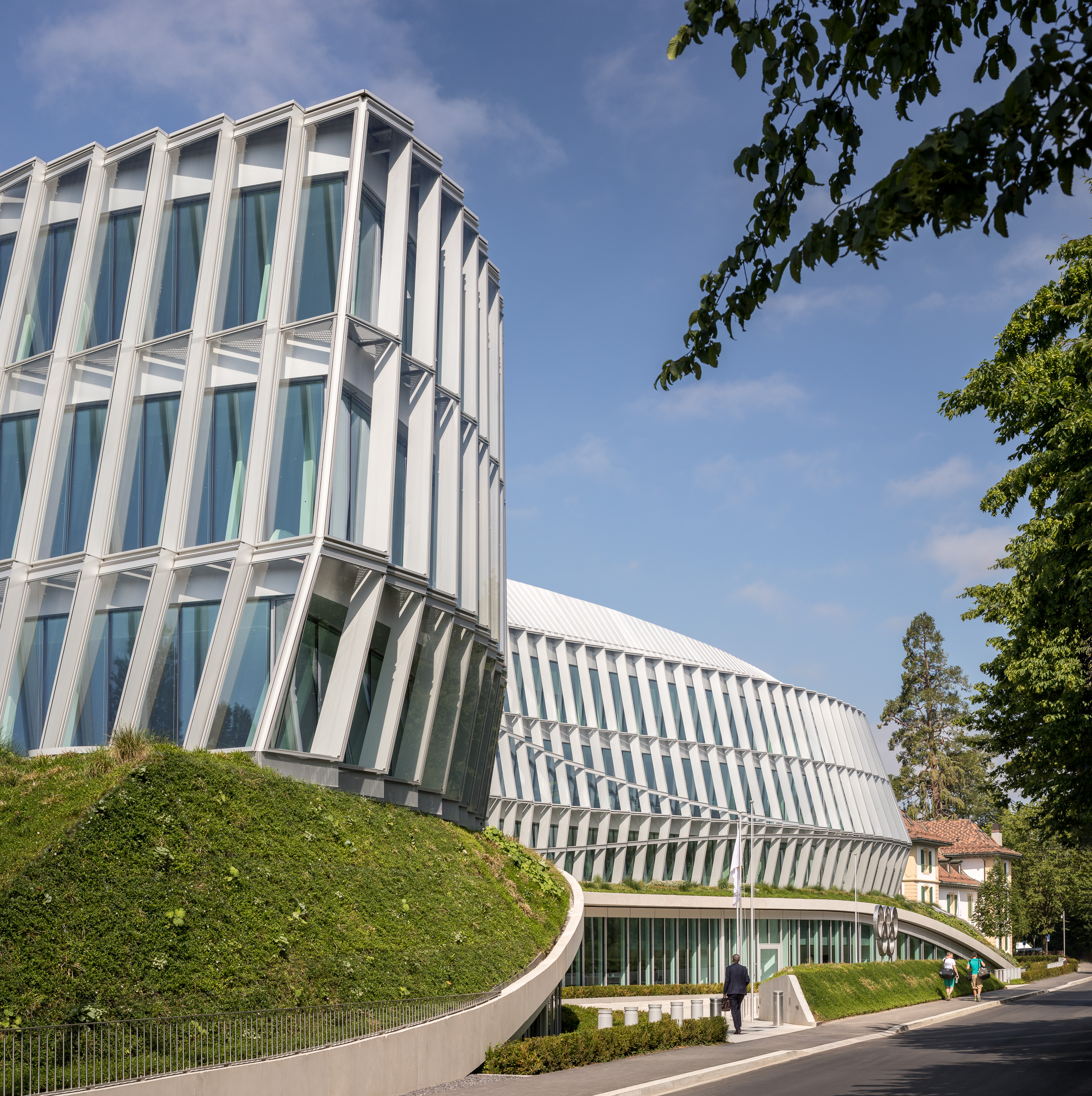
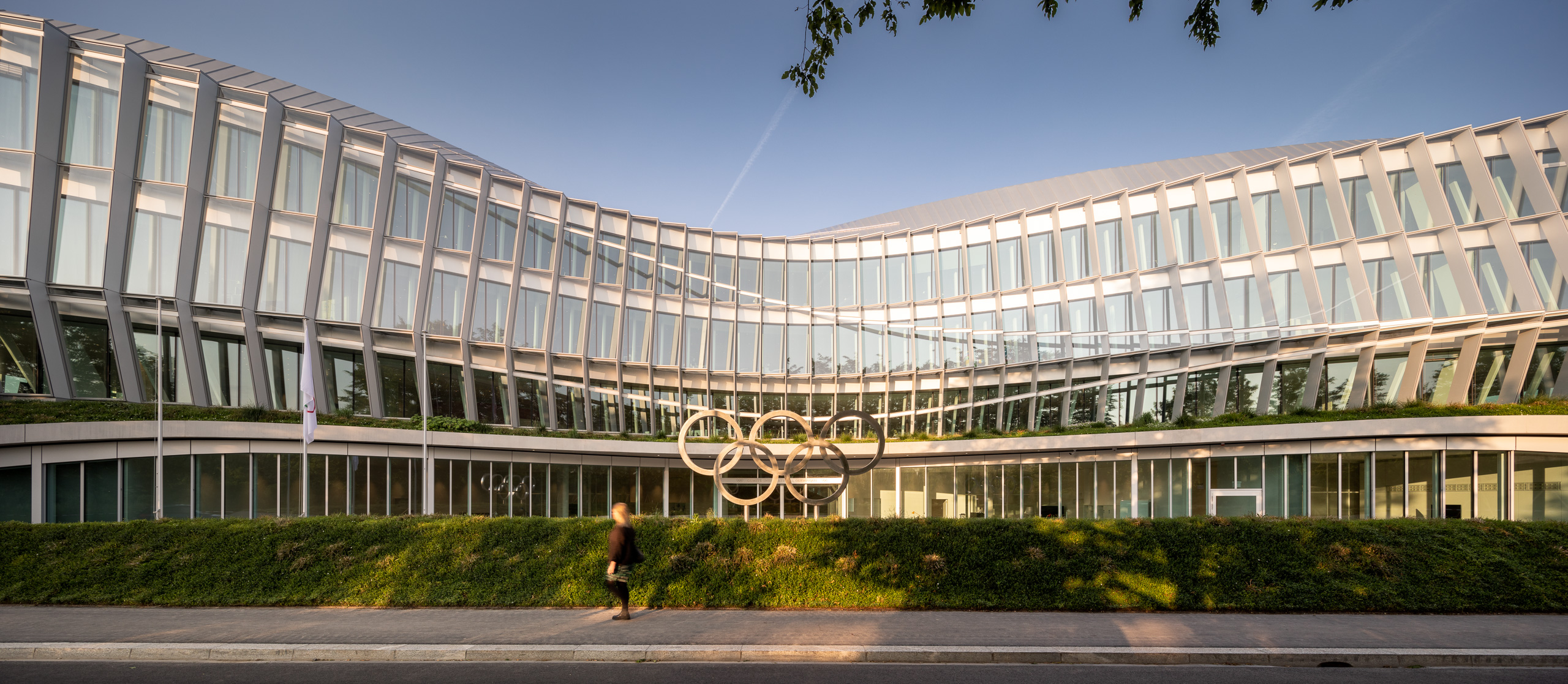
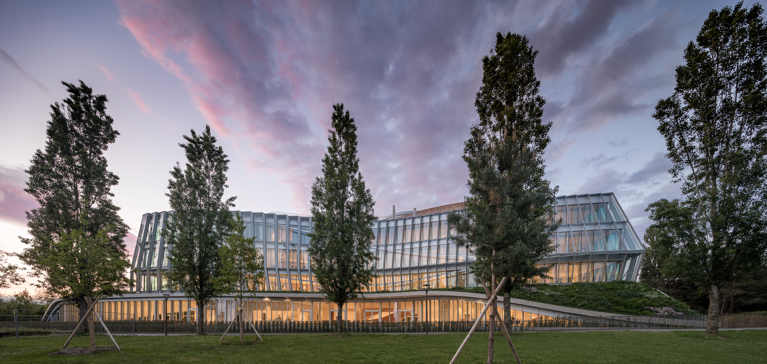
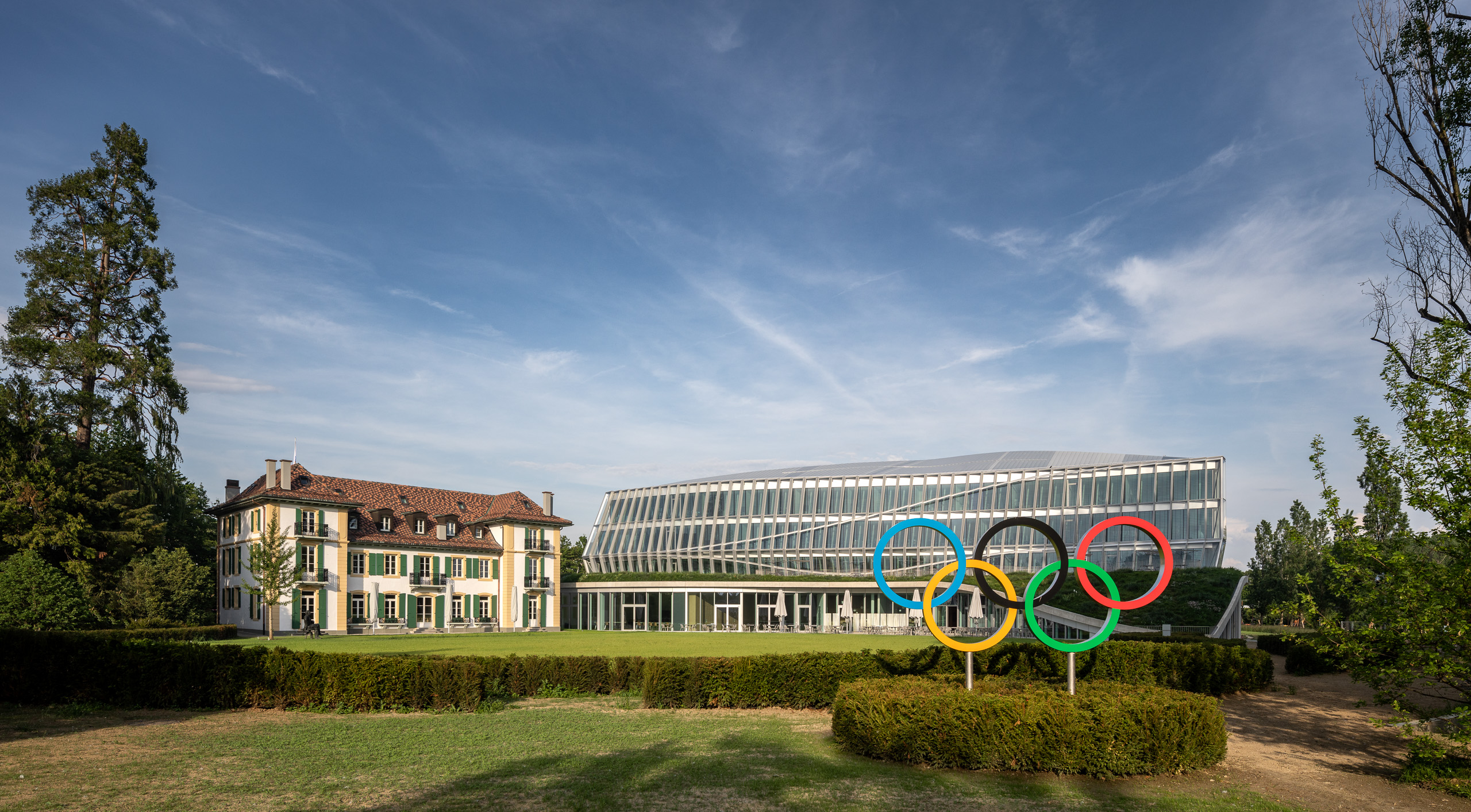
After seven years of planning and three years of construction, the International Olympic Committee (IOC) is finally unveiling its new 22,000 sq m HQ in Lausanne, Switzerland, on 23 June. Olympic House has been designed to embody the movement’s lofty values, while its undulating shape mimics the flips and twists of a snowboarder.
Mention the IOC to most people, and the Games are undoubtedly what first come to mind. But the organisation is more than that, says Marie Sallois, its director of corporate development, brand and sustainability. ‘We are the governing body of the sports movement,’ she explains; the non-profit organisation gives an average of $3.4m a day to athletes and sports-related causes around the world, anything from gender equality to infrastructure in refugee camps.
Lausanne has been the IOC’s home since the beginning of the First World War, when founder Pierre de Coubertin chose the city for its neutrality. But with time, its employees found themselves scattered in four separate buildings around the city. In 2006, the organisation started thinking about how to regroup under one roof.
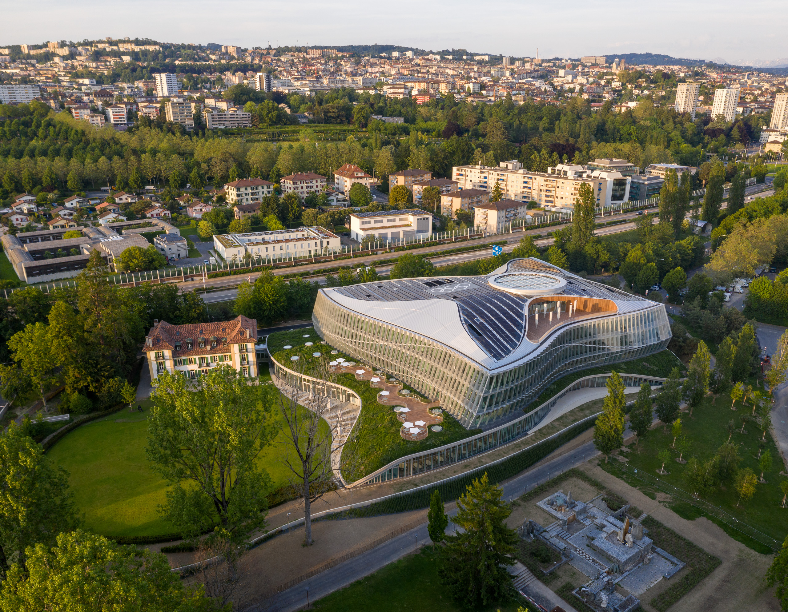
A new building would require what Sallois calls five ‘key success factors’. It needed spaces that encourage collaboration, a flexible structure that could evolve with changing work habits, and symbolism of what the IOC stands for. Sustainability was also vital; the IOC had to ‘walk the talk’ if it expected the same of organising committees and sports federations. Finally, the building had to integrate into its environment, a public park overlooking Lake Geneva.
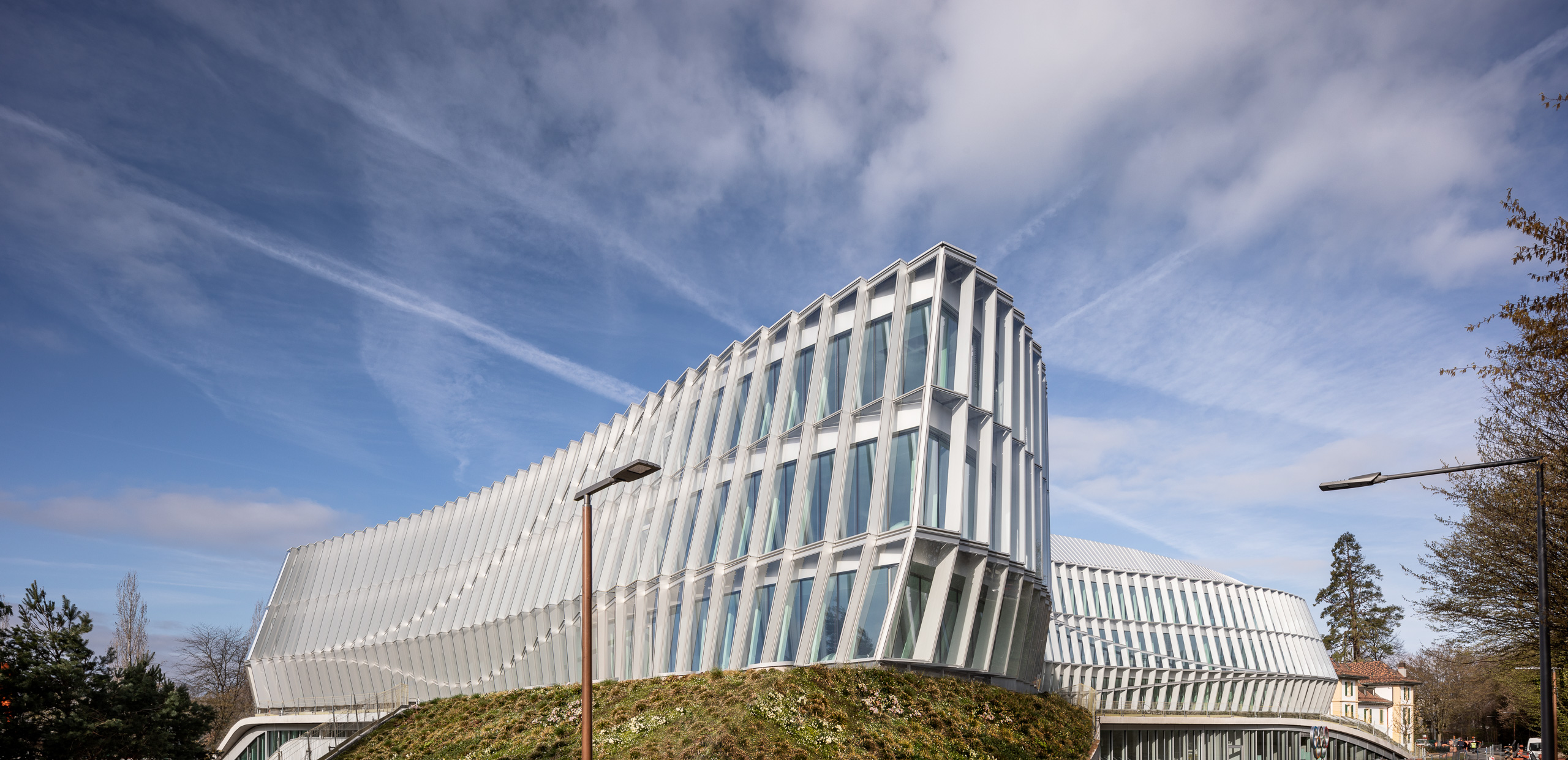
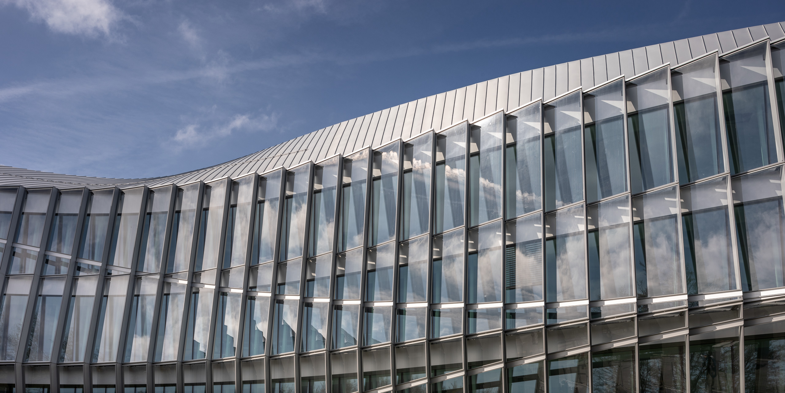
In 2013, the IOC invited 12 international architecture firms to submit proposals, ultimately selecting Denmark’s 3XN, whose overarching philosophy is that architecture shapes behaviour. A few months before the building’s inauguration, the firm’s founder, Kim Herforth Nielsen, and senior partner and head of design, Jan Ammundsen, gave Wallpaper* a tour of the site in Lausanne. ‘Every part of this building has a meaning,’ says Nielsen, showing the stop-motion image of a snowboarder that drove the dynamic and undulating design. The clear glass façade and load-bearing steel columns behind the glazing allow for transparency and flexibility, with open spaces and a minimum of supporting structures inside; no columns stand within 8m of the façade, so workspaces can easily be modified at any time.
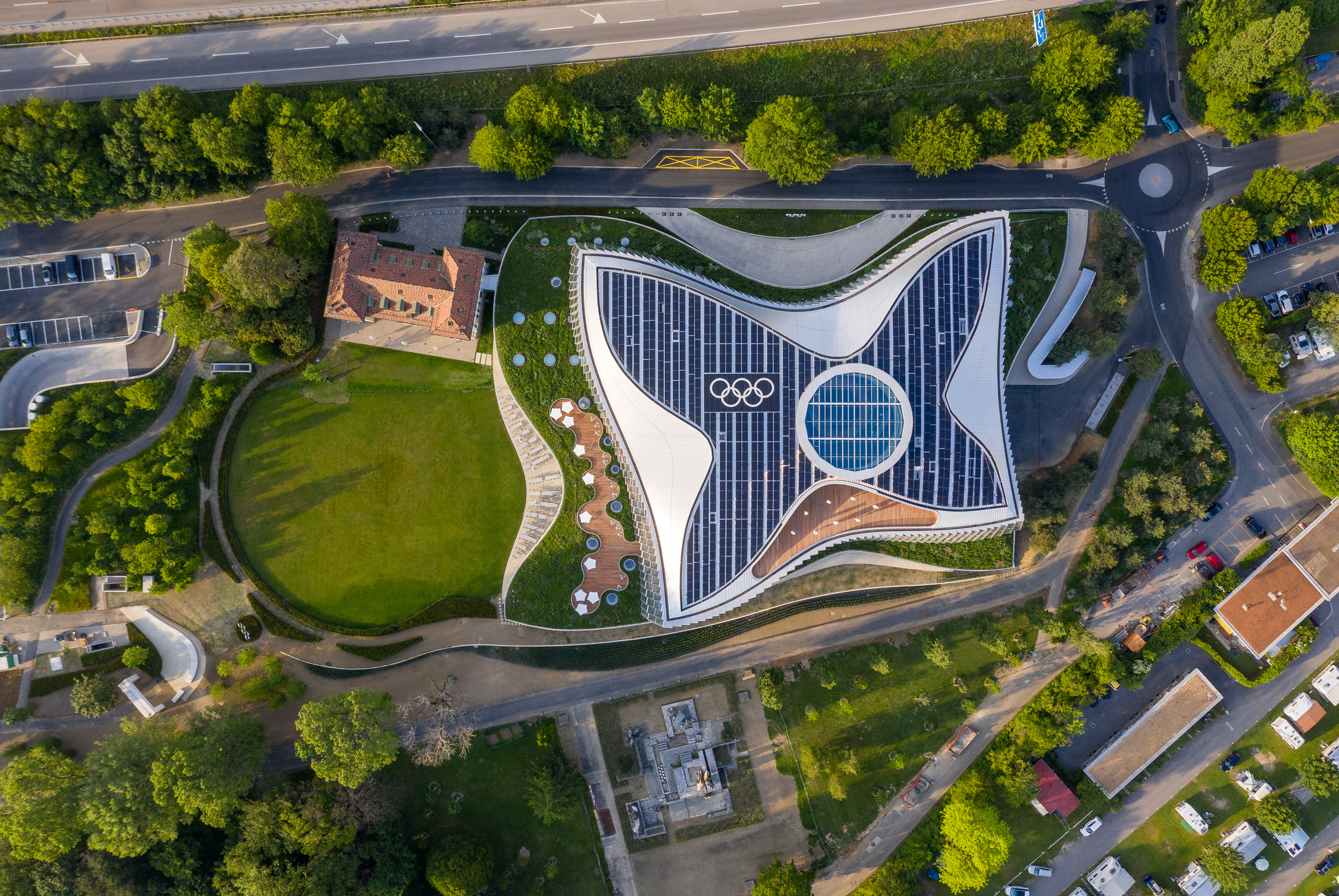
Nielsen shows a square being pushed in on all sides to give an idea of how they arrived at the concave shape, which serves several purposes: reducing the building’s footprint, allowing daylight to penetrate everywhere, and creating more outdoor views. This was a way of ‘taking the park into the building’.
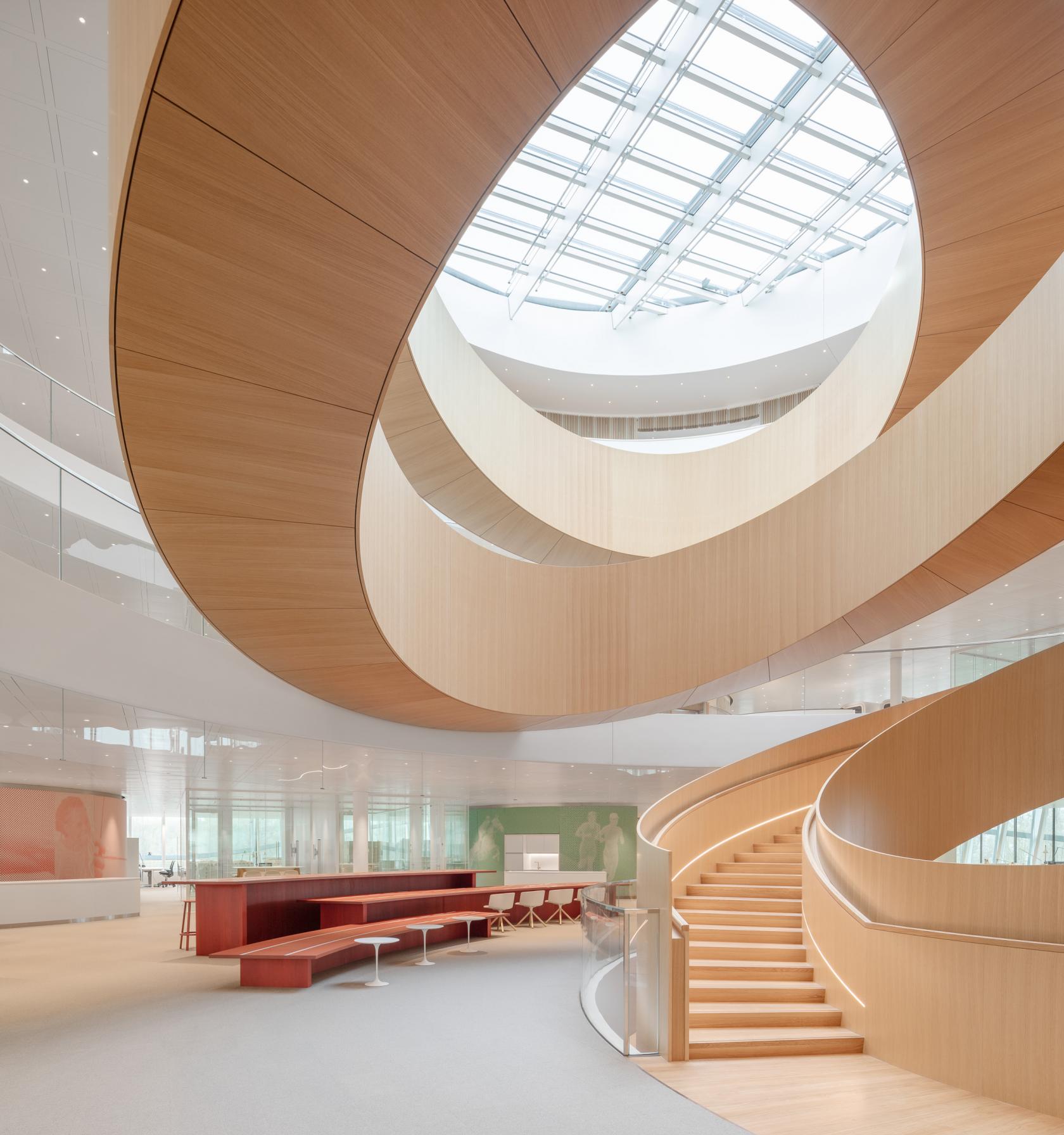
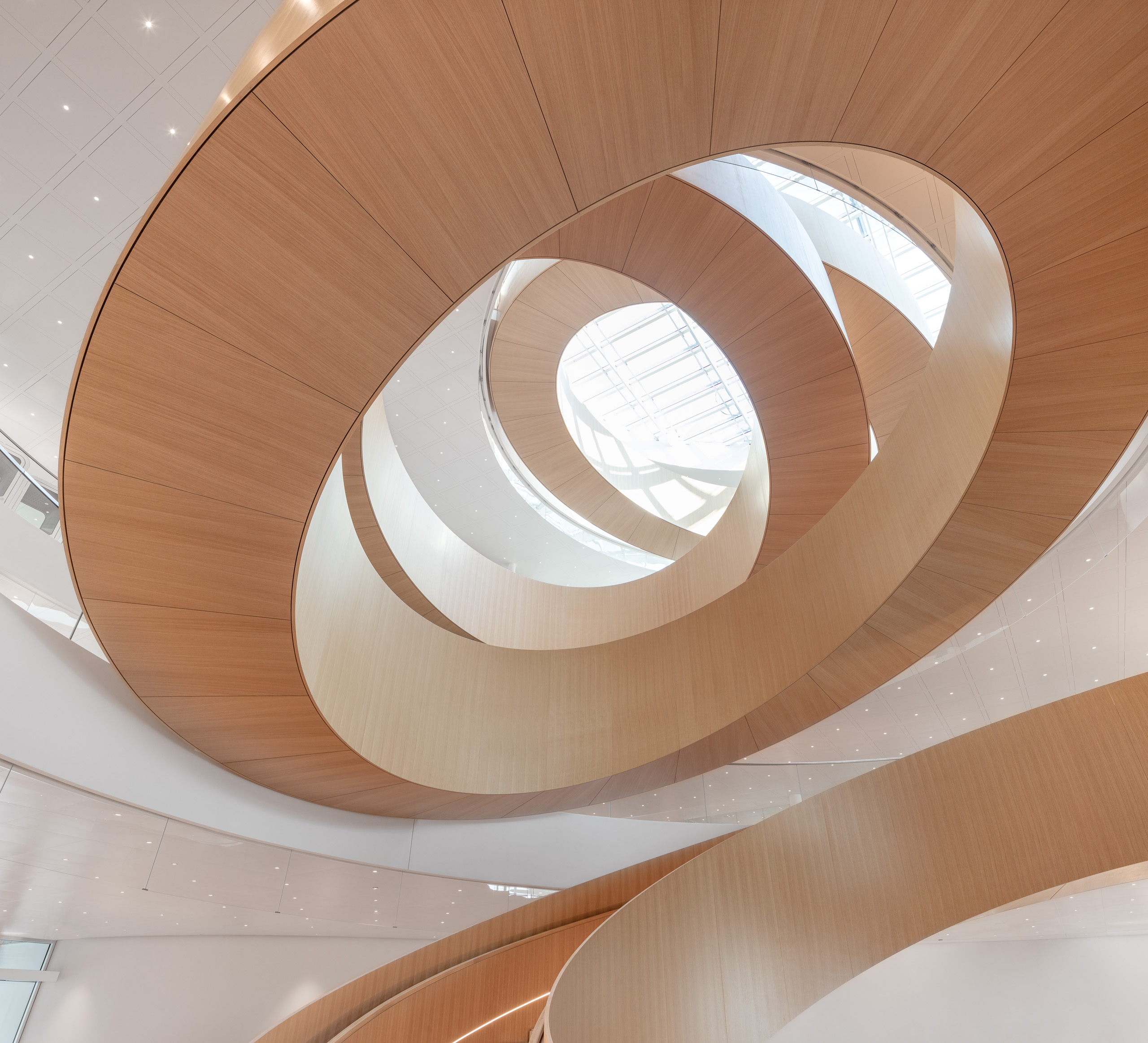
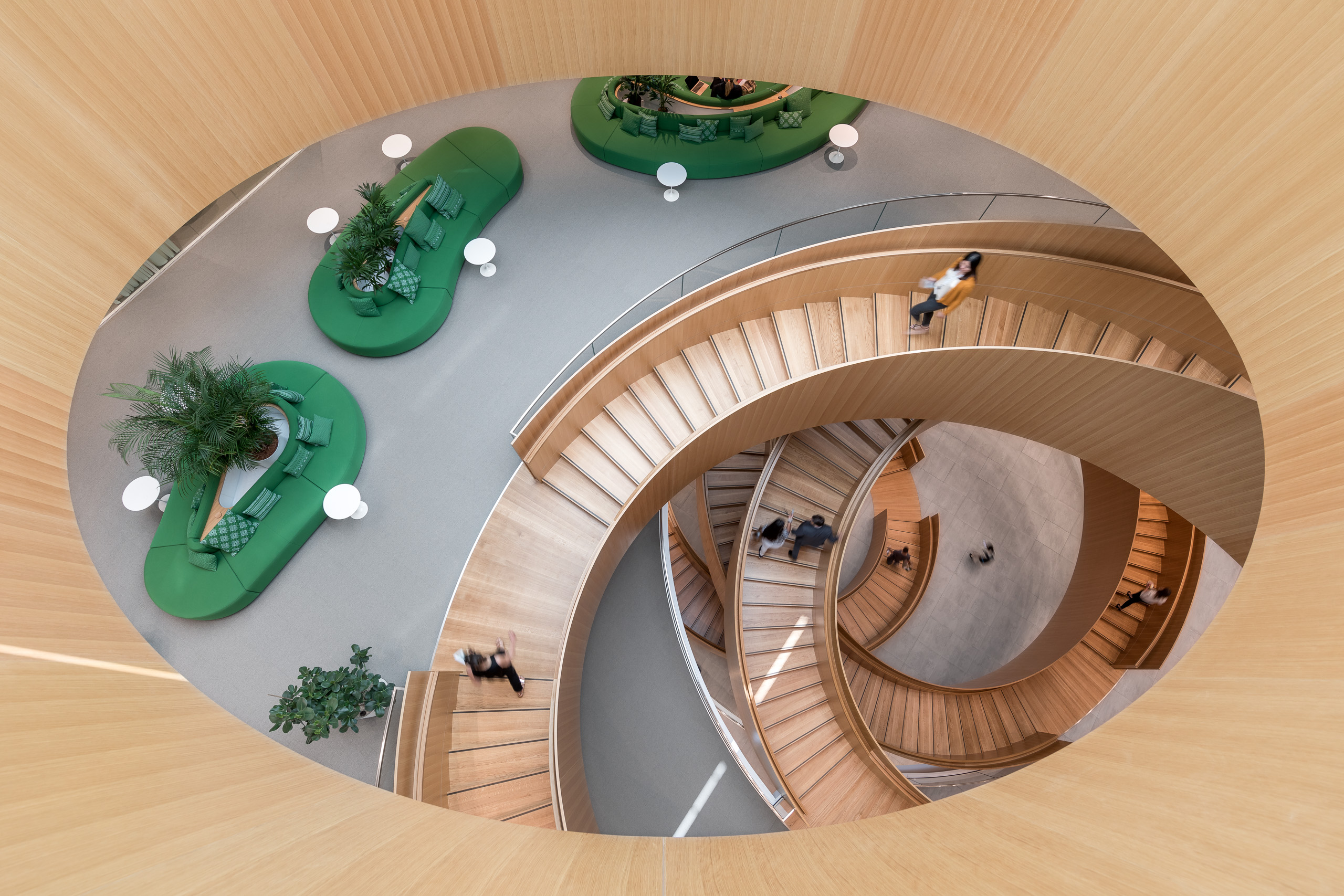
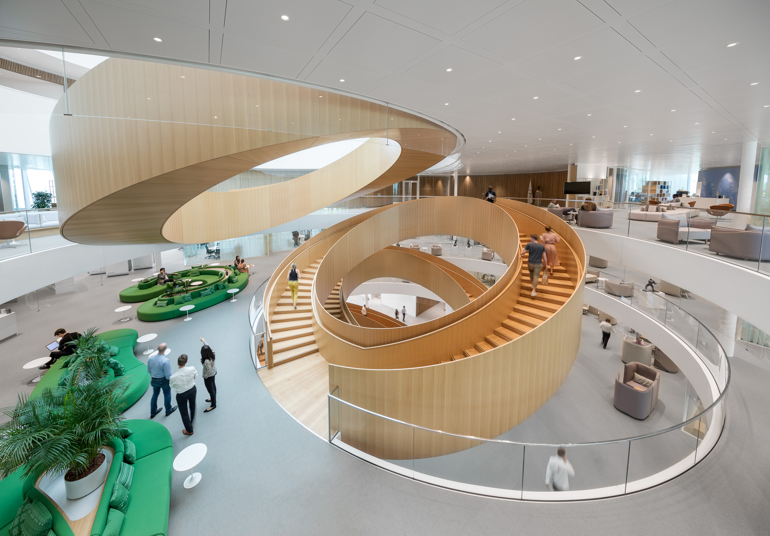
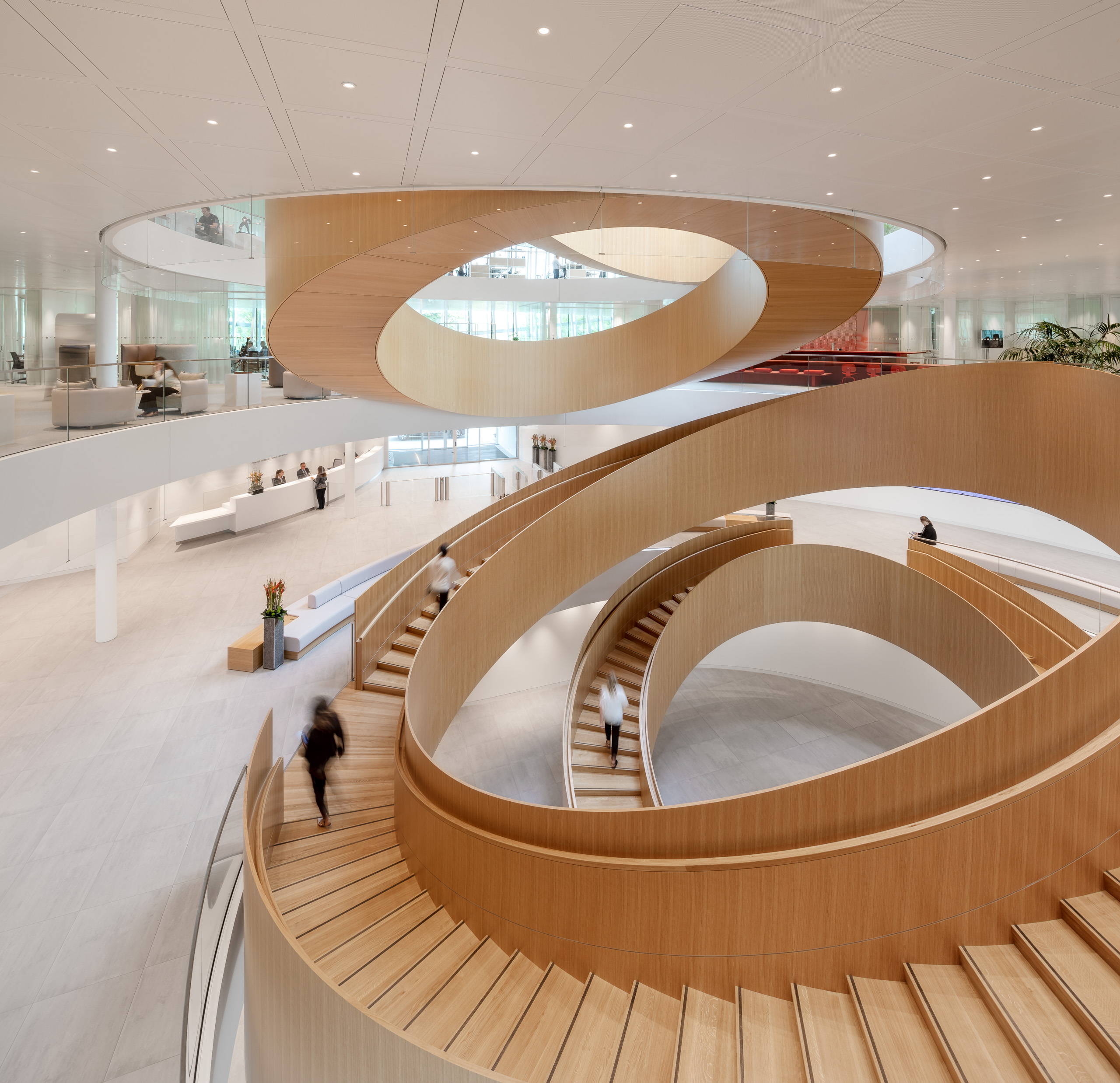
As for the IOC’s iconic rings, the architects turned them into a functional object, a breathtaking oak staircase inside a central atrium. Cascading from floor to floor, each ring is attached only at the top and bottom, as though suspended. None of the rings touch; people climb the stairs to the right or left, then walk a few steps on each landing to reach the next flight, the design encouraging interaction. Each ring is built like a wheel, with an outer rim that creates the shape and an inner one that forms the stairs. ‘It reads like a real circle, but the geometry of a staircase does not work like that,’ explains Ammundsen.
RELATED STORY
The staircase provides a wow factor from the moment you enter the building. A statue of de Coubertin stands before it, greeting visitors, while a bronze olive tree growing up from the basement is a nod to the Olympics’ Greek roots. Large screens on the walls show sporting events, past and present. The ground floor includes a fitness centre, a lobby café and a pretty restaurant/meeting space with circular skylights and a view of the lake. Five hundred people will work here in open-plan offices occupying the first and second floors, with glass-enclosed meeting rooms and a first-floor terrace. The third floor is dedicated to governance, with the president’s office and the executive board meeting room, while the fourth has a roof terrace with spectacular views. For sustainability, the IOC wished to honour both Swiss and international certifications – an extremely ambitious goal, especially since the certifications had conflicting requirements at times. It helped that Olympic House was designed and measured wholly by computer, using parametric design. ‘It would have been hard ten years ago because we didn’t have the tools to do it so precisely,’ Nielsen says.

More than 95 per cent of materials salvaged from the old administrative headquarters were reused or recycled. The building’s compact shape reduces energy needs, and the tilting and staggering of its windows filters sunlight to keep it cool. The façade is made of two separate glass layers, which insulate and reduce noise. Concrete in the walls and flooring helps minimise the energy consumption for heating and cooling, keeping the environment temperate, while rooftop solar panels contribute to the building’s electricity needs – and from the air, look like a dove. The nearby lake is a ‘fantastic asset’ says Ammundsen, its water used for heating and cooling. Rainwater is harvested for taps and toilets. Most of the building’s contractors were local, including Vitra, which supplied furniture made of sustainable materials. The grounds offer bicycle parking and Lausanne’s first hydro charging station.
And though it is not open to the public (the Olympic Museum in Lausanne serves that purpose), the building feels welcoming. Vegetated plinths slope down to the ground, so the structure blends in with the landscape. Cycle and pedestrian paths run by it, offering views inside. Security is passive, consisting largely of bumps and ditches. The IOC developed its plans for Olympic House at the same time as its strategic road map for a more open and transparent future. Ultimately, says Sallois, ‘This is more than a building. It is a project of change.’
A version of this article originally appeared in the July 2019 issue of Wallpaper* (W*244)
INFORMATION
Wallpaper* Newsletter
Receive our daily digest of inspiration, escapism and design stories from around the world direct to your inbox.
-
 Japan in Milan! See the highlights of Japanese design at Milan Design Week 2025
At Milan Design Week 2025 Japanese craftsmanship was a front runner with an array of projects in the spotlight. Here are some of our highlights
By Danielle Demetriou
-
 Tour the best contemporary tea houses around the world
Celebrate the world’s most unique tea houses, from Melbourne to Stockholm, with a new book by Wallpaper’s Léa Teuscher
By Léa Teuscher
-
 ‘Humour is foundational’: artist Ella Kruglyanskaya on painting as a ‘highly questionable’ pursuit
Ella Kruglyanskaya’s exhibition, ‘Shadows’ at Thomas Dane Gallery, is the first in a series of three this year, with openings in Basel and New York to follow
By Hannah Silver
-
 A contemporary Swiss chalet combines tradition and modernity, all with a breathtaking view
A modern take on the classic chalet in Switzerland, designed by Montalba Architects, mixes local craft with classic midcentury pieces in a refined design inside and out
By Jonathan Bell
-
 Step inside Rains’ headquarters, a streamlined hub for Danish creativity
Danish lifestyle brand Rains’ new HQ is a vast brutalist construction with a clear-cut approach
By Natasha Levy
-
 This restored Danish country home is a celebration of woodworking – and you can book a stay
Dinesen Country Home has been restored to celebrate its dominant material - timber - and the craft of woodworking; now, you can stay there too
By Ellie Stathaki
-
 Greenland through the eyes of Arctic architects Biosis: 'a breathtaking and challenging environment'
Danish architecture studio Biosis has long worked in Greenland, challenged by its extreme climate and attracted by its Arctic land, people and opportunity; here, founders Morten Vedelsbøl and Mikkel Thams Olsen discuss their experience in the northern territory
By Ellie Stathaki
-
 The Living Places experiment: how can architecture foster future wellbeing?
Research initiative Living Places Copenhagen tests ideas around internal comfort and sustainable architecture standards to push the envelope on how contemporary homes and cities can be designed with wellness at their heart
By Ellie Stathaki
-
 Denmark’s BIG has shaped itself the ultimate studio on the quayside in Copenhagen
Bjarke Ingels’ studio BIG has practised what it preaches with a visually sophisticated, low-energy office with playful architectural touches
By Jonathan Bell
-
 Herzog & de Meuron’s Children’s Hospital in Zurich is a ‘miniature city’
Herzog & de Meuron’s Children’s Hospital in Zurich aims to offer a case study in forward-thinking, contemporary architecture for healthcare
By Ellie Stathaki
-
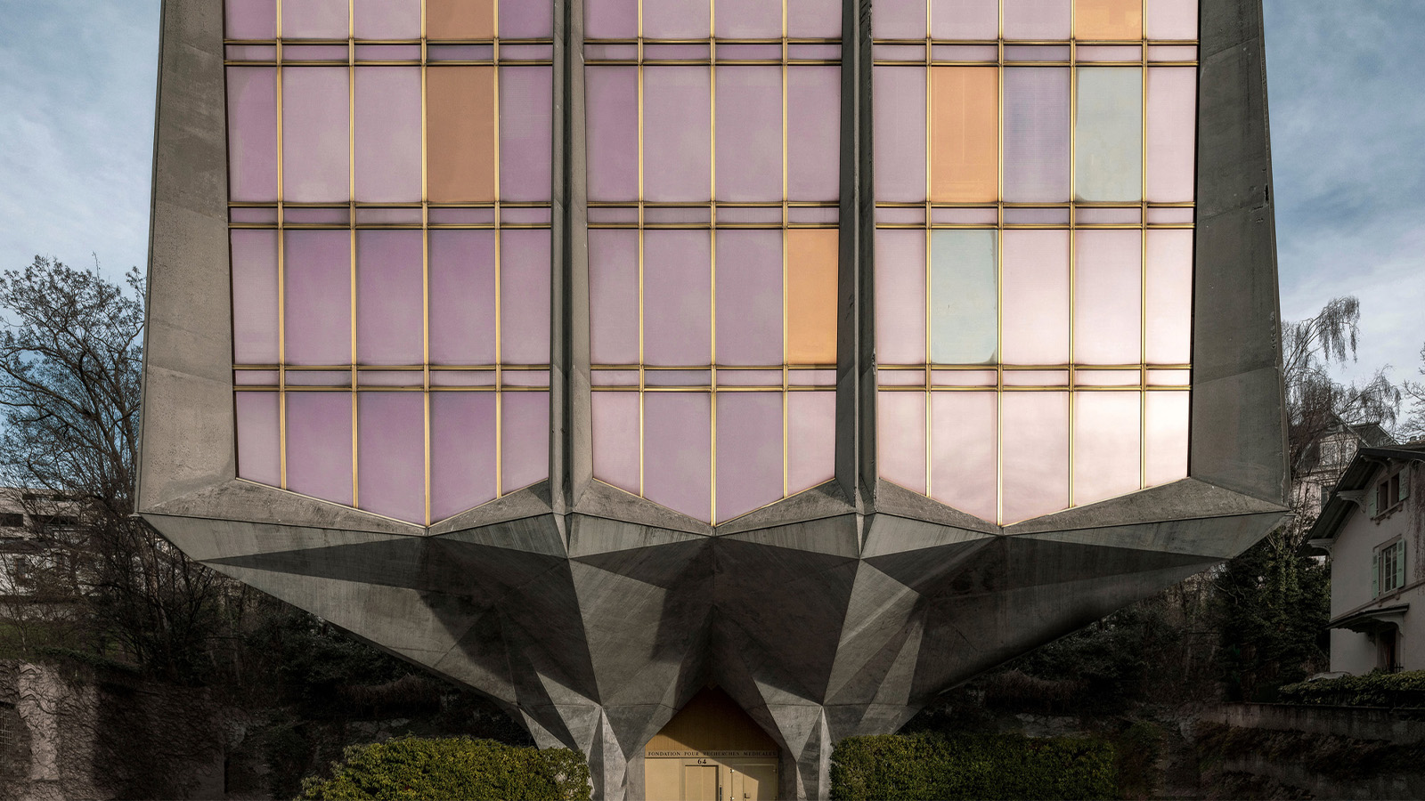 Step inside La Tulipe, a flower-shaped brutalist beauty by Jack Vicajee Bertoli in Geneva
Sprouting from the ground, nicknamed La Tulipe, the Fondation Pour Recherches Médicales building by Jack Vicajee Bertoli is undergoing a two-phase renovation, under the guidance of Geneva architects Meier + Associé
By Jonathan Glancey