The spirit of Stanley Kubrick is present in Optimist Design's monochrome LA lair for Three Six Zero
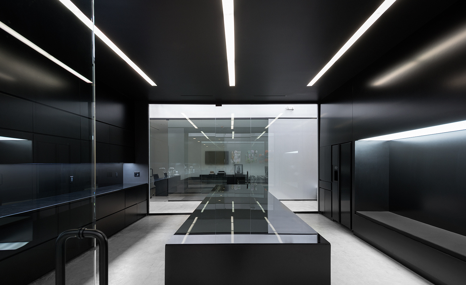
No one ever called West Hollywood beautiful. The streetscape – marked by concrete shells, run-down shops and malls and ugly car lots – is an unrelenting reminder of America’s hollowed-out suburban sprawl. In recent years, though, WeHo, as locals call the area, has attracted a bevy of slick restaurants, hotels and boutiques to rival Beverly Hills. With little fanfare, it has become a hotbed of creative energy, its artistic vibrancy entirely at odds with the uninspiring visual cues. Stepping through the doors of talent-management company Three Six Zero’s new HQ is to realise, once again, just how deceptive outside appearances can be.
When Three Six Zero, who in 2010 formed a partnership Jay Z's Roc Nation, found space in film director Tim Burton's old studio – a blank-faced, single-storey warehouse on Willoughby Avenue – getting someone to repurpose the 10,000 sq ft space was easy. LA studio Optimist Design had worked with Jay Z before, on a music video set, but the recommendation came from jewellery designer Sarah-Jane Wilde. ‘We designed her office,’ says Tino Schaedler, Optimist’s head architect, ‘and when Three Six Zero was looking for the right designer, she brought up our name.’
The brief seemed simple enough: a space that balanced sophistication with star appeal, the latter particularly important given that Three Six Zero represents some of America’s biggest music, film, television and literary celebrities. Think Calvin Harris, Travis Scott, Brett Easton Ellis, Deadmau5 and Frank Ocean. ‘My background is in film,’ Schaedler says, referencing his stage design and production work at the Grammys for Daft Punk, Kanye West and Pharrell Williams, as well as set design on Burton’s Charlie and the Chocolate Factory and the Harry Potter films. ‘So I have always thought of space as a sequential experience. It’s important for us to consider how the space unfolds as you walk through it. On this project, Stanley Kubrick and his use of one-point perspective for the strong visual and emotional impact in The Shining and 2001: A Space Odyssey was an inspiration.’
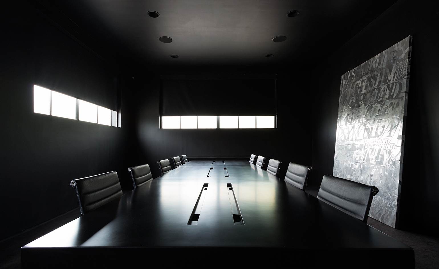
A reflective painting by Pia Habekost has impact in the otherwise all-black conference room
The Kubrickian influence is distinctive, particularly in the way the individual rooms and spaces, each designed almost like a set piece, have a symmetry and spatial depth. The conceit is a dramatic one and the tone is set the moment you step into the lobby – an austere volume lined on each side with a floating leather-clad bench, and dominated by a solid monolith of a reception desk with a black satin finish. Overhead hangs a flat chandelier in the form of a diamond-shaped trellis, a motif repeated in the open-plan office space and in the artists’ lounge.
Polished concrete floors anchor two types of spaces, which are differentiated through lighting and colour. All the offices are bright, naturally lit by skylights carved into the original 22ft-high box-truss ceiling, and touched with silver, white and glossy black accents. All the communal areas – such as the kitchen, media lounge, conference room and toilets – are largely artificially lit and decorated only in dark graphite and black, in varying gloss, satin and matte finishes.
The funereal quality of so much black is offset by judicious applications of silver, alongside thin lighting strips, back-painted glass and, in the conference room, a silver reflective painting by LA-based artist Pia Habekost. The scheme adds a subtle punch, Schaedler says, pointing to the effectiveness of the black in the main office space, where it ‘reflects the sunlight in a nice way, and kind of enhances the way the light changes throughout the day’.
With the exception of the Herman Miller Eames Aluminium Group chairs, most of the furniture was custom built. ‘We wanted it all to feel seamless and merge with the architecture,’ Schaedler says. ‘We also used the furniture to create compositional lines and a dynamic depth. We designed two chairs – the black ‘Tokyo’ chair, inspired by the seat of the Lamborghini Marzal designed by Marcello Gandini for Bertone, and the silver, graphic ‘Berlin’ chair – both of which seemed a great fit as they originated out of the same kind of thinking and exploration.’

A flat chandelier in the form of a diamond-shaped trellis hangs over the reception desk
For the Three Six Zero partners, this is more than a workplace. Part office and part louche den, it’s the latest salvo in the strategic expansion of a creative empire that now covers London, New York and Los Angeles.
And for Optimist Design, it adds to an already extraordinary CV. Not that anyone is resting on their laurels. ‘We are currently working on a photo studio for Nike and our own new office in Los Angeles, as well as a house in Silver Lake,’ says Schaedler, adding that his studio has just finished the design for Kanye West’s Famous music video.
As originally featured in the November 2016 issue of Wallpaper* (W*212)
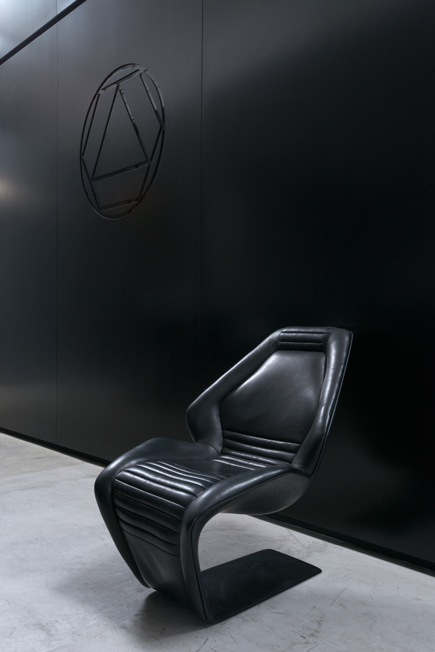
The lobby features a custom ‘Tokyo’ chair by Tino Schaedler
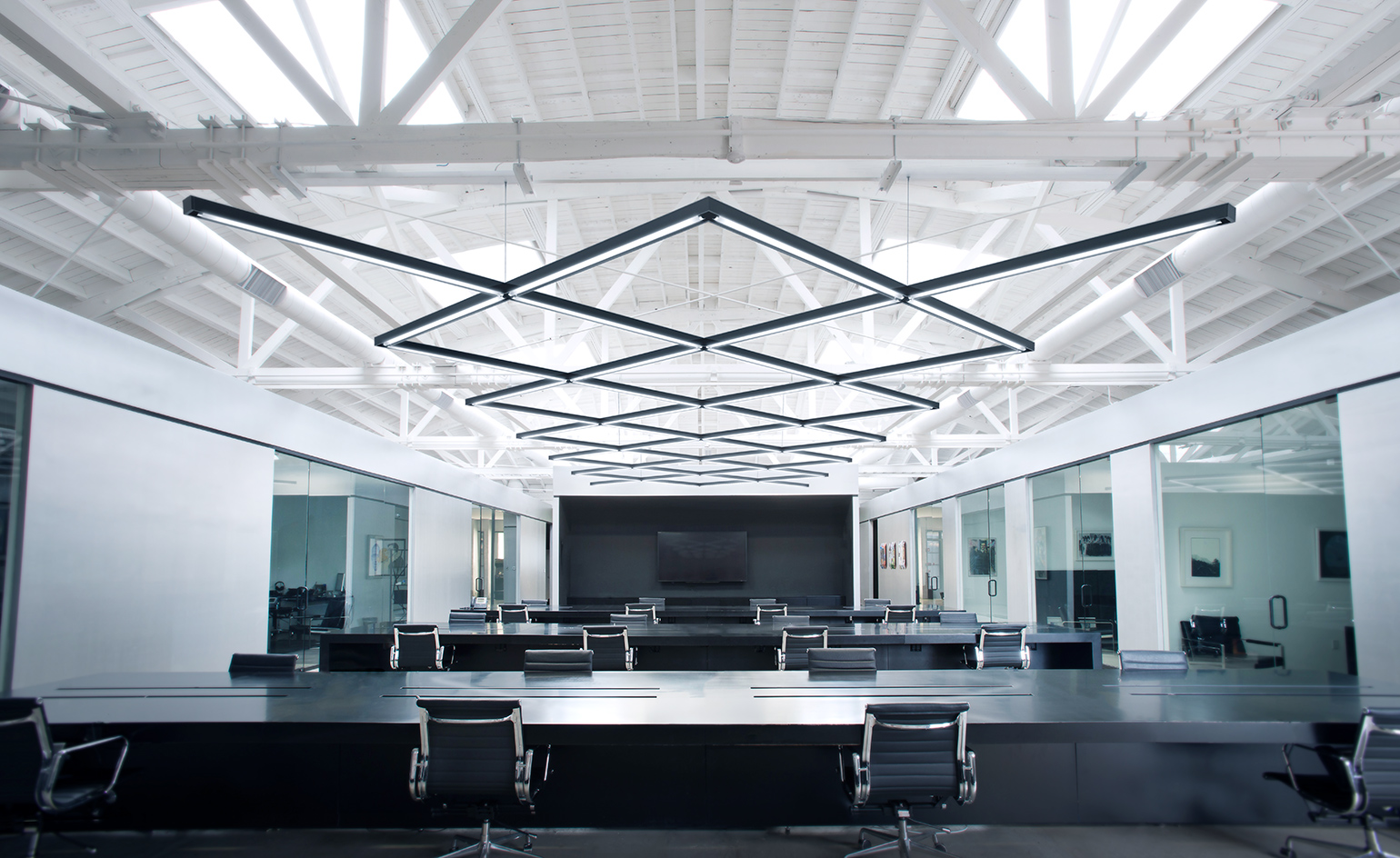
Diamond-patterned lighting is a running motif, seen here in the main office space
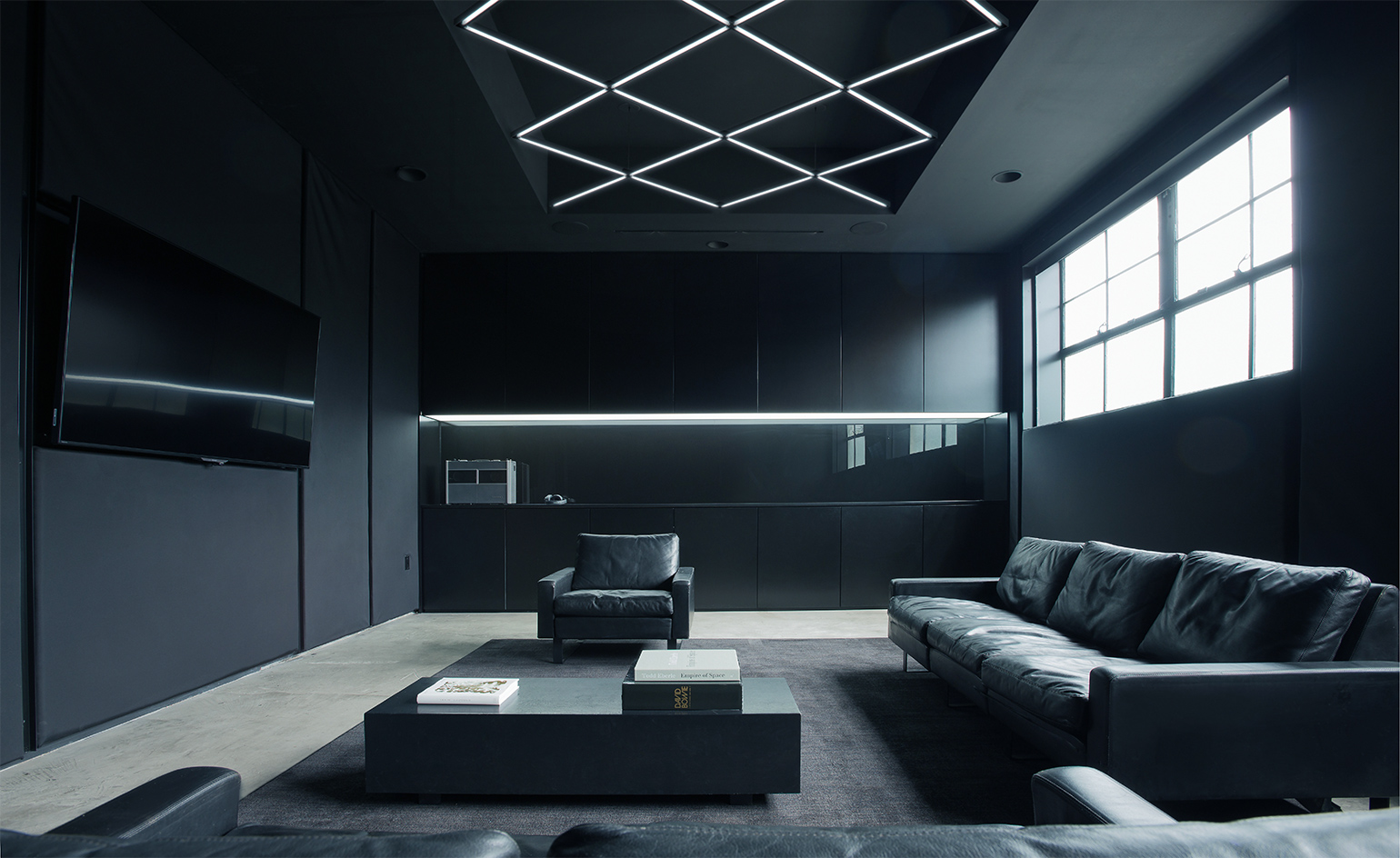
The walls of the artist’s lounge are fabric-covered for sound insulation
INFORMATION
For more information, visit the Optimist Design website
Wallpaper* Newsletter
Receive our daily digest of inspiration, escapism and design stories from around the world direct to your inbox.
Daven Wu is the Singapore Editor at Wallpaper*. A former corporate lawyer, he has been covering Singapore and the neighbouring South-East Asian region since 1999, writing extensively about architecture, design, and travel for both the magazine and website. He is also the City Editor for the Phaidon Wallpaper* City Guide to Singapore.
-
 Japan in Milan! See the highlights of Japanese design at Milan Design Week 2025
At Milan Design Week 2025 Japanese craftsmanship was a front runner with an array of projects in the spotlight. Here are some of our highlights
By Danielle Demetriou
-
 Tour the best contemporary tea houses around the world
Celebrate the world’s most unique tea houses, from Melbourne to Stockholm, with a new book by Wallpaper’s Léa Teuscher
By Léa Teuscher
-
 ‘Humour is foundational’: artist Ella Kruglyanskaya on painting as a ‘highly questionable’ pursuit
Ella Kruglyanskaya’s exhibition, ‘Shadows’ at Thomas Dane Gallery, is the first in a series of three this year, with openings in Basel and New York to follow
By Hannah Silver