The Oslo National Museum offers ‘low-key monumentality’
Architect Klaus Schuwerk completes the Oslo National Museum, which prepares to open its doors to the public this weekend

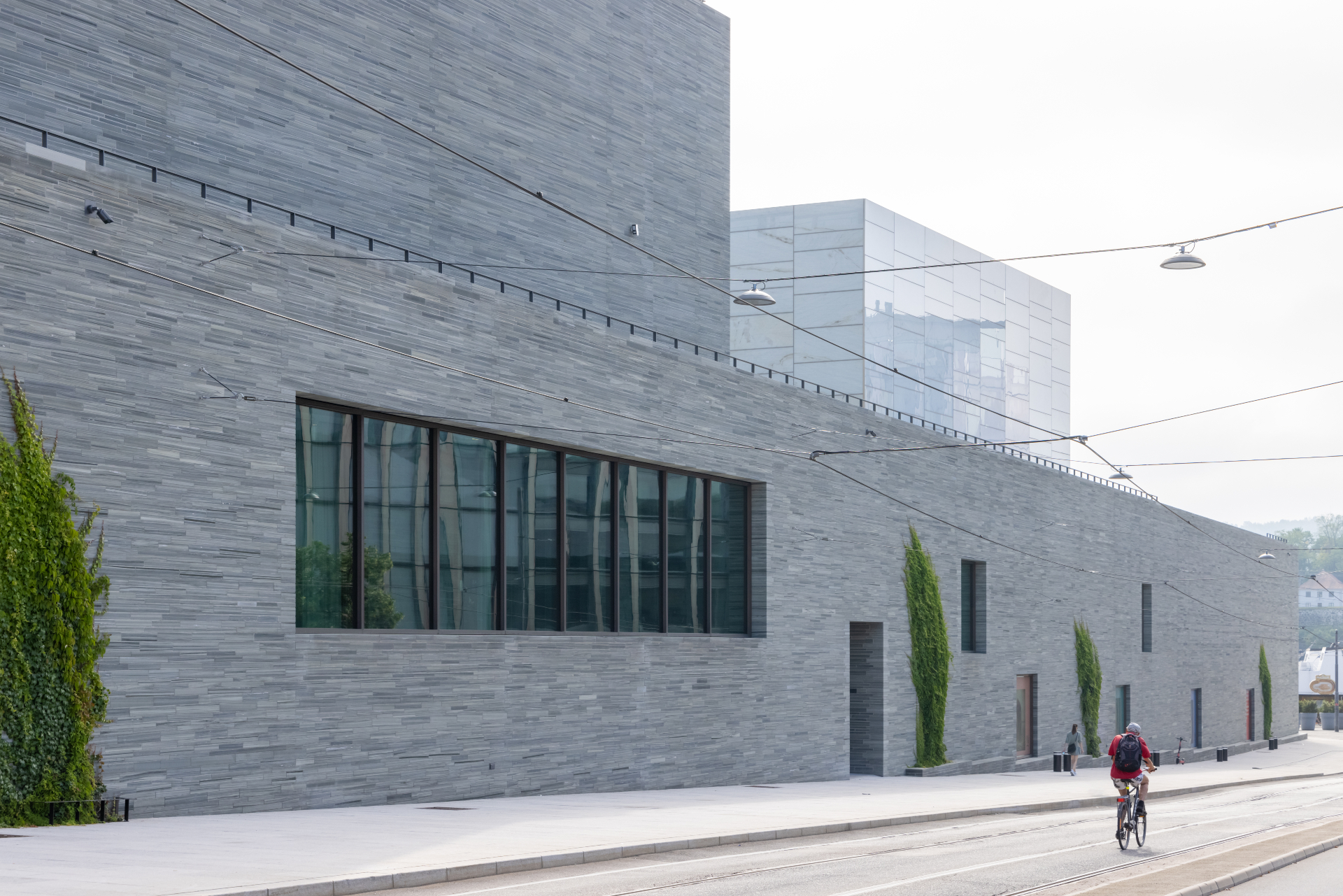
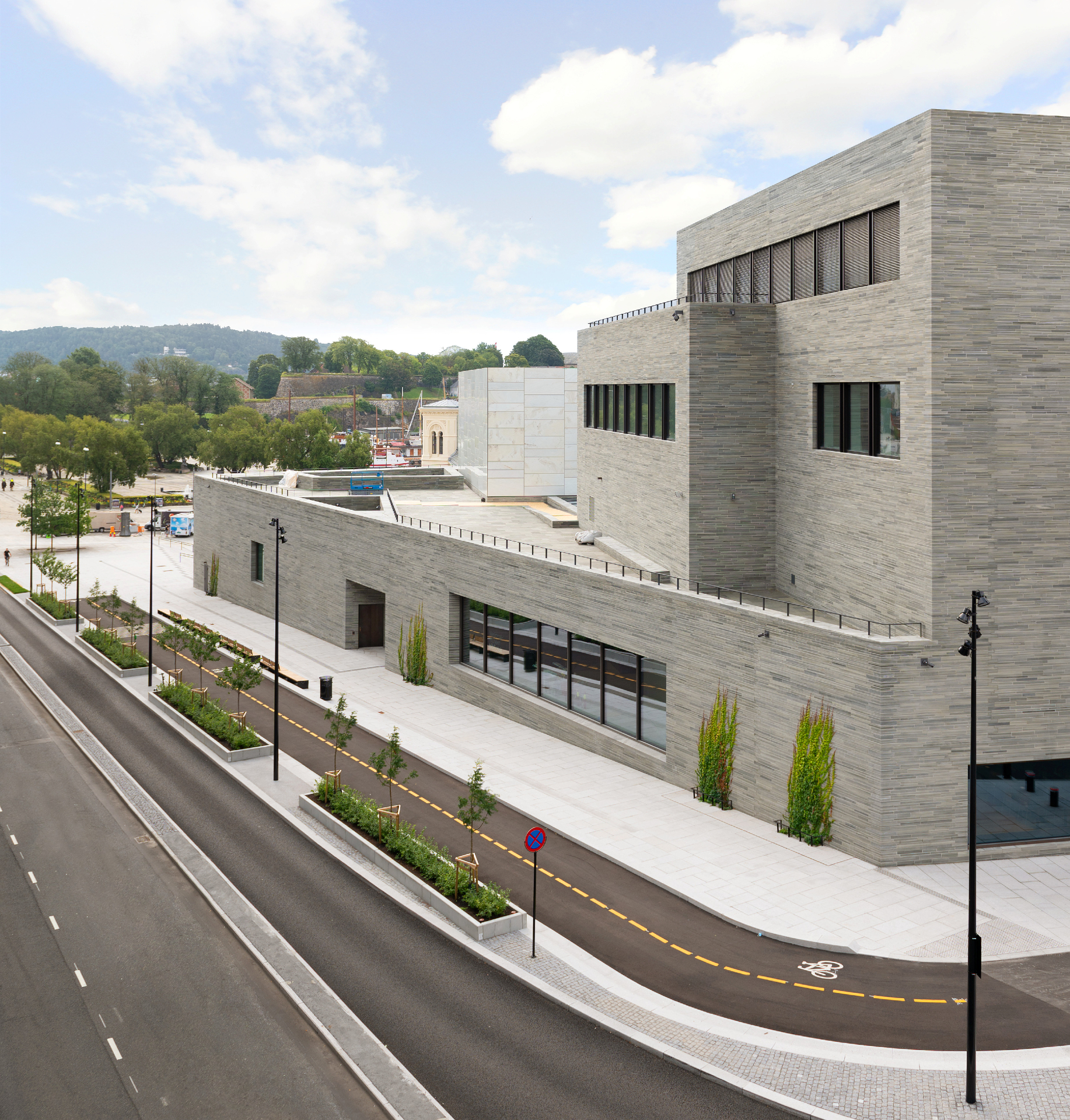
The new Oslo National Museum is the latest mega project to open along the Norwegian capital's increasingly buzzing waterfront in the past couple of years. However, unlike its most recent predecessor, the kookily slanted-at-the-top Munch museum, its arrival and presence is more muted. And this despite its whopping 54,600 sq m size and impressive £510m price tag. Composed of a low-slung structure that gets taller as it moves away from the harbour in line with the surrounding streetscape, it is topped by a translucent volume to the fore and a darker volume behind it. At the front it joins up with two existing 19th-century former railway buildings (one of which is now the Nobel Peace Prize museum), forming a new piazza that leads to the entrance foyer. It is at once a monumental and encyclopaedic museum for the 21st century, bringing together the collections of five existing city institutions dedicated to art, architecture and design – yet it is somehow also modest and minimal.
Lead architect Naples-based Klaus Schuwerk (who won the competition with Berlin office Kleihues + Kleihues), credits the city he lives in, a place where there is no fake architecture, he says, and his architectural forefathers over thousands of years for the building’s design. In particular, he cites Leon Battista Alberti, Karl Friedrich Schinkel and Mies van der Rohe, without which this building would have been ‘unthinkable'. A Norwegian newspaper coined the term ‘low-key monumentality’ in relation to the project and Schuwerk liked this definition because, for him, monumentality is not about something being ‘gigantic' but about something ‘that will remain for a long time', something that has meaning and presence.
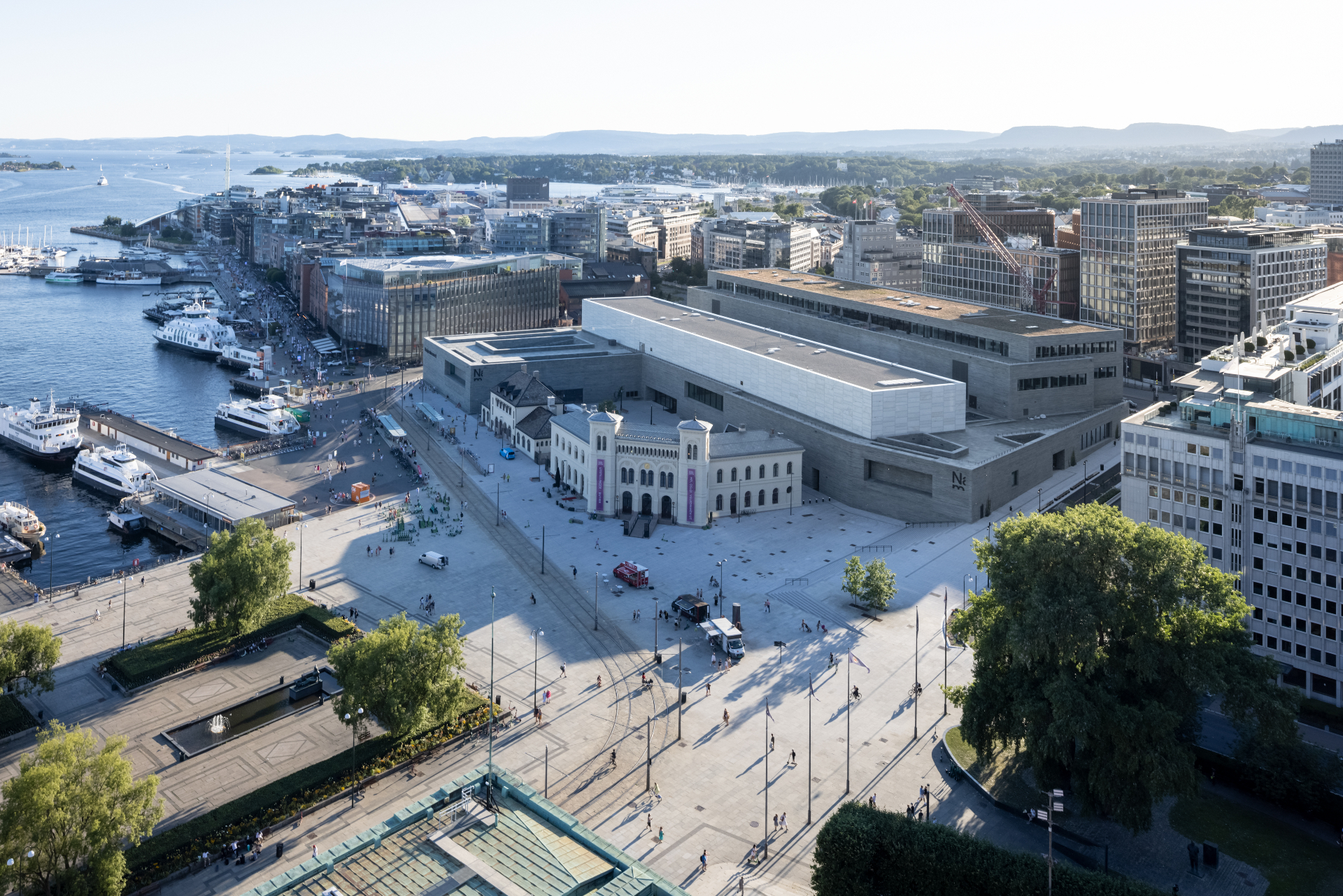
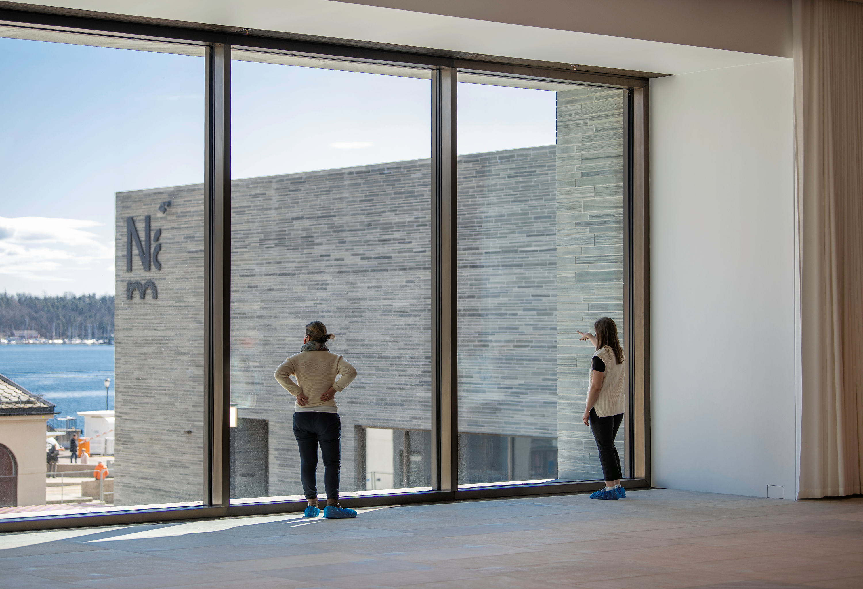
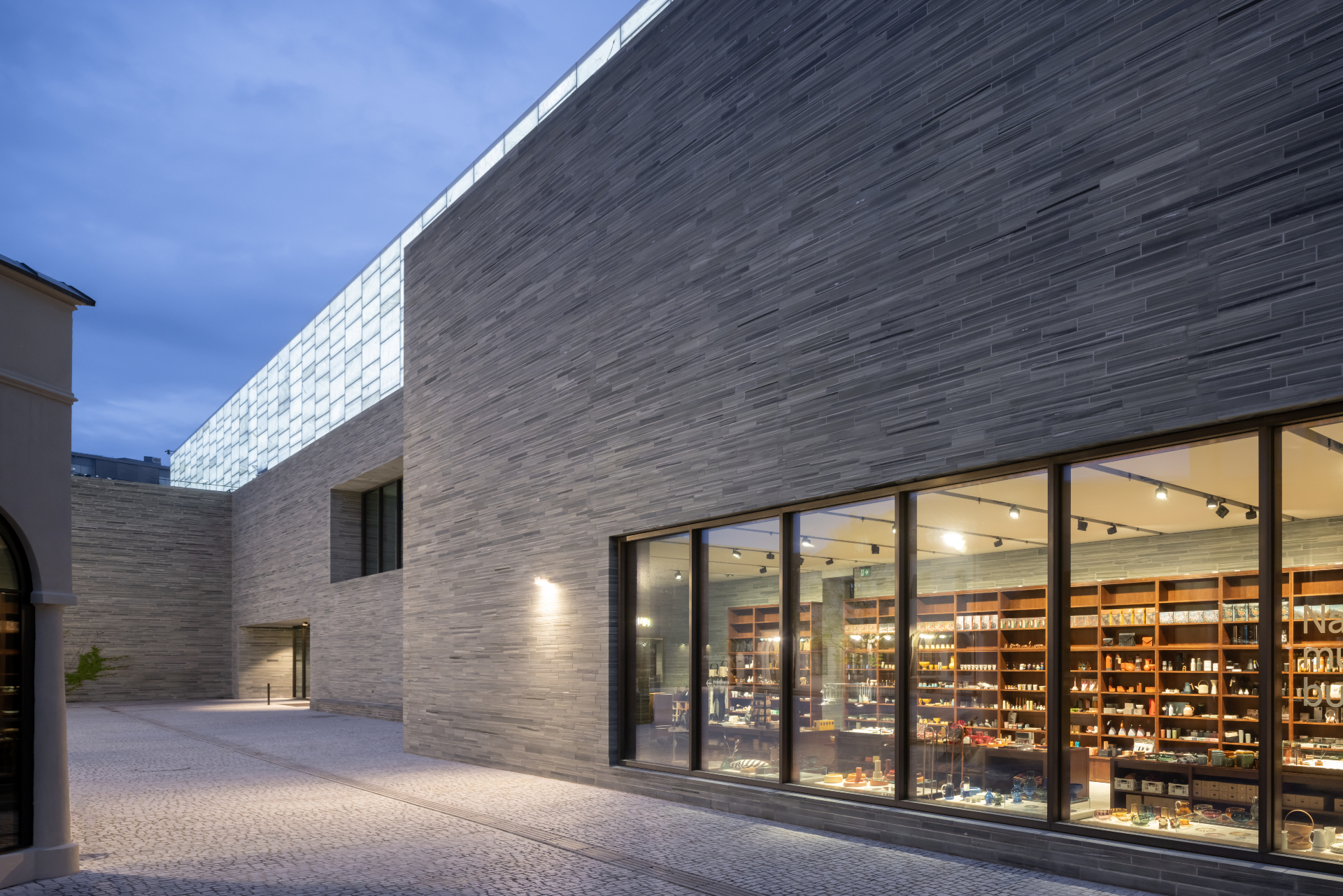
A lot of the building’s allure and appeal is in fact its aura of calm and solidity in an urban area characterised by visual and architectural diversity and some messiness. The choice of an often local, sometimes noble, and always durable palette of materials plays an important role. A southern German shell limestone was selected for the floors of the public areas, while oak boards are used in the exhibition rooms. Elsewhere, marble can be seen around the windows in the exhibition areas and the windows and oak doors have bronze casings and door handles and fittings respectively. The real material protagonist, or ‘player' as Schuwerk puts it, is a decorative slate from Oppdal in central Norway that was chosen for the façade and vestibule cladding. ‘This stone is what most of Norway is made of but you don’t see it look like this,' says Schuwerk. ‘Usually, it's cut horizontally and then it's a bit cloudy but we cut it vertically across the grain so you see all these layers inside the stone. Within each layer, there are millions of years of Norwegian history.'
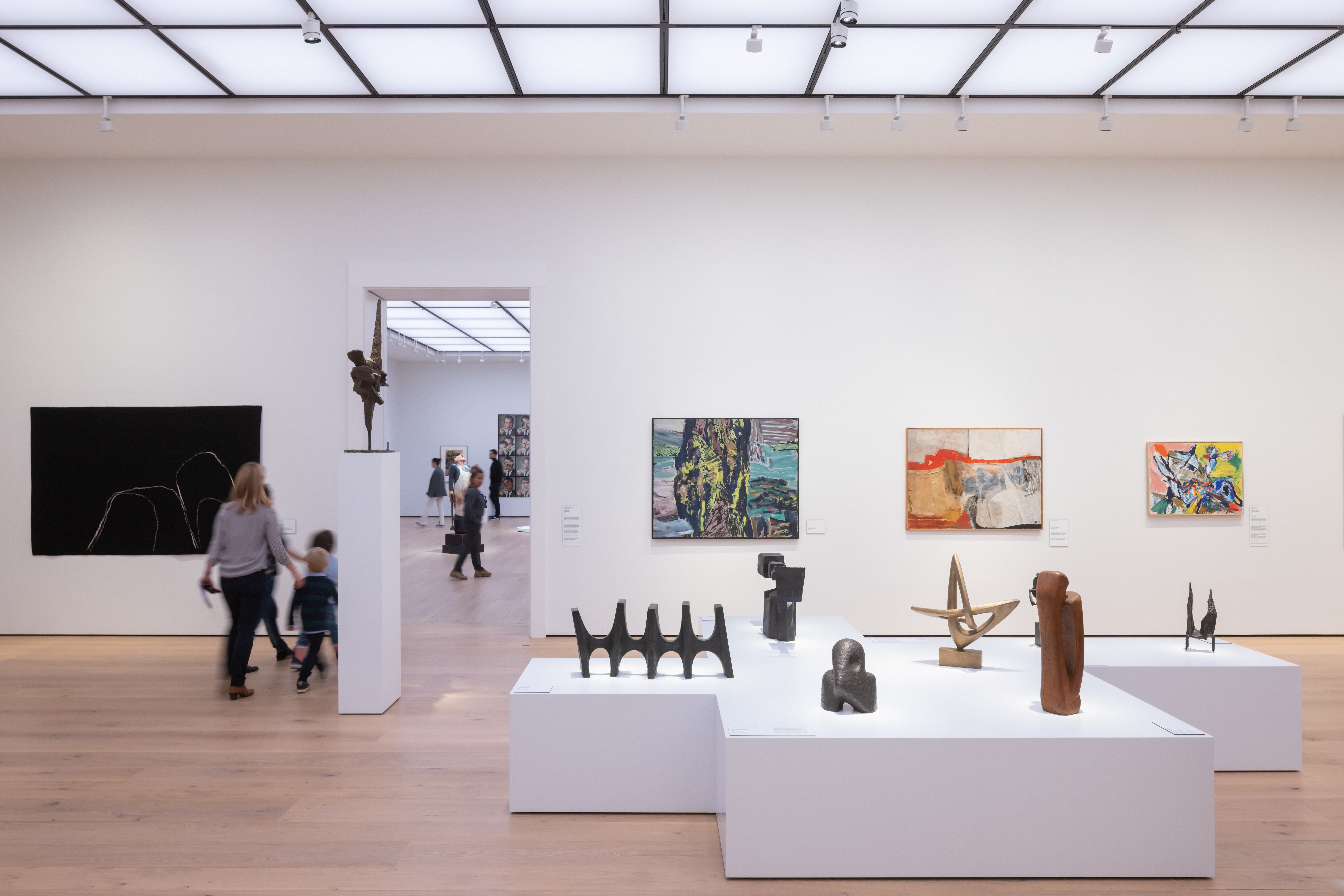
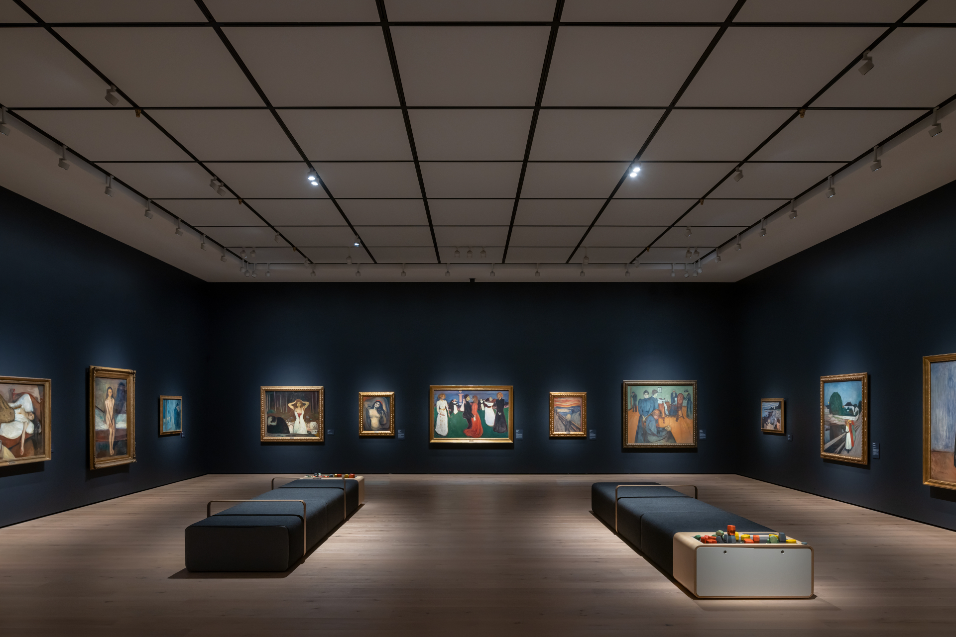
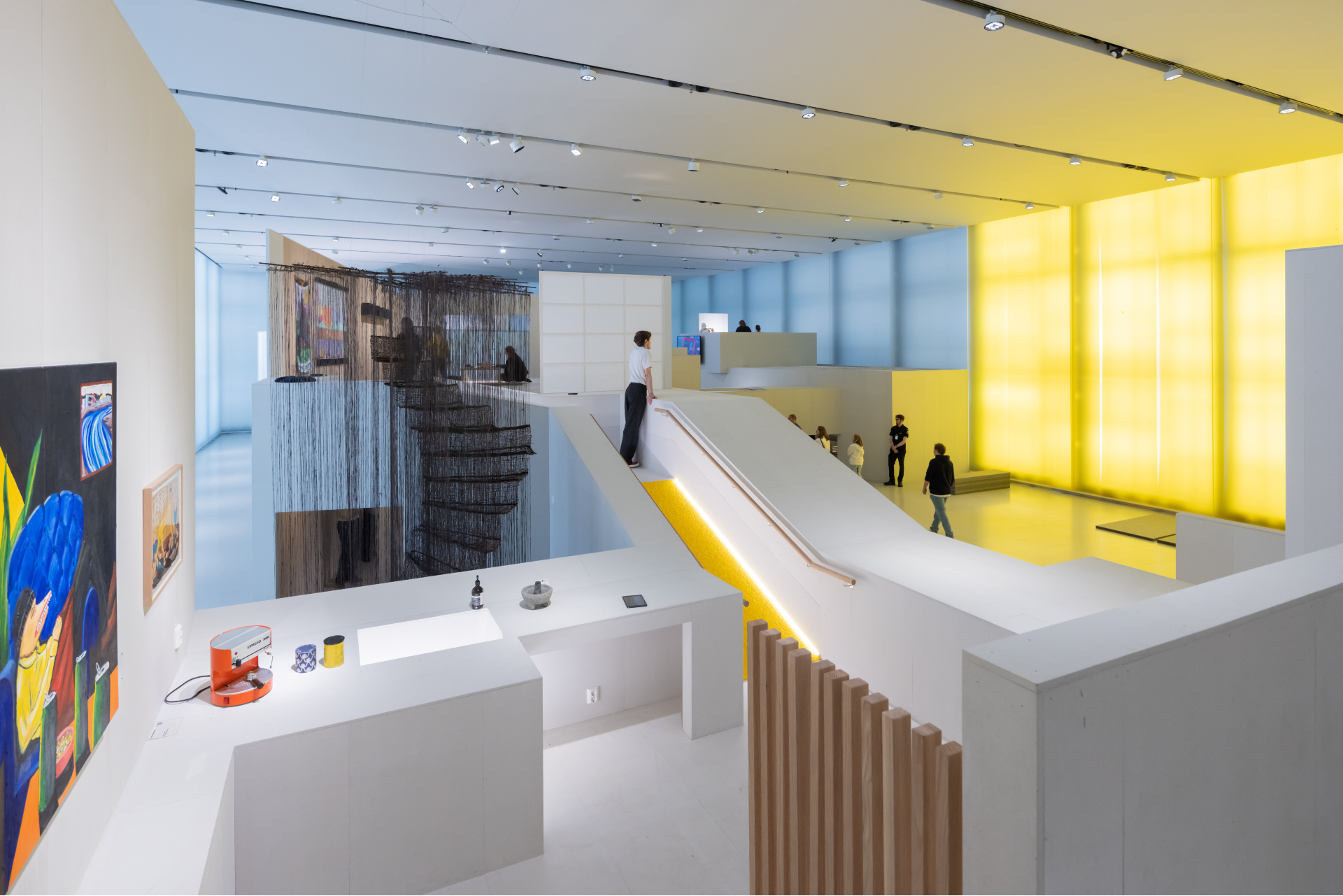
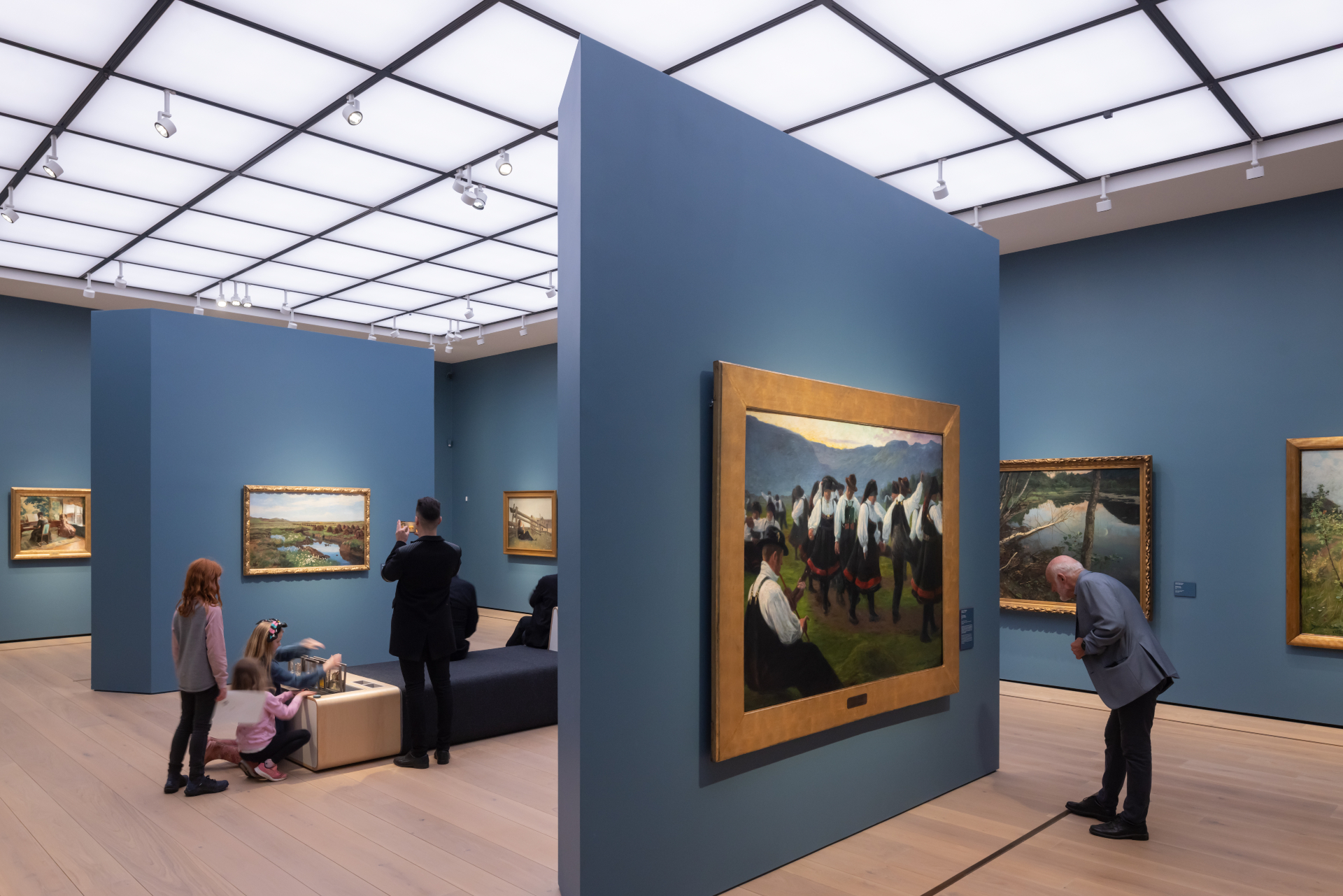
Internally the exhibition rooms feature wooden floors and light-filled ceilings, while the central foyers or atriums on each floor have stone floors and textile ceilings. There are tantalising framed views through the galleries, into internal courtyards that contain sculptural works, or up long and elegant staircases, that provide a visual rest and change of pace, a necessity in a building with some 90 rooms, or 13,000 sq m, dedicated to permanent and temporary exhibitions. As well as a publicly accessible art library, two cafés, a fairly discreet yet large museum shop, an auditorium and several meeting rooms, the building, unusually for a city centre museum, also manages to house conservation studios, a photography studio and storage space for most of the museum’s 400,000-plus collection of objects.
The top floor contains the Light Hall, a 133m-long space with walls made of marble glass (thin sheets of Portuguese marble laminated between two sheets of glass) that will be used for temporary exhibitions and sits atop a plinth of grey slate. With the 7m-high ceilings, the atmosphere here is uplifting and luminescent in the daytime, and beacon-like at night, when 9,000 LED diodes highlight its veined patterns to great effect. Perhaps surprisingly, no art can be hung on the walls here, but it is a space that could accommodate dramatic large-scale sculptures or site-specific installations in a way few other venues can and it leads onto an expansive roof terrace that can accommodate more art and events.
It’s no secret that the architect and museum have had a difficult relationship at times, partly due to the former’s uncompromising approach, and that construction delays and escalating costs have also caused controversy. Schuwerk has asked for a clarification to be published on the museum’s website about aspects of the project he says he didn’t author. It’s mainly things like the wayfinding and signage (inside and out), the benches in the exhibition areas, the digital monitors in the entrance foyer and a lot of the furniture, which he feels don’t fit with the architectural vision. He objects to the first-floor café too, saying this was a last-minute addition and there is a proper restaurant space downstairs. There has been some bemusement about his stance, as these things appear fairly small fry to many.
Yet despite all the ‘noise’ around the project’s inception, the core idea and tone of the building are intact, inside and out. It’s a credit to both the architect’s determination regarding certain material and design choices (the sumptuous marble-clad toilets on the lower-ground floor are a good example of his perseverance), and the museum’s willingness to see it through, that this is the case. Most importantly, however, this is a building that feels comfortable and even inspiring to be in, and solid enough that it should still be here in hundreds of years’ time.
Wallpaper* Newsletter
Receive our daily digest of inspiration, escapism and design stories from around the world direct to your inbox.
INFORMATION
Giovanna Dunmall is a freelance journalist based in London and West Wales who writes about architecture, culture, travel and design for international publications including The National, Wallpaper*, Azure, Detail, Damn, Conde Nast Traveller, AD India, Interior Design, Design Anthology and others. She also does editing, translation and copy writing work for architecture practices, design brands and cultural organisations.
-
 Nikos Koulis brings a cool wearability to high jewellery
Nikos Koulis experiments with unusual diamond cuts and modern materials in a new collection, ‘Wish’
By Hannah Silver
-
 A Xingfa cement factory’s reimagining breathes new life into an abandoned industrial site
We tour the Xingfa cement factory in China, where a redesign by landscape specialist SWA Group completely transforms an old industrial site into a lush park
By Daven Wu
-
 Put these emerging artists on your radar
This crop of six new talents is poised to shake up the art world. Get to know them now
By Tianna Williams
-
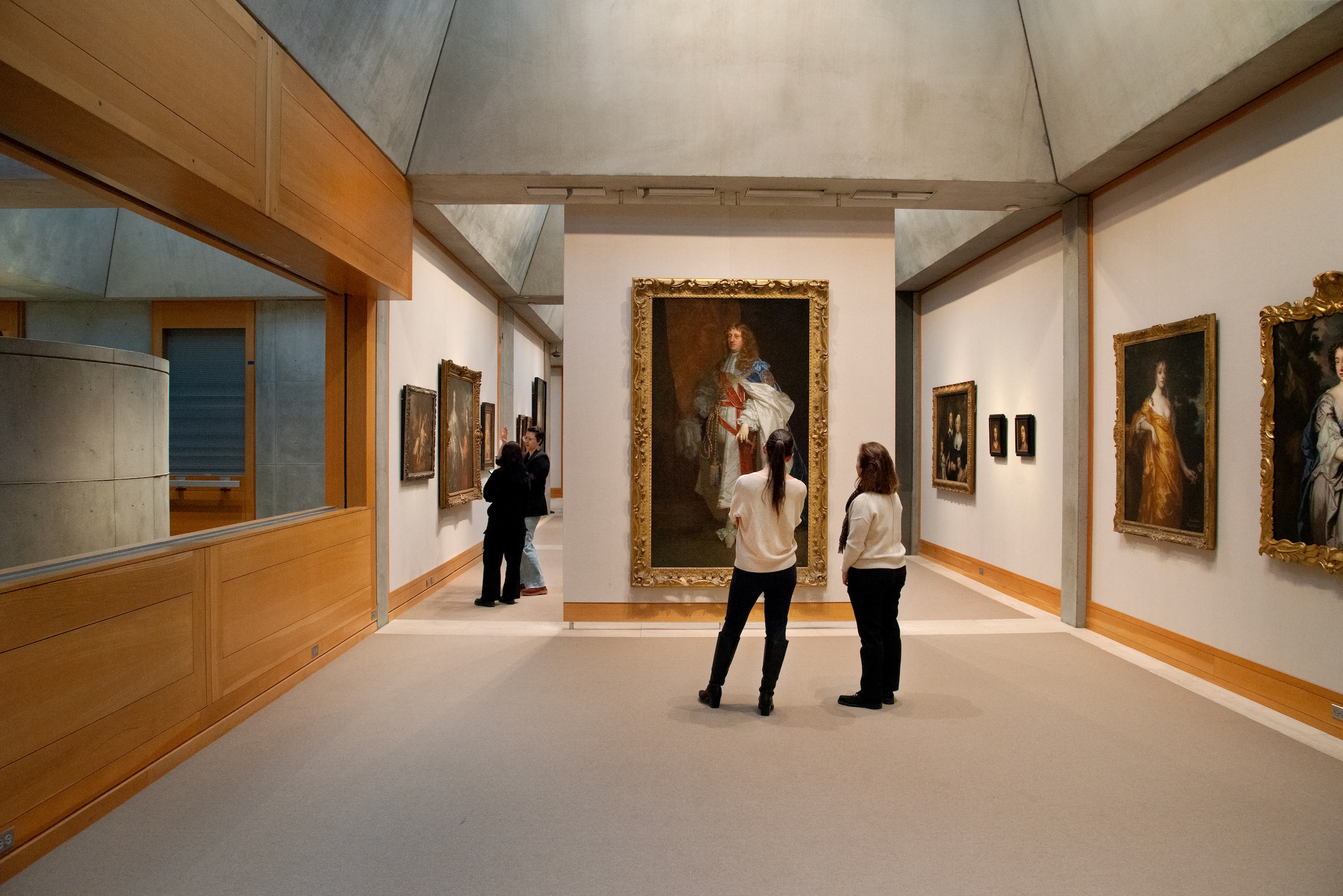 The Yale Center for British Art, Louis Kahn’s final project, glows anew after a two-year closure
After years of restoration, a modernist jewel and a treasure trove of British artwork can be seen in a whole new light
By Anna Fixsen
-
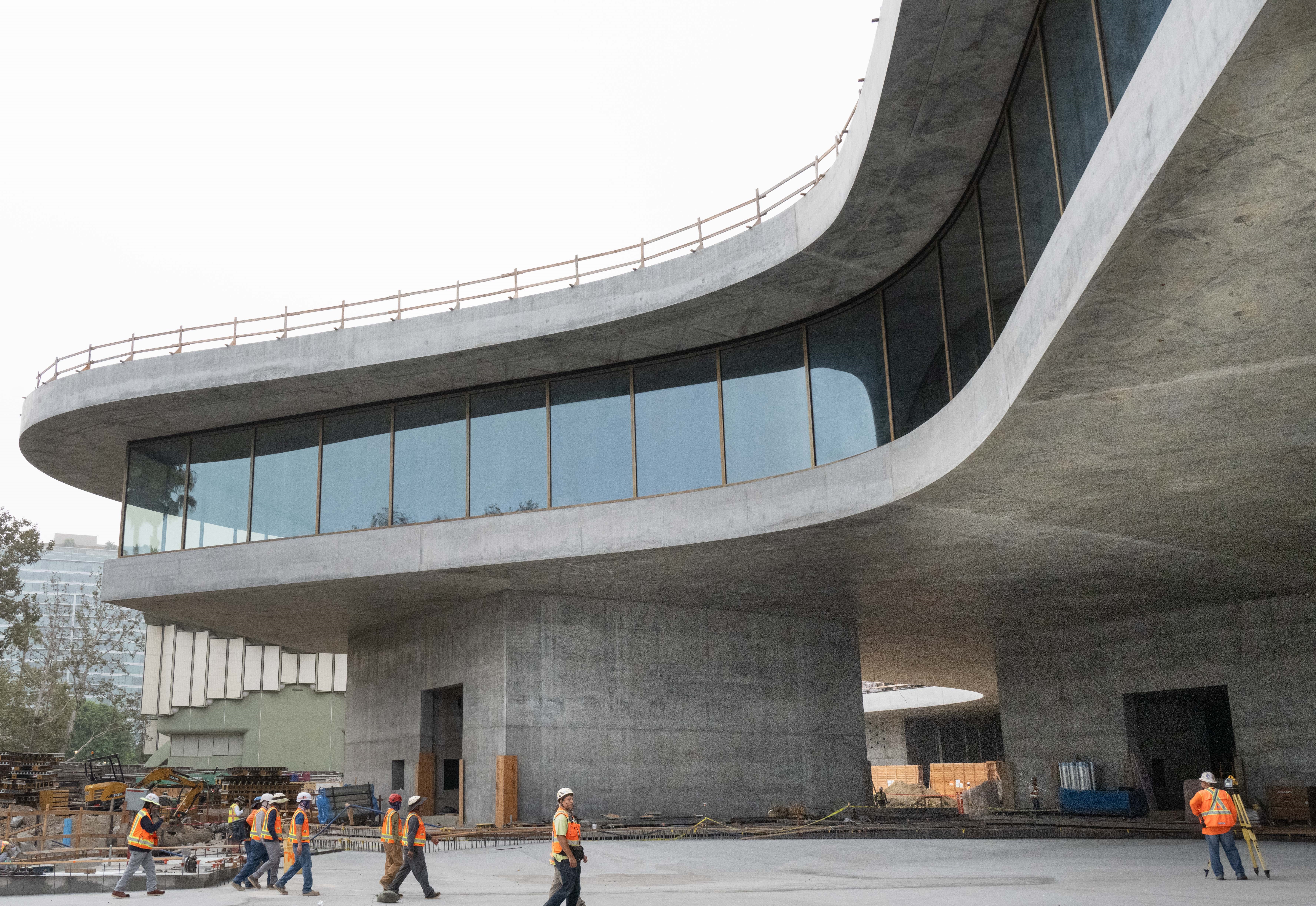 You’ll soon be able to get a sneak peek inside Peter Zumthor’s LACMA expansion
But you’ll still have to wait another year for the grand opening
By Anna Fixsen
-
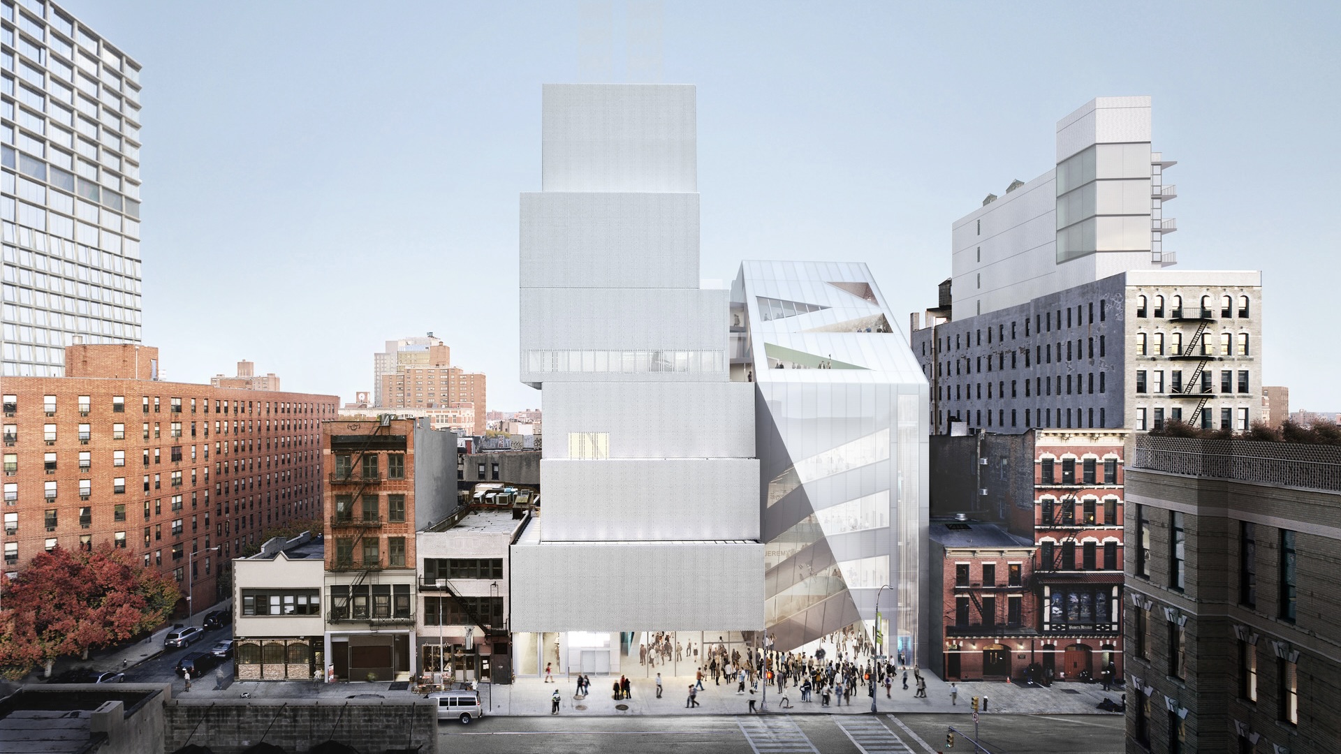 NYC's The New Museum announces an OMA-designed extension
OMA partners including Rem Koolhas and Shohei Shigematsu are designing a new building for Manhattan's only dedicated contemporary art museum
By Anna Solomon
-
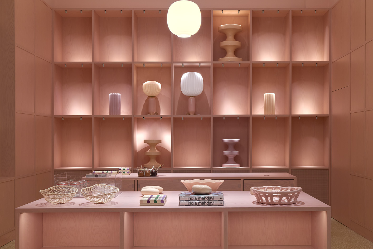 PoMo Museum opens its colourful spaces in Trondheim’s art nouveau post office
PoMo Museum is a new Trondheim art destination, featuring colourful interiors by India Mahdavi in an art nouveau post office heritage building
By Francesca Perry
-
 Tour this waterfront Norwegian summer house in pristine nature
Cabin Lillesand by architect, Lund Hagem respects and enhances its natural setting in the country's south
By Ellie Stathaki
-
 Gulbenkian Foundation's new art centre by Kengo Kuma is light and inviting
Lisbon's Gulbenkian Foundation reveals its redesign and new contemporary art museum, Centro de Arte Moderna (CAM), by Kengo Kuma with landscape architects VDLA
By Amah-Rose Mcknight Abrams
-
 Kunstsilo sees a functionalist grain silo transformed into Norway’s newest art gallery
Kunstsilo’s crisp modern design by Mestres Wåge with Spanish firms Mendoza Partida and BAX Studio transforms a listed functionalist grain silo into a sleek art gallery
By Clare Dowdy
-
 Aarestua Cabin brings old Norwegian traditions into the 21st century
Aarestua Cabin by Gartnerfuglen is a modern retreat with links to historical Norwegian traditions, and respect for its environment
By Ellie Stathaki