Peter Marino designs Lehmann Maupin’s new Chelsea gallery in New York
With almost every inch of New York’s West Chelsea neighbourhood now claimed, an exciting new residential building has sprouted up where the iconic Getty gas station once stood. Designed by Peter Marino, The Getty is comprised of six apartments – five full floor units and a single duplex penthouse with a roof terrace and private pool – and houses the Hill Art Foundation and the latest outpost of the Lehmann Maupin art gallery on the first four floors
In contrast to the many architectural statements that already punctuate the neighbourhood, Marino’s design for the 11 storey mid-rise building is comparatively understated. Offset aluminium and glass panels on the façade give the building an individual identity, while unique glass curtainwalls and 6.7m high corners without mullions facilitate an immediacy to the High Line located adjacent.
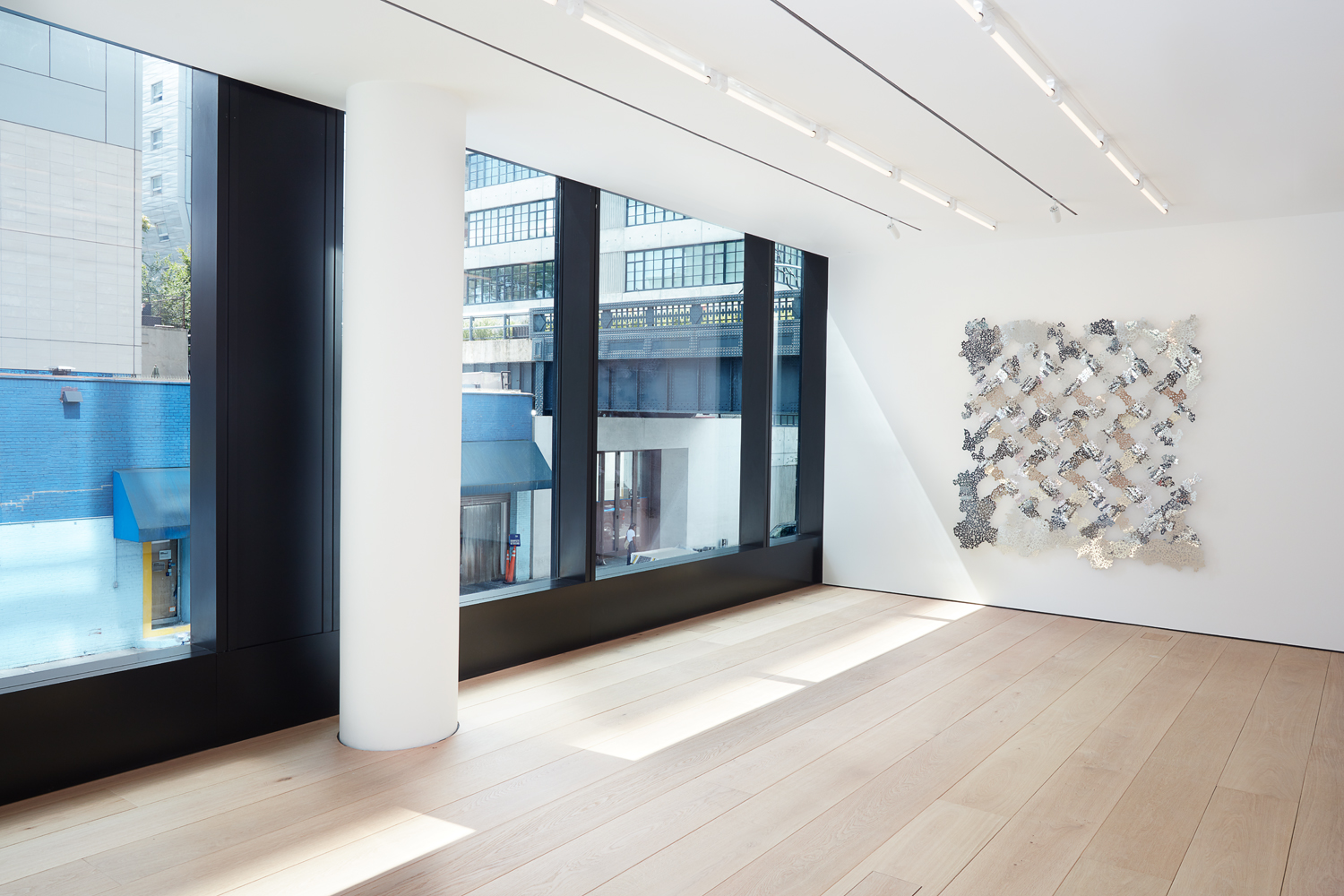
For Lehmann Maupin, Marino devised three dynamic floors, which include column-free exhibition spaces on the ground level, private viewing areas and office space on the second floor, and a black box gallery space on the cellar level for films and other special projects.
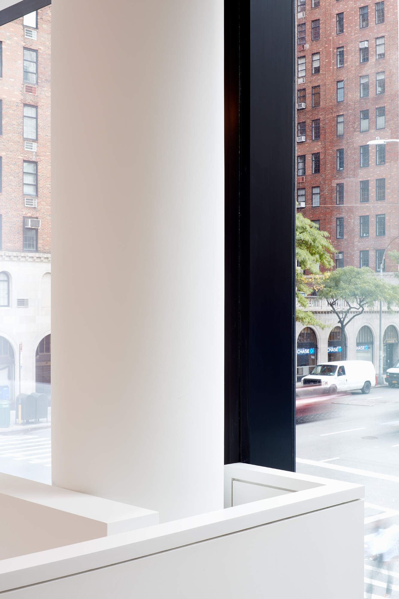
The new 24th street Lehmann Maupin gallery.
Each gallery provides unique views and opportunities for artists whose exhibitions vary wildly in scale and medium,’ says Marino. ‘As architect of the entire building, our approach to the gallery spaces relates to our overall design approach – to create a series of unique, variable and flexible gallery spaces – which provided a substantial expansion from Lehmann Maupin’s Christie Street location.’
‘For most of the gallery’s history, we have had two spaces in New York, in Chelsea and the Lower East Side. We came to realise you really need the flexibility and space that two locations provides,’ says gallery co-founder David Maupin, who closed the Christie Street outpost earlier this year.
‘When we learned Peter Marino was the architect [of The Getty], we were immediately interested. I’ve known Peter for over 20 years, and trust that he knows the needs of our artists and aesthetic of the gallery. Rachel and I walked up the block to see the location, and knew immediately that this prime corner was exactly what we had been looking for. The location of 24th Street is hugely significant in Chelsea with so many amazing galleries on one block. We’re among good company.’
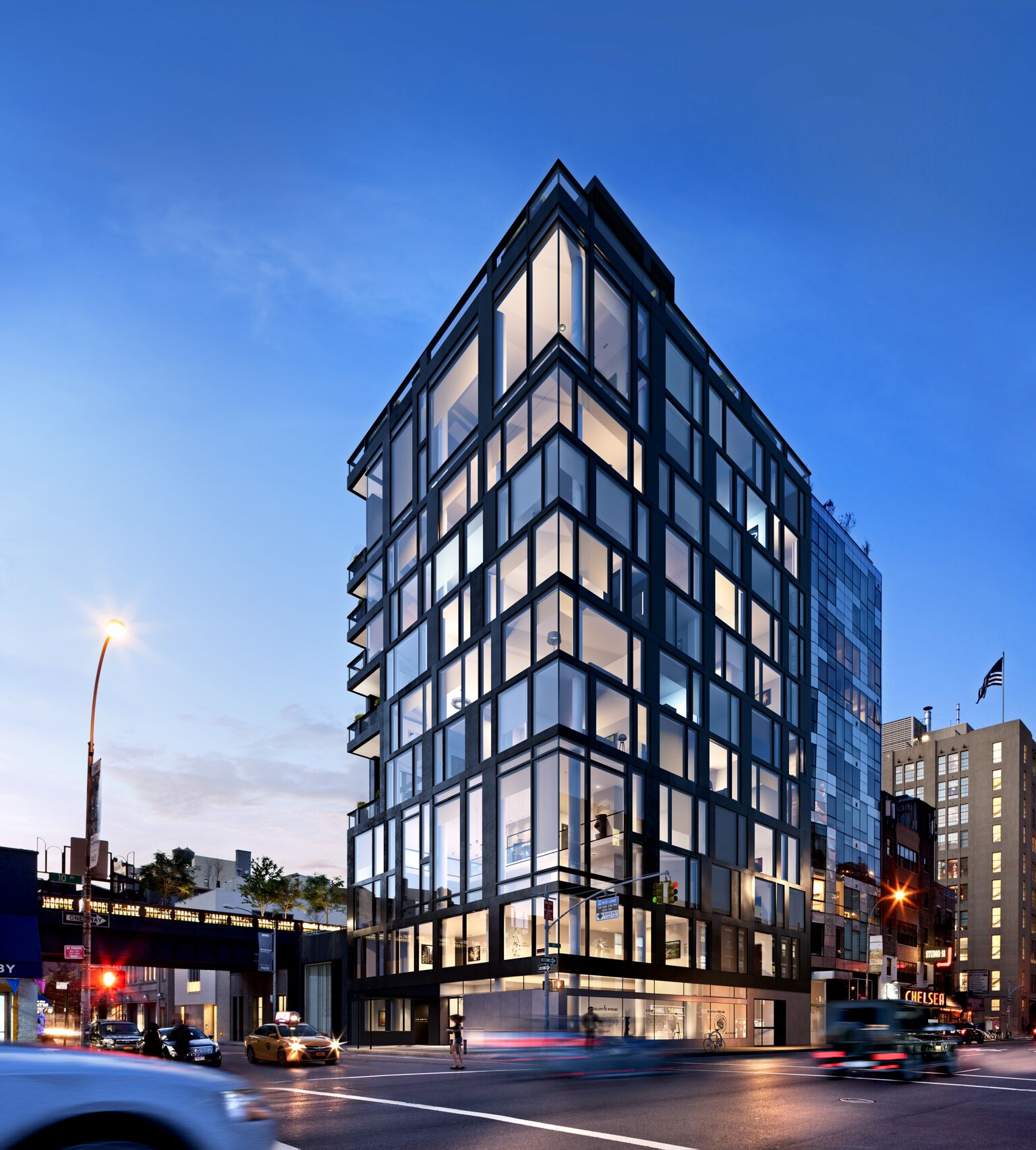
An exterior rendering of the gallery and residential building. Rendering courtesy of Victor Group and Lehmann Maupin, New York, Hong Kong, and Seoul
The new and improved location not only boasts a larger square footage, but generous amounts of daylight, special glass coatings to protect both artwork and interiors from UV damage and a unique mezzanine level as well.
Marino says, ‘Our intention to bring certain elements of Christie Street into the space can be seen with the mezzanine, which the Christie Street gallery also enjoyed. The mezzanine allows the artwork to be viewed from different perspectives and provides a space for social events and openings. Each gallery provides unique views and opportunities for artists.’
He adds, ‘We intended to bring Chelsea as a former manufacturing neighborhood into the space. The solid oak floors, 12” wide, provides a consistent identity throughout all of the spaces and are a nod to the industrial heritage of Chelsea. The flooring was intentionally left natural, brushed for enhanced colouring and the edges were rounded to suggest something gently used, rather than the rigidity of something entirely new.’
In terms of programming, the new 24th street space is conceived as a standalone space, despite its 22nd street sibling being close by. Maupin says, ‘However, when it curatorially makes sense, we want to expand exhibitions between both locations. We often did double gallery exhibitions for special bodies of work in Chelsea and the Lower East Side. Our opening exhibition for Liza Lou: Classification and Nomenclature of Clouds at [the new space] will spread between both galleries as well, and now visitors can see both within two blocks walk.’
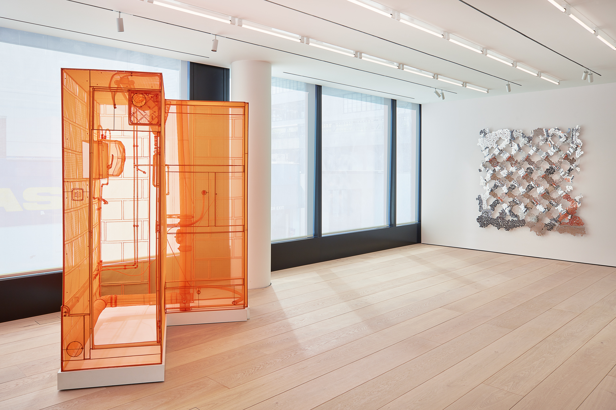
Generous amounts of daylight and balanced with a special glass coating to protect both artwork and interiors from UV damage.
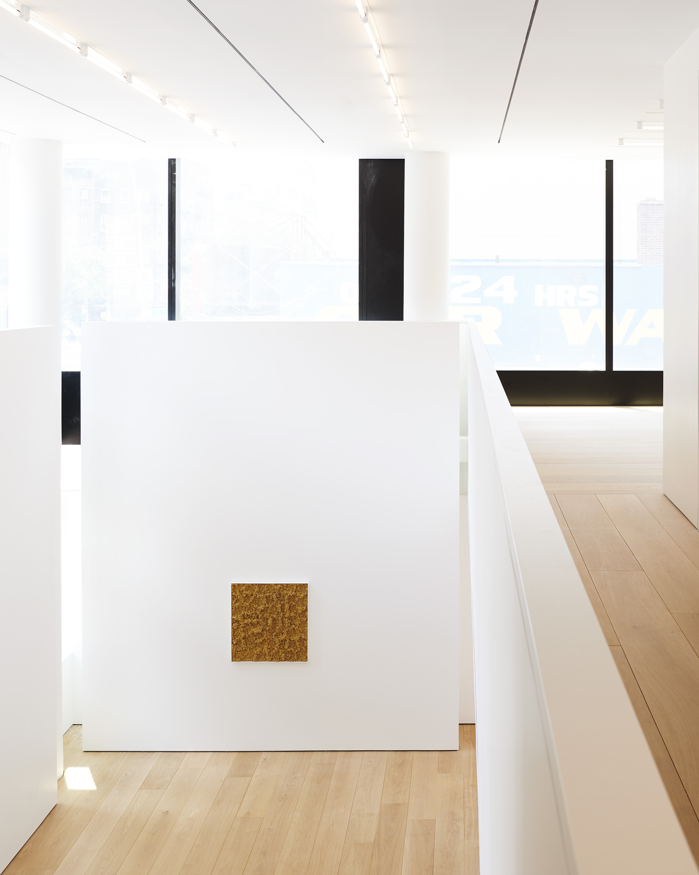
The mezzanine allows the artwork to be viewed from different perspectives and provides a space for social events and openings.
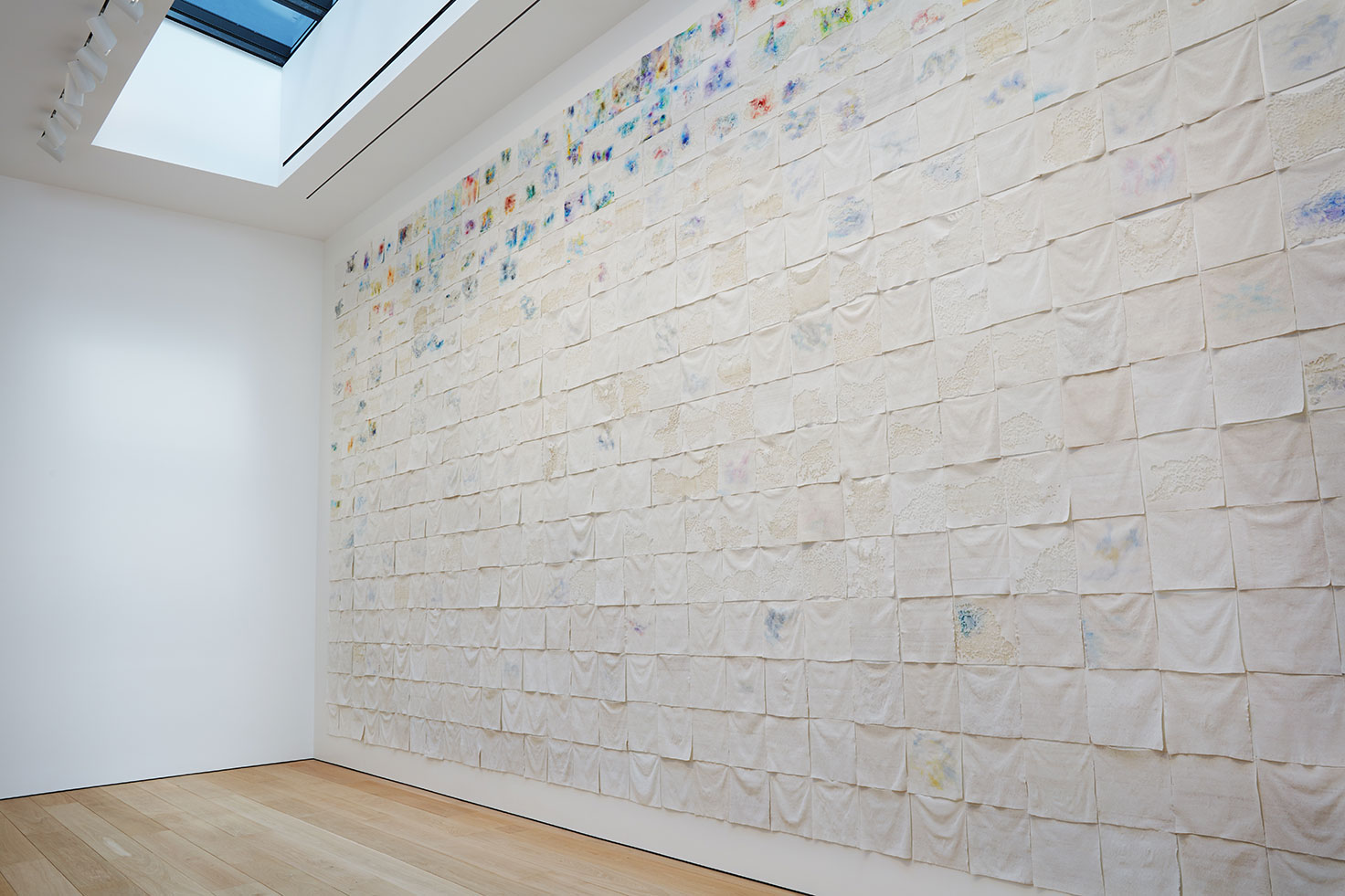
Liza Lou, ‘Classification and Nomenclature of Clouds’, installation view, Lehmann Maupin, New York, 2018. Courtesy the artist and Lehmann Maupin, New York, Hong Kong, and Seoul
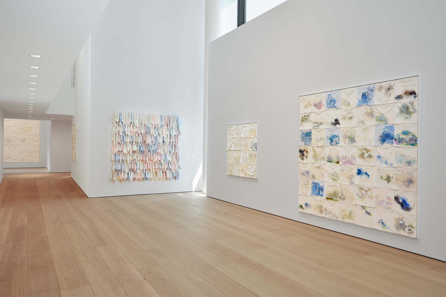
Liza Lou, ‘Classification and Nomenclature of Clouds’, installation view, Lehmann Maupin, New York, 2018. Courtesy the artist and Lehmann Maupin, New York, Hong Kong, and Seoul.
INFORMATION
For more information, visit the Peter Marino Architect website and the Lehmann Maupin website
Wallpaper* Newsletter
Receive our daily digest of inspiration, escapism and design stories from around the world direct to your inbox.
Pei-Ru Keh is a former US Editor at Wallpaper*. Born and raised in Singapore, she has been a New Yorker since 2013. Pei-Ru held various titles at Wallpaper* between 2007 and 2023. She reports on design, tech, art, architecture, fashion, beauty and lifestyle happenings in the United States, both in print and digitally. Pei-Ru took a key role in championing diversity and representation within Wallpaper's content pillars, actively seeking out stories that reflect a wide range of perspectives. She lives in Brooklyn with her husband and two children, and is currently learning how to drive.
-
 Put these emerging artists on your radar
This crop of six new talents is poised to shake up the art world. Get to know them now
By Tianna Williams
-
 Dining at Pyrá feels like a Mediterranean kiss on both cheeks
Designed by House of Dré, this Lonsdale Road addition dishes up an enticing fusion of Greek and Spanish cooking
By Sofia de la Cruz
-
 Creased, crumpled: S/S 2025 menswear is about clothes that have ‘lived a life’
The S/S 2025 menswear collections see designers embrace the creased and the crumpled, conjuring a mood of laidback languor that ran through the season – captured here by photographer Steve Harnacke and stylist Nicola Neri for Wallpaper*
By Jack Moss
-
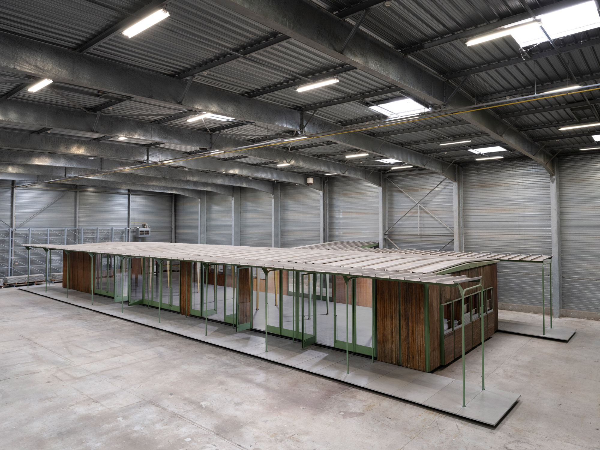 Croismare school, Jean Prouvé’s largest demountable structure, could be yours
Jean Prouvé’s 1948 Croismare school, the largest demountable structure ever built by the self-taught architect, is up for sale
By Amy Serafin
-
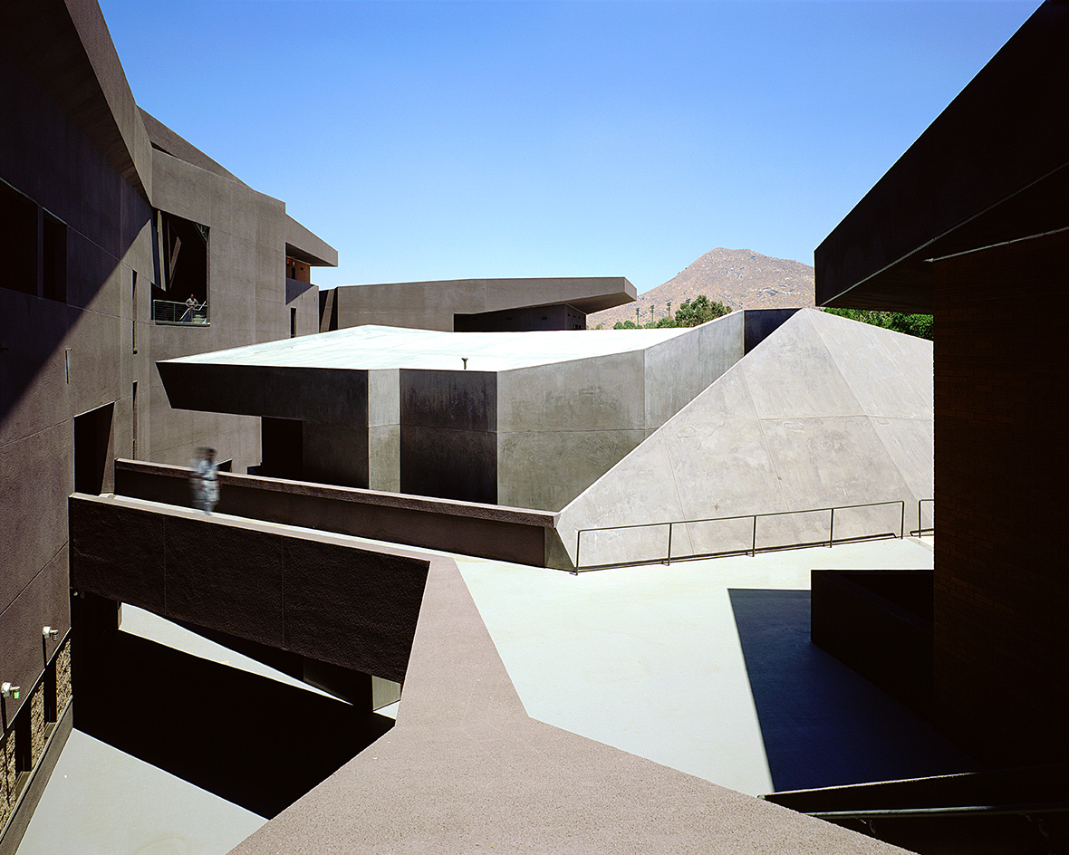 We explore Franklin Israel’s lesser-known, progressive, deconstructivist architecture
Franklin Israel, a progressive Californian architect whose life was cut short in 1996 at the age of 50, is celebrated in a new book that examines his work and legacy
By Michael Webb
-
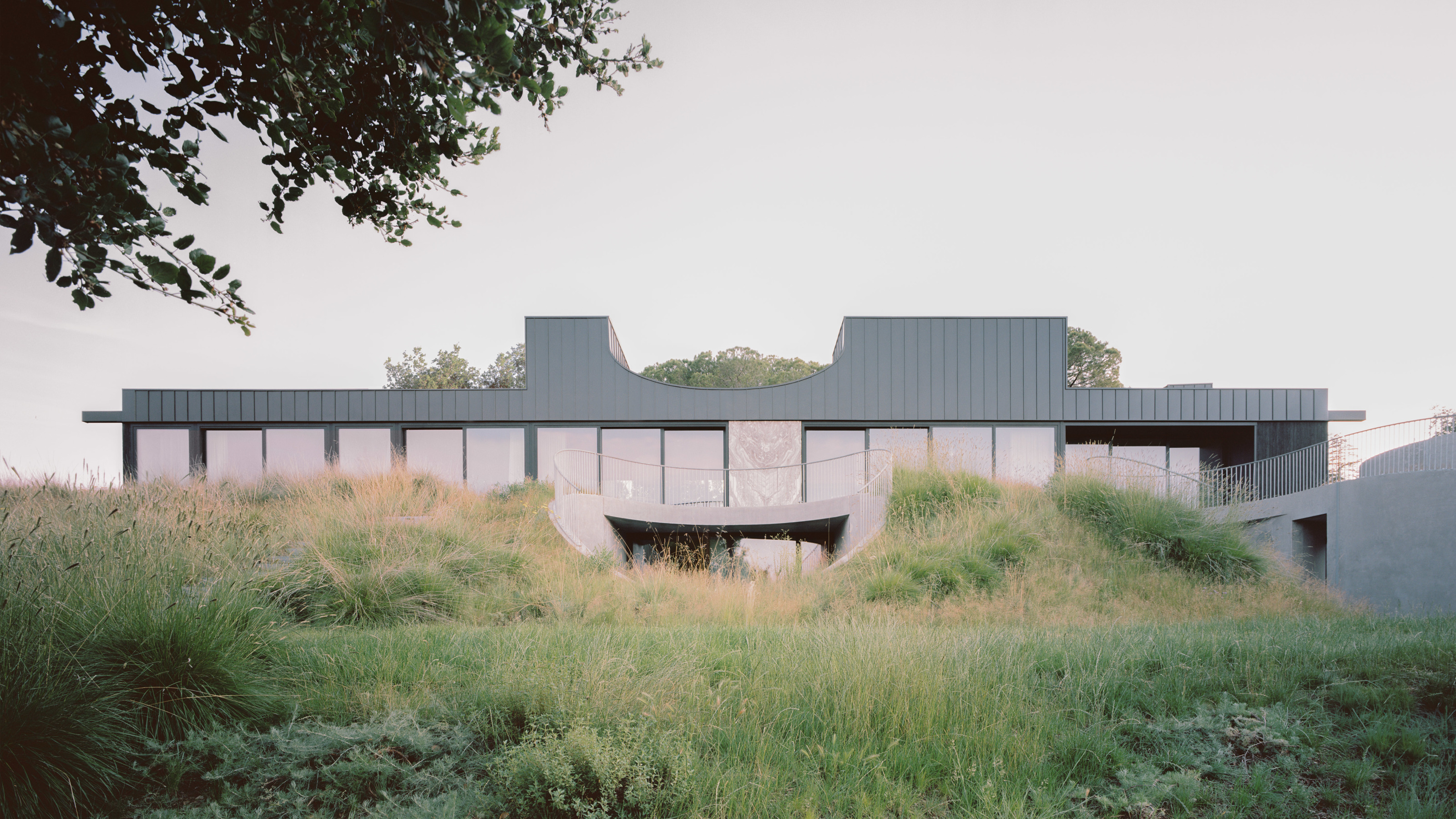 A new hilltop California home is rooted in the landscape and celebrates views of nature
WOJR's California home House of Horns is a meticulously planned modern villa that seeps into its surrounding landscape through a series of sculptural courtyards
By Jonathan Bell
-
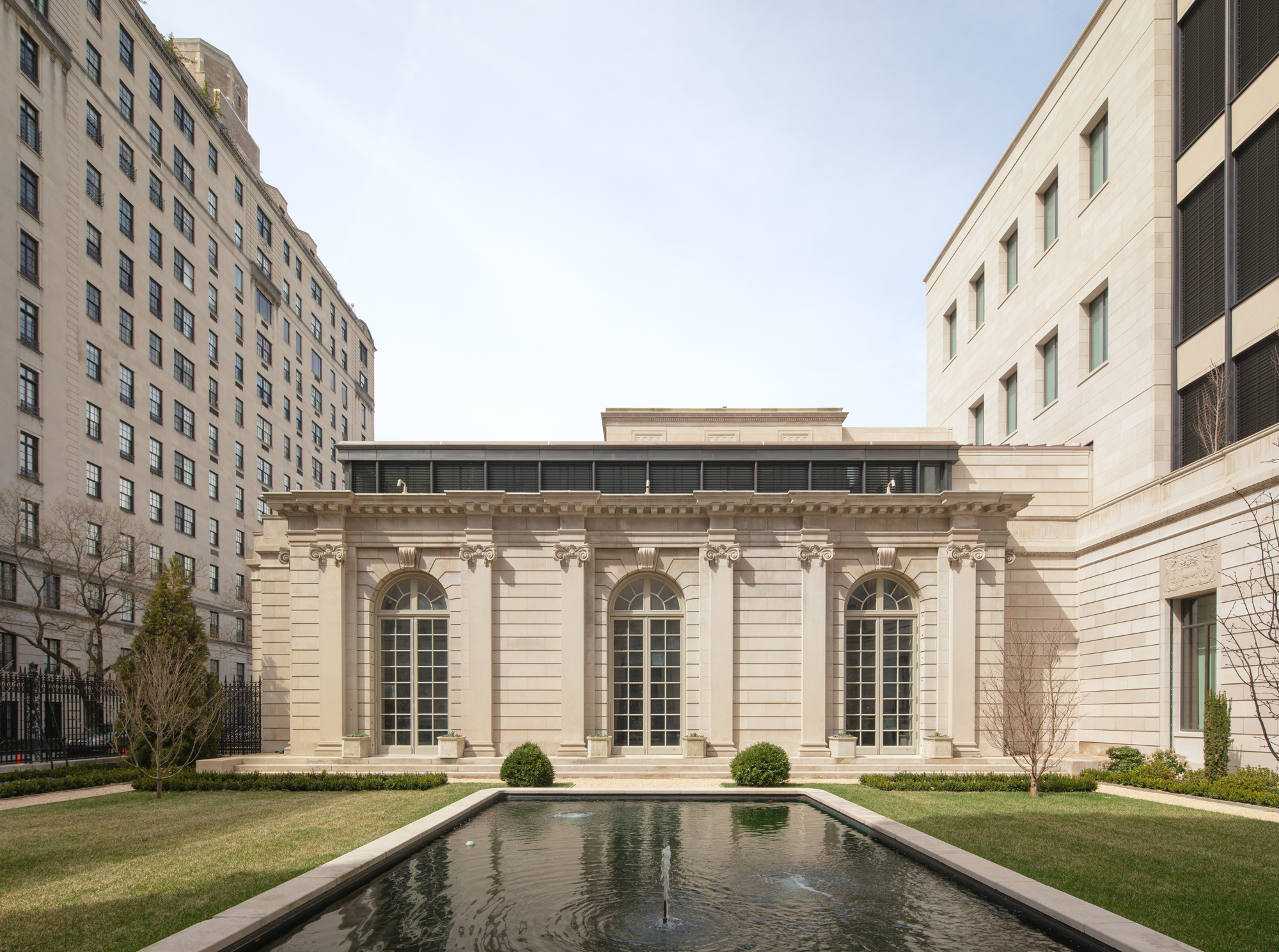 The Frick Collection's expansion by Selldorf Architects is both surgical and delicate
The New York cultural institution gets a $220 million glow-up
By Stephanie Murg
-
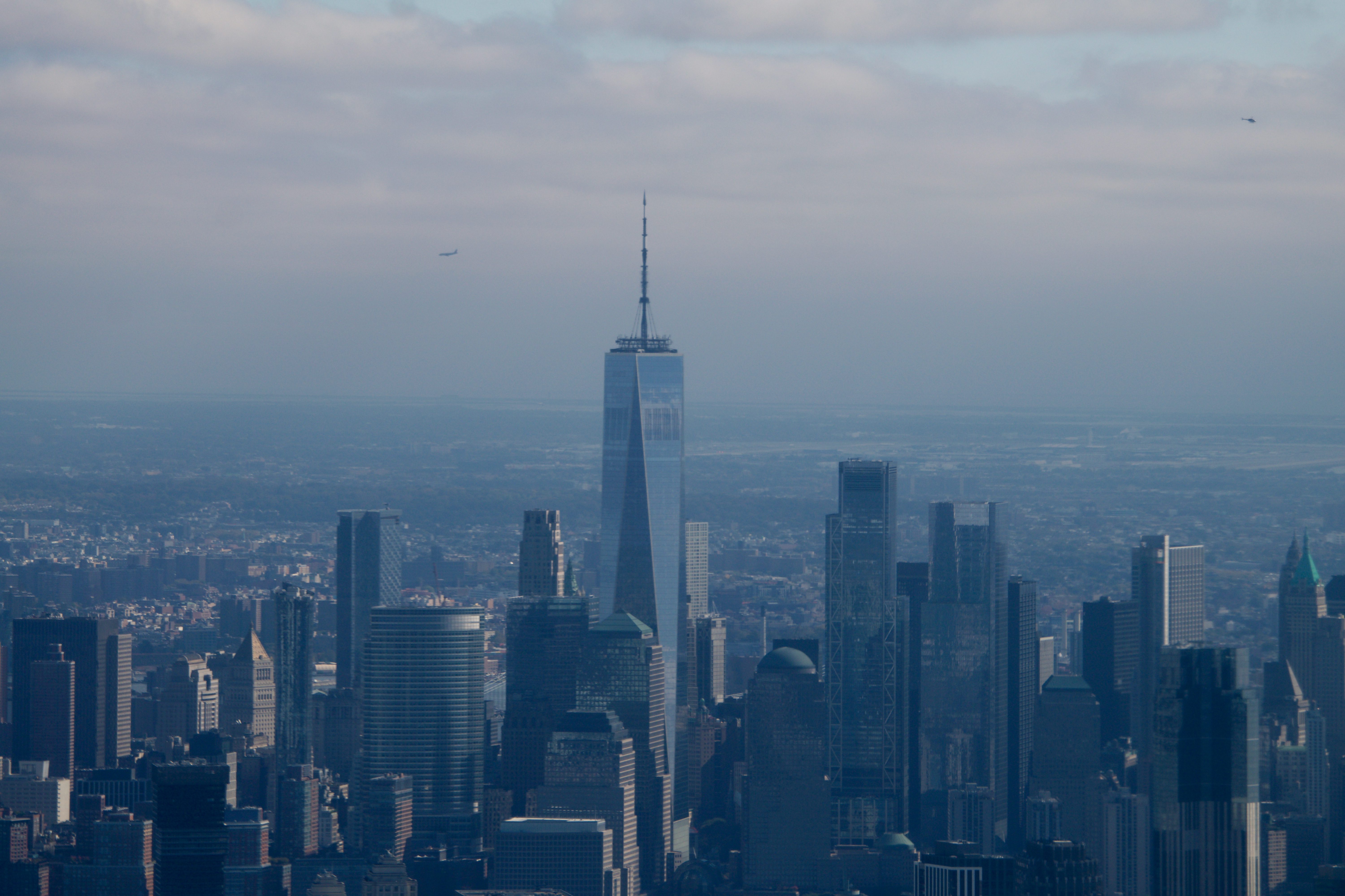 Remembering architect David M Childs (1941-2025) and his New York skyline legacy
David M Childs, a former chairman of architectural powerhouse SOM, has passed away. We celebrate his professional achievements
By Jonathan Bell
-
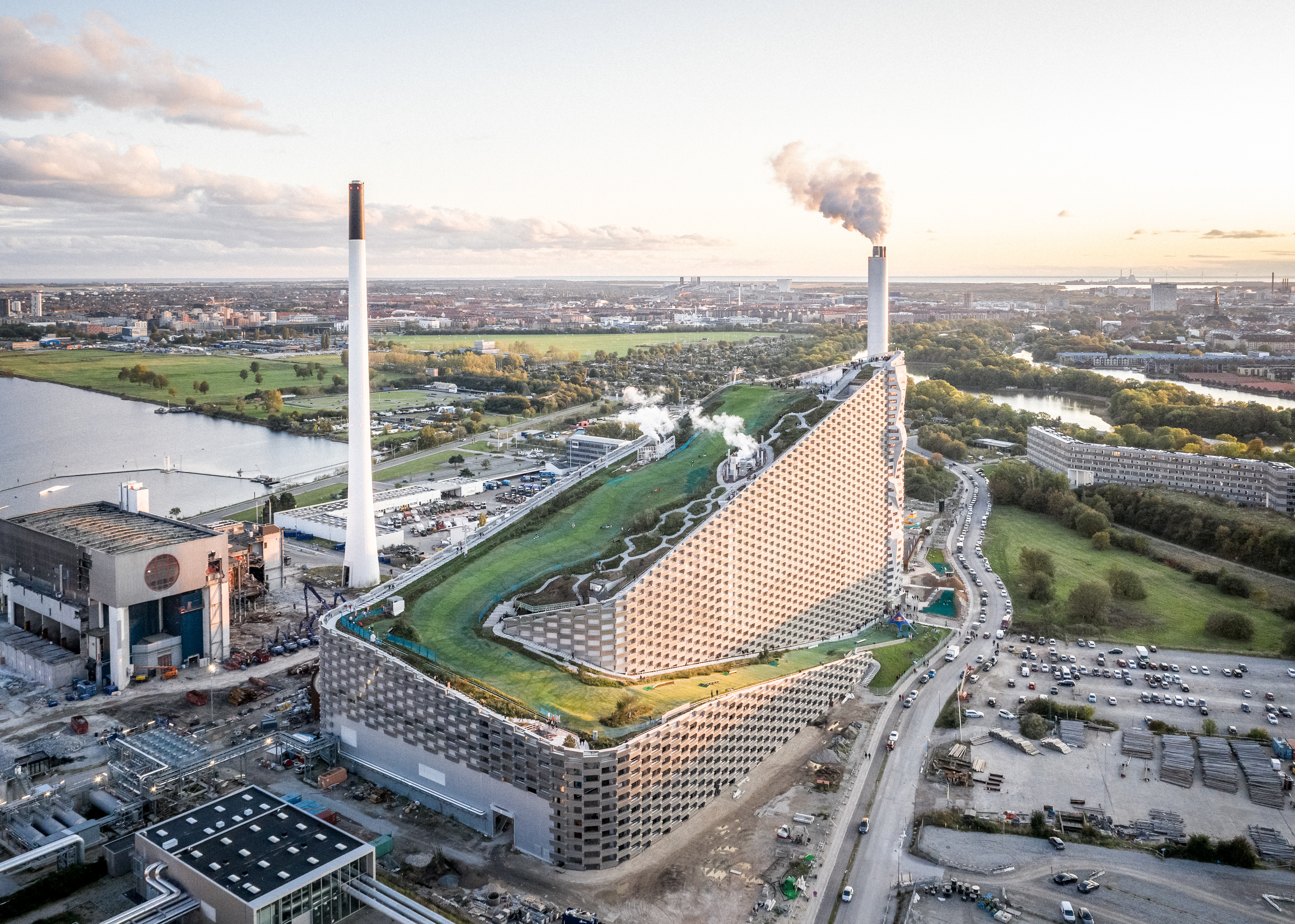 What is hedonistic sustainability? BIG's take on fun-injected sustainable architecture arrives in New York
A new project in New York proves that the 'seemingly contradictory' ideas of sustainable development and the pursuit of pleasure can, and indeed should, co-exist
By Emily Wright
-
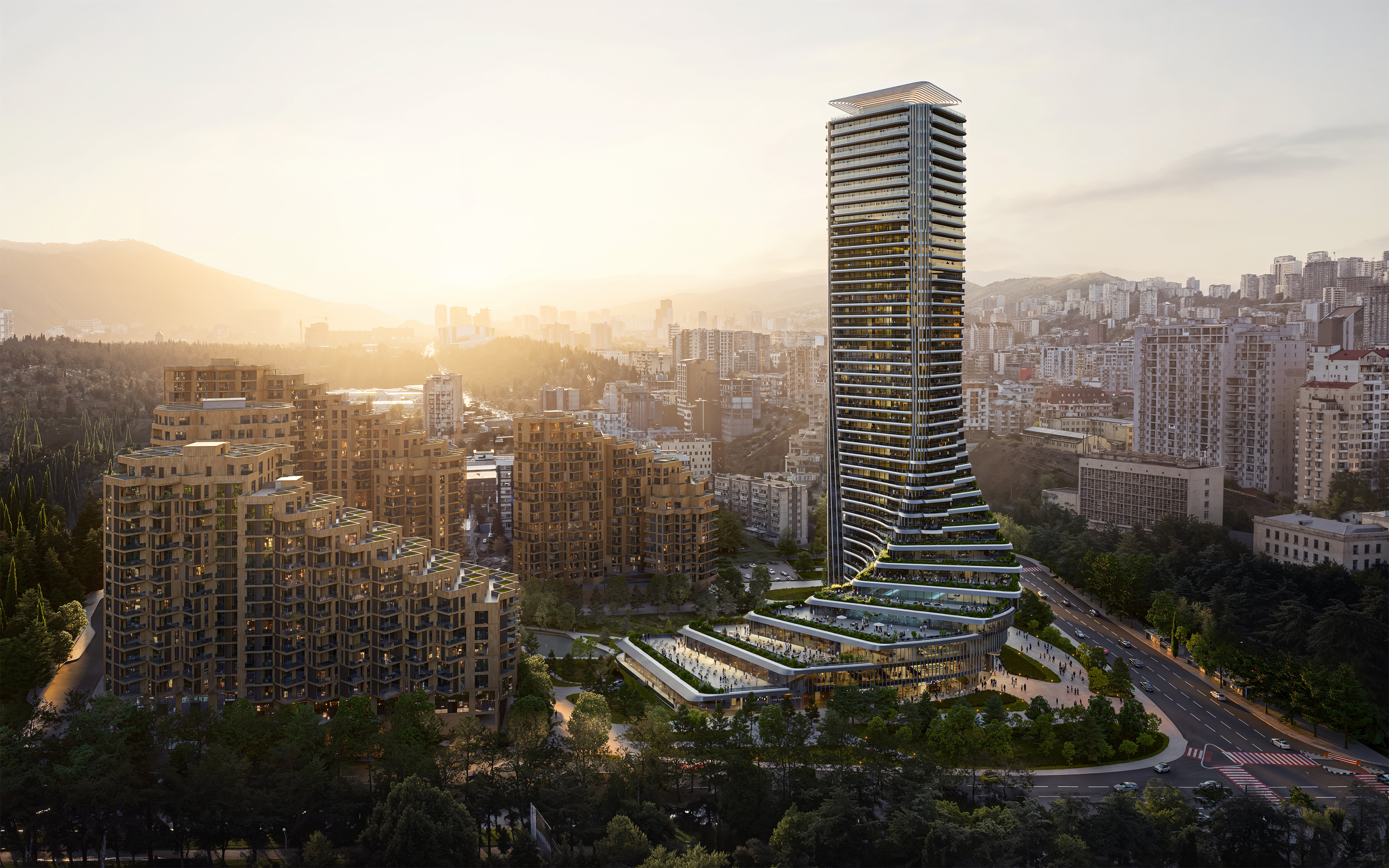 The upcoming Zaha Hadid Architects projects set to transform the horizon
A peek at Zaha Hadid Architects’ future projects, which will comprise some of the most innovative and intriguing structures in the world
By Anna Solomon
-
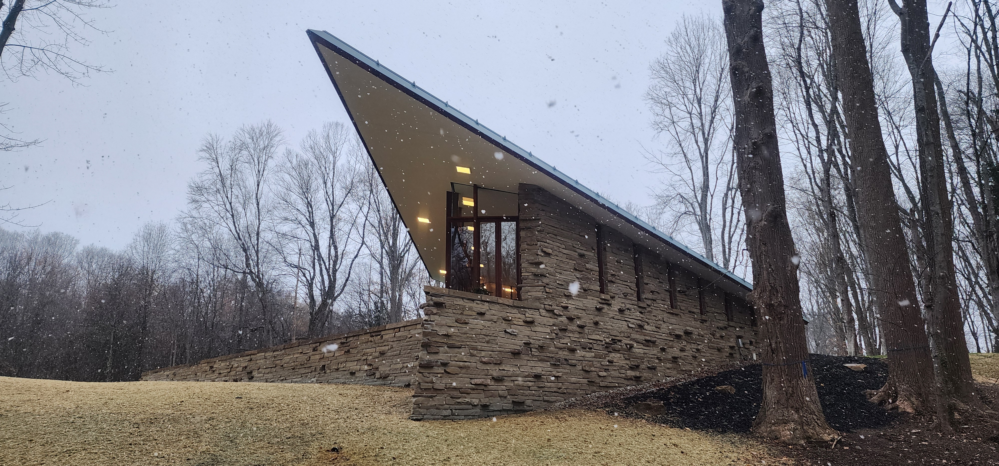 Frank Lloyd Wright’s last house has finally been built – and you can stay there
Frank Lloyd Wright’s final residential commission, RiverRock, has come to life. But, constructed 66 years after his death, can it be considered a true ‘Wright’?
By Anna Solomon