3XN’s Quay Quarter Tower in Sydney is a template for sustainable reuse
Quay Quarter Tower by Danish architecture firm 3XN, developed in partnership with BVN, offers sustainable architecture through clever redesign and reuse in Sydney, Australia
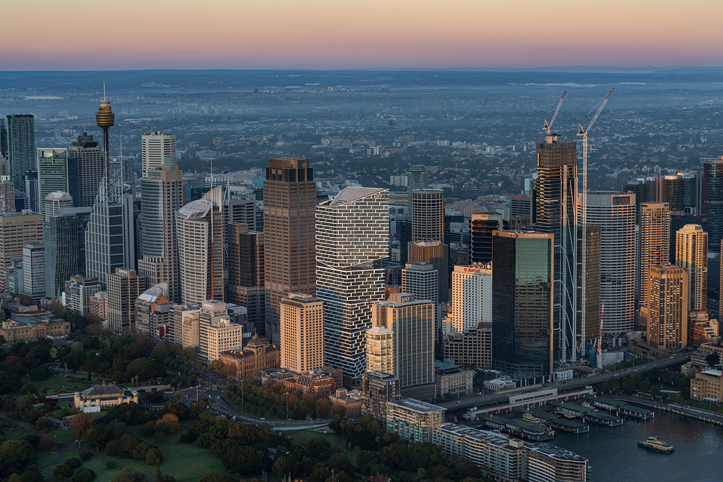
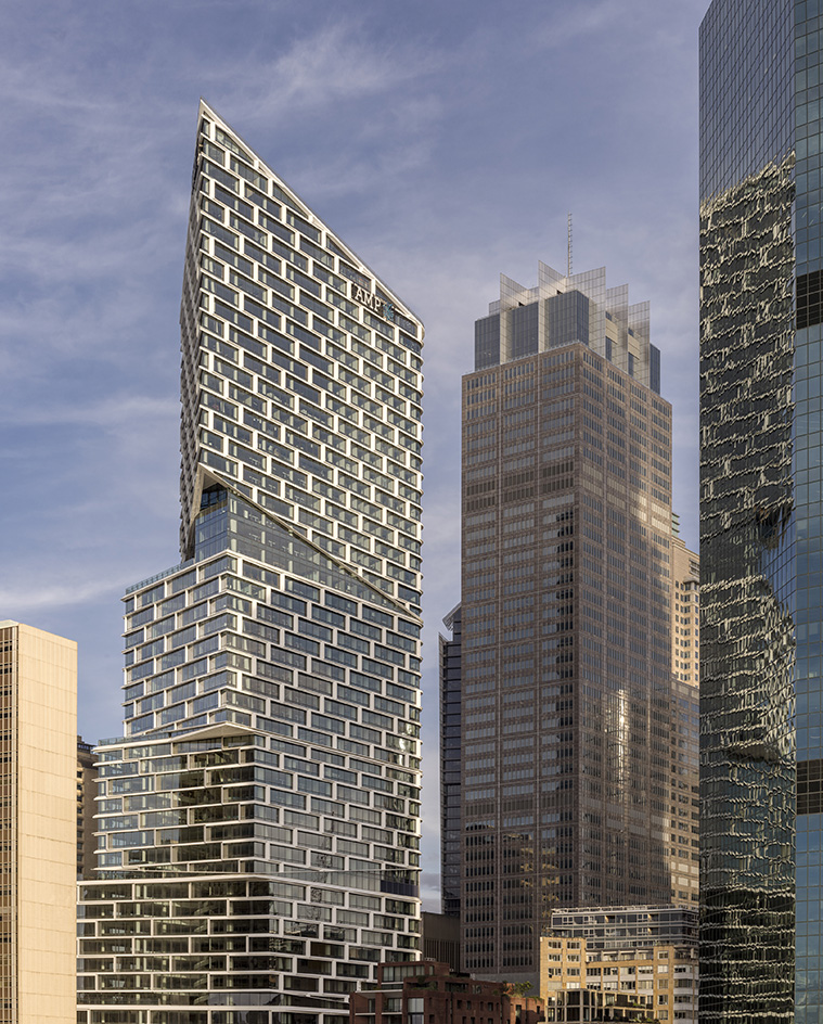
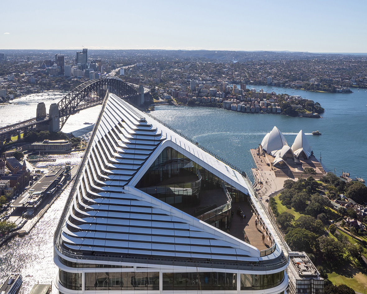
Quay Quarter Tower cuts a fine figure near the Sydney waterfront, all twisted forms and contemporary high-rise dynamics; but this tall building stands out for more reasons than one. Its sculptural physique is certainly eye-catching, but this is also an impressive feat of sustainable reuse, hailing a new era for its genre in Australia and beyond. Its accolades now include a prestigious International Highrise Award 2022, which has just been announced today. Sustainable architecture, urban innovation, striking aesthetics; there's a lot to be said for this new-era high-rise.
Quay Quarter Tower’s sustainable reuse
Its architects, 3xn (in partnership with BVN) celebrate the project as ‘the world’s first adaptive reuse skyscraper’. Gone are the days when height and volumetric gymnastics alone could impress the global architecture scene. Now, every building needs to work hard to make the most of its challenges and opportunities in order to have a positive – or, at least, neutral – impact, environmentally speaking. Quay Quarter Tower was designed to do that, not least through its very basis as a redesign of an existing tall structure – as the client, AMP, opted for a clever reimagining, instead of demolishing, its 40-year-old bones.
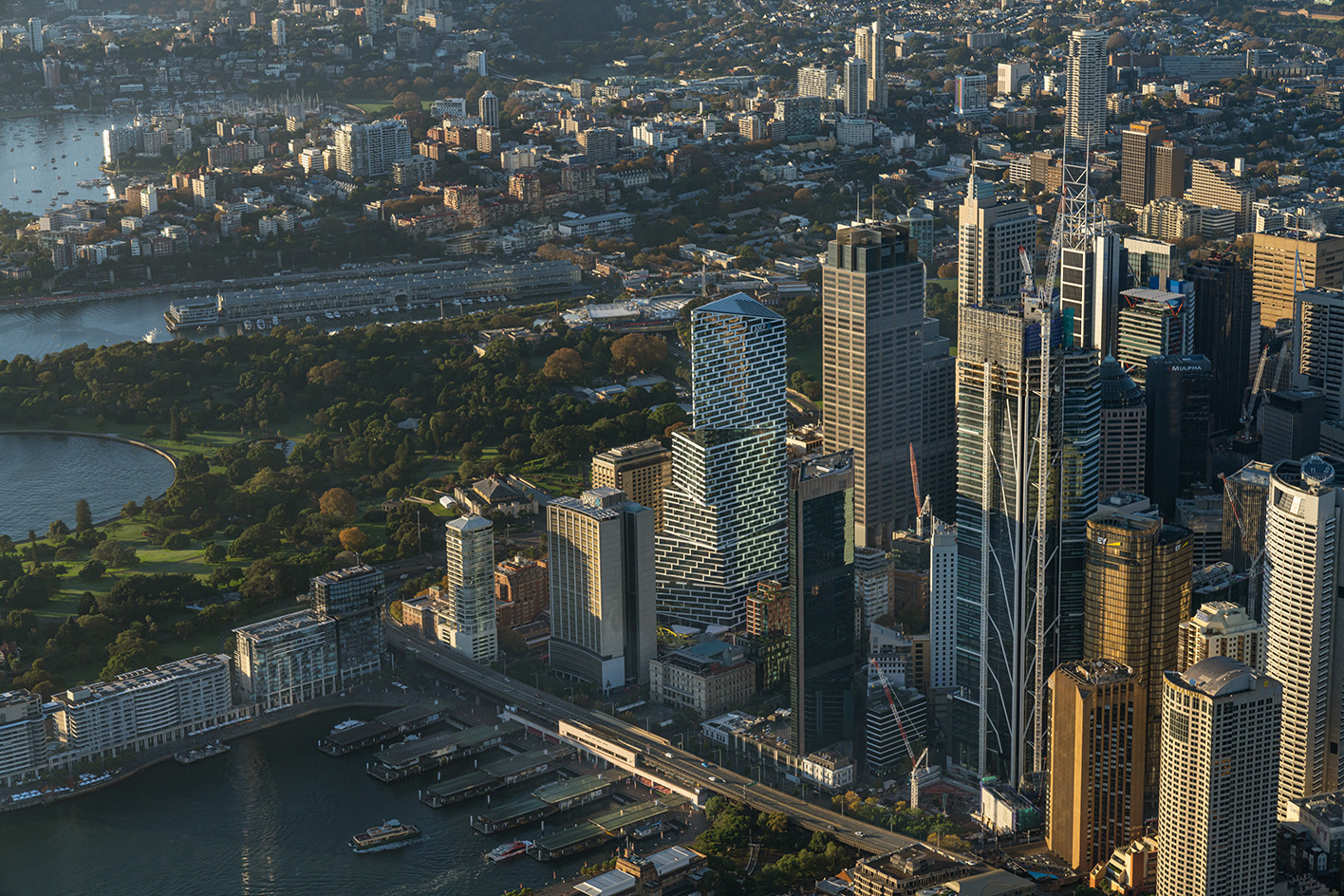
Spanning 206m and 50 storeys high, Quay Quarter Tower – previously known as AMP Centre – was in need of a refresh. In 2014, its owners decided to act, appointing 3XN through an international competition – the Danish studio is well known for its progressive approach to environmentally friendly design and jumped at the opportunity for a proposal, winning the bid (and developed in partnership with BVN).
‘They could have knocked it down, but they didn't. It was also a clever financial decision as if they’d done that, due to local planning regulations, they couldn't have built as high as this,’ 3XN founder Kim Herforth Nielsen explains.
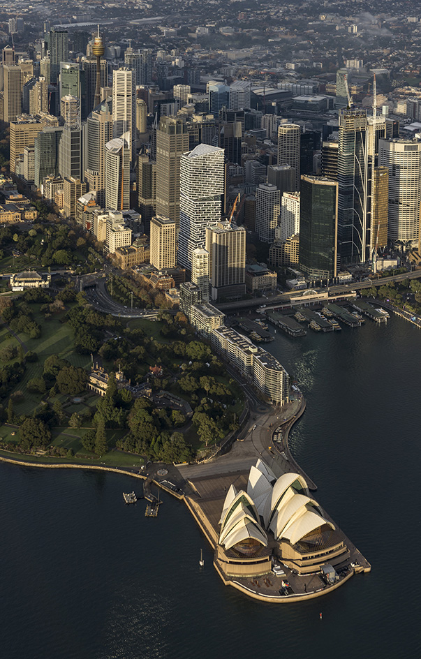
The site is a stone's throw from the Sydney Opera House, another Danish design in the Australian metropolis, so the architects knew they had to make this a truly spectacular one in order to follow in Jørn Utzon’s footsteps.
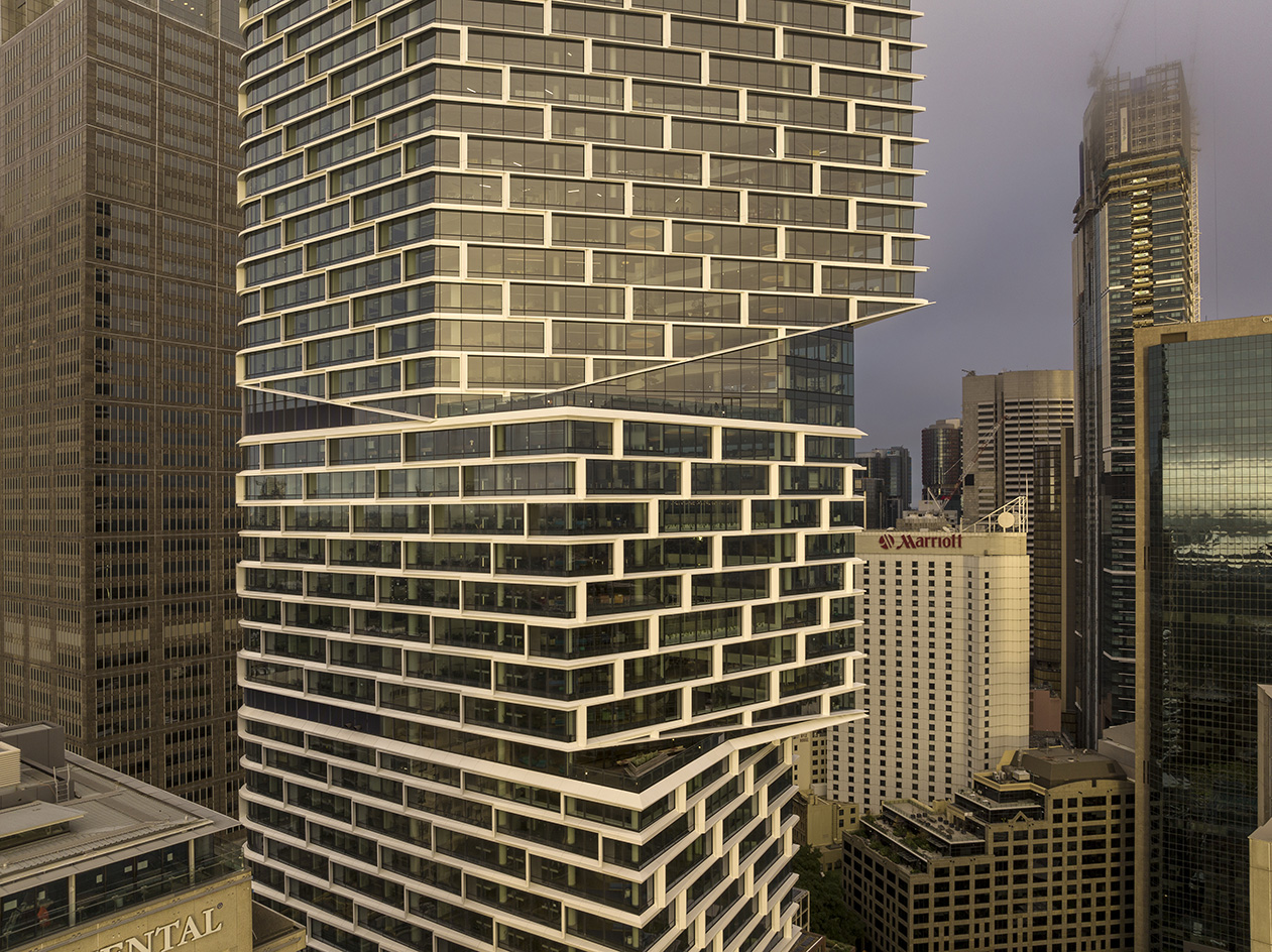
Now, Quay Quarter Tower is composed of five stacked and shifted volumes; the lower floors face Young Street and Sydney Harbour Bridge. The building's volumes then fan out eastwards towards panoramic views of the Royal Botanic Gardens, the Sydney Opera House and the wider harbour. This twisted shape was especially conceived for the design to be as site-specific as possible, adding dynamism to the arrangement – the form achieved not as a goal in itself, but rather resulting from the careful orchestration of vistas and light orientation.
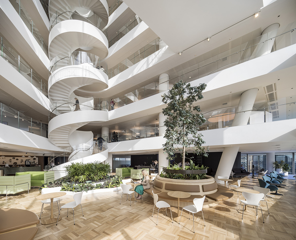
Meanwhile, internally, the spaces are built around large-scale atria on various levels, which create hubs of activity and underline the sense of community in the building – opening up view lines and communication between floors and functions. 'We wanted to create a campus, and work with the idea of an atrium to get as much daylight and [as many] views as possible inside,' Herforth Nielsen says. ‘We wanted to create a strong sense of where you are, whenever you stepped out of a lift.'
Wallpaper* Newsletter
Receive our daily digest of inspiration, escapism and design stories from around the world direct to your inbox.
3XN partner Fred Holt adds: 'It was designed from the inside out, it’s all around the user experience, it has a sculptural shape but it’s not really about the shape.' Quay Quarter Tower represents a 'vertical village' the team explain, as they hoped to strike the right balance between 'intimacy and connectivity'.
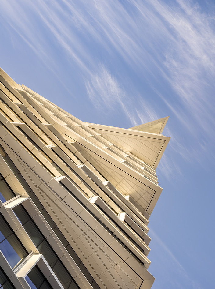
This project also has a huge economic benefit to it, the team say. 'It’s a great sustainability story; we are pushing transformation of existing assets and by doing so, we saved about nine months of work in the process, so as an asset owner you can fill up the building quicker,' says Holt.
And this is despite the design adding approximately 45,000 sq m of new tower floor area, primarily on the north side of the building (the architects achieved this by grafting on new floorplates to the existing slabs).
The smart façade helps with climate control inside the building; its cladding, a series of external sunshade hoods, reduces heat loads, making internal blinds redundant, and cutting overall energy needs.
The tower’s social aspect – the 'vertical village' concept – meets environmental elements such as this, which combined with the upcycling of a large-scale, existing building add to the project's sustainability credentials. At the same time, with an open ground level, Quay Quarter Tower also feels powerfully connected to its neighbourhood, helping to transform the whole urban locale.
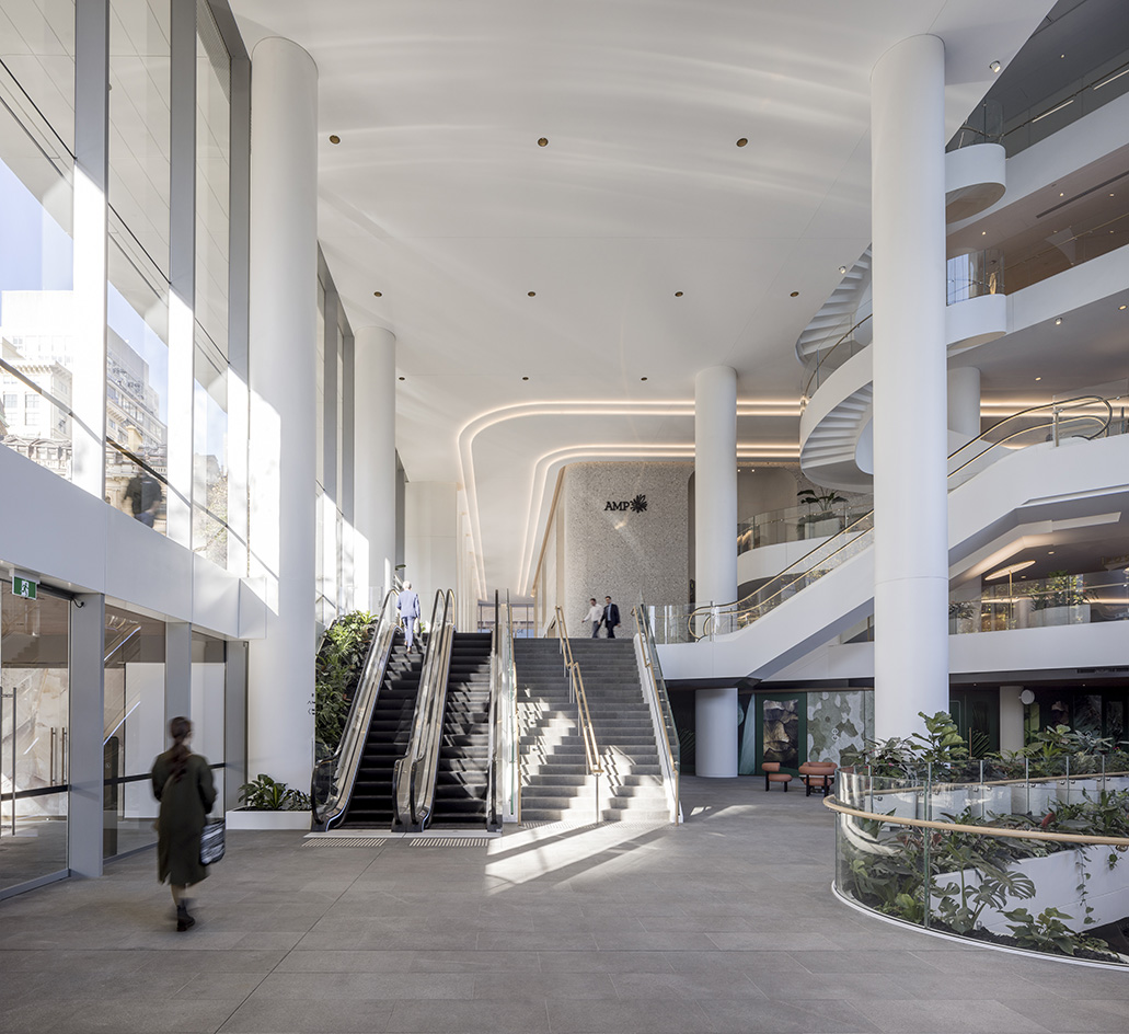
Quay Quarter Tower's International Highrise Award 2022 win highlights its success in creating a coherent design that does many things with one fell swoop. 'Sydney has high-rises with a lot more textures – look at Harry Seidler's work for example – and we wanted to do something in that world, we wanted to solve issues through the form,' Herforth Nielsen concludes. ‘It was a lot about how [a] building lands in the city and we wanted to make sure we connect it and animate it as much as possible. And its initial renders look just like the end result – even better!'
Ellie Stathaki is the Architecture & Environment Director at Wallpaper*. She trained as an architect at the Aristotle University of Thessaloniki in Greece and studied architectural history at the Bartlett in London. Now an established journalist, she has been a member of the Wallpaper* team since 2006, visiting buildings across the globe and interviewing leading architects such as Tadao Ando and Rem Koolhaas. Ellie has also taken part in judging panels, moderated events, curated shows and contributed in books, such as The Contemporary House (Thames & Hudson, 2018), Glenn Sestig Architecture Diary (2020) and House London (2022).
-
 Marylebone restaurant Nina turns up the volume on Italian dining
At Nina, don’t expect a view of the Amalfi Coast. Do expect pasta, leopard print and industrial chic
By Sofia de la Cruz
-
 Tour the wonderful homes of ‘Casa Mexicana’, an ode to residential architecture in Mexico
‘Casa Mexicana’ is a new book celebrating the country’s residential architecture, highlighting its influence across the world
By Ellie Stathaki
-
 Jonathan Anderson is heading to Dior Men
After months of speculation, it has been confirmed this morning that Jonathan Anderson, who left Loewe earlier this year, is the successor to Kim Jones at Dior Men
By Jack Moss
-
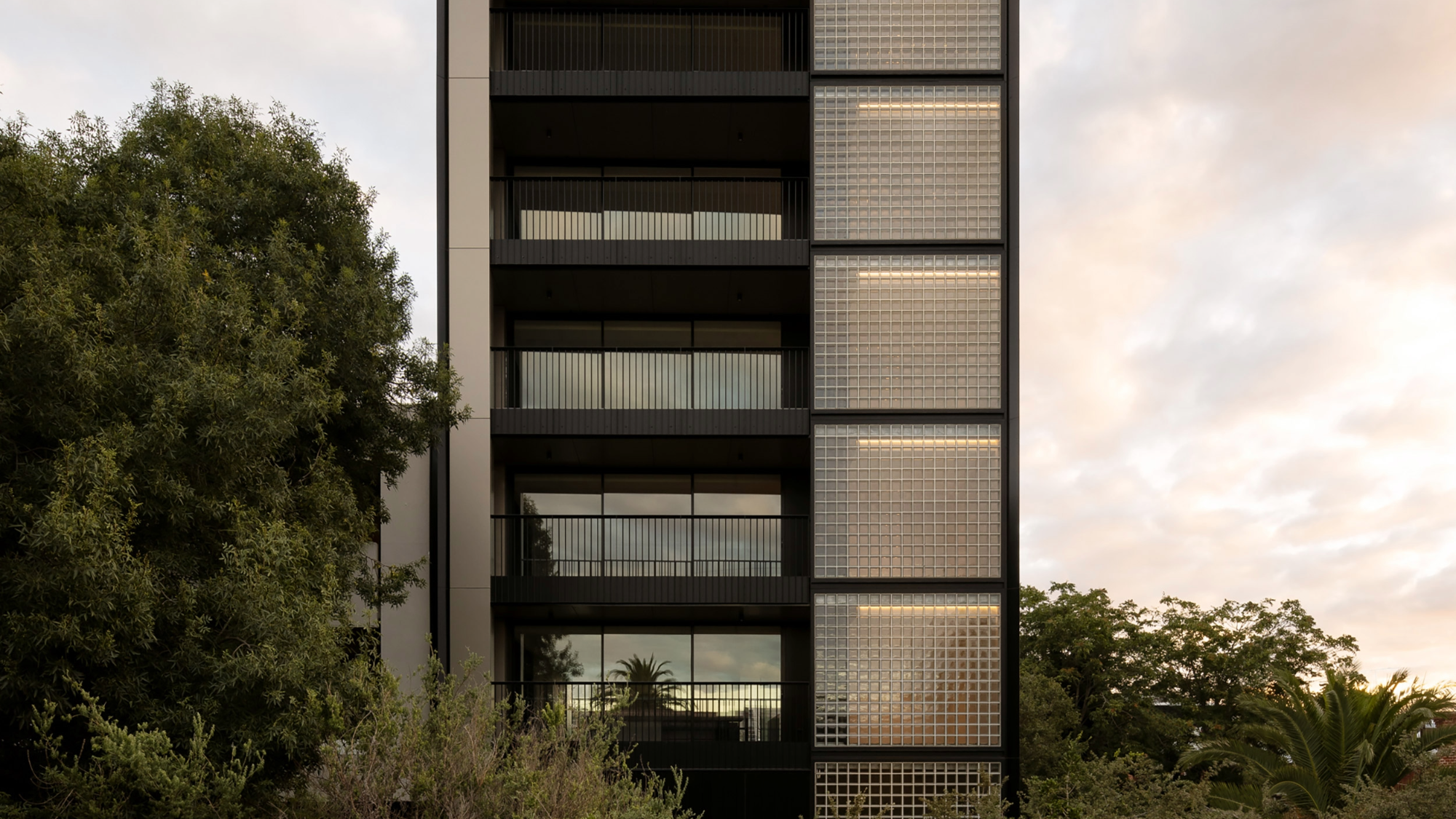 The humble glass block shines brightly again in this Melbourne apartment building
Thanks to its striking glass block panels, Splinter Society’s Newburgh Light House in Melbourne turns into a beacon of light at night
By Léa Teuscher
-
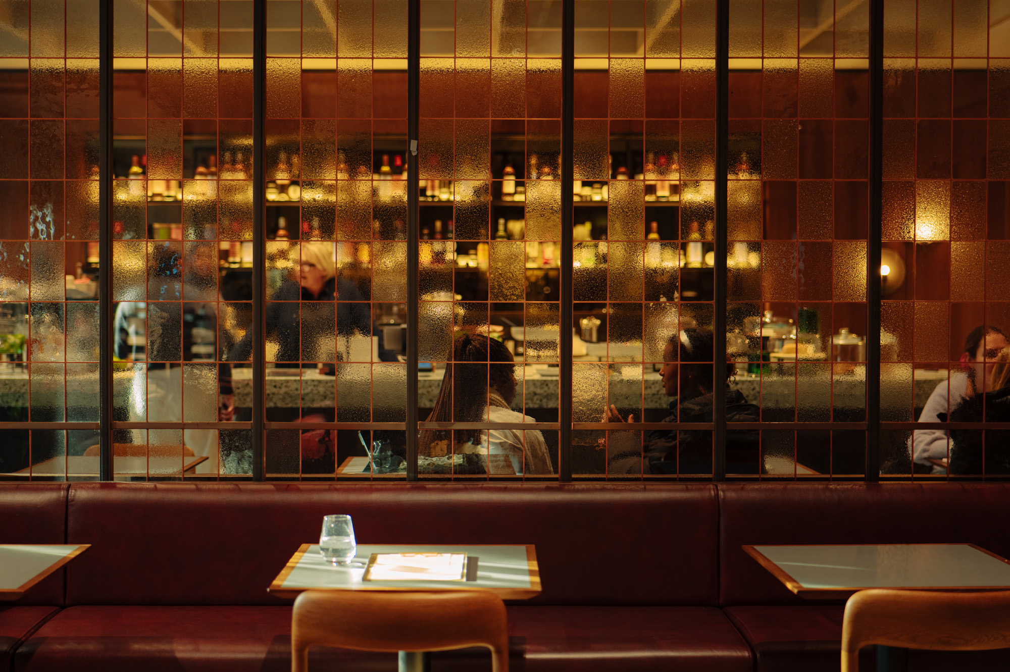 Fluid workspaces: is the era of prescriptive office design over?
We discuss evolving workspaces and track the shape-shifting interiors of the 21st century. If options are what we’re after in office design, it looks like we’ve got them
By Ellie Stathaki
-
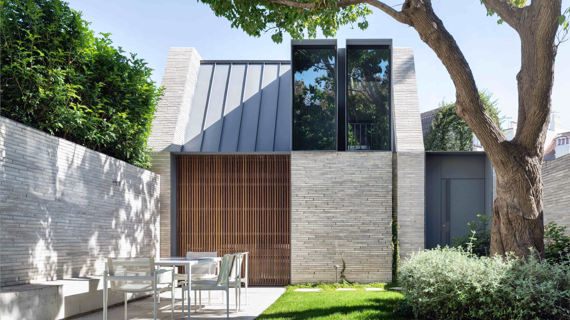 A contemporary retreat hiding in plain sight in Sydney
This contemporary retreat is set behind an unassuming neo-Georgian façade in the heart of Sydney’s Woollahra Village; a serene home designed by Australian practice Tobias Partners
By Léa Teuscher
-
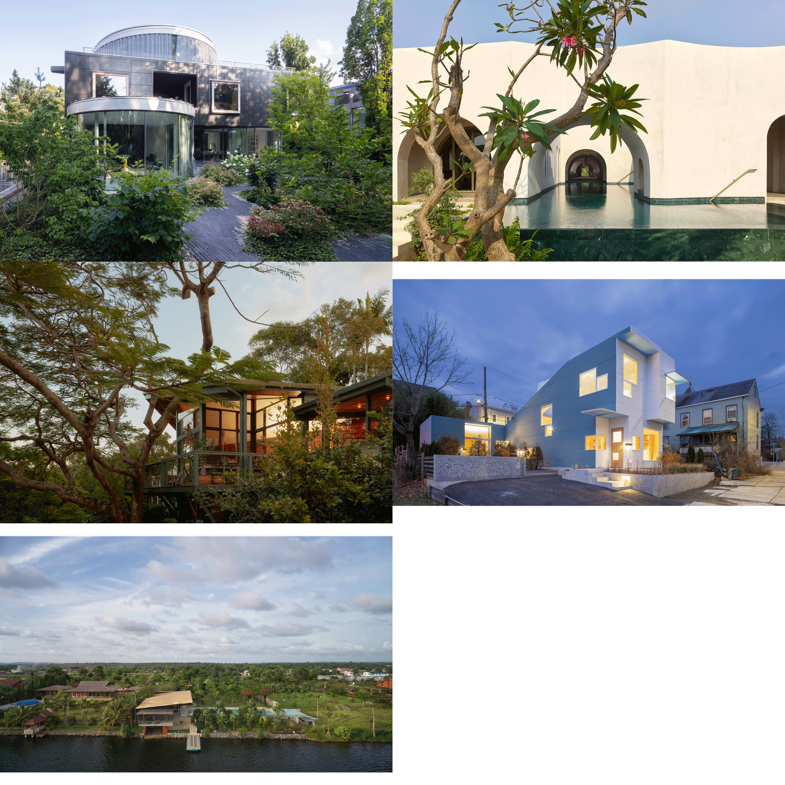 Join our world tour of contemporary homes across five continents
We take a world tour of contemporary homes, exploring case studies of how we live; we make five stops across five continents
By Ellie Stathaki
-
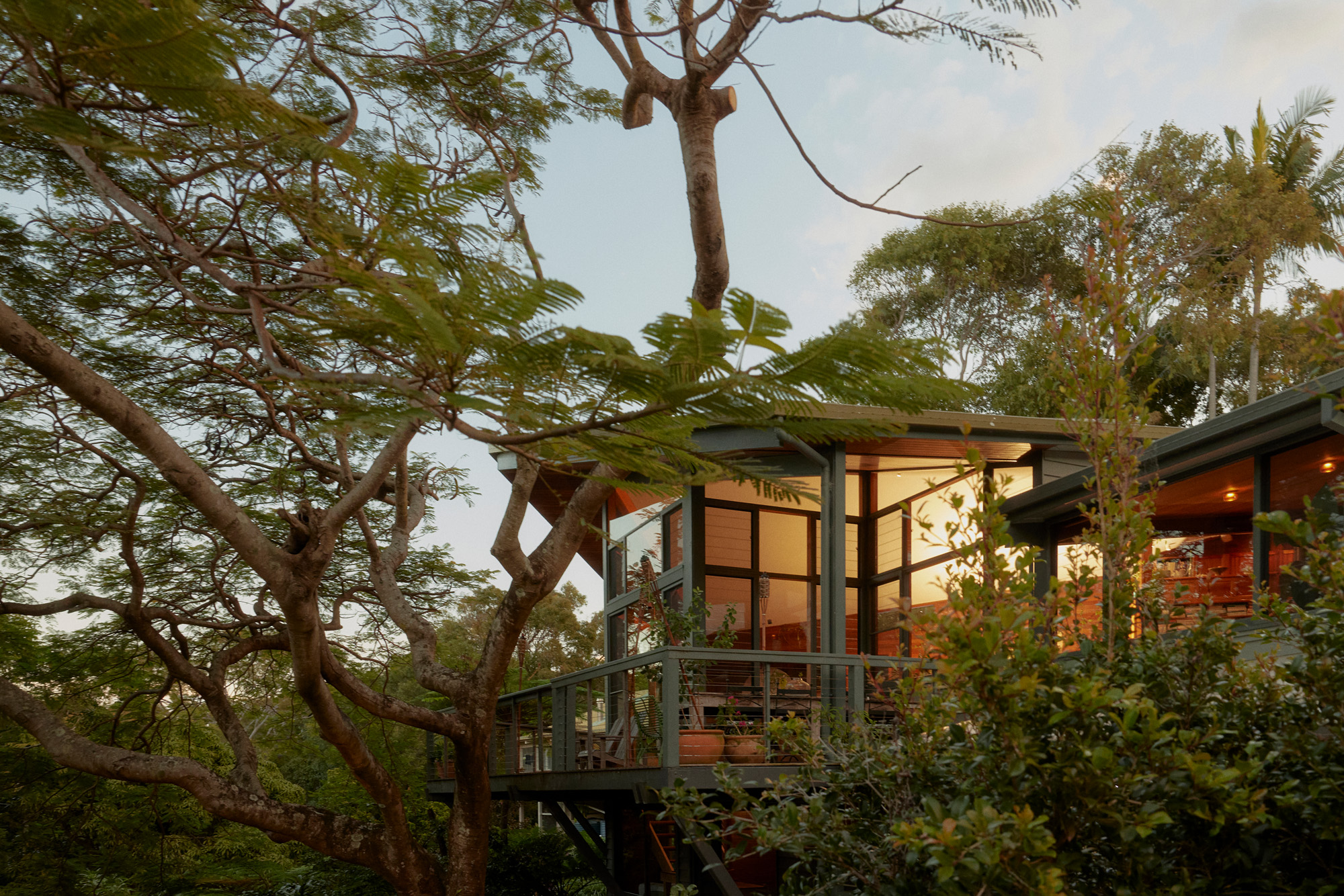 Who wouldn't want to live in this 'treehouse' in Byron Bay?
A 1980s ‘treehouse’, on the edge of a national park in Byron Bay, is powered by the sun, architectural provenance and a sense of community
By Carli Philips
-
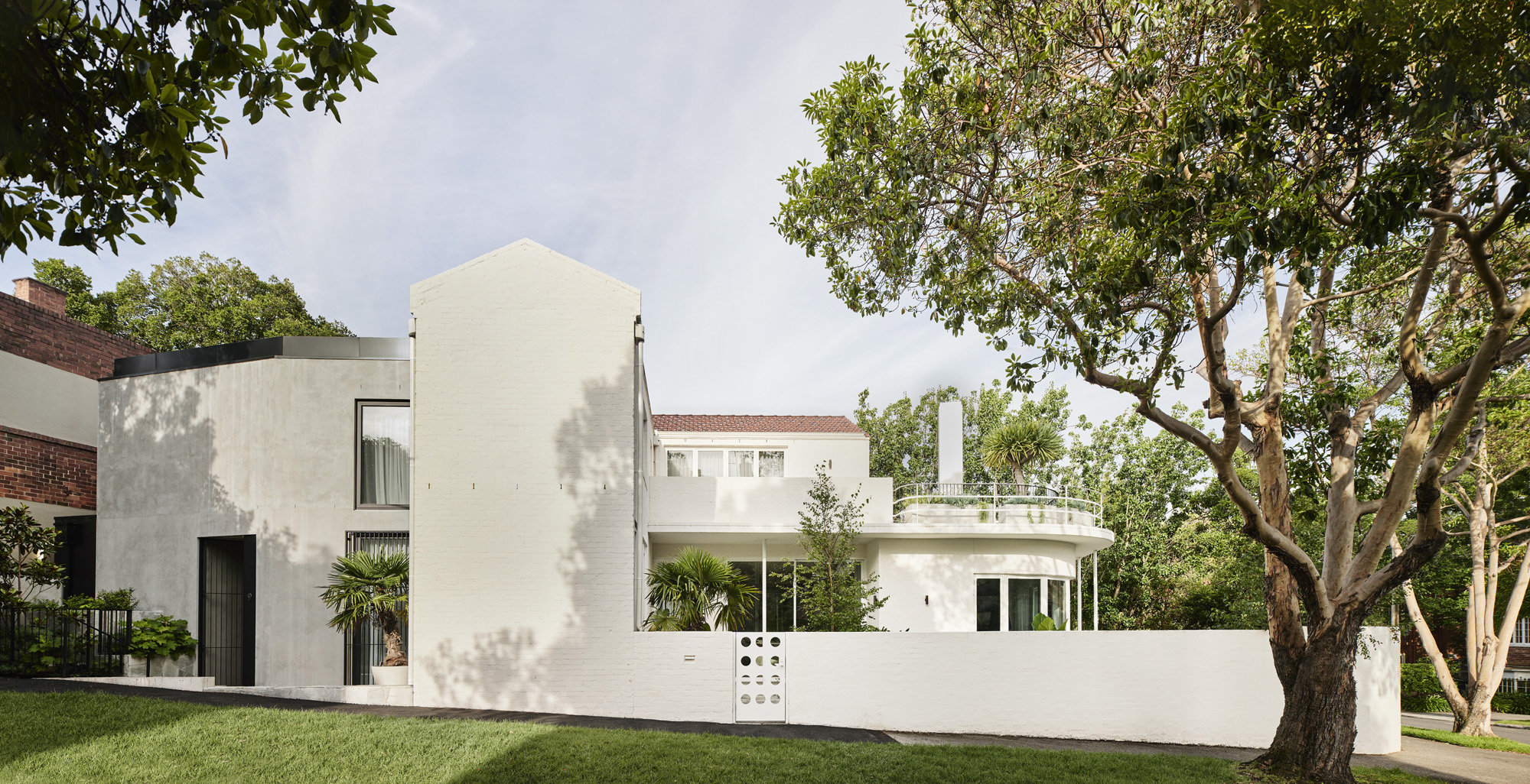 A modernist Melbourne house gets a contemporary makeover
Silhouette House, a modernist Melbourne house, gets a contemporary makeover by architects Powell & Glenn
By Ellie Stathaki
-
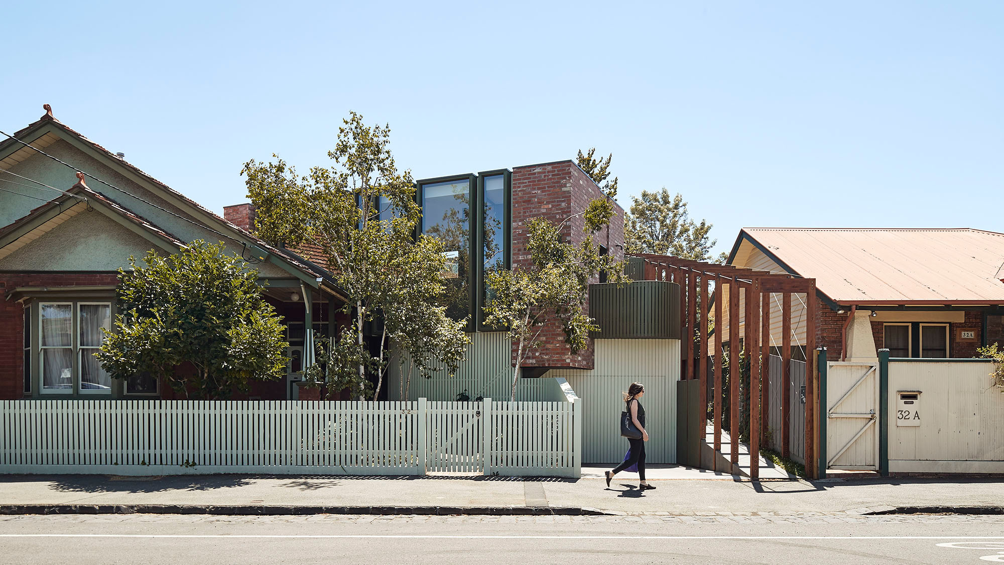 A suburban house is expanded into two striking interconnected dwellings
Justin Mallia’s suburban house, a residential puzzle box in Melbourne’s Clifton Hill, interlocks old and new to enhance light, space and efficiency
By Jonathan Bell
-
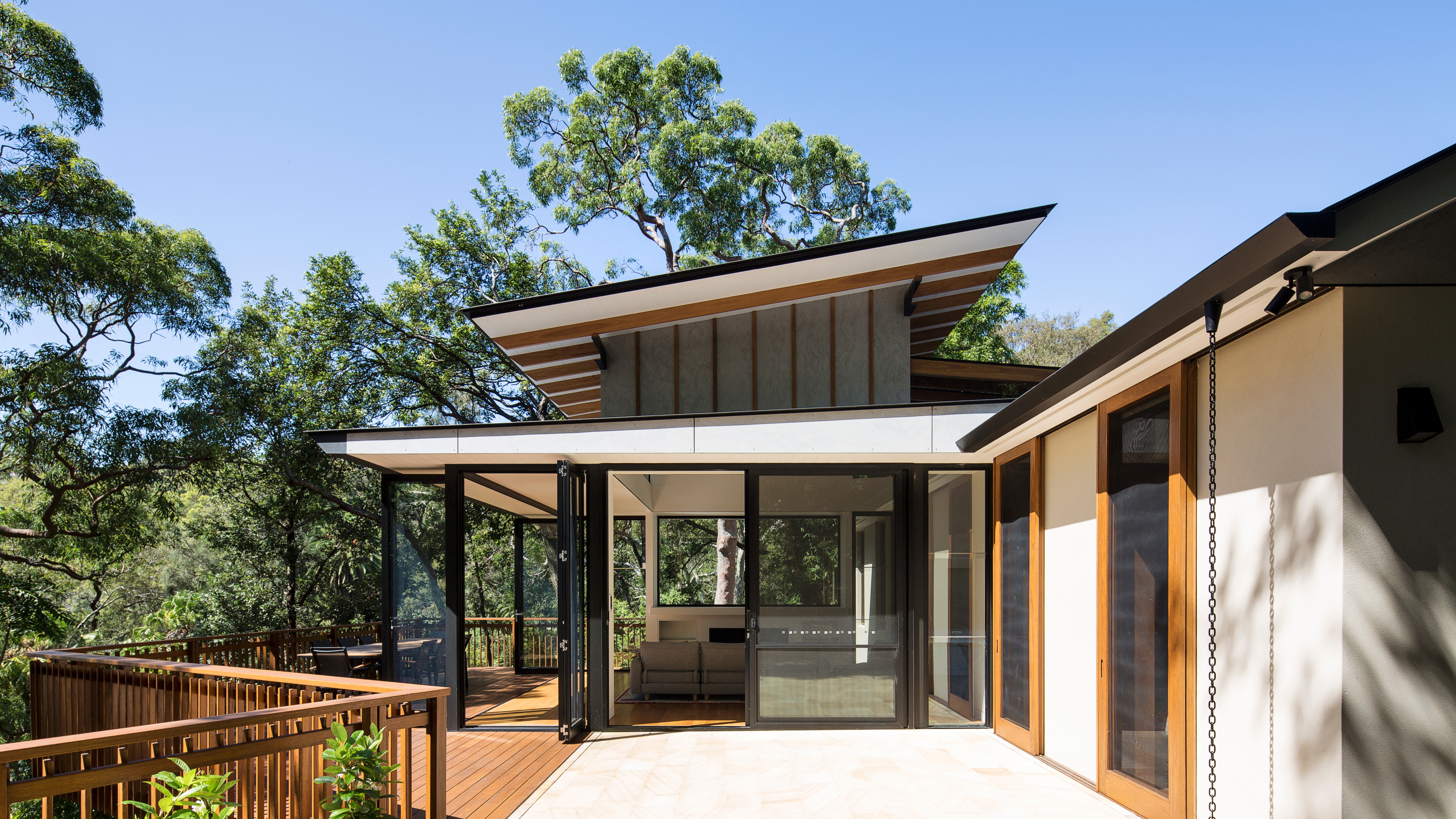 Palm Beach Tree House overhauls a cottage in Sydney’s Northern Beaches into a treetop retreat
Set above the surf, Palm Beach Tree House by Richard Coles Architecture sits in a desirable Northern Beaches suburb, creating a refined home in verdant surroundings
By Jonathan Bell