Rand Elliott’s Oklahoma Contemporary draws on the region’s light and sky
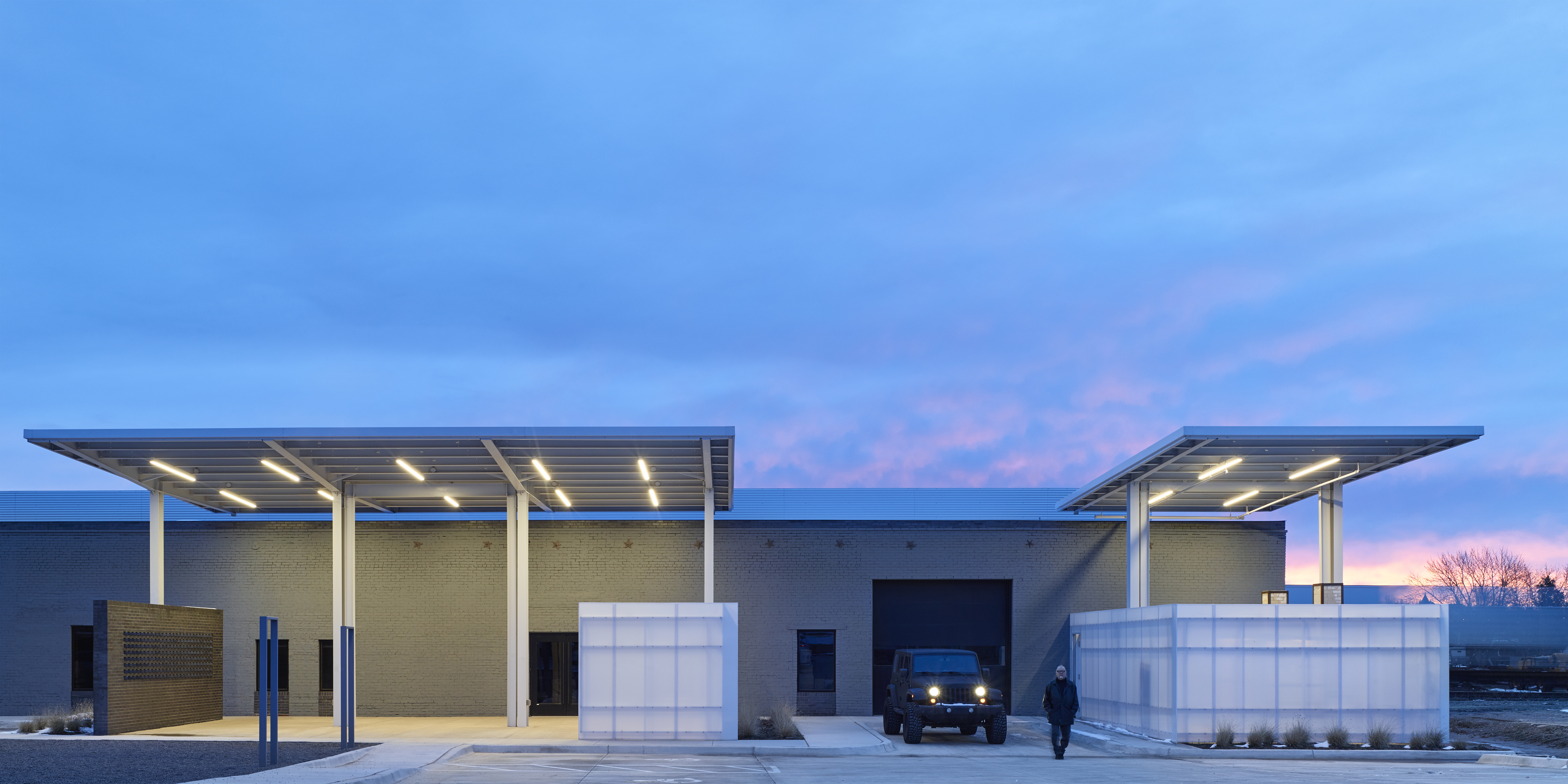
Clad in an innovative and multi-functional recycled aluminum skin and enhanced by unusually angled volumes and interior galleries, the new Oklahoma Contemporary Arts Center by Rand Elliott Architects completes
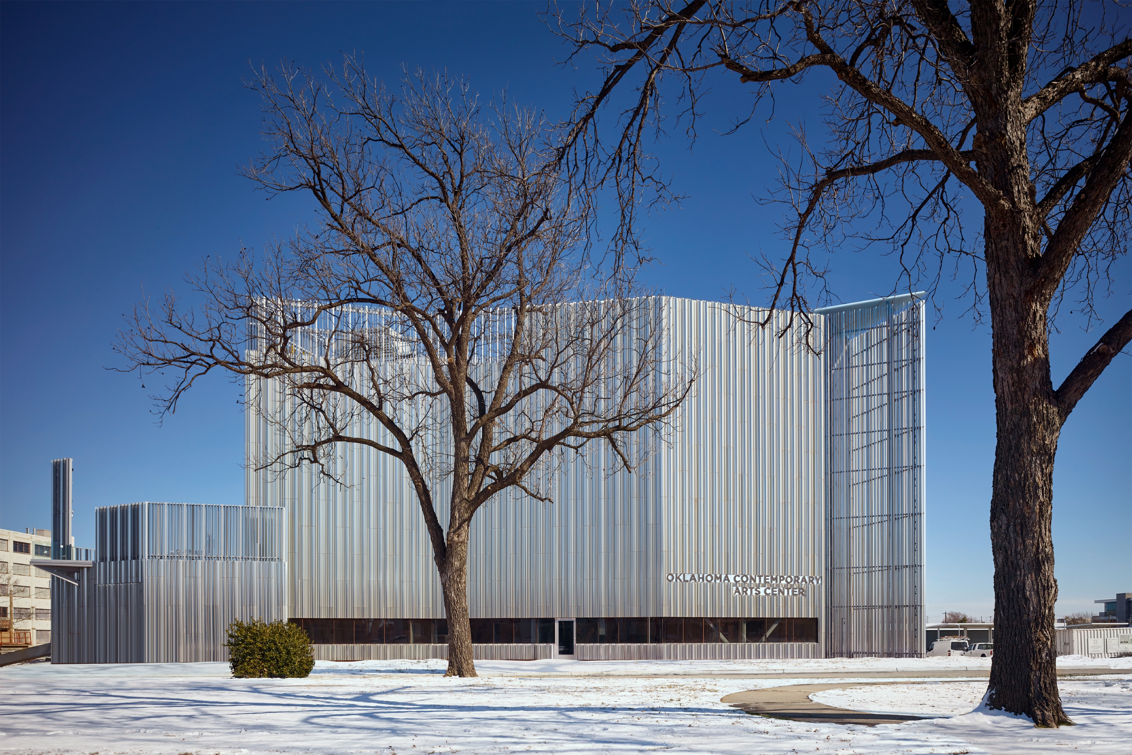
‘All communities live with the good and the bad,' muses Rand Elliott, referring to Oklahoma events such as the disastrous 1930’s Dust Bowl Period, or the tragic 1995 bombing. When his Oklahoma City-based firm, Rand Elliott Architects, took on the task of designing the new facilities for the local contemporary arts centre, he wanted to go above and beyond all of that. The question arose: ‘What do we have here that’s really unique and special that we can use to reimagine what Oklahoma City is all about?'
The quality of the light in Oklahoma has been immortalized in Rodgers and Hammerstein’s ‘Oklahoma!’ – and incidentally, ‘Bright Golden Haze’, a phrase taken from the first line of the iconic musical, also functions as the recently completed Oklahoma Contemporary Arts Center's inaugural exhibition’s title.
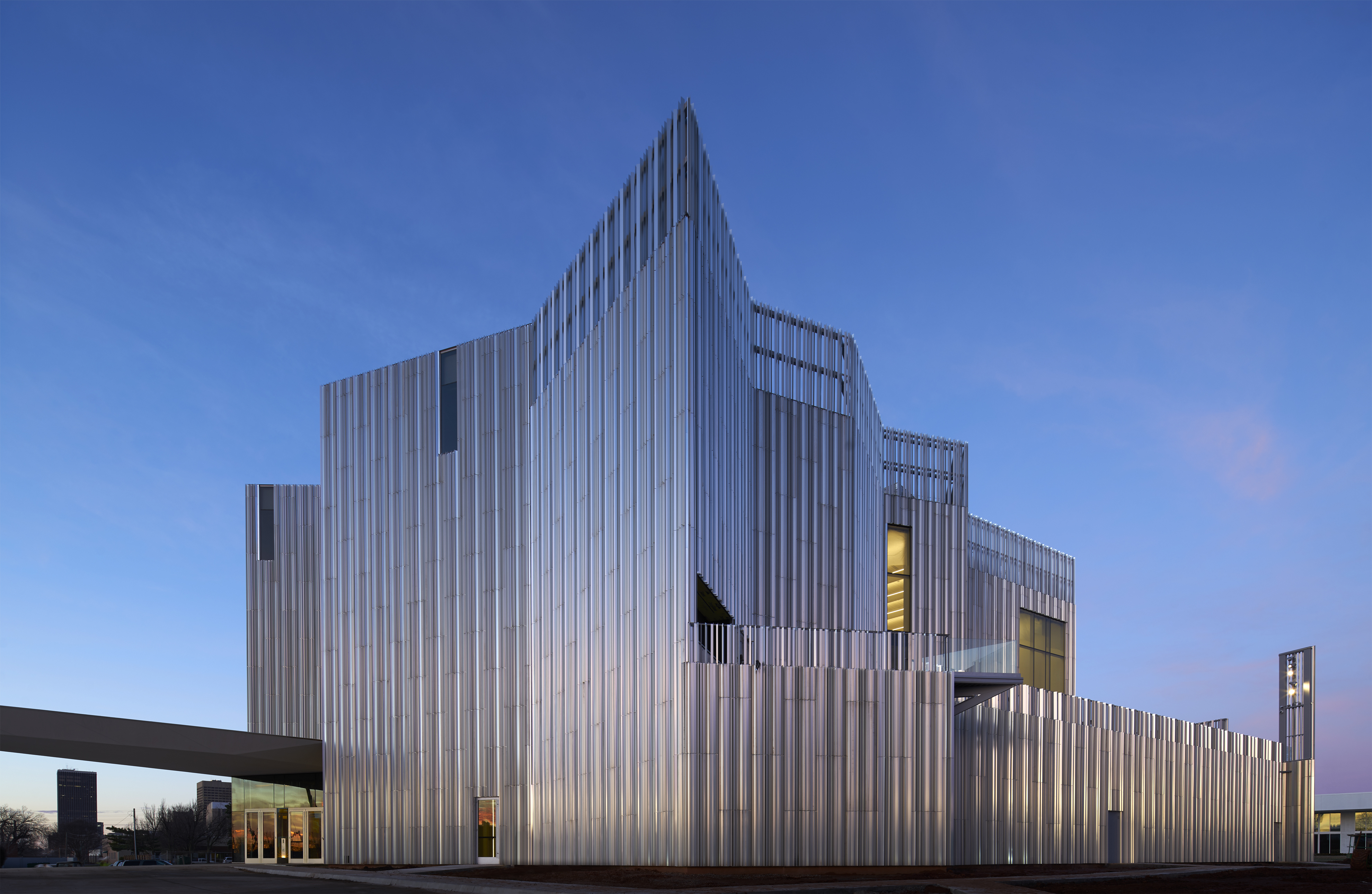
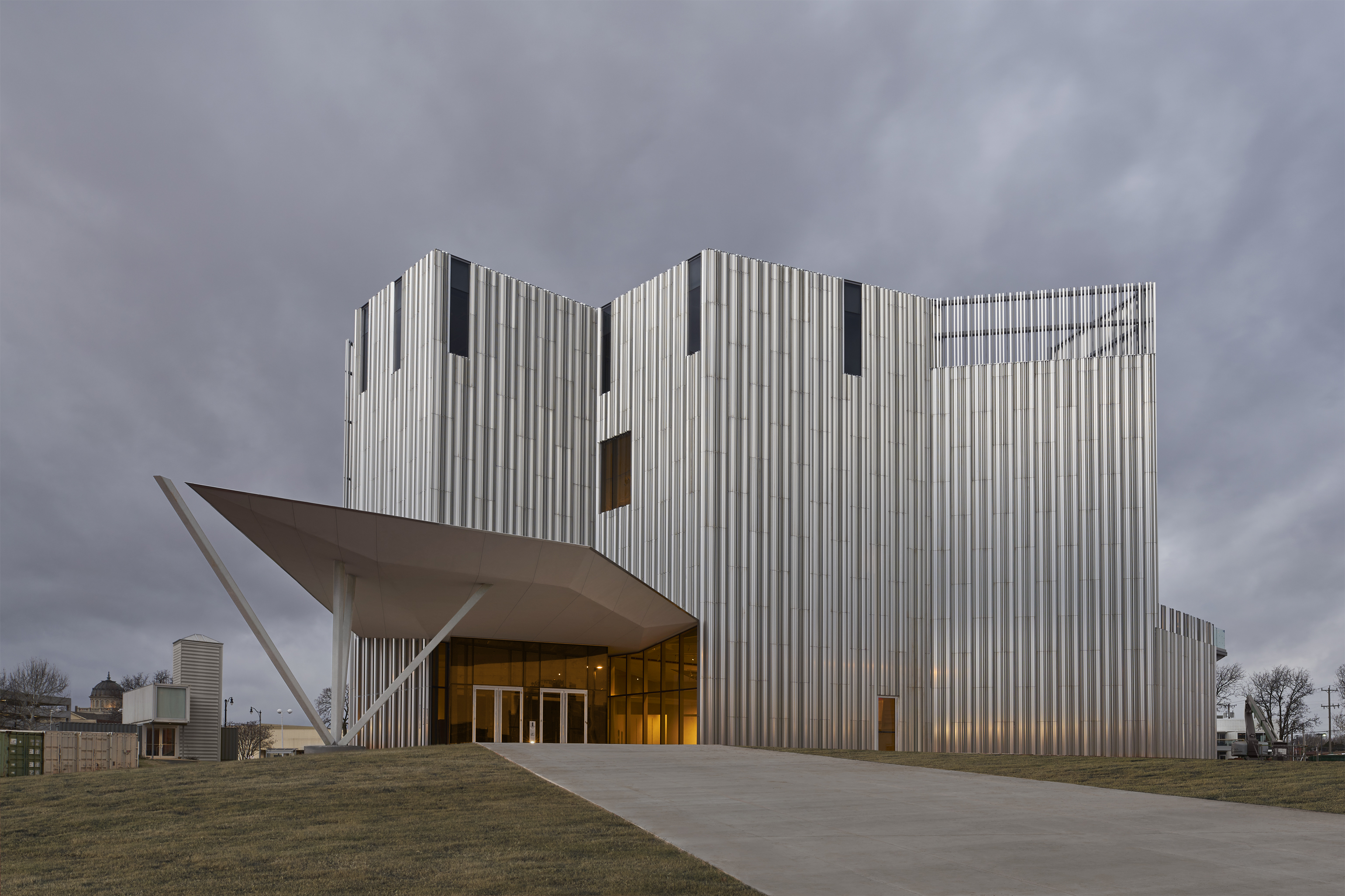
So for answers, naturally, the architects looked to the sky. The museum’s new flagship building features an innovative recycled aluminum ‘skin that actually absorbs and catches the light', says Elliot. The facade structure is made of series of blind-fastened fins inclined at different angles that refract the sunlight.
‘As the sun appears to move from east to west, the building literally transforms,' enthuses Elliott. ‘As it goes into the afternoon it will go from blues to oranges.' This skin also functions as a rain screen that helps the building to self-cool, and therefore, be greener.
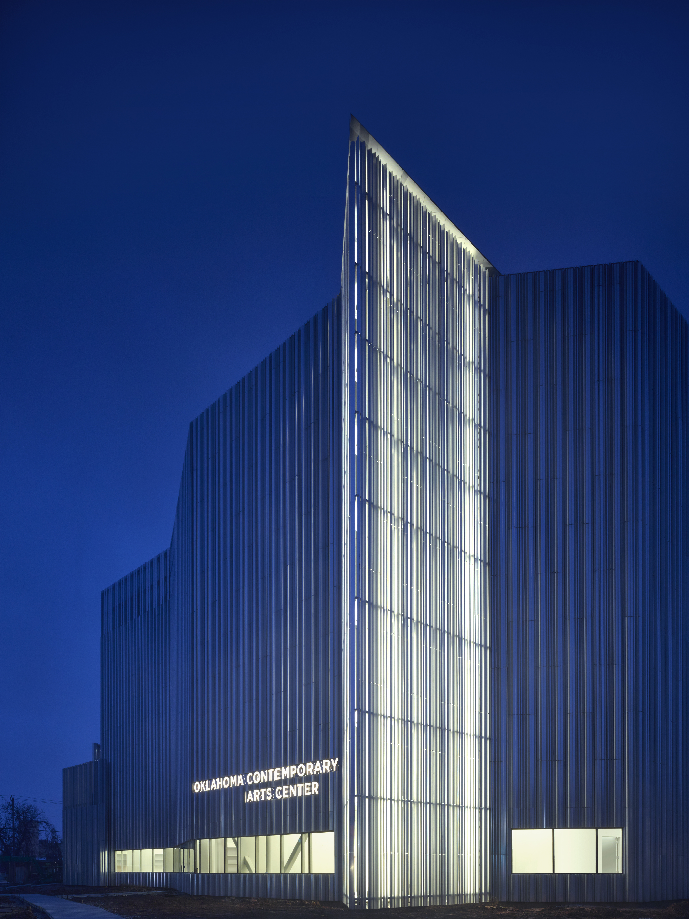
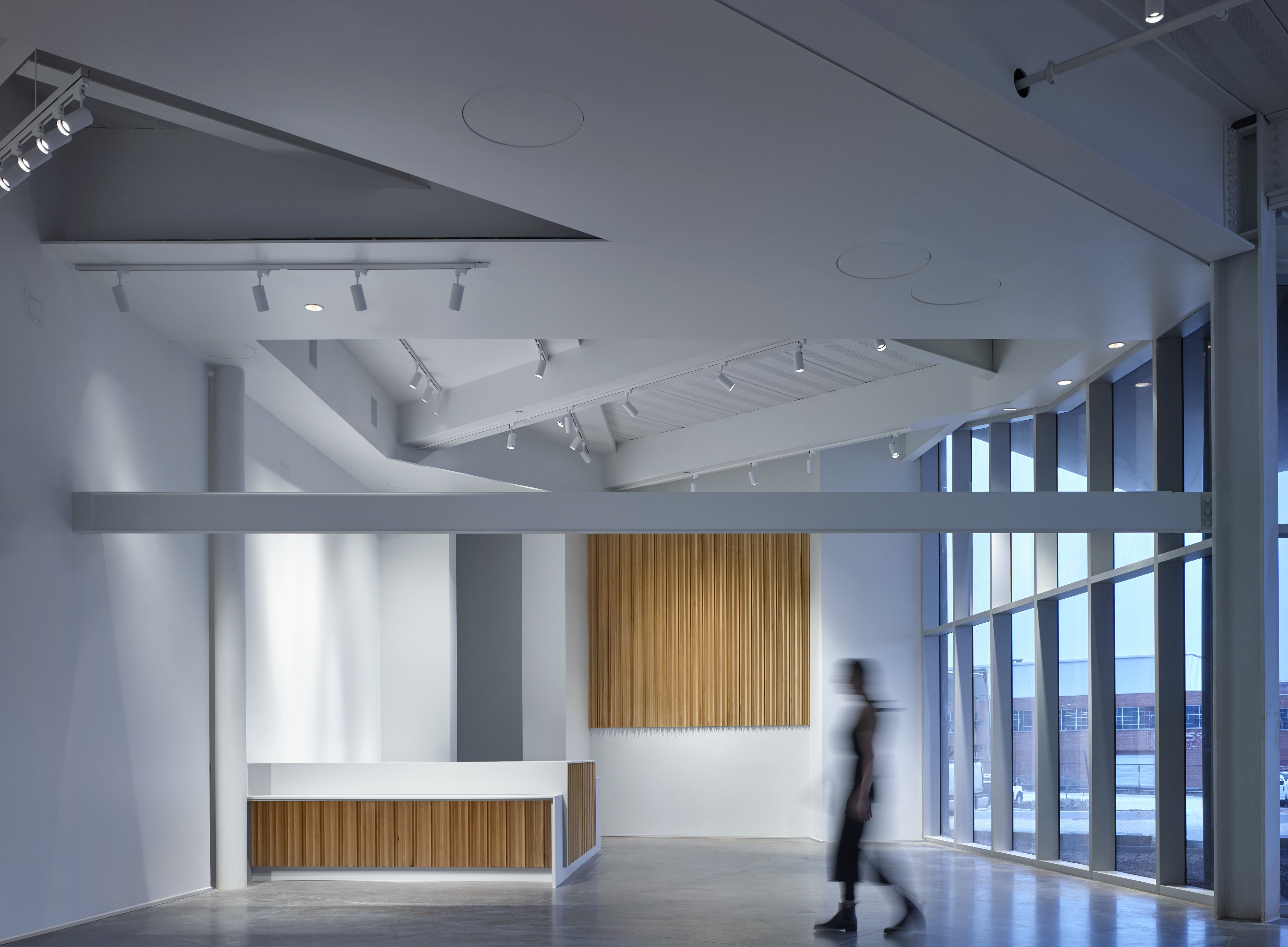
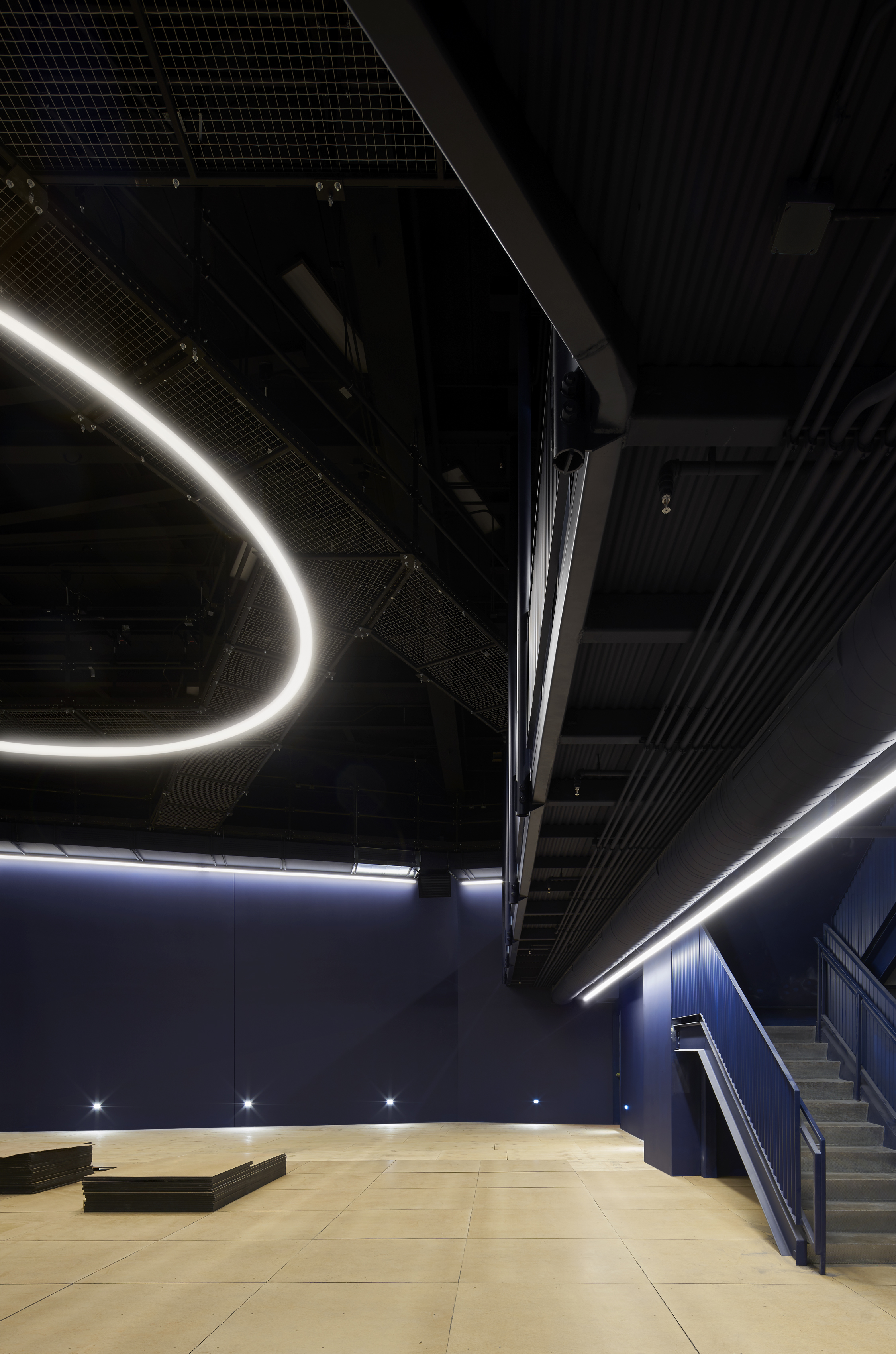
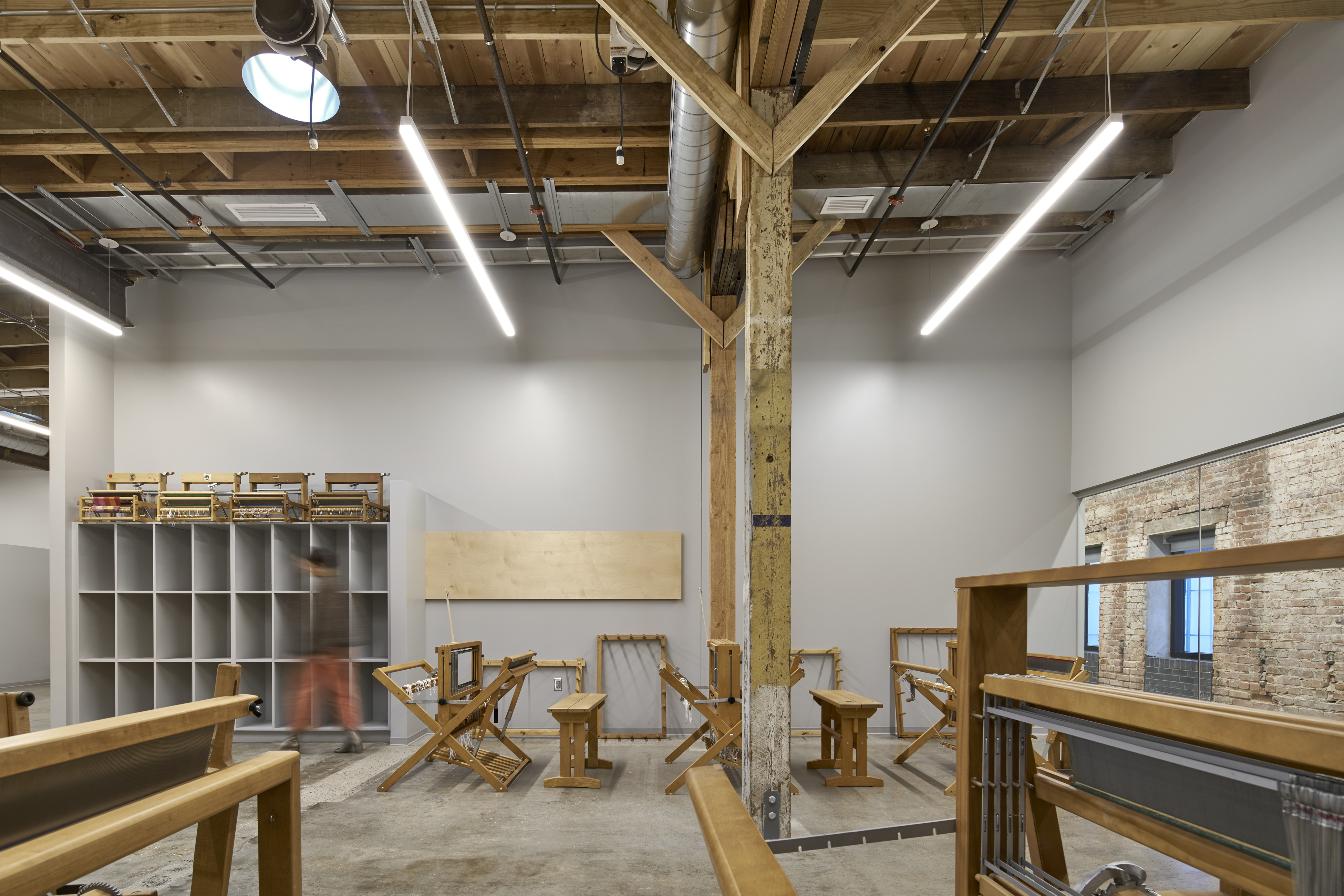
The building’s unorthodox architectural outline amplifies its visual impact, and also influences how the art on the inside will be experienced. None of the interior spaces are rectangular and there are very few 90-degree walls to be found – resulting in an adaptive space that can be altered according to exhibition needs.
For ‘Bright Golden Haze’, which opens on 13 March, these modifications include secluded corners and curtained-off sections that enhance the exhibition’s guiding theme of ‘the ways in which contemporary artists use light to create a sense of place,' reveals Jennifer Scanlan, the curatorial and exhibitions director at Oklahoma Contemporary.
Atmospheric works such as Olafur Eliasson’s Black Glass Eclipse, Vija Celmin’s night sky prints, Leo Villareal’s Star Ceiling, and works by James Turrell and Robert Irwin share the exhibition space with the digital realities of John Gerrard’s landscapes and the indigenous perspectives on light and place by Marianne Nicolson and Yatika Fields.
The opening, taking place next week, will be momentous. In addition to the art on show, Oklahoma’s community will have gained a thoughtful building poised to become a transformational destination.

INFORMATION
Wallpaper* Newsletter
Receive our daily digest of inspiration, escapism and design stories from around the world direct to your inbox.
Siska Lyssens has contributed to Wallpaper* since 2014, covering design in all its forms – from interiors to architecture and fashion. Now living in the U.S. after spending almost a decade in London, the Belgian journalist puts her creative branding cap on for various clients when not contributing to Wallpaper* or T Magazine.
-
 Eight designers to know from Rossana Orlandi Gallery’s Milan Design Week 2025 exhibition
Wallpaper’s highlights from the mega-exhibition at Rossana Orlandi Gallery include some of the most compelling names in design today
By Anna Solomon
-
 Nikos Koulis brings a cool wearability to high jewellery
Nikos Koulis experiments with unusual diamond cuts and modern materials in a new collection, ‘Wish’
By Hannah Silver
-
 A Xingfa cement factory’s reimagining breathes new life into an abandoned industrial site
We tour the Xingfa cement factory in China, where a redesign by landscape specialist SWA Group completely transforms an old industrial site into a lush park
By Daven Wu
-
 We explore Franklin Israel’s lesser-known, progressive, deconstructivist architecture
Franklin Israel, a progressive Californian architect whose life was cut short in 1996 at the age of 50, is celebrated in a new book that examines his work and legacy
By Michael Webb
-
 A new hilltop California home is rooted in the landscape and celebrates views of nature
WOJR's California home House of Horns is a meticulously planned modern villa that seeps into its surrounding landscape through a series of sculptural courtyards
By Jonathan Bell
-
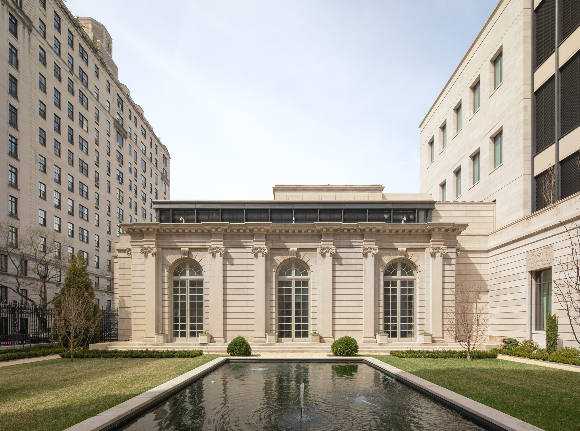 The Frick Collection's expansion by Selldorf Architects is both surgical and delicate
The New York cultural institution gets a $220 million glow-up
By Stephanie Murg
-
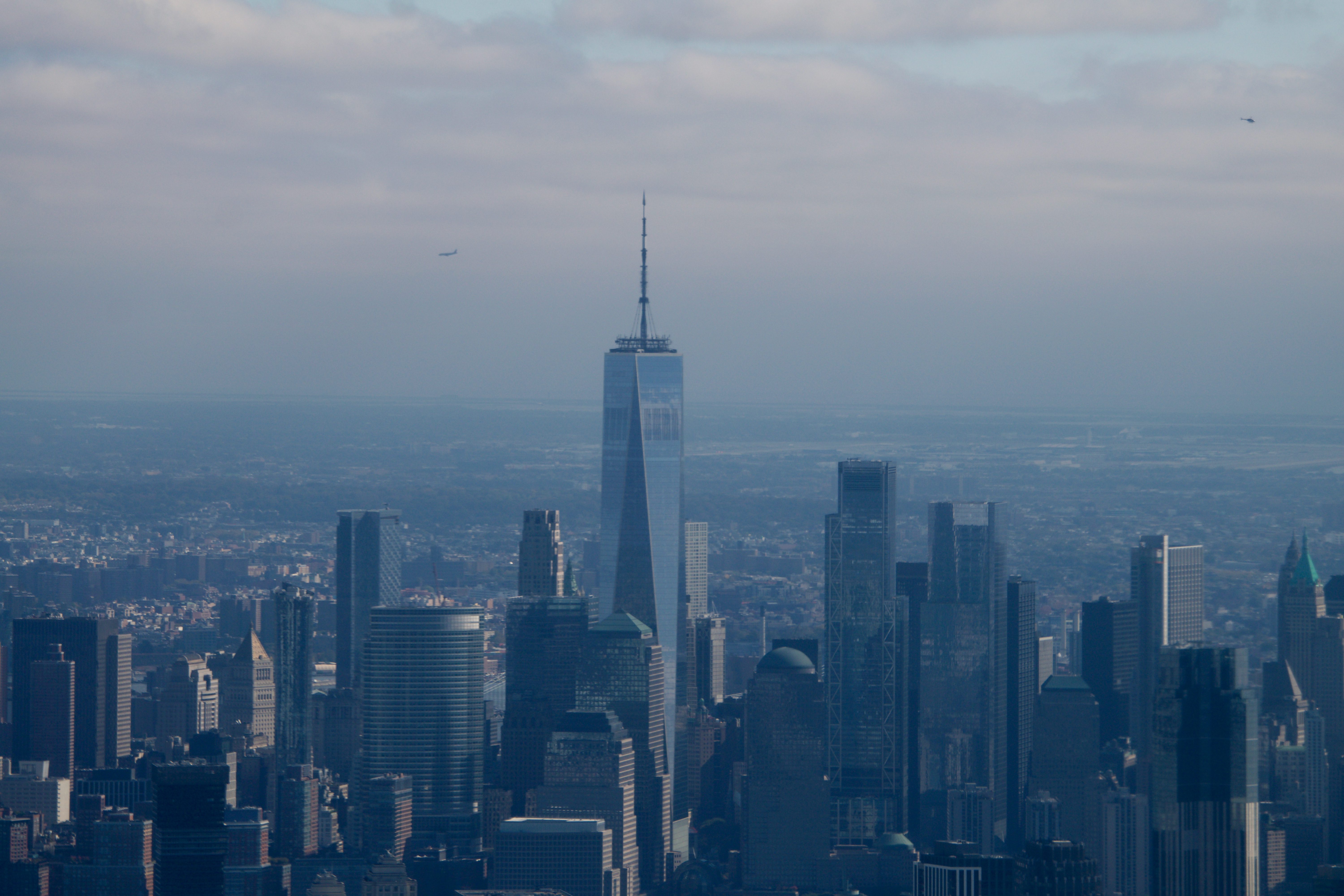 Remembering architect David M Childs (1941-2025) and his New York skyline legacy
David M Childs, a former chairman of architectural powerhouse SOM, has passed away. We celebrate his professional achievements
By Jonathan Bell
-
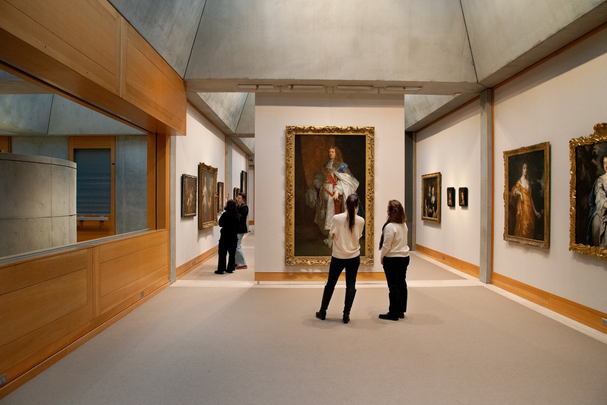 The Yale Center for British Art, Louis Kahn’s final project, glows anew after a two-year closure
After years of restoration, a modernist jewel and a treasure trove of British artwork can be seen in a whole new light
By Anna Fixsen
-
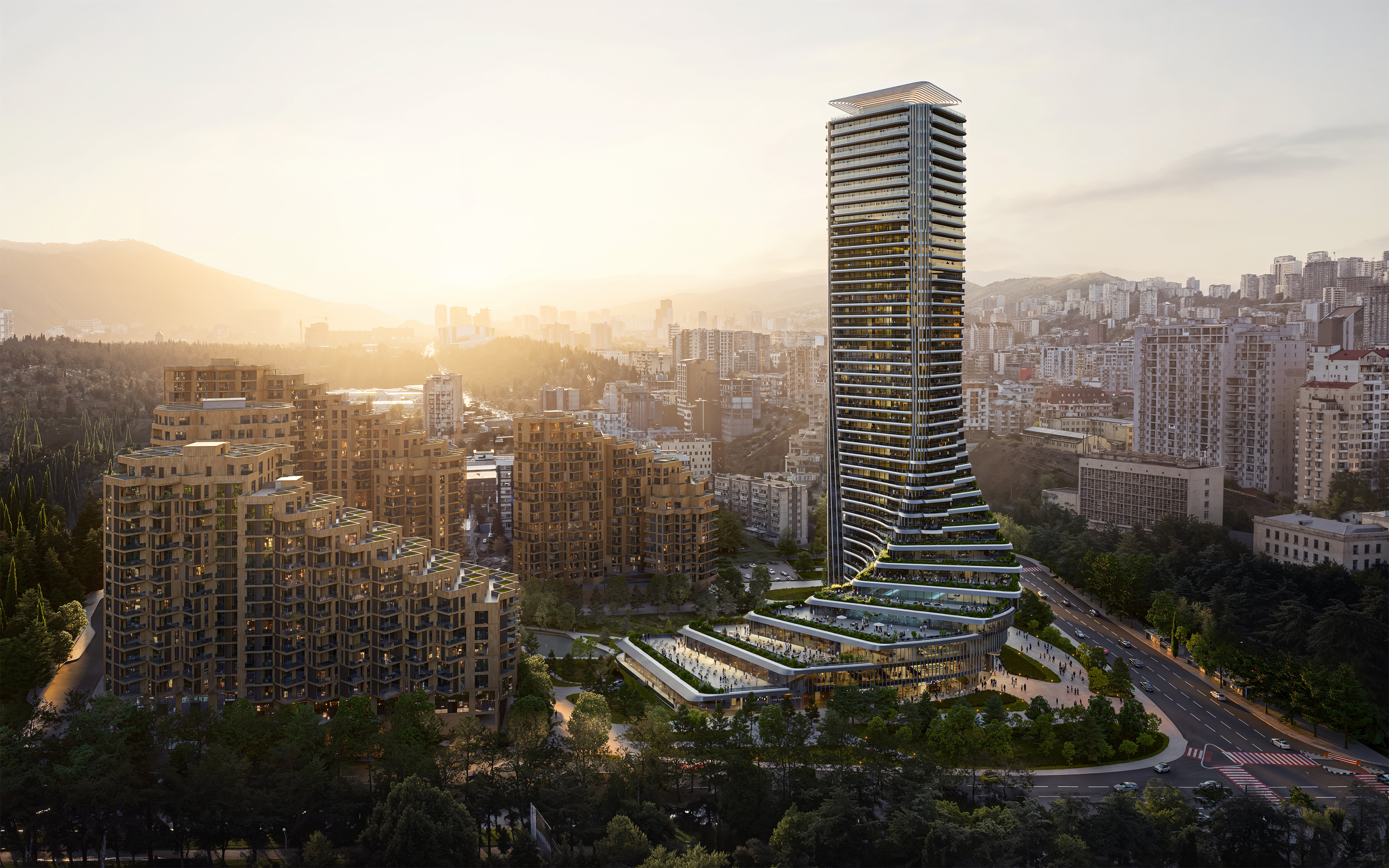 The upcoming Zaha Hadid Architects projects set to transform the horizon
A peek at Zaha Hadid Architects’ future projects, which will comprise some of the most innovative and intriguing structures in the world
By Anna Solomon
-
 Frank Lloyd Wright’s last house has finally been built – and you can stay there
Frank Lloyd Wright’s final residential commission, RiverRock, has come to life. But, constructed 66 years after his death, can it be considered a true ‘Wright’?
By Anna Solomon
-
 Heritage and conservation after the fires: what’s next for Los Angeles?
In the second instalment of our 'Rebuilding LA' series, we explore a way forward for historical treasures under threat
By Mimi Zeiger