LA architect Ray Kappe’s duo of houses pair modernist and organic ideas
Los Angeles-based architect Ray Kappe is renowned worldwide for his contributions to the modernist movement. From forming his own practice in 1954 to founding SCI-Arc (the Southern California Institute of Architecture) in 1972, he is still in practice to this day. In 2006, Wallpaper* visited a pair of Kappe builds: one the home and office of Dr Esther Benton, the other the architect’s own Kappe House in Pacific Palisades, a Cultural Heritage Landmark

Receive our daily digest of inspiration, escapism and design stories from around the world direct to your inbox.
You are now subscribed
Your newsletter sign-up was successful
Want to add more newsletters?
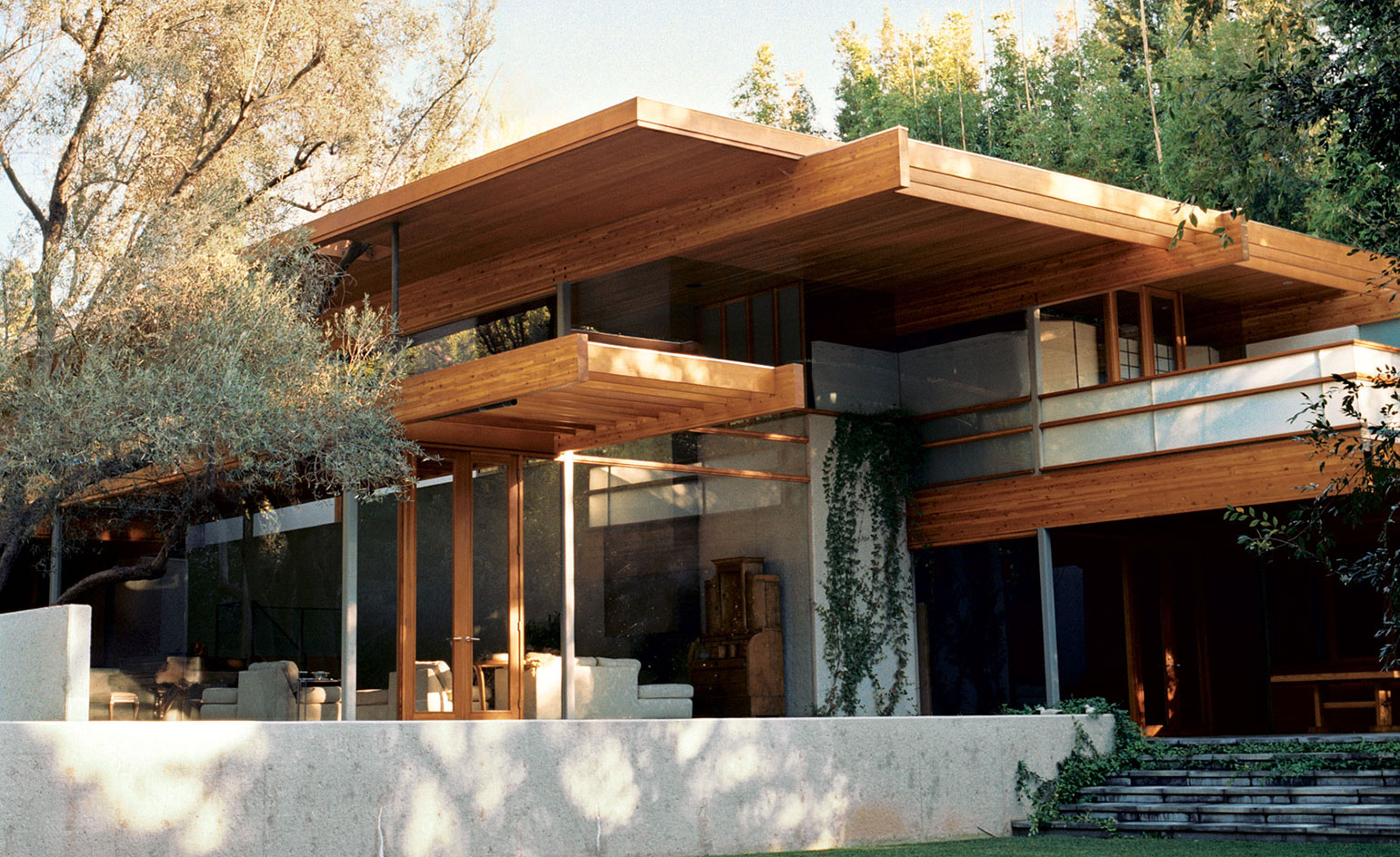
Only a few metres from the busy traffic of Sunset Boulevard in Brentwood, Los Angeles, there is a space as calming and as restful as a cup of green tea. Hidden from the hectic city by bamboo, trees and grasses, down a driveway in a mini-canyon, is the very healing home and office of psychologist Dr Esther Benton. The private site allowed her to commission a home whose acreage of glass walls intercut with planes of Douglas fir and a sense of the outside coming in are in the best tradition of Southern Californian modernism.
Given Benton’s location (the site has a hill in the middle and sits on the edge of the Santa Monica Canyon), and her taste for the transparency and honesty of SoCal modernism, it made perfect sense that she chose Ray Kappe as her architect. The founder of the experimental Southern California Institute of Architecture, and the natural heir to Frank Lloyd Wright, Richard Neutra and R M Schindler, Kappe began his career in the 1950s by bringing together Neutra’s use of space with the more natural modernism of Harwell Hamilton Harris, to which he added some of Lloyd Wright’s love of landscapes.

The large windows open the house up to natural light and make the trees outside part of the living experience.
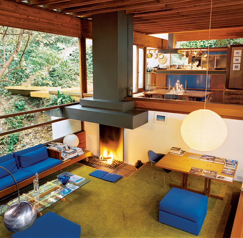
Kappe has designed around 100 homes that make the best of the difficult topography of Santa Monica’s hillsides and canyons. These include his own, the Kappe House (1967) in Pacific Palisades. Built on a slope around six concrete towers, it was designated a Cultural Heritage Landmark in 1996, and the dramatically cantilevered (it’s been called a floating treehouse) building’s wooden beams and glass expanses have become yet another LA icon of design.
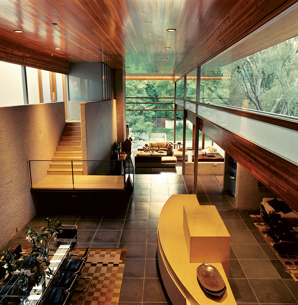
When Benton moved to her plot in the late 1970s, it featured a falling-down, Cape Cod-style home, which sat on the hill. In 1990, Kappe brought her a design that would incorporate the hill into a new building, using a high concrete retaining wall to create two distinct but cleverly connected spaces. One, with 20ft-high ceilings and glass walls, houses the downstairs living and dining areas. The other, on top of the hill, contains two bedroom suites, a library and separate office for Benton’s patients. Downstairs is all drama and space; upstairs, the delight is in the detail. Both spaces are under the same roof, which is split by a linear skylight.
‘Things are what they are in this house. Form follows function. There is no artifice and the structural elements are exposed. The concrete is rough, and it declares itself as concrete.’
Dr Esther Benton
‘We have the climate and the light in LA, so our homes need to be about bringing the outside in,’ says Benton. ‘That explains the glass, but also the little details, like the grid of concrete tiles that is maintained inside and out; they’re the same material, just polished and sealed on the inside. The worktop slab in the kitchen was the same pour as the patio outside the kitchen window, so it flows straight into the house.’
Benton, who practised for 20 years at LA’s Cedars-Sinai Medical Center, wanted a home office so she could spend more time with her daughter and escape the hell of commuting, but at the same time see patients privately. Her office therefore has a separate entrance, but a large pivoting panel in its wall allows her to look down into the main living area and stay connected with the rest of the house. In the master bedroom, there are again openings that link the room with the main living space and allow an unobstructed view to the glass walls and the greenery outside.
RELATED STORY

This is a home in which the landscape is always close, and sometimes incorporated – in two places, trees grow through gaps in the external planes. The garden landscaping was by the El Salvador-born designer Mia Lehrer. The garden is a hugely important element in the success of the building because, unlike much of Kappe’s local work, this building does not sit on a bluff or extend out from a cliff, allowing a jaw-dropping view to do much of the work. Instead, down in its dell, Benton’s home is all mottled light, a shady and green space for contemplation and repair.
That’s not to say there isn’t also technology at work. Slender steel posts support the glue-laminated roof beams in the main downstairs space and create multi-level junctions where the glass, steel and vertical grain of the Douglas fir meet. In places, it’s like having a huge varnished ladder stretched across the ceiling. ‘Things are what they are in this house,’ says Benton. ‘Form follows function. There is no artifice and the structural elements are exposed. The concrete is rough, and it declares itself as concrete.’
Also in the main room is a large, unfinished cabinet designed by Kappe. It sits awaiting the steel and glass panels to finish it off. It is one of the few curved structures in the house and provides a much-needed contrast to the profusion of planes around it. It also makes for a clear contrast with the rigorous straight lines of Kappe’s own house, located just five minutes away, but completed 30 years earlier.

Architect Ray Kappe’s own house, completed 30 years before he built the Benton House, offers a similar sense of drama, but is more rigorous in its use of straight lines.
For all the Benton home’s concrete (supporting the now hidden hill), there is much lightness and simplicity in the house’s details. In the bathrooms, cupboards and glass surfaces float in line with steps leading to baths and showers; in the living room, the oxidised, unfinished steel flue of the fireplace rises upwards into the master bedroom, where it opens out into another fireplace. In the library, a book-lined space that manages to be both cosy and modern, the fireplace is set in a wall of glass and the room looks out onto a secluded patio. In one ensuite shower room, the privacy of the plot is underlined by the daring, all-glass walls and skylight, while in the other bathroom, the level of privacy is determined by the movement of mesh screens or clear and opaque glass panels, which slide along window tracks, offering multiple choices.
Benton contributed her ideas towards the design of her home, but says her decisions had nothing to do with her professional philosophy. There is no Gestalt-meets-Bauhaus psycho-architectural theory being played out here. Instead, the main elements of Kappe’s building are honesty, simplicity and tranquillity. All of which come in handy for a therapist’s surgery – and for a rather wonderful home. §
As originally featured in the August 2006 issue of Wallpaper* (W*90)
INFORMATION
For more information, visit the Kappe Architects website
Receive our daily digest of inspiration, escapism and design stories from around the world direct to your inbox.