Washington D.C.’s Kennedy Center opens The REACH with 16-day performance festival
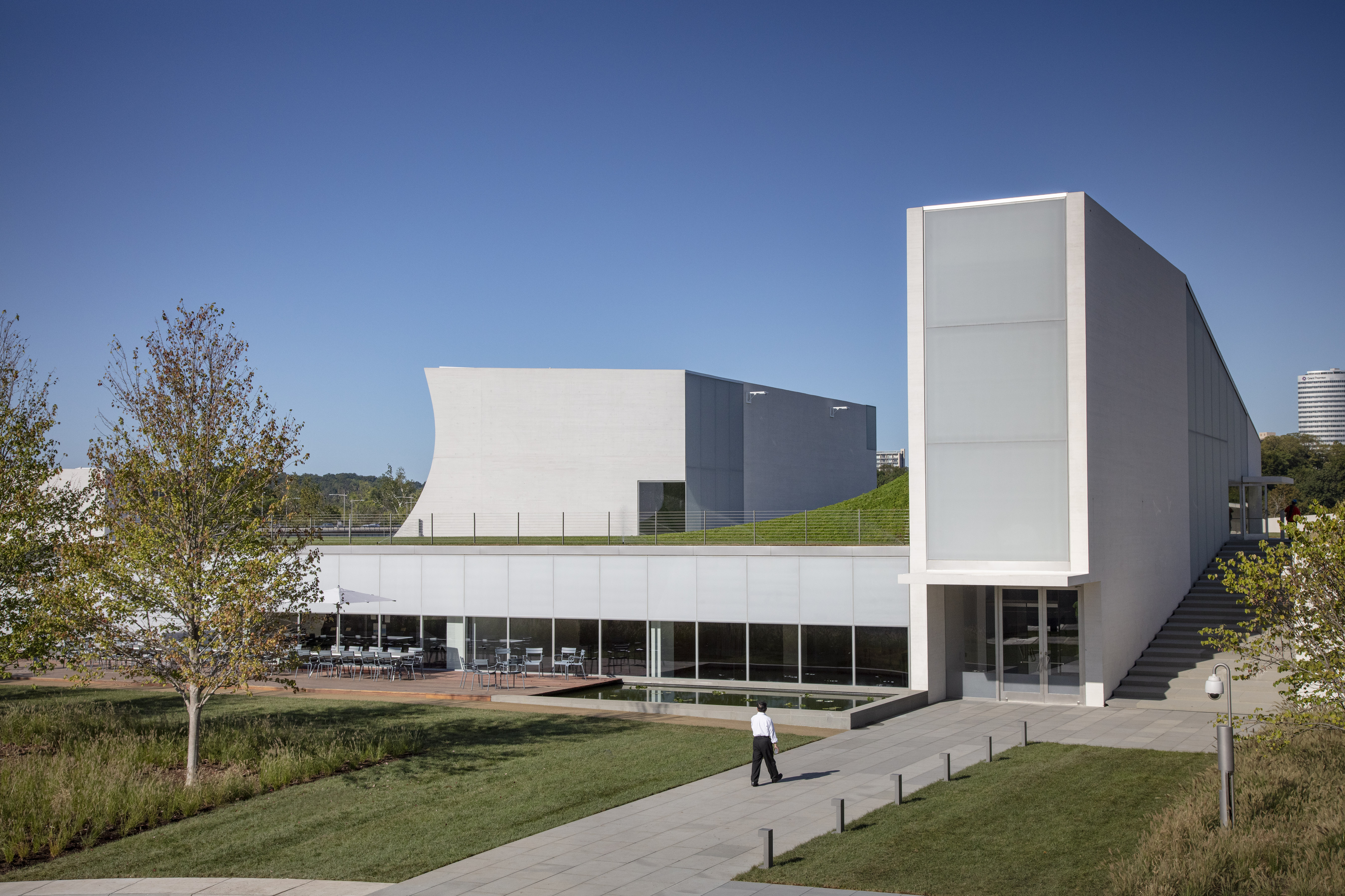
The Kennedy Center celebrates the opening of its $250 million expansion, the REACH, with a 16-day festival of music, dance, and performing arts events starting this weekend. The REACH — an acronym made up of aspirational verbs: renew, experience, activate, create, and honour — adds 72,000 sq ft of interior space within and below 4.6 acres of landscape, all of which audiences and performers will activate, board members of the Kennedy Center hope, with their arrival on 7 September.
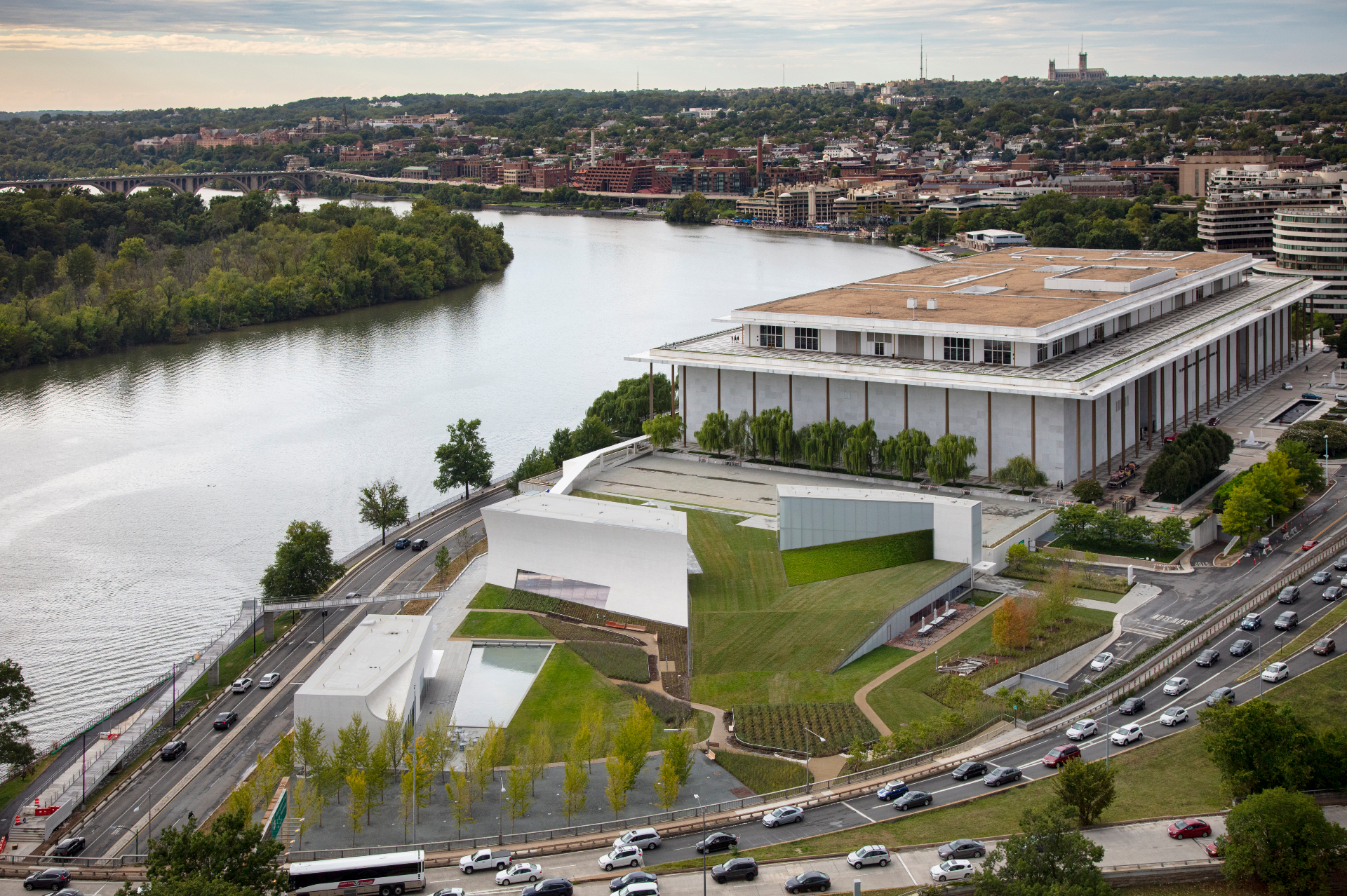
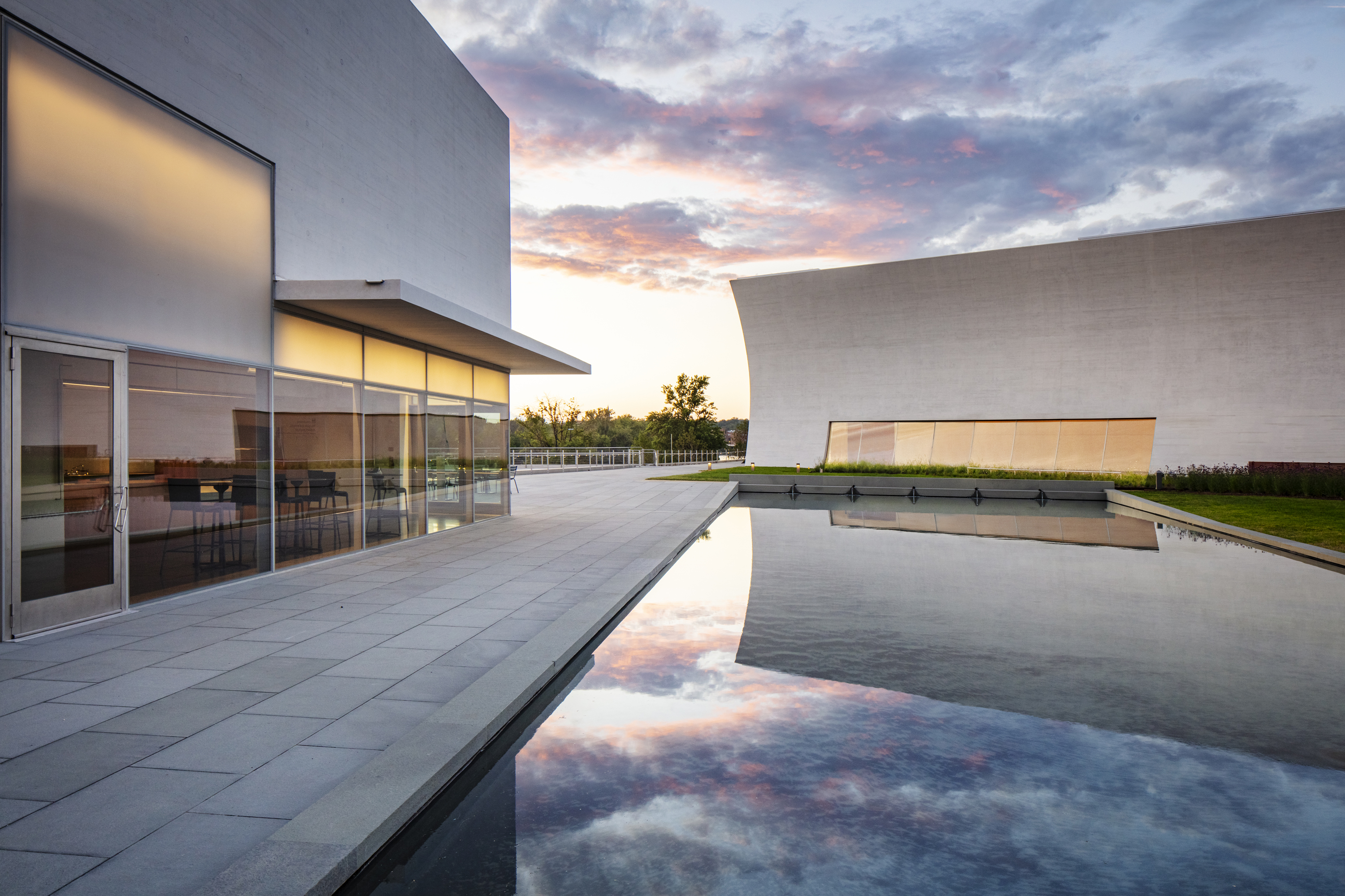
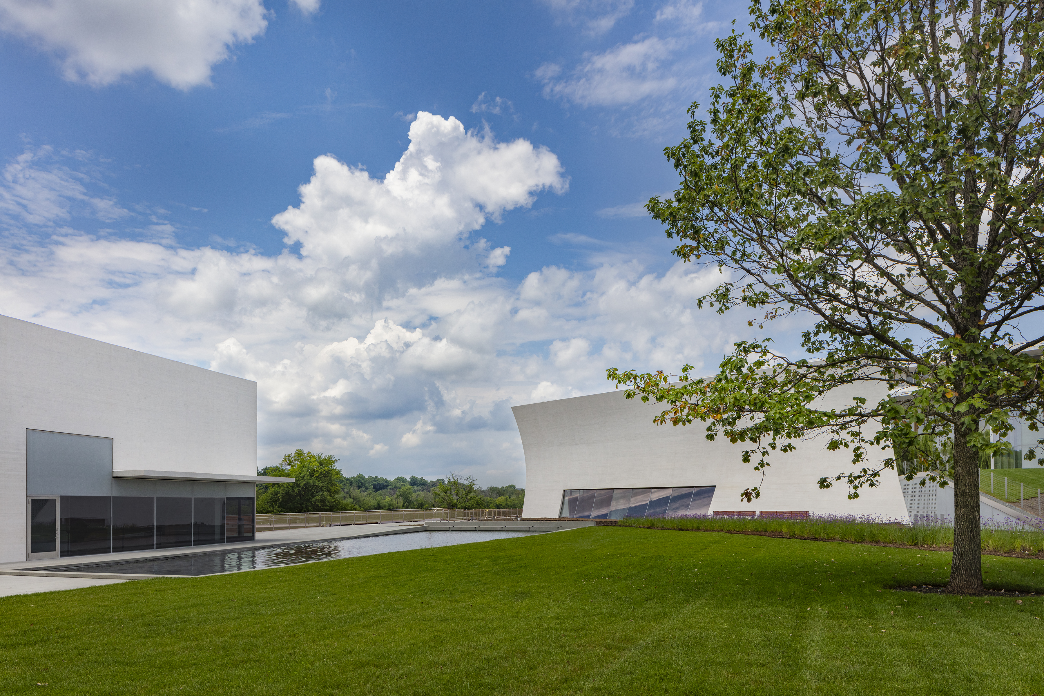
Designed by a team comprising Steven Holl Architects (SHA), BNIM, and Hollander Design Landscape Architects, the expansion rises triumphantly from the irregular leftover space between the Potomac and the highway that crosses it in an area formerly dedicated to the original 1971 Edward Durrell Stone building’s garage entry and bus parking. With the metaphor of an iceberg in mind, three white pavilions float above the new, artificial ground plane as the triangles to Stone’s bombastic timpani. These pavilions connect below ground to the larger mass of flexible rehearsal and performance spaces spread over two levels. Along the western edge of the expansion, thick glazing affords river views to the multi-use studios while limiting outdoor noise. Parking is still a consideration, but now one that is tucked out of sight beneath an undulating green roof of reflecting pools, lawn, and a Ginkgo grove.
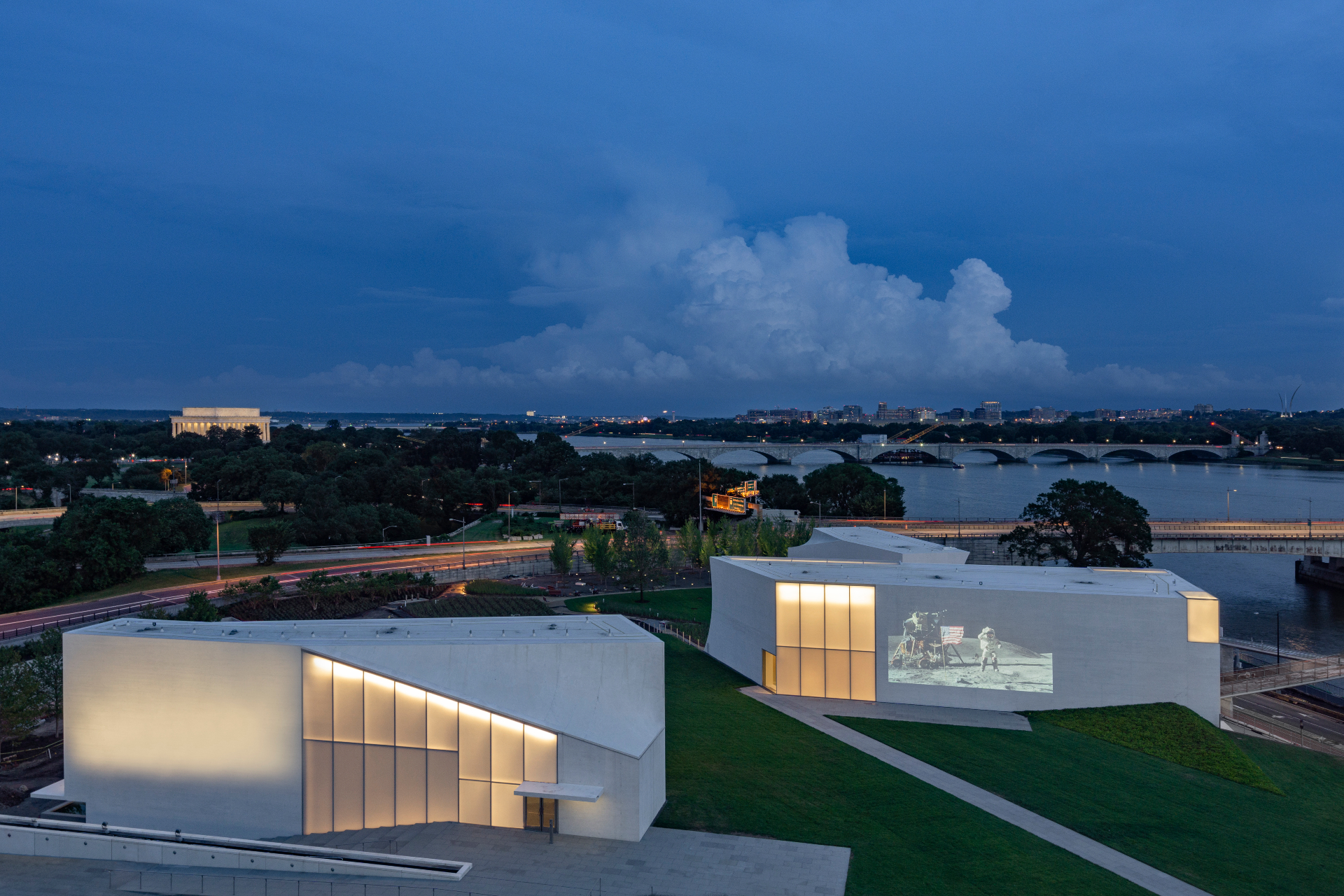
If only the same consideration were applied to the knot of highway infrastructure surrounding the site. The opening festival promises roughly one thousand artists in more than 500 events, many of which will be outdoor performances, and the future possibility of shows being live-streamed and projected onto the exterior of one of the pavilions has also been floated. But it’s hard to imagine those experiences not being drowned out by the near-constant din of automotive and airplane traffic overhead.
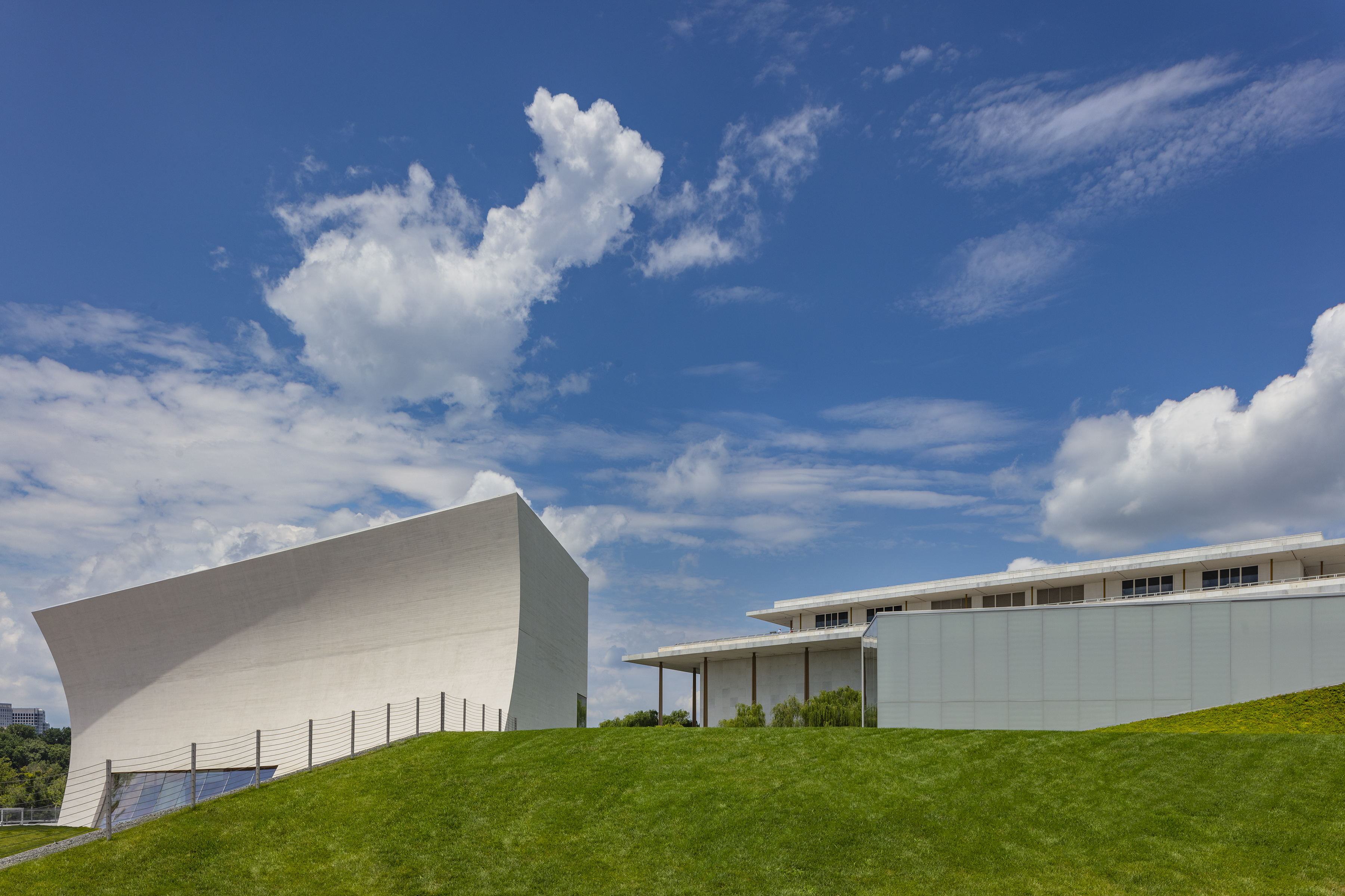
These are, of course, conditions the design team has done its best to mitigate. In terms of outdoor treatments, the pavilions also eschew parallel surfaces, with the largest, dubbed the Skylight Pavilion, featuring a concave concrete wall footed by curving glass. The Ginkgo grove attempts to buffer the lawn from roadway noise, and a reflecting pool offers further noise dampening through sound absorption.
SHA partner Chris McVoy describes the outdoor space as surprisingly quiet given the movement around the site. ‘It's situated, in section, in an ideal acoustic zone', he says. ‘We’re below the onramp to the Memorial Bridge, so that there's no direct line of hearing from the wheels of cars, and we’re above the traffic on the parkway.' Simulcasts, he explains, will be screened on the northern side of the Skylight Pavilion, thus using that structure itself as an acoustic barrier between audiences and traffic on the Memorial Bridge to the south. The River Pavilion likewise shields the lower lawn from parkway traffic noise, and in many places, the landscape gently rises up the outside of the pavilions, in what McVoy terms ‘sedum swoops', that soften hard surfaces.
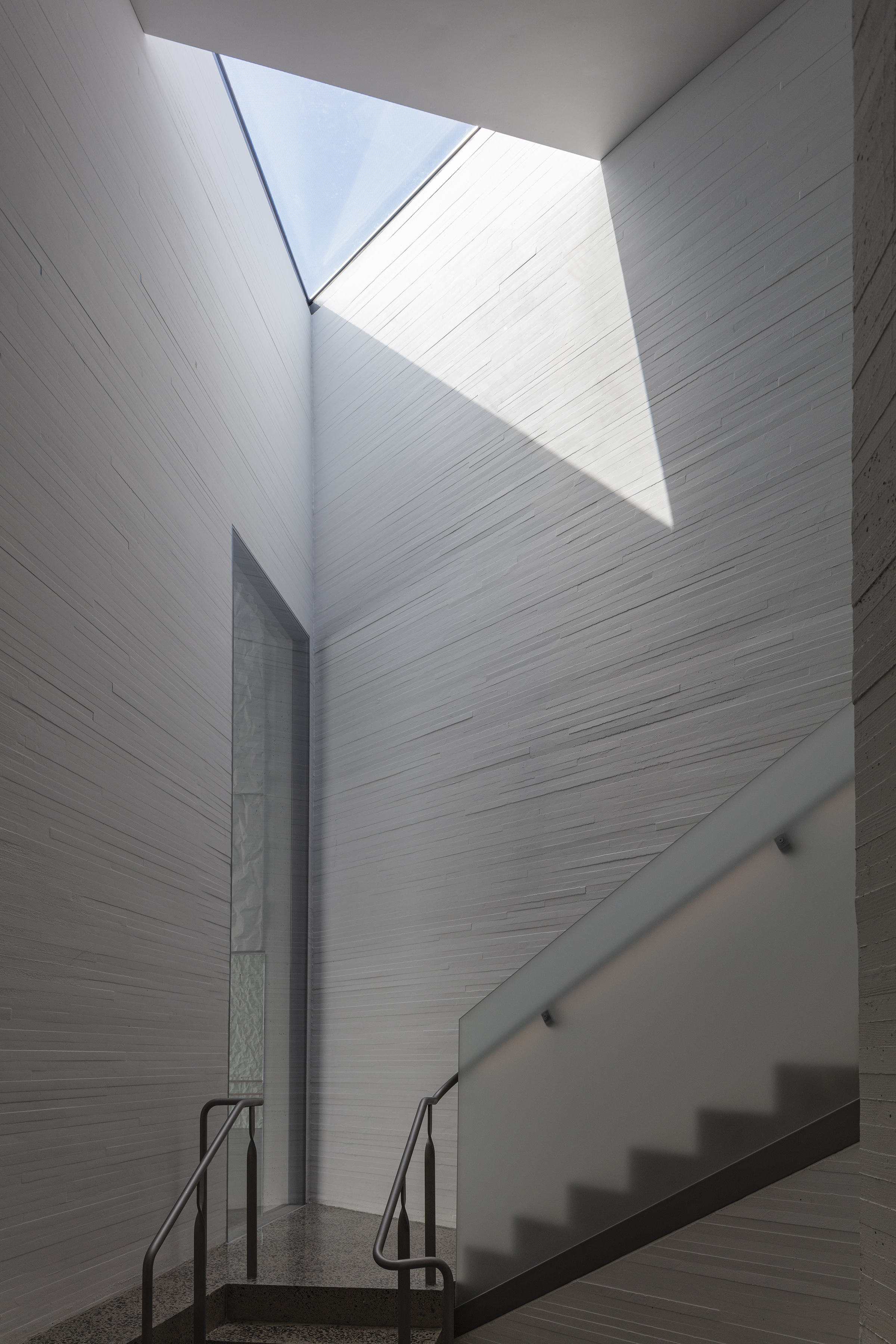
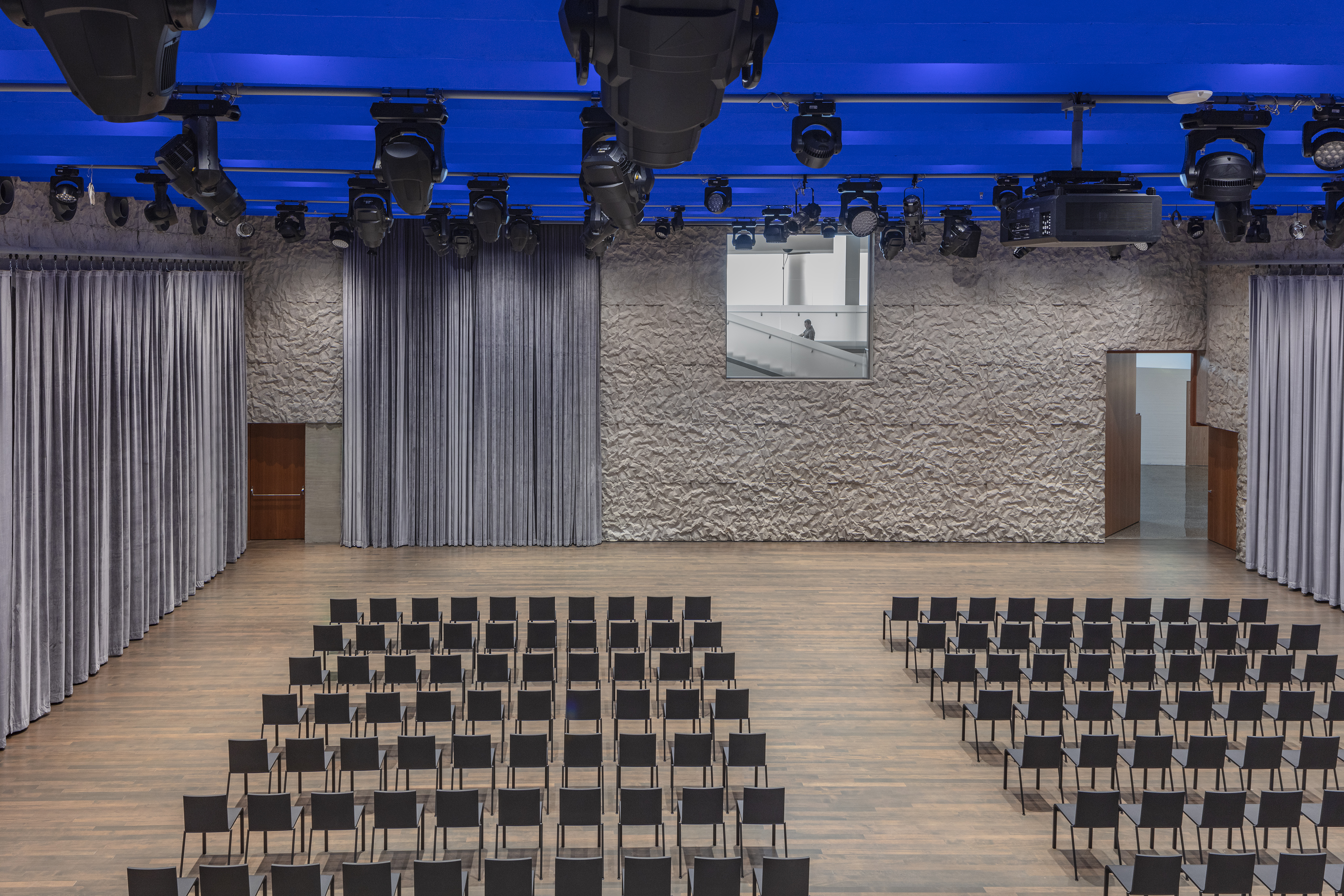
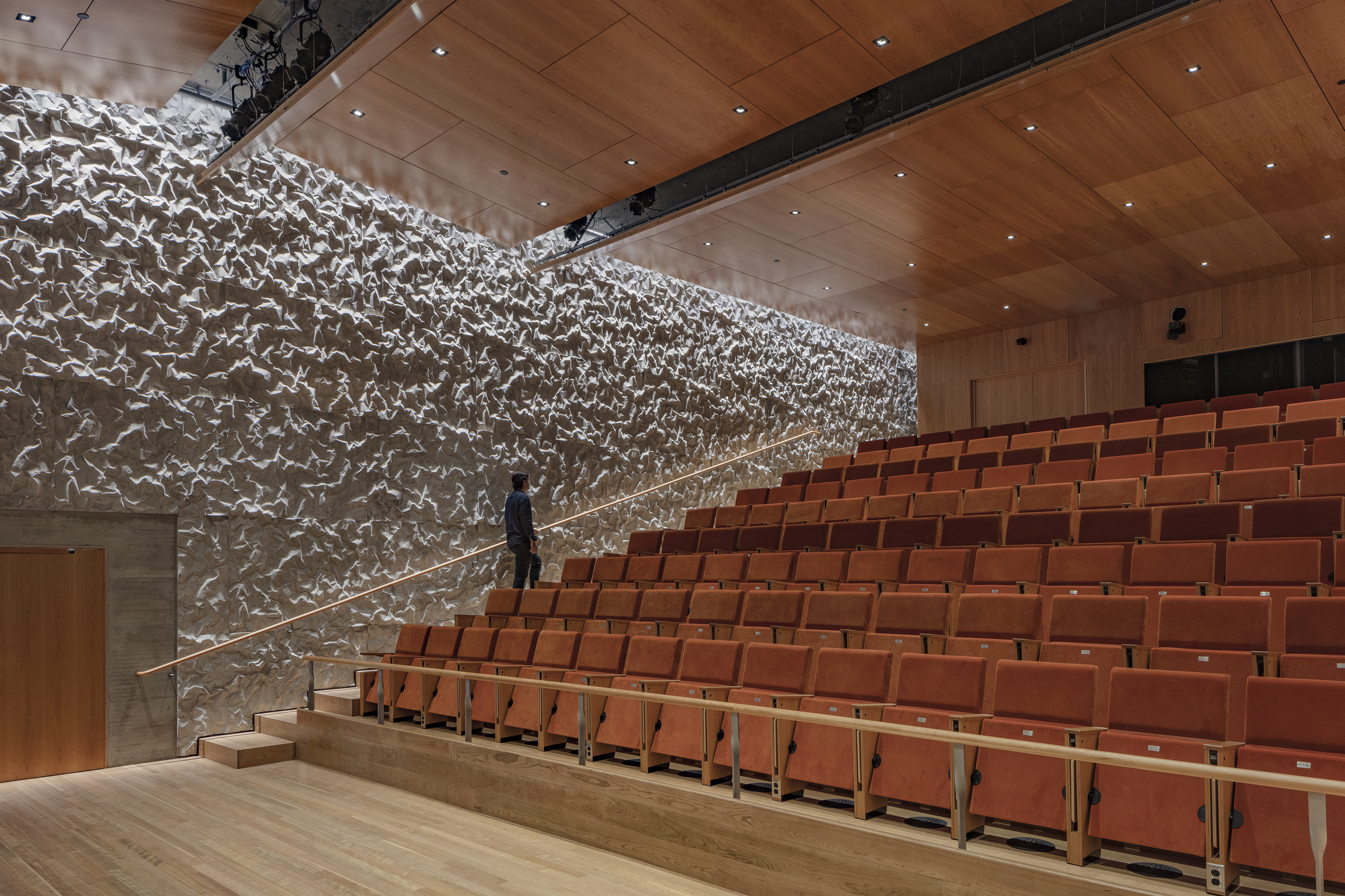
On the interior, the team’s efforts include invention of a new material application, ‘crinkle concrete’, that performs both acoustically and structurally. Based upon the principle of reducing parallel planes and developed in-house at SHA by Garrick Ambrose with acoustician David Harvey, the technique for creating crinkle concrete involves pounding thin sheet metal until it becomes a surface of high-relief dents and mounds, then coating it in rubber to serve as the textured formwork for in situ concrete pours. In addition to that visible acoustic treatment, the combination of low-velocity forced-air handling and radiant floors connected to an extensive geothermal well system promises noiseless temperature control.
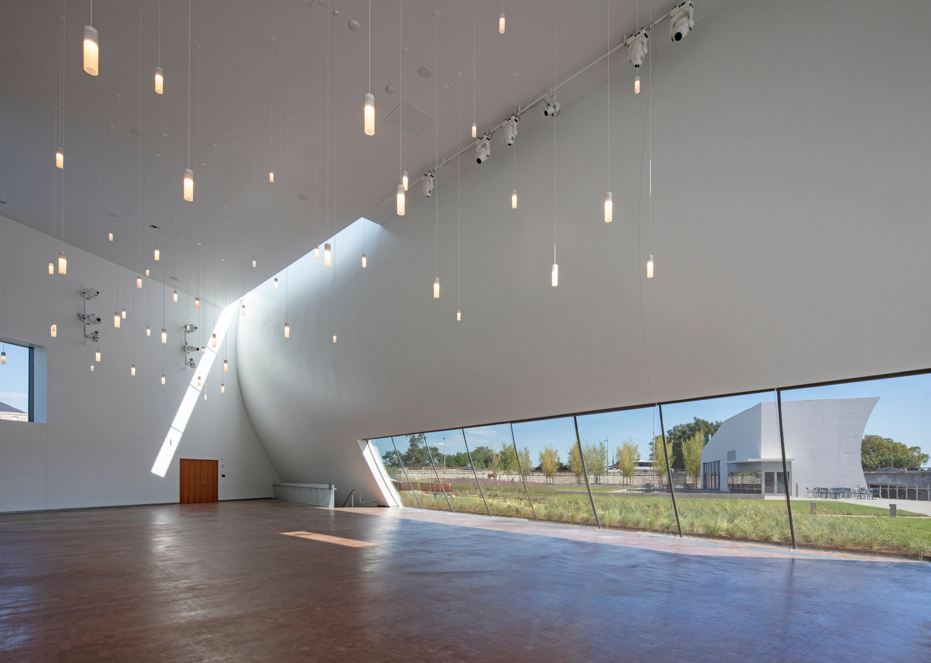
One of the firm’s fascinations has long been the interplay of architecture and light, and, for a building whose bulk is underground, the REACH succeeds admirably at channeling daylight below. The window walls on the west side of the lower levels admit plenty of natural light, and in the studios that line this edge, the textured concrete is also tinted white to further reflect light into the space. Where the pavilions rise, they also funnel light downward; a strategic triangular skylight brightens a back staircase. ‘We take rehearsal space, and we make it a beautiful space to be, with great views and great light', McVoy says. ‘The artists are in there eight hours a day sometimes. And so to see the course of the day change through the light is really inspiring.'
While the artists rehearsing will undoubtedly see benefit to practicing in such bright spaces, visitors can also enjoy them, thanks to an ambulatory that offers mezzanine views into the studios below.
To address the Kennedy Center’s relative isolation, tucked as it is beside a highway interchange and the self-contained Watergate complex, the designers employed a more overt metaphor, that of a literal reach across Rock Creek Parkway in bridge form, to invite pedestrians and cyclists into the Center from the waterside promenade. With a decidedly informal – and pointedly public – layout, the REACH attempts to overwrite any notions of cultural elitism that may have fomented in the Kennedy Center’s last five decades, to promote outreach and openness into the next generation in what the architects consider a living memorial honouring John F. Kennedy.
INFORMATION
Wallpaper* Newsletter
Receive our daily digest of inspiration, escapism and design stories from around the world direct to your inbox.
-
 The Subaru Forester is the definition of unpretentious automotive design
It’s not exactly king of the crossovers, but the Subaru Forester e-Boxer is reliable, practical and great for keeping a low profile
By Jonathan Bell
-
 Sotheby’s is auctioning a rare Frank Lloyd Wright lamp – and it could fetch $5 million
The architect's ‘Double-Pedestal’ lamp, which was designed for the Dana House in 1903, is hitting the auction block 13 May at Sotheby's.
By Anna Solomon
-
 Naoto Fukasawa sparks children’s imaginations with play sculptures
The Japanese designer creates an intuitive series of bold play sculptures, designed to spark children’s desire to play without thinking
By Danielle Demetriou
-
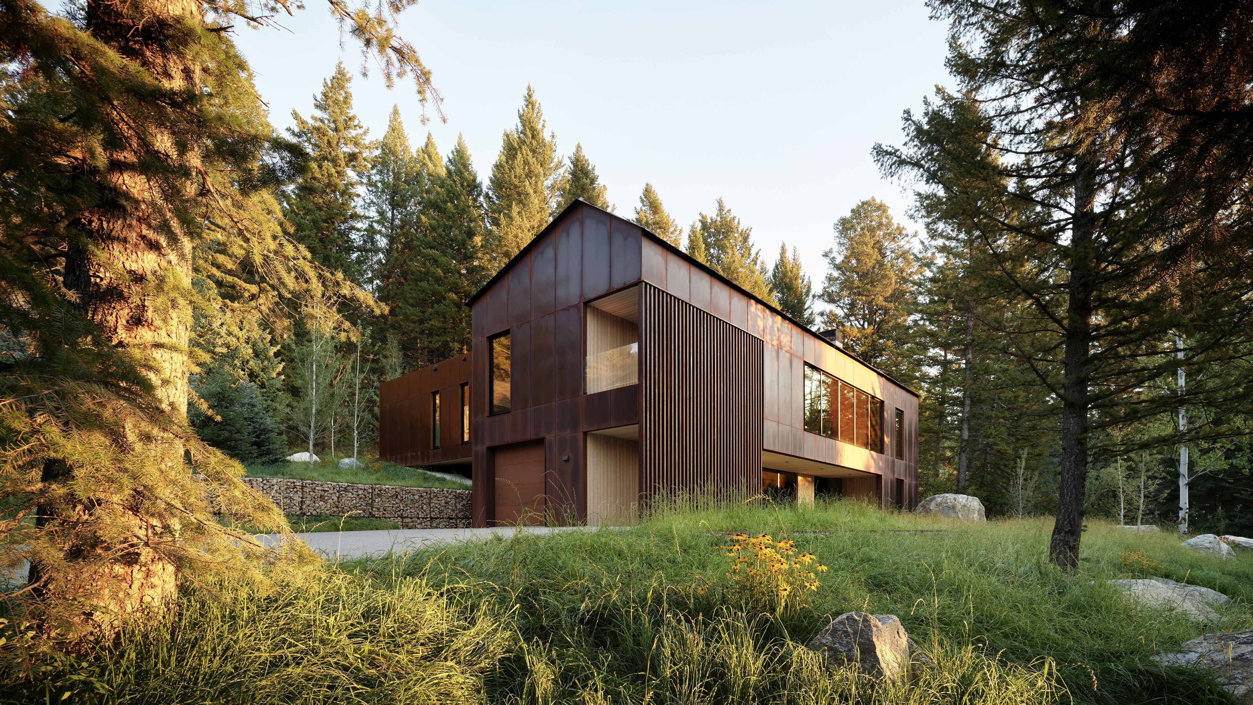 This minimalist Wyoming retreat is the perfect place to unplug
This woodland home that espouses the virtues of simplicity, containing barely any furniture and having used only three materials in its construction
By Anna Solomon
-
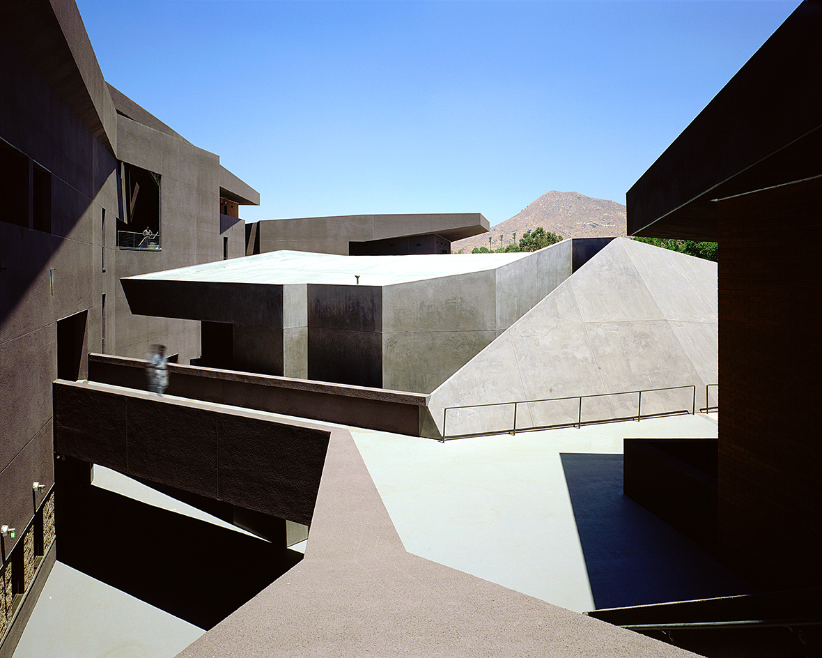 We explore Franklin Israel’s lesser-known, progressive, deconstructivist architecture
Franklin Israel, a progressive Californian architect whose life was cut short in 1996 at the age of 50, is celebrated in a new book that examines his work and legacy
By Michael Webb
-
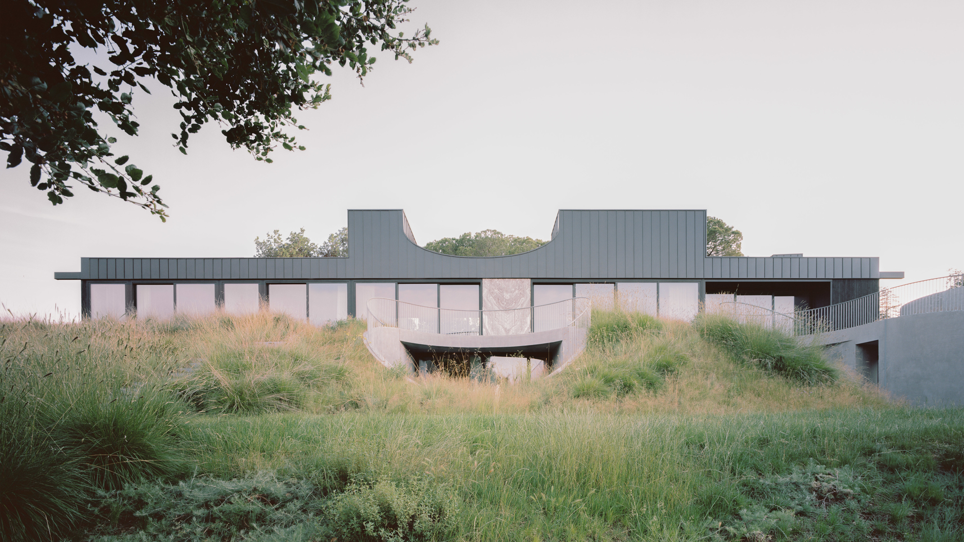 A new hilltop California home is rooted in the landscape and celebrates views of nature
WOJR's California home House of Horns is a meticulously planned modern villa that seeps into its surrounding landscape through a series of sculptural courtyards
By Jonathan Bell
-
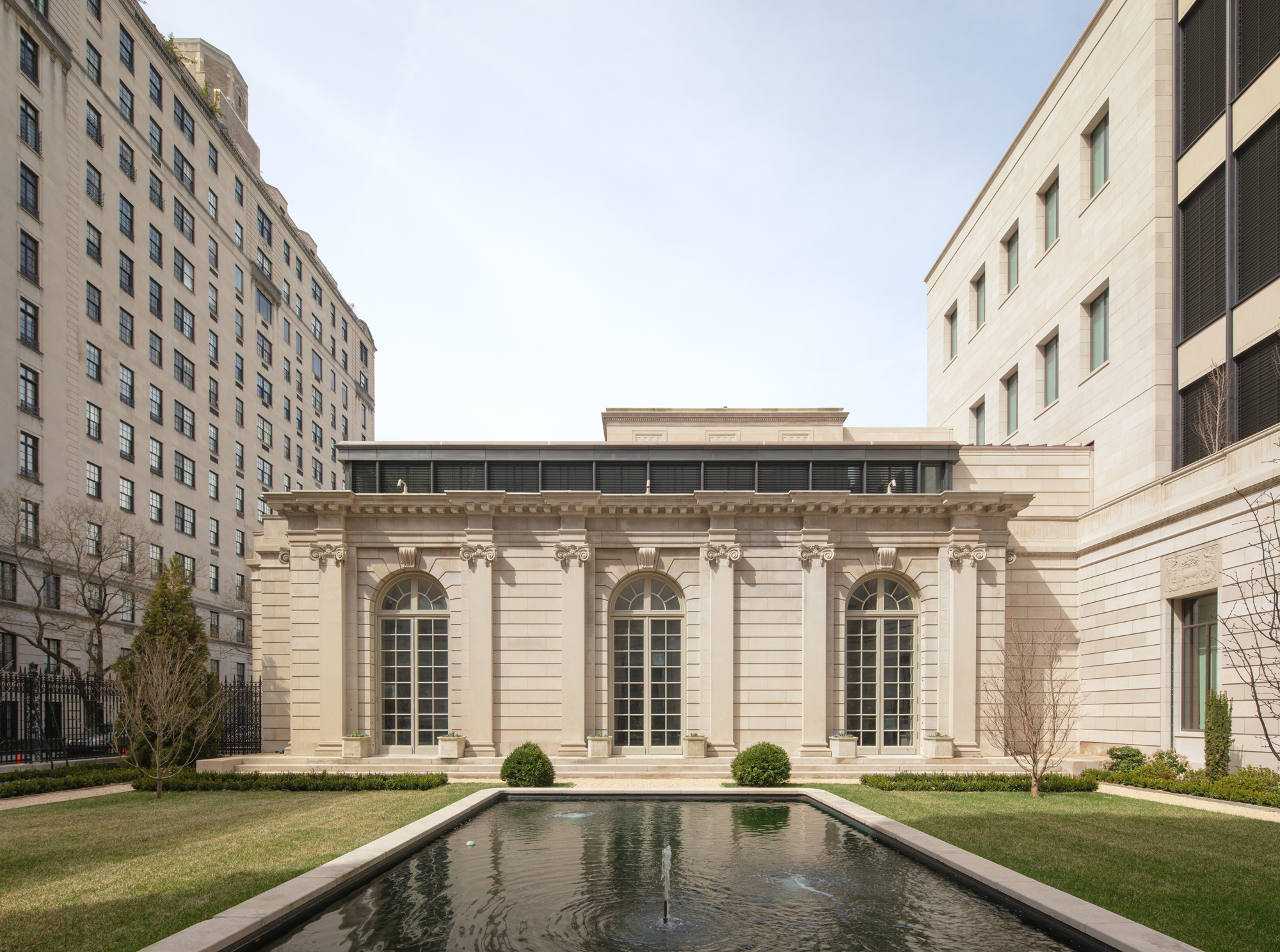 The Frick Collection's expansion by Selldorf Architects is both surgical and delicate
The New York cultural institution gets a $220 million glow-up
By Stephanie Murg
-
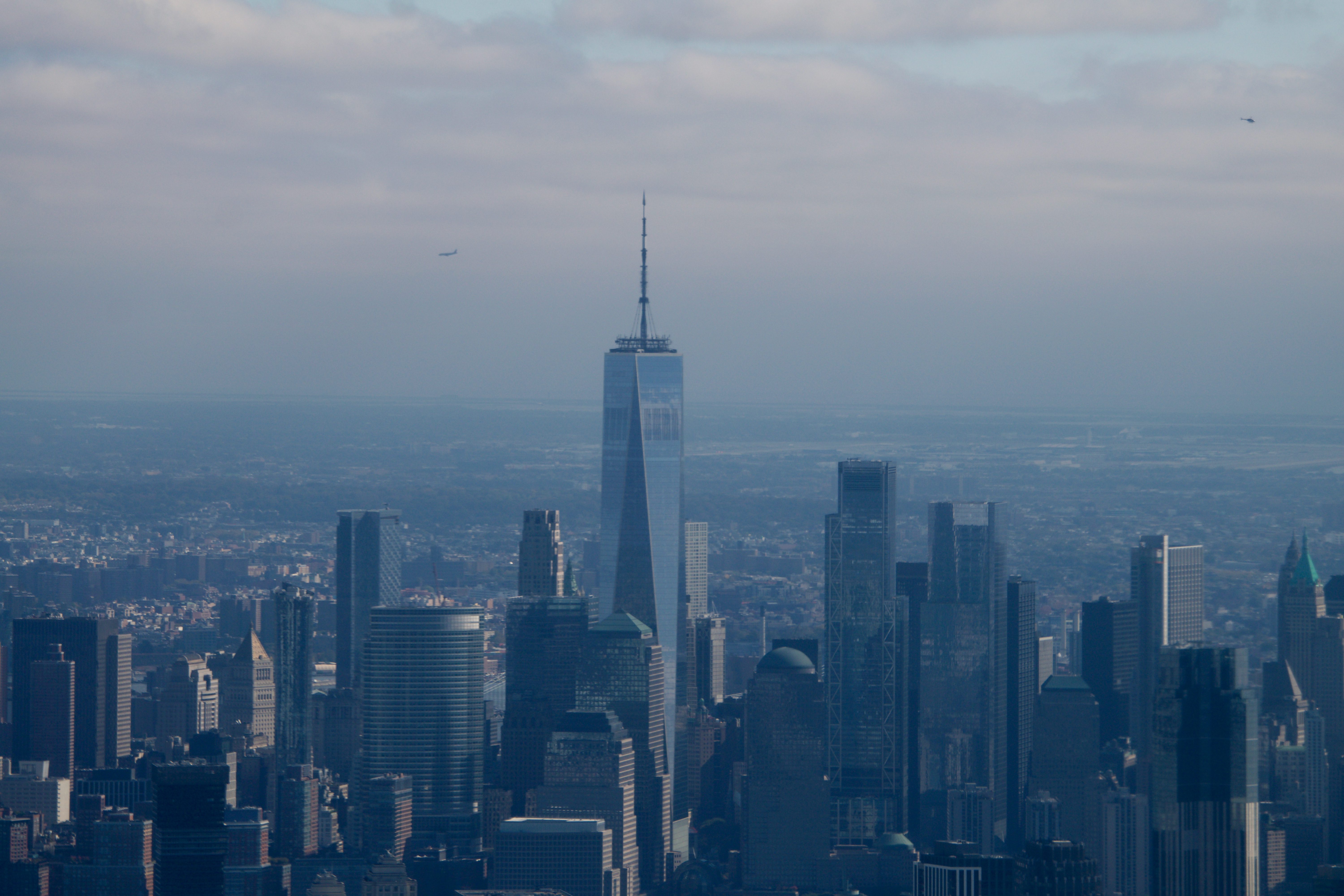 Remembering architect David M Childs (1941-2025) and his New York skyline legacy
David M Childs, a former chairman of architectural powerhouse SOM, has passed away. We celebrate his professional achievements
By Jonathan Bell
-
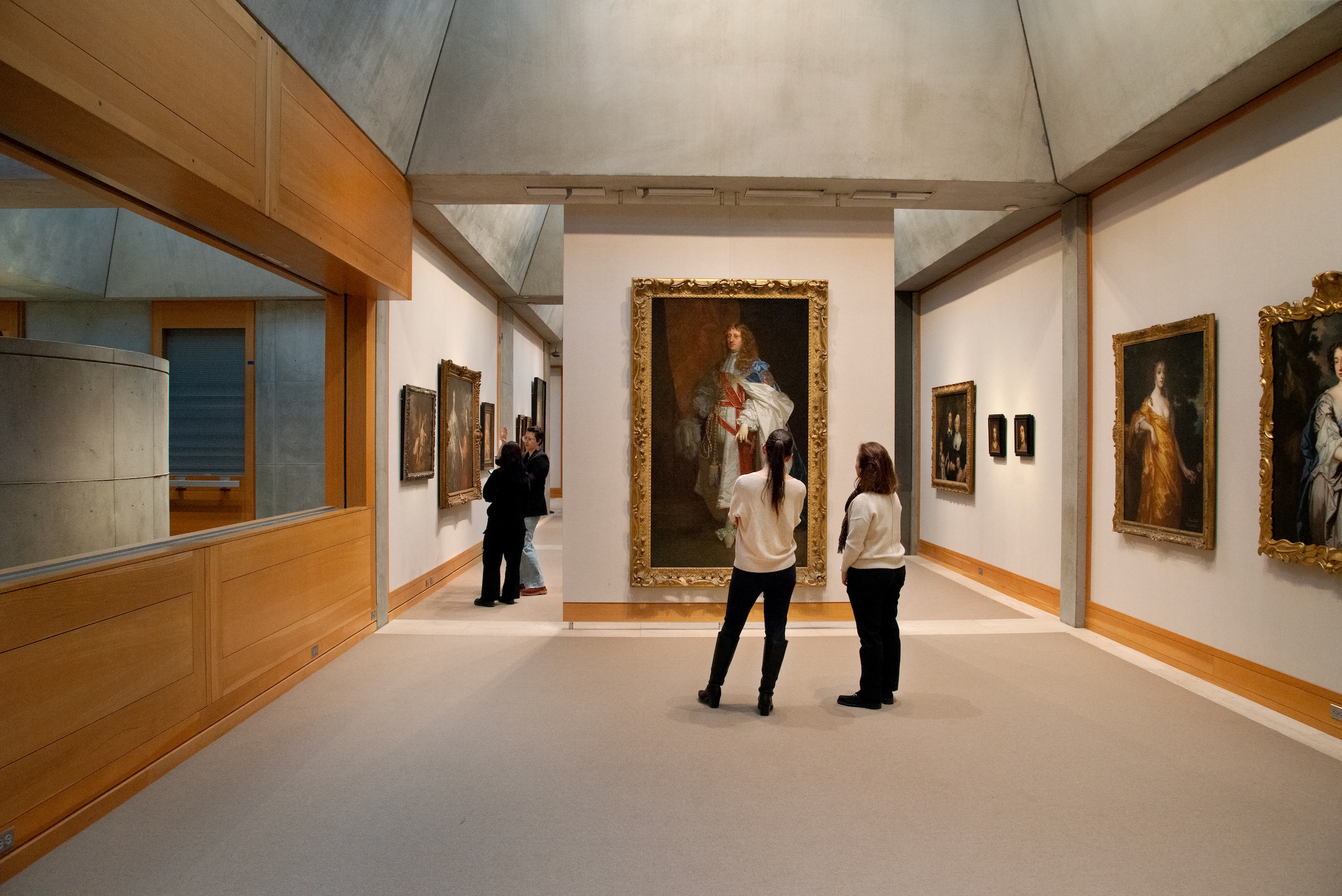 The Yale Center for British Art, Louis Kahn’s final project, glows anew after a two-year closure
After years of restoration, a modernist jewel and a treasure trove of British artwork can be seen in a whole new light
By Anna Fixsen
-
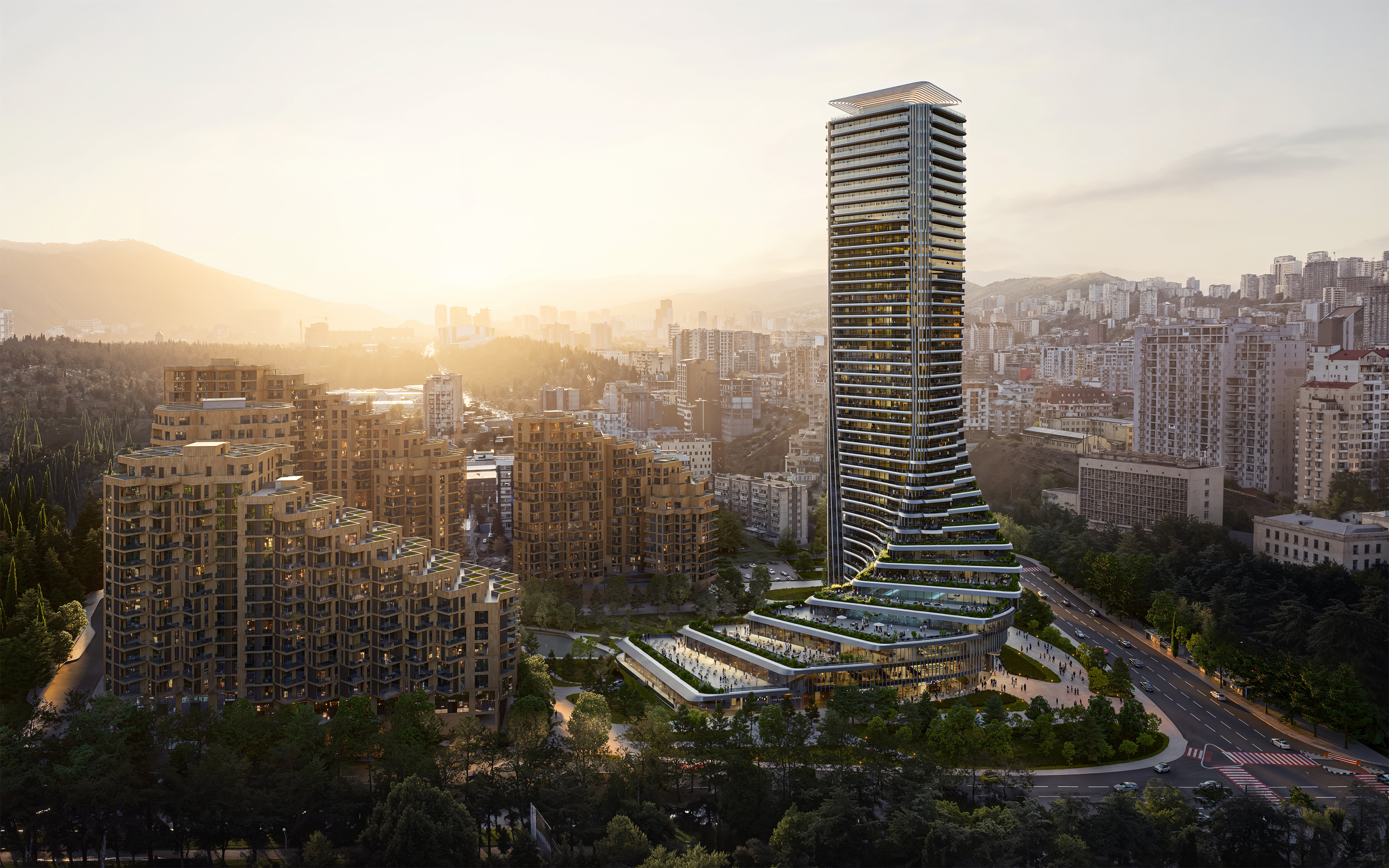 The upcoming Zaha Hadid Architects projects set to transform the horizon
A peek at Zaha Hadid Architects’ future projects, which will comprise some of the most innovative and intriguing structures in the world
By Anna Solomon
-
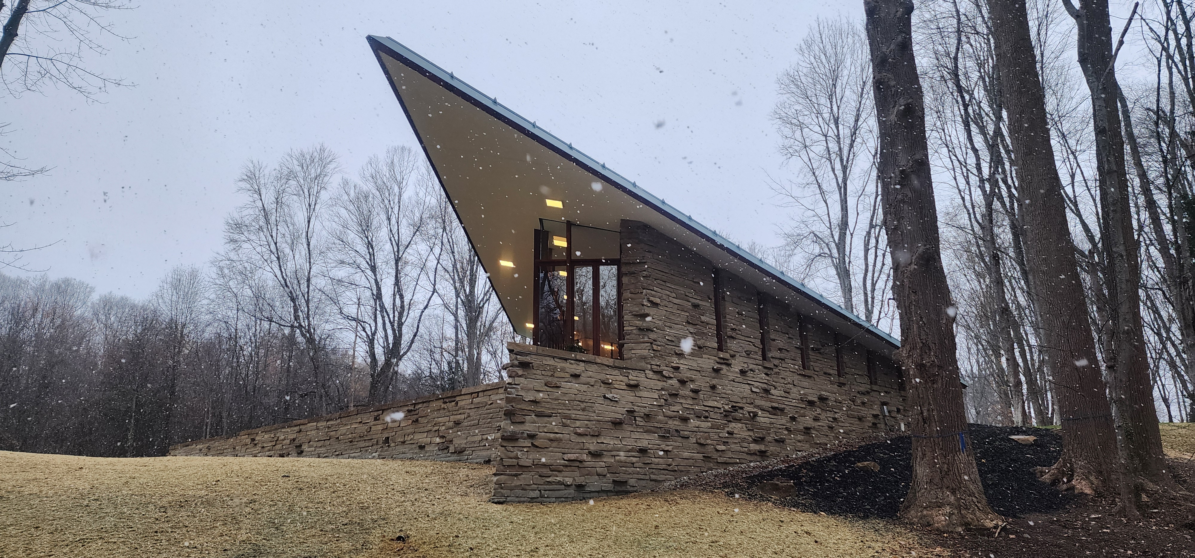 Frank Lloyd Wright’s last house has finally been built – and you can stay there
Frank Lloyd Wright’s final residential commission, RiverRock, has come to life. But, constructed 66 years after his death, can it be considered a true ‘Wright’?
By Anna Solomon